A PMO lives or dies by the monthly pack. Somebody has to answer what the portfolio is spending, what is slipping, and who is carrying too much – and in most organisations that answer arrives as a 40-tab workbook rebuilt by hand every month. The Project Management Office (PMO) Dashboard in Google Sheets replaces that ritual with six linked pages that re-filter on a click.Dashboard in Google Sheets
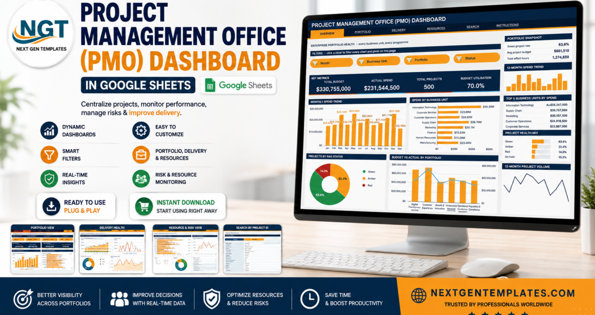
The file ships loaded with 500 sample projects across 8 business units, 6 portfolios and 10 project managers, carrying $330,755,000 of budget, $231,544,500 of actual spend and 1,274,650 effort hours. Sixteen KPI cards, sixteen charts and sixteen slicers are already wired up, so you can test every filter before you paste a single row of your own data.
Get the Project Management Office (PMO) Dashboard in Google Sheets
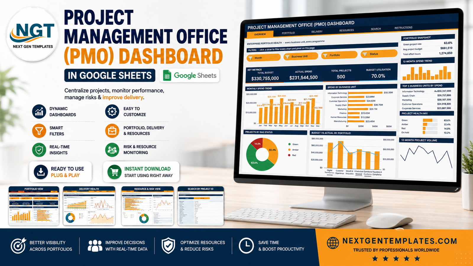
Key Features of the Project Management Office (PMO) Dashboard
- Built on native pivot tables and slicers. Every chart reads a real pivot table parked to the right of its page. Google’s own pivot table documentation explains the engine underneath; the point here is that no SUMPRODUCT chain sits between your data and the visuals, so the file stays quick as the register grows.Dashboard in Google Sheets
- Four slicers per page. One click re-filters all four charts and the sidebar Top 5 table together. Filters are page-scoped, so Delivery can sit on Red while Resources sits on one sponsor.
- Sixteen KPI cards driven by SUMIFS and COUNTIFS against the Data sheet – deliberately unfiltered, so enterprise totals stay put while you drill.
- A consistent sidebar on all four analysis pages: snapshot metrics, a 12-month spend sparkline, a Top 5 ranking, a percentage mix bar list and an At a Glance block.
- A Search page that returns all 17 fields of any project record from a Project ID dropdown.
- Numbered lifecycle values – 1 Initiation through 6 Closure, 1 Low through 4 Critical – so charts sort in real order rather than alphabetically.
- Room for 1,000 project rows already covered by every pivot, slicer and formula.
- A single palette block in the Apps Script file: ink #16304F, accent #F5A524, sky #4FB0C6.
Dashboard Pages Explanation
1. Overview – enterprise portfolio health
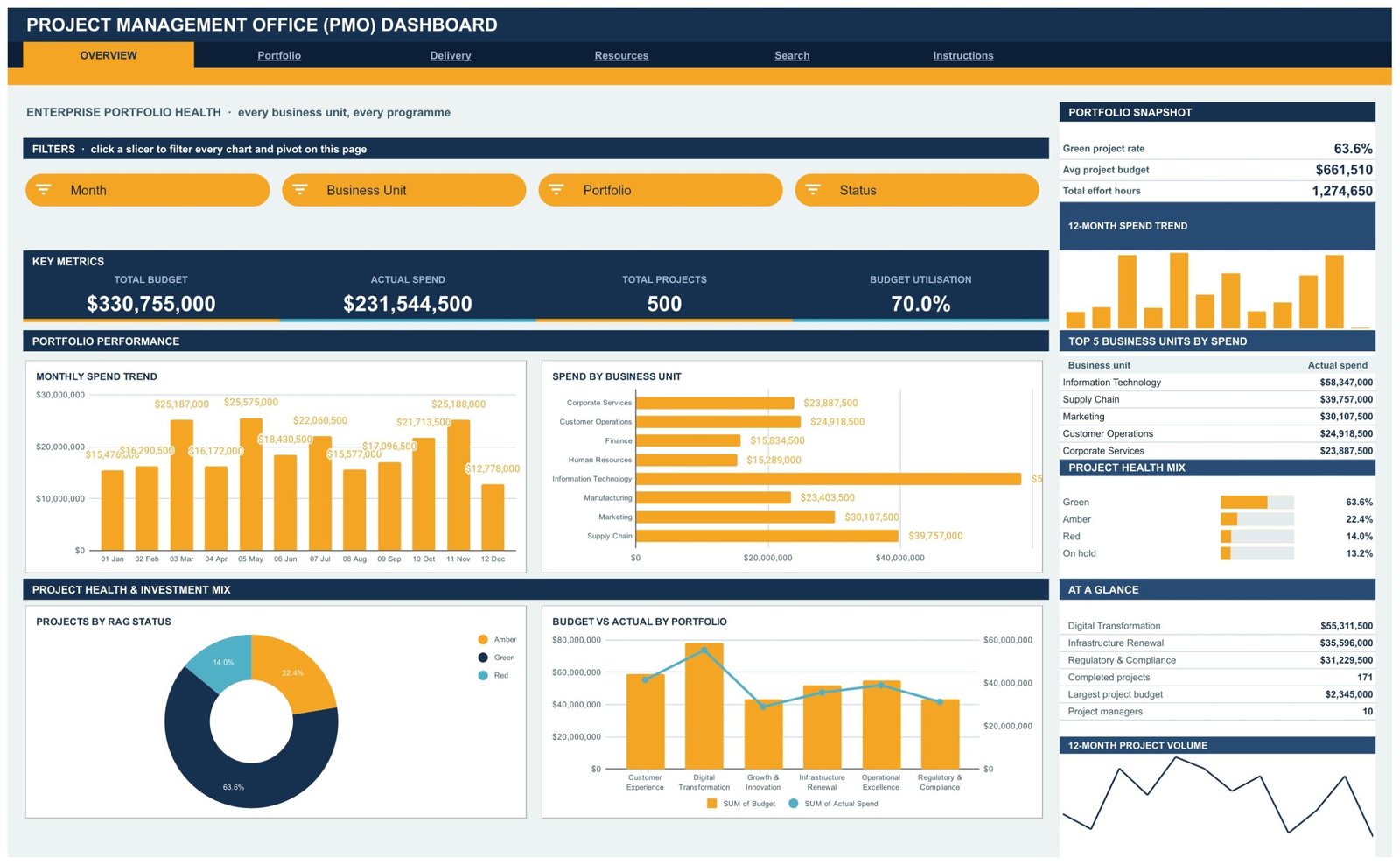
The landing page answers the steering-committee question in four numbers: Total Budget $330,755,000, Actual Spend $231,544,500, Total Projects 500 and Budget Utilisation 70.0%. Four charts follow – Monthly Spend Trend, Spend by Business Unit, Projects by RAG Status and Budget vs Actual by Portfolio. The right sidebar holds a Portfolio Snapshot (green project rate 63.6%, average project budget $661,510, total effort hours 1,274,650), the Top 5 Business Units by Spend with Information Technology leading at $58,347,000, a Project Health Mix, and an At a Glance list showing 171 completed projects and a largest project budget of $2,345,000. Slicers: Month, Business Unit, Portfolio, Status.
2. Portfolio – the investment view
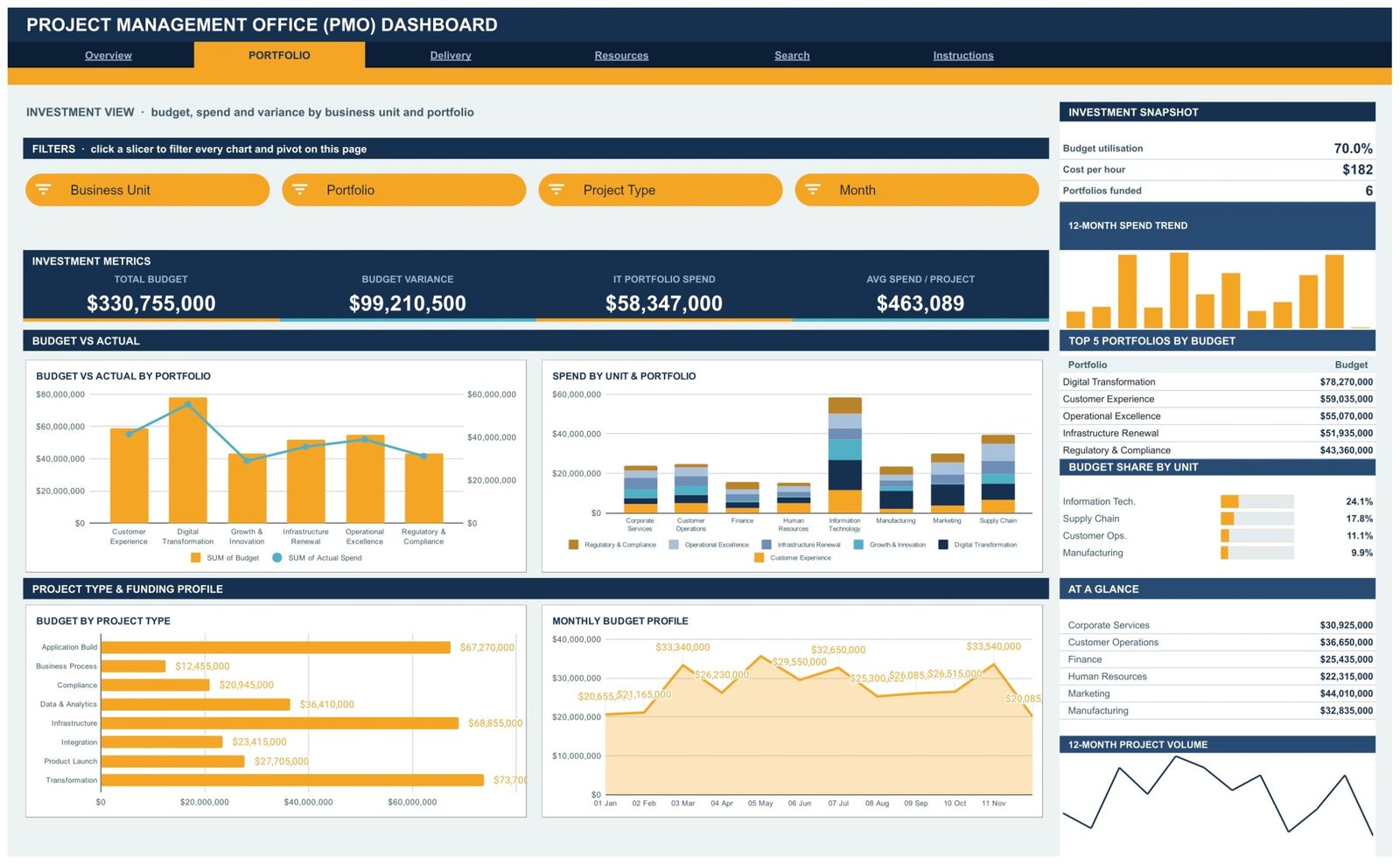
This page follows the money. Total Budget $330,755,000, Budget Variance $99,210,500, IT Portfolio Spend $58,347,000 and Avg Spend per Project $463,089 sit at the top. Budget vs Actual by Portfolio and Spend by Unit and Portfolio show commitment against draw-down, while Budget by Project Type splits Infrastructure ($68,855,000), Application BuildDashboard in Google Sheets ($67,270,000) and Transformation ($73,700,000) apart. The sidebar ranks the Top 5 Portfolios by Budget, led by Digital Transformation at $78,270,000, and shows budget share by unit: Information Technology 24.1%, Supply Chain 17.8%, Customer Operations 11.1%. Slicers: Business Unit, Portfolio, Project Type, Month.
3. Delivery – RAG status, phase and slip
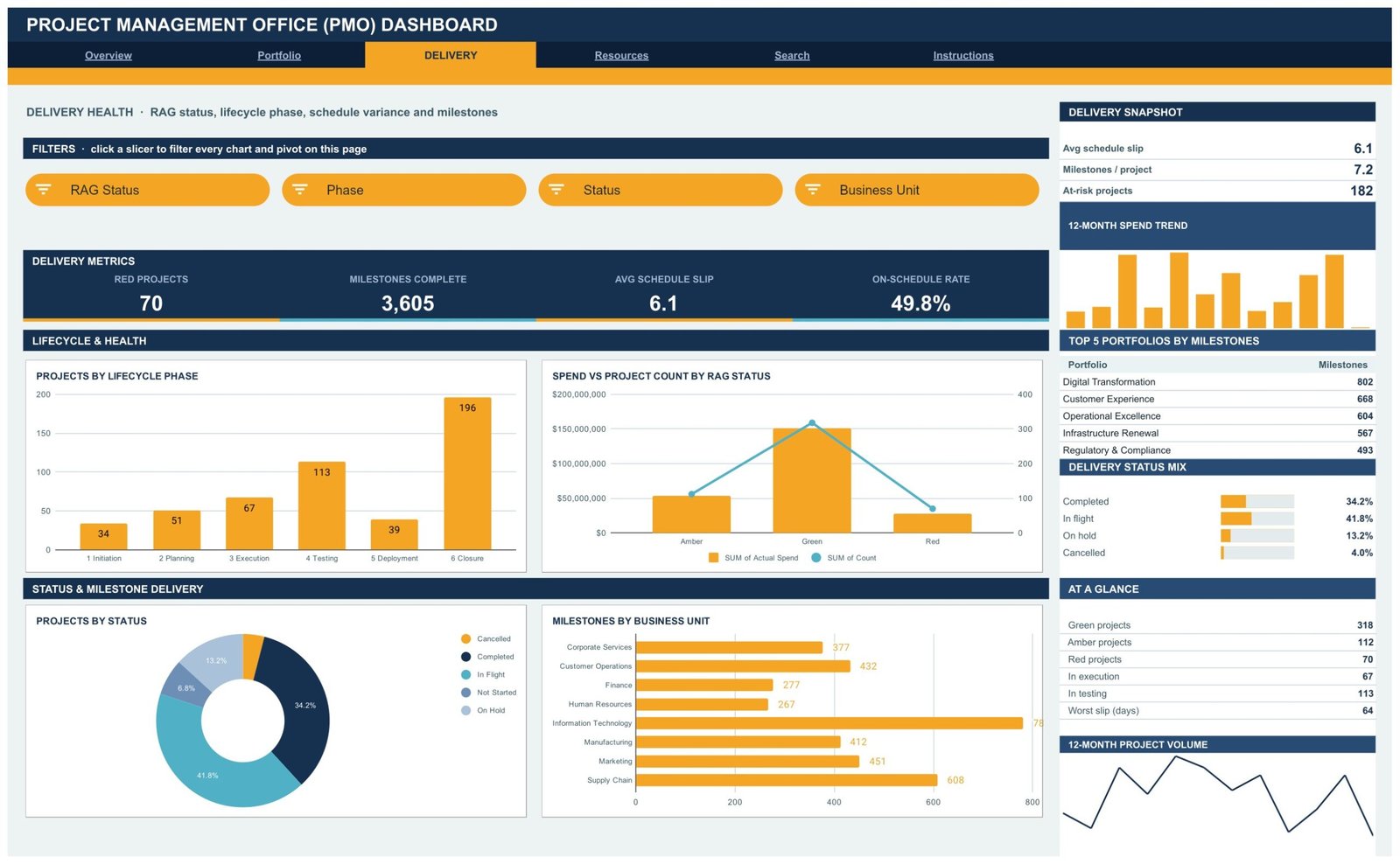
The delivery page is where uncomfortable truths live: 70 Red Projects, 3,605 Milestones Complete, an average schedule slip of 6.1 days and an On-Schedule Rate of 49.8%. Projects by Lifecycle Phase shows the shape of the pipeline – 34 in Initiation, 51 in Planning, 67 in Execution, 113 in Testing, 39 in Deployment and 196 in Closure. Spend vs Project Count by RAG Status, Projects by Status and Milestones by Business Unit complete the picture. The sidebar flags 182 at-risk projects and a worst slip of 64 days. Slicers: RAG Status, Phase, Status, Business Unit.Dashboard in Google Sheets
4. Resources – workload, sponsors and risk
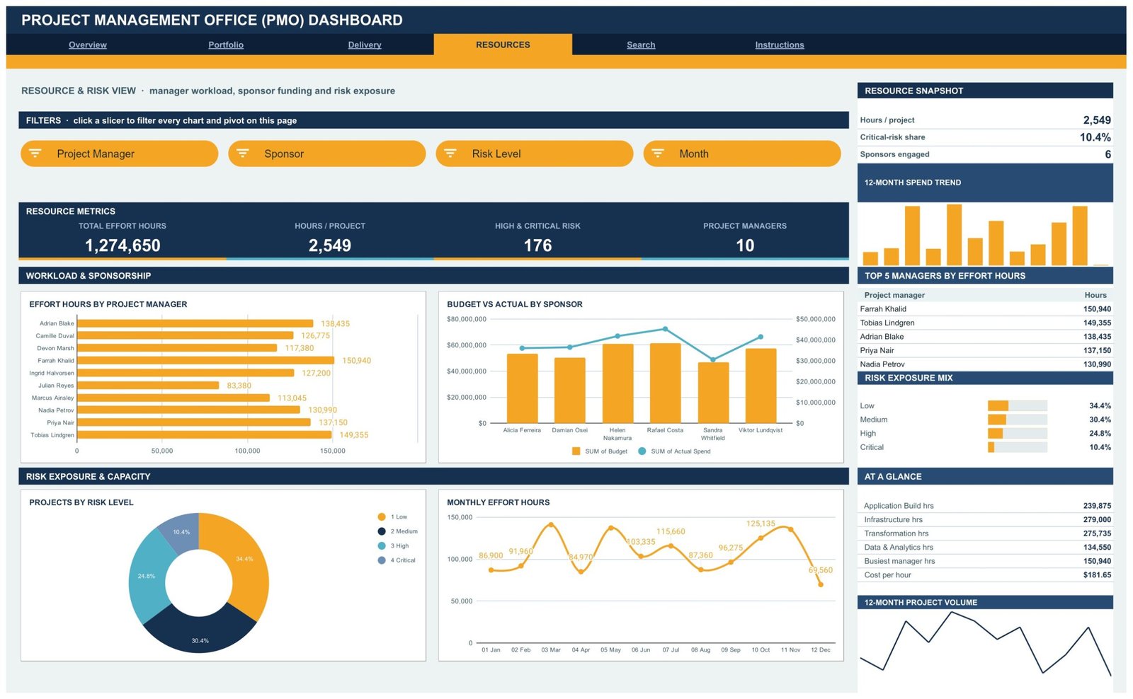
Total Effort Hours 1,274,650, Hours per Project 2,549, High and Critical Risk 176, Project Managers 10. Effort Hours by Project Manager makes imbalance obvious – Farrah Khalid on 150,940 hours against Julian Reyes on 83,380 – while Budget vs Actual by Sponsor, Projects by Risk Level and Monthly Effort Hours round out capacity and exposure. The Risk Exposure Mix reads Low 34.4%, Medium 30.4%, High 24.8%, Critical 10.4%. Slicers: Project Manager, Sponsor, Risk Level, Month.
5. Search – one project, all 17 fields
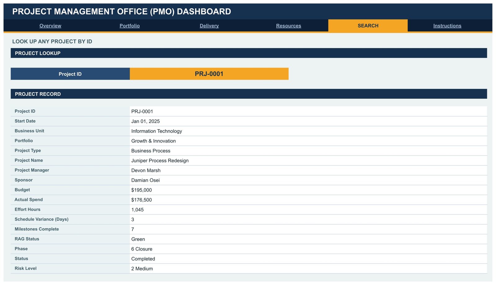
Pick a Project ID from the dropdown and the record renders in full: start date, business unit, portfolio, project type, project name, project manager, sponsor, budget, actual spend, effort hours, schedule variance in days, milestones complete, RAG status, phase, status and risk level. It is the page you open when a sponsor stops the meeting to ask about one initiative.Dashboard in Google Sheets
6. Instructions – the ten-step guide
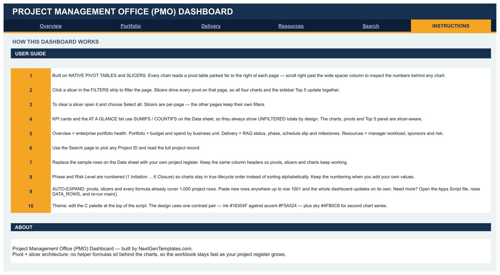
A plain-English user guide: how the pivots and slicers interact, why the KPI cards stay unfiltered, how to replace the sample register, why Phase and Risk Level are numbered, how the sheet auto-expands to 1,000 rows, and which line to edit to change the theme.Dashboard in Google Sheets
PMO Dashboard in Google Sheets vs. Excel vs. Paid PPM SaaS – Feature Comparison
| This Google Sheets PMO Dashboard | Excel PMO workbook | Asana / Monday.com / Smartsheet | |
|---|---|---|---|
| Cost | $9.99 once | $15-30 once, plus an Office licence | $10-25 per user per month |
| Platform | Any browser, Google Sheets | Desktop Excel | Vendor cloud |
| Setup time | About 15 minutes | 30-60 minutes | Days to weeks |
| Real-time team collaboration | Yes, native | Only via SharePoint co-authoring | Yes |
| Mobile access | Google Sheets app | Limited | Yes |
| Customisable fields | Yes, edit the Data sheet | Yes | Within the vendor’s model |
| Share with a link | Yes | File or drive link | Yes |
| Year-1 cost at 5 users | $9.99 | $15-30 plus licences | $600-1,500 |
| Portfolio RAG and budget variance out of the box | Yes | Build it yourself | Usually a higher tier |
| You own and can edit the logic | Yes | Yes | No |
Who Should Use This Template
It suits a PMO or programme office running roughly 20 to 1,000 projects that already keeps a register in a spreadsheet and reports to a monthly or quarterly steering committee. It suits IT programme directors who need one portfolio number rather than a workbook, consultancies reporting delivery health to clients, and public-sector or non-profit programme teams that cannot justify per-seat PPM licences.
It is a poor fit if you need Gantt charts with dependencies and a critical path, resource levelling against individual calendars, timesheet capture, or a system of record with per-user permissions and an audit trail. This is a reporting layer over a project register, not a scheduling engine.
Real-World Use Cases
Monthly steering pack. Priya, a PMO manager at a 900-person manufacturer, pastes her register export into the Data sheet on the first working day, screenshots Overview and Delivery, and finishes a pack that used to take two days.
Capital planning. Daniel, an IT programme director, filters the Portfolio page to Information Technology, reads the 24.1% budget share straight off the sidebar, and walks into the planning meeting with one defensible figure.
Weekly workload review. Anika, a delivery lead at a consultancy, opens Resources every Monday, checks Effort Hours by Project Manager, and rebalances before someone quietly tips into overload.
Advantages of the PMO Dashboard in Google Sheets
- Speed. Pivot tables do the aggregation, so a 500-row register renders instantly and 1,000 rows behaves the same way.
- Honest filtering. Slicers drive the charts while the KPI cards hold enterprise totals, so you never confuse a filtered subtotal for the portfolio number.
- No lock-in. Every pivot, formula and script line is visible and editable. Nothing is hidden behind a vendor API.
- Collaboration for free. Share it like any other sheet – view-only for reviewers, edit for programme managers.
- One-time cost. $9.99 against $600-1,500 a year for five seats on a PPM platform.
Opportunities for Improvement
Two honest limitations. First, there is no Gantt or dependency view – the dashboard reports on phase, slip and milestone counts, not on a schedule network, so pair it with your existing planning tool. Second, the KPI cards are unfiltered by design; if you want cards that respond to slicers you would need to point them at the pivot outputs instead of the Data sheet, which is a deliberate trade-off rather than a bug. A third, smaller point: the register is a flat table, so a project belongs to exactly one portfolio and one business unit. Split-funded initiatives need a convention of their own.Project Management Office (PMO) Dashboard
Best Practices
- Refresh the register on a fixed day each month so trend charts stay comparable.
- Keep the column headers exactly as delivered – pivots, slicers and charts are bound to them. Add new columns to the right instead.Project Management Office (PMO) Dashboard
- Preserve the number prefixes on Phase and Risk Level so lifecycle order survives.
- Agree what Amber means before you publish the first pack; RAG only works if the definition is written down.
- Give reviewers view-only access so their slicer clicks do not move your view mid-meeting.
- Keep one archived copy per reporting month – it is the cheapest portfolio history you will ever build.
Explore Relevant Templates
- Engineering Dashboard in Google Sheets
- Knowledge Management Dashboard in Google Sheets
- Real Estate Development Dashboard in Google Sheets
- Community Services Dashboard in Google Sheets
- All Google Sheets dashboards
If you would like to build portfolio reporting like this yourself, the Excel Pivot Tables & Dashboards course on NextGenTemplates Academy covers pivots, slicers and layout with practice files.
Frequently Asked Questions
Do I need to know Apps Script?
No. The dashboard arrives fully built. Script knowledge only helps if you want to change the palette or raise the row limit, and the Instructions page names the exact lines.
How many projects can it hold?
1,000 rows are covered out of the box. Paste anywhere up to row 1001 and every pivot, slicer and chart follows. Beyond that, raise DATA_ROWS in the script and re-run main().
Why do the KPI cards ignore my slicer?
By design. Cards and the At a Glance list use SUMIFS and COUNTIFS on the Data sheet so enterprise totals stay stable. Charts, pivots and the Top 5 panel are the slicer-aware parts.Project Management Office (PMO) Dashboard
Can several people use it at the same time?
Yes – it is a normal Google Sheet. Note that slicer selections are shared with anyone who has edit access, so use view-only for reviewers.Project Management Office (PMO) Dashboard
Can I match it to our brand colours?
Yes. Edit the palette block at the top of the script – ink #16304F, accent #F5A524, sky #4FB0C6 – and re-run it.
Is it a subscription?
No. One payment of $9.99, lifetime access to the file.
About the Author
Built by PK – Microsoft Certified Professional with 15+ years of Excel, Google Sheets, and Power BI experience. Founder of NextGenTemplates, reaching 300K+ subscribers across YouTube channels. Every template is hand-built and tested before release.
Conclusion
Most PMO reporting problems are not analytical, they are logistical – the numbers exist, but assembling them eats the first week of every month. This dashboard moves that work to a paste and a click: replace the register, open Overview, click a slicer. Six pages cover portfolio investment, delivery health, resource load and single-project lookup, and the whole thing runs in a browser tab your steering committee already has open.
Get the Project Management Office (PMO) Dashboard in Google Sheets
Instant download with a Make a Copy link, one-time $9.99 payment and lifetime access.