Hey there! Are you ready to jazz up your Google Sheets with some snazzy The Ultimate 3D Doughnut Chart Guide!? Well, you’re in the right place! Today, I’m going to walk you through creating a dynamic The Ultimate 3D Doughnut Chart Guide! That not only looks cool but also updates automatically. So, let’s dive in and make your data pop!
The Ultimate 3D Doughnut Chart Guide
Setting Up Your Data
First things first, let’s set up our worksheet with the necessary data. Here’s how you can get started smoothly:
Step 1: Add a New Worksheet
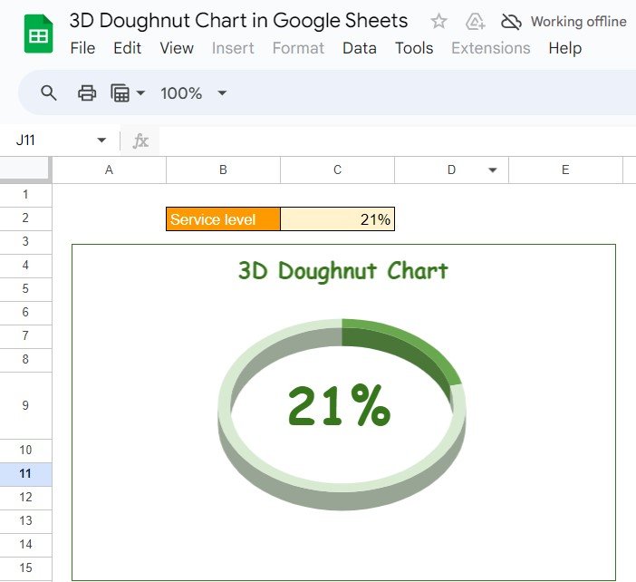
Insert Your KPIs: Pop open a new worksheet and jot down your Key Performance Indicators. For instance, let’s take a look at a common example:
Step 2: Clean Up Your Workspace
Remove Gridlines for Clarity: Head over to the ‘View’ tab, click on ‘Show’, and uncheck ‘Gridlines’. This little tweak will make your chart look super clean and professional.
Crafting Your 3D Doughnut Chart

Alright, now that our data is all set, it’s time to create the chart itself. Follow these steps:
Step 3: Create and Customize Your Chart
Select Your Data: Highlight the data you just entered.
Insert the Chart: Go to the Insert menu, click on ‘Chart’, and pick ‘Pie Chart’. Then, give it a twist by adjusting the settings to display it as a 3D chart.
Making Your Chart Dynamic
Now, for the exciting part—making your chart update automatically!
Why Go for a 3D Doughnut Chart?
Now, you might wonder, why should I use a 3D Doughnut Chart? Here are a few reasons:
- Visual Appeal: These charts are visually engaging, making your presentations or reports stand out.
- Easy to Understand: They help clearly differentiate between data segments.
- Automatically Updated: Google Sheets allows your data to refresh automatically, offering real-time insights without any extra effort.
Opportunities for Improvement
No tool is perfect, right? Here’s where Google Sheets could up its game:
- Enhanced Interactivity: More interactive elements like tooltips or clickable segments could be added.
- Increased Customization: Offering more customization options for the chart’s appearance would be a great boon.
Best Practices for Stellar Charts
To make the most out of your 3D Doughnut Charts, keep these tips in mind:
- Simplicity is Key: Avoid cluttering your chart with too many segments.
- Color Contrast: Use contrasting colors to enhance readability.
- Clear Labels: Make sure every part of your chart is clearly labeled with text or a legend.
Wrapping Up
And there you have it! You’re now equipped to create dynamic and visually appealing 3D Doughnut Charts in Google Sheets. Dive in, experiment with your data, and watch your charts come to life!
Frequently Asked Questions
Q. How can I ensure my 3D Doughnut Chart updates in real-time?
Simply use functions like =RANDBETWEEN() to simulate live data updates, refreshing the chart automatically with every change.
Q. Can I add more segments to my 3D Doughnut Chart?
Yes, you can! While we used a basic example here, feel free to add as many KPIs as you need. Just ensure the total percentage adds up to 100%.Double-check your selected data range and the chart settings in Google Sheets. Ensure the chart type is correctly set to ‘Pie Chart’ and styled to appear 3D, and make sure there are no errors in your data inputs.
Visit our YouTube channel to learn step-by-step video tutorials
Youtube.com/@NeotechNavigators


