Universities and academic institutions manage multiple departments, each responsible for performance, student success, research output, and operational efficiency. Tracking and analyzing these metrics can be complex without a structured tool. That’s why we created the University Department KPI Dashboard in Google Sheets — a ready-to-use and fully interactive dashboard designed to simplify departmental performance tracking.
This article will walk you through the features, structure, advantages, and best practices of using this KPI dashboard to measure and improve your university department’s performance.
What Is a University Department KPI Dashboard in Google Sheets?
A University Department KPI Dashboard is an interactive, data-driven tool built in Google Sheets that helps university administrators and academic leaders monitor the key performance indicators (KPIs) of different departments.
It consolidates academic, research, and administrative data in one place — allowing you to visualize progress, compare actual results with targets, and track year-over-year performance trends.
Using this dashboard, you can make data-informed decisions to improve teaching quality, research output, student engagement, and resource utilization.
Key Features of the University Department KPI Dashboard
Click to Buy University Department KPI Dashboard in Google Sheets
This Google Sheets dashboard includes six essential worksheets, each designed for specific functionality:
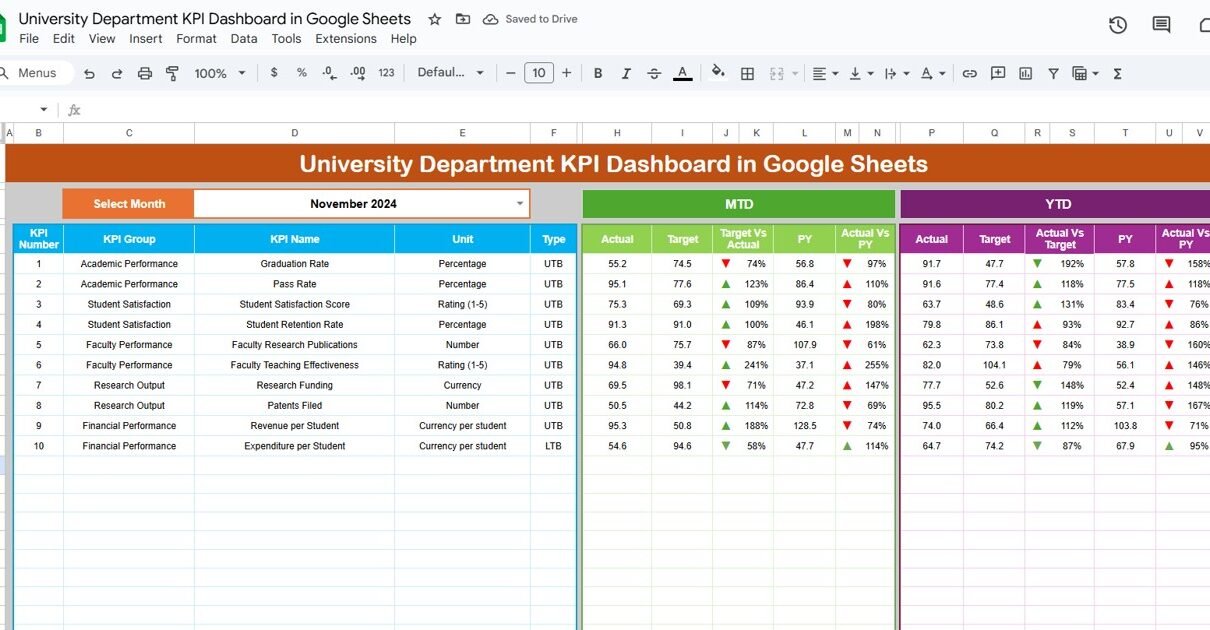
1. Dashboard Sheet Tab
The Dashboard Sheet is the main visual interface of the dashboard. It brings together all departmental KPIs in a single, easy-to-understand view.
Key highlights:
-
Month Selector (Cell D3): Select any month from the dropdown to dynamically update the dashboard’s numbers.
-
Metrics Covered:
-
MTD (Month-to-Date): Shows Actual, Target, and Previous Year data with performance comparisons.
-
YTD (Year-to-Date): Displays cumulative performance data for the year.
-
-
Conditional Formatting:
-
Green upward arrows (▲) for improvement.
-
Red downward arrows (▼) for underperformance.
-
-
Automatic Calculation:
-
Target vs Actual (%) = Actual ÷ Target
-
PY vs Actual (%) = Current Year ÷ Previous Year
-
This layout provides a clear picture of departmental progress and areas requiring attention.

Click to Buy University Department KPI Dashboard in Google Sheets
2. KPI Trend Sheet Tab
The KPI Trend Sheet offers a detailed breakdown of each KPI’s performance and characteristics.
Features include:
-
Dropdown Selection (Cell C3): Choose any KPI to view details.
-
Displayed Information:
-
KPI Group (Academic, Research, Administrative, etc.)
-
Unit of Measurement (%, Count, Hours, etc.)
-
KPI Type: UTB (Upper-the-Better) or LTB (Lower-the-Better)
-
KPI Formula
-
KPI Definition
-
This sheet allows you to analyze trends for specific KPIs over time — for example, tracking student satisfaction rate or faculty research output across semesters.

Click to Buy University Department KPI Dashboard in Google Sheets
3. Actual Number Sheet Tab
In the Actual Number Sheet, you enter the real performance data for your department.
How to use:
-
Input monthly MTD and YTD figures.
-
Update the starting month (Cell E1) to refresh the data range automatically.
This ensures your dashboard always reflects the latest academic or operational data.

4. Target Sheet Tab
The Target Sheet captures departmental goals and benchmarks.
Instructions:
-
Enter target values for each KPI — both MTD and YTD.
-
Align targets with your department’s strategic plan or accreditation requirements.
Tracking actual performance against set targets helps you measure success effectively.

Click to Buy University Department KPI Dashboard in Google Sheets
5. Previous Year Number Sheet Tab
The Previous Year Sheet provides historical data for performance comparison.
How to use:
-
Enter data from the previous academic year.
-
This allows year-over-year performance evaluation to identify progress or areas of decline.

6. KPI Definition Sheet Tab
This sheet acts as a reference library for all KPIs used in the dashboard.
Details include:
-
KPI Name
-
KPI Group
-
Unit
-
Formula
-
KPI Definition
-
Type (LTB or UTB)
This ensures consistency across all departments and prevents confusion while reporting metrics.

Click to Buy University Department KPI Dashboard in Google Sheets
Advantages of the University Department KPI Dashboard
The University Department KPI Dashboard in Google Sheets offers numerous benefits:
-
Comprehensive Departmental View: Centralizes all academic and administrative KPIs.
-
Real-Time Tracking: Automatically updates data and visuals for quick insights.
-
Comparative Analysis: Provides MTD, YTD, and Year-over-Year comparisons.
-
Data-Driven Decisions: Helps administrators make informed academic and financial decisions.
-
Customizable & Scalable: Suitable for different departments and programs.
-
Collaborative: Multiple faculty or administrators can edit simultaneously in Google Sheets.
Best Practices for Using the Dashboard
Follow these best practices to maximize your dashboard’s impact:
-
Update Data Monthly: Keep actual and target numbers current for accurate tracking.
-
Focus on Actionable KPIs: Monitor metrics that directly impact departmental outcomes.
-
Use Conditional Formatting Wisely: Green for improvement, red for issues — for quick interpretation.
-
Align KPIs with Strategic Goals: Ensure metrics support university accreditation and improvement plans.
-
Review Yearly Trends: Use the KPI Trend Sheet to evaluate long-term performance.
-
Collaborate with Teams: Encourage departments to update data collectively for shared accountability.
How to Use the University Department KPI Dashboard
Click to Buy University Department KPI Dashboard in Google Sheets
-
Open the template in Google Sheets.
-
Enter actual, target, and previous year data in respective sheets.
-
Select the month (cell D3) in the dashboard tab.
-
Review MTD and YTD performance metrics.
-
Drill down into specific KPIs using the trend analysis sheet.
-
Use insights to plan interventions, resource allocation, or faculty development.
Conclusion
The University Department KPI Dashboard in Google Sheets is an essential tool for academic institutions looking to improve data visibility, enhance performance tracking, and ensure accountability.
With real-time analysis, visual indicators, and customizable KPIs, this dashboard helps universities strengthen their academic and operational excellence — empowering decision-makers to lead with data.
Whether you’re tracking student performance, research productivity, or financial efficiency, this dashboard offers a scalable, easy-to-use solution for every department.
Frequently Asked Questions (FAQs)
Click to Buy University Department KPI Dashboard in Google Sheets
Q1: Can I customize KPIs for different departments?
Yes, each department can define its own KPIs in the KPI Definition Sheet while keeping a consistent format.
Q2: Does the dashboard support both academic and administrative KPIs?
Absolutely. You can track teaching, research, finance, HR, and operations KPIs in one template.
Q3: Can multiple users collaborate on this dashboard?
Yes, Google Sheets allows real-time collaboration with controlled permissions.
Q4: How can I visualize progress quickly?
Use the conditional arrows (▲ ▼) and percentage comparisons for an instant performance snapshot.
Q5: Can I add graphs or charts to visualize data?
Yes, Google Sheets allows you to insert dynamic charts for additional visual reporting.
Visit our YouTube channel to learn step-by-step video tutorials
Youtube.com/@NeotechNavigators
Click to Buy University Department KPI Dashboard in Google Sheets