The Insurance Policy Analytics Dashboard in Google Sheets turns a list of insurance policies into a clear, filterable report. You get five KPI cards, chart pages for commission, agents, payment modes and monthly trends, a keyword search sheet and one Data sheet that feeds everything.
It is built for independent agents, small brokerages and agency operations staff. They need to see how many policies are active, expired, cancelled or pending, who is selling them and how much premium and commission they bring in. You can do all of this without buying an agency management system. It runs in a normal Google account, and the filters are standard Google Sheets slicers.
🎥 Watch the Video Tutorial
Get the Insurance Policy Analytics Dashboard
What Problem This Insurance Dashboard Solves
Most small agencies keep policies in one long spreadsheet. The data is all there, but the answers are not easy to see. Someone has to build a pivot table every time the owner asks how many policies expired last quarter, or which agent brought in the most premium.
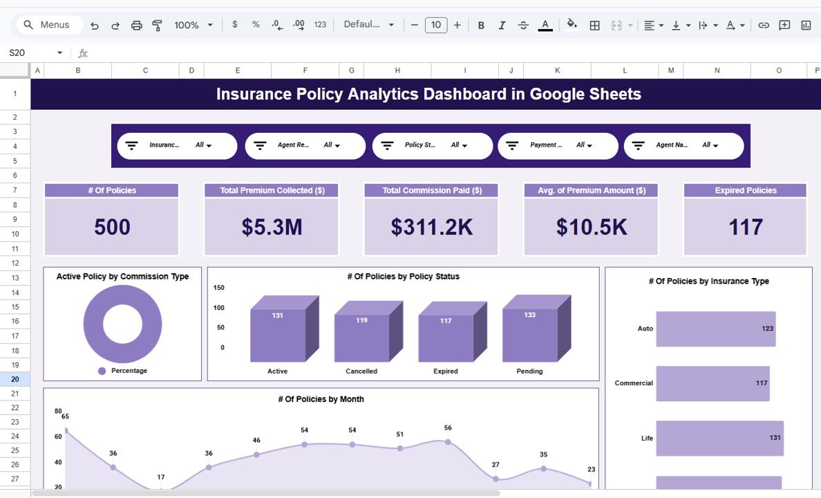
This template answers those questions on fixed report pages. Every report page has the same five slicers at the top: Insurance Type, Agent Region, Policy Status, Payment Mode and Agent Name. Pick a value and every chart on that page updates. You might pick “South” region, “Life” insurance or one agent.
Dashboard Pages Explained
The file has seven tabs: Overview, Commission Analysis, Agent Performance, Policy Revenue & Payouts, Monthly Trends, Search Sheet and Data Sheet. The figures below come from the sample data of 500 policies that ships with the template.
1. Overview
The Overview page shows five KPI cards. With the sample data they read: # Of Policies 500, Total Premium Collected ($) $5.3M, Total Commission Paid ($) $311.2K, Avg. of Premium Amount ($) $10.5K and Expired Policies 117.
Below the cards are the charts. # Of Policies by Policy Status shows Active 131, Cancelled 119, Expired 117 and Pending 133. # Of Policies by Insurance Type covers Auto, Commercial, Life and Travel. # Of Policies by Month is a trend line, and Active Policy by Commission Type is a doughnut chart.
2. Commission Analysis
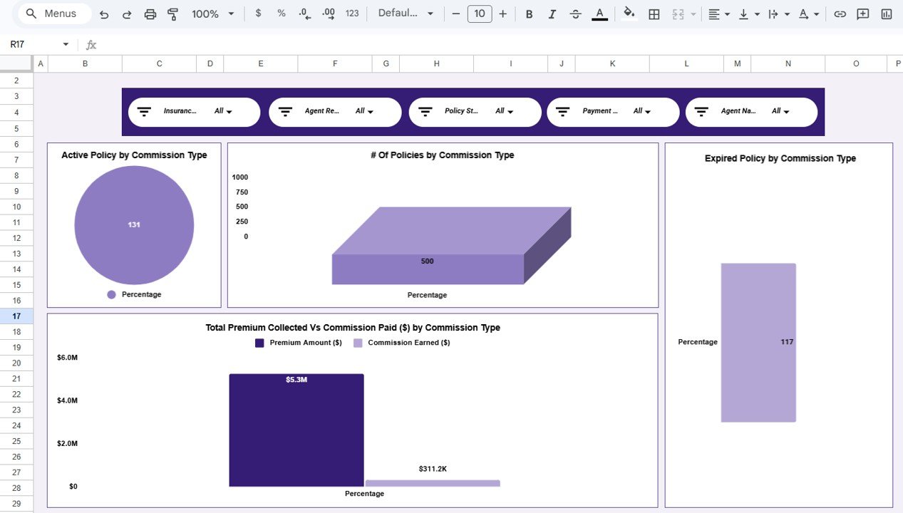
This page groups the data by Commission Type. It has four charts: Active Policy by Commission Type, # Of Policies by Commission Type, Expired Policy by Commission Type, and Total Premium Collected Vs Commission Paid ($) by Commission Type. In the sample data every policy uses the “Percentage” commission type, so each chart shows one bar. If your agency also uses flat or tiered commissions, enter that value in the Commission Type column and it appears as a separate group.
3. Agent Performance
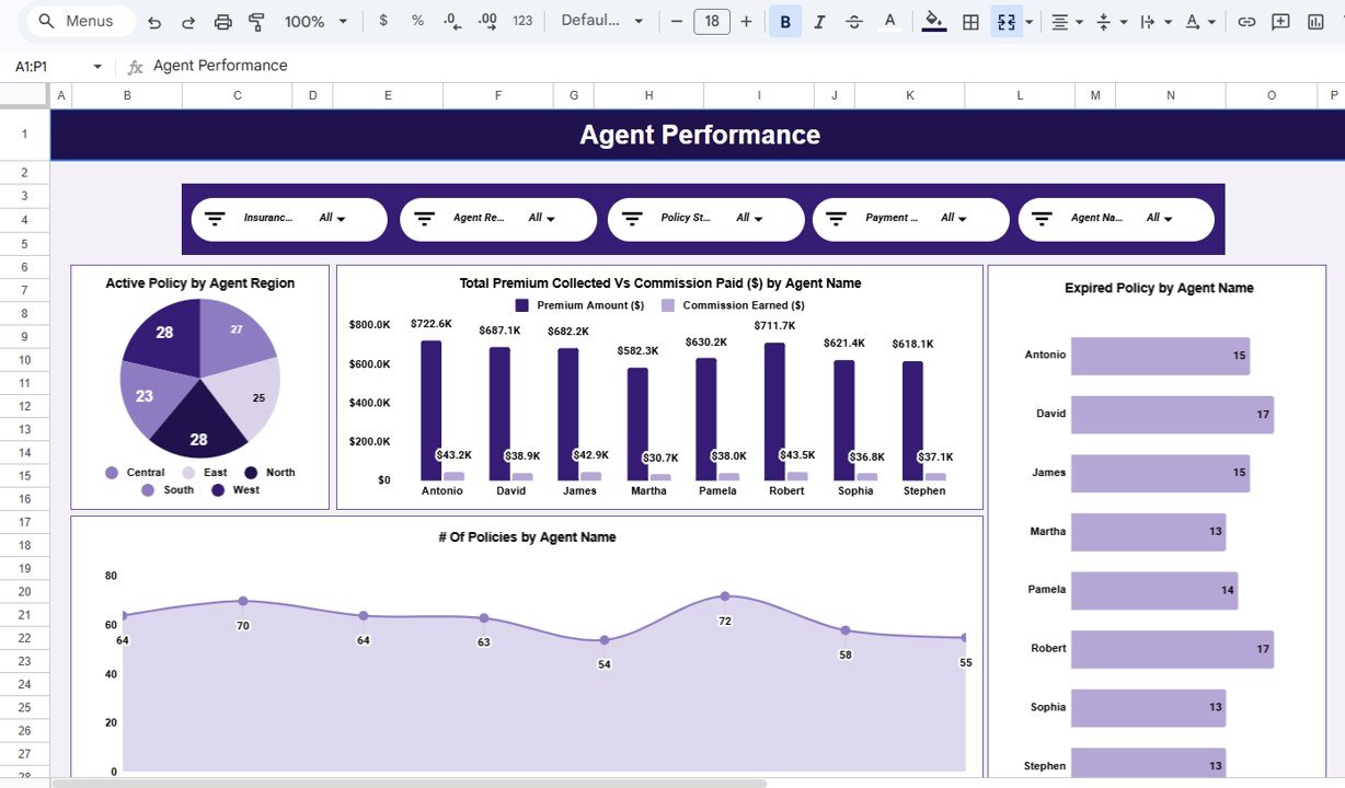
This page compares the eight sample agents: Antonio, David, James, Martha, Pamela, Robert, Sophia and Stephen. Its four charts are Active Policy by Agent Region (Central, East, North, South, West), Total Premium Collected Vs Commission Paid ($) by Agent Name, Expired Policy by Agent Name and # Of Policies by Agent Name. In the sample, Antonio has the highest premium at $722.6K and Robert follows at $711.7K. David and Robert each have 17 expired policies, the most of any agent.
4. Policy Revenue & Payouts
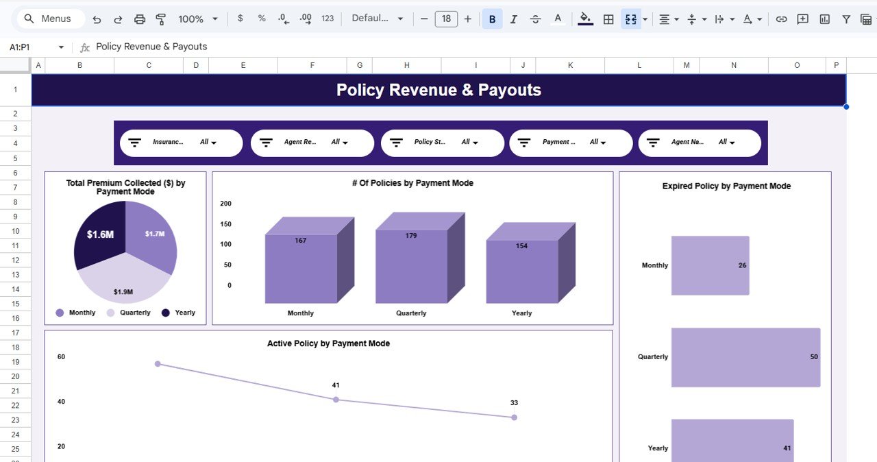
This page breaks the book down by Payment Mode: Monthly, Quarterly or Yearly. The charts are Total Premium Collected ($) by Payment Mode (about $1.7M, $1.9M and $1.6M), # Of Policies by Payment Mode (167, 179 and 154), Expired Policy by Payment Mode and Active Policy by Payment Mode. It shows whether clients on short billing cycles lapse more often than annual payers.
5. Monthly Trends
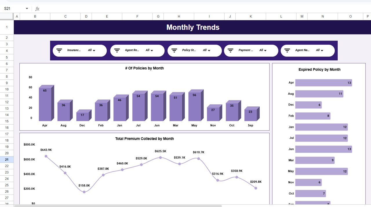
Three charts show the year by month: # Of Policies by Month, Expired Policy by Month and Total Premium Collected by Month. In the sample, April is the busiest month with 65 policies and $643.9K premium, and December is the quietest with 17 policies and $158.0K. Use this page to see when renewal work will peak.
6. Search Sheet
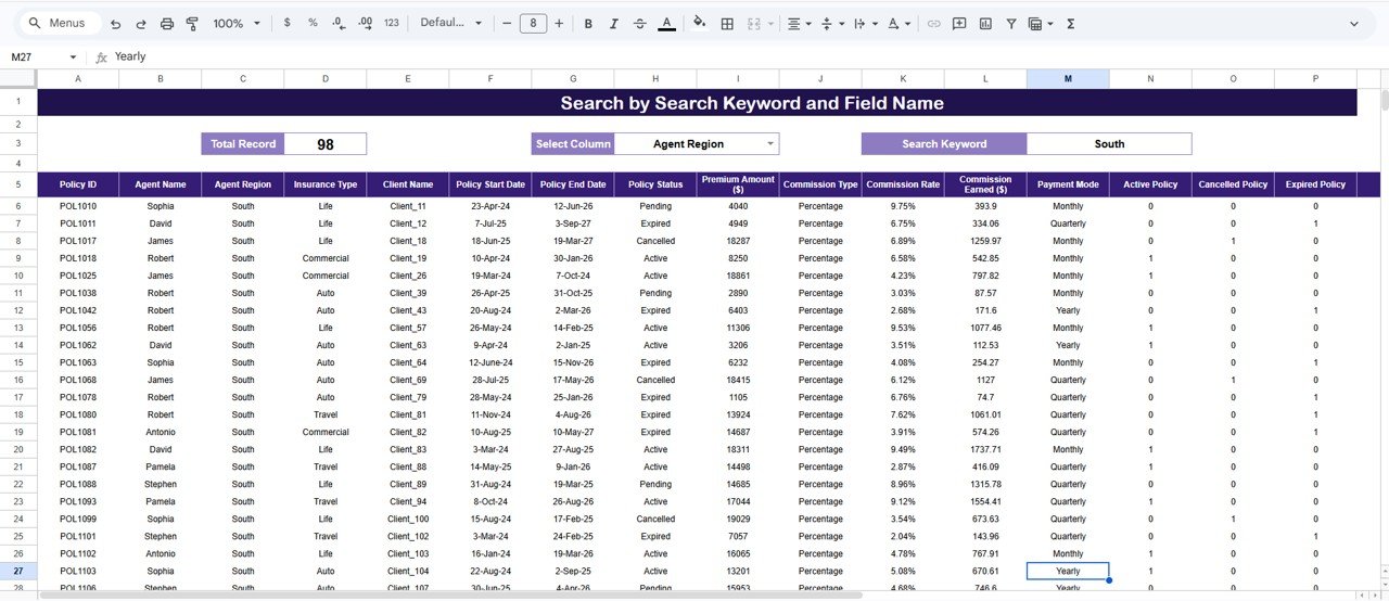
The Search Sheet is titled “Search by Search Keyword and Field Name”. Choose a field in Select Column (for example Agent Region), type a value in Search Keyword (for example South), and the sheet lists every matching policy with a Total Record count. In the screenshot the South region returns 98 records.
7. Data Sheet
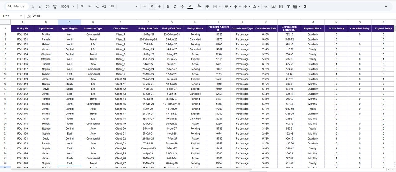
The Data Sheet is the only tab you edit. Each row is one policy, with these columns: Policy ID, Agent Name, Agent Region, Insurance Type, Client Name, Policy Start Date, Policy End Date, Policy Status, Premium Amount ($), Commission Type, Commission Rate, Commission Earned ($), Payment Mode, Active Policy, Cancelled Policy and Expired Policy.
KPIs in the Insurance Policy Analytics Dashboard in Google Sheets
The table below shows how each KPI card relates to the Data Sheet columns. The sample values check out: $5.3M ÷ 500 policies ≈ $10.5K average premium. For POL1010, a premium of 4,040 at a 9.75% rate gives 393.9 commission earned.
| KPI | What it measures | How it is calculated | Better when |
|---|---|---|---|
| # Of Policies | Size of the filtered book | Count of Policy ID rows | Higher (growth) |
| Total Premium Collected ($) | Premium volume | Sum of Premium Amount ($) | Higher |
| Total Commission Paid ($) | Commission cost or income on that premium | Sum of Commission Earned ($), where each row = Premium Amount × Commission Rate | Depends on your side: agency income or carrier cost |
| Avg. of Premium Amount ($) | Typical policy size | Total Premium ÷ # Of Policies | Higher, if risk is unchanged |
| Expired Policies | Policies that lapsed | Sum of the Expired Policy flag (1 or 0) | Lower |
How to Use It With Your Own Data
- Open the Google Sheets copy link from the PDF guide in your download. Choose File > Make a copy to save the file in your own Drive.
- Go to the Data Sheet tab. Delete the sample rows and paste your policies under the same headers, without renaming or reordering columns.
- Fill Commission Earned ($) as Premium Amount × Commission Rate. You can use a formula such as:
=I2*K2 - Set the Active Policy, Cancelled Policy and Expired Policy columns to 1 or 0 to match Policy Status. For example, in the Expired Policy column:
=IF(H2="Expired",1,0) - Open the Overview tab and check that the KPI cards match your own totals.
- Use the five slicers on any report page to filter by Insurance Type, Agent Region, Policy Status, Payment Mode or Agent Name.
- Use the Search Sheet when you need to look up the policy list for one agent, client, status or region.
The column letters in the formulas above follow the sample layout: I = Premium Amount, K = Commission Rate, H = Policy Status. If you want to build reports like this yourself, the Pivot Tables & Dashboards course on NextGenTemplates Academy walks through the same summary-and-slicer approach step by step.
Real-World Use Cases
- Agency owner’s weekly review: Filter Policy Status to “Pending” to see open business by agent. Then switch to “Expired” to plan follow-up calls.
- Agent coaching: Compare premium, commission and expired counts for each agent on the Agent Performance page before one-to-one meetings.
- Renewal planning: Use the Monthly Trends page to see which months hold the most policies. Schedule renewal reminders ahead of those months.
Best Practices
- Update the Data Sheet on a fixed day each week so the numbers mean the same thing every time you look.
- Keep Policy Status values consistent: Active, Cancelled, Expired, Pending. A typo such as “expird” creates a new chart group.
- Store Commission Rate as a percentage (9.75%), not as 9.75, or the commission totals will be 100 times too high.
- Give view-only access to people who only read the report. Keep edit access for whoever maintains the Data Sheet.
- Reset all slicers to “All” before you share a screenshot, so readers are not looking at a filtered view by accident.
Limitations: Who Should Not Use This Template
- It is an analytics template, not a policy administration system. It does not quote, bind, issue documents or send renewal reminders.
- It has no connection to carrier portals. Data must be pasted or imported into the Data Sheet.
- It does not cover claims, loss ratios or underwriting. If you need claims tracking, look at a dedicated claims dashboard.
- Very large books (tens of thousands of rows) will make Google Sheets slow. Power BI is a better fit at that size.
Template vs Spreadsheet vs Agency Software
| Need | Plain policy spreadsheet | This dashboard | Agency management system |
|---|---|---|---|
| KPI cards and charts | Build them yourself | Ready-made on 5 report pages | Yes |
| Filter by agent, region, status, payment mode | Manual filters | Five slicers on every report page | Yes |
| Policy issuing and renewals workflow | No | No | Yes |
| Setup effort | High | Paste data into one sheet | Onboarding project |
| Cost model | Free | One-time template purchase | Usually a subscription |
Related Insurance Templates and Guides
For a wider view of an agency, read the Insurance Agency Dashboard in Google Sheets walkthrough. For target-vs-actual tracking, see the Insurance KPI Dashboard in Google Sheets and the Insurance KPI Scorecard in Google Sheets. Brokers comparing carriers may prefer the Insurance Brokers Dashboard in Google Sheets. If you only need a simple register of policies and premiums, the Insurance Policy and Premium Tracker in Google Sheets is a lighter option.
Related template: Insurance Policy and Premium Tracker in Google Sheets.
Frequently Asked Questions
What KPIs does the Insurance Policy Analytics Dashboard track?
It shows five KPI cards: # Of Policies, Total Premium Collected ($), Total Commission Paid ($), Avg. of Premium Amount ($) and Expired Policies. All five update when you change the slicers or the Data Sheet.
Which filters are available?
Every report page has five slicers: Insurance Type, Agent Region, Policy Status, Payment Mode and Agent Name. The Search Sheet adds a column-and-keyword lookup for any field.
Can I add my own insurance types or regions?
Yes. The charts group by whatever values are in the Data Sheet. If you enter “Health” or “Home” in Insurance Type, or new region names in Agent Region, they appear in the charts and slicers.
Do I need Excel or any add-on?
No. It is a normal Google Sheets file. It works in any modern browser with a free Google account, and you can view it in the Google Sheets mobile app.
How is commission calculated?
Each policy row holds a Premium Amount and a Commission Rate. Commission Earned ($) is premium multiplied by rate, and the Total Commission Paid card adds up that column for the current filter.
Is there an Excel or Power BI version?
This exact dashboard is a Google Sheets template. For other platforms, see the insurance agency and insurance KPI dashboards in the NextGenTemplates catalog.
Wrapping Up
If your policy list already sits in a spreadsheet, this dashboard gives it a proper reporting layer: five clear KPIs, agent and payment-mode comparisons, monthly trends and a fast search. Paste your policies into the Data Sheet, check the Overview totals and use the slicers to answer the questions your team asks every week.
Get the Insurance Policy Analytics Dashboard
📅 Last updated: October 2026