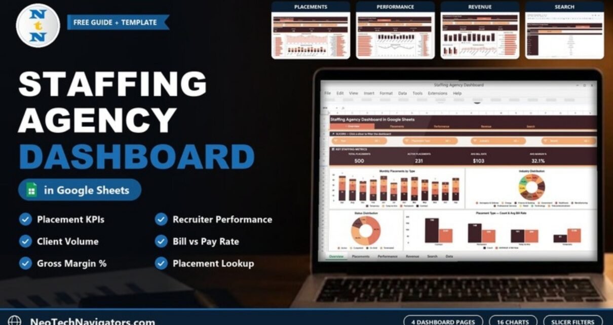
The Staffing Agency Dashboard in Google Sheets turns a plain list of placements into a four-page report on volume, recruiter output, client demand, bill rates and margin. It is built for staffing agency owners, recruitment operations managers and account managers who already keep placement records in a spreadsheet and want a clear weekly view without buying a full applicant tracking system.
Inside you get an Overview, Placements, Performance and Revenue page, a Search sheet for looking up a single placement, and a Data sheet that feeds everything. Each dashboard page has its own KPI strip and slicers, and the 16 charts update as soon as you add or edit rows in the Data sheet.
🎥 Watch the Video Tutorial
Get the Staffing Agency Dashboard
What Problem Does This Staffing Dashboard Solve?
Most small and mid-size agencies track placements in a shared sheet: one row per placement with the client, job title, candidate, recruiter, bill rate and pay rate. The data is there, but the answers are not. How many placements are still active? Which recruiter commands the best rates? Which department or industry is driving revenue, and what is the real margin between bill rate and pay rate?
This template answers those questions from the same row-by-row data. You keep entering placements the way you already do, and the dashboard pages summarise them by month, placement type, industry, department, recruiter, client and status.
Staffing Agency Dashboard in Google Sheets: Pages Explained
A navigation bar at the top of every page links Overview, Placements, Performance, Revenue and Search, so you can move between views in one click. Each dashboard page has a row of slicers labelled Click a slicer to filter the dashboard.
1. Overview Page
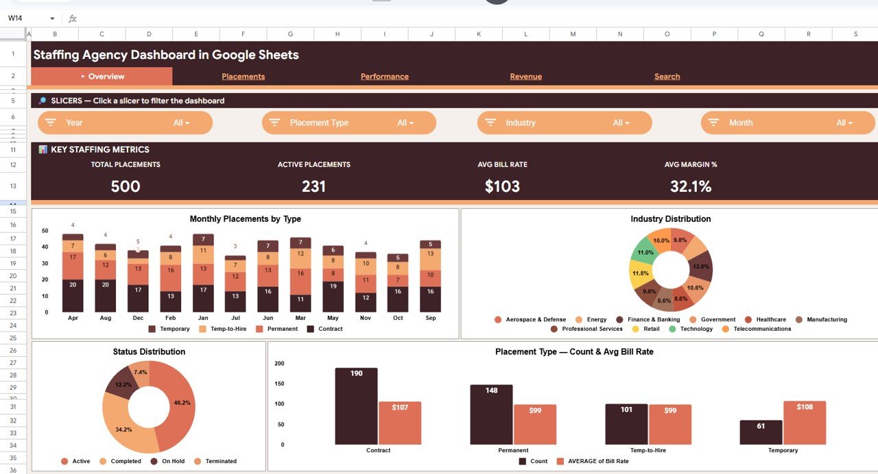
The Overview page has four slicers (Year, Placement Type, Industry and Month) and a Key Staffing Metrics strip. In the sample data the strip shows 500 Total Placements, 231 Active Placements, an Avg Bill Rate of $103 and an Avg Margin % of 32.1%.
Below the strip are four charts:
- Monthly Placements by Type: a stacked column chart that splits each month into Contract, Permanent, Temp-to-Hire and Temporary placements.
- Industry Distribution: a donut chart across ten industries: Aerospace & Defense, Energy, Finance & Banking, Government, Healthcare, Manufacturing, Professional Services, Retail, Technology and Telecommunications.
- Status Distribution: the share of placements that are Active (46.2%), Completed (34.2%), On Hold (12.2%) and Terminated (7.4%).
- Placement Type: Count & Avg Bill Rate: count and average bill rate side by side. Contract has 190 placements at $107, Permanent 148 at $99, Temp-to-Hire 101 at $99 and Temporary 61 at $108.
2. Placements Page
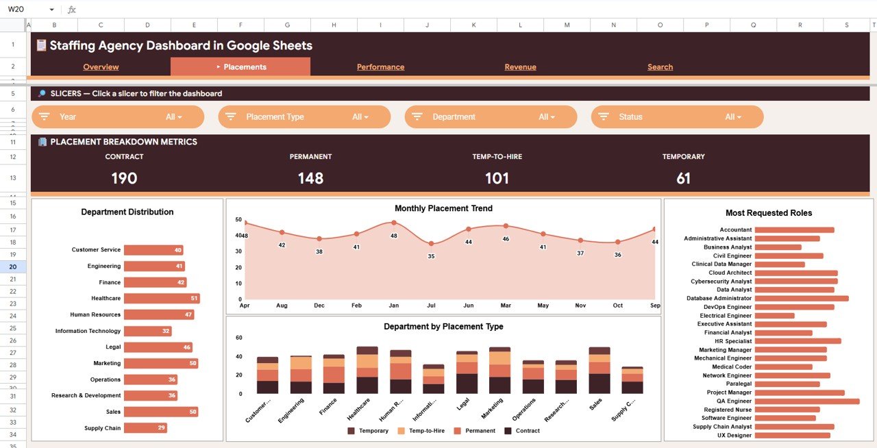
The Placements page uses Year, Placement Type, Department and Status slicers. Its Placement Breakdown Metrics strip counts each placement type: Contract 190, Permanent 148, Temp-to-Hire 101 and Temporary 61, which adds up to the 500 placements on the Overview.
- Department Distribution: placements for 12 departments. Healthcare leads the sample with 51, followed by Marketing and Sales with 50 each.
- Monthly Placement Trend: a line chart of placements per month (between 35 and 48 in the sample).
- Department by Placement Type: stacked columns showing the type mix inside each department.
- Most Requested Roles: a bar list of job titles, from Accountant and Data Analyst to Registered Nurse and UX Designer.
3. Performance Page
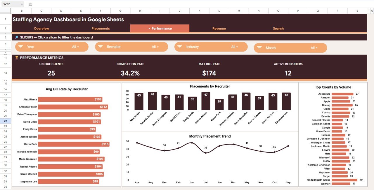
The Performance page uses Year, Recruiter, Industry and Month slicers. The Performance Metrics strip shows 25 Unique Clients, a 34.2% Completion Rate, a Max Bill Rate of $174 and 12 Active Recruiters.
- Avg Bill Rate by Recruiter: ranges from $93 to $115 across the 12 recruiters in the sample.
- Placements by Recruiter: total volume per recruiter (29 to 48 placements).
- Monthly Placement Trend: the month-by-month line, filtered by whichever recruiter or industry you pick.
- Top Clients by Volume: placements per client company, with UnitedHealth Group (32), Accenture (27) and Boeing (26) at the top of the sample.
4. Revenue Page
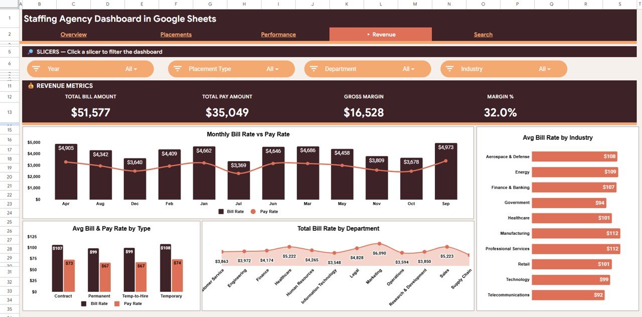
The Revenue page uses Year, Placement Type, Department and Industry slicers. The Revenue Metrics strip shows Total Bill Amount ($51,577), Total Pay Amount ($35,049), Gross Margin ($16,528) and Margin % (32.0%).
- Monthly Bill Rate vs Pay Rate: bill rate columns with a pay rate line for each month.
- Avg Bill Rate by Industry: from $92 (Telecommunications) to $112 (Manufacturing and Professional Services).
- Avg Bill & Pay Rate by Type: Contract $107 vs $73, Permanent $99 vs $67, Temp-to-Hire $99 vs $67, Temporary $108 vs $74.
- Total Bill Rate by Department: Marketing is highest in the sample at $6,090.
5. Search Sheet
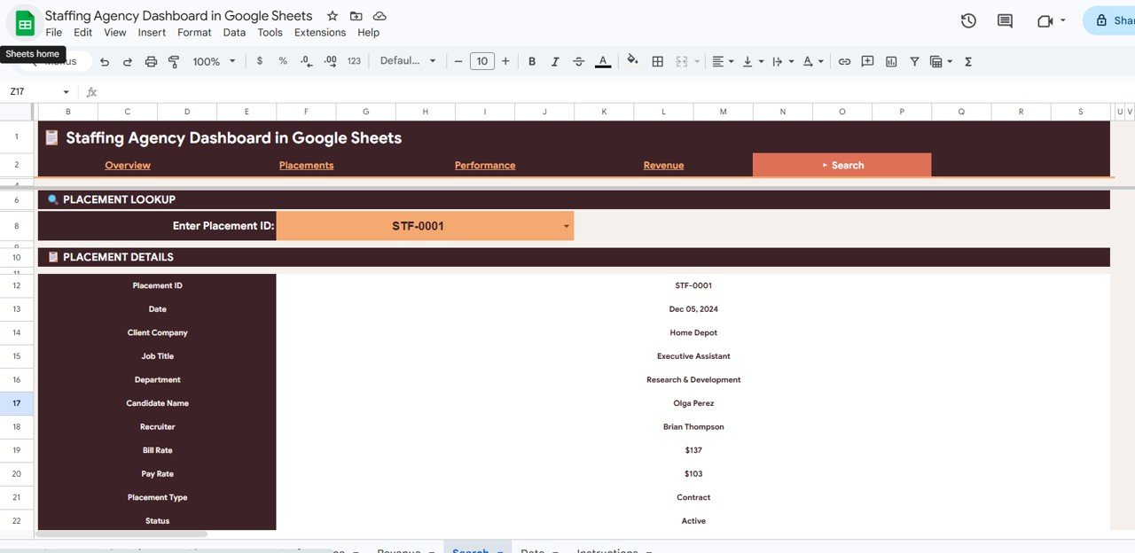
The Search sheet is a Placement Lookup. Pick a Placement ID from the Enter Placement ID drop-down (for example STF-0001) and the Placement Details panel shows 11 fields: Placement ID, Date, Client Company, Job Title, Department, Candidate Name, Recruiter, Bill Rate, Pay Rate, Placement Type and Status. It is handy when a client or recruiter asks about one specific placement.
6. Data Sheet
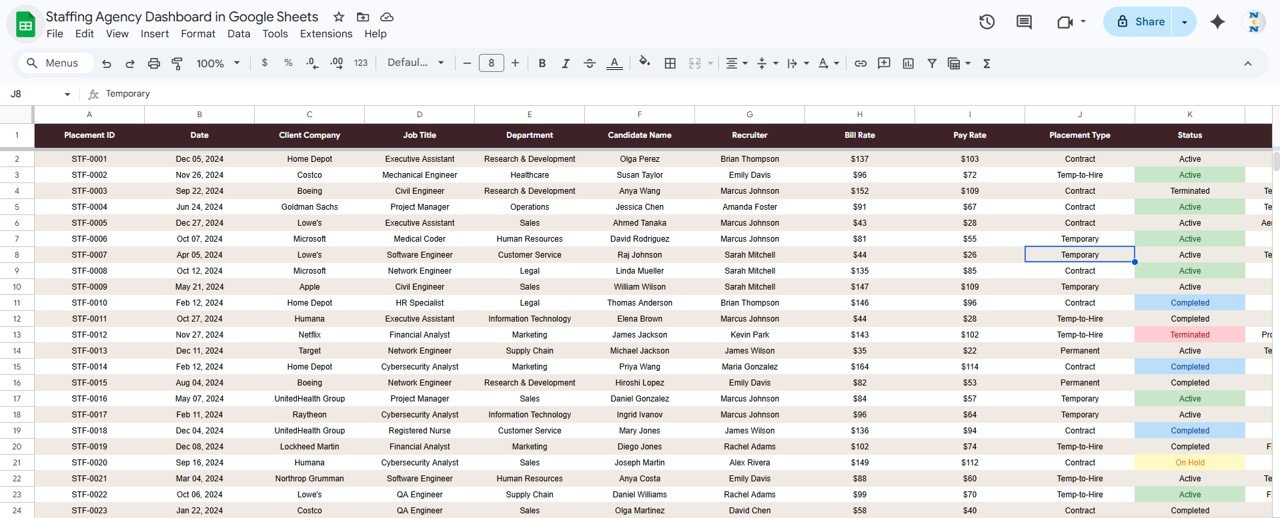
The Data sheet holds one row per placement. The visible columns are Placement ID, Date, Client Company, Job Title, Department, Candidate Name, Recruiter, Bill Rate, Pay Rate, Placement Type and Status, and more columns to the right feed the industry charts. Status values are Active, Completed, On Hold and Terminated, and many status cells are highlighted in colour. The file also includes an Instructions tab.
Staffing KPIs on the Dashboard
The table lists every KPI card in the template, what it tells you and how it is calculated. You can check each one against the sample values.
| KPI | What it measures | How it is calculated | Better when |
|---|---|---|---|
| Total Placements | Placement volume in the filtered period | Count of placement rows (500) | Higher |
| Active Placements | Placements currently running | Count of rows with Status = Active (231) | Higher |
| Avg Bill Rate | Typical rate charged to clients | Average of Bill Rate ($103) | Higher |
| Avg Margin % | Average spread between bill and pay rate | Average margin across placements, shown as a % of bill rate (32.1%) | Higher |
| Unique Clients | Breadth of the client base | Distinct Client Company values (25) | Higher |
| Completion Rate | Share of placements finished | Completed ÷ Total Placements (34.2%) | Higher |
| Max Bill Rate | Top rate achieved | Maximum Bill Rate ($174) | Higher |
| Active Recruiters | Recruiters with placements | Distinct Recruiter values (12) | Context |
| Gross Margin | Money left after paying the candidate | Total Bill Amount − Total Pay Amount ($51,577 − $35,049 = $16,528) | Higher |
| Margin % | Margin on total billing | Gross Margin ÷ Total Bill Amount (16,528 ÷ 51,577 = 32.0%) | Higher |
If you want to recreate some of these numbers in your own sheet, these Google Sheets formulas work on a Data sheet laid out like the one above (Bill Rate in column H, Pay Rate in column I, Status in column K):
Active placements:  =COUNTIF(Data!K2:K,"Active")
Average bill rate:  =AVERAGE(Data!H2:H)
Gross margin:       =SUM(Data!H2:H)-SUM(Data!I2:I)
Margin %:           =(SUM(Data!H2:H)-SUM(Data!I2:I))/SUM(Data!H2:H)
For a structured course on building summaries and dashboards like this, the Pivot Tables & Dashboards course on NextGenTemplates Academy takes you from raw data to finished report pages.
How to Use It with Your Own Data
- Open the file from the link in your download and choose File → Make a copy to save it to your own Google Drive.
- Read the Instructions tab, then go to the Data sheet and clear the sample rows (keep the header row).
- Paste or type your placements, one per row, in the same column order. Keep Placement Type and Status values consistent (for example Contract, Permanent, Temp-to-Hire, Temporary; Active, Completed, On Hold, Terminated).
- Give each placement a unique ID so it appears in the Search drop-down.
- Open the Overview page and check that the KPI strip matches a quick count of your data.
- Use the slicers on each page to filter by year, month, type, industry, department, recruiter or status.
- Share the file with your team. Give most people view-only access and limit editing to the person who maintains the Data sheet.
Real-World Use Cases
- Weekly team meeting: start on the Overview page for active placements and status mix, then open Performance to compare placements and average bill rate per recruiter.
- Client account reviews: filter Performance by month to see how many placements a client received, and use the Search sheet to answer questions about a single placement on the call.
- Pricing and margin checks: on the Revenue page, compare bill and pay rates by placement type and industry to spot where margin is thin before you quote new work.
Google Sheets Template vs Other Options
| Need | Plain spreadsheet | This dashboard template | Full ATS / staffing software |
|---|---|---|---|
| Placement list | Yes | Yes (Data sheet) | Yes |
| KPI cards and charts | Build yourself | Ready-made, 4 pages | Usually included |
| Single placement lookup | Filter manually | Search sheet | Yes |
| Candidate pipeline, CV parsing | No | No | Yes |
| Cost model | Free | One-time purchase | Usually a monthly subscription |
| Team sharing | Google Drive link | Google Drive link | User accounts |
Best Practices
- Update the Data sheet on a fixed day each week so everyone looks at the same numbers.
- Use drop-down lists (Data → Data validation) for Placement Type, Status and Department so spelling differences do not split the charts.
- Enter dates as real dates, not text, or the month filters and trend lines will skip those rows.
- Change Status as placements end. Active Placements and Completion Rate are only as accurate as your status updates.
- Review the Revenue page monthly and the Overview and Performance pages weekly.
Limitations: Who Should Not Use It
- It tracks placements, not the candidate funnel. If you need sourced, screened, submitted and interviewed stages, look at a pipeline tool or the Recruitment Pipeline Dashboard in Google Sheets.
- Bill and pay amounts are summed from the rate columns. Hours worked and invoices are not modelled, so it is not a billing or payroll system.
- There is no CV parsing, email integration or user-level permissions beyond normal Google Drive sharing.
- Very large data sets (tens of thousands of rows) will make Google Sheets slower. The Power BI version suits bigger volumes better.
Related Templates and Guides
If you prefer another platform, the same dashboard is available as the Staffing Agency Dashboard in Excel and the Staffing Agency Dashboard in Power BI.
On NeoTech Navigators you can also read about the browser-based Staffing Agency Dashboard in HTML, the Temp Staffing Dashboard in Google Sheets, the Recruitment Agencies Dashboard in Google Sheets and the Recruitment KPI Dashboard in Google Sheets.
Frequently Asked Questions
What KPIs does the Staffing Agency Dashboard in Google Sheets show?
The Overview shows Total Placements, Active Placements, Avg Bill Rate and Avg Margin %. The Performance page adds Unique Clients, Completion Rate, Max Bill Rate and Active Recruiters, and the Revenue page shows Total Bill Amount, Total Pay Amount, Gross Margin and Margin %.
Can I filter the dashboard by recruiter or client?
Yes. The Performance page has a Recruiter slicer, and the other pages have slicers for year, month, placement type, industry, department or status. Client-level volume appears in the Top Clients by Volume chart.
Do I need Excel or any add-on?
No. It runs in Google Sheets in your browser with a free Google account. No macros or add-ons are needed.
Why is Avg Margin % slightly different from Margin % on the Revenue page?
They are two different measures. Margin % on the Revenue page divides total gross margin by total bill amount (32.0% in the sample). Avg Margin % on the Overview is an average margin figure (32.1%), so the two can differ slightly.
Does it track candidates before they are placed?
No. Every row is a placement. Pre-placement stages are not included, so you would need a separate pipeline tracker for those.
Can several people use it at the same time?
Yes. It is a normal Google Sheets file, so you can share it by link and several people can view or edit it at once, depending on the permissions you set.
Wrapping Up
The Staffing Agency Dashboard in Google Sheets gives a growing agency one place to see placement volume, recruiter performance, client demand and bill-versus-pay margin, all from a single Data sheet. Load your own placements, set a weekly update routine, and use the Overview, Performance and Revenue pages for team meetings and pricing decisions.
Get the Staffing Agency Dashboard in Google Sheets
📅 Last updated: October 2026