Renewable Energy Dashboard in Google Sheets is a ready-to-use reporting template for teams that track renewable generation, solar output, wind output, CO2 savings, revenue, downtime, and maintenance activity. The IEA’s 2026 electricity update says renewable electricity generation is forecast to overtake coal in 2026, with renewables expected to grow by more than 8% and reach 37% of global electricity generation by 2027. That growth makes simple, repeatable renewable energy reporting more important for operators, analysts, and sustainability teams.
This dashboard gives you a structured Google Sheets file with seven sheet tabs: Overview, Solar Performance, Wind Performance, Maintenance & Alerts, Financial & Savings, Search Sheet, and Data Sheet. Instead of building separate trackers for output, revenue, maintenance, and savings, users can add records once and review the main insights through cards, slicers, and charts.
Click here to purchase the Renewable Energy Dashboard in Google Sheets.
Key Features of Renewable Energy Dashboard in Google Sheets
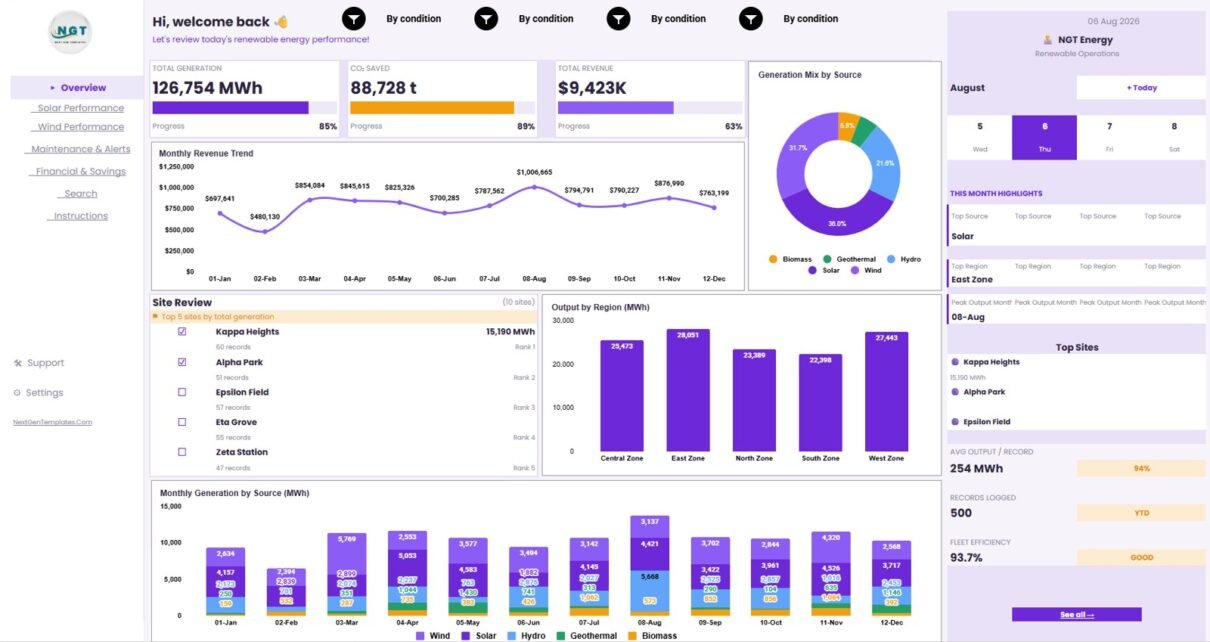
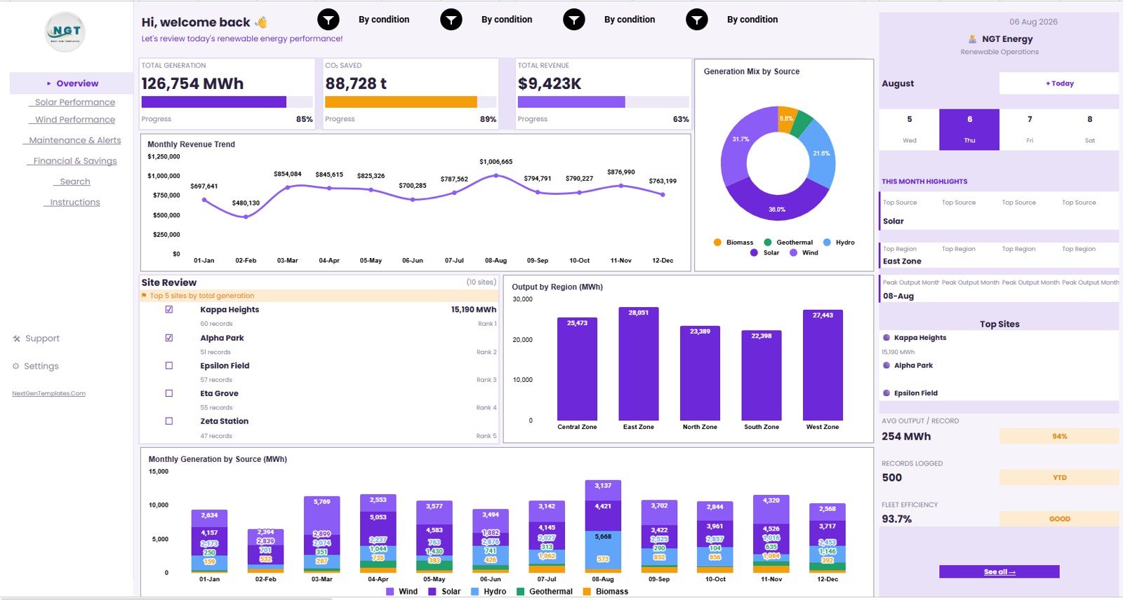
The dashboard is designed for practical renewable energy performance review. At the top level, it tracks Total Generation, CO2 Saved, Total Revenue, Avg Output / Record, Records Logged, and Fleet Efficiency. These cards help users understand performance before moving into source, site, region, or maintenance details.
Multiple slicers make it easier to filter the dashboard quickly. A renewable energy manager can isolate one month, a finance analyst can review one region, and a sustainability analyst can compare output or CO2 savings by source without rebuilding reports.
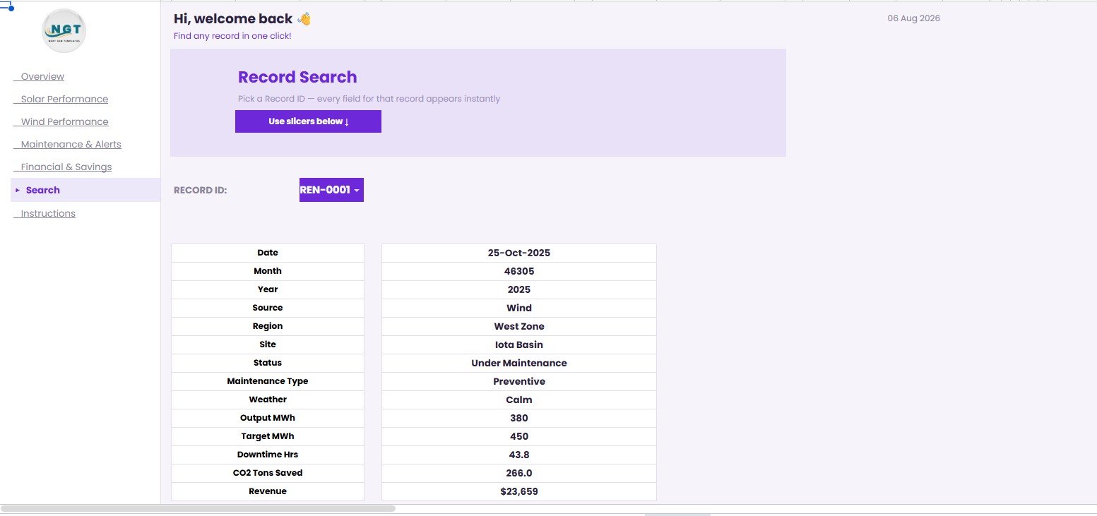
The Search Sheet is useful when someone needs a single record. Select a Record ID and the sheet returns Date, Month, Year, Source, Region, Site, Status, Maintenance Type, Weather, Output MWh, Target MWh, Downtime Hrs, CO2 Tons Saved, and Revenue. Google Sheets also supports native charting and collaboration; Google’s own Google Sheets chart help explains the chart foundation behind this type of reporting file.
Dashboard Pages Explanation
1. Overview Page
The Overview Page gives a high-level operating view. The KPI cards show Total Generation, CO2 Saved, Total Revenue, Avg Output / Record, Records Logged, and Fleet Efficiency, so leadership can scan the most important renewable energy indicators quickly.
Monthly Revenue by Month: This chart shows how revenue moves month by month. It helps users identify high-revenue periods and investigate months where output, pricing, or downtime affected results.
Generation Mix by Source: This chart shows how total generation is split by source. It helps teams understand whether solar, wind, or another source is driving most production.
Total Generation by Site: This chart compares total output across sites. It is helpful for spotting strong assets, weak locations, and sites that deserve a deeper maintenance or weather review.
Output by Region: This chart compares renewable output by region. It supports regional performance reporting and helps managers connect production results with geographic operations.
Generation by Source and Month: This chart combines monthly timing with source mix. It helps teams compare solar and wind behavior over time and review seasonality.
2. Solar Performance
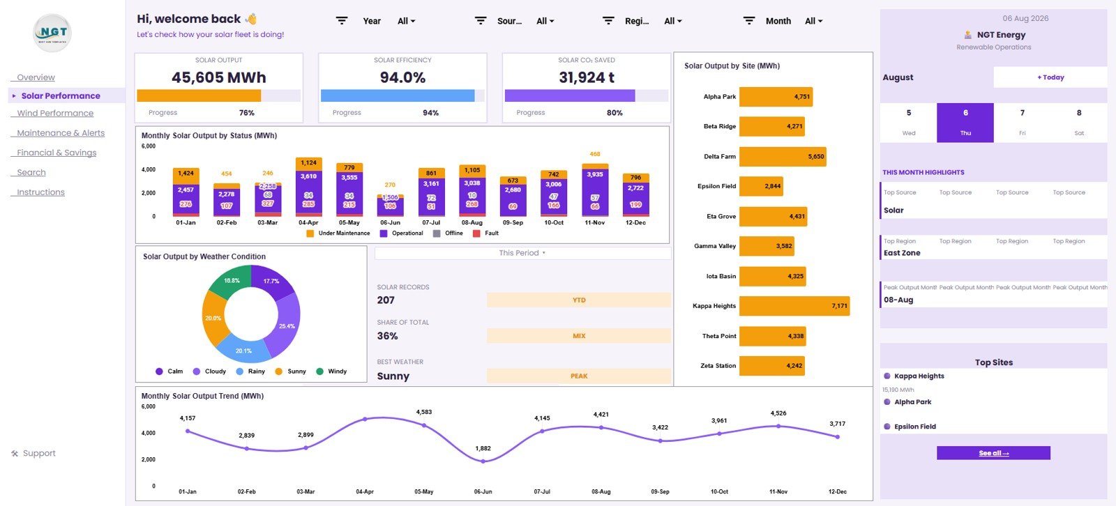
The Solar Performance tab focuses only on solar generation, making it easier to separate solar patterns from other renewable sources.
Solar Output by Status and Month: This chart shows how solar output changes by operating status over months. It helps teams see whether active, delayed, maintenance, or other statuses are affecting production.
Solar Output by Weather Condition: This chart connects solar output with weather. It gives users a quick way to compare production across clear, cloudy, rainy, or other conditions captured in the dataset.
Solar Output by Site: This chart ranks solar output by site. It helps operators compare locations and identify assets that may need review.
Solar Output by Month: This chart shows monthly solar trends. It helps users spot seasonal movement and compare current performance against expectations.
3. Wind Performance
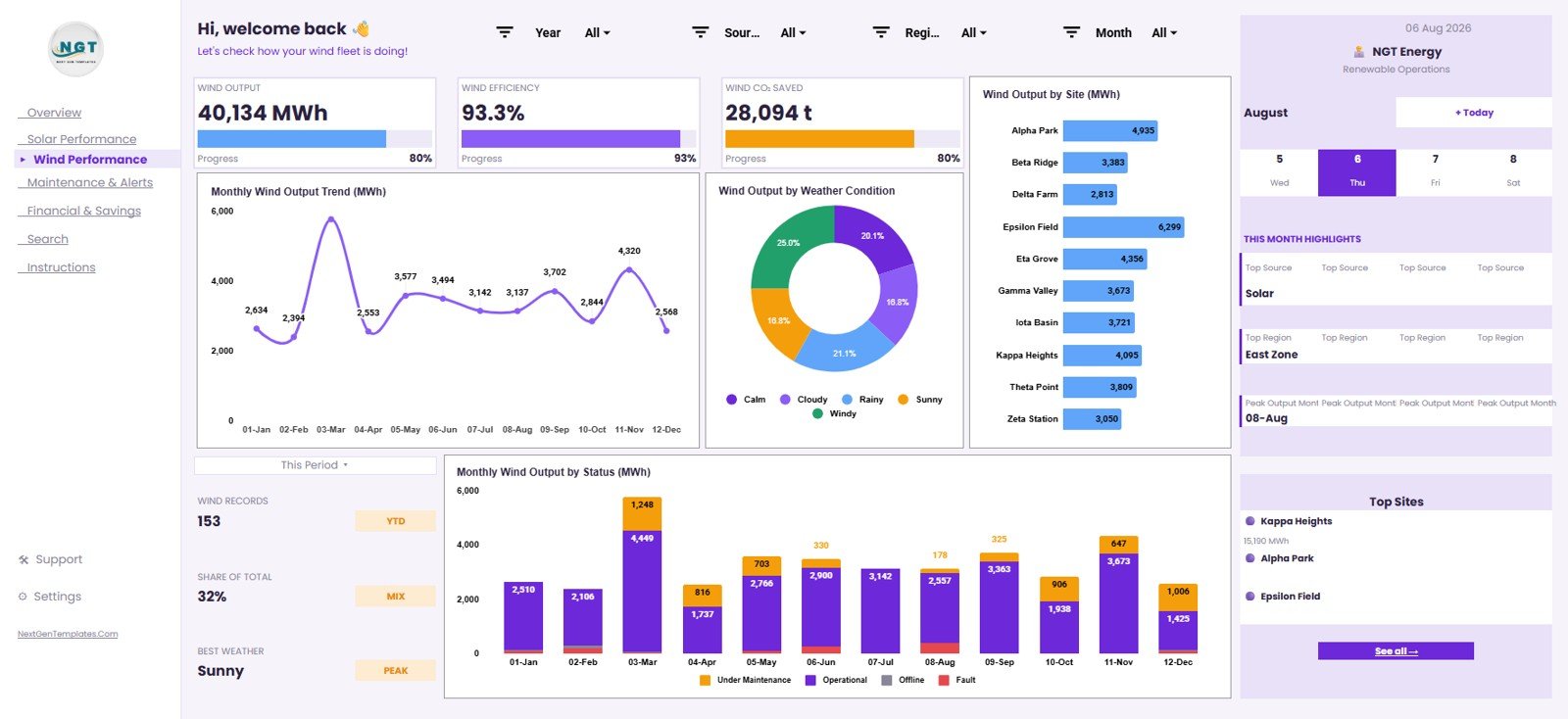
The Wind Performance tab gives the same focused treatment to wind generation. It is useful for teams that operate both solar and wind assets and want source-specific views.
Wind Output by Month: This chart shows monthly wind production. It helps users compare wind behavior across the reporting period and spot changes that may need follow-up.
Wind Output by Weather Condition: This chart compares wind output across weather categories. It helps users connect operating conditions with generation results.
Wind Output by Site: This chart compares wind generation by site. It helps teams find the assets producing the most output and the locations falling behind.
Wind Output by Status and Month: This chart shows how wind output is distributed by status and month. It supports review of outages, maintenance impact, and recurring production gaps.
4. Maintenance & Alerts
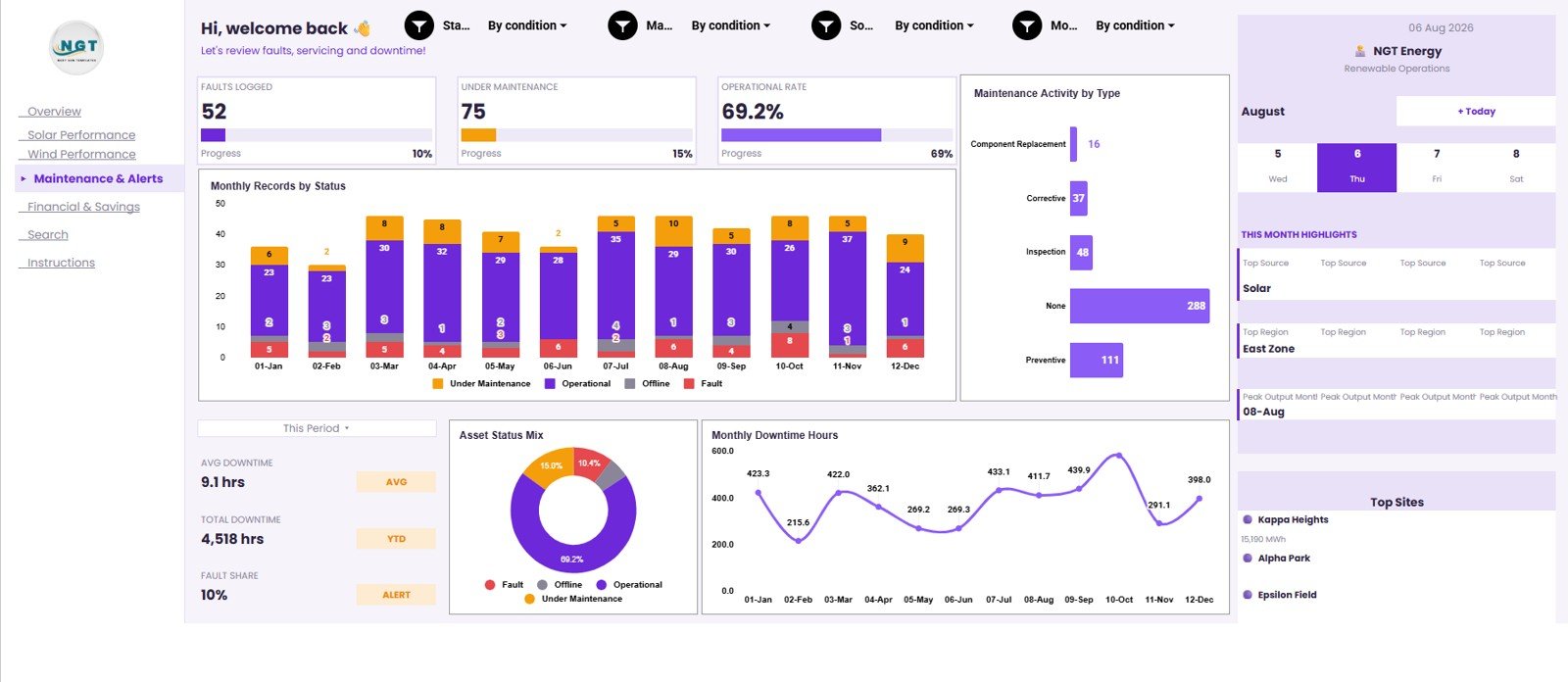
The Maintenance & Alerts tab helps connect operating health with renewable energy output. It is useful during weekly review meetings, reliability updates, and asset follow-up discussions.
Records by Status and Month: This chart shows how records are distributed by status over time. It helps users understand whether active, warning, maintenance, or delayed records are increasing.
Maintenance Activity by Type: This chart summarizes maintenance types. It helps teams see which activity categories appear most often and where resources may be needed.
Asset Status by Status: This chart groups assets by current status. It provides a quick health view for renewable equipment and operating sites.
Downtime Hours by Month: This chart tracks downtime across months. It helps users see when downtime was highest and whether maintenance programs are reducing losses.
5. Financial & Savings
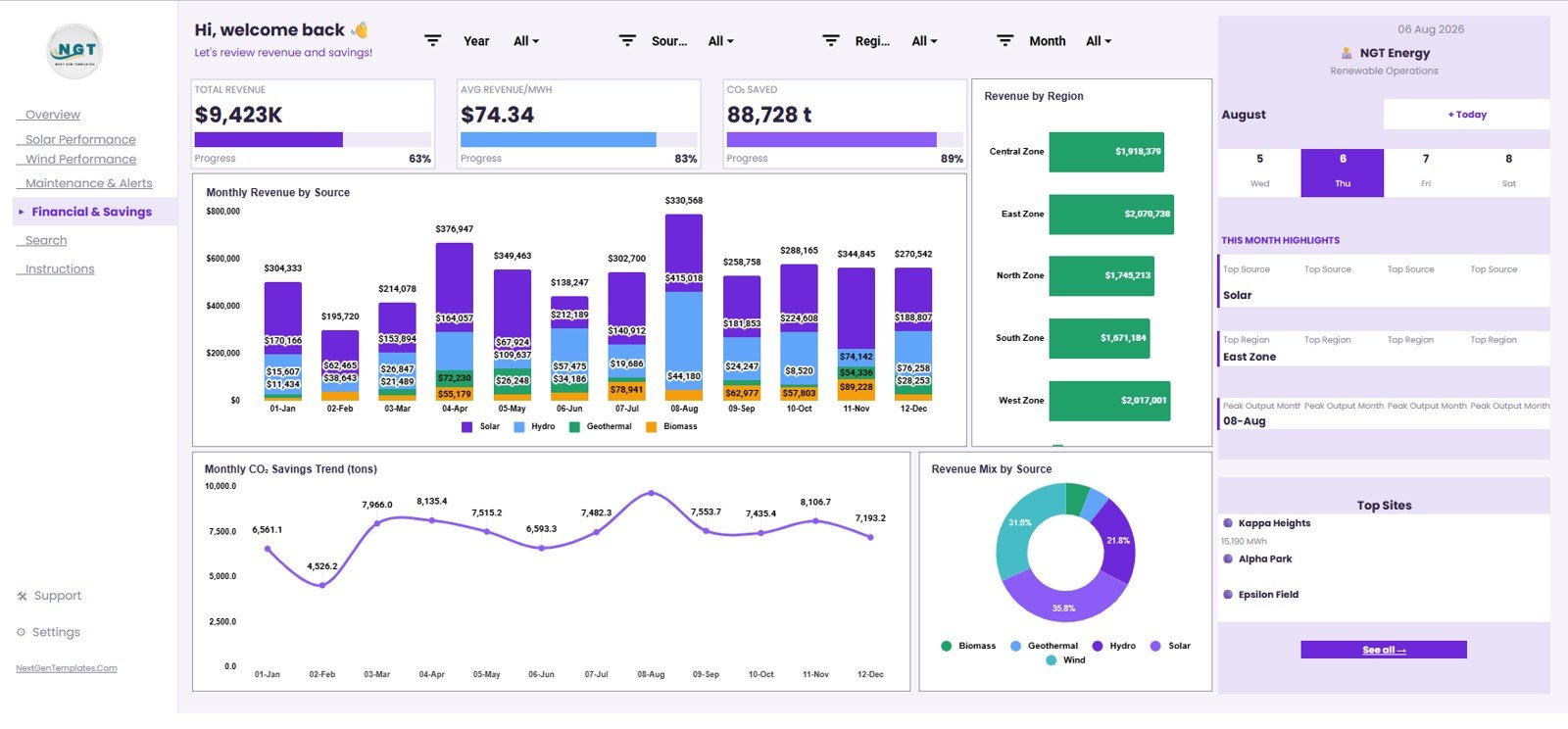
The Financial & Savings tab connects renewable operations with business and sustainability outcomes. It is useful for finance reviews, ESG updates, and performance reporting.
Revenue by Source and Month: This chart shows how each source contributes to revenue across months. It helps users understand whether solar, wind, or another source is driving financial results.
Revenue by Region: This chart compares revenue by region. It helps teams identify the strongest regional contributors and regions that may need more attention.
CO2 Savings by Month: This chart tracks avoided emissions or CO2 tons saved over time. It supports sustainability reporting and monthly ESG commentary.
Revenue Mix by Source: This chart shows the share of revenue by source. It helps users explain source-level financial contribution in a simple visual.
6. Search Sheet Tab
The Search Sheet lets users select a Record ID and instantly view the full renewable energy record. This is helpful when someone asks about one site entry, one high downtime record, one revenue line, or one weather-related output result.
7. Data Sheet Tab
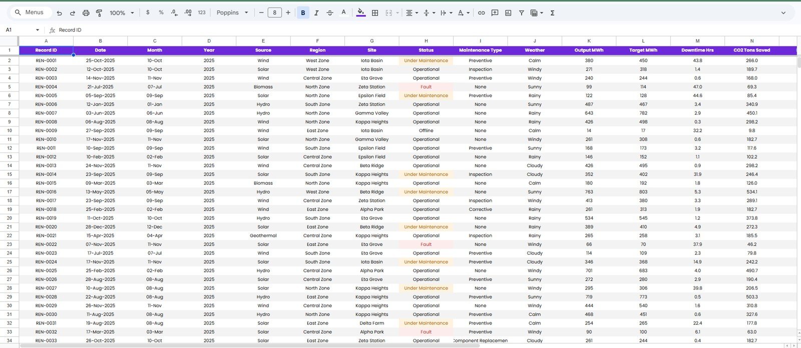
The Data Sheet is where users add the source records in the same format. Keeping the same fields allows the dashboard pages, slicers, charts, and search lookup to continue working correctly.
Renewable Energy Dashboard in Google Sheets vs. Microsoft Excel vs. Paid Energy SaaS – Feature Comparison
| Feature | This Google Sheets Dashboard | Microsoft Excel Dashboard | Paid Energy SaaS |
|---|---|---|---|
| Cost | $9.99 one-time template purchase | Template cost plus Microsoft access | Monthly or annual subscription |
| Platform | Google Sheets in browser | Excel desktop or Excel online | Vendor cloud platform |
| Setup time | Copy the file and replace records | Open workbook and refresh data | Implementation and onboarding required |
| Real-time team collaboration | Native Google Drive sharing | Available through Microsoft 365 | Usually available by paid seat |
| Mobile access | Google Sheets mobile app | Excel mobile app | Vendor app or browser |
| Customizable fields | Edit sheets, fields, labels, and formulas | Edit workbook structure and formulas | Depends on vendor configuration |
| Share with link | Built into Google Drive | Available through OneDrive | Usually login controlled |
| Year-1 cost at 5 users | $9.99 total for the template | Template cost plus licenses | Often hundreds or thousands |
| Record lookup | Included through Search Sheet | Depends on workbook design | Depends on plan |
Who Should Use This Template
This template is a good fit for renewable energy managers, solar and wind site supervisors, energy finance analysts, sustainability analysts, ESG reporting leads, facility managers, operations managers, and consultants who need clear renewable energy reporting without a long software project.
It is not a replacement for live SCADA, IoT monitoring, meter automation, utility billing software, carbon accounting systems, or enterprise maintenance platforms. It works best when the data is already available in a table and the team wants a simple reporting layer.
Real-World Use Cases
Priya, a renewable operations manager, uses the Overview and Maintenance & Alerts tabs before monthly meetings to explain generation, fleet efficiency, and downtime.
Daniel, a sustainability analyst, uses the Generation Mix, CO2 Savings by Month, and source/month charts to prepare ESG updates for leadership.
Aisha, a finance analyst, uses the Financial & Savings page to compare revenue by source, region, and month before building management commentary.
Advantages of Renewable Energy Dashboard in Google Sheets
The first advantage is speed. Users can copy the file, replace the sample records, and begin reviewing charts without building a workbook from zero.
The second advantage is collaboration. Because the dashboard is built in Google Sheets, teams can share the file, review the same numbers, and update records using Google Drive permissions.
The third advantage is flexibility. Users can customize labels, formulas, chart titles, slicers, and source records to match internal renewable energy reporting needs.
Opportunities for Improvement
This dashboard does not automatically ingest live meter data, weather APIs, SCADA feeds, or finance system exports. Teams that need automated integrations may need a connected database, Apps Script automation, or a dedicated energy platform.
It also depends on consistent data entry. If Record IDs, dates, source names, regions, and status values are not entered consistently, the charts and lookup sheet may need cleanup.
Best Practices
Keep the Data Sheet format consistent, especially Record ID, date, source, region, site, status, maintenance type, weather, output, target, downtime, CO2 saved, and revenue fields.
Update records on a regular schedule so monthly comparisons remain meaningful. Review slicer values after adding new categories, and protect formula areas if multiple users will edit the file.
Use the Search Sheet for audit questions, but use the Overview, Solar, Wind, Maintenance, and Financial pages for recurring performance review.
Explore Relevant Templates
- Renewable Energy Dashboard in Google Sheets
- Renewable Energy KPI Dashboard in Google Sheets
- Geothermal Energy Dashboard in Power BI
- Energy and Utility Dashboard in HTML
- Browse Google Sheets dashboard articles
Frequently Asked Questions
What does the Renewable Energy Dashboard in Google Sheets track?
It tracks generation, CO2 saved, revenue, average output per record, records logged, fleet efficiency, solar output, wind output, maintenance activity, downtime, and record-level details.
Can I replace the sample data?
Yes. Replace records in the Data Sheet Tab while keeping the same column structure.
Does the dashboard include a Search Sheet?
Yes. Select a Record ID to view the full record details instantly.
Can multiple people use the dashboard?
Yes. Google Sheets supports file sharing and collaboration through Google Drive permissions.
Does it connect automatically to meters or SCADA systems?
No. It is a manual reporting dashboard template for structured renewable energy records.
Is this better than paid energy SaaS?
It is better for teams that need a fast, low-cost reporting template. Paid SaaS is better when you need automated integrations, live telemetry, workflow automation, or enterprise controls.
About the Author
Built by PK – Microsoft Certified Professional with 15+ years of Excel, Google Sheets, and Power BI experience. Founder of NextGenTemplates, reaching 300K+ subscribers across YouTube channels. Every template is hand-built and tested before release.
Conclusion
The Renewable Energy Dashboard in Google Sheets turns renewable operations records into a clear reporting system for generation, CO2 savings, revenue, solar performance, wind performance, maintenance, downtime, search lookup, and data entry. It is a strong fit for teams that want quick visibility without committing to a recurring analytics subscription.
Click here to purchase the Renewable Energy Dashboard in Google Sheets.
Visit our YouTube channel to learn step-by-step tutorials.