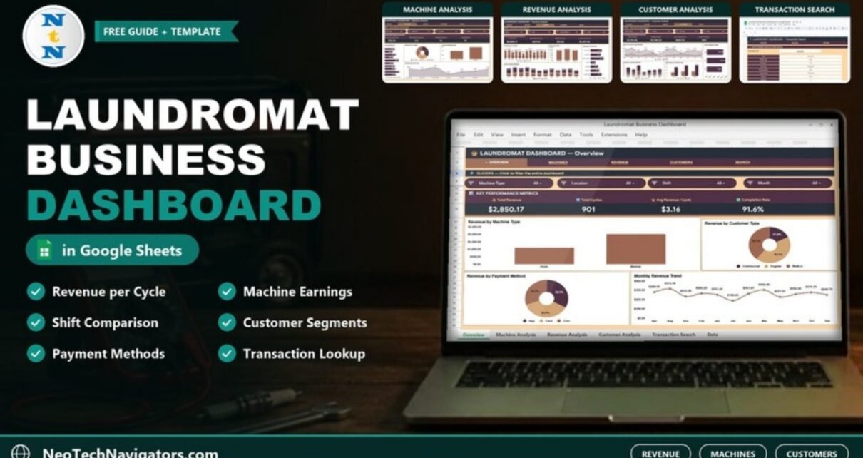
The Laundromat Business Dashboard in Google Sheets turns a laundromat’s transaction log into a clear report. It shows revenue, wash and dry cycles, machine performance, shifts and customer types. It has four report pages with their own slicers, a Transaction ID lookup and one Data sheet that feeds everything.
It is made for owners and managers of self-service or attended laundromats with one or a few locations. They can export or note down each transaction, but have no easy way to see which machines, cycles and customers bring in the money. The file runs in a normal Google account and does not need add-ons or macros.
🎥 Watch the Video Tutorial
Get the Laundromat Business Dashboard
What This Laundromat Dashboard Helps You Answer
- How much revenue did we take this month, and how many cycles ran?
- Which washers and dryers earn the most, and which are under-used?
- Which cycle types (Regular Wash, Heavy Duty Wash, Quick Dry and so on) bring in the most revenue?
- Do Morning, Afternoon or Evening shifts earn more?
- How much comes from Walk-in, Regular and Commercial customers, and how do they pay: App, Card or Coin?
The navigation bar at the top of each page links Overview, Machines, Revenue, Customers and Search. The Data sheet sits behind them. The figures below come from the 500 sample transactions included in the file.
Dashboard Pages Explained
1. Overview
Slicers: Machine Type, Location, Shift and Month. The “Key Performance Metrics” strip shows Total Revenue ($2,850.17), Total Cycles (901), Avg Revenue / Cycle ($3.16) and Completion Rate (91.6%).
The four charts are Revenue by Machine Type (Dryer vs Washer), Revenue by Customer Type, Revenue by Payment Method and Monthly Revenue Trend.

2. Machine Analysis
Slicers: Machine Type, Machine ID, Location and Month. The “Machine Performance Metrics” strip shows Top Transaction Revenue ($16.35), Avg Cycles / Transaction (2.0), Maintenance Events (16) and Unique Machines (10).
The charts are:
- Revenue by Machine ID, covering dryers D-01 to D-04 and washers W-01 to W-06. W-05 is top at $416.93.
- Revenue by Location, split across Downtown, Main Street and Oak Avenue.
- Cycles by Machine Type.
- Revenue by Cycle Type.

3. Revenue Analysis
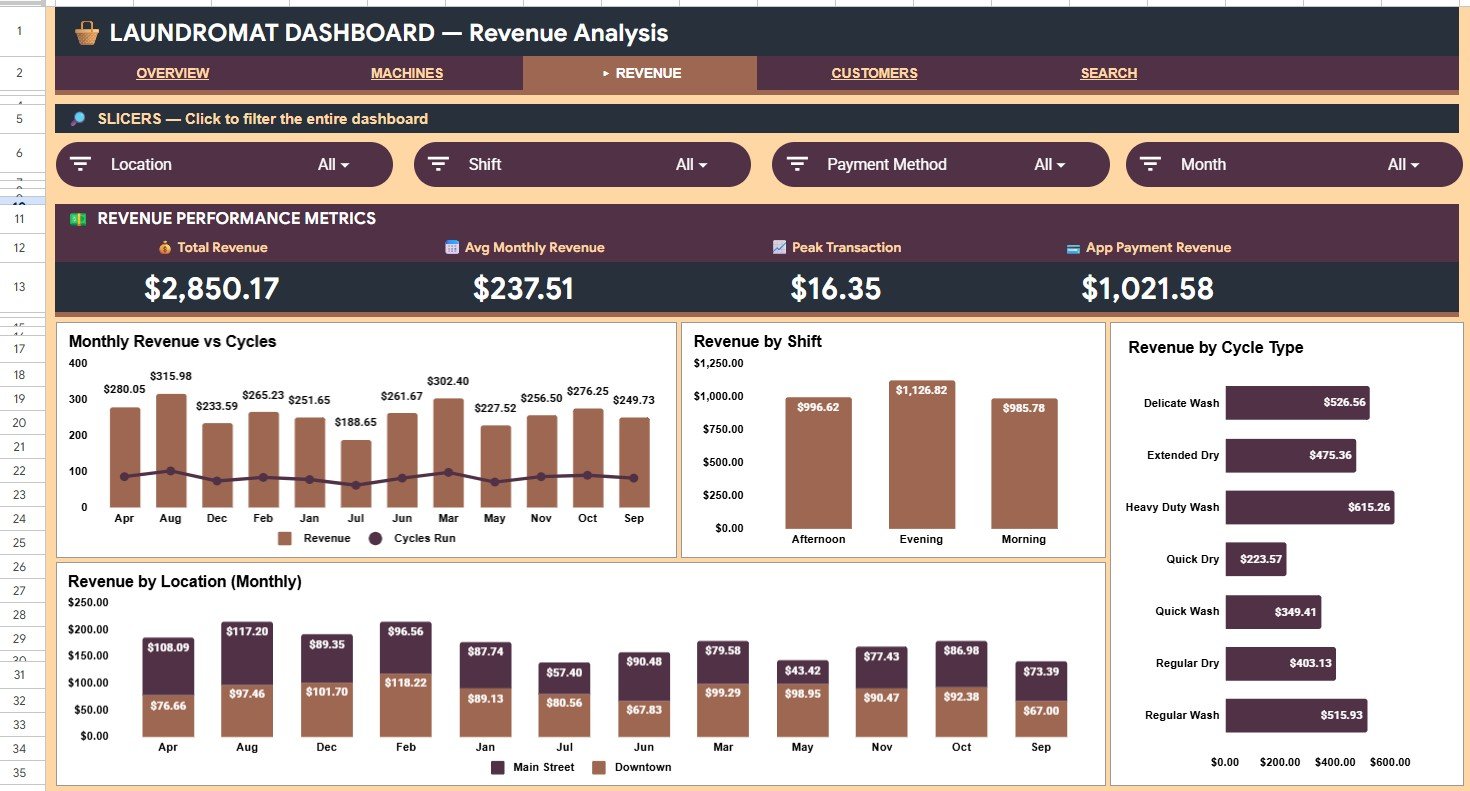
Slicers: Location, Shift, Payment Method and Month. The “Revenue Performance Metrics” strip shows Total Revenue ($2,850.17), Avg Monthly Revenue ($237.51), Peak Transaction ($16.35) and App Payment Revenue ($1,021.58).
The charts are:
- Monthly Revenue vs Cycles, with columns for revenue and a line for cycles run.
- Revenue by Shift: Afternoon $996.62, Evening $1,126.82, Morning $985.78.
- Revenue by Cycle Type, where Heavy Duty Wash leads at $615.26.
- Revenue by Location (Monthly).
4. Customer Analysis
Slicers: Customer Type, Location, Cycle Type and Month. The “Customer Performance Metrics” strip shows Walk-in Revenue ($1,216.05), Regular Revenue ($1,340.24), Commercial Revenue ($552.93) and Total Transactions (500).
The charts are:
- Revenue by Customer Type (Monthly).
- Payment Method Usage: App $1,021.58, Card $1,143.35, Coin $944.29.
- Cycle Type by Customer Segment.
- Shift Usage by Customer Type.

5. Transaction Search
Type a value such as LND-0002 into the Transaction ID box. The page shows Date, Machine Type, Machine ID, Cycle Type, Payment Method, Customer Type, Revenue, Cycles Run, Location, Shift, Status, Month and Year. For LND-0002 it shows Dryer D-02, Regular Dry, App payment, Commercial customer, $7.59, 3 cycles, Main Street, Morning shift, Completed.

6. Data Sheet
Each row is one transaction, with these columns: Transaction ID, Date, Machine Type, Machine ID, Cycle Type, Payment Method, Customer Type, Revenue, Cycles Run, Location, Shift, Status, Month, Year and Count. The Status column uses values such as Completed and Error.

KPIs in the Laundromat Business Dashboard in Google Sheets
You can check the sample figures: $2,850.17 ÷ 901 cycles = $3.16 per cycle, and $2,850.17 ÷ 12 months = $237.51 average monthly revenue.
| KPI | What it measures | How it is derived | Better when |
|---|---|---|---|
| Total Revenue | Money taken in the filtered period | Revenue total for the filtered transactions (see the note below the table) | Higher |
| Total Cycles | Machine usage | Total of the Cycles Run column for the transactions the card counts (see the note below the table) | Higher |
| Avg Revenue / Cycle | Price realised per cycle | Total Revenue ÷ Total Cycles | Higher |
| Completion Rate | Share of transactions that finished without a problem | Transactions with Status = Completed ÷ all transactions | Higher |
| Maintenance Events | How often machines needed attention | Count of maintenance events in the filtered data (Machines page) | Lower |
| Avg Monthly Revenue | Typical month | Total Revenue ÷ number of months | Higher |
| Walk-in / Regular / Commercial Revenue | Revenue mix by customer segment | Sum of Revenue for each Customer Type | A balanced mix |
A note on totals: the three customer-segment cards add up to $3,109.22, as do the App, Card and Coin bars. That is more than the $2,850.17 Total Revenue card, because the cards do not all count the same set of transactions. When you compare figures across pages, compare like with like. Use Total Revenue for headline reporting, and use the segment and payment figures for mix and share.
How to Use It With Your Own Data
- Open the copy link in the PDF guide and choose File > Make a copy.
- Go to the Data sheet. Replace the sample rows with your own transactions, keeping the same headers and column order.
- Use consistent labels for Machine Type (Washer, Dryer), Machine ID (W-01, D-01 …), Shift (Morning, Afternoon, Evening) and Status (Completed, Error and so on).
- Fill Month and Year from the Date column. With the date in B2:
=TEXT(B2,"mmm") =YEAR(B2) - If the Search page shows the date as a number such as 45602.22917, select that cell and apply Format > Number > Date.
- Open the Overview, check the totals against your own records, and then use the slicers on each page.
If you want to learn how reports like this are built from summary tables and slicers, the Pivot Tables & Dashboards course on NextGenTemplates Academy is a good next step.
Real-World Use Cases
- Machine replacement decisions: Compare Revenue by Machine ID with the Maintenance Events count to decide which units to repair, reprice or replace first.
- Staffing by shift: Use Revenue by Shift and Shift Usage by Customer Type to put attendants on the shifts that matter most.
- Commercial accounts review: Filter the Customers page to Commercial and check which cycle types and shifts those accounts use before you renegotiate rates.
Best Practices
- Add transactions at least weekly, so problems such as a machine logging errors show up quickly.
- Record failed or refunded cycles with a clear Status instead of deleting them. That keeps the Completion Rate honest.
- Keep Machine IDs fixed. If you replace a machine, give it a new ID so its history stays separate.
- Reset all slicers to “All” before you share a screenshot with a partner or accountant.
- Share the file view-only with anyone who does not enter data.
Limitations: Who Should Not Use This Template
- It is not a POS or payment system. Your coin, card or app systems still capture the transactions, and you then paste or import them.
- It has no live link to machines or payment terminals.
- Very large transaction logs will slow Google Sheets down. The Power BI version suits bigger data sets.
Dashboard vs Spreadsheet vs Laundry Software
| Need | Plain spreadsheet | This dashboard | Laundry POS / management software |
|---|---|---|---|
| Revenue, machine, shift and customer reports | Build by hand | Ready-made pages with slicers | Usually yes |
| Transaction lookup | Filter or scroll | Enter a Transaction ID | Yes |
| Payment capture and machine control | No | No | Yes |
| Data ownership | You | You (your Google Drive) | Vendor platform |
| Cost model | Free | One-time template purchase | Usually monthly |
Related Templates and Guides
Prefer a file that opens in any browser without Google Sheets? Read the Laundromat Dashboard in HTML walkthrough. If you also run dry cleaning orders, the Dry Clean Service Management System Web App handles the order workflow. Owners of similar self-service businesses may also find the Car Wash Business KPI Scorecard in Google Sheets and the Car Wash Management System Tracker useful.
Related templates: Laundromat Dashboard in Excel and Laundromat Dashboard in Power BI.
Frequently Asked Questions
What KPIs does the Laundromat Business Dashboard in Google Sheets show?
The Overview shows Total Revenue, Total Cycles, Avg Revenue / Cycle and Completion Rate. The Machines, Revenue and Customers pages each add four more metrics, such as Maintenance Events, Avg Monthly Revenue and revenue by customer type.
Can I track more than one location?
Yes. Every transaction has a Location field. The sample uses Downtown, Main Street and Oak Avenue, and you can add your own location names.
Can I add more machines?
Yes. Add new Machine IDs in the Data sheet and they appear in the Revenue by Machine ID chart and the Machine ID slicer.
Why is a date showing as a number on the Search page?
Google Sheets stores dates as serial numbers. Select the cell and apply Format > Number > Date to show it as a normal date.
Do I need a paid Google Workspace account?
No. A free Google account is enough to copy, edit and share the file.
Is there an Excel or Power BI version?
Yes. Laundromat dashboards are also available for Excel and Power BI on NextGenTemplates, linked above.
Wrapping Up
A laundromat earns money one small transaction at a time, so patterns are easy to miss. This dashboard groups those transactions by machine, cycle, shift, location and customer so you can see what is working. Paste in your transactions, check the Overview totals and review the Machines and Revenue pages every week.
Get the Laundromat Business Dashboard
📅 Last updated: October 2026