The global EdTech market is projected to reach USD 437.54 billion by 2033, and that growth puts more pressure on course teams to understand enrolments, revenue, active learners, refunds, engagement, and course quality in one place. The EdTech Dashboard in Google Sheets is a ready-to-use reporting template for online course businesses, learning platforms, academies, coaching institutes, and education teams that want dashboard visibility without a paid analytics system.
This template gives you 7 sheet tabs, 4 headline cards, 20 analysis charts, multiple slicers, an Enrolment Lookup sheet, and a structured Data Sheet. Because it is built in Google Sheets, your team can share the file, review charts from the browser, and work with familiar spreadsheet controls. Google also provides detailed guidance for sharing and collaborating in Sheets, which makes this template practical for distributed course operations teams.
Get the EdTech Dashboard in Google Sheets
Key Features of EdTech Dashboard in Google Sheets
- 4 high-level cards: Course Revenue, Total Enrolments, Active Learners, and Drop-off Rate.
- 7 dashboard tabs: Overview, Course Catalogue, Learner Insights, Revenue & Plans, Learning Engagement, Enrolment Lookup, and Data Sheet.
- 20 charts: analyze course revenue, plan mix, region demand, learning hours, refunds, instructor activity, device usage, and ratings.
- Multiple slicers: filter the dashboard quickly by the available course, plan, region, status, device, instructor, and date fields.
- Search workflow: choose an Enrolment ID and return the full learner record on the lookup tab.
- Editable Google Sheets format: replace sample rows with your own EdTech or LMS export while keeping the same column structure.
- No recurring reporting subscription: buy once, copy to your Drive, and adapt it to your learning business.
Dashboard Pages Explanation
1 – Overview Page
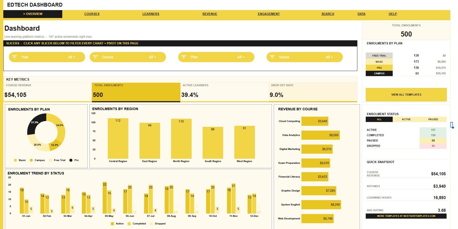
The Overview Page is the executive summary for the dashboard. On the top, it shows Course Revenue, Total Enrolments, Active Learners, and Drop-off Rate so management can read the current learning business picture quickly.
Enrolments by Plan: This chart compares enrolment volume by plan. It helps you understand whether free, trial, basic, premium, or enterprise plans are driving learner acquisition.
Enrolments by Region: This chart compares learner demand by region. It is useful for spotting high-performing markets and regions where marketing or support needs attention.
Revenue by Course: This chart ranks courses by revenue contribution. Course owners can use it to identify top courses and weaker revenue areas that need pricing or promotion review.
Enrolment Trend by Status: This chart tracks enrolment status movement over time. It helps you see whether active, completed, dropped, or pending enrolments are moving in a healthy direction.
2 – Course Catalogue
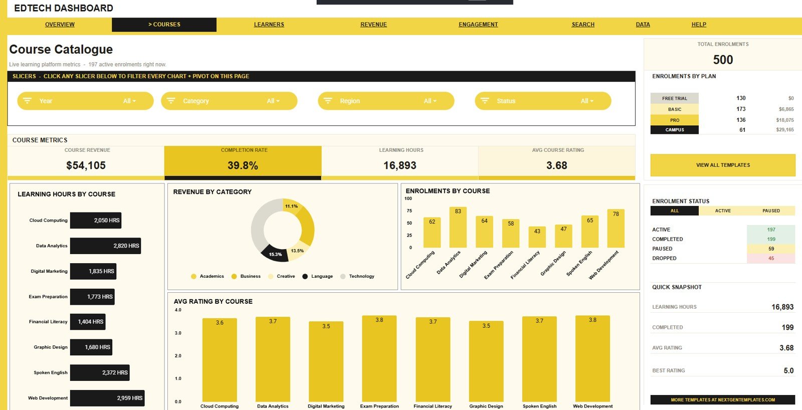
In this sheet tab, the dashboard focuses on course-level performance. It helps course managers compare learning time, revenue, enrolment volume, and learner rating across the course library.
Learning Hours by Course: This chart compares total learning hours across courses. It helps you identify the courses that create the most learner time commitment.
Revenue by Category: This chart groups revenue by course category. It shows which learning areas are producing the highest commercial value.
Enrolments by Course: This chart ranks courses by learner count. It helps you find popular courses and courses that may need a new launch campaign.
Avg Rating by Course: This chart compares learner satisfaction by course. It is useful for identifying content quality issues and courses that deserve testimonials or promotion.
3 – Learner Insights
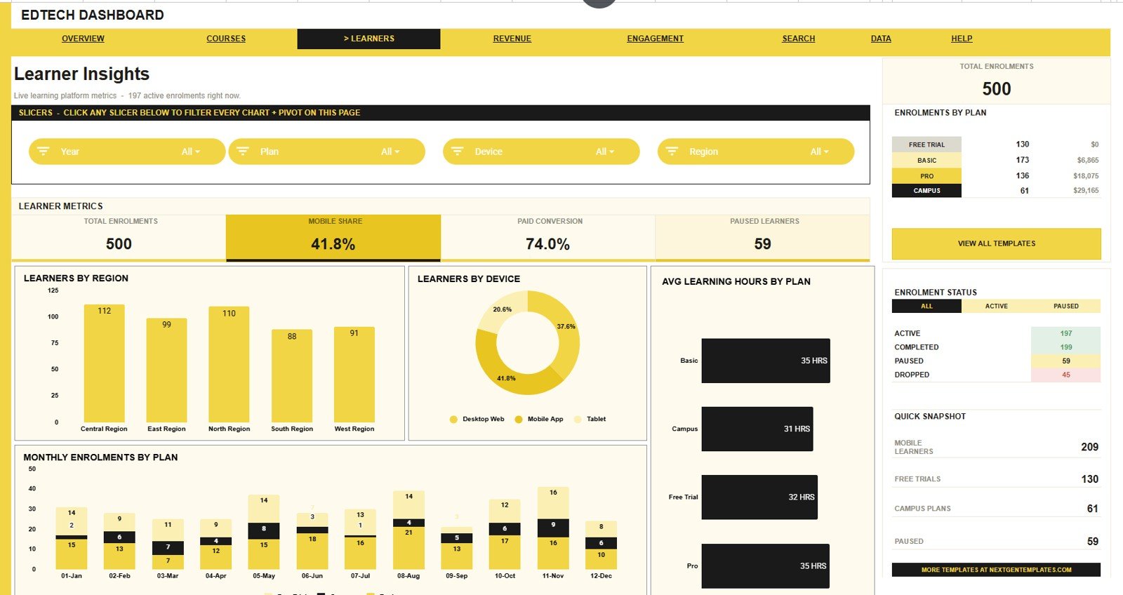
The Learner Insights tab shows who your learners are and how they engage by region, device, plan, and month. This view is helpful for growth, product, support, and learner success teams.
Learners by Region: This chart shows learner count by region. It helps teams compare market demand and decide where localized learning support may be needed.
Learners by Device: This chart compares learner activity by device type. It helps product teams prioritize mobile, tablet, and desktop experiences based on actual usage.
Avg Learning Hours by Plan: This chart compares average learning hours across plans. It shows whether different plan types are producing different levels of engagement.
Monthly Enrolments by Plan: This chart tracks monthly enrolments by plan. It helps leaders understand plan momentum after campaigns, launches, or pricing changes.
4 – Revenue & Plans
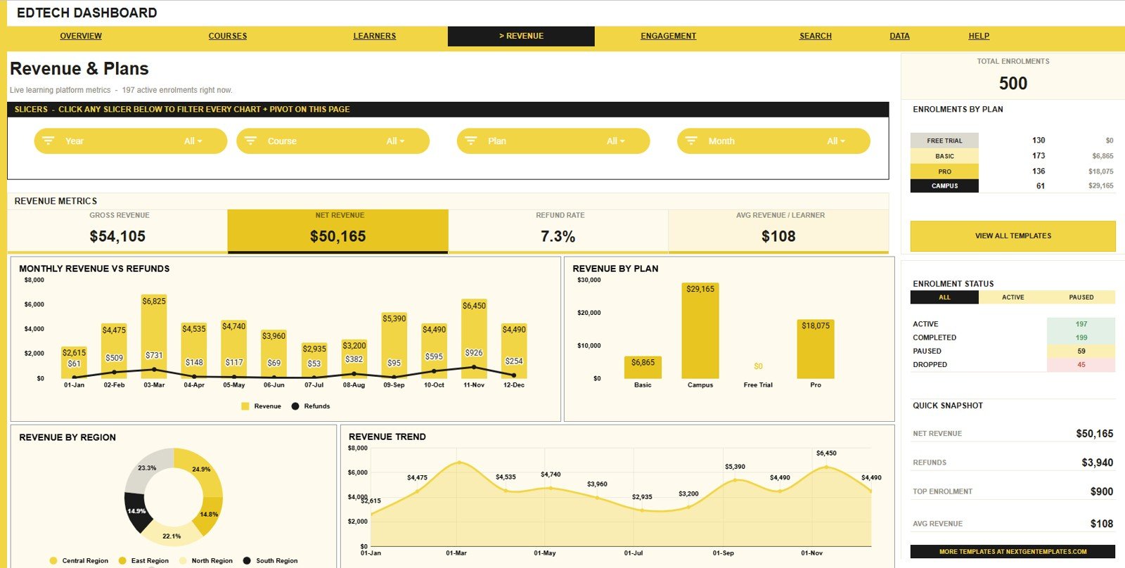
The Revenue & Plans tab gives the finance and commercial view of the learning business. It connects sales, refunds, plan type, region, and month into one reporting page.
Revenue and Refunds by Month: This chart shows revenue and refunds side by side across months. It helps finance users spot periods where refund pressure is unusually high.
Revenue by Plan: This chart compares revenue generated by each plan. It helps you understand whether plan volume is translating into meaningful revenue.
Revenue by Region: This chart shows which regions generate the most revenue. It can guide regional marketing, partnerships, and sales focus.
Revenue by Month: This chart tracks month-wise revenue movement. It is useful for management reporting, monthly reviews, and campaign impact checks.
5 – Learning Engagement
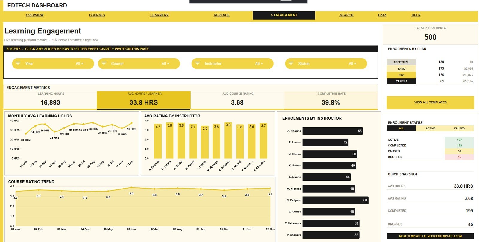
The Learning Engagement tab reviews learner activity and instructor performance. It combines learning hours, ratings, instructor enrolments, and course rating trends in one sheet.
Avg Learning Hours by Month: This chart shows how average learning hours change over time. It helps teams understand whether learners are spending more or less time in courses.
Avg Rating by Instructor: This chart compares instructor rating averages. It supports coaching conversations and helps identify instructors with strong learner feedback.
Enrolments by Instructor: This chart compares enrolment volume by instructor. It helps managers understand instructor demand and workload concentration.
Course Rating by Month: This chart tracks course rating movement by month. It helps detect learner sentiment changes after course updates or instructor changes.
6 – Enrolment Lookup
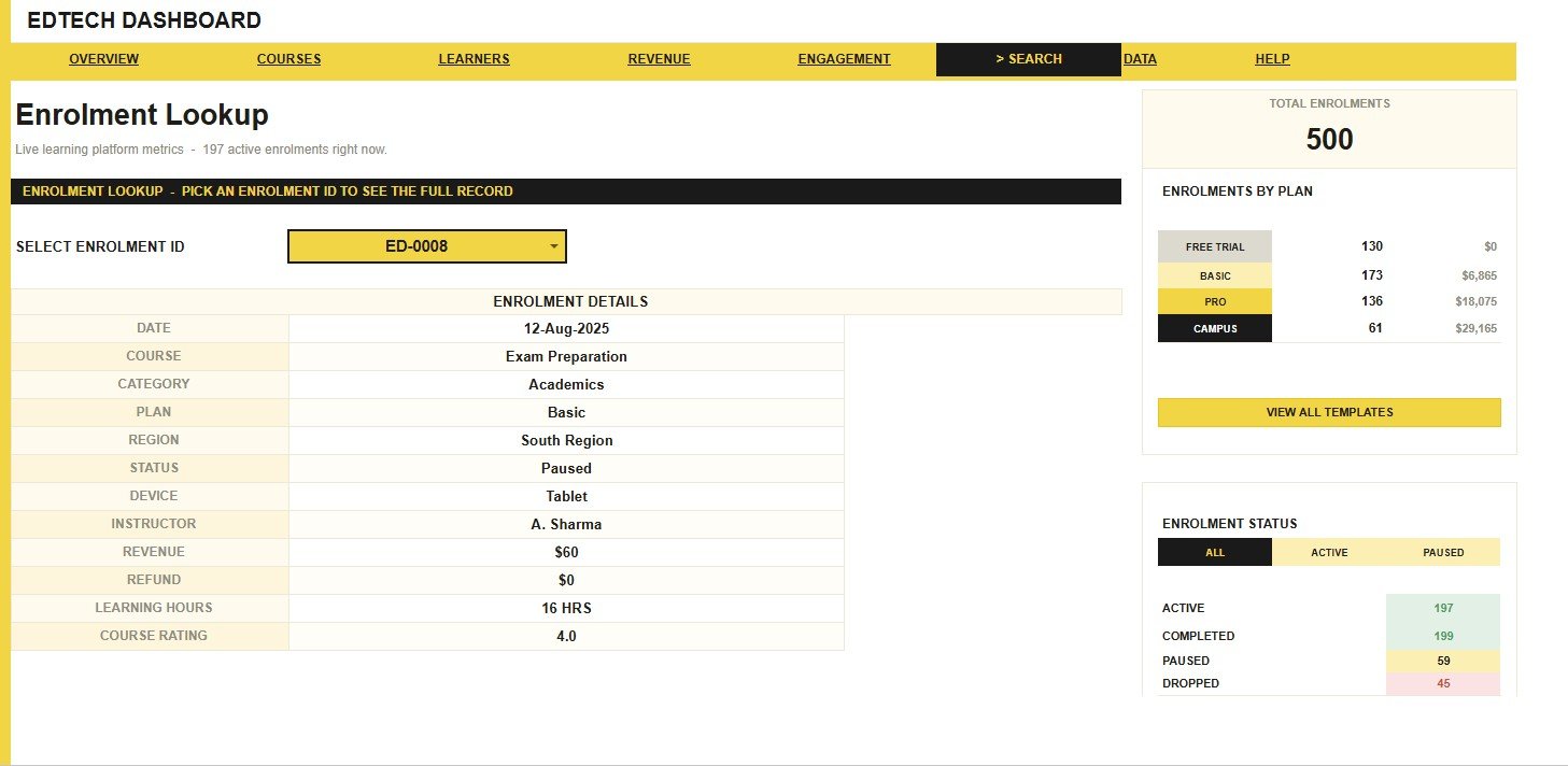
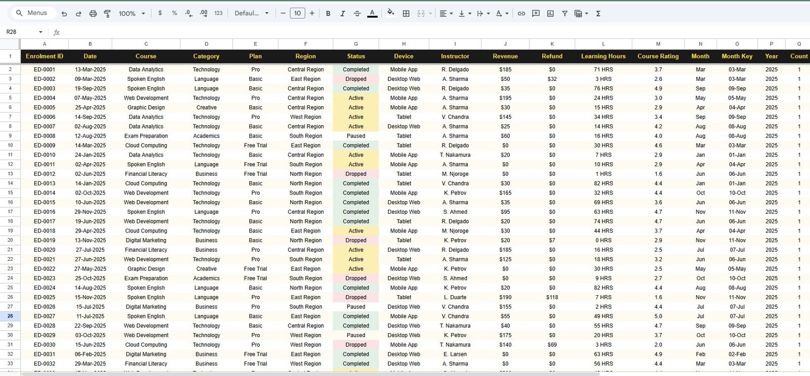
This is the search sheet. Users can pick an Enrolment ID to see the full learner record, including date, course, category, plan, region, status, device, instructor, revenue, refund, learning hours, and course rating.
7 – Data Sheet Tab
This is the Data Sheet. Here you need to add the data in the same format so every dashboard page, slicer, card, lookup field, and chart stays connected.
EdTech Dashboard in Google Sheets vs. Microsoft Excel Dashboard vs. Paid LMS SaaS – Feature Comparison
| Feature | EdTech Dashboard in Google Sheets | Microsoft Excel dashboard | Paid LMS analytics SaaS |
|---|---|---|---|
| Cost | $9.99 one-time template cost | Template cost plus possible Microsoft 365 licensing | Monthly or annual subscription |
| Platform | Google Sheets in browser | Excel desktop or web | Vendor web app |
| Setup time | Copy the file and replace sample rows | Open workbook and refresh formulas or pivots | Implementation, user setup, and integration work |
| Real-time team collaboration | Native Google Drive sharing | Requires OneDrive or SharePoint setup | Included depending on subscription plan |
| Mobile access | Google Sheets app and browser | Excel mobile app | Vendor app or responsive portal |
| Customizable fields | Edit columns, labels, formulas, charts, and slicers | Edit workbook structure | Limited by vendor configuration |
| Share with link | Yes, through Google Drive permissions | Yes, if cloud-hosted | Usually requires named accounts |
| Year-1 cost at 5 users | $9.99 template cost | Template plus license costs | Often hundreds or thousands per year |
| Course revenue and refunds | Built into the Revenue & Plans tab | Possible with a custom build | Depends on paid modules and integrations |
| Enrolment lookup | Included as a search sheet | Possible with formulas | Usually tied to the LMS learner profile |
Who Should Use This Template
The EdTech Dashboard in Google Sheets is best for online academies, coaching centers, LMS administrators, course marketplace teams, digital learning startups, instructor-led training businesses, and education consultants who want a clear reporting layer in a familiar spreadsheet format.
It is also useful for founders and operations managers who need a fast way to present course revenue, enrolment mix, learner engagement, instructor workload, and learner ratings in a monthly meeting. If your current reporting process is screenshots from different tools plus manual tables, this template gives you a single working file.
Real-World Use Cases
Aarav, online academy founder: uses the Overview Page and Revenue & Plans tab before monthly strategy meetings. He can see which courses generate revenue, which plans are growing, and whether refunds are rising.
Maya, learner success manager: uses Learner Insights and Learning Engagement to review learning hours, device usage, and course rating trends. She can focus support on regions, devices, or plans where engagement is low.
Jordan, course operations lead: uses Course Catalogue and instructor charts to compare course demand, instructor ratings, and enrolment load. This helps with instructor coaching and course update planning.
Advantages of EdTech Dashboard in Google Sheets
- Fast visibility: 4 summary cards give leadership an immediate view of revenue, enrolments, active learners, and drop-off rate.
- Course-level analysis: Course Catalogue helps teams compare demand, learning hours, revenue, and ratings.
- Financial clarity: Revenue & Plans separates revenue, refunds, plans, regions, and monthly trends.
- Learner behavior context: Learner Insights and Learning Engagement show how people actually use the learning product.
- Practical lookup: Enrolment Lookup saves time when you need one learner record quickly.
- Editable structure: Since it is a Google Sheets file, users can rename fields, adjust formulas, and customize charts after copying it.
Opportunities for Improvement
This template is intentionally spreadsheet-based, so it does not automatically connect to your LMS, payment gateway, CRM, or support desk. Advanced teams may later add Apps Script, scheduled imports, BigQuery, or Looker Studio if they want automated data refresh.
It also does not replace data governance. If you work with student records, review your own privacy rules, access permissions, retention policies, and local requirements before sharing the file broadly. Use Google Drive permissions carefully and keep sensitive learner information limited to the people who need it.
Best Practices
- Keep the Data Sheet format consistent: Add new rows in the same columns so the charts and lookup stay connected.
- Review drop-off weekly: Drop-off Rate is most useful when checked frequently, not only at the end of the month.
- Compare revenue with refunds: A growing revenue chart is stronger when refunds remain stable or decline.
- Segment by plan and region: Plan and region views often reveal where growth or support work should happen next.
- Protect the master file: Keep one clean master copy, then share working copies with your team.
- Document field definitions: Define what counts as active, dropped, refunded, and completed so reports stay consistent.
Explore Relevant Templates
- Education Services Dashboard in Google Sheets for wider student and education services analysis.
- EdTech KPI Dashboard in Google Sheets for target-based EdTech performance tracking.
- Education KPI Dashboard in Google Sheets for institution-level education KPIs.
- Student Academic Insights Dashboard in Google Sheets for academic, attendance, and fee analysis.
- Student Enrollment KPI Dashboard in Google Sheets for admissions and retention tracking.
To build dashboards like this on your own data, the Excel Pivot Tables & Dashboards course on NextGenTemplates Academy teaches the method step by step with practice files.
Get the EdTech Dashboard in Google Sheets
Frequently Asked Questions
What is included in the EdTech Dashboard in Google Sheets?
The template includes Overview, Course Catalogue, Learner Insights, Revenue & Plans, Learning Engagement, Enrolment Lookup, and Data Sheet tabs, with 4 headline cards and 20 analysis charts.
What cards are shown on the Overview Page?
The Overview Page shows Course Revenue, Total Enrolments, Active Learners, and Drop-off Rate. These cards give a quick management summary before users review the detailed charts.
Can I use this dashboard with LMS data?
Yes, if your LMS data can be exported and arranged in the same structure as the Data Sheet. Paste your records into that structure so the dashboard and lookup continue to work.
Does the template work on mobile?
Yes, it can be opened in the Google Sheets mobile app or browser. For heavy editing, slicer use, and chart review, a desktop or laptop screen will be more comfortable.
Does it include a search sheet?
Yes. The Enrolment Lookup sheet lets users pick an Enrolment ID and see the full learner record, including course, plan, region, status, revenue, refund, learning hours, and rating fields.
Is this a replacement for an LMS?
No. It is a reporting dashboard for EdTech data. It does not host courses, issue certificates, process payments, run quizzes, or manage learner accounts.
Can I customize the dashboard?
Yes. Since it is built in Google Sheets, you can edit labels, formulas, charts, slicers, and the Data Sheet after creating your own copy.
About the Author
Built by PK – Microsoft Certified Professional with 15+ years of Excel, Google Sheets, and Power BI experience. Founder of NextGenTemplates, reaching 300K+ subscribers across YouTube channels. Every template is hand-built and tested before release.
Conclusion
The EdTech Dashboard in Google Sheets gives course teams a practical way to track revenue, enrolments, active learners, drop-off rate, course performance, learner behavior, plan mix, regional demand, refunds, and instructor performance in one editable spreadsheet. It is a strong fit when you want clear dashboard reporting without committing to a monthly analytics platform.