HealthTech Dashboard in Google Sheets is a ready-to-use reporting template for healthtech teams that need a fast view of cases, revenue, completion, consult time, provider workload, channel performance, and patient outcomes. The workbook includes 7 sheet tabs, 5 executive KPI cards, 25 chart views, multiple slicers, a Case ID search sheet, and a structured Data Sheet for easy record updates.
Instead of rebuilding charts manually every week, you can paste or replace records in one data table and review the dashboard pages immediately. This makes the template useful for telehealth teams, digital clinic operators, healthcare platforms, provider managers, and analysts who need a practical Google Sheets dashboard without paying for a full healthcare SaaS reporting module.
Get the HealthTech Dashboard in Google Sheets
Key Features of HealthTech Dashboard in Google Sheets
- 7 Google Sheets tabs for overview, service performance, provider activity, revenue and margin, patient outcomes, search, and raw data.
- 5 top-level KPI cards covering Total Cases, Platform Revenue, Completion Rate, Avg Consult, and Outcome Score.
- 25 chart views across the dashboard pages for status, region, service, provider, age group, channel, plan type, revenue, cost, and outcomes.
- Multiple slicers that let users filter the dashboard quickly without editing formulas or rebuilding charts.
- Case ID search sheet for record-level lookup when users need the details behind a single case.
- Structured Data Sheet tab where users add data in the same format so the dashboard stays connected.
- Browser-based Google Sheets workflow for teams that prefer shareable dashboards over desktop-only files.
Dashboard Pages Explanation
The template is organized into focused pages. Each page answers a different management question: what is happening overall, which services are performing, how providers are contributing, where revenue and margin are moving, how patient outcomes are changing, and what is inside a specific case record.
1. Overview Page
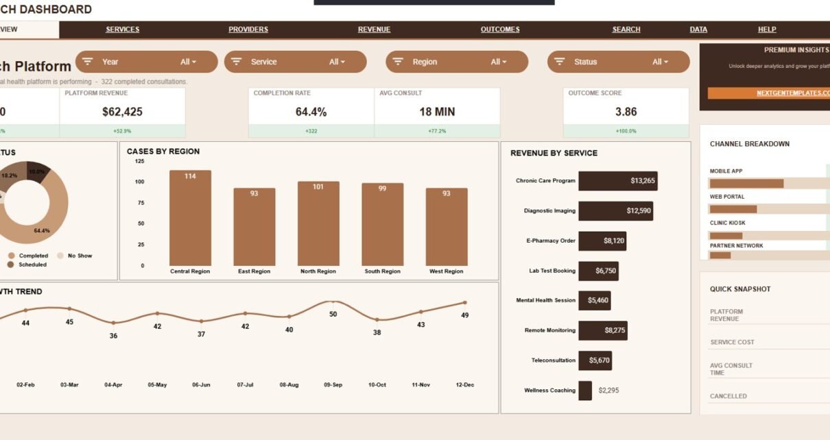
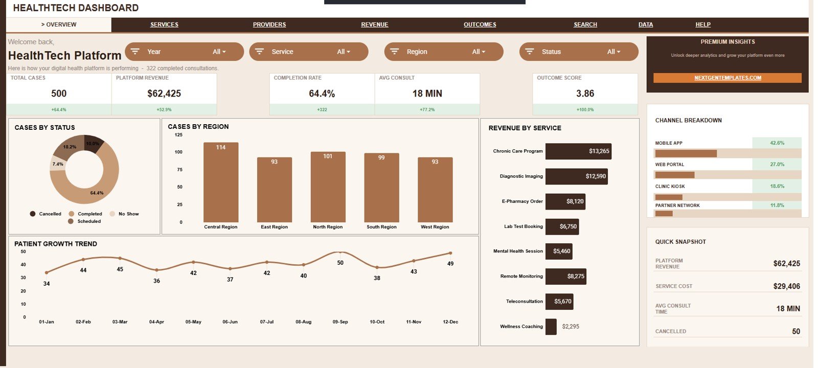
The Overview Page is the main command center for the dashboard. It gives leaders a quick summary of case volume, revenue, completion, consult time, and outcome quality before they move into deeper analysis pages.
Total Cases: This card shows the total number of healthtech case records under the current slicer selection. It helps teams understand overall workload before reviewing service, provider, and regional splits.
Platform Revenue: This card summarizes revenue generated by the selected cases. It gives finance and operations teams an immediate signal of monetization performance.
Completion Rate: This card shows how many cases reached a completed status compared with total cases. It helps teams identify whether cases are moving through the workflow effectively.
Avg Consult: This card shows average consult time for the selected cases. It helps managers monitor consultation workload and service delivery effort.
Outcome Score: This card summarizes the average patient outcome score. It helps teams keep quality and patient impact visible next to volume and revenue.
Cases by Status: This chart splits cases by status so users can see completed, pending, cancelled, or other case states. It helps identify workflow bottlenecks and follow-up queues quickly.
Cases by Region: This chart shows how case volume is distributed across regions. It helps operations teams understand where demand is concentrated and where coverage may need adjustment.
Revenue by Service: This chart compares revenue contribution by healthtech service. It helps teams see which service lines are driving the most income.
Patient Growth by Month: This trend chart shows month-by-month patient or case growth. It helps users spot seasonality, growth momentum, or demand slowdowns.
Channel Breakdown by Channel: This chart shows the share of cases or activity by channel. It helps marketing, operations, and patient access teams understand which channels are contributing most.
2. Services Performance
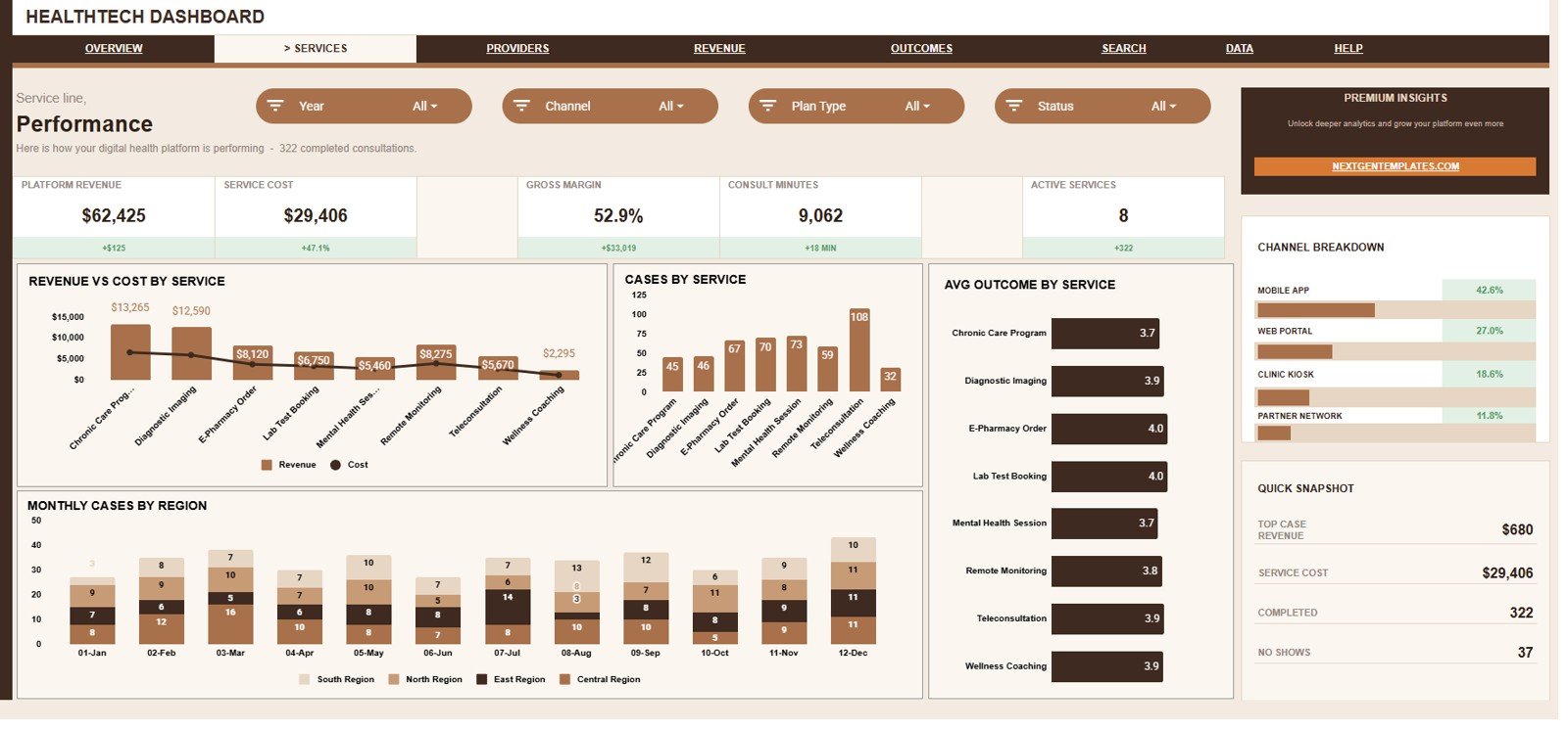
The Services Performance tab is built for service-line review. It helps users compare revenue, cost, case volume, outcomes, monthly regional movement, and channel contribution across services.
Revenue and Cost by Service: This chart compares revenue and service cost side by side for each service. It helps managers see which services create stronger contribution and which may need margin review.
Cases by Service: This chart shows case volume by service line. It helps identify high-demand services and areas where staffing, provider capacity, or marketing may need attention.
Average Outcome by Service: This chart compares patient outcome score by service. It helps quality teams see which service categories are performing well and which may need process improvement.
Monthly Cases by Region: This chart shows regional case volume across months. It helps users understand whether growth is broad-based or concentrated in specific regions.
Channel Breakdown by Channel: This chart shows service-related activity by channel. It helps teams compare acquisition, delivery, or engagement channels from the service performance view.
3. Provider Activity
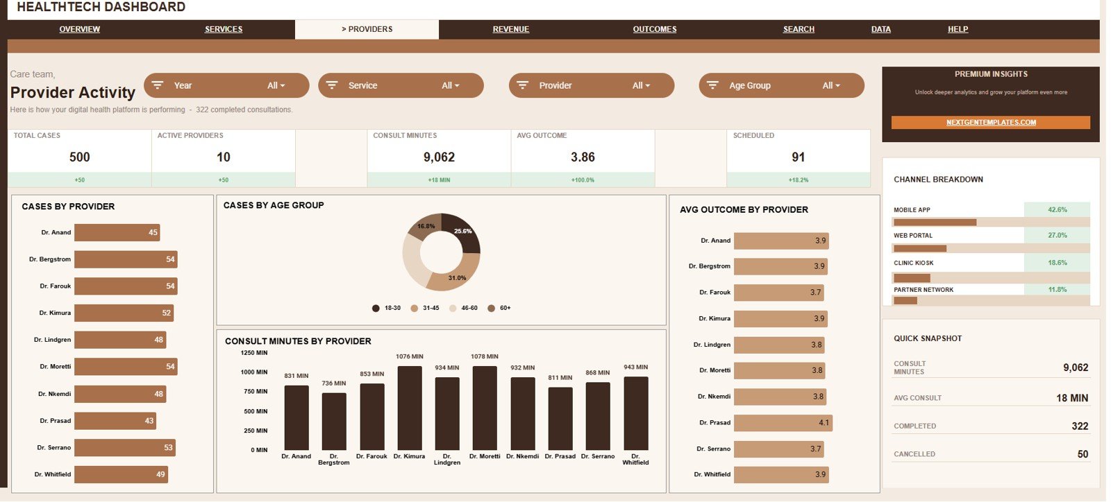
The Provider Activity tab focuses on workload, patient mix, consultation effort, and outcome performance by provider. It is useful for provider success teams, clinical operations managers, and workforce planning.
Cases by Provider: This chart compares how many cases each provider handled. It helps leaders spot workload concentration and provider capacity gaps.
Cases by Age Group: This chart shows how case volume is distributed by age group. It helps teams understand patient mix and tailor service planning by demographic needs.
Consult Minutes by Provider: This chart shows total consult time by provider. It helps managers compare workload intensity, not just case counts.
Average Outcome by Provider: This chart compares provider-level average outcome scores. It supports quality review while giving leaders a starting point for coaching or process learning.
Channel Breakdown by Channel: This chart shows provider activity by channel. It helps users see whether provider workload is tied to specific channels such as app, web, phone, partner, or referral sources.
4. Revenue and Margin
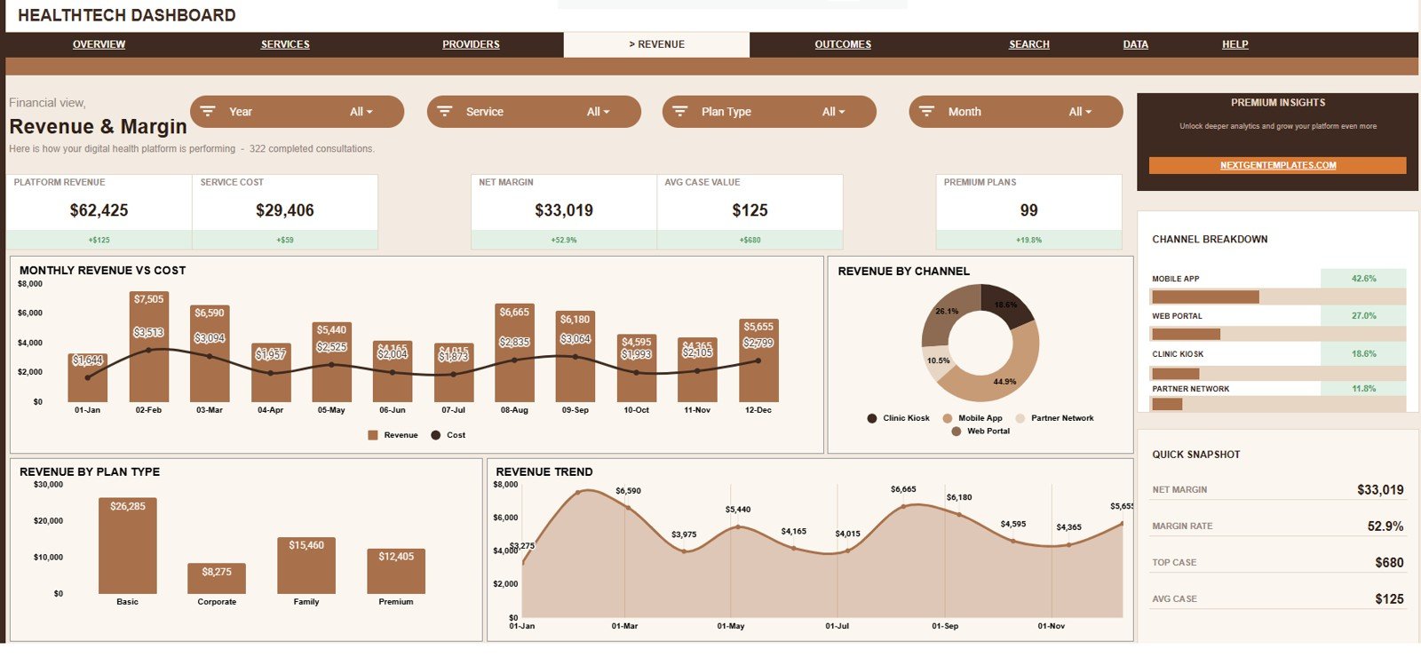
The Revenue and Margin tab gives finance and leadership teams a clearer view of money movement. It compares revenue, service cost, channel contribution, plan type revenue, and revenue trends over time.
Monthly Revenue and Cost by Month: This chart compares revenue and cost by month. It helps teams see whether revenue growth is coming with healthy cost control.
Revenue by Channel: This chart shows revenue contribution by channel. It helps marketing and commercial teams understand which channels are producing the strongest financial results.
Revenue by Plan Type: This chart compares revenue across plan types. It helps teams review subscription, pay-per-use, insurance, enterprise, or other plan categories depending on the dataset.
Revenue Trend by Month: This line or trend view shows revenue movement across months. It helps users spot growth patterns, dips, and seasonal changes without scanning raw rows.
Channel Breakdown by Channel: This chart repeats channel mix from the revenue view. It helps users connect revenue patterns with the channel distribution behind them.
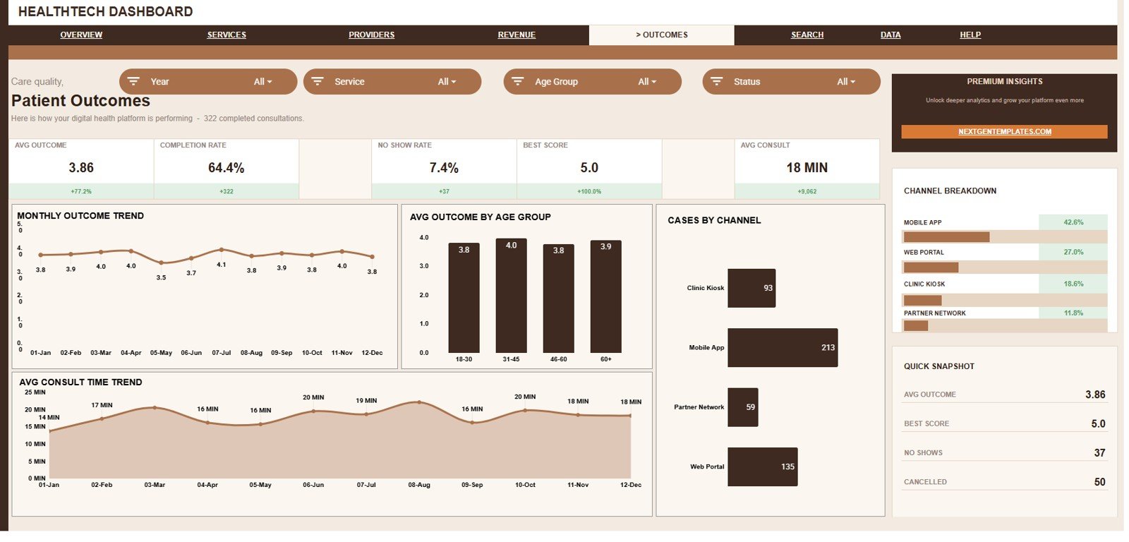
5. Patient Outcomes
The Patient Outcomes tab keeps quality and service impact visible. It helps users review outcome movement, age group outcomes, case channels, consult time, and channel mix from a patient performance angle.
Monthly Outcome by Month: This chart tracks average outcome score over time. It helps teams see whether patient results are improving, declining, or staying flat.
Average Outcome by Age Group: This chart compares outcome score by age group. It helps identify patient segments where the service experience or clinical pathway may need closer review.
Cases by Channel: This chart shows case volume by channel. It helps teams understand how patients are entering or using the platform.
Average Consult Time by Month: This chart tracks consult time movement by month. It helps users see whether case complexity or provider workload is changing over time.
Channel Breakdown by Channel: This chart shows the overall channel mix in the outcome view. It helps connect patient result signals with the channels that generated the cases.
6. Search Sheet Tab
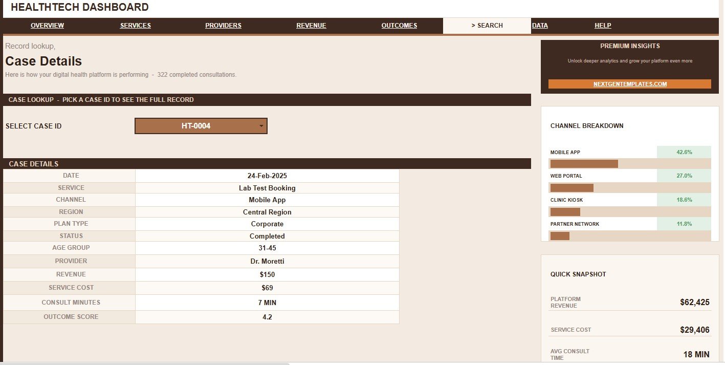
The Search sheet helps users move from summary dashboards to individual case detail. Select a Case ID and the sheet returns the full healthtech case record, including date, service, channel, region, plan type, status, age group, provider, revenue, service cost, consult minutes, and outcome score.
This is especially useful when someone asks why a number changed, why a case is not complete, which provider handled it, how much revenue it generated, or what the recorded outcome score was.
7. Data Sheet Tab
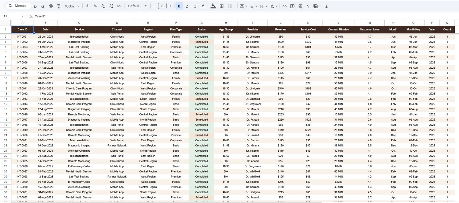
The Data Sheet tab is the source table for the entire dashboard. Users add healthtech case records in the same format so KPI cards, charts, slicers, and the Search sheet continue working correctly.
For best results, keep the column names, date fields, status values, service names, region values, plan type values, provider names, revenue numbers, service cost numbers, consult minutes, and outcome score fields consistent when replacing the sample data.
HealthTech Dashboard in Google Sheets vs. Microsoft Excel vs. Paid Healthcare SaaS – Feature Comparison
| Feature | HealthTech Dashboard in Google Sheets | Microsoft Excel Dashboard | Paid Healthcare SaaS |
|---|---|---|---|
| Cost | $9.99 one-time | Template cost plus Excel access | Monthly or annual subscription |
| Platform | Google Sheets, browser-based | Excel desktop or Excel web | Vendor cloud platform |
| Setup time | Create a copy and replace sample records | Open workbook, replace records, refresh | Implementation, onboarding, and configuration |
| Real-time team collaboration | Yes, through Google Drive sharing | Limited unless using OneDrive or SharePoint | Usually included by plan |
| Mobile access | Google Sheets app or browser | Excel app or browser | Vendor app or browser |
| Customizable fields | Editable sheet structure, formulas, and charts | Editable workbook structure | Often limited by admin settings |
| Share with link | Yes, through Google permissions | Yes, with Microsoft permissions | Usually login controlled |
| Year-1 cost at 5 users | $9.99 plus any Google Workspace cost | Template plus licensing | Often hundreds or thousands of dollars |
| Healthtech case lookup | Included with Case ID search sheet | Possible with formulas or VBA | Depends on reporting module |
| Best fit | Fast internal analytics and shareable spreadsheet reporting | Offline or Microsoft-centered reporting | System-of-record workflow management |
Who Should Use This Template
- Healthtech founders who need a clear view of case volume, revenue, completion, and outcomes.
- Telehealth operations managers reviewing provider workload, consult time, and channel demand.
- Healthcare finance analysts comparing revenue, service cost, plan type, and margin trends.
- Provider success teams monitoring cases by provider, consult minutes, and outcome score.
- Healthcare consultants preparing a quick reporting layer for client presentations.
- Small clinic or digital health teams that want Google Sheets collaboration without a large SaaS rollout.
Real-World Use Cases
Maya, a healthtech operations manager, opens the Overview Page every Monday to review total cases, completion rate, average consult time, and provider workload. She then moves to Provider Activity to see whether one provider is overloaded or whether a specific age group is creating higher demand.
Daniel, a finance analyst, uses the Revenue and Margin tab to compare revenue, service cost, plan type, and channel performance. When revenue increases but margin does not, he can quickly see whether service costs or channel mix changed.
Aisha, a patient outcomes lead, reviews the Patient Outcomes tab to check outcome score by month and age group. She uses the Search sheet to inspect specific cases before preparing improvement notes for the clinical operations team.
Advantages of HealthTech Dashboard in Google Sheets
- It is easy to share with authorized team members through Google Drive.
- The dashboard keeps case, revenue, provider, service, channel, and outcome views in one file.
- Slicers make dashboard review faster during live meetings.
- The Search sheet supports quick record-level validation without scanning raw rows.
- The Data Sheet structure makes the template easy to reuse month after month.
- It avoids monthly dashboard software costs for teams that only need spreadsheet-based reporting.
Opportunities for Improvement
This template is intentionally spreadsheet-based, so it does not automatically connect to an EHR, EMR, billing platform, CRM, claims tool, telehealth platform, or data warehouse. Teams that need live data sync can still use this dashboard, but they may need an import workflow, API integration, or scheduled export process.
It is also not a compliance product by itself. Health information rules depend on your country, your Google Workspace configuration, permissions, retention policy, access controls, and internal procedures. Use approved, de-identified, or properly governed data when testing and sharing the file.
Best Practices
- Keep the Data Sheet column structure unchanged unless you also update formulas, charts, slicers, and lookup fields.
- Use consistent status names, service names, channel names, provider names, plan types, and region labels.
- Validate revenue, service cost, consult minutes, and outcome score fields before reviewing the dashboard.
- Protect formula and dashboard ranges so casual users only edit the data entry area.
- Share the Google Sheet only with approved users and review Google support guidance for sharing files from Google Docs Editors.
- Create a backup copy before making structural changes to charts, formulas, slicers, or search logic.
- Use the Search sheet to investigate outliers before making management decisions from summary charts.
Explore Relevant Templates
- HealthTech Dashboard in Google Sheets
- Healthcare Management Dashboard in Google Sheets
- Healthcare Services Dashboard in Google Sheets
- Telehealth Dashboard in Google Sheets
- Blood Bank Management System Tracker in Google Sheets
- Browse Google Sheets Dashboard Templates
Interested in building reports like this yourself? The Excel Pivot Tables & Dashboards course on NextGenTemplates Academy covers the techniques with practice files.
Frequently Asked Questions
What does the HealthTech Dashboard in Google Sheets track?
It tracks cases, status, region, service, channel, plan type, provider, age group, revenue, service cost, consult minutes, completion rate, and outcome score.
How many pages are included?
The dashboard includes 7 tabs: Overview, Services Performance, Provider Activity, Revenue and Margin, Patient Outcomes, Search, and Data Sheet.
Can I replace the sample data?
Yes. Replace the sample rows in the Data Sheet tab while keeping the same column format so the dashboard pages continue updating correctly.
Does the template include a lookup page?
Yes. The Search sheet lets users select a Case ID and view the full case record, including date, service, channel, region, plan type, status, age group, provider, revenue, service cost, consult minutes, and outcome score.
Can I share the dashboard with my team?
Yes. Since it is built in Google Sheets, you can share the copied file through Google Drive permissions. Follow your organization’s rules for protected or sensitive healthcare data.
Is this an EHR or patient record system?
No. This is a reporting dashboard template. It is not an EHR, EMR, billing system, claims platform, patient portal, or clinical decision support tool.
Does it work on mobile?
The file can be opened in the Google Sheets mobile app or a browser, although detailed dashboard review is usually easier on a desktop or laptop screen.
About the Author
Built by PK – Microsoft Certified Professional with 15+ years of Excel, Google Sheets, and Power BI experience. Founder of NextGenTemplates, reaching 300K+ subscribers across YouTube channels. Every template is hand-built and tested before release.
Conclusion
The HealthTech Dashboard in Google Sheets gives teams a practical way to review cases, revenue, consult time, service performance, provider activity, patient outcomes, channels, regions, plans, search records, and raw data in one editable workbook. It is best for teams that want a fast spreadsheet reporting layer rather than a long software implementation.