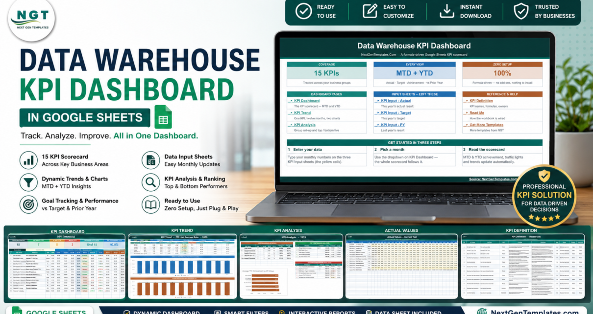
The Data Warehouse KPI Dashboard in Google Sheets tracks 15 data platform KPIs across 5 KPI groups and 10 linked tabs. Every KPI shows month-to-date and year-to-date actual, target, achievement percentage, traffic-light status and a prior-year comparison — on a single row, driven by a single month dropdown. Setup takes under 10 minutes.Data Warehouse KPI Dashboard in Google Sheets
Most data teams already know their numbers. What they lack is one page where pipeline reliability, freshness, quality and cost sit next to each other, month after month, in a format a non-engineer can read in thirty seconds. Buying a data observability platform to get that page costs four figures a month. This Data Warehouse KPI Dashboard in Google Sheets is the cheap, boring, defensible alternative: you type your monthly numbers, and it does the scoring, the ranking and the colour-coding for you.Data Warehouse KPI Dashboard in Google Sheets
Get the Data Warehouse KPI Dashboard in Google Sheets
One clarification before we go further, because the name is ambiguous: this template covers a data warehouse — the cloud analytics platform your ETL jobs load into — not a physical distribution warehouse. If you came looking for pallets and pick rates, the Warehouse Management KPI Scorecard in Google Sheets is the one you want.Data Warehouse KPI Dashboard in Google Sheets
Key Features of the Data Warehouse KPI Dashboard in Google Sheets
The template ships 15 KPIs in five groups. Data Pipeline holds ETL Job Success Rate, Average ETL Run Time, Failed Load Count and Pipeline SLA Adherence. Availability & Performance holds Warehouse Uptime, Average Query Response Time and Data Freshness Lag. Data Quality & Governance holds Data Quality Score, Schema Change Incidents, Data Reconciliation Pass Rate and Data Lineage Coverage. Cost Efficiency holds Storage Cost per TB and Cost per 1,000 Queries. Capacity & Volume holds Storage Utilisation and Records Loaded.Data Warehouse KPI Dashboard in Google Sheets
- One control for the whole workbook. The Select Month dropdown on the KPI Dashboard is the only input. Change it and the MTD block, the YTD block, the status colours, the group roll-up and the top and bottom five lists all recalculate at once.
- Upper-the-better and lower-the-better both scored correctly. Each KPI carries a UTB or LTB flag. Achievement is actual ÷ target for UTB, target ÷ actual for LTB — so beating a run-time, cost or failure-count target scores above 100%, not below it.
- Traffic lights you can re-tune. On Target from 100%, At Risk 95–99%, Missed below 95%. The thresholds live in ordinary formulas on the KPI Dashboard sheet, so a team on a tighter SLA changes them once.Data Warehouse KPI Dashboard in Google Sheets
- The KPI list is data, not code. Add, rename or delete a row on the KPI Definition sheet and every other sheet follows it automatically. There is no formula to edit anywhere else in the workbook.Data Warehouse KPI Dashboard in Google Sheets
- Governance metadata on every metric. Formula, plain-English definition, owner role, priority and reporting frequency are stored per KPI, so a number in a review always has an owner and a definition attached.Data Warehouse KPI Dashboard in Google Sheets
- Entirely formula-driven. No add-ons, no Apps Script, no permissions dialog to approve, and nothing that breaks when Google changes an API.
Dashboard Pages Explanation
Welcome / Home
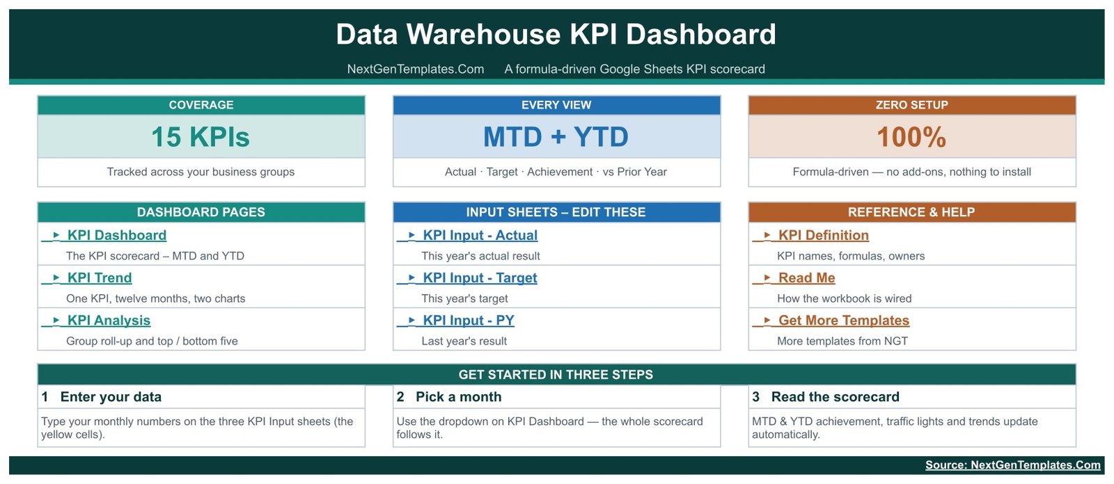
The launch page. Three link cards split the workbook into the Dashboard pages you read (KPI Dashboard, KPI Trend, KPI Analysis), the Input sheets you edit (KPI Input – Actual, KPI Input – Target, KPI Input – PY) and the Reference & Help sheets (KPI Definition, Read Me, Get More Templates). A Get Started in Three Steps strip sums the workflow up: enter your data, pick a month, read the scorecard.Data Warehouse KPI Dashboard in Google Sheets
KPI Dashboard — the scorecard
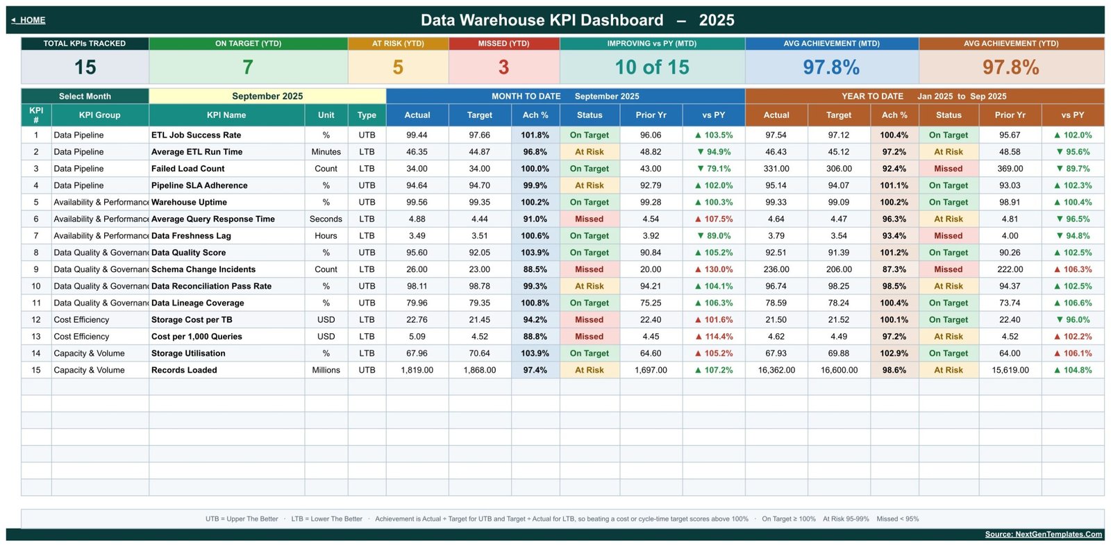
The page you will screenshot for your monthly review. Seven header cards summarise Total KPIs Tracked, On Target (YTD), At Risk (YTD), Missed (YTD), Improving vs PY (MTD), Avg Achievement (MTD) and Avg Achievement (YTD). Below them, all 15 KPIs appear in one table with Month To Date and Year To Date blocks side by side, each carrying actual, target, achievement %, status, prior year and vs PY. In the sample data for September 2025, that reads 7 On Target, 5 At Risk, 3 Missed and 97.8% average achievement.
KPI Trend — one KPI, twelve months
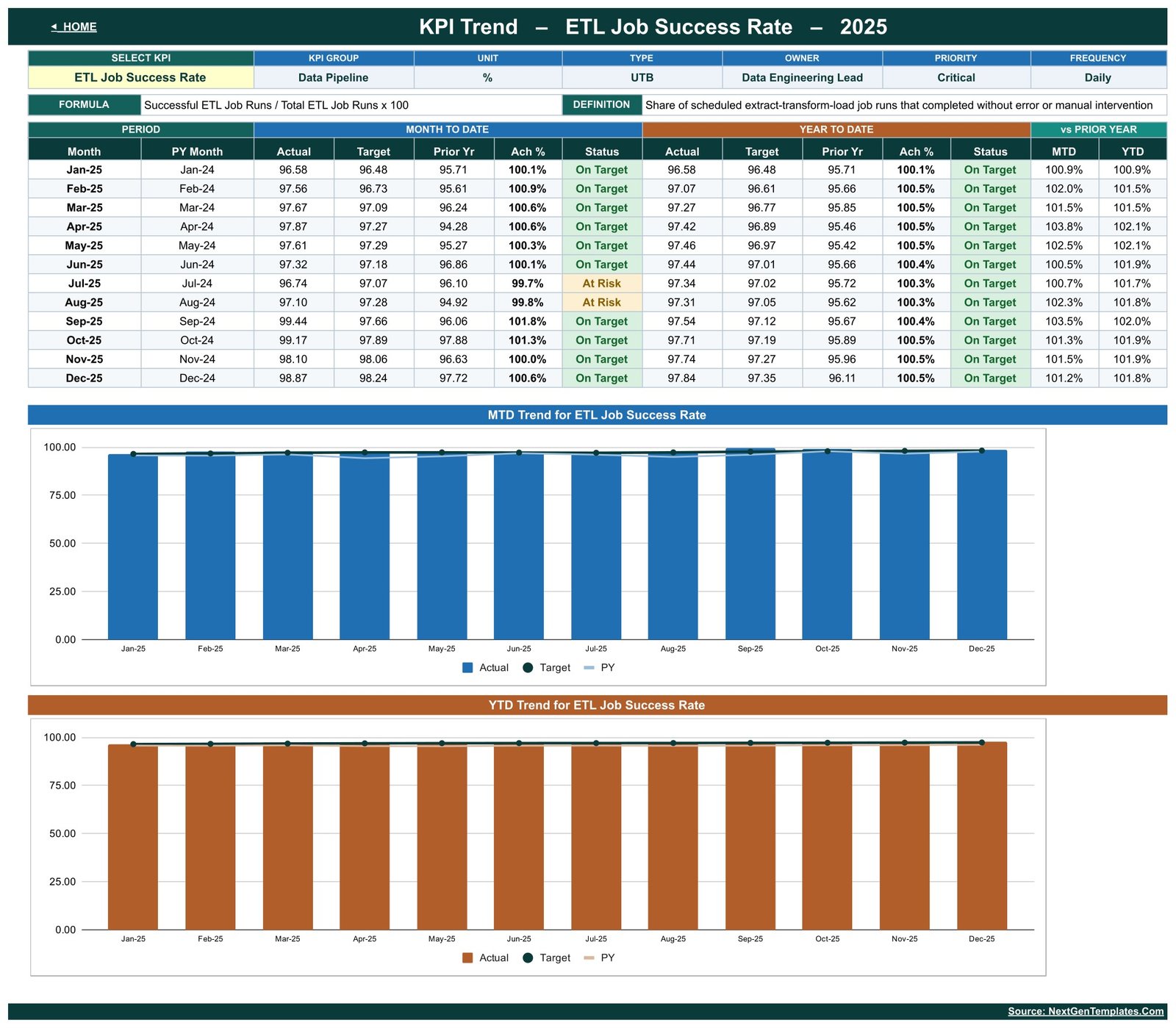
Choose any KPI from the dropdown and the page rebuilds around it. A header strip repeats its group, unit, type, owner, priority, frequency, formula and definition. A twelve-month table then lists MTD and YTD actual, target, prior year, achievement and status for each month, followed by two charts: MTD Actual vs Target vs Prior Year by Month and YTD Actual vs Target vs Prior Year by Month.
KPI Analysis — group roll-up and rankings
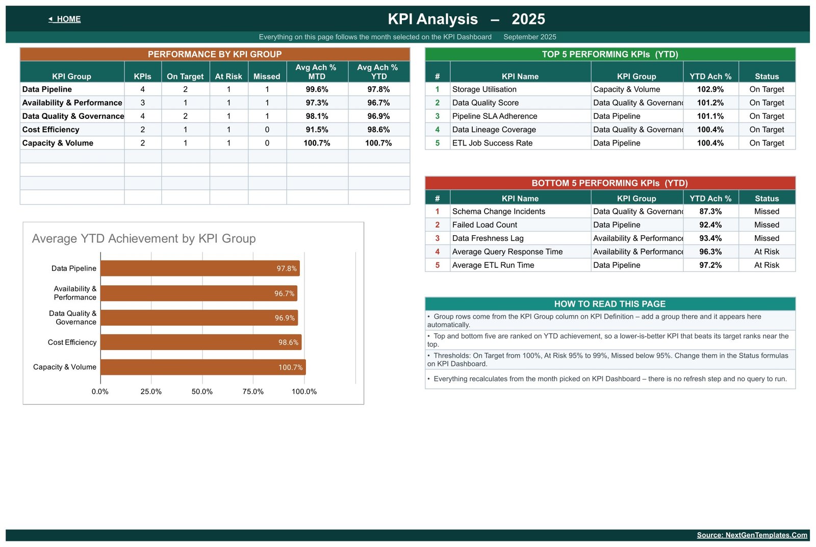
A Performance by KPI Group table counts KPIs, On Target, At Risk and Missed per group with average MTD and YTD achievement, next to an Average YTD Achievement by KPI Group chart. Two ranked tables show the Top 5 and Bottom 5 Performing KPIs on YTD achievement, and a How to Read This Page panel spells out the thresholds and the LTB ranking behaviour.
Actual Values — the input sheet
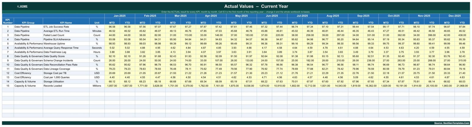
This is where you actually work. Every KPI gets a row, every month of the reporting year gets an MTD and a YTD column, and the editable cells are shaded yellow. The reporting year is set by one cell, so changing it re-bases the whole workbook. Two identical sheets, KPI Input – Target and KPI Input – PY, hold this year’s targets and last year’s results.
KPI Definition — the master list
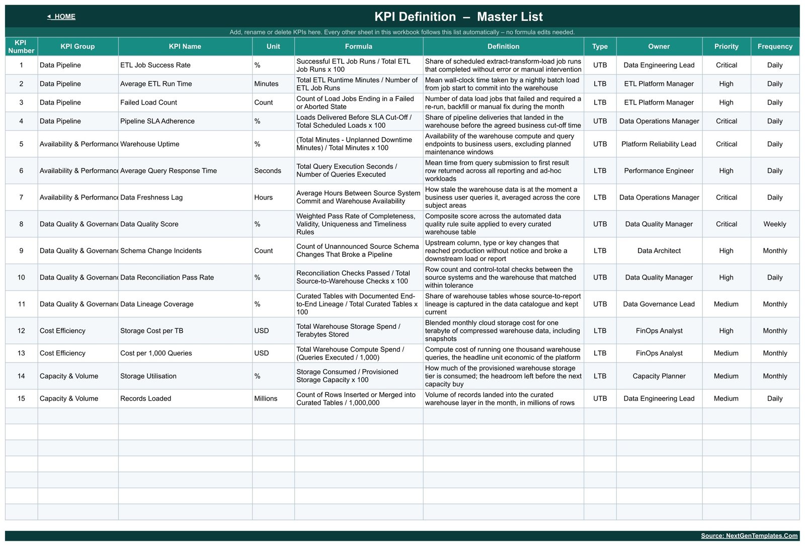
The control sheet. Each row holds KPI number, group, name, unit, calculation formula, definition, UTB/LTB type, owner, priority and frequency. It doubles as your data dictionary: when someone asks in a review what Data Lineage Coverage means, the answer is on this sheet, not in a Confluence page nobody updated.
Data Warehouse KPI Dashboard vs. an Excel Scorecard vs. Paid Data Observability SaaS — Feature Comparison
| Feature | Data Warehouse KPI Dashboard in Google Sheets | Microsoft Excel scorecard | Monte Carlo / Datadog / Looker |
|---|---|---|---|
| Cost | $8.99 one-time ✔ | $10–25 one-time + Microsoft 365 | $1,000–10,000+ / month |
| Platform | Google Sheets, browser only ✔ | Desktop Excel | Vendor cloud |
| Setup time | Under 10 minutes ✔ | 15–30 minutes | Weeks (connectors, agents, SSO) |
| Real-time team collaboration | Yes, native multi-editor ✔ | Only via OneDrive co-authoring | Yes ✔ |
| Mobile access | Yes, Sheets app ✔ | Limited | Yes ✔ |
| Add your own KPIs | Type a row, no formula edits ✔ | Usually needs formula edits | Config change or vendor ticket |
| Auto-connects to your warehouse | No — monthly manual entry | No | Yes ✔ |
| Share with a link | Yes ✔ | File attachment | Paid seat required |
| Year-1 cost at 5 users | $8.99 total ✔ | $10–25 + licences | $12,000–120,000 |
For data teams that want a defensible monthly KPI review without a six-figure observability contract, the Data Warehouse KPI Dashboard in Google Sheets sits in the sweet spot.
Who Should Use This Template
Perfect for:
- Data engineering and analytics leads at 10–500 person companies who report platform health monthlyData Warehouse KPI Dashboard
- Data platform, BI and FinOps managers who need reliability, freshness, quality and cost on one pageData Warehouse KPI Dashboard
- Analytics consultancies presenting warehouse performance to clients on a fixed monthly cadence
- Teams standing up a first data scorecard before they can justify an observability budget
Not a fit if:
- You need metrics pulled live and automatically from Snowflake, BigQuery or Redshift — this is filled in by hand each month
- You need real-time alerting or on-call paging when a pipeline fails
- You need row-level anomaly detection or automated column-level lineage capture — this reports the score, it does not compute it
Real-World Use Cases
Priya leads data engineering at a 120-person SaaS company. On the first working day of each month she updates the three input sheets, picks the new month and screenshots the KPI Dashboard for her platform review. Because ETL Job Success Rate, Pipeline SLA Adherence and Data Freshness Lag sit next to each other with prior-year columns, she presents a reliability trend rather than defending a single bad month.
Marcus runs FinOps for a retail analytics group. His two numbers are Storage Cost per TB and Cost per 1,000 Queries. He uses the KPI Trend page to put a twelve-month unit-cost curve next to its target line in front of finance, without exporting anything from the billing console into a slide deck.
An analytics consultancy reports to six clients. Each client gets its own copy of the workbook with its own KPI Definition list. The Top 5 and Bottom 5 tables on KPI Analysis give every monthly report the same two-minute opening summary, whatever metric set that client happens to use.
Advantages of the Data Warehouse KPI Dashboard in Google Sheets
The cost case is the obvious one: $8.99 once against $1,000+ a month for a platform whose reporting layer you would mostly be paying for. But the operational advantages matter more day to day.
First, it forces definitions. You cannot enter a Data Quality Score without the KPI Definition sheet stating what it is and who owns it, which kills the usual argument about whose number is right. Second, it is portable — a plain Google Sheet opens on a phone, in a client’s browser and in a board pack, with no seat to provision. Third, MTD and YTD sit side by side, so a month that looks bad in isolation is immediately visible as either a blip or a trend. Fourth, because everything is formulas, you can audit any cell; nothing is hidden inside a script or a refresh job.
Opportunities for Improvement
Two honest limitations. The template is a reporting layer, not a collection layer — somebody has to gather the monthly numbers from your orchestrator, warehouse console and billing export and type them in. For most teams that is a fifteen-minute job, but it is a job. And it is monthly by design: there is no daily or weekly grain, so it will not replace an operational monitoring dashboard.
One cosmetic note on the shipped build, disclosed rather than hidden: the KPI Group column is narrower than the two longest group names, so Availability & Performance and Data Quality & Governance render clipped on the KPI Dashboard, Actual Values, KPI Definition and the Top/Bottom Five tables. Nothing is calculated wrongly — the full text is in the cell. Widening that one column after you make your copy fixes it in about five seconds.
Best Practices
- Set your targets for the whole year up front on KPI Input – Target. Retro-fitting a target after a bad month is how scorecards lose credibility.
- Trim the KPI list before you start. Fifteen metrics is a lot for a first review; eight that people actually act on beats fifteen nobody reads.
- Fill the owner column properly. A KPI with no named owner never improves.
- Check the UTB/LTB flag on every metric you add. It is the one field that silently inverts your traffic lights if you get it wrong.
- Keep one workbook per reporting year, and archive the previous one rather than overwriting it — the prior-year columns are only as good as the file you kept.
- Share view-only with your wider audience and edit-only with the person who owns data entry. Google’s sharing and permissions documentation covers the options.
Explore Relevant Templates
- Web Development KPI Dashboard in Google Sheets — the closest sibling on the same scorecard line, aimed at delivery and site-performance metrics.
- Operational Efficiency KPI Dashboard in Google Sheets — the same month-picker scorecard applied to process and throughput metrics.
- Google Analytics KPI Dashboard in Google Sheets — the same framework for web analytics reporting.
- Cloud Computing Dashboard in Google Sheets — the analytical, chart-led counterpart if you want to slice a dataset rather than score a month.
- Browse the full range of Google Sheets templates on NextGenTemplates.Data Warehouse KPI Dashboard
If you want to get better at building scorecards like this, the Excel Pivot Tables & Dashboards course on NextGenTemplates Academy takes you through the reporting skills step by step, with practice files.
Get the Data Warehouse KPI Dashboard in Google Sheets
Frequently Asked Questions
Which KPIs does the Data Warehouse KPI Dashboard track?
The Data Warehouse KPI Dashboard in Google Sheets ships 15 KPIs in five groups: Data Pipeline, Availability & Performance, Data Quality & Governance, Cost Efficiency and Capacity & Volume. Examples include ETL Job Success Rate, Pipeline SLA Adherence, Warehouse Uptime, Data Quality Score, Data Lineage Coverage and Storage Cost per TB.
Does it connect directly to Snowflake, BigQuery or Redshift?
No. The Data Warehouse KPI Dashboard in Google Sheets is a manual monthly scorecard — you type your figures onto the three KPI Input sheets and every calculation follows. It is not affiliated with any warehouse vendor, needs no API keys, and asks for no add-on permissions.Data Warehouse KPI Dashboard
Can I add or remove KPIs?
Yes. The KPI Definition sheet is the master list for the entire workbook. Add a row, rename a metric or delete one you do not track, and the KPI Dashboard, KPI Trend and KPI Analysis pages all follow automatically. No formula editing is needed anywhere in the Data Warehouse KPI Dashboard.
How does it handle metrics where lower is better?
Every KPI carries a UTB or LTB flag. For lower-the-better metrics such as Average ETL Run Time, Failed Load Count and Cost per 1,000 Queries, achievement is target ÷ actual, so beating the target correctly scores above 100% and shows green instead of red.Data Warehouse KPI Dashboard
How long does setup take?
Under 10 minutes for the shipped 15 KPIs. Make your own copy, set the reporting year, then type or paste your monthly actuals, targets and prior-year figures into the yellow cells on the three input sheets. Pick a month on the KPI Dashboard and the scorecard is complete.
How does this compare to a paid data observability platform?
Tools like Monte Carlo and Datadog compute metrics automatically and alert in real time, from roughly $1,000 a month. The Data Warehouse KPI Dashboard in Google Sheets costs $8.99 once and reports metrics you already collect — it is a management scorecard, not a monitoring agent, and the two solve different problems.Data Warehouse KPI Dashboard
Is this the same as your analytical Google Sheets dashboards?
No. This is the KPI scorecard line: a month picker, traffic lights, a KPI Trend page and a KPI Analysis page. The analytical Google Sheets dashboards are chart-led and slice a transaction dataset instead. Many teams buy one of each — the scorecard for the monthly review, the analytical dashboard for exploration.Data Warehouse KPI Dashboard
About the Author
Built by PK — Microsoft Certified Professional with 15+ years of Excel, Google Sheets and Power BI experience. Founder of NextGenTemplates, reaching 300K+ subscribers across YouTube channels. Every template is hand-built and tested before release.Data Warehouse KPI Dashboard
Conclusion
A data platform without a monthly scorecard tends to get judged on its last outage. The Data Warehouse KPI Dashboard in Google Sheets gives you the opposite: 15 defined metrics with owners, twelve months of context, and a colour on every row that a CFO can read as fast as a data engineer can. It will not replace your monitoring stack, and it is not trying to — it replaces the slide deck you rebuild by hand every month.
Instant download · One-time payment · No subscription · Lifetime access
Last updated: August 2026