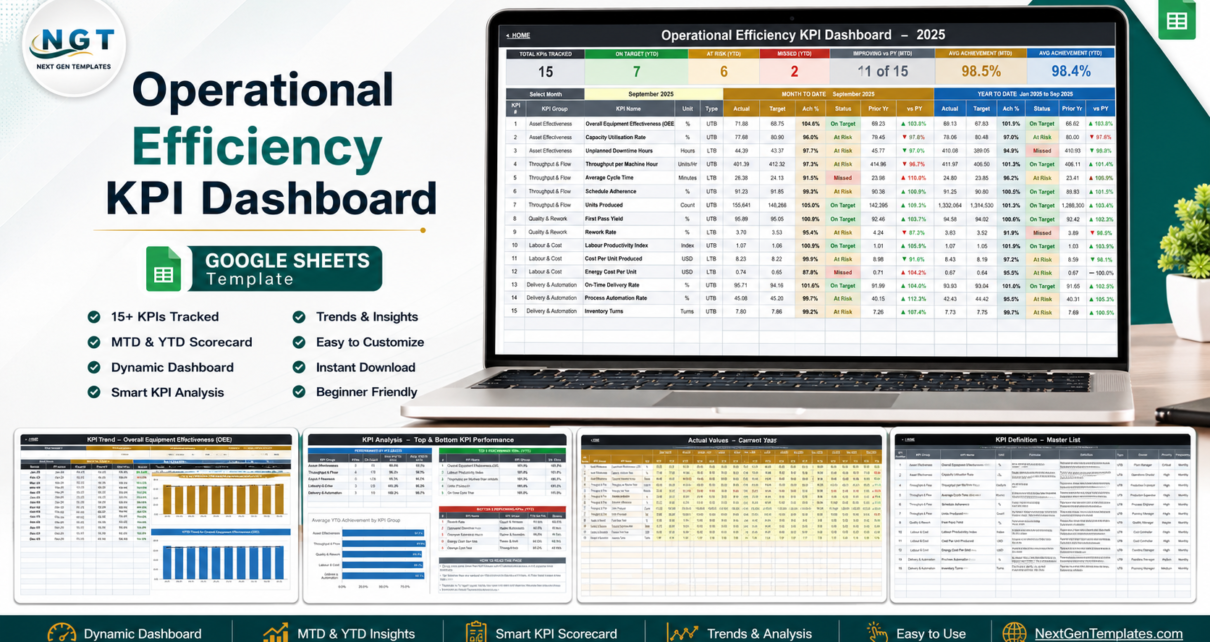
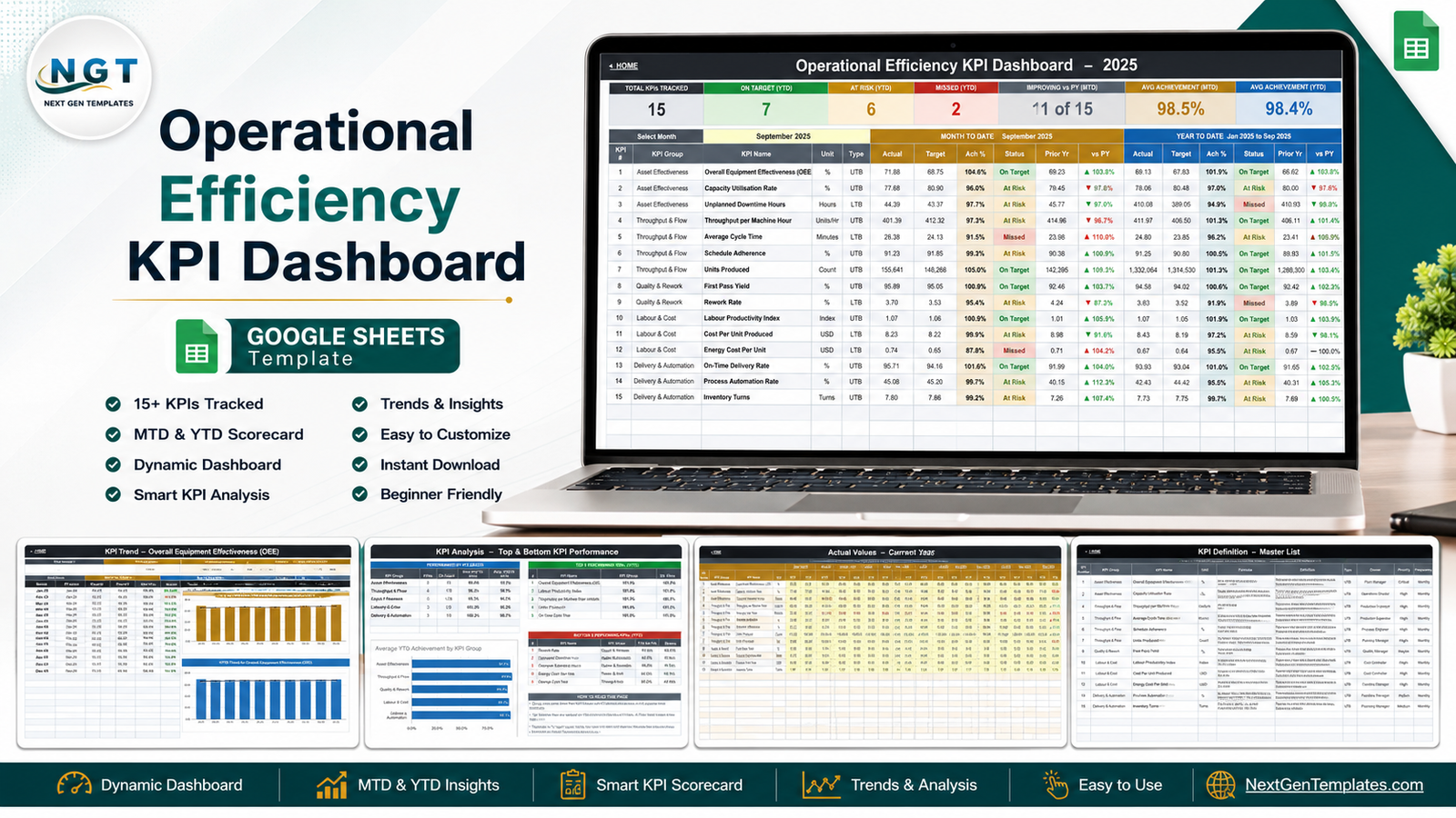
Most operations teams do not lose their monthly review to a lack of data. They lose it to four spreadsheets that disagree. The Operational Efficiency KPI Dashboard in Google Sheets replaces that pile with one formula-driven scorecard: 15 KPIs across 5 KPI groups, each showing month-to-date and year-to-date actual, target, achievement percentage, traffic-light status and a prior-year comparison, all driven by a single month dropdown. Ten tabs, zero add-ons, zero Apps Script, and no refresh button anywhere.
One thing to settle before anything else, because the name collides badly with a neighbouring product family. This is a KPI scorecard: a fixed KPI list, a month picker, targets, thresholds and trends. It is not an analytical operations dashboard, the kind that slices transactions by region, customer and product using pivot tables and slicers. NextGenTemplates publishes both. If the analytical style is what you actually want, the Transportation Operations Dashboard in Google Sheets is that shape. The two are complements, not duplicates: the scorecard tells you what moved, the analytical dashboard helps you find out why.Operational Efficiency KPI Dashboard in Google Sheets
Key Features of the Operational Efficiency KPI Dashboard in Google Sheets
- 15 KPIs in 5 groups. Asset Effectiveness (3), Throughput & Flow (4), Quality & Rework (2), Labour & Cost (3), Delivery & Automation (3).
- A single month dropdown that re-bases the scorecard, the trend page and the analysis page at once.Operational Efficiency KPI Dashboard in Google Sheets
- Seven summary cards across the top: Total KPIs Tracked, On Target (YTD), At Risk (YTD), Missed (YTD), Improving vs PY (MTD), Avg Achievement (MTD), Avg Achievement (YTD).Operational Efficiency KPI Dashboard in Google Sheets
- MTD and YTD side by side on every KPI row, each block carrying Actual, Target, Ach %, Status, Prior Yr and vs PY.Operational Efficiency KPI Dashboard in Google Sheets
- Direction-aware scoring. Each KPI is typed UTB (upper the better) or LTB (lower the better), so beating a cost or cycle-time target scores above 100% rather than below it.
- Editable thresholds in plain formulas: On Target from 100%, At Risk 95% to 99%, Missed below 95%.Operational Efficiency KPI Dashboard in Google Sheets
- Three simple input grids – Actual, Target and Prior Year – with yellow entry cells and one month column pair each.Operational Efficiency KPI Dashboard in Google Sheets
- A KPI master list that every other sheet reads, so renaming or removing a KPI needs no formula surgery.Operational Efficiency KPI Dashboard in Google Sheets
Dashboard Pages Explanation Operational Efficiency KPI Dashboard in Google Sheets
Home
A plain navigation page. Three coverage cards state the scope – 15 KPIs, MTD + YTD, 100% formula-driven – then three link blocks point to the dashboard pages, the input sheets and the reference sheets. A “Get started in three steps” strip closes it: enter your data, pick a month, read the scorecard.Operational Efficiency KPI Dashboard in Google Sheets
KPI Dashboard
The scorecard. Fifteen rows: Overall Equipment Effectiveness (OEE), Capacity Utilisation Rate, Unplanned Downtime Hours, Throughput per Machine Hour, Average Cycle Time, Schedule Adherence, Units Produced, First Pass Yield, Rework Rate, Labour Productivity Index, Cost Per Unit Produced, Energy Cost Per Unit, On-Time Delivery Rate, Process Automation Rate and Inventory Turns. In the sample month, OEE runs 104.6% of target for the month while Average Cycle Time misses – and both facts sit in the same eye-line, which is the entire point of a scorecard.
KPI Trend
A single-KPI deep dive driven by its own dropdown. The header echoes that KPI’s group, unit, type, owner, priority, frequency, formula and definition, then a twelve-month table runs January to December with MTD and YTD blocks plus a vs Prior Year pair. Two charts sit underneath – MTD Trend for Overall Equipment Effectiveness (OEE) and YTD Trend for Overall Equipment Effectiveness (OEE) – each plotting actual bars against a target marker line and a prior-year line, so a run of small misses is visible before it becomes a quarter-long problem.
KPI Analysis
Three blocks, all following the month you picked on the scorecard. Performance by KPI Group counts On Target, At Risk and Missed per group and averages MTD and YTD achievement. Top 5 and Bottom 5 Performing KPIs rank every KPI on YTD achievement. An Average YTD Achievement by KPI Group bar chart puts the five groups side by side. A short “How to read this page” panel explains that the ranking is achievement-based, so a lower-is-better KPI that beats its target ranks near the top.
KPI Input – Actual, Target and PY
Three identical grids, one row per KPI and a month column pair (MTD and YTD) across the year. Cell E3 on the Actual sheet sets the first month of the reporting year, so a single edit re-bases the whole workbook onto a April-March or July-June fiscal calendar.
KPI Definition
The master list, and the sheet that makes the rest of the workbook editable: KPI number, group, name, unit, formula, plain-English definition, UTB/LTB type, owner, priority and frequency. OEE, for example, is recorded as Availability x Performance x Quality x 100, owned by the Plant Manager, Critical priority, monthly frequency.Operational Efficiency KPI Dashboard in Google Sheets
Operational Efficiency KPI Dashboard vs. Excel vs. Paid Ops Analytics SaaS – Feature Comparison
| Point of comparison | This Google Sheets scorecard | Excel KPI workbook | Paid ops analytics SaaS |
|---|---|---|---|
| Cost | One-time purchase | One-time file, plus a Microsoft 365 licence per user | Recurring subscription that scales with users and connectors |
| Platform | Google Sheets in any browser | Desktop Excel for the full experience | Vendor web app |
| Setup time | Copy the sheet, paste your monthly numbers | Download, open, paste your numbers | Connect sources, model metrics, build views |
| Real-time team collaboration | Native multi-user editing | Via OneDrive co-authoring | Yes |
| Mobile access | Google Sheets mobile app | Excel mobile app, limited | Yes |
| Customisable KPI list | Fully – edit the KPI Definition sheet | Fully | Limited to the vendor’s metric model |
| Share with a link | Standard Google Drive sharing | Attachment or cloud link | Seat-based sharing |
| Year-1 cost at 5 users | The template price, once | Five Microsoft 365 licences | Annual subscription, renewed every year |
| MTD and YTD in one view | Side by side on every KPI row | Depends on the workbook | Usually a date-range switch, not both at once |
| Lower-the-better scoring | Built in per KPI | Depends on the workbook | Configurable |
Who Should Use This Template
Plant managers, operations directors, production supervisors, planning managers and continuous-improvement leads running a fixed monthly KPI set. It suits factories, fulfilment centres, workshops and service-operations teams of roughly 5 to 200 people – large enough that the numbers matter, small enough that a BI platform is overkill.Operational Efficiency KPI Dashboard in Google Sheets
It is a poor fit if you need machine-level or shift-level data. This is a monthly scorecard you type numbers into, not an MES, a SCADA feed or an IoT pipeline. It is also the wrong tool if your question is “which product line and which customer drove the variance” – that is dimensional analysis, and the analytical dashboard family handles it.Operational Efficiency KPI Dashboard in Google Sheets
Real-World Use Cases
A components factory tightening its monthly review. The plant manager enters fifteen numbers, picks the month, and arrives at the review with a single page: OEE beating target, Average Cycle Time missed, Energy Cost Per Unit missed. The meeting starts at the discussion instead of at a reconciliation argument.
A fulfilment centre choosing improvement projects. The continuous-improvement lead uses the Bottom 5 Performing KPIs table to pick the quarter’s two projects, then uses the KPI Trend page three months later to show whether the line actually moved – against target and against last year.
A multi-site operations director. One copy of the sheet per site, each shared with its site lead through a Drive link. At month end he compares the Avg Achievement (YTD) card across three tabs open side by side, and drills into whichever site slipped.
Advantages of the Operational Efficiency KPI Dashboard
- Nothing to install or authorise. Native Google Sheets formulas and charts only – no add-on marketplace, no OAuth prompt, no script permissions. Google’s own Sheets documentation covers everything you would ever need to modify it.
- Both time frames at once. A monthly number without its YTD context invites cherry-picking; showing both removes the argument.
- Honest scoring on cost KPIs. Because LTB metrics invert the achievement formula, a plant that cut Cost Per Unit below target is not punished by a naive Actual/Target ratio.
- Genuinely re-brandable. The KPI Definition sheet is the source of truth, so switching from manufacturing KPIs to service-desk or logistics KPIs is a data-entry job, not a rebuild.
- Fiscal-calendar friendly. One cell sets the first month of the year.
Opportunities for Improvement
Two honest notes. First, at the shipped column widths a few long values display truncated – the KPI name “Overall Equipment Effectiveness (OEE)” on the scorecard and the owner “Continuous Improvement Lead” on the KPI Definition sheet. The stored values are complete; dragging the column edge reveals them. Second, the workbook is monthly by design. Teams that review weekly or by shift will need to aggregate before entry, or keep a daily capture sheet feeding it. Adding a fourth input grid for a second prior year, or a variance-commentary column beside each KPI, are both easy extensions once the sheet is yours.
Best Practices
- Fix the KPI list before the first entry. Edit the KPI Definition sheet first, and only then start typing numbers – renaming later is fine, restructuring mid-year is not.
- Name an owner per KPI and keep the column filled. A scorecard with no owners produces discussion; a scorecard with owners produces action.
- Set targets once a year and freeze them. Moving a target mid-year to protect a status is the fastest way to make the whole page ignored.
- Give data owners edit access only to the input sheets and everyone else view access – protect the calculated pages.
- Read the KPI Trend page before writing commentary. One red month inside a rising twelve-month trend is a different story from one red month at the end of a decline.
- Keep the Bottom 5 list as your standing action list. Two items per quarter, closed out, beats fifteen items reviewed and forgotten.
Explore Relevant Templates
- Data Warehouse KPI Dashboard in Google Sheets – the same scorecard engine aimed at data-platform KPIs, and a natural companion if IT and operations report together.
- Web Development KPI Dashboard in Google Sheets – the delivery-team cut of the scorecard.
- Blockchain and Cryptocurrency KPI Scorecard in Google Sheets – another scorecard from the same family.
- Google Analytics KPI Dashboard in Google Sheets – the marketing counterpart.
- Warehouse Management KPI Scorecard in Google Sheets – pair it with this one to cover storage and dispatch.
- Coaching Networks Dashboard in Excel – useful if your improvement programme runs through coaches and mentors.
Building KPI scorecards and reports is a skill you can practise: the Excel Pivot Tables & Dashboards course on NextGenTemplates Academy covers the reporting techniques behind scorecards like this one.
Frequently Asked Questions
Is this a scorecard or an analytics dashboard?
A scorecard. Fixed KPIs, a month picker, targets, traffic lights, trend and group analysis. The analytical dashboards are a separate family that slices transaction data by dimension with charts and slicers.Operational Efficiency KPI Dashboard in Google Sheets
Can I replace the 15 KPIs with my own?
Yes. The KPI Definition sheet is the master list – rename, add or delete rows there and the dashboard, trend and analysis pages follow. A straight rename needs no formula edits.Operational Efficiency KPI Dashboard in Google Sheets
Does it need an add-on, script or data connector?
No. Native Google Sheets formulas and charts throughout, so there is nothing to install, nothing to authorise and no refresh step.Operational Efficiency KPI Dashboard in Google Sheets
How are lower-is-better KPIs scored?
Each KPI carries a UTB or LTB flag. UTB achievement is Actual divided by Target; LTB is Target divided by Actual. Beating a downtime, cost or cycle-time target therefore scores above 100%.Operational Efficiency KPI Dashboard in Google Sheets
Can several people use it at once?
Yes – it is an ordinary Google Sheets file, so normal Drive sharing and simultaneous editing apply.Operational Efficiency KPI Dashboard in Google Sheets
What do I actually download?
A PDF that previews every page and carries the “Make a copy” link. Clicking it creates your own editable Google Sheets copy; the master stays view-only, so every copy starts clean.Operational Efficiency KPI Dashboard in Google Sheets
Can I use it in Microsoft Excel?
It is built for Google Sheets. Exporting to .xlsx works, but the dropdowns and charts are tuned for Sheets – for an Excel-native scorecard, look at the Excel KPI dashboard range instead.Operational Efficiency KPI Dashboard in Google Sheets
About the Author
Built by PK – Microsoft Certified Professional with 15+ years of Excel, Google Sheets, and Power BI experience. Founder of NextGenTemplates, reaching 300K+ subscribers across YouTube channels. Every template is hand-built and tested before release.Operational Efficiency KPI Dashboard in Google Sheets
Conclusion
A monthly operations review is only as good as the page it starts from. The Operational Efficiency KPI Dashboard in Google Sheets gives you that page: fifteen KPIs, five groups, MTD and YTD together, honest scoring on the lower-is-better metrics, and a trend view that shows whether last quarter’s fix held. It is the scorecard half of the pair – keep an analytical dashboard alongside it for the investigation that follows a red light.Operational Efficiency KPI Dashboard in Google Sheets
Get the template: Operational Efficiency KPI Dashboard in Google Sheets on NextGenTemplates – instant download, lifetime access, free updates.Operational Efficiency KPI Dashboard in Google Sheets