Most monthly web-performance reports die the same way: someone rebuilds the same table by hand, the targets live in a different file, last year’s figures are missing, and by the time the deck is ready the meeting has moved on. The Google Analytics KPI Dashboard in Google Sheets replaces that ritual with a fixed scorecard. It carries 15 KPIs across four KPI groups, twelve months of Month-to-Date and Year-to-Date columns on three input sheets, and ten tabs in total – and every figure on it recalculates from a single Select Month dropdown. No add-on, no Apps Script, no refresh step.Google Analytics KPI Dashboard in Google Sheets
Read this first – what this template is not. This is an independent Google Sheets template. It is not affiliated with, endorsed by, or connected to Google. It does not connect to, import from, sync with, or authenticate against Google Analytics, GA4, Looker Studio or any Google API, and it installs nothing in anyone’s analytics account. You type or paste your own monthly totals into three input sheets and the scorecard calculates from those. Every KPI name, target, threshold and number in the screenshots below is demo data, placed there only so the file is not empty on first open – none of it is a benchmark, a recommendation or a claim about what your figures should be. No parity with GA4 metric definitions is claimed either.
Get the Google Analytics KPI Dashboard in Google Sheets
One more distinction worth making up front, because our catalogue holds both: this is a KPI scorecard, not an analytical dashboard. A scorecard answers “did we hit the target this month, and are we ahead of last year?” for a fixed KPI list. An analytical dashboard slices a transaction table with filters and charts to answer “why?”. They pair well; they are not substitutes.
Key Features of the Google Analytics KPI Dashboard in Google Sheets
- 15 KPIs in four groups – Audience & Traffic (Sessions, Total Users, New Users, Returning Visitor Rate), Engagement (Pageviews per Session, Average Session Duration, Engagement Rate, Bounce Rate), Acquisition (Organic Traffic Share, Cost Per Acquisition) and Conversion & Revenue (Goal Completions, Conversion Rate, Ecommerce Revenue, Revenue per Session, Cart Abandonment Rate).
- One month picker drives the whole file. The Select Month dropdown on the KPI Dashboard sets the reporting month for the scorecard and for the KPI Analysis page at the same time.Google Analytics KPI Dashboard in Google Sheets
- MTD and YTD in parallel. Each KPI shows Actual, Target, Achievement %, Status and Prior Year for both windows, plus a vs PY percentage with an up, down or flat marker.
- Traffic lights on editable bands. On Target from 100%, At Risk 95% to 99%, Missed below 95% – written as ordinary formulas in the Status columns, so a team with different tolerances can change them.Google Analytics KPI Dashboard in Google Sheets
- UTB and LTB handling. Mark a KPI Upper-The-Better or Lower-The-Better on the definition sheet and achievement inverts automatically, so beating a Cost Per Acquisition or Bounce Rate target scores above 100% rather than below it.
- A trend page for any single KPI, with twelve months of MTD and YTD actual, target and prior year, plus two charts.Google Analytics KPI Dashboard in Google Sheets
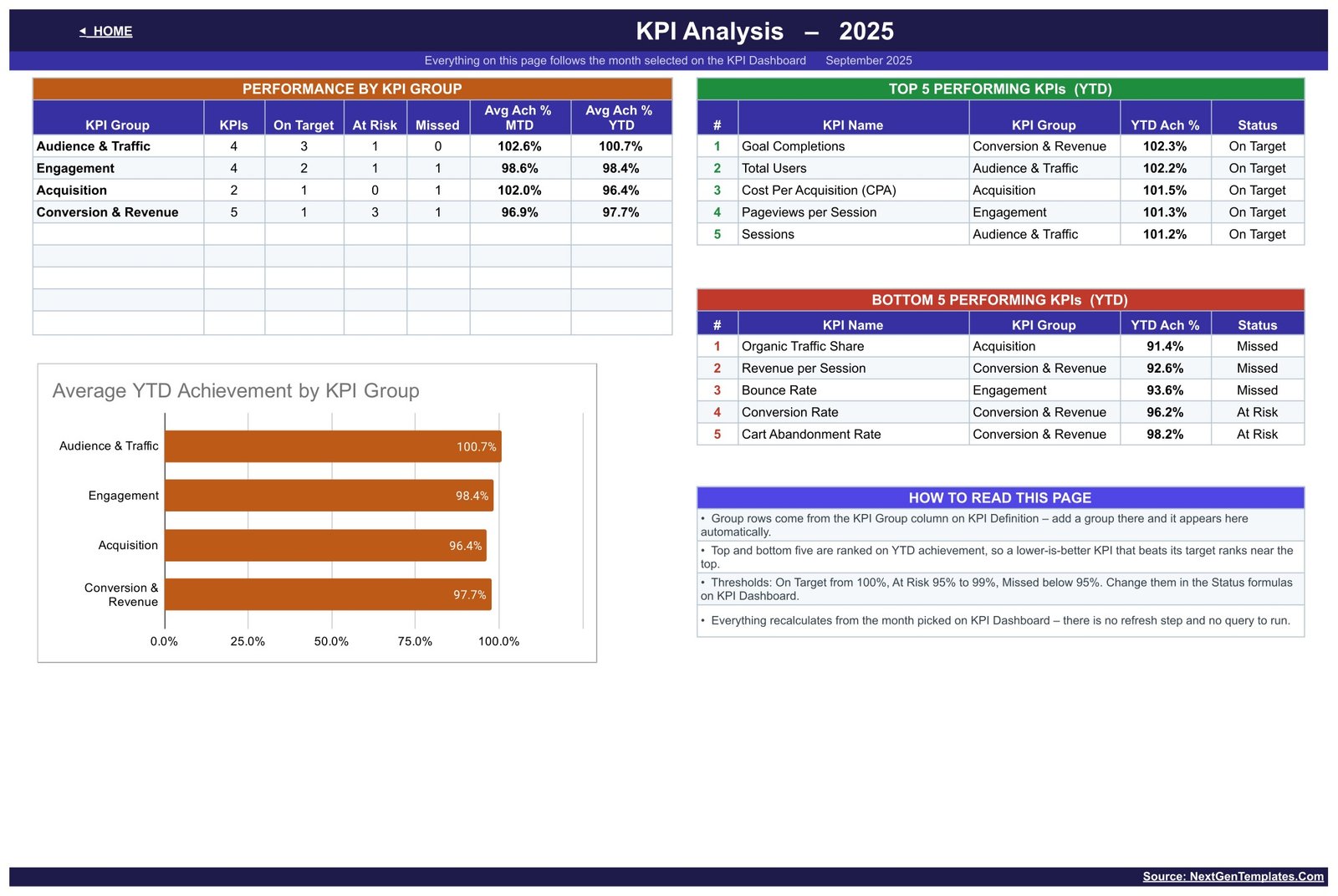
- A group analysis page with On Target / At Risk / Missed counts per group and ranked top-five and bottom-five tables.Google Analytics KPI Dashboard in Google Sheets
- A master list that drives everything. Add, rename or delete a KPI on the KPI Definition sheet and every other sheet follows, with no formula editing.Google Analytics KPI Dashboard in Google Sheets
- Native formulas only. No add-on, no Apps Script, no connector, no API key, nothing to authorise.Google Analytics KPI Dashboard in Google Sheets
Dashboard Pages ExplanationGoogle Analytics KPI Dashboard in Google Sheets
Ten tabs: a Home navigator, three dashboard pages, three input sheets, the KPI Definition master list, a Read Me and a Get More Templates page. Here is what each of the photographed pages does.Google Analytics KPI Dashboard in Google Sheets
Home
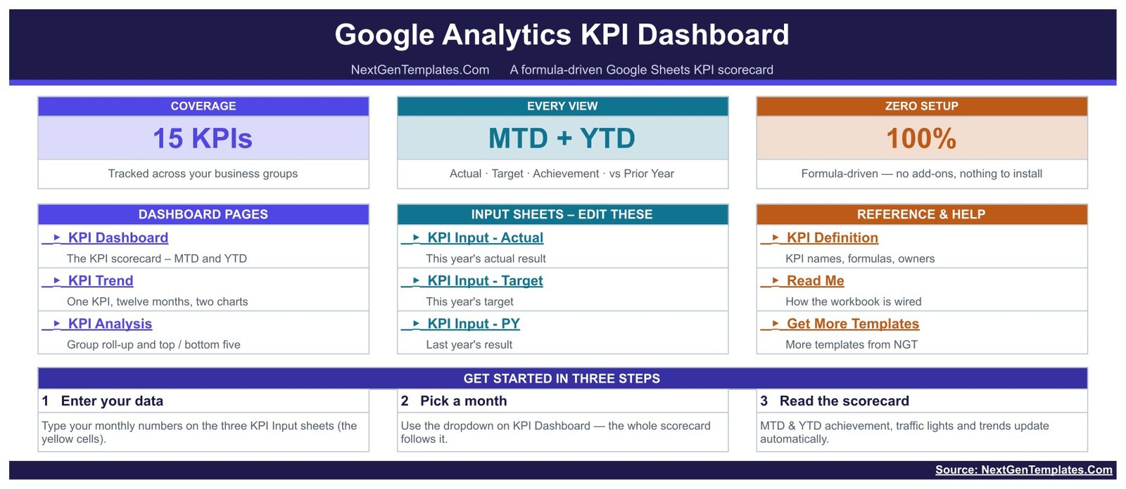
The cover. Three stat cards summarise the build – 15 KPIs tracked across your business groups, MTD + YTD with Actual, Target, Achievement and vs Prior Year on every view, and 100% formula-driven with nothing to install. Below them, a link panel for every sheet in the file, split into Dashboard Pages, Input Sheets – Edit These, and Reference & Help. A three-step start guide closes the page: enter your data, pick a month, read the scorecard.Google Analytics KPI Dashboard in Google Sheets
KPI Dashboard
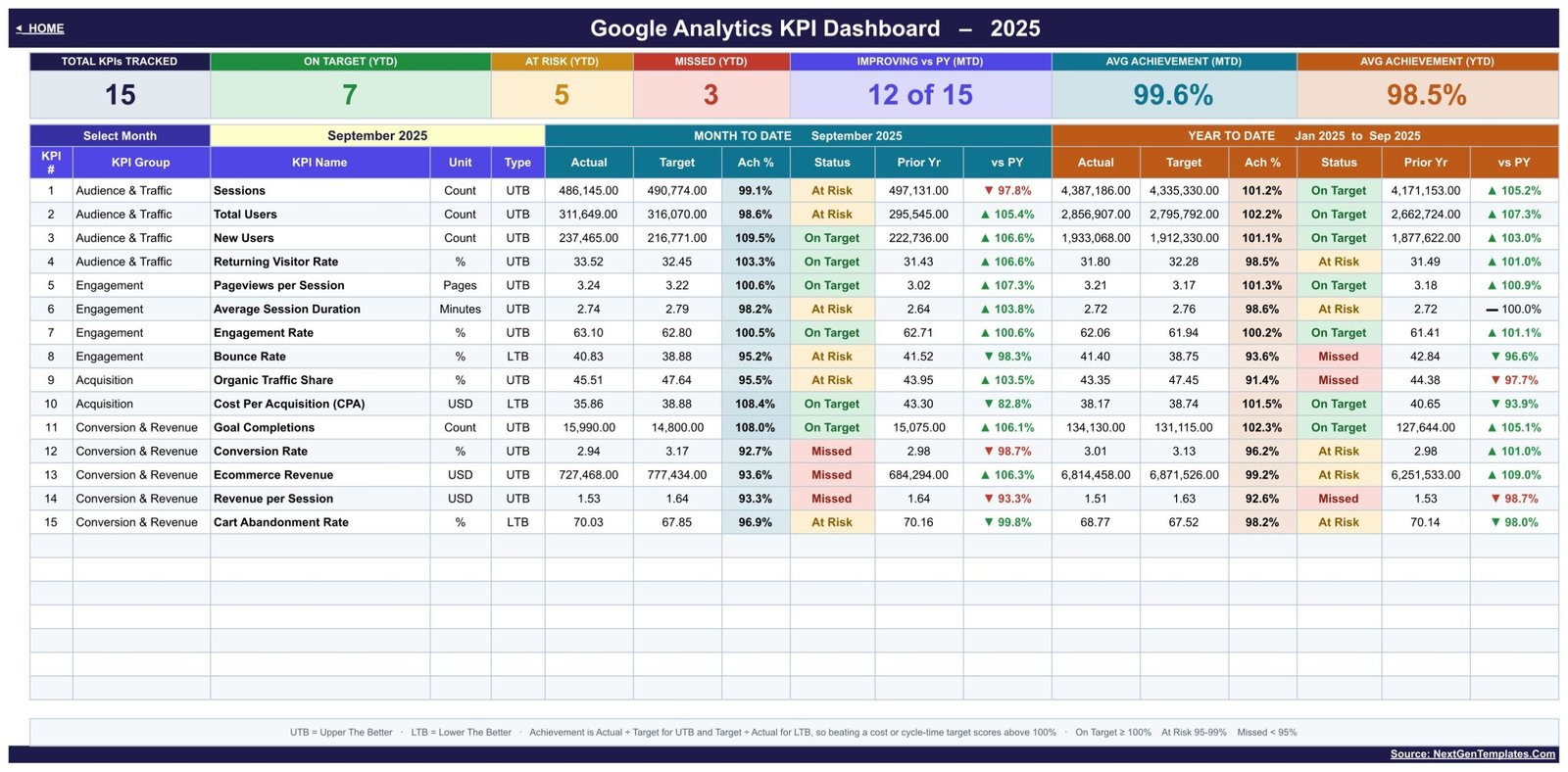
The scorecard itself. Seven cards run across the top: Total KPIs Tracked, On Target (YTD), At Risk (YTD), Missed (YTD), Improving vs PY (MTD), Avg Achievement (MTD) and AvgGoogle Analytics KPI Dashboard in Google Sheets Achievement (YTD). Under them, one row per KPI carrying its number, group, name, unit and type, then a Month to Date block and a Year to Date block, each with Actual, Target, Ach %, Status, Prior Yr and vs PY. A footnote spells out the rules in plain English – UTB is Upper The Better, LTB is Lower The Better, achievement is Actual divided by Target for UTB and Target divided by Actual for LTB, and the three status bands. In the demo month shown (September of the sample year), 7 KPIs sit On Target on a YTD basis, 5 At Risk and 3 Missed, with 12 of 15 improving against prior year on MTD.
KPI Trend
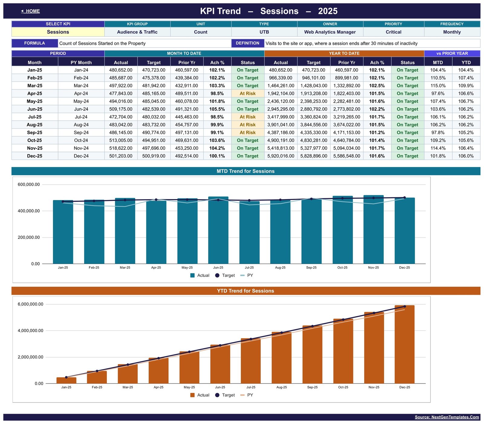
Choose one KPI from a dropdown and the page rebuilds around it. A header strip repeats its group, unit, type, owner, priority and frequency, and prints its formula and definition so nobody has to guess what is being measured. Then twelve rows – one per month, each paired with the same month last year – showing MTD actual, target, prior year, achievement and status, the same five for YTD, and vs prior year percentages for both. Two charts sit underneath: MTD Trend for Sessions plots monthly actual columns against target and prior-year lines, and YTD Trend for Sessions does the same for the cumulative figure. Both titles follow whichever KPI you select.Google Analytics KPI Dashboard in Google Sheets
KPI Analysis
The roll-up, and it follows the same month you picked on the dashboard – the subtitle says so on screen. Performance by KPI Group counts how many KPIs in each group are On Target, At Risk and Missed and averages their MTD and YTD achievement; the Average YTD Achievement by KPI Group bar chart shows the same four numbers. Alongside it, Top 5 and Bottom 5 Performing KPIs are ranked on YTD achievement, each with its group, percentage and status. A How to Read This Page box explains the four things people otherwise ask: groups come from the KPI Definition sheet, the ranking is on YTD achievement so a lower-is-better KPI that beats its target ranks near the top, the thresholds are editable in the Status formulas, and everything recalculates from the month picker with no refresh step.Google Analytics KPI Dashboard in Google Sheets
KPI Input – Actual (and Target, and PY)
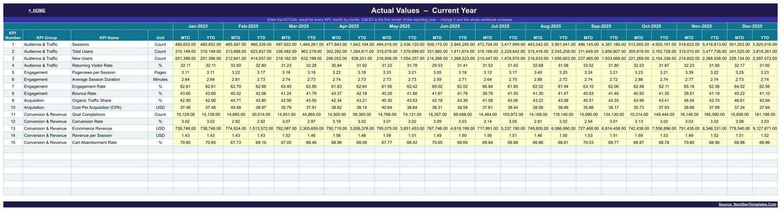
Three identically shaped entry sheets: this year’s actual result, this year’s target, and last year’s actual. Each has one row per KPI and a pair of MTD and YTD columns for all twelve months, with the entry cells shaded yellow so there is no doubt about what is safe to type in. A single cell sets the first month of the reporting year, so a July-to-June or April-to-March year re-bases the whole workbook without touching a formula.Google Analytics KPI Dashboard in Google Sheets
KPI Definition
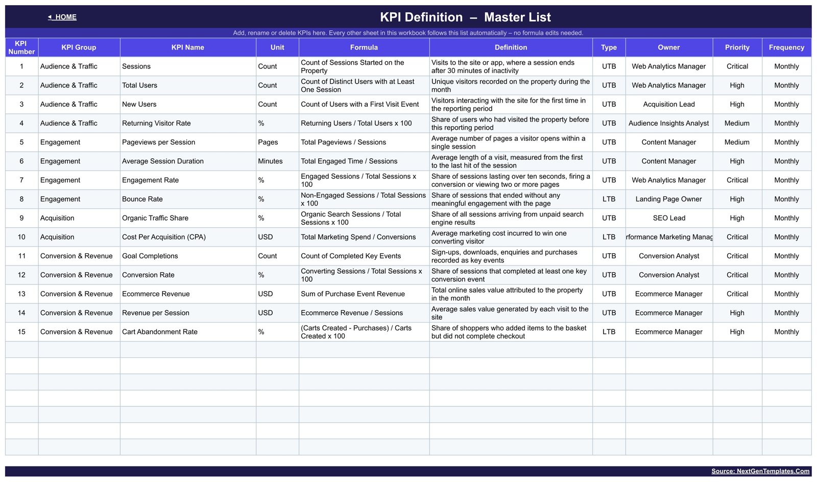
The master list every other sheet reads: KPI number, group, name, unit, formula, definition, type, owner, priority and frequency. The supplied set names owners such as Web Analytics Manager, SEO Lead, Conversion Analyst and Ecommerce Manager, with Critical / High / Medium priorities and a Monthly frequency – all editable labels, not roles the template enforces. Rename a KPI here and it changes everywhere; add a new group and it appears on the Analysis page on its own.Google Analytics KPI Dashboard in Google Sheets
Google Analytics KPI Dashboard in Google Sheets vs. an Excel KPI Workbook vs. Paid Marketing Analytics SaaS – Feature Comparison
| This template | Excel KPI workbook | Paid marketing analytics SaaS | |
|---|---|---|---|
| Cost | One-time 9.99 | One-time, plus an Office licence | Recurring subscription, usually per seat |
| Platform | Google Sheets, any browser | Desktop Excel | Vendor web app |
| Setup time | Minutes – make a copy, type your numbers | Minutes | Hours to days, plus account access |
| Real-time team collaboration | Yes, native to Sheets | Only via OneDrive co-authoring | Yes |
| Mobile access | Yes, Google Sheets app | Limited | Yes |
| Editable KPI list | Yes – one master sheet drives everything | Usually needs formula edits | Fixed to the vendor’s metric set |
| Share with a link | Yes | No | Yes, inside the vendor account |
| Connects to your analytics account | No – you enter the numbers yourself | No | Yes |
| Month picker with MTD and YTD | Yes, one dropdown | Varies | Varies |
| Year-1 cost at 5 users | 9.99 one-time | One-time, plus licences | Recurring, multiplied by seats |
The trade is honest and worth stating plainly: a paid platform pulls the data for you and this does not. What you get instead is a scorecard you own outright, whose KPI list, thresholds and owners you control, that costs nothing to run each month, and that will still open in five years.
Who Should Use This Template
Marketing managers who present a monthly web-performance pack to a leadership team and want the same fifteen lines every time. Agency account managers who run identical reporting for several clients and need one copy per client. In-house SEO and ecommerce leads who already export monthly totals and want somewhere consistent to put them, with targets and prior-year built in. Founders and small teams who want targets and traffic lights without a reporting subscription.
It is the wrong tool if you want a live feed – there is no connection and no scheduled refresh. It is also the wrong tool for session-level or event-level investigation: it works on monthly totals you supply, not raw hit data, and it will not attribute conversions, de-duplicate users across devices, or reconcile your figures against any platform’s own reporting.
Real-World Use Cases
The monthly leadership pack. Priya runs marketing at a 40-person ecommerce brand. On the first working day of the month she pastes her exported totals into the three input sheets, sets the month picker and screenshots the scorecard straight into the deck. When Conversion Rate and Revenue per Session appear in the Bottom 5, that is the slide the meeting starts on.
Client reporting at an agency. Daniel keeps one copy of the file per client with an identical KPI list, so every monthly report reads the same way and a client changing account manager sees no change in format. The KPI Definition sheet doubles as the agreed definition of each metric, which stops the quarterly argument about what “engaged session” means.
A trimmed-down SEO scorecard. Aisha only reports Acquisition and Engagement. She deletes the other KPIs on the definition sheet, and the dashboard, trend and analysis pages shrink to her six metrics without a single formula edit.
Advantages of the Google Analytics KPI Dashboard in Google Sheets
- Nothing to install or authorise. Native Google Sheets formulas, so there is no add-on to approve, no script permission prompt and no IT ticket.
- One dropdown, whole-file consistency. The dashboard and the analysis page can never disagree about which month they are showing.
- Targets and prior year are first-class. Most homemade reports carry actuals only; this carries three parallel data sets, which is what makes achievement percentages and vs-PY markers possible.
- Correct maths for cost and rate metrics. The UTB / LTB switch means CPA, Bounce Rate and Cart Abandonment Rate are scored the right way round.
- Genuinely re-usable. Because the master list drives every page, the same file works for a SaaS site, a publisher or a store once the KPI names are swapped.
- Shareable and portable. A Sheets link, mobile access, and a file that outlives whichever tool you export your numbers from.
Opportunities for Improvement
Being straight about the limits is more useful than a feature list:
- Manual entry. Twelve months x three data sets is a real typing job the first time you populate it. Paste from your export rather than typing, and budget an hour for the initial load.
- Monthly granularity only. There is no weekly or daily view, and no channel, device or landing-page breakdown – those belong in an analytical dashboard.
- No data validation on the inputs. Nothing stops a mistyped figure, and nothing cross-checks MTD against YTD. A wrong number in produces a confident wrong traffic light out.
- A cosmetic export defect. On the KPI Definition page, the Owner column is too narrow for the longest entry, so “Performance Marketing Manager” is clipped on screen. The cell contains the full text – widen the column in your own copy and it reads correctly. It is a display width issue, not a data issue.
- The demo year runs to December. The sample file carries all twelve months of demo figures, including months after the selected one. Clear the future months in your copy if a stakeholder might read them as forecasts.
Best Practices
- Agree the KPI Definition sheet before anyone enters a number. Fifteen KPIs with written formulas and named owners is a governance document as much as a lookup table.
- Fill Target and PY first. Achievement percentages and vs-PY markers are meaningless until those two sheets are complete, and a half-filled scorecard erodes trust fast.
- Set your reporting-year start once in the cell provided, before you paste anything, so you are not re-aligning twelve columns later.
- Tune the bands to your own tolerance. 100 / 95 / 95 is a starting point. A brand-new channel probably deserves wider bands than a mature one.
- Keep the source of every number. Note in your own copy where each figure was exported from and on what date, so a challenged number can be traced.
- Use File > Make a copy per client or per year rather than overwriting – see Google’s own documentation on copying a spreadsheet – and archive the old copy.
- Pair it with an analytical dashboard. The scorecard tells you a KPI missed; the analytical view tells you which segment caused it.
Explore Relevant Templates
- Google Analytics KPI Dashboard in Google Sheets – the template described in this article.
- Google Analytics KPI Dashboard in Power BI – the same scorecard idea built as a Power BI report.
- Website Traffic KPI Dashboard in Google Sheets – a traffic-weighted KPI set on the same pattern.
- SEO Content Performance KPI Dashboard in Google Sheets – for content and organic-search reporting.
- Marketing KPI Scorecard in Google Sheets – the wider marketing view, above channel level.
- Web Development KPI Dashboard in Google Sheets – the build-side companion to this reporting-side scorecard.
- Or browse every Google Sheets KPI Dashboard we publish.
If you would like to build scorecards like this yourself, the Excel Pivot Tables & Dashboards course on NextGenTemplates Academy takes you through the skills one step at a time, with practice files.
Get the Google Analytics KPI Dashboard in Google Sheets
Frequently Asked Questions
Does this connect to my Google Analytics account?
No. It does not connect to, import from, sync with or authenticate against Google Analytics, GA4, Looker Studio or any Google API. There is no OAuth step, no connector and no scheduled refresh, and it installs nothing in any analytics account. You enter your own monthly totals on the three KPI Input sheets. The template is independent and is not affiliated with, endorsed by or connected to Google.
Do the KPI definitions match GA4’s definitions?
They are our own plain-English definitions, written on the KPI Definition sheet so you can read and edit them. No parity with any platform’s metric definitions is claimed. Reconcile against whatever you export from before you report the numbers onward.
Are the numbers and targets in the screenshots real?
No – all of it is demo data, supplied so the file is not empty on first open. Every target and threshold is a placeholder for you to replace. Nothing here is a benchmark or a recommendation about what your own figures should be.
Can I change the KPI list, the groups and the traffic-light bands?
Yes to all three. The KPI list and its groups live on the KPI Definition sheet and every other sheet follows it automatically. The 100% / 95% / below-95% bands are ordinary formulas in the Status columns on the KPI Dashboard.
Does my reporting year have to start in January?
No. One cell on the KPI Input – Actual sheet sets the first month, and the whole workbook re-bases from it.
How is this different from an analytical Google Sheets dashboard?
A scorecard has a fixed KPI list, targets, achievement percentages and traffic lights, and answers “did we hit it?”. An analytical dashboard slices a transaction table with filters and charts and answers “why?”. Different jobs – many teams keep one of each.
What do I actually download?
A PDF containing the link to the Google Sheets template and a short setup guide. Open the link and choose File > Make a copy; the shared sheet is view-only by design, so your copy is entirely your own.
About the Author
Built by PK – Microsoft Certified Professional with 15+ years of Excel, Google Sheets, and Power BI experience. Founder of NextGenTemplates, reaching 300K+ subscribers across YouTube channels. Every template is hand-built and tested before release.
Conclusion
The value in this file is not the fifteen KPIs – it is that the month picker, the targets, the prior-year column and the traffic lights are already wired to each other, so the monthly report becomes a paste-and-pick job instead of a rebuild. Keep the supplied web-analytics KPI set or swap the whole list on the definition sheet; the rest of the workbook follows either way. Just remember what it is: a reporting spreadsheet you fill in yourself, independent of Google, with no live connection to any analytics platform.
Get the Google Analytics KPI Dashboard in Google Sheets on NextGenTemplates.