Most HVAC contractors already know their revenue. Far fewer can tell you, on the first Monday of the month, what their First-Time Fix Rate did against target, whether callbacks moved up or down against the same month last year, and which of their KPI groups is quietly dragging theHVAC Contractor KPI Dashboard in Google Sheets year down. The HVAC Contractor KPI Dashboard in Google Sheets exists for exactly that gap: 15 named HVAC KPIs across 5 business groups, each showing month-to-date and year-to-date achievement, a prior-year comparison and a traffic light, all driven by one month dropdown and nothing but formulas.HVAC Contractor KPI Dashboard in Google Sheets
This is the KPI Dashboard build — the month-picker, traffic-light family with a KPI Trend page and a KPI Analysis page. It is not the separately sold HVAC Contractor KPI Scorecard, and the difference is explained in full further down, because the names are close enough to trip people up.
Get the HVAC Contractor KPI Dashboard in Google Sheets
Key Features of the HVAC Contractor KPI Dashboard in Google Sheets
Fifteen HVAC KPIs, already defined. Service Calls Completed, Installations Completed and Maintenance Agreement Sign-ups under Volume & Demand. First-Time Fix Rate, Callback / Rework Rate, On-Time Arrival Rate, Emergency Response Time and Warranty Claim Rate under Service Quality. Average Job Value, Revenue per Technician, Gross Margin and Days to Invoice under Financial. Technician Utilization under Workforce. Agreement Renewal Rate and Quote-to-Job Conversion under Sales & Retention. Each one arrives with a written formula, a plain-English definition, a unit, an owner, a priority and a frequency.HVAC Contractor KPI Dashboard in Google Sheets
One dropdown drives the whole file. Pick a month on the KPI Dashboard sheet and the scorecard grid, the year-to-date window and the KPI Analysis roll-up all recalculate. There is no refresh button, no query, no add-on to authorise.HVAC Contractor KPI Dashboard in Google Sheets
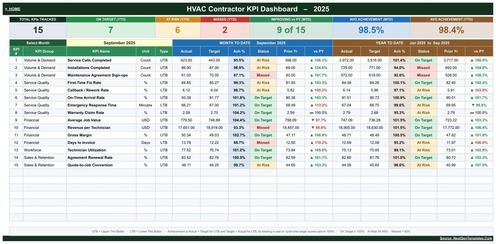
MTD and YTD in the same row. Each KPI line carries Actual, Target, Achievement %, Status, Prior Yr and vs PY for the selected month, then the identical six columns again for the year to date. You never have to flip between two views to see whether a bad month is a bad year.
Upper-the-better and lower-the-better are handled separately. Achievement is Actual ÷ Target for UTB metrics and Target ÷ Actual for LTB metrics. That matters more than it sounds: Emergency Response Time, Callback / Rework Rate, Warranty Claim Rate and Days to Invoice are all metrics where a smaller number is better, and a naïve percentage would show them as failing every time they improve.HVAC Contractor KPI Dashboard in Google Sheets
Visible, editable thresholds. On Target from 100 %, At Risk between 95 % and 99 %, Missed below 95 %. The bands live in the Status formulas on the KPI Dashboard sheet, so a firm that wants a tighter or looser definition of “on target” can change them once.HVAC Contractor KPI Dashboard in Google Sheets
A definitions sheet that actually drives the workbook. Rename a KPI, move it to a different group, change its owner or delete it, and every other page follows automatically. No formula editing.
Dashboard Pages Explanation
Home
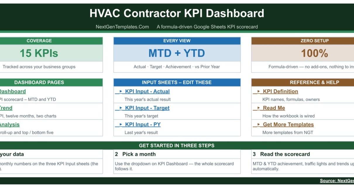
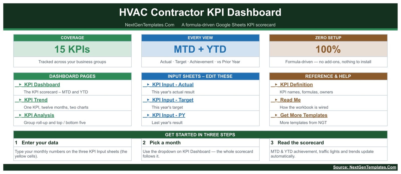
A navigation page rather than a report. Three coverage tiles (15 KPIs, MTD + YTD in every view, 100 % formula-driven), a link block to each of the eight sheets grouped into Dashboard Pages, Input Sheets and Reference & Help, and a three-step getting-started strip: enter your data, pick a month, read the scorecard.
KPI Dashboard
The scorecard itself, and the page most owners will live on. A header strip of seven tiles — Total KPIs Tracked, On Target (YTD), At Risk (YTD), Missed (YTD), Improving vs PY (MTD), Avg Achievement (MTD) and Avg Achievement (YTD) — sits above a row-per-KPI grid split into a Month-to-Date block and a Year-to-Date block. In the sample file, which opens on September 2025, the tiles read 15 KPIs tracked, 7 On Target, 6 At Risk, 2 Missed, 9 of 15 improving against prior year, and average achievement of 98.5 % MTD against 98.4 % YTD.HVAC Contractor KPI Dashboard in Google Sheets
KPI Trend
Choose one KPI from the Select KPI dropdown. The page reprints that KPI’s group, unit, type, owner, priority, frequency, formula and definition, then lays out all twelve months with Actual, Target, Prior Yr, Achievement % and Status for MTD and again for YTD, plus MTD and YTD percentage columns against prior year. Two charts sit underneath — an MTD Trend column chart with Target and prior-year lines over it, and a YTD Trend chart doing the same for the cumulative figure. This is the page for the question “is this a bad month or a bad trend?”HVAC Contractor KPI Dashboard in Google Sheets
KPI Analysis
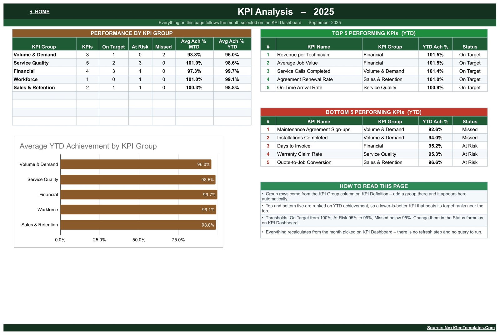
Everything on this page follows the month selected on KPI Dashboard. A Performance by KPI Group table gives the count of KPIs, On Target, At Risk and Missed per group alongside average MTD and YTD achievement. Beside it, Top 5 and Bottom 5 Performing KPIs are ranked on YTD achievement. An Average YTD Achievement by KPI Group bar chart sits below, next to a short panel explaining the ranking logic and the thresholds.
KPI Input – Actual, Target and PY
Three matching entry sheets, one for this year’s actual result, one for this year’s target and one for last year’s result. Each runs January to December with MTD and YTD columns per month, and only the yellow cells are for typing. Cell E3 on the Actual sheet sets the first month of the reporting year, so a contractor on a July-to-June financial year changes one cell and the whole workbook re-bases.HVAC Contractor KPI Dashboard in Google Sheets
KPI DefinitionHVAC Contractor KPI Dashboard in Google Sheets
The master list: KPI Number, KPI Group, KPI Name, Unit, Formula, Definition, Type, Owner, Priority and Frequency. Owners come pre-assigned to Service Manager, Install Manager, Dispatch Lead, Quality Lead, Operations Manager, Finance Manager and Sales Coordinator — a starting point for the monthly accountability conversation rather than decoration.HVAC Contractor KPI Dashboard in Google Sheets
HVAC Contractor KPI Dashboard vs. Excel vs. Paid Field-Service SaaS — Feature Comparison
| This template (Google Sheets) | Building it in Excel yourself | Paid field-service SaaS | |
|---|---|---|---|
| Cost | One payment | Free software, days of build time | Recurring per-technician fee |
| Platform | Google Sheets, any browser | Desktop Excel | Vendor cloud |
| Setup time | Make a copy, type your figures | Write every formula and chart | Onboarding and data migration |
| Real-time team collaboration | Yes, native to Google Sheets | Only through OneDrive co-authoring | Yes |
| Mobile access | Google Sheets mobile app | Excel mobile app | Vendor app |
| Customisable KPIs | Yes — edit the KPI Definition sheet | Yes, if you write the formulas | Usually a fixed metric set |
| Share with a link | Yes | No | Seat-based |
| Year-1 cost at 5 users | The purchase price, once | Your own build time | Recurring, multiplied by seats |
| Dispatch and job scheduling | No — reporting only | No | Yes |
| Prior-year comparison built in | Yes, MTD and YTD | Only if you build it | Varies by vendor |
Who Should Use This Template
Owner-operators of residential and light-commercial HVAC firms who want one monthly page that answers “are we on target?” without buying software. Service managers who report upward every month and are tired of rebuilding the same summary. Multi-branch contractors who want every branch reporting the same fifteen KPIs on the same definitions so the numbers are actually comparable. And any HVAC business that already has the figures — in a service system, an invoice ledger, or a notebook — and simply needs somewhere disciplined to put them.HVAC Contractor KPI Dashboard in Google Sheets
It suits a monthly reporting rhythm. If you need per-job or daily detail, a scorecard is the wrong shape of tool and an operational dashboard such as the HVAC Service Dashboard in Google Sheets is a better fit.
Real-World Use Cases
The monthly owner’s review. A nine-technician residential firm enters last month’s numbers on the three input sheets, opens KPI Dashboard and picks the month. In the sample data, Callback / Rework Rate sits at 98.7 % achievement and flags At Risk while Days to Invoice shows 88.7 % and flags Missed — two specific conversations instead of a vague sense that things are slipping.
The board pack. A service manager screenshots the KPI Analysis page. Volume & Demand averages 96.0 % YTD with two Missed KPIs; Financial averages 99.7 %; the bottom five are ranked, so the meeting opens on Maintenance Agreement Sign-ups at 92.6 % rather than wandering through everything.
The branch comparison. Three branches each keep a copy on identical KPI definitions. “First-Time Fix Rate” therefore means the same thing in all three, and the group roll-up on each file can be read side by side without an argument about methodology.
Advantages of the HVAC Contractor KPI Dashboard in Google Sheets
Nothing to install or authorise. It is a plain Google Sheets file. No add-on, no macro, no Apps Script permission prompt, no external data connection. Anyone with a Google account can open their own copy and start typing.
The definitions are written down. Half the value of a KPI pack is agreeing what the KPI means. This one ships the formula and the definition for all fifteen, on a sheet the whole team can read.
Prior-year context comes free. Because there is a dedicated PY input sheet, every KPI is judged against both a target and last year — which often tells a different, more useful story than target alone.
It grows with you. Add a KPI to the definition sheet and it appears everywhere. Change the status thresholds once and the whole scorecard re-colours.
Shareable at no extra cost. Google Sheets has no per-seat charge for viewing your own file, so a fifteen-person firm pays exactly what a one-person firm pays.
Opportunities for Improvement
Honesty is worth more than a sales pitch, so: this template does not import anything. It has no connection to ServiceTitan, Housecall Pro, Jobber, QuickBooks or any dispatch or accounting system. Monthly figures are typed in by hand, on three sheets. For most contractors that is fifteen minutes a month, but it is fifteen minutes somebody has to actually do.
It also does not alert or notify — a Missed status shows up when you open the file, not in your inbox. It is monthly by design, so it will not answer a question about yesterday. It carries no benchmark data, so it cannot tell you how your 84.4 % First-Time Fix Rate compares with the industry; it only compares you with your own target and your own prior year. And it is a reporting layer, not an operations system: no dispatching, no scheduling, no job costing, no invoicing.
Best Practices
Trim before you build. Fifteen KPIs is a lot for a small firm. Delete the ones you will not genuinely review each month; a scorecard nobody reads is worse than no scorecard.
Set targets before the year starts, not after. The Target input sheet is most useful when it is filled in in advance. Retro-fitting targets to results is a way of never missing one.
Assign the owners for real. The Owner column on KPI Definition is pre-filled with roles. Replace them with names, and the monthly review has someone to speak to each line.
Fill the PY sheet once, properly. It is the most tedious hour of setup and the one that pays back most, because it turns every status into a comparison rather than a verdict.
Lock what you do not want touched. Only the yellow cells are meant to be typed in. Google’s own guide to protecting a sheet or range shows how to protect the calculated columns before you share the file with a team.
Keep a monthly cadence. Same day each month, same order: enter, pick the month, read KPI Analysis, drill into the bottom five on KPI Trend.
Explore Relevant Templates
- HVAC Contractor KPI Dashboard in Google Sheets — the template reviewed here.
- HVAC Contractor KPI Scorecard in Google Sheets — the other HVAC contractor template, from the KPI Scorecard family. Different structure, same industry — see the FAQ below.
- HVAC Service Dashboard in Google Sheets — the analytical counterpart, with operational charts and breakdowns rather than a monthly scorecard.
- Field Service KPI Dashboard in Google Sheets — the same scorecard idea for field service generally.
- Plumbing Contractor Dashboard in Google Sheets — for firms running both trades.
- Maintenance Tasks Calendar in Google Sheets — schedule the planned-maintenance visits sitting behind the agreement KPIs.
Get the HVAC Contractor KPI Dashboard in Google Sheets
If you would like to build KPI dashboards of your own, the Excel Pivot Tables & Dashboards course on NextGenTemplates Academy covers the method step by step, with practice files.
Frequently Asked Questions
What is the difference between the HVAC Contractor KPI Dashboard and the HVAC Contractor KPI Scorecard?
They are two different NextGenTemplates products for the same industry, and neither is a version of the other. This one — the KPI Dashboard — is a month-picker, traffic-light build: a full grid with one row per KPI and month-to-date and year-to-date blocks side by side, a dedicated KPI Trend page for single-KPI deep dives, a KPI Analysis page with a group roll-up and top/bottom five, and three separate input sheets for Actual, Target and Prior Year. The KPI Scorecard is from the Scorecard family: a KPI-card layout with RAG status lights, a dropdown that switches the comparison between target and prior year, a KPI Trend page of its own, and a single monthly data sheet holding all three number sets together. Choose on layout, not on which one sounds newer.
Does it connect to my dispatch or accounting software?
No. There is no integration, import or sync of any kind. You enter monthly figures manually on the three KPI Input sheets. That is why it works regardless of which system your office runs.
Can I change or add KPIs?
Yes. The KPI Definition sheet is the master list and every other page reads from it. Rename, re-group, reassign an owner or delete — the scorecard, trend page and analysis page all follow.
Do I need Excel, an add-on or macros?
None of them. It is a formula-driven Google Sheets file that opens in any browser.
Is my financial year supported if it does not start in January?
Yes. Cell E3 on the KPI Input – Actual sheet sets the first month of the reporting year and the workbook re-bases to it.
What are the numbers already in the file?
Demonstration data for a 2025 reporting year, so every page shows its behaviour before you clear it and enter your own.
Does it benchmark me against other HVAC contractors?
No. It ships no industry benchmark data. Status colours reflect your own targets and the thresholds you set, nothing more.
About the Author
Built by PK – Microsoft Certified Professional with 15+ years of Excel, Google Sheets, and Power BI experience. Founder of NextGenTemplates, reaching 300K+ subscribers across YouTube channels. Every template is hand-built and tested before release.
Conclusion
The HVAC Contractor KPI Dashboard in Google Sheets does one job properly: it turns a month of HVAC figures into a fifteen-line scorecard with targets, prior-year comparison and traffic lights, plus a trend page and a group analysis behind it. It will not dispatch a technician or raise an invoice, and it will not fetch a single number for you. What it will do is make the monthly review a fifteen-minute routine instead of an afternoon of spreadsheet archaeology.
If you would rather have the KPI-card layout with RAG lights and a comparison switch, take the HVAC Contractor KPI Scorecard in Google Sheets instead — same industry, different structure. Otherwise, get the HVAC Contractor KPI Dashboard in Google Sheets and make your own copy today.