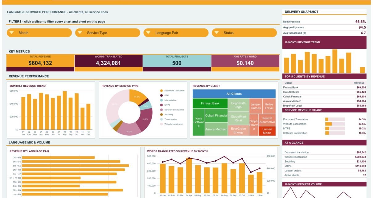
The Translation & Localization Dashboard in Google Sheets turns a flat project log into a six-tab reporting system: 500 sample projects, 4,324,081 words, $604,132 of service revenue, 16 KPI cards, 17 charts and 15 slicers, all driven by native pivot tables. Average rate per word lands at $0.140, average quality score at 94.5 and average turnaround at 4.7 days — and every one of those figures moves the moment you paste your own rows onto the Data sheet.
Most translation agencies already have the data. It sits in a job list, a spreadsheet export from a CAT tool, or a folder of invoices. What is missing is the answer to three questions a language services business lives on: which language pairs actually make money, which service lines carry the quality score, and which clients are worth the rush capacity. This Translation & Localization Dashboard in Google Sheets answers all three in a browser tab, without a TMS seat and without a subscription.
Key Features of the Translation & Localization Dashboard in Google Sheets
- Six tabs in one file. Four analytical pages — Overview, Services, Languages, Clients — plus a Search lookup and an Instructions guide.
- 16 KPI cards built on SUMIFS and COUNTIFS. They report unfiltered totals by design, so the headline numbers stay stable while you slice the charts underneath them.
- 17 charts. Revenue trends, a service mix donut, a client treemap, language pair bars, quality gauges, a status donut, an area volume chart and a linguist scatter plot.
- 15 slicers across Month, Service Type, Language Pair, Status, Priority, Client, Industry and Linguist. Each one drives every pivot on its own page, and pages keep their own filters.
- A sidebar on every analytical page with a snapshot block, a 12-month revenue trend, a Top 5 ranking table, a share-percentage list and an At a Glance figure list.
- Auto-expansion to 1,000 rows. Pivots, slicers and formulas already reach row 1001, so pasted projects are picked up without re-ranging anything.
- An editable Apps Script build. Raise DATA_ROWS for a bigger log, or edit the colour palette at the top of the file and re-run main() to rebuild the whole dashboard in your own brand colours.
Dashboard Pages Explanation
Overview — Language Services Performance
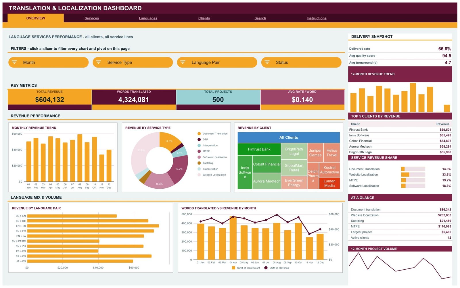
The company-wide page: all clients, all service lines. Cards read Total Revenue $604,132, Words Translated 4,324,081, Total Projects 500 and Avg Rate / Word $0.140. Charts are Monthly Revenue Trend, Revenue by Service Type, Revenue by Client, Revenue by Language Pair and Words Translated vs Revenue by Month. The sidebar adds a Delivery Snapshot — 66.6% delivered, 94.5 average quality, 4.7 day turnaround — plus Top 5 Clients by Revenue, led by Fintrust Bank at $69,504, and a Service Revenue Share list showing website localization at 33.6%.
Services — Service Line Economics
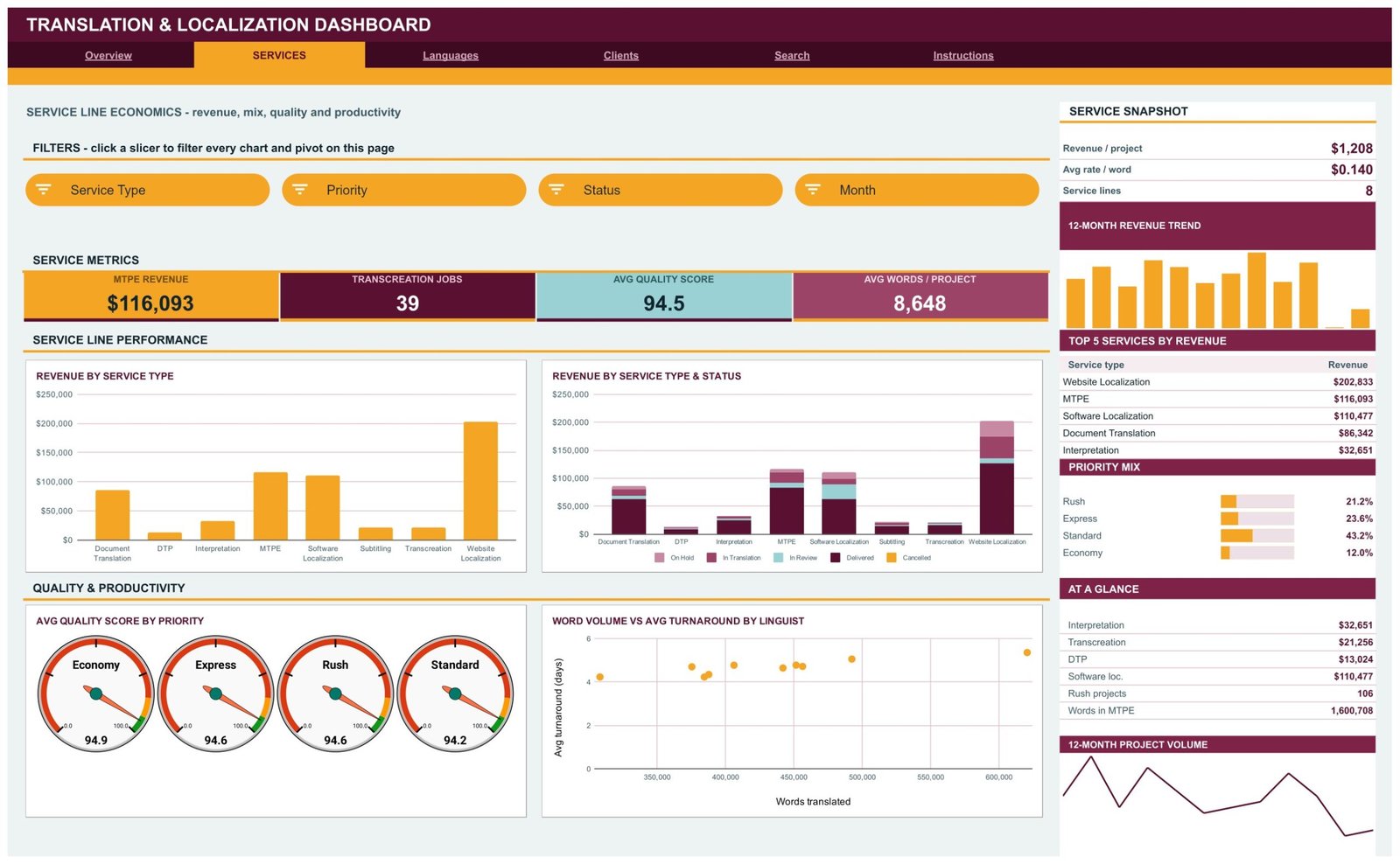
Revenue, mix, quality and productivity across 8 service lines. Cards read MTPE Revenue $116,093, Transcreation Jobs 39, Avg Quality Score 94.5 and Avg Words / Project 8,648. Charts are Revenue by Service Type, Revenue by Service Type & Status, Avg Quality Score by Priority on four gauges, and Word Volume vs Avg Turnaround by Linguist. The sidebar ranks Top 5 Services by Revenue — website localization $202,833, MTPE $116,093, software localization $110,477 — and breaks out the Priority Mix at Standard 43.2%, Express 23.6%, Rush 21.2% and Economy 12.0%.
Languages — Language Pair Analysis
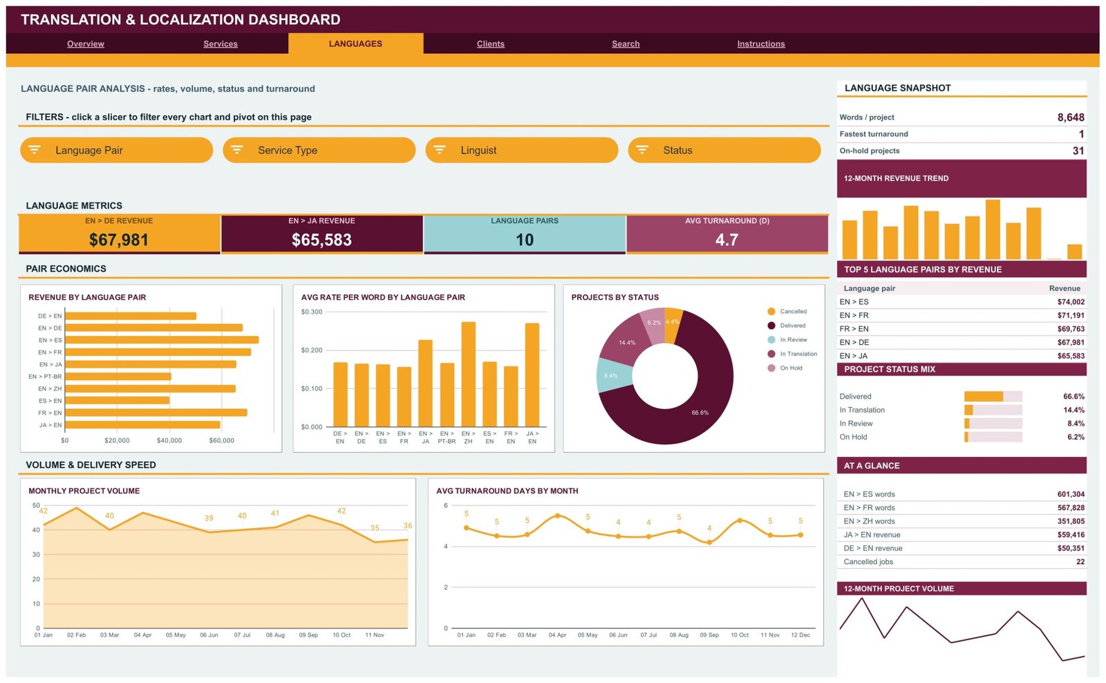
Rates, volume, status and turnaround across 10 language pairs. Cards read EN > DE Revenue $67,981, EN > JA Revenue $65,583, Language Pairs 10 and Avg Turnaround 4.7 days. Charts are Revenue by Language Pair, Avg Rate per Word by Language Pair, Projects by Status, Monthly Project Volume and Avg Turnaround Days by Month. The Top 5 Language Pairs by Revenue table is led by EN > ES at $74,002, and the Project Status Mix shows 66.6% delivered against 6.2% on hold.
Clients — Client, Industry and Vendor Quality
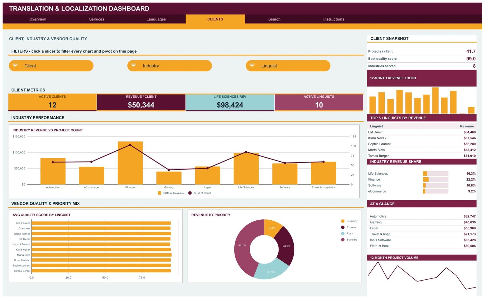
Who paid and who delivered. Cards read Active Clients 12, Revenue / Client $50,344, Life Sciences Rev $98,424 and Active Linguists 10. Charts are Industry Revenue vs Project Count across 8 industries, Avg Quality Score by Linguist across all 10 linguists, and Revenue by Priority. The sidebar ranks Top 5 Linguists by Revenue — Elif Demir leads at $84,460 — and the Industry Revenue Share list puts Finance at 22.2% and Life Sciences at 16.3%.
Search — Project Lookup
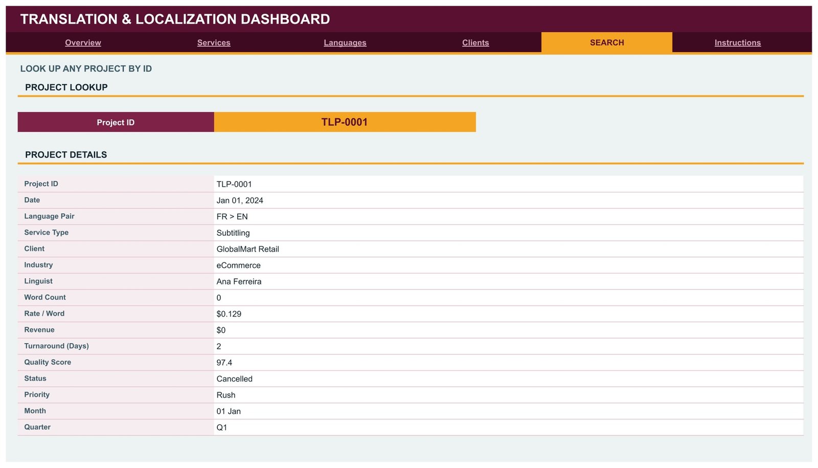
Type a Project ID and the page returns the full record: date, language pair, service type, client, industry, linguist, word count, rate per word, revenue, turnaround days, quality score, status, priority, month and quarter. It is the page you open when a client emails about one job rather than a whole month.
Instructions — User Guide
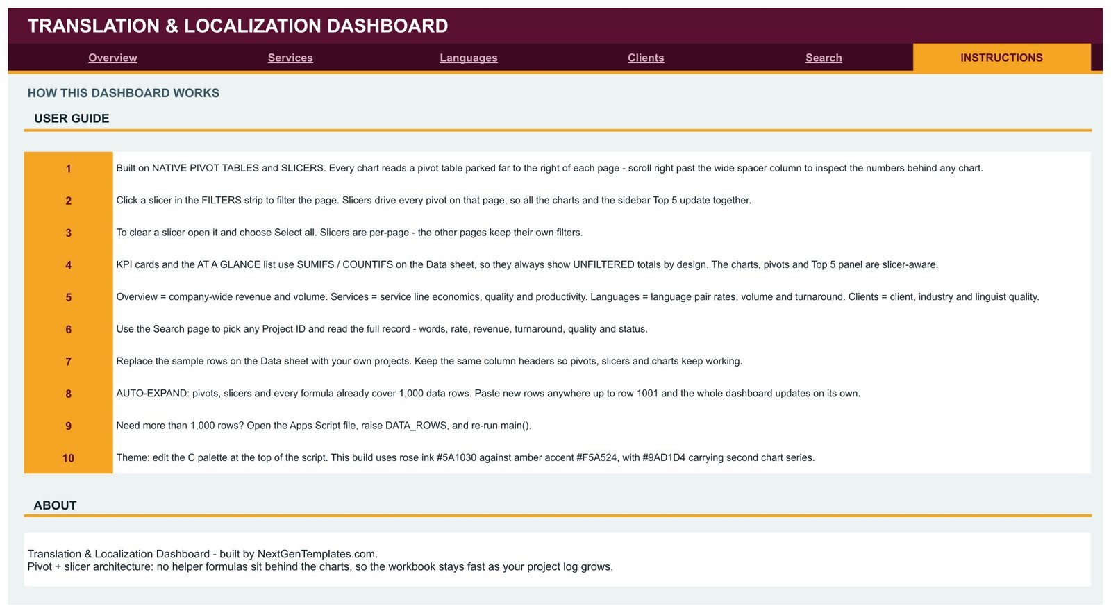
Ten numbered steps covering the pivot and slicer architecture, how to clear a slicer with Select all, why the KPI cards deliberately stay unfiltered, how to swap in your own project rows, the 1,000-row auto-expand limit and how to change the colour theme in the script.
Translation & Localization Dashboard in Google Sheets vs. Excel vs. Paid TMS — Feature Comparison
| Feature | Translation & Localization Dashboard in Google Sheets | Excel dashboard equivalent | XTRF / Plunet TMS |
|---|---|---|---|
| Cost | $9.99 one-time ✅ | $13.99 one-time | $50–$150 / user / month |
| Platform | Google Sheets, browser only ✅ | Desktop Excel | Vendor cloud + onboarding |
| Setup time | Under 10 minutes ✅ | Under 10 minutes | 2–8 weeks of implementation |
| Real-time team collaboration | Built in ✅ | Needs OneDrive co-authoring | Built in |
| Mobile access | Google Sheets app ✅ | Limited | Vendor app |
| Customisable fields and charts | Fully editable, script included ✅ | Fully editable | Admin-controlled, often chargeable |
| Share with a link | Yes, view or edit ✅ | File send or cloud link | Seat required |
| Language pair rate analysis | Dedicated page, 10 pairs ✅ | Dedicated page | Yes |
| Single project lookup | Search tab by Project ID ✅ | Search tab | Yes |
| Year-1 cost at 5 users | $9.99 ✅ | $13.99 | $3,000–$9,000 |
For agencies that want language-pair margin and linguist quality visible this week without a TMS implementation, the Translation & Localization Dashboard in Google Sheets sits in the sweet spot.
Who Should Use This Template
Perfect for:
- Translation and localization agencies running 20–2,000 projects a year and billing by the word
- Localization and vendor managers inside software, life sciences and eCommerce companies buying from several suppliers
- Freelance project managers and small LSP teams who need client-facing reporting without paying for a TMS seat
- Finance and operations leads who want revenue by language pair, service line and client on one screen
Not a fit if:
- You need a full TMS — translation memory, CAT tool integration, job dispatch and vendor invoicing are outside this template’s scope
- You expect a live API sync from XTRF, Plunet or memoQ; rows are pasted or imported here
- Your log runs well past 1,000 rows and you are not comfortable changing one constant in the bundled Apps Script
Real-World Use Cases
Marta runs a nine-person localization agency in Lisbon. Each month she pastes delivered jobs onto the Data sheet and filters the Languages page to EN > JA. Seeing that her best rate per word also carries her longest turnaround, she adds an express surcharge to that pair instead of discounting it to win volume.
Daniel is a vendor manager at a life sciences software company. He opens the Clients page to show his director that Life Sciences work alone accounts for $98,424 across 8 industries, then uses Avg Quality Score by Linguist to defend keeping two named linguists on the preferred vendor list.
Priya coordinates freelance subtitling and DTP work on her own. The Services page shows her that website localization is a third of her revenue while DTP is only $13,024 of it, so she stops chasing DTP briefs and moves those hours into MTPE post-editing, which pays $116,093 across the same year.
Advantages of the Translation & Localization Dashboard in Google Sheets
- No recurring cost. A TMS at $50–$150 per user per month reaches $3,000–$9,000 in year one for five people. This is $9.99 once.
- It is fast because of the architecture. Charts read pivot tables rather than a wall of helper formulas, so the file does not slow down as the project log grows.
- Client-safe sharing. Share the file view-only with a link and a client sees their own report without a login or a seat.
- Time back every month. Rebuilding the same pivot-and-chart pack by hand costs most coordinators half a day; here it is a paste.
- Nothing is locked. Every chart, pivot and formula is editable, and the Apps Script that built it ships with the file.
Opportunities for Improvement
Being straight about the limits: the KPI cards and the At a Glance lists use SUMIFS and COUNTIFS on the Data sheet, so they show unfiltered totals by design — if you expect the headline cards to move with the slicers, they will not, and the Instructions tab says so at step 4. The default build covers 1,000 data rows, which is generous for a small agency but needs a DATA_ROWS change for a busy one. There is no cost or margin column in the sample data, so gross profit per language pair is something you would add yourself. And because the file is not connected to a CAT tool, someone has to export and paste the month’s jobs. For most teams that is ten minutes; for a high-volume LSP it is an argument for a proper TMS on top of this.
Best Practices
- Keep the column headers exactly as shipped — the pivots, slicers and formulas are bound to them.
- Paste values, not formatted cells, when you import from a CAT tool or accounting export.
- Use one consistent language pair notation (EN > ES, not “English to Spanish” in some rows) so the pair charts stay clean.
- Clear a page’s slicers with Select all before you screenshot it for a client report.
- Duplicate the file at year end and start a fresh copy, so each year keeps its own 12-month trend.
- If you rebrand, change the palette once at the top of the script rather than recolouring 17 charts by hand.
- Learn the underlying tools once: Google’s own guide to pivot tables in Google Sheets covers the mechanics this build sits on.
Explore Relevant Templates
The same dashboard exists on the other two platforms: the Translation & Localization Dashboard in Excel for desktop teams, and the Translation & Localization Dashboard in Power BI when you need drillthrough pages and a published workspace.
If your reporting is monthly and board-facing rather than analytical, look at the Translation & Localization KPI Dashboard in Excel or the Translation & Localization KPI Dashboard in Power BI, both of which use a month picker and traffic lights.
Agencies selling language work alongside other outsourced services usually pair this with the Outsourcing (BPO/KPO) Dashboard in Google Sheets or the Facility Services Dashboard in Google Sheets. For risk and delivery reporting on the same client base, see the Risk Mitigation KPI Dashboard in Google Sheets. The full range lives in the Google Sheets Dashboards category.
Frequently Asked Questions
What KPIs does the Translation & Localization Dashboard in Google Sheets track?
The Translation & Localization Dashboard in Google Sheets tracks 16 KPIs including total revenue, words translated, total projects, average rate per word, average quality score, average turnaround days, active clients and active linguists. Every card recalculates when you replace the sample data with your own.
How long does setup take?
Under 10 minutes. Open the PDF in your download, click the Make a copy link, then paste your project rows onto the Data sheet. The Translation & Localization Dashboard in Google Sheets already covers 1,000 rows, so nothing needs re-ranging first.
How does this compare to a paid TMS like XTRF or Plunet?
A TMS handles job dispatch, translation memory and invoicing for $50–$150 per user per month. The Translation & Localization Dashboard in Google Sheets covers the reporting layer only — revenue, rates, turnaround and quality — for a single $9.99 payment with no seats to buy.
Can I add my own language pairs, clients and service types?
Yes. The Translation & Localization Dashboard in Google Sheets reads whatever values appear in your Data sheet columns, so new language pairs, service lines, clients and linguists show up in the slicers, pivots and Top 5 tables automatically.
Do the KPI cards respond to the slicers?
No, and that is deliberate. In the Translation & Localization Dashboard in Google Sheets the KPI cards and At a Glance lists use SUMIFS and COUNTIFS for stable unfiltered totals, while the charts, pivots and Top 5 panel are slicer-aware. Step 4 of the Instructions tab explains it.
What if I have more than 1,000 projects?
Open the bundled Apps Script file, raise the DATA_ROWS constant and re-run main(). The Translation & Localization Dashboard in Google Sheets then rebuilds every pivot, slicer and formula across the larger range, exactly as described in step 9 of the Instructions tab.
Does it work on mobile and can I share it with clients?
Yes. It runs in any browser and in the Google Sheets mobile app, and you can share it view-only with a link. Client access to the Translation & Localization Dashboard in Google Sheets costs nothing extra because it is an ordinary Sheets file.
About the Author
Built by PK — Microsoft Certified Professional with 15+ years of Excel, Google Sheets and Power BI experience. Founder of NextGenTemplates, reaching 300K+ subscribers across YouTube channels. Every template is hand-built and tested before release.
Conclusion
If your language services business runs on a job list and a monthly scramble, the Translation & Localization Dashboard in Google Sheets gives you the reporting layer without the TMS bill: four analytical pages, a project lookup, 16 KPI cards, 17 charts and 15 slicers over your own data in under ten minutes.
👉 Click here to Purchase the Translation & Localization Dashboard in Google Sheets
Instant download · One-time payment · No subscription
🎥 For step-by-step walkthroughs, visit Youtube.com/@NeoTechNavigators.
Last updated: August 2026