Most facilities teams already have the data they need. It is sitting in a helpdesk export or a shared ticket log: date, site, service category, technician, cost, hours. What is missing is the layer that turns 500 rows into an answer. The Facility Services Dashboard in Google Sheets is that layer — a six-page analytical report built on native pivot tables and slicers that profiles $388,844 of service cost, 500 tickets, 3,051 labor hours, 8 sites, 9 service categories and 10 technicians the moment you open it.
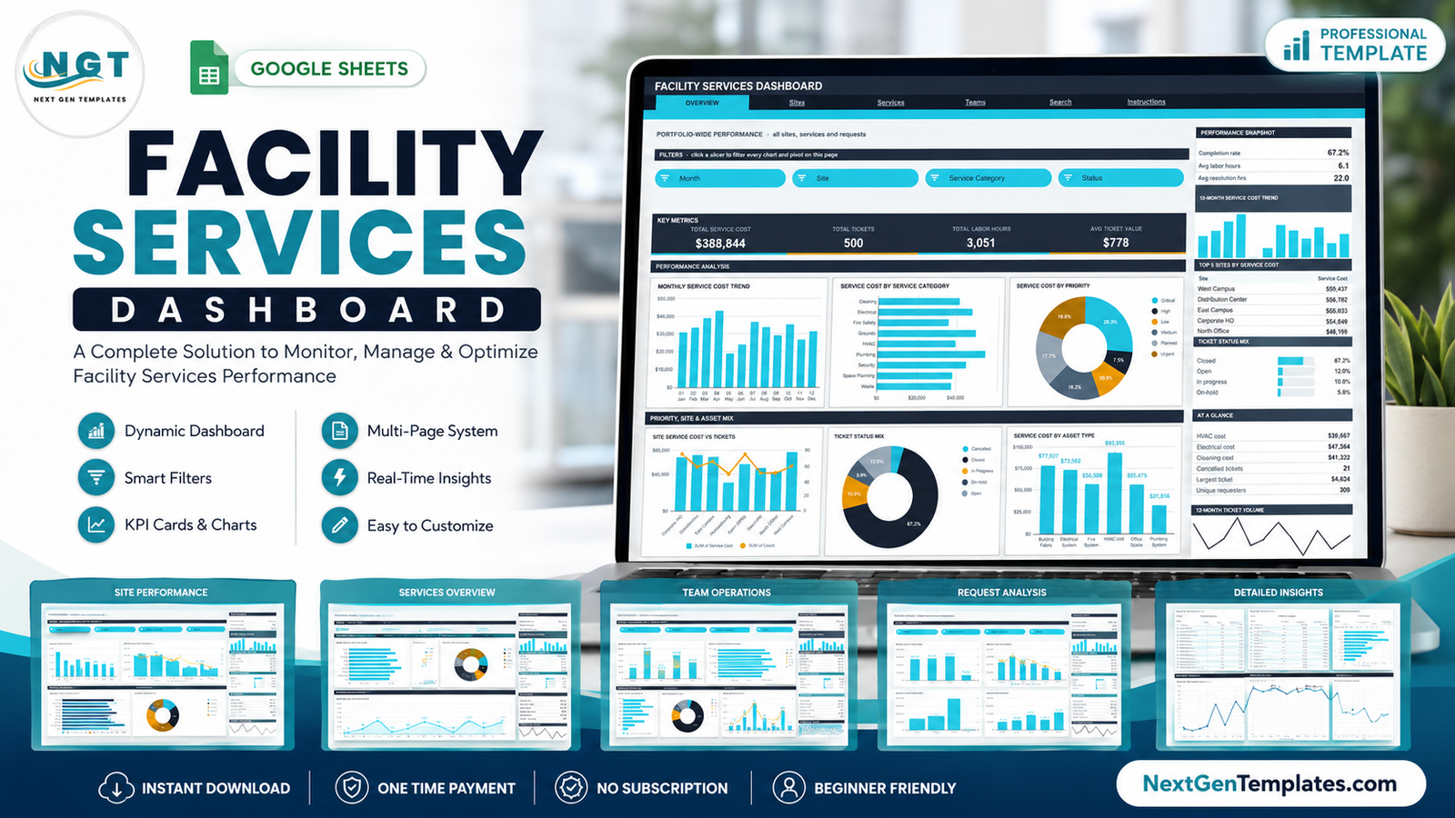
The numbers in the sample build make the point on their own. Emergency repair accounts for $124,762 of spend against $24,389 on preventive maintenance — a five-to-one ratio that is invisible in a ticket list and obvious in a chart. Completion rate sits at 67.2%, average resolution runs to 22.0 hours, and cost per labor hour lands at $127. This is the analytical dashboard line, not a KPI scorecard: there are no targets or traffic lights here, just a clear read of where cost, effort and delay concentrate.
Get the Facility Services Dashboard in Google Sheets
Key Features of the Facility Services Dashboard in Google Sheets
- Six pages plus a Data sheet — Overview, Sites, Services, Teams, Search and Instructions.
- 16 KPI cards across the four analysis pages, from Total Service Cost down to On Hold Rate.
- 16 slicers, four on every analysis page, each driving every pivot on that page at once.
- Native pivot tables behind each chart, parked to the right of the page so the numbers are auditable.
- A snapshot rail on every analysis page: a Top 5 league table, a percentage share panel, an At a Glance list, a 12-month cost trend and a 12-month ticket volume line.
- A Ticket ID lookup page that returns all 16 fields of any single request.
- 1,000 rows pre-wired — pivots, slicers and formulas already reach row 1001, so pasting new tickets needs no re-ranging.
- A one-line colour palette at the top of the bundled Apps Script; the shipped theme is Slate #26323F with Cyan #22D3EE and Amber #F59E0B.
Dashboard Pages Explanation
Overview — portfolio-wide performance
Four slicers (Month, Site, Service Category, Status) sit above four KPI cards: Total Service Cost $388,844, Total Tickets 500, Total Labor Hours 3,051 and Avg Ticket Value $778. Six charts follow — Monthly Service Cost Trend, Service Cost by Service Category, Service Cost by Priority, Site Service Cost vs Tickets, Ticket Status Mix and Service Cost by Asset Type. The right rail carries a Performance Snapshot (completion rate 67.2%, avg labor hours 6.1, avg resolution 22.0 hrs), a Top 5 Sites by Service Cost table led by West Campus at $59,437, a status mix bar list and an At a Glance panel showing HVAC cost $39,667, electrical cost $47,364 and cleaning cost $41,322.
Sites — cost, labor and request mix by location
Slicers here are Site, Request Type, Month and Priority. The KPI row reads Closed Tickets 336, Avg Resolution Hrs 22.0, Corporate HQ Cost $54,849 and Avg Labor Hours 6.1. Service Cost vs Labor Hours puts a cost column against a labor-hours line for all eight locations; Service Cost by Site & Request stacks the eight request types inside each site’s bar so you can see, per building, how much of the spend is emergency versus routine. Monthly Labor Hours and Tickets by Status close the page, and the rail adds cost per labor hour of $127 alongside a Top 5 Services by Service Cost table led by Plumbing at $53,791.Facility Services Dashboard in Google Sheets
Services — request, category and technician performance
Slicers: Request Type, Service Category, Technician, Asset Type. KPI cards show Preventive Maint Cost $24,389, Emergency Repairs 74, Vendor Callout Cost $46,215 and Largest Ticket $4,624. Service Cost by Request Type is the page’s headline chart, with emergency repair at $124,762, installation at $80,277 and vendor callout at $46,215. Service Category Service Cost vs Tickets pairs spend against volume, Service Cost by Technician ranks all ten names, and Labor Hours by Asset Type splits effort across building fabric, electrical, fire, HVAC, office space and plumbing. Top 5 Technicians by Service Cost is on the rail, led by Dmitri Volkov at $49,396.
Teams — priorities, assets and request channels
Slicers: Priority, Asset Type, Request Channel, Month. Critical Request Cost $102,419, High Priority Tickets 31, Active Technicians 10 and On Hold Rate 5.8% head the page. Tickets by Priority shows the volume shape (Planned 111, Medium 103, Critical 92, Low 85, Urgent 78, High 31), Asset Type Service Cost vs Labor Hours compares spend with effort, Service Cost by Request Channel splits intake across mobile app, phone, web portal, supervisor, service desk and email, and Monthly Ticket Volume tracks the year.Facility Services Dashboard in Google Sheets
Search — one ticket, all 16 fields
Type a Ticket ID such as FST-0001 and the page returns the complete record: date, site, service category, request type, requester, priority, service cost, labor hours, resolution time, technician, request channel, status, asset type, month and quarter. It is the page you use when a chart shows an outlier and someone asks which job that actually was.Facility Services Dashboard in Google Sheets
Instructions — how the file is wired
A numbered ten-point guide explains the architecture: pivots live to the right of each page behind a wide spacer column, slicers are per-page rather than global, and the KPI cards and At a Glance lists use SUMIFS and COUNTIFS against the whole Data sheet so they stay unfiltered on purpose while the charts, pivots and Top 5 panel react to slicers.
Facility Services Dashboard in Google Sheets vs. Excel vs. Paid CAFM/CMMS Software — Feature Comparison
| This Google Sheets template | Excel facilities dashboard | Paid CAFM/CMMS SaaS | |
|---|---|---|---|
| Cost | $9.99 one time | $13.99 one time | $35-$100 per user per month |
| Platform | Google Sheets, browser only | Desktop Excel | Vendor cloud |
| Setup time | Under 10 minutes | Under 15 minutes | 2-6 weeks onboarding |
| Real-time team collaboration | Yes, native | Only via OneDrive co-authoring | Yes |
| Mobile access | Google Sheets app | Excel mobile, limited | Dedicated app |
| Customizable fields | Full — it is your sheet | Full | Restricted to vendor schema |
| Share with a link | Yes | No | Seat-based |
| Year-1 cost at 5 users | $9.99 | $13.99 | $2,100-$6,000 |
| Slicer-driven cross-filtering | 16 slicers, 4 per page | Yes | Yes |
| Work-order dispatch to technicians | No | No | Yes |
| Who owns the data | You, in your Drive | You, on your disk | The vendor |
Who Should Use This Template
It suits facilities managers running between two and twenty sites, in-house maintenance teams, campus and estates offices, property and building-services contractors, and operations analysts who have to produce a monthly service-cost report but do not need a CMMS seat for every colleague who only reads it. It also suits anyone stuck at the reporting stage of a CMMS rollout — export the ticket log, paste it in, and you have the analysis while the platform project runs.
It is the wrong tool if you need field dispatch, barcode asset scanning, IoT sensor feeds, automatic preventive-maintenance scheduling or a regulator-grade audit trail. Those belong to a real CMMS. This file explains the work; it does not run it.
Real-World Use Cases
Priya, facilities manager for an eight-site manufacturing group. Her monthly board pack used to mean rebuilding a pivot table by hand. She now filters the Overview page to last month, screenshots the Top 5 Sites table and the Service Cost by Priority donut, and is finished in four minutes. The line that changed her budget conversation was the emergency-versus-preventive split.
Daniel, estates coordinator at a university campus. He uses the Sites page with the Request Type slicer to show which buildings drive vendor callouts, then the Teams page’s Service Cost by Request Channel donut to argue for moving requests off the phone and into the web portal.
Amara, operations analyst at a building-services contractor. She filters the Services page by technician to compare cost per labor hour across the ten-person crew, then uses the Search page to pull the exact ticket behind any outlier before raising it in a performance review.
Advantages of the Facility Services Dashboard in Google Sheets
- Nothing to install. It opens in a browser on a free Google account — no add-on, no extension, no licence to assign.
- The maths is inspectable. Because every chart reads a real pivot table rather than a hidden helper block, you can scroll right and see exactly which rows produced a number.
- It stays fast as the log grows. Pivot-and-slicer architecture means no chain of array formulas recalculating on every edit.
- Sharing is a link, not a seat. Send the sheet to a contractor for a week and revoke it afterwards.
- The data stays yours. The file lives in your Drive, and no vendor holds your service history.
- Re-branding is one edit. Change the palette constant in the script and every page follows.
Opportunities for Improvement
Honest limitations, so you can judge the fit before you buy. The KPI cards and the At a Glance lists are deliberately unfiltered — they use SUMIFS and COUNTIFS on the full Data sheet — so if you expect a card to move when you click a slicer, it will not. Slicers are per-page rather than global, which means a filter set on Sites does not carry across to Services. The default build covers 1,000 data rows; going beyond that means opening the bundled Apps Script, raising DATA_ROWS and re-running main(). There is no SLA-breach flag, no cost-versus-budget variance column and no automatic scheduling of recurring work — all of those are things you would add on the Data sheet and a new pivot, and none of them ship in the box.
Best Practices
- Keep the column headers exactly as shipped. Renaming a header silently drops the field out of the pivots that use it.
- Paste values, not formatted cells, when you import a helpdesk export, so the date and number columns stay typed.
- Use one Ticket ID convention across your whole log — the Search page matches on an exact string.Facility Services Dashboard in Google Sheets
- Clear a slicer with Select all rather than leaving it half-filtered; a forgotten filter is the most common reason two people read different numbers from the same page.
- Refresh monthly, not daily. This is a management report, and monthly cadence keeps the trend charts readable.Facility Services Dashboard in Google Sheets
- Keep a raw archive tab of each export before you clean it, so a disputed figure can always be traced back.Facility Services Dashboard in Google Sheets
- Learn the underlying feature set. Google’s own documentation on pivot tables in Google Sheets covers the grouping and slicer behaviour this dashboard is built on.
Explore Relevant Templates
- Facility Services Dashboard in Google Sheets — the template described in this post.
- Facility Services Dashboard in Power BI — the same subject with drillthrough pages and DAX measures.
- Facility Services Dashboard in Excel — the desktop workbook version.
- Facilities Management Analysis Dashboard in Google Sheets — a wider estates view.
- Housekeeping Service Analytics Dashboard in Google Sheets — soft-services detail.
- Cleaning Service Dashboard in Google Sheets — contract cleaning operations.Facility Services Dashboard in Google Sheets
Get the Facility Services Dashboard in Google Sheets
If you want to build pivot-driven reports like this yourself, the Excel Pivot Tables & Dashboards course on NextGenTemplates Academy teaches the method with practice files.
Frequently Asked Questions
What do I actually download?
A PDF containing a “Make a copy” link. Clicking it creates your own editable copy of the dashboard in your Google Drive. Nothing is shared with anyone else.
Do I need Excel or a paid Google Workspace plan?
No. A free personal Google account is enough, and the file works entirely in the browser.Facility Services Dashboard in Google Sheets
Can I add my own sites, categories and technicians?
Yes. Type them into the Data sheet and they flow through to the slicers, pivots and charts automatically — nothing is hard-coded to the sample values.
How many tickets can it handle?
1,000 rows out of the box. For more, open the bundled Apps Script, raise the DATA_ROWS constant and re-run main() so the pivots and slicers rebuild at the larger size.Facility Services Dashboard in Google Sheets
Why do the KPI cards ignore my slicer selection?
By design. The cards and the At a Glance panel are SUMIFS/COUNTIFS totals over the whole Data sheet, so a portfolio-wide reference number always stays on screen while the charts below react to the filters.
Is this a KPI scorecard?
No. This is the analytical dashboard line — cost, labor, priority and channel profiling. A KPI scorecard with monthly targets and RAG status is a different product family on the same site.Facility Services Dashboard in Google Sheets
Can several people use it at once?
Yes. Share it like any Google Sheets file; edits save in real time and each person can hold their own filter view.Facility Services Dashboard in Google Sheets
About the Author
Built by PK – Microsoft Certified Professional with 15+ years of Excel, Google Sheets, and Power BI experience. Founder of NextGenTemplates, reaching 300K+ subscribers across YouTube channels. Every template is hand-built and tested before release.Facility Services Dashboard in Google Sheets
Conclusion
A facilities function that cannot say which site, which service category and which request type consume its budget is negotiating that budget blind. The Facility Services Dashboard in Google Sheets answers those three questions in about ten minutes of setup, from data you already have, for a one-time $9.99 rather than a per-seat subscription. Paste your ticket log into the Data sheet, click a slicer, and read the split.Facility Services Dashboard in Google Sheets
Get the Facility Services Dashboard in Google Sheets →
For walkthroughs of this and other Google Sheets dashboards, subscribe to NeoTechNavigators on YouTube.Facility Services Dashboard in Google Sheets