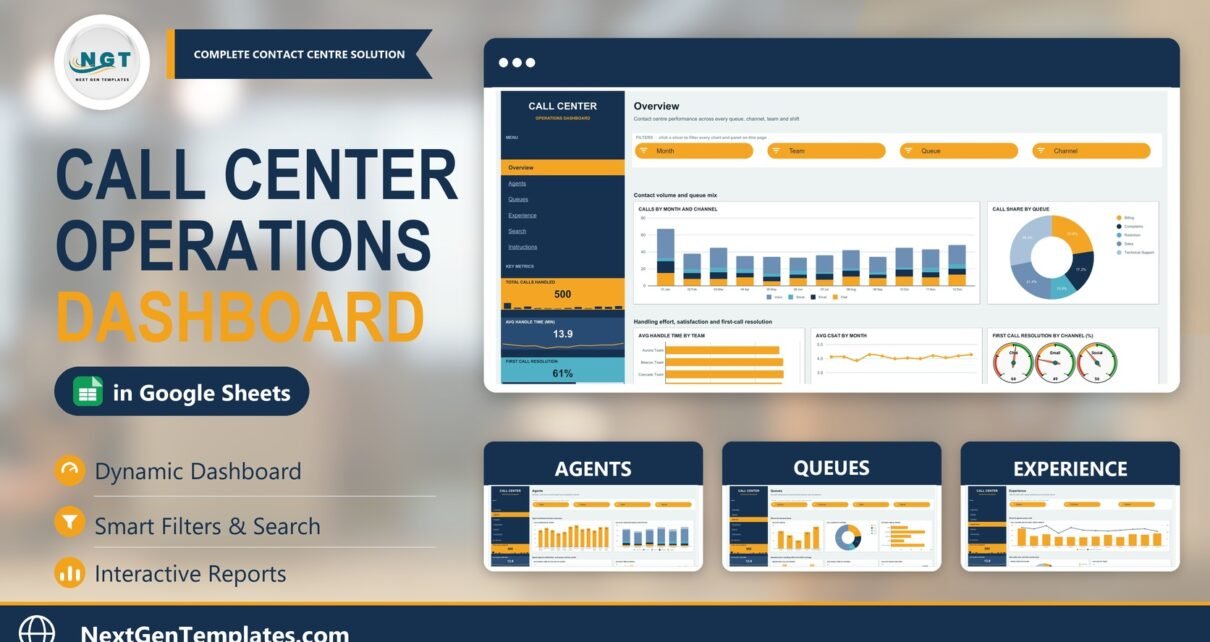
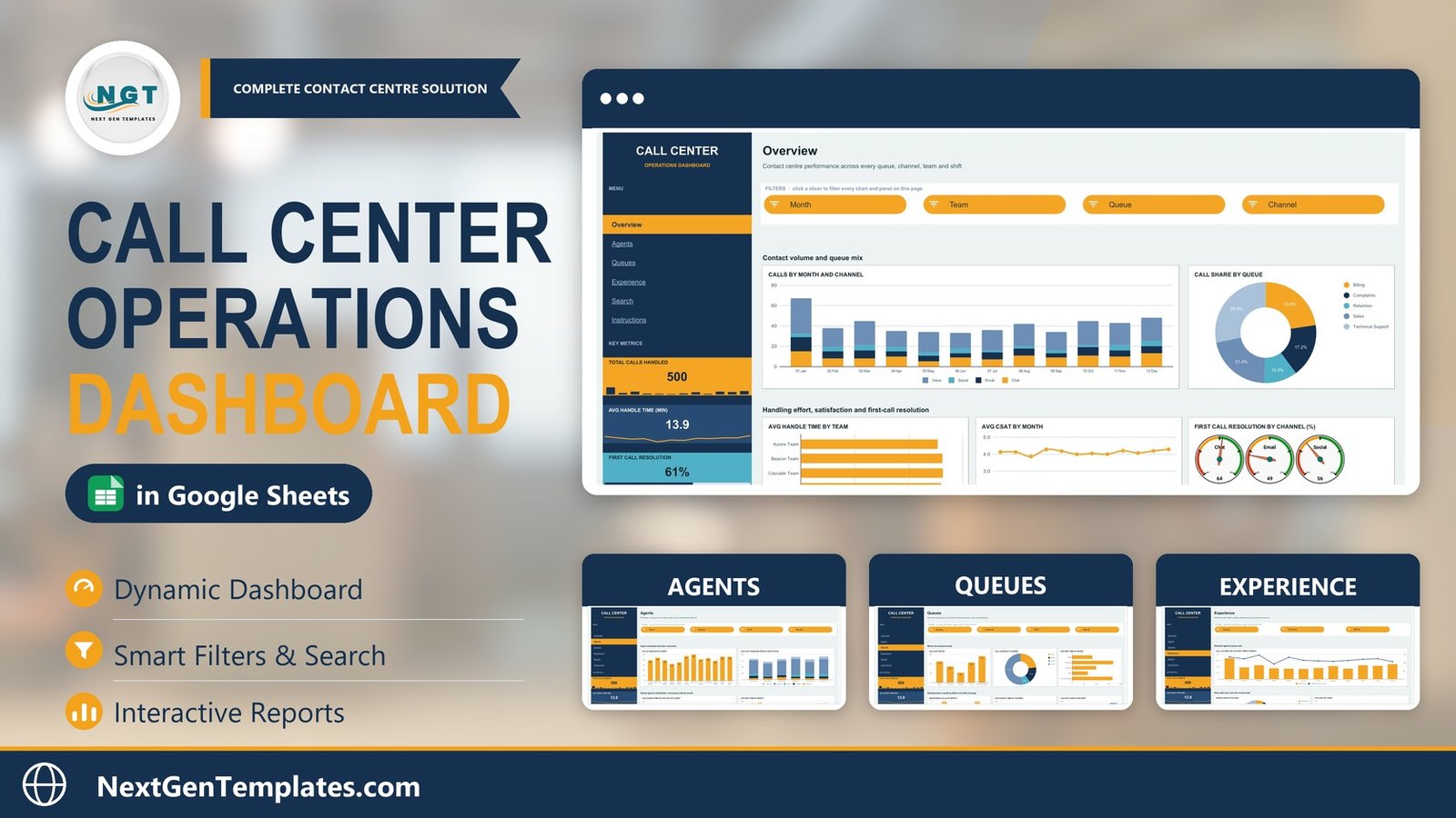
Most contact centres already own their numbers. The phone system records every call, every wait, every disposition, and it will happily export the lot to CSV. What most teams do not own is a way to read those numbers on a Monday morning without rebuilding a pivot table from scratch. The Call Center Operations Dashboard in Google Sheets closes that gap: paste an export into one tab and six linked pages light up with 4 headline KPIs, 17 charts and panels and 15 slicers, plus a Call ID lookup that returns any single record in full.
The sample workbook ships with 500 call records spanning 12 agents, 6 teams, 5 queues, 4 channels and 4 shifts, and the pivots are pre-sized for 1,000 rows across a 16-column Data tab. In the sample data the picture is immediately readable: 500 calls handled, 13.9 minutes average handle time, 61% first call resolution, 4.11 average CSAT, 119 seconds average wait and a 7.8% abandonment rate.
One thing to be clear about before you read further. This is an offline analysis workbook. It does not connect to Genesys, Five9, Avaya, Twilio, Zendesk or any other ACD or CCaaS platform. It does not dial, record or monitor calls, and nothing on it refreshes in real time. You export your data and paste it in. If you need a live wallboard, this is not that product – and the rest of this article assumes you already know it.
Key Features of the Call Center Operations Dashboard in Google Sheets
- A persistent KPI rail. Total Calls Handled, Avg Handle Time (min), First Call Resolution % and Avg CSAT Score sit in the navy left rail on every page, each with its own sparkline or progress bar, so the headline numbers travel with you as you move between views.
- An “At a glance” strip beneath them: average wait time in seconds, abandonment rate, active agents and escalated calls.
- Per-page slicers, not global ones. The Overview filters on Month, Team, Queue and Channel; Agents on Team, Queue, Shift and Month; Queues on Queue, Channel, Shift and Month; Experience on Queue, Channel and Month. Because they are page-scoped, two people can hold two different views in the same file.
- Four gauge dials for first call resolution, one per channel, instead of a single blended percentage that hides the weak channel.
- A handle-time versus CSAT scatter plotted per agent – the one chart that separates “fast” from “good”.
- Shift coverage built into the queue view, stacking Morning, Afternoon, Evening and Night.
- A Call ID search page driven by INDEX/MATCH wrapped in IFERROR, so a missing ID reads “Not found” rather than #N/A.
- No hard-coded numbers. Every figure traces to a pivot on the Data tab, and the pivots sit from column Z onwards on each page if you want to inspect them.
Dashboard Pages Explanation
1. Overview – the Monday-morning read
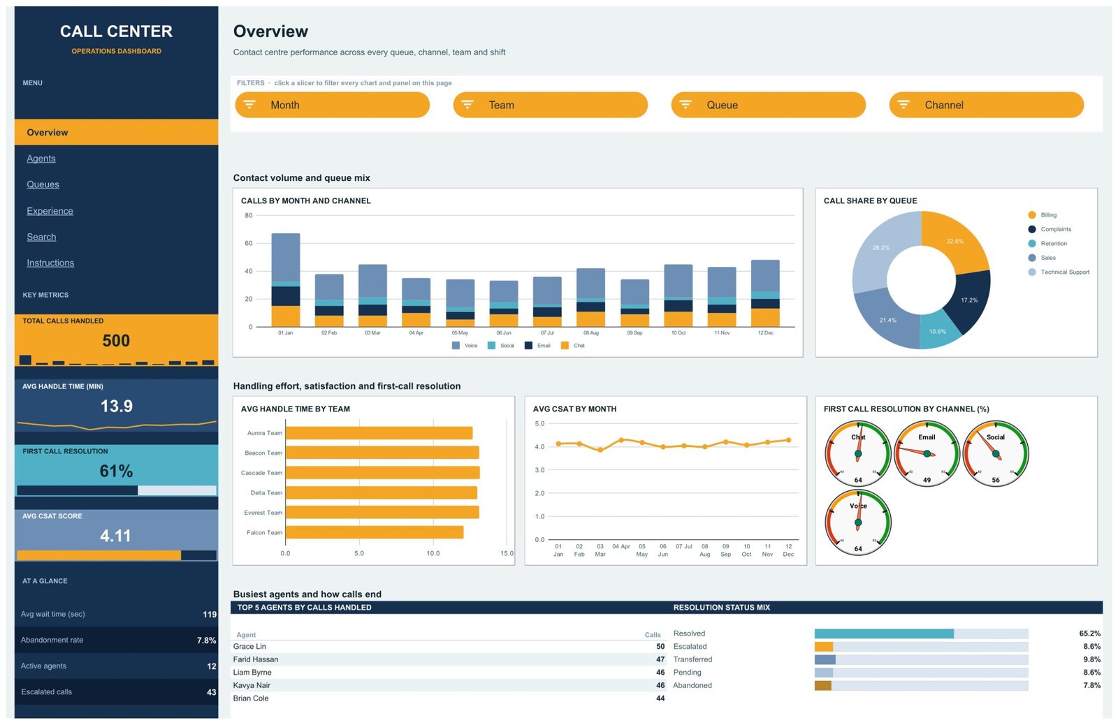
Contact volume and queue mix sit at the top: Calls by Month and Channel as a stacked column broken into Voice, Chat, Email and Social, beside Call Share by Queue as a donut. In the sample that donut reads Technical Support 28.2%, Billing 22.6%, Sales 21.4%, Complaints 17.2% and Retention 10.6% – one glance tells you where the demand actually lives.
The middle band covers handling effort and satisfaction: Avg Handle Time by Team, Avg CSAT by Month and First Call Resolution by Channel as four dials. The bottom band ranks the Top 5 Agents by Calls Handled and shows the Resolution Status Mix – Resolved 65.2%, Transferred 9.8%, Escalated 8.6%, Pending 8.6%, Abandoned 7.8% in the sample.
2. Agents – workload and the speed-versus-satisfaction trade-off
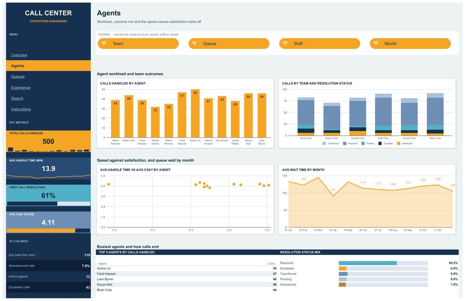
Calls Handled by Agent carries a data label on every bar, so the spread across the roster is legible without hovering. Calls by Team and Resolution Status stacks five outcomes per team, which is how an escalation-heavy team shows itself. Then the two charts that matter most in a one-to-one: Avg Handle Time vs Avg CSAT by Agent as a scatter, and Avg Wait Time by Month as a filled area with labelled points.
3. Queues – where demand lands
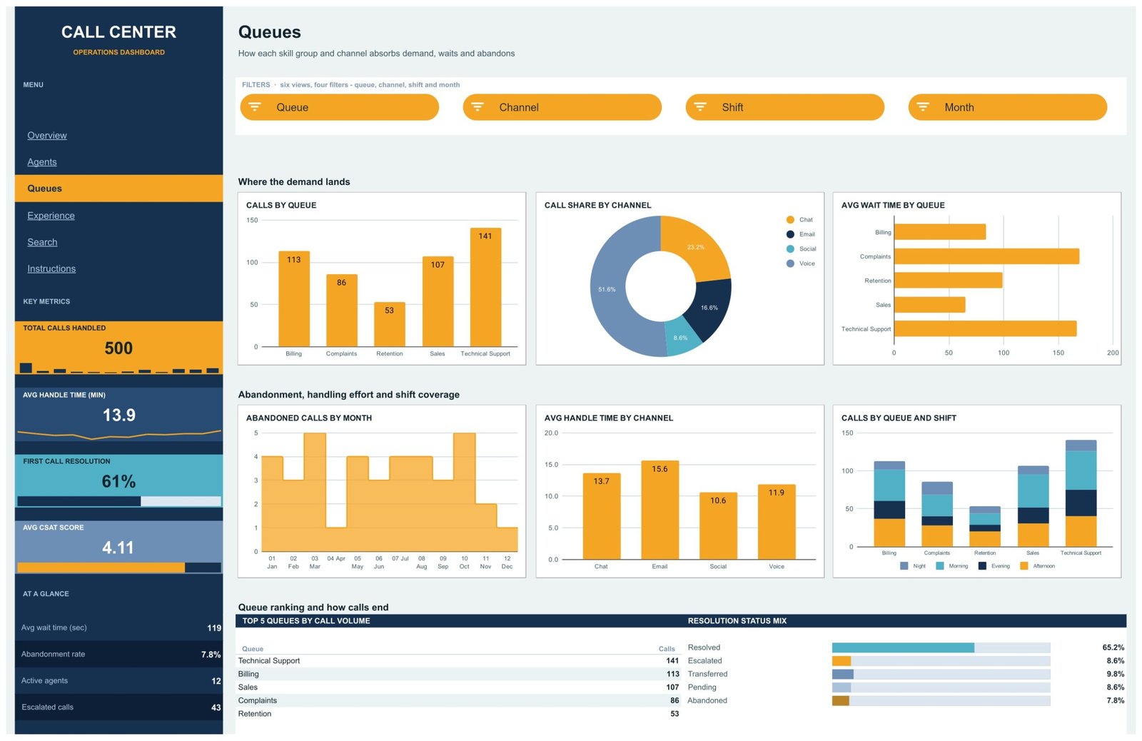
Six views on one page: Calls by Queue, Call Share by Channel (Voice 51.6%, Chat 23.2%, Email 16.6%, Social 8.6%), Avg Wait Time by Queue, Abandoned Calls by Month, Avg Handle Time by Channel (Email is the slowest at 15.6 minutes in the sample, Social the fastest at 10.6) and Calls by Queue and Shift. A Top 5 Queues by Call Volume ranking closes the page.
4. Experience – the caller’s side of the call
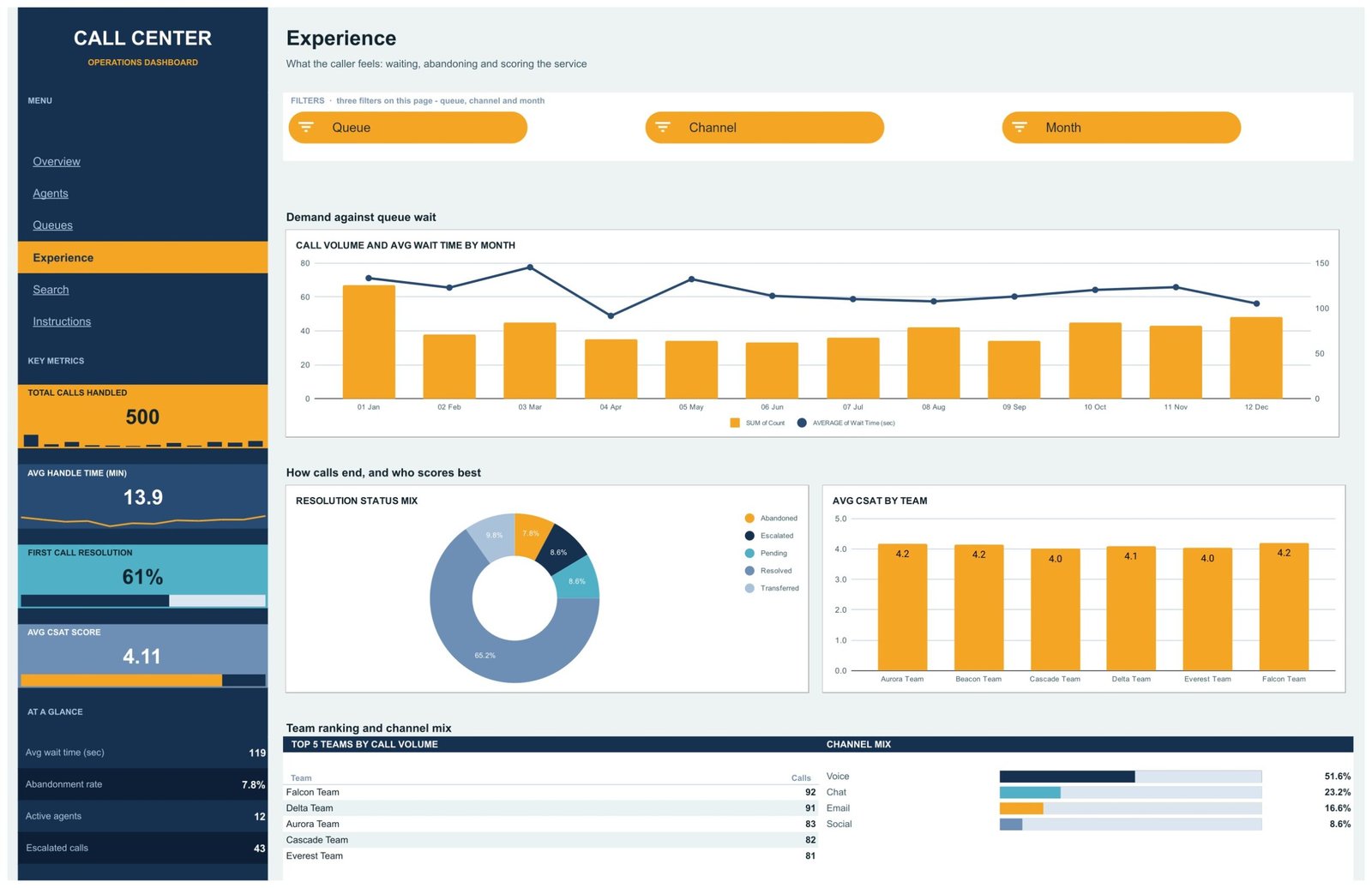
This page asks a different question: not how hard the team worked, but what the caller felt. Call Volume and Avg Wait Time by Month puts both series on one combo chart, so a volume spike that did not move the wait line reads as good staffing rather than luck. Alongside it sit the Resolution Status Mix donut, Avg CSAT by Team and a Top 5 Teams by Call Volume ranking with a Channel Mix strip.
5. Search – one Call ID, the whole record
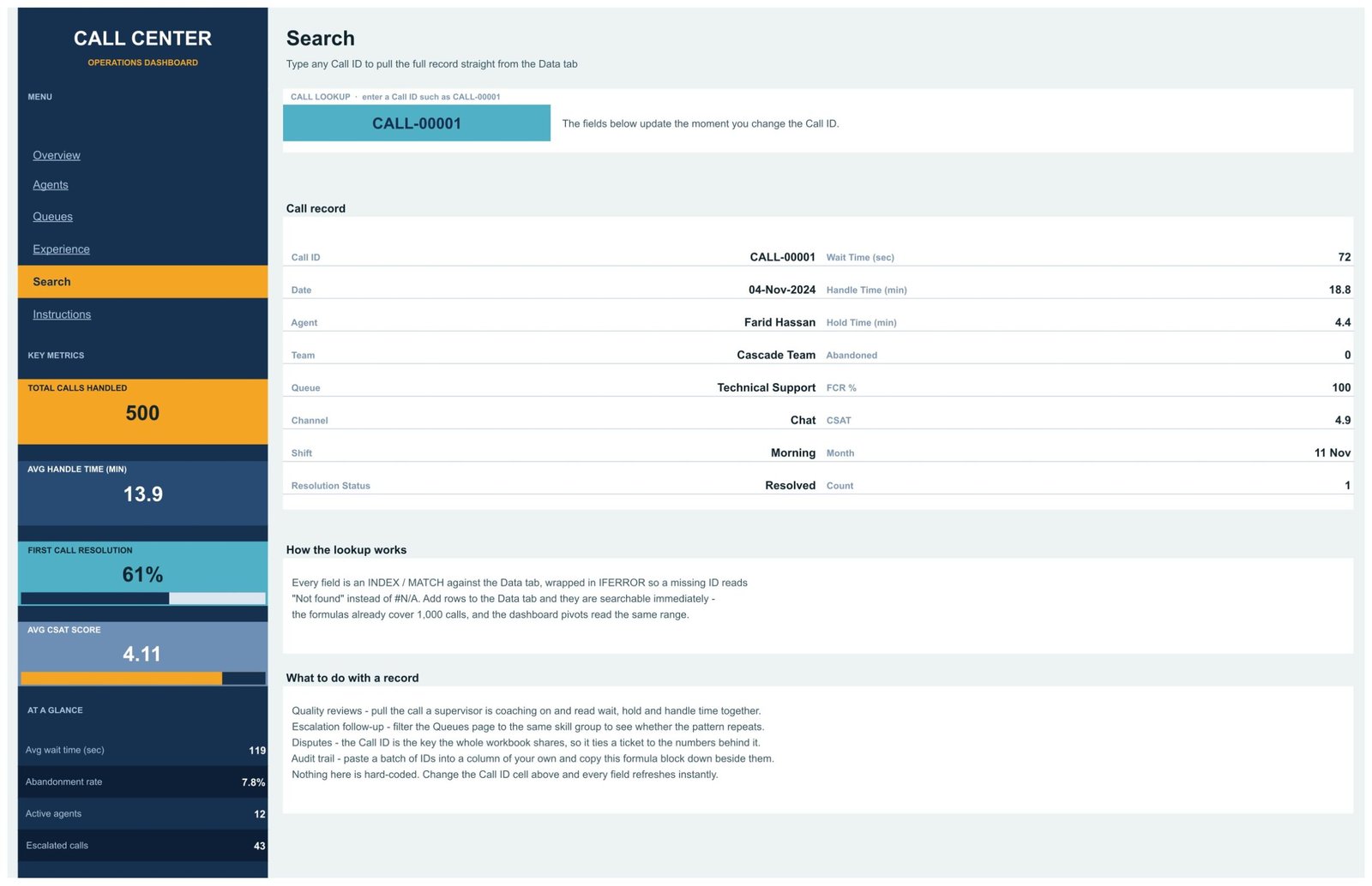
Type a Call ID such as CALL-00001 into the highlighted cell and fifteen fields fill in: Date, Agent, Team, Queue, Channel, Shift, Resolution Status, Wait Time, Handle Time, Hold Time, Abandoned flag, FCR %, CSAT, Month and Count. It is the page a supervisor uses during a quality review, or when a customer disputes what happened on a specific call.
6. Instructions – the page that keeps the file alive
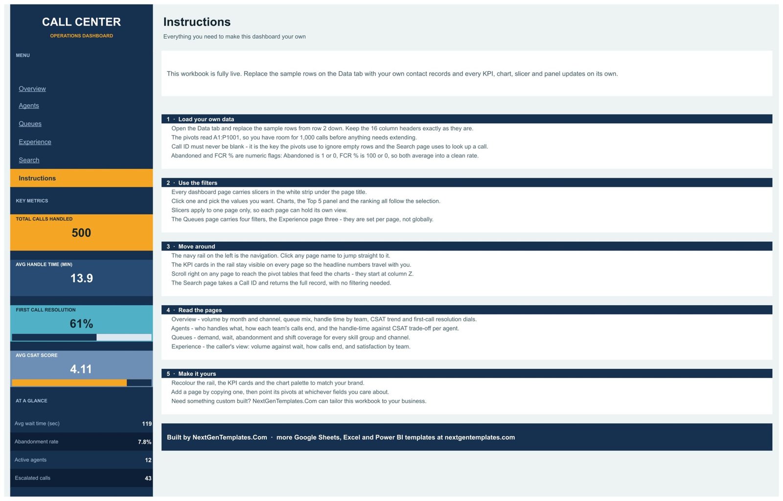
Five numbered sections: loading your own data, using the filters, moving around, reading each page, and making it yours by recolouring the rail, cards and chart palette.
Call Center Operations Dashboard in Google Sheets vs. Excel vs. Paid Contact-Centre Analytics
| This template (Google Sheets) | Excel dashboard build | Paid CCaaS analytics add-on | |
|---|---|---|---|
| Cost | One-off 16.99 | One-off, or days of your own time | Typically 15-40 per agent per month |
| Platform | Google Sheets, browser only | Desktop Excel | Vendor cloud |
| Setup time | About 10 minutes | Similar, once the file is open | Weeks, plus telephony integration |
| Real-time team collaboration | Yes, native | Only via OneDrive co-authoring | Yes |
| Mobile access | Yes, Sheets app | Limited | Yes |
| Customisable fields | Yes – you own the file | Yes | Rarely, without professional services |
| Share with a link | Yes | No | Seat-based |
| Year-1 cost at 5 users | 16.99 | 16.99-19.99 | 900-2,400 |
| Live ACD / telephony feed | No – paste an export | No | Yes |
| Call recording and monitoring | No | No | Yes |
Who Should Use This Template
Team leaders running roughly 5-30 agents who already export call detail and want a weekly operations review without paying per seat for reporting. BPO account managers who have to show a client FCR by channel and abandonment by shift. In-house support desks whose current dashboard is a pivot table someone rebuilds every Monday. Operations analysts who want a working structure to adapt rather than a blank sheet.
It is the wrong fit for anyone who needs live queue alerting, workforce-management forecasting or call recording. It also starts to strain above about 1,000 calls per reporting period unless you extend the pivot ranges yourself.
Real-World Use Cases
The evening abandonment problem. A billing team leader filters the Queues page to Billing and reads Calls by Queue and Shift against Abandoned Calls by Month. The evening block carries a disproportionate share of abandons. Two people move shift; the next month’s chart confirms it worked.
The client review. A BPO account manager filters the Overview to the client’s queue and screenshots the four FCR dials. Voice at 64 and Email at 49 is a specific, arguable finding – far more useful than a single 61% headline.
The coaching conversation. A support manager opens the Agents scatter before one-to-ones. An agent two minutes faster than the team average with a CSAT half a point below it is a conversation about rushing, not a performance warning.
Advantages of the Call Center Operations Dashboard in Google Sheets
- Zero infrastructure. A free Google account and a browser. No install, no macros, no scripts, no add-ons.
- Page-scoped filters. Genuinely useful in a shared file – your view does not overwrite a colleague’s.
- Channel-level honesty. Splitting FCR and handle time by channel is what turns “our FCR is 61%” into something actionable.
- Call-level drill-down. Most spreadsheet dashboards stop at aggregates; the Search page goes back to the individual call.
- Fully editable. Add a queue, rename a team, recolour the palette – the pivots read whatever is in your data.
Opportunities for Improvement
Being honest about the limits is more useful than a feature list. There is no service-level (SLA) percentage – answered-within-X-seconds is not a column in the sample schema, and if you need it you will add it yourself. There is no forecasting or Erlang staffing model. The pivots stop at 1,000 rows until you extend them. And because it is offline, the numbers are only as fresh as your last paste – if you need today’s figures at 3pm, this is not the tool.
Best Practices
- Never leave Call ID blank. It is the key the pivots use to ignore empty rows and the Search page uses to find a record.
- Keep Abandoned as 1 or 0 and FCR % as 100 or 0. Both then average into a clean rate with no extra formulas.
- Paste on a fixed cadence – the same day each week – so month-on-month charts compare like with like.
- Refresh the pivots after a big paste, then check the KPI rail against your phone system’s own totals once before you trust the file.
- Duplicate a page rather than overloading one. Copy a page and repoint its pivots if you want a fifth view; the layout survives it.Call Center Operations Dashboard in Google Sheets
- If you are new to the mechanics, Google’s own guide to creating and using pivot tables covers everything this workbook does under the hood.Call Center Operations Dashboard in Google Sheets
Explore Relevant Templates
- Call Center Operations Dashboard in Google Sheets – the template this article covers.
- Call Center Operations Dashboard in Excel and the Power BI version – the same six-page structure on other platforms.
- Call Center KPI Scorecard in Google Sheets – target-versus-actual traffic lights rather than pivots and slicers.
- Call Abandonment Rate KPI Dashboard in Google Sheets – one metric, tracked in depth.
- IT Help Desk Dashboard in Google Sheets – for ticket queues instead of call queues.
- Related reading: Outsourcing (BPO/KPO) Dashboard in Google Sheets and Recruitment Agencies Dashboard in Google Sheets.Call Center Operations Dashboard in Google Sheets
Frequently Asked Questions
Does it connect to my phone system or CRM?
No. There is no ACD, CCaaS or ticketing connector of any kind, and no live refresh. You export call detail to CSV and paste it into the Data tab.
How many call records can it hold?
The pivots read A1:P1001, so 1,000 records work with no changes. Beyond that, extend the pivot ranges – nothing in the file is locked.Call Center Operations Dashboard in Google Sheets
What columns does my export need?
Sixteen: Call ID, Date, Agent, Team, Queue, Channel, Shift, Resolution Status, Wait Time (sec), Handle Time (min), Hold Time (min), Abandoned, FCR %, CSAT, Month and Count.
Can I add my own queues, teams, channels or shifts?
Yes. The sample uses 5 queues, 6 teams, 4 channels and 4 shifts, but the pivots read whatever values appear in your data.Call Center Operations Dashboard in Google Sheets
Do the slicers apply to the whole workbook?
No, and that is deliberate. They are set per page, so different pages can hold different selections at once.Call Center Operations Dashboard in Google Sheets
Do I need Excel, add-ons or scripts?
None of them. A free Google account and a browser is the whole requirement.Call Center Operations Dashboard in Google Sheets
How is this different from the Call Center KPI Scorecard?
The scorecard is a month-picker with target-versus-actual traffic lights. This is an analytical dashboard: pivots, slicers, six pages and call-level drill-down.Call Center Operations Dashboard in Google Sheets
About the Author
Built by PK – Microsoft Certified Professional with 15+ years of Excel, Google Sheets, and Power BI experience. Founder of NextGenTemplates, reaching 300K+ subscribers across YouTube channels. Every template is hand-built and tested before release.
Conclusion
A contact centre does not usually lack data – it lacks a repeatable way to read it. The Call Center Operations Dashboard in Google Sheets gives you that: paste an export, and volume, handle time, first call resolution, CSAT, wait, abandonment, shift coverage and per-agent behaviour are all one click apart, with a Call ID lookup underneath for the moments when the aggregate is not enough. It will not replace your phone system, and it is not trying to. It replaces the pivot table you rebuild every Monday.
Get the Call Center Operations Dashboard in Google Sheets on NextGenTemplates – instant download, lifetime access.
For walkthroughs of this and other Google Sheets dashboards, subscribe to NeoTechNavigators on YouTube.