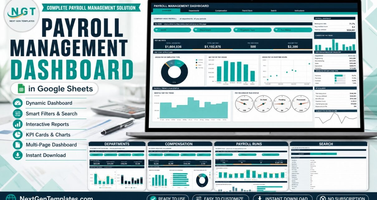
The Payroll Management Dashboard in Google Sheets turns a flat pay register into six tabs, 16 KPI cards, 21 charts and 15 slicers. It ships with 500 sample pay records and is wired for 1,000 rows out of the box, and every chart is driven by a native Google Sheets pivot table rather than a hidden column of helper formulas. Setup takes about ten minutes: make a copy, paste your own register over the sample rows, and all four analysis pages redraw.
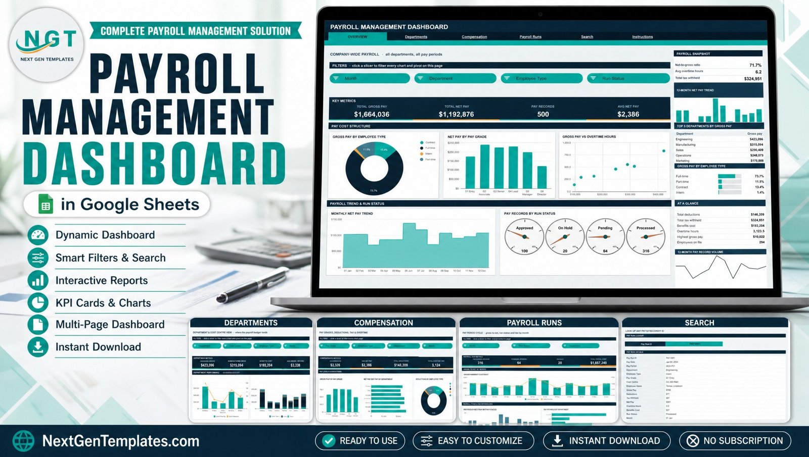
Most payroll teams already have the numbers. What they do not have is a view of them. The pay register comes out of the payroll provider each cycle as a few hundred rows of gross, deductions, tax and net, gets checked line by line, and is then filed. Nobody sees that Manufacturing quietly absorbed a fifth of the budget, or that overtime hours peaked in June and never came back down. This template is the missing reporting layer on top of the payroll system you already run.
Get the Payroll Management Dashboard in Google Sheets
One thing to be clear about before anything else. This is an analytics and reporting spreadsheet built on sample data. It is not a payroll engine. It does not calculate pay, run a pay cycle, produce payslips, or compute, file or remit income tax, provident fund, ESI, social security, National Insurance or any other statutory withholding. It makes no compliance claim for any country, state or jurisdiction. It reads what your payroll system has already produced and shows you what it adds up to.
Key Features of the Payroll Management Dashboard in Google Sheets
- Six tabs, four of them analysis pages. Overview, Departments, Compensation and Payroll Runs each carry a four-card KPI strip, a filter row, a chart grid and a right-hand sidebar. Search and Instructions complete the file, and a top navigation bar repeats on every page.
- A 16-column pay register. Pay Run ID, Pay Date, Pay Period, Department, Employee Type, Pay Grade, Cost Centre, Employee Name, Gross Pay, Deductions, Tax Withheld, Net Pay, Overtime Hours, Benefits Cost, Run Status and Month.
- 21 charts plus an eight-strip trend rail. Seventeen named charts and four run-status gauges span the analysis pages, and every page carries a 12-Month Net Pay Trend strip and a 12-Month Pay Record Volume strip in its sidebar. Chart types include donut, column, bar, scatter, area, stacked column and dual-axis combo.
- 15 native slicers, three or four per page. Month, Department, Employee Type, Run Status, Cost Centre and Pay Grade. Slicers are per-page, so filtering Compensation does not disturb Payroll Runs.
- Pivot-driven, not formula-driven. Each chart reads a real pivot table parked to the right of its page past a wide spacer column. Scroll right on any page to inspect the numbers behind any visual.
- Seven departments and six cost centres. Engineering, Finance, Human Resources, Manufacturing, Marketing, Operations and Sales; CC-101 Admin, CC-202 Plant, CC-303 R&D, CC-404 Sales, CC-505 Support and CC-606 Logistics.
- Six pay grades and four employee types. G1 Entry through G6 Director; Full-time, Part-time, Contract and Intern.
- A record-level Search page. Pick a Pay Run ID and read the whole record without scrolling the raw data sheet.
Dashboard Pages Explanation
Page 1: Overview — company-wide payroll
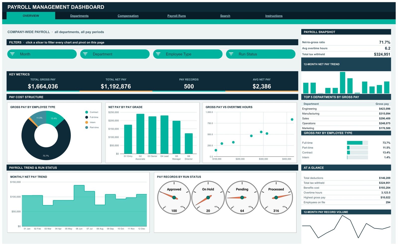
The whole-company view. KPI cards show Total Gross Pay, Total Net Pay, Pay Records and Avg Net Pay. The sidebar snapshot adds net-to-gross ratio, average overtime hours and total tax withheld, then a Top 5 Departments by Gross Pay table, a Gross Pay by Employee Type share panel and an At a Glance list covering total deductions, tax withheld, benefits cost, overtime hours, highest gross pay and employees on file. Charts are Gross Pay by Employee Type, Net Pay by Pay Grade, Gross Pay vs Overtime Hours, Monthly Net Pay Trend, and Pay Records by Run Status rendered as four gauges. Slicers: Month, Department, Employee Type, Run Status.
Page 2: Departments — where the payroll budget lands
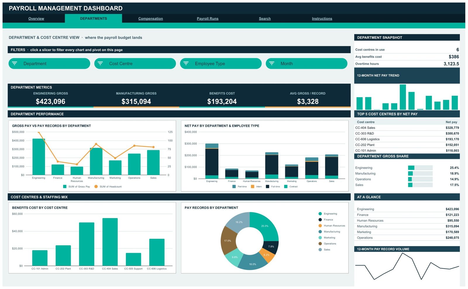
Department and cost-centre spend. KPI cards show Engineering Gross, Manufacturing Gross, Benefits Cost and Avg Gross per Record, with a snapshot for cost centres in use, average benefits cost and overtime hours. Charts are Gross Pay vs Pay Records by Department, Net Pay by Department and Employee Type, Benefits Cost by Cost Centre, and Pay Records by Department, supported by a Top 5 Cost Centres by Net Pay table and a Department Gross Share panel. Slicers: Department, Cost Centre, Employee Type, Month.
Page 3: Compensation — pay grades, deductions, tax and overtime
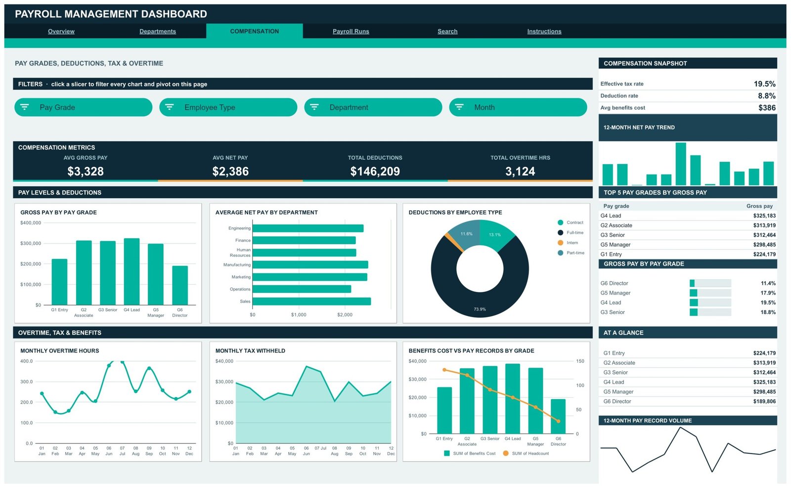
The pay-structure view. KPI cards show Avg Gross Pay, Avg Net Pay, Total Deductions and Total Overtime Hours, with a snapshot for effective tax rate, deduction rate and average benefits cost. Charts are Gross Pay by Pay Grade, Average Net Pay by Department, Deductions by Employee Type, Monthly Overtime Hours, Monthly Tax Withheld, and Benefits Cost vs Pay Records by Grade. A Top 5 Pay Grades by Gross Pay table and a Gross Pay by Pay Grade share panel sit in the sidebar. Slicers: Pay Grade, Employee Type, Department, Month.
Page 4: Payroll Runs — the pay period cycle
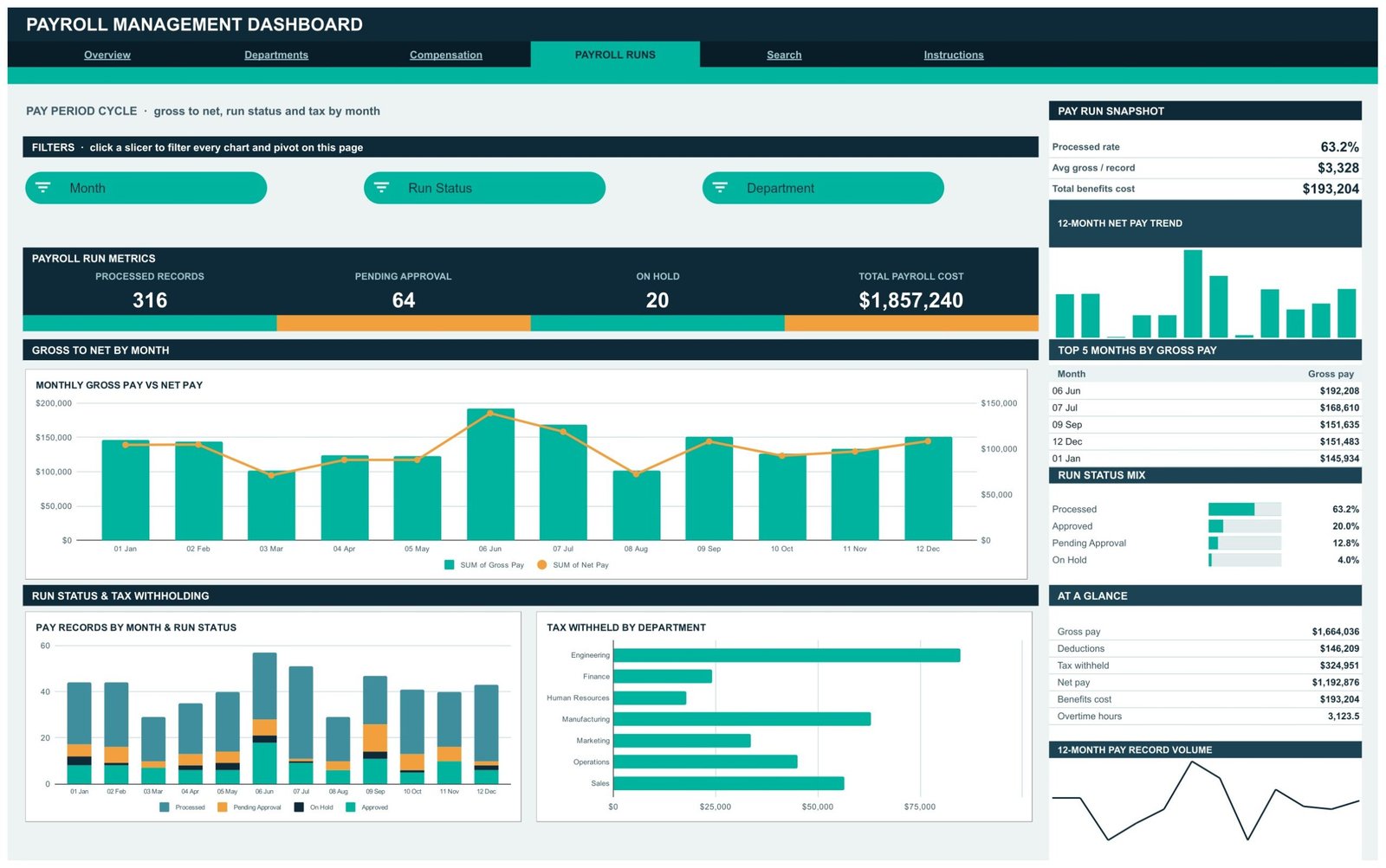
Gross to net, run status and tax by month. KPI cards show Processed Records, Pending Approval, On Hold and Total Payroll Cost, with a snapshot for processed rate, average gross per record and total benefits cost. Charts are Monthly Gross Pay vs Net Pay, Pay Records by Month and Run Status, and Tax Withheld by Department, alongside Top 5 Months by Gross Pay and a Run Status Mix panel covering Processed, Approved, Pending Approval and On Hold. Slicers: Month, Run Status, Department.
Page 5: Search — look up any pay run record by ID
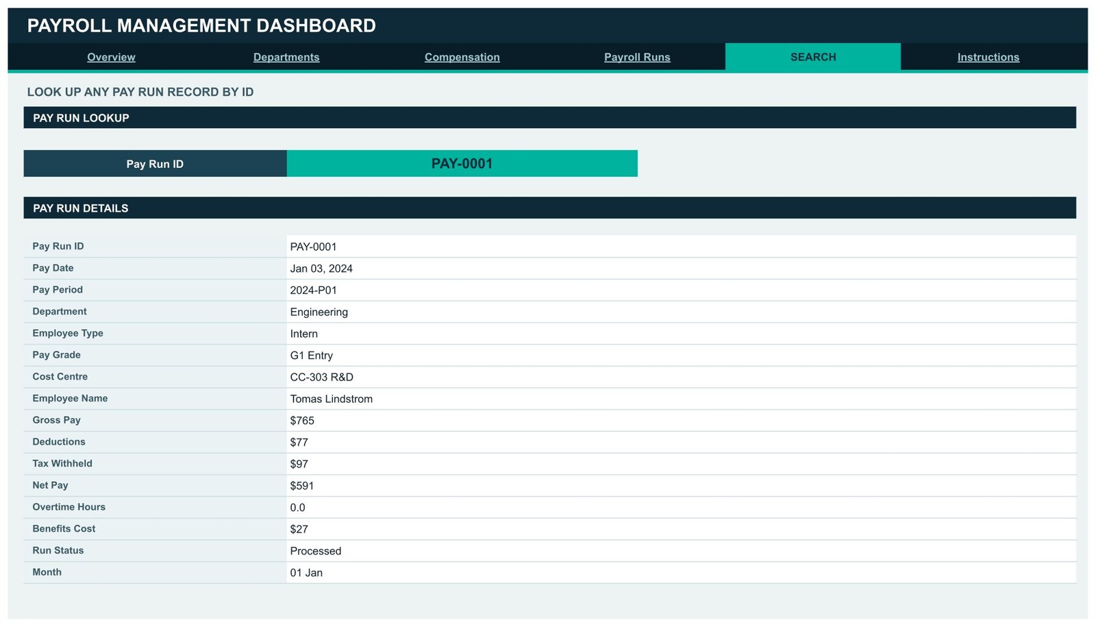
Pick a Pay Run ID from the dropdown and the page returns that single record in full: Pay Date, Pay Period, Department, Employee Type, Pay Grade, Cost Centre, Employee Name, Gross Pay, Deductions, Tax Withheld, Net Pay, Overtime Hours, Benefits Cost, Run Status and Month. This is the page you open when somebody queries one line of the register.
Page 6: Instructions — how this dashboard works
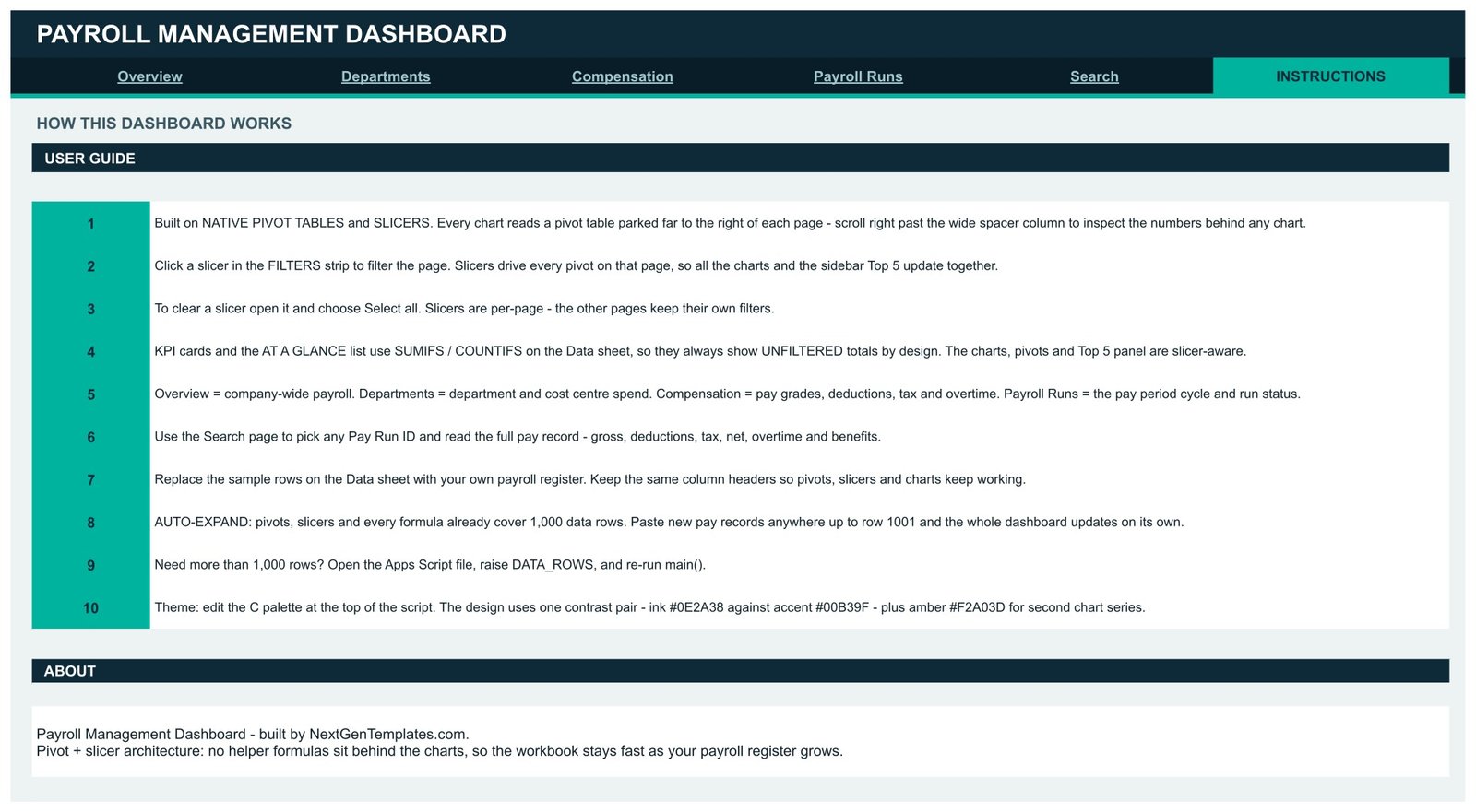
A ten-step user guide. It explains the pivot-and-slicer architecture, how to clear a slicer with Select all, why the KPI cards and At a Glance list use SUMIFS and COUNTIFS for deliberately unfiltered totals while the charts stay slicer-aware, how to swap in your own register, the 1,000-row auto-expand limit, how to raise DATA_ROWS in the bundled Apps Script file, and how to edit the colour palette.
Payroll Management Dashboard vs. Excel vs. Paid Payroll SaaS — Feature Comparison
| Feature | Payroll Management Dashboard in Google Sheets | Microsoft Excel dashboard | Gusto / BambooHR / ADP Workforce Now |
|---|---|---|---|
| Cost | $9.99 one-time | $15-30 one-time + Microsoft 365 | $40-180 base + $6-25 per employee / month |
| Platform | Google Sheets, browser only ✅ | Desktop Excel or Microsoft 365 | Vendor cloud |
| Setup time | About 10 minutes ✅ | 15-30 minutes | Days to weeks of onboarding |
| Real-time team collaboration | Native, multi-editor ✅ | Co-authoring, file-lock prone | Yes, seat-limited |
| Mobile access | Google Sheets app ✅ | Excel mobile, charts cramped | Dedicated app ✅ |
| Customisable fields and charts | Fully editable, you own the file ✅ | Fully editable | Vendor-defined reports |
| Share with a link | Yes, Drive link ✅ | Needs OneDrive or an attachment | Login required |
| Runs payroll and files statutory tax | No — reporting only | No | Yes ✅ |
| Year-1 cost at 5 users | $9.99 total ✅ | $15-30 + licences | $1,000-3,500+ |
For teams that want to see where payroll money actually goes without paying a per-employee monthly fee for a reporting module, the Payroll Management Dashboard in Google Sheets sits in the sweet spot — alongside, not instead of, the system that runs your payroll.
Who Should Use This Template
Perfect for:
- HR and finance managers at 20-500 person companies who export a pay register each cycle and want a board-ready view of it
- Payroll administrators checking run status, pending approvals and on-hold records before closing a period
- Finance business partners allocating payroll cost across departments, cost centres and pay grades
- Accountants, bookkeepers and consultants who report on client payroll totals without processing the payroll themselves
- Anyone whose payroll reporting is currently a monthly export nobody turns into a chart
Not a fit if:
- You need software that actually runs payroll. This calculates no gross-to-net, produces no payslip, and computes, files and remits no tax or statutory contribution of any kind.
- You need statutory filing or compliance evidence. No form, return, deadline or regulator rule is built in, and no compliance claim is made for any jurisdiction.
- You want a system of record for real employee compensation. See the honest warning in the next section — a Google Sheet is not it.
- You need SOC 2, single sign-on, role-based permissions or an approval workflow. Those are properties of a system, not of a spreadsheet.
- Your register runs past 1,000 rows and you would rather not edit a script. The pivots, slicers and formulas cover 1,000 rows; beyond that you raise DATA_ROWS in the Apps Script file and re-run main().
A Straight Word About Employee Data
The sample register includes an Employee Name column, so it is worth saying plainly: an ordinary Google Sheet is not appropriate storage for real employee compensation records. It has no field-level permission, no access log you can audit, no approval trail and no encryption key you control. Anyone you share the file with can see every salary in it, and a link shared one step too widely cannot be recalled.
If you populate it with live data, treat that copy as sensitive personal data: keep it inside your organisation’s Google Workspace with restricted sharing, limit editors to the people who already have a lawful reason to see pay, and follow your own data-protection policy and local law. Safer still, anonymise the Employee Name column to an employee code before you paste anything in — every chart, pivot and KPI in this dashboard works perfectly on codes, because none of them aggregate by name. Google’s own documentation on sharing files and folders is worth reading before you share a populated copy.
Advantages of the Payroll Management Dashboard in Google Sheets
- It is fast, because there are no helper columns. Native pivot tables do the aggregation. A register that grows toward 1,000 rows does not drag a thousand array formulas with it.
- You can audit any number. Every chart’s pivot sits to the right of its page. When a figure looks wrong, you scroll right and see the table that produced it — not a black box.
- It costs once. $9.99 against $1,000-3,500 for a year of a mid-market HR platform’s reporting at five users, with no seat limit on the people who read it.
- It shares like any Google file. No login for your team to provision, no vendor onboarding, no export step to get a chart into a slide.
- It is honest about scope. A reporting layer that admits it is a reporting layer is more useful than one that implies it can file your taxes.
Opportunities for Improvement
Three limitations are worth knowing before you buy. First, the KPI cards and the At a Glance list do not respond to slicers. They use SUMIFS and COUNTIFS across the whole Data sheet by design, as a fixed reference against the filtered charts. It is a deliberate choice, and it does surprise people on their first click — the Instructions tab says so at step 4.
Second, the 1,000-row ceiling is a real ceiling. Paste 1,200 rows and the last 200 sit outside every pivot range with no warning. Raising DATA_ROWS in the Apps Script file and re-running main() fixes it, but that is a script edit, not a menu option.
Third, the dashboard validates nothing. It will happily chart a negative net pay, a duplicated Pay Run ID or a row whose deductions exceed its gross, because it is a reporting view rather than a control. Your payroll system is where those checks belong; this shows you the shape of what came out of it.
Best Practices
- Keep the 16 column headers exactly as shipped. Pivots, slicers and charts all bind to them by name, and renaming one breaks the charts that read it.
- Paste values, not formulas, when you bring the register across from your payroll export. It keeps the file light and avoids stray references to a closed source.
- Anonymise Employee Name to an employee code unless you have a specific reason not to. Nothing in the dashboard aggregates by name.
- Keep one copy per period or per client rather than appending forever, so no single file drifts past 1,000 rows unnoticed.
- Use Select all to clear a slicer before you screenshot a page for a report — a stray filter left on one page is the commonest way a payroll chart ends up misread.
- Read the Payroll Runs page before the Overview page at period close. Pending Approval and On Hold tell you whether the totals on Overview are even final yet.
Explore Relevant Templates
If you would rather maintain payroll month by month by hand than analyse an existing register, the Monthly Payroll Manager and Dashboard in Google Sheets is the maintenance twin of this template — employee salary setup, hourly and overtime rates and monthly hours tracking. To model payroll cost forward from a hiring plan, use the Startup Payroll Calculator in Google Sheets.
For a real multi-user system with logins and roles instead of a spreadsheet, look at the Payroll and Salary Management System Web App or the broader HR Employee Management System Web App — both are covered on this blog in the Payroll and Salary Management System Web App write-up. On the capture side, the Payroll Data Entry System in Excel and the Employee Master and Record Data Entry System in Excel build the register this dashboard reads.
On the wider HR reporting shelf, the Diversity & Inclusion Dashboard in Google Sheets, the Executive Search & Staffing Dashboard in Google Sheets, the Recruitment Agencies Dashboard in Google Sheets and the Leadership Development KPI Dashboard in Google Sheets use the same pivot-and-slicer architecture, so anything you learn here transfers directly.
Want to build skills like this step by step? The Excel Pivot Tables & Dashboards course on NextGenTemplates Academy teaches the pivot-and-chart approach behind dashboards like this one, with practice files.
Get the Payroll Management Dashboard in Google Sheets
Frequently Asked Questions
Does the Payroll Management Dashboard in Google Sheets run payroll?
No. The Payroll Management Dashboard in Google Sheets is a reporting layer over a register your payroll system has already produced. It does not calculate gross-to-net pay, generate payslips, or compute, file or remit any tax or statutory contribution. Keep your existing payroll provider.
Does it handle income tax, provident fund, ESI or social security?
No. Tax Withheld, Deductions and Benefits Cost are values you paste in from your own payroll output. The Payroll Management Dashboard in Google Sheets performs no statutory calculation and makes no compliance claim for any country, state or jurisdiction.
Can I store real employee salary data in it?
Treat any populated copy as sensitive personal data. A Google Sheet has no field-level permission, no audit trail and no encryption you control. Keep it inside your organisation’s Drive with restricted sharing, follow your own data-protection policy, or anonymise the Employee Name column to a code first.
How many pay records does it hold?
The Payroll Management Dashboard in Google Sheets ships with 500 sample records, and its pivots, slicers and formulas already cover 1,000 rows. Paste anywhere up to row 1001 and everything updates on its own. Beyond 1,000, raise DATA_ROWS in the bundled Apps Script file and re-run main().
How long does setup take?
About ten minutes. Open the PDF in your download, click the “Make a copy” link, then paste your register over the sample rows on the Data sheet keeping the same 16 headers. All 16 KPI cards, 21 charts and four analysis pages update automatically.
How does this compare to Gusto, BambooHR or ADP?
Those platforms run payroll and file taxes; this does not. The Payroll Management Dashboard in Google Sheets is a $9.99 one-time reporting view that sits on top of whatever payroll system you already use, with no per-employee monthly fee and no seat limit on the people reading it.
Why do the KPI cards not change when I click a slicer?
By design. The KPI cards and the At a Glance list use SUMIFS and COUNTIFS across the whole Data sheet, so they always show unfiltered totals as a fixed reference. The charts, pivots and Top 5 panels are slicer-aware and do respond, which is what makes the comparison useful.
About the Author
Built by PK — Microsoft Certified Professional with 15+ years of Excel, Google Sheets, and Power BI experience. Founder of NextGenTemplates, reaching 300K+ subscribers across YouTube channels. Every template is hand-built and tested before release.
Conclusion
The Payroll Management Dashboard in Google Sheets does one job well: it takes the pay register you already produce and makes it legible in six tabs, 16 KPI cards, 21 charts and 15 slicers, for a one-time $9.99 instead of a per-employee monthly reporting fee. It does not run your payroll, calculate your tax or keep your compliance record — and it says so plainly, because a reporting tool that is honest about its edges is the one you can actually trust in a review meeting.
Instant download · One-time payment · No subscription
Last updated: August 2026