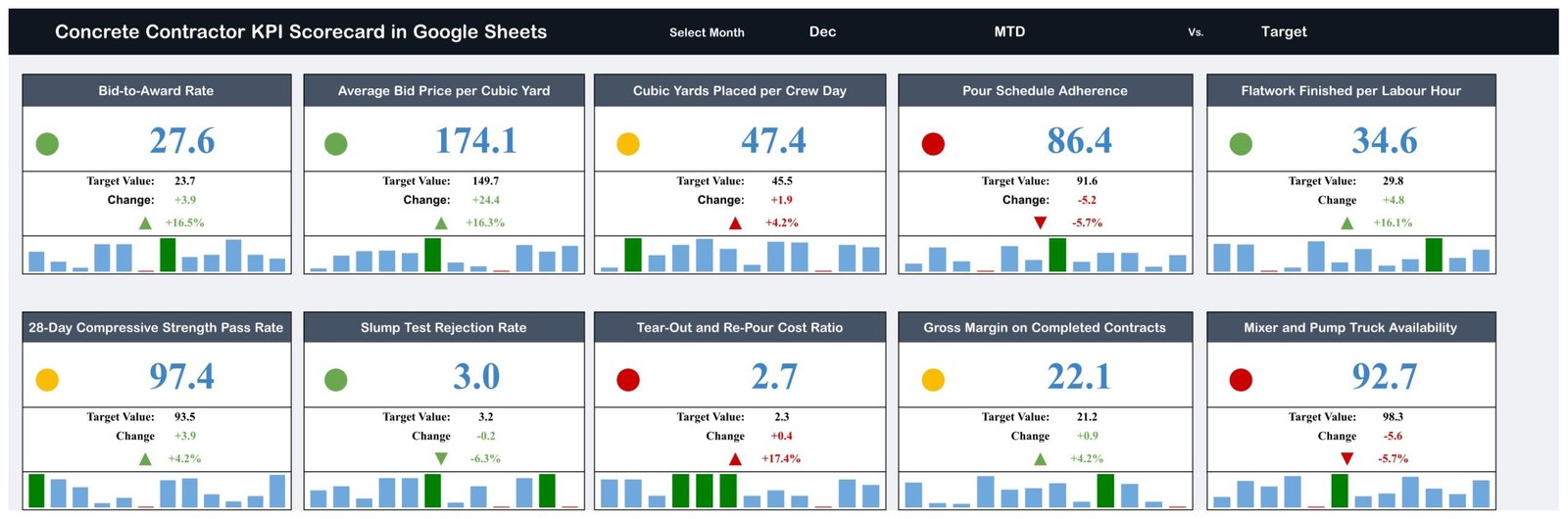
Ask ten concrete contractors how last month went and you will get ten stories. Ask them for the numbers and most reach for a folder of job costings, a dispatch log and a bank balance. The Concrete Contractor KPI Scorecard in Google Sheets replaces that with one screen: ten concrete-specific KPIs, each with an actual, a target, the gap in units and in percent, a red / amber / green light and a twelve-month mini bar strip. In the December sample that ships with the file, four KPIs are green, three amber and three red – and the three reds are the ones that cost money.
It is a month-picker scorecard, built on four connected sheets and 120 rows of editable monthly data. It is not an analytics dashboard with slicers and pivot pages, and it is not the KPI Dashboard family – a distinction worth making, because near-identical names exist across all three lines. This post walks through what is actually on each page, where the sheet stops, and how to run a monthly numbers meeting off it.
Get the Concrete Contractor KPI Scorecard in Google Sheets
Key Features of the Concrete Contractor KPI Scorecard
- Ten KPIs in five groups – Bidding & Sales (2), Pour Production (3), Quality & Rework (3), Financial (1) and Fleet & Safety (1).
- A single month picker drives every card, light and change figure on the scorecard page.
- MTD and YTD in parallel – each KPI carries a month-to-date and a year-to-date actual, target and prior-year value.
- Direction-aware scoring – eight KPIs are typed UTB (upper is better), two are LTB (lower is better).
- Traffic lights per card, scored against that KPI’s own target rather than a single global rule.
- A twelve-month spark strip on every card, with the selected month highlighted.
- A KPI Trend page with its own KPI picker and two Actual vs Target vs PY charts, one MTD and one YTD.
- A written formula and definition for all ten metrics.
- An open data page – one block per KPI, twelve months each, six value columns.
The Four Pages, Explained
Page 1 – the KPI Scorecard
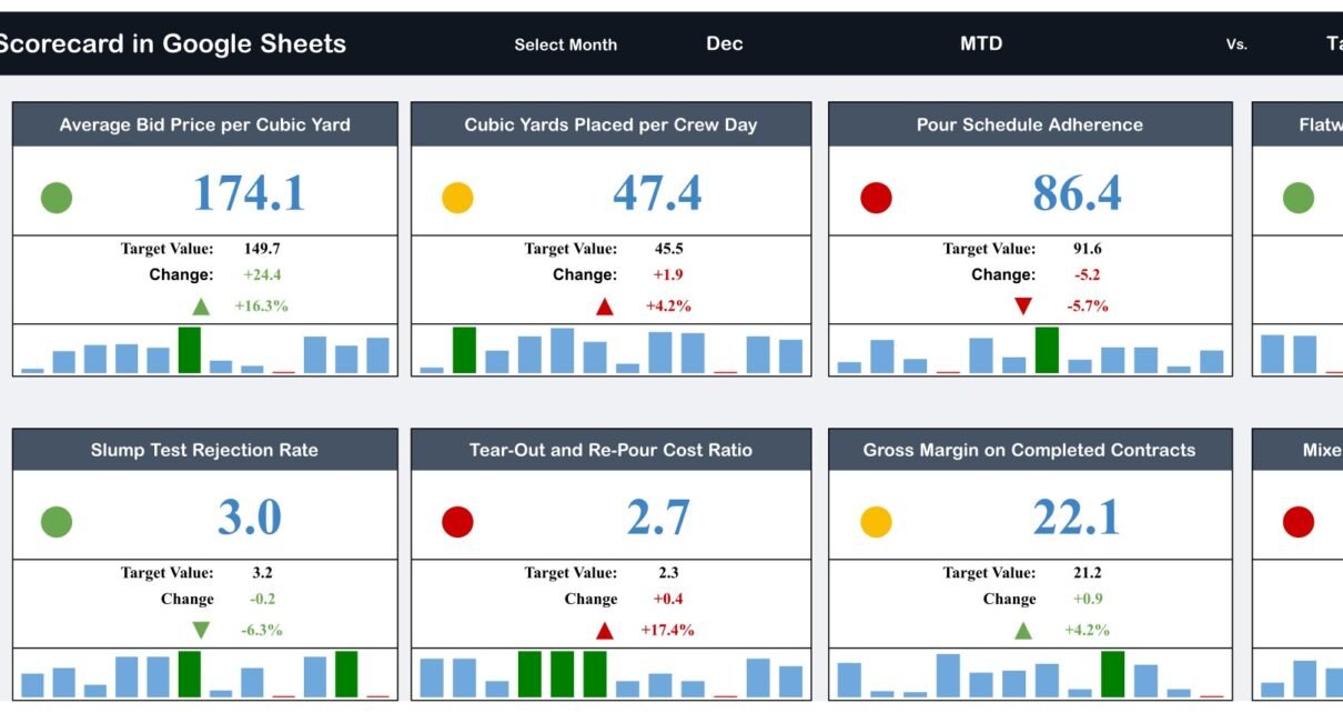
The header carries the title, a Select Month picker (Dec in the sample) and the basis, MTD vs. Target. Below sit ten cards in two rows of five. Each card shows the KPI name, a coloured dot, the actual value in large type, the target value, the change in raw units, the change as a percentage with an up or down arrow, and a twelve-bar mini chart underneath.
The December sample reads: Bid-to-Award Rate 27.6 against a 23.7 target; Average Bid Price per Cubic Yard 174.1 against 149.7; Cubic Yards Placed per Crew Day 47.4 against 45.5; Pour Schedule Adherence 86.4 against 91.6; Flatwork Finished per Labour Hour 34.6 against 29.8; 28-Day Compressive Strength Pass Rate 97.4 against 93.5; Slump Test Rejection Rate 3.0 against 3.2; Tear-Out and Re-Pour Cost Ratio 2.7 against 2.3; Gross Margin on Completed Contracts 22.1 against 21.2; and Mixer and Pump Truck Availability 92.7 against 98.3.
Read as a board, that month tells a coherent story. Sales is strong – conversion and price per yard are both ahead. Production volume is fine. What is failing is delivery and consistency: pours are missing their booked dates, trucks are not pour-ready as often as planned, and rework is 17.4% above where it should be. Those three reds are related, and seeing them side by side is the whole point of a scorecard.
Page 2 – KPI Trend
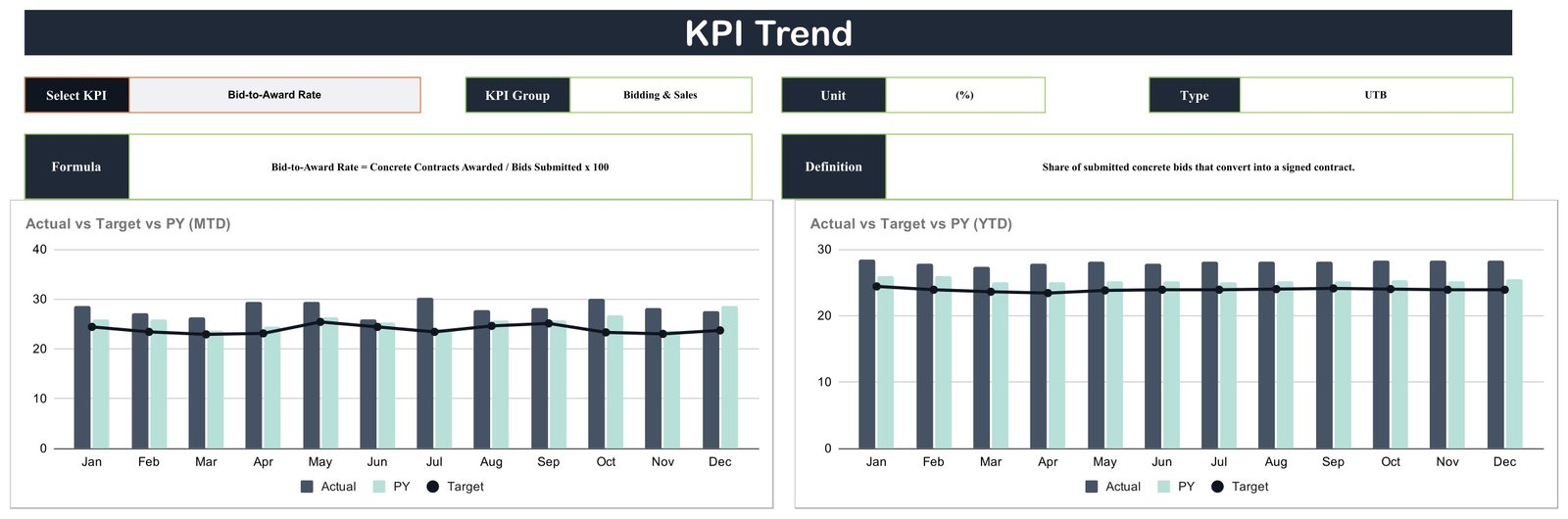
This page has one picker – Select KPI – and four read-only fields that follow it: KPI Group, Unit, Type and, on a second row, Formula and Definition. With Bid-to-Award Rate selected it reports the Bidding & Sales group, a (%) unit, UTB type, the formula Bid-to-Award Rate = Concrete Contracts Awarded / Bids Submitted x 100 and the definition “Share of submitted concrete bids that convert into a signed contract.”
Underneath are two clustered column charts: Actual vs Target vs PY (MTD) and Actual vs Target vs PY (YTD). Both run January to December, with a dark actual bar, a pale prior-year bar and a target line running across. The MTD chart is the noisy one – month by month movement. The YTD chart is the smooth one, which is where a genuine trend shows up rather than a single bad month.
Page 3 – the KPI definitions
One table, ten rows, seven columns: #, KPI Group, KPI Name, Unit, Formula, Definition and Type. This is the page that makes the scorecard survive a change of staff. When “Flatwork Finished per Labour Hour” is written down as Square Feet of Slab Finished / Finishing Labour Hours, in (SF/Hour), typed UTB, and defined as “Slab and flatwork area trowelled out for each hour of finishing labour”, two people cannot quietly calculate it two different ways.
It is also where you edit the sheet. Change a KPI name here, change its unit, rewrite the formula text, and – this is the one people forget – change the Type from UTB to LTB if the new metric is one where lower is better. The scoring follows that field.
Page 4 – the monthly data
One block per KPI, headed KPI-1 through KPI-10, each with twelve month rows and six value columns grouped as MTD (Actual, Target, PY) and YTD (Actual, Target, PY). 120 rows in total. This is the only page you type into; everything on pages 1 and 2 reads from here.
Concrete Contractor KPI Scorecard vs. Excel vs. Paid Construction SaaS – Feature Comparison
| This Google Sheets scorecard | An Excel KPI workbook | Paid construction SaaS | |
|---|---|---|---|
| Cost | One-time 13.99 (8.99 on sale) | One-time purchase | Roughly 300-1,200 per month |
| Platform | Google Sheets, any browser | Excel desktop | Vendor-hosted web and mobile |
| Setup time | Minutes | Minutes, once Excel is installed | Weeks of configuration |
| Real-time collaboration | Yes, natively | Via OneDrive co-authoring | Yes |
| Mobile access | Yes, Google Sheets app | Limited | Yes |
| Customisable KPIs | Yes – name, unit, formula, target and direction are all cells | Yes | Only within the vendor’s model |
| Share with a link | Yes | No | Per-seat login |
| Year-1 cost at 5 users | 13.99 total | Template cost plus Office licences | 3,600-14,400 |
| Pour metrics out of the box | Yes | Depends on the workbook | Usually, inside a larger system |
| Live sync with accounting or dispatch | No | No | Yes |
Who Should Use This Template
It fits owner-operators and small-to-mid concrete contractors doing flatwork, foundations and slabs; estimators who want bid conversion sitting next to price per cubic yard; and operations managers who already hold a monthly numbers meeting and rebuild the summary by hand each time.
It does not fit anyone who needs live data pulled from batching, dispatch or accounting software – there are no integrations and no imports. It does not fit anyone expecting alerts or emails when a KPI turns red; the lights are visual, on the sheet, and nothing else happens. It does not do per-project or per-crew drilldown – it reports at company level, by month. And the quality KPIs are management summaries you type in, not lab reports or certified test records.
Real-World Use Cases
The rework conversation. Tear-Out and Re-Pour Cost Ratio at 2.7% against a 2.3% target does not sound dramatic until you read the change column: +17.4% worse than target. On a company turning over a few million, that gap is a truck. Because the KPI Trend page shows the same metric across twelve months, you can tell in one look whether it is one bad pour or a drifting finishing practice – and those need completely different responses.
The “are we buying work?” question. Every estimator has been accused of winning jobs by dropping price. Bid-to-Award Rate at 27.6% against a 23.7% target, sitting on the same board as an Average Bid Price per Cubic Yard of 174.1 against a 149.7 target, answers it without an argument. Conversion up, price up.
The missed-pour post-mortem. Pour Schedule Adherence at 86.4% and Mixer and Pump Truck Availability at 92.7% both showed red in December. In most contractors those two numbers live in two different reports owned by two different people. On one board, the connection between the trucks that were down and the pours that slipped is unavoidable.
Advantages of the Concrete Contractor KPI Scorecard
- Ten numbers, one screen, one month. The constraint is the feature – a board you can actually read in a meeting.
- Nothing is hidden. Every formula is visible on the definitions page and every value is a cell you can edit.
- Direction is handled properly. A falling rejection rate scores green; a falling margin scores red. Plenty of home-made scorecards get this wrong.
- Prior-year comparison is built in, not bolted on – useful in a trade this seasonal.
- No installation, no add-ons, no subscription. A free Google account and a browser is the whole stack.
- It travels. Share a view-only link with a partner or lender without giving anyone a login to your systems.
Opportunities for Improvement
Honesty helps more than hype here. Data entry is manual – somebody types twelve months of figures for ten KPIs, and keeps typing each month. There is no drilldown to project or crew, so a red light tells you that something went wrong, never where. The layout is fixed at ten KPIs; adding an eleventh means editing the sheet rather than clicking a button. And there is no alerting of any kind. If those limits matter more than the price does, a full construction platform is the honest recommendation.
One cosmetic note on the sample file: on the Cubic Yards Placed per Crew Day card, the +4.2% change renders with a red up-arrow even though the metric is upper-is-better and beat its target – the two other cards at the same +4.2% render green. It is a display quirk in the shipped snapshot only; the traffic light itself, and the underlying calculation, are correct.
Best Practices
- Set targets you would defend out loud. A soft target produces an all-green board that tells you nothing.
- Fill in prior-year values. They are what turn “we did 47.4 yards per crew day” into “we did better than last December”.
- Fix the review date. The scorecard is a monthly ritual, not a live feed. Same week each month, same ten numbers.
- Open the KPI Trend page for every red. One card, twelve months, MTD and YTD – decide there whether it is noise or a trend.
- Update the definitions page when you change a metric, including the UTB / LTB type, so the scoring stays right.
- Keep a spare copy. Google Sheets version history is good, but a duplicate before a big edit is better. Google’s own guide to version history in Google Sheets is worth five minutes.
Explore Relevant Templates
- Masonry Contractor KPI Scorecard in Google Sheets – the same board for block, brick and stone.
- Flooring Installation KPI Scorecard in Google Sheets – the closest trade neighbour, for the crews working on top of your slabs.
- Roofing Contractor KPI Scorecard in Google Sheets and Drywall Contractor KPI Scorecard in Google Sheets – if you run more than one trade.
- Cement and Steel Dashboard in Google Sheets – the analytical dashboard family, if charts and slicers are what you actually want.
- Concrete Supplier Management System Web App – a full ordering and dispatch system for when a monthly scorecard is no longer enough.
Curious how scorecards and dashboards like this are put together? The Excel Pivot Tables & Dashboards course on NextGenTemplates Academy covers the reporting techniques behind them, with practice files.
Get the Concrete Contractor KPI Scorecard in Google Sheets
Frequently Asked Questions
Is this the KPI scorecard or the analytical concrete dashboard?
The scorecard. Ten KPI cards, a month picker, traffic lights, a KPI Trend page and a definitions page. The analytical dashboards – charts, slicers, pivot pages – are a separate family, and the KPI Dashboard line is a third. Names across the three are close enough to confuse, so check the page images before you buy.
Does it connect to my batching plant, dispatch or accounting software?
No. No integrations, no imports, no API. Values are typed or pasted into the data page.
Will it alert me when a KPI goes red?
No. No emails, no notifications, no scheduled reminders. The traffic lights are visual only.
Can I swap in my own KPIs?
Yes. Name, group, unit, formula text, definition and UTB / LTB type are all editable cells, and the data page has a matching block per KPI.
Are the strength and slump numbers a testing record?
No. 28-Day Compressive Strength Pass Rate and Slump Test Rejection Rate are summary percentages you enter yourself – management numbers, not lab reports or certified test records.
Do I need a paid Google Workspace account?
No. A free Google account is enough. The PDF in your download carries a copy link that creates the sheet in your own Drive.
How long does setup take?
Making the copy takes a minute. Replacing 120 rows of sample data takes as long as it takes you to find your own figures – most people do a first pass with six months and backfill later.
About the Author
Built by PK – Microsoft Certified Professional with 15+ years of Excel, Google Sheets, and Power BI experience. Founder of NextGenTemplates, reaching 300K+ subscribers across YouTube channels. Every template is hand-built and tested before release.
Conclusion
A concrete business does not fail because nobody knew the numbers. It fails because the numbers lived in six places and nobody put them next to each other. The Concrete Contractor KPI Scorecard in Google Sheets is a deliberately small answer to that: ten metrics, one month, one screen, formulas you can read, and a trend page for the one that turned red. It will not dispatch a truck or issue an invoice – and it does not cost what the software that does those things costs.
Get the Concrete Contractor KPI Scorecard in Google Sheets – one-time payment, instant download, no subscription.