Most insulation contractors already know their revenue. Far fewer can say, on the second working day of the month, whether their crews put down more board feet per day than last month, whether foam usage overran the estimate, and whether the jobs that failed a blower door test are trending up or down. Those answers usually live in three different places — a job folder, the estimator’s spreadsheet and the bookkeeper’s head.
The Insulation Contractor KPI Scorecard in Google Sheets puts all of them on one page. Ten insulation KPIs, five groups, a red / amber / green light on every card, a target, a variance and a twelve-month sparkline. Pick a month, choose month-to-date or year-to-date, and the whole scorecard re-reads.
This is the KPI Scorecard format specifically — a one-page monthly review sheet. It is a different template from the chart-heavy KPI Dashboard line and from the general analytical dashboards, both of which also carry contractor-trade names. If you want a wall of charts, those are the ones to look at. If you want ten numbers and three colours, read on.
Key Features of the Insulation Contractor KPI Scorecard in Google Sheets
- Ten insulation-specific KPIs across Sales & Estimating, Production & Installation, Quality & Callbacks, Financial and Safety.
- Traffic lights driven by your own targets, using a RAG band table that sits on the sheet where you can see and change it.
- UTB / LTB direction per KPI, so a metric where lower is better is never scored as though higher were better.
- Select Month, MTD/YTD and Vs. Target / Vs. PY controls in the header strip.
- A twelve-month sparkline on every card, with the selected month highlighted.
- A KPI Trend page that rebuilds around whichever KPI you choose, formula and definition included.
- A KPI Definition sheet documenting every metric so the team argues about performance, not vocabulary.
- One data sheet — ten blocks, twelve months each, six columns.
- No add-ons, no scripts, no subscription. It is a plain Google Sheet you copy into your own Drive.
Sheets Explanation
KPI Scorecard
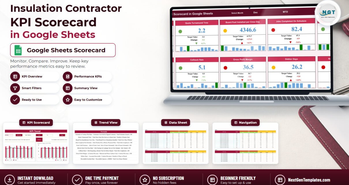
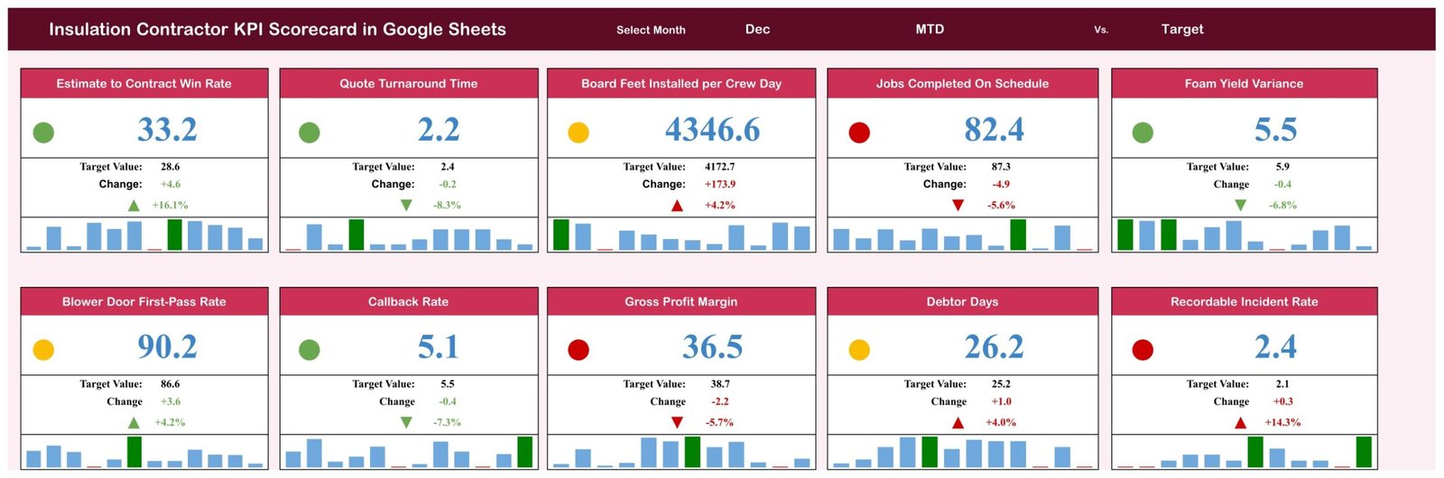
The front page and the reason the template exists. The maroon header carries the template name and three controls: Select Month, the actual type (MTD or YTD) and the comparison basis (Vs. Target or Vs. PY). Under it sit ten cards in two rows of five.
Each card gives you five things at once: the KPI name, a coloured light, the current value, the target it is being judged against, and the variance — both as an absolute change and as a percentage with an arrow. A twelve-month column sparkline runs along the bottom of every card with the selected month picked out in green.
The December sample month that ships in the file is deliberately mixed: four green, three amber, three red. Estimate to Contract Win Rate is green at 33.2% against a 28.6% target. Quote Turnaround Time is green at 2.2 days against 2.4. Jobs Completed On Schedule is red at 82.4% against 87.3%, Gross Profit Margin red at 36.5% against 38.7%, and Recordable Incident Rate red at 2.4 against 2.1. Board Feet Installed per Crew Day, Blower Door First-Pass Rate and Debtor Days all land amber — inside the tolerance band but not clear of it.
KPI Trend
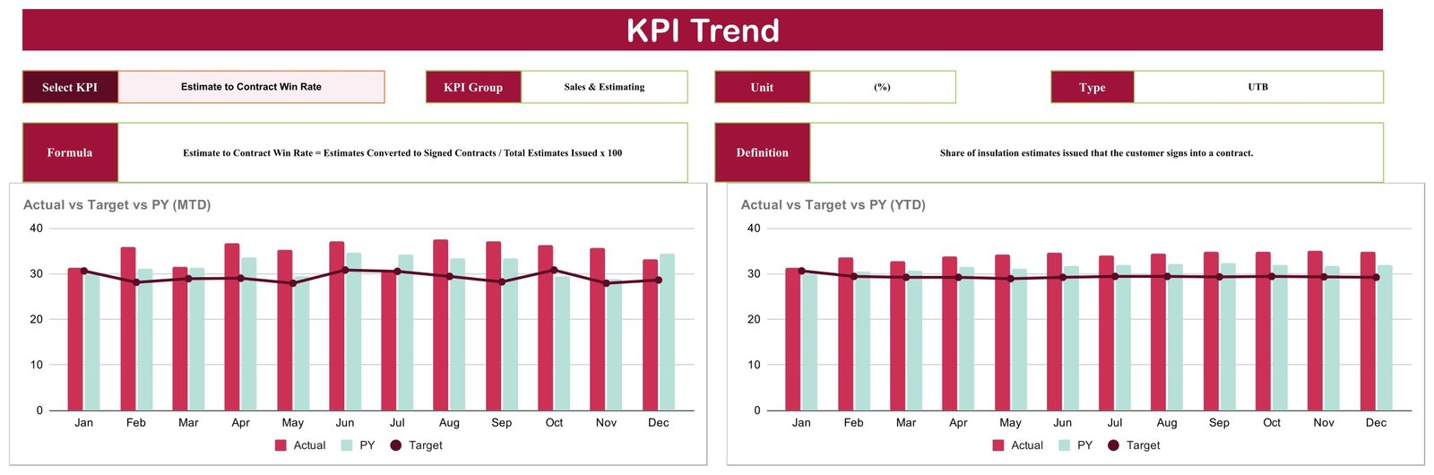
Pick a KPI from the Select KPI dropdown and this page fills itself in: KPI Group, Unit, Type (UTB or LTB), the exact Formula and a one-line Definition. Two charts follow — Actual vs Target vs PY (MTD) and Actual vs Target vs PY (YTD) — each running January to December with Actual and Prior Year as columns and Target as a line across the top. When a card on the front page goes red, this is where you find out whether it is a bad month or a bad quarter.
KPI Definition

One table, ten rows, seven columns: number, KPI Group, KPI Name, Unit, Formula, Definition and Type. This is the page to send a new production manager in week one.
KPI Data
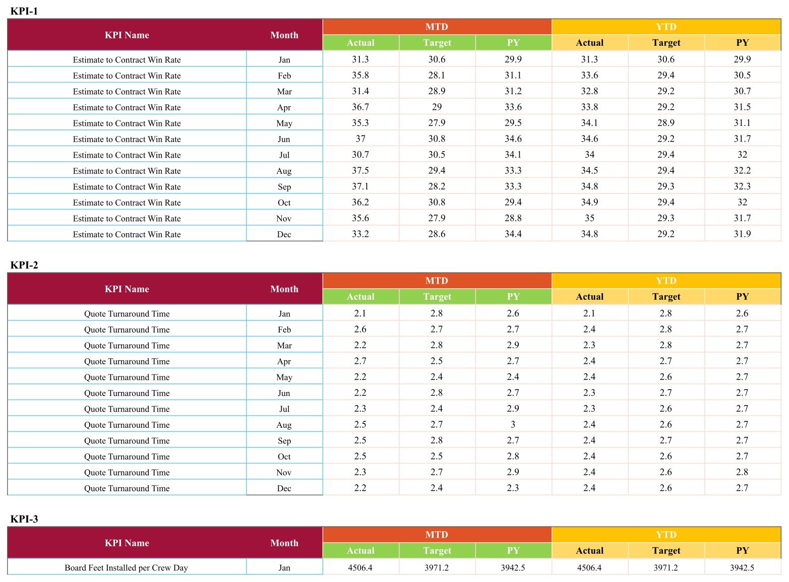
The only sheet you type on. Ten labelled blocks, KPI-1 through KPI-10. Each has a row per month and six figure columns: MTD Actual, Target and PY, then YTD Actual, Target and PY. Overwrite the sample numbers with yours and everything upstream recalculates.
The Ten KPIs and What They Actually Measure
| # | Group | KPI | Unit | Direction | What it tells you |
|---|---|---|---|---|---|
| 1 | Sales & Estimating | Estimate to Contract Win Rate | % | Higher is better | Share of insulation estimates issued that the customer signs into a contract. |
| 2 | Sales & Estimating | Quote Turnaround Time | Days | Lower is better | Average working days between the site survey and the priced quote reaching the customer. |
| 3 | Production & Installation | Board Feet Installed per Crew Day | Bd Ft | Higher is better | Spray foam and batt output delivered by an average installation crew in one working day. |
| 4 | Production & Installation | Jobs Completed On Schedule | % | Higher is better | Share of insulation jobs handed back on or before the promised completion date. |
| 5 | Production & Installation | Foam Yield Variance | % | Lower is better | How far actual spray foam consumption overruns the estimated set count on completed jobs. |
| 6 | Quality & Callbacks | Blower Door First-Pass Rate | % | Higher is better | Share of completed jobs that meet the target air changes per hour at the first blower door test. |
| 7 | Quality & Callbacks | Callback Rate | % | Lower is better | Share of finished jobs that need a crew back on site to correct sagging, gaps or odour complaints. |
| 8 | Financial | Gross Profit Margin | % | Higher is better | Revenue left after foam, batt, blown-in material and installation labour on completed contracts. |
| 9 | Financial | Debtor Days | Days | Lower is better | Average days a completed insulation invoice sits unpaid by builders and homeowners. |
| 10 | Safety | Recordable Incident Rate | Per 200k hrs | Lower is better | Recordable injuries per 200,000 crew hours across attic, crawlspace and commercial retrofit work. |
Three of these are the ones you will not find in a generic contractor template. Board Feet Installed per Crew Day is the productivity number insulation crews are actually measured on. Foam Yield Variance compares sets used against sets estimated, which is where spray foam margin quietly leaks. Blower Door First-Pass Rate is the quality gate that decides whether a retest and a return trip land on your cost sheet.
How the Traffic Lights Are Decided
The RAG band table lives on the sheet, so nothing is hidden. For an upper-the-better KPI, a variance against target at or below 0% is red, anything up to +10% is amber, and above +10% turns green. For a lower-the-better KPI the same bands are mirrored: more than 10% above target is red, within 10% is amber, and at or below target is green.
That is why a KPI can beat its target and still show amber. Blower Door First-Pass Rate at 90.2% against an 86.6% target is a 4.2% variance — better than plan, but not by enough to clear the green band. If your business wants a tighter or looser tolerance, edit the band table; every light follows it.
Insulation Contractor KPI Scorecard in Google Sheets vs. Excel vs. Job-Management Software — Feature Comparison
| Feature | This Google Sheets scorecard | The Excel edition | JobNimbus / Buildertrend / ServiceTitan |
|---|---|---|---|
| Cost | One-time, under $15 | One-time, under $17 | Monthly, per user |
| Time to first report | Minutes | Minutes | Weeks |
| Insulation KPIs out of the box | All ten | All ten | Generic; needs custom reports |
| Team access | Standard Sheets sharing, no seats | Shared drive or email | Paid seat each |
| Phone access on site | Yes | Limited | Yes |
| Offline use | No | Yes | Partial |
| Automatic data feed | No — monthly manual entry | No | Yes |
| Edit every formula yourself | Yes | Yes | No |
| Traffic lights against your own targets | Yes | Yes | Sometimes, at extra cost |
Also Available in Microsoft Excel
The same ten KPIs, the same five groups and the same RAG logic are also published as the Insulation Contractor KPI Scorecard in Excel, which will live at nextgentemplates.com/product/insulation-contractor-kpi-scorecard-in-excel/. Pick the Excel edition if your office works offline or already reports out of Excel; pick this Google Sheets edition if you want one live copy that the estimator, the production manager and the bookkeeper all read from their phones. They are sold separately and priced separately — you do not need both.
Who Should Use This Template
- Spray foam, batt and blown-in insulation contractors running roughly two to twenty crews.
- Owner-operators who want one monthly number review rather than a stack of job reports.
- Production managers who track board feet per crew day and want yield variance beside it.
- Weatherisation and retrofit firms that have to evidence blower door first-pass performance.
- Estimators whose win rate and turnaround should be judged next to production and margin.
- Office managers and bookkeepers who already close the month in a spreadsheet.
It is not the right tool if you need live accounting sync, job-level costing, crew dispatch, or more than twelve months of history in a single file.
Real-World Use Cases
- The Monday production meeting. Open one page, look at the three reds, spend the meeting on those.
- Chasing foam waste. Foam Yield Variance goes amber twice in a row; the trend page shows exactly which month it started.
- Estimator scorecard. Quoting faster only counts if the win rate holds — both sit in the same group on the same page.
- Collections. Debtor Days drifting above target is the office manager’s cue to start calling before quarter end.
- Safety review. Recordable Incident Rate reported in the same monthly pack as output and margin, not in a separate binder.
- Bonding or bank pack. Print the KPI Trend page per metric for a twelve-month Actual vs Target vs Prior Year record.
- Onboarding. Hand a new supervisor the KPI Definition sheet on day one.
Advantages of the Insulation Contractor KPI Scorecard in Google Sheets
- It is genuinely one page. Ten cards, no scrolling, no tab-hopping to answer “how did we do”.
- The KPIs are trade-specific. Board feet per crew day and foam yield variance are not renamed sales metrics.
- Scoring logic is visible. The RAG bands and the UTB/LTB flags are cells on a sheet, not code you cannot inspect.
- Nothing is locked. Every formula, name, unit and band is editable.
- Sharing is free. Google Sheets permissions, not per-seat licences.
- Prior-year comparison is built in. Most simple scorecards give you target only; this one carries PY on every metric and both time bases.
- It prints and exports cleanly to PDF for a board or bonding pack.
Opportunities for Improvement
An honest list, because no template is everything:
- Manual monthly entry. There is no connector to QuickBooks, Xero or a job-management system. Someone types the figures once a month.
- Twelve months per file. Multi-year history means copying the file each year or extending the data sheet.
- Monthly granularity only. If you need weekly crew-level reporting, this is the wrong grain.
- Ten KPIs is a deliberate ceiling. Adding an eleventh means extending the data sheet and adding a card by hand.
- No job-level drill-down. The scorecard reports totals; the underlying job detail stays in whatever system holds it.
- Needs an internet connection. That is the trade-off for live sharing; the Excel edition covers the offline case.
Best Practices
- Set real targets, not aspirations. Every light is driven by the target column, so an optimistic target makes the whole page red and the page stops being useful.
- Agree the definitions before the first close. Walk the team through the KPI Definition sheet once; it saves an argument every month afterwards.
- Enter the prior year. A target tells you what you wanted; PY tells you whether you are actually improving.
- Close on the same day each month. Consistency matters more than speed for trend readability.
- Give edit rights to one owner. Share read-only with everyone else so the data sheet does not get edited mid-meeting.
- Review ambers, not just reds. An amber that has been amber for four months is a slow decline that never triggers an alarm.
- Tune the RAG bands once, then leave them. Moving the goalposts mid-year makes the trend meaningless.
- Keep a copy per year and name it clearly so the twelve-month charts stay clean.
Explore Relevant Templates
- Drywall Contractor KPI Scorecard in Google Sheets — the same one-page scorecard format for drywall and finishing crews.
- Carpentry Workshop KPI Scorecard in Google Sheets — ten workshop KPIs in the same layout.
- Roofing Contractor KPI Dashboard in Google Sheets — the KPI Dashboard line, a more chart-driven format.
- Plumbing Business KPI Dashboard in Google Sheets — field-service KPIs for a plumbing operation.
- Electrical Contractor KPI Dashboard in Google Sheets — technician performance and first-time fix rate.
If you want to go deeper on building your own reporting, the Excel Pivot Tables & Dashboards course on NextGenTemplates Academy covers KPI reporting step by step, with practice files.
Frequently Asked Questions
Is this the KPI Scorecard or the KPI Dashboard?
The KPI Scorecard. It is the one-page, month-picker, traffic-light format with a KPI Trend page and a KPI Definition sheet. NextGenTemplates publishes a separate KPI Dashboard line and a separate analytical Dashboard line under similar trade names; they are different templates with different layouts.
Do I need a paid Google account?
No. A free personal Google account is enough.
How do I get the file after buying?
The download is a PDF containing a “Make a copy” link. Click it while signed in to Google and a private, fully editable copy appears in your own Drive.
Can I add or rename KPIs?
Yes. Nothing is protected. Rename a KPI, change its unit, edit the formula text and switch it between upper-the-better and lower-the-better on the definition sheet.
Does it connect to my accounting software?
No. Figures are entered by hand once a month, which is what keeps the file free of add-ons and portable between Google accounts.
Why is a KPI amber when it beat target?
Because the bands score the size of the variance, not just its sign. Beating target by under 10% is amber; beating it by more than 10% is green. The band table is on the sheet and you can change it.
How much history does it hold?
Twelve months, January to December, with MTD and YTD on every KPI.
Can the whole crew see it?
Yes, through normal Google Sheets sharing, with no per-user fees.
Is there an Excel version?
Yes, with the same ten KPIs. It is a separate product at a separate price.
What support do I get?
Email support for setup questions plus free walkthroughs on the NextGenTemplates YouTube channel.
About the Author
Written by the NextGenTemplates team, who have built Excel, Google Sheets and Power BI reporting tools for small trade and service businesses for over a decade. The KPI set in this scorecard follows how insulation contractors measure work in practice — output in board feet per crew day, foam consumption against the estimated set count, and blower door first-pass rate as the quality gate — rather than a generic contractor metric list with the labels changed.
Conclusion
An insulation business does not fail because nobody looked at revenue. It fails quietly, through foam overrun that nobody costed, jobs that slipped past the promised date, retests that were never counted and invoices that aged out of memory. Each of those has a number, and all ten of them fit on one page.
The Insulation Contractor KPI Scorecard in Google Sheets gives you that page for a one-time price, with every formula open, every band editable and no subscription attached. Set your targets, enter twelve months of figures, and spend the monthly meeting on the three cards that are red instead of hunting for the numbers in the first place.
Get the Insulation Contractor KPI Scorecard in Google Sheets →