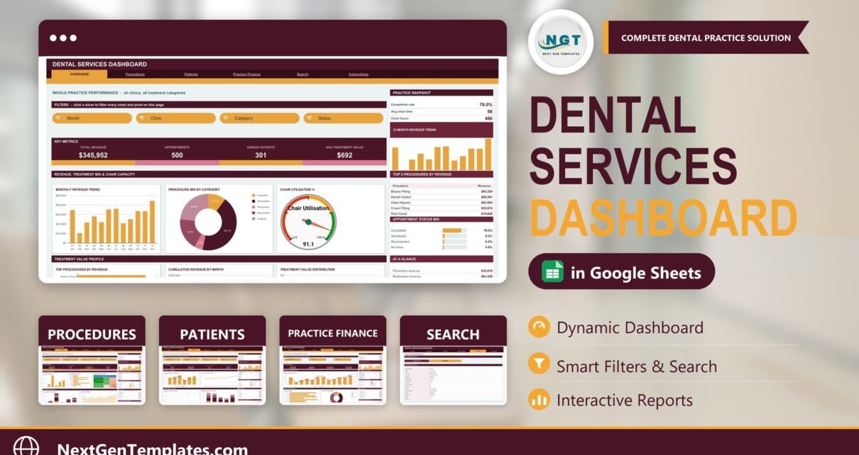
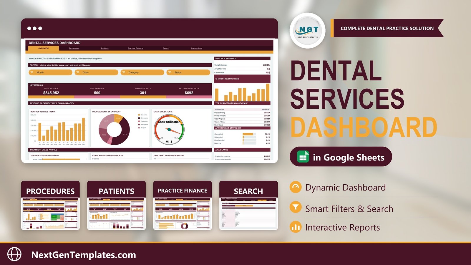
The Dental Services Dashboard in Google Sheets reports 16 KPI cards across 4 analysis pages, driven by 18 charts and 15 slicers, over an appointment log seeded with 500 sample visits and pre-ranged to 1,000 rows. It is built entirely on native Google Sheets pivot tables and slicers — no add-ons, no macros, no Apps Script — so the file opens and works in any Google account, and setup takes under 10 minutes.
Most dental practices already own the data this dashboard needs. Your practice-management system knows every appointment, every procedure, every lab bill and every insurance claim. What it usually will not give you is a single page where revenue, chair utilisation, lab cost ratio and no-show rate sit next to each other. That is the gap the Dental Services Dashboard in Google Sheets fills: you paste an export, and the reporting is already built.
Get the Dental Services Dashboard in Google Sheets
Key Features of the Dental Services Dashboard in Google Sheets
- Four analysis pages from one appointment log. Overview covers whole-practice performance, Procedures covers treatment mix and chair time, Patients covers insurance cover and age mix, and Practice Finance covers collections and lab costs. All four read the same Data sheet, so the numbers reconcile by construction.
- 16 KPI cards. Total Revenue, Appointments, Unique Patients, Avg Treatment Value, Implant Revenue, Cleanings Booked, Orthodontic Revenue, Total Chair Hours, Self-Pay Revenue, Child Appointments, No-Show Rate, Gross Revenue, Lab Costs, Net After Lab and Insurance Claims — computed with SUMIFS and COUNTIFS on the Data sheet.
- 15 slicers. Month, Clinic, Category, Status, Procedure, Insurance Plan, Age Group, Dentist and Payment Method, distributed across the four pages. Each slicer drives every pivot on its own page.
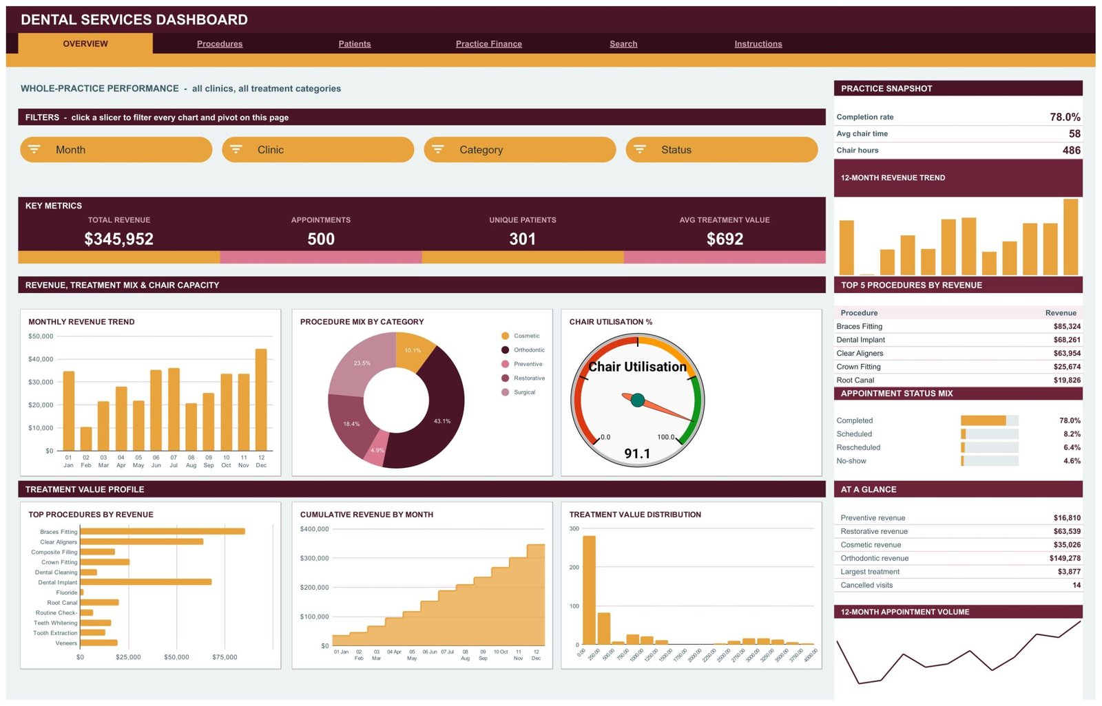
- A chair utilisation gauge. Booked chair minutes measured against an annual capacity of 32,000 chair minutes, reading 91.1 on the sample data, with the capacity figure exposed in a helper block you edit once.
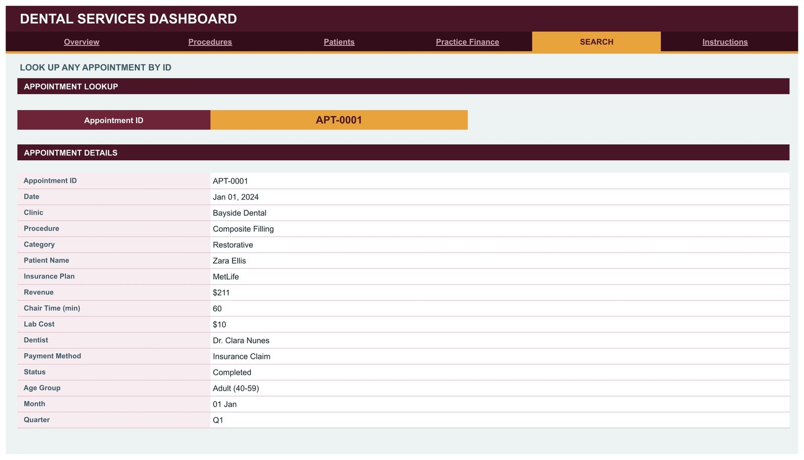
- An appointment lookup page. Enter an Appointment ID and the Search page returns all 16 fields for that visit.
- Sidebar panels on every analysis page. A three-metric snapshot, a 12-month revenue trend, a Top 5 table, a share-bar breakdown, an At a Glance list and a 12-month appointment volume line.
- 1,000-row auto-expand. Every pivot, slicer and formula already reaches row 1001, so pasted rows are picked up without re-ranging anything.
One design decision is worth calling out because it surprises people: the KPI cards and the At a Glance lists are deliberately unfiltered. They are SUMIFS/COUNTIFS against the whole Data sheet, so they hold steady as a baseline while the charts, pivots and Top 5 panels respond to your slicers. The Instructions page says so explicitly — it is a design choice, not a wiring bug.
Dashboard Pages Explanation
Page 1: Overview — whole-practice performance
Reports Total Revenue, Appointments, Unique Patients and Avg Treatment Value, with a Practice Snapshot panel showing completion rate, average chair time and chair hours. The charts are Monthly Revenue Trend, Procedure Mix by Category, Chair Utilisation, Top Procedures by Revenue, Cumulative Revenue by Month and Treatment Value Distribution. The sidebar carries Top 5 Procedures by Revenue and an Appointment Status Mix panel splitting Completed, Scheduled, Rescheduled and No-show.
Page 2: Procedures — treatment mix, volume and chair time
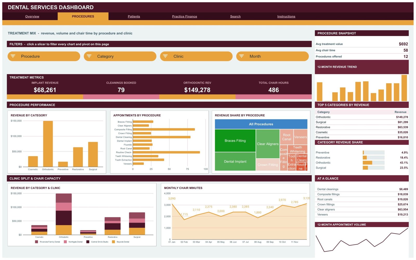
Reports Implant Revenue, Cleanings Booked, Orthodontic Revenue and Total Chair Hours across the 12 procedures the practice offers. The charts are Revenue by Category, Appointments by Procedure, Revenue Share by Procedure, Revenue by Category & Clinic and Monthly Chair Minutes. The sidebar adds Top 5 Categories by Revenue and a Category Revenue Share panel, so you can see at once that orthodontics carries 43.1% of revenue while preventive work carries 4.9%.
Page 3: Patients — insurance cover, age mix and dentist workload
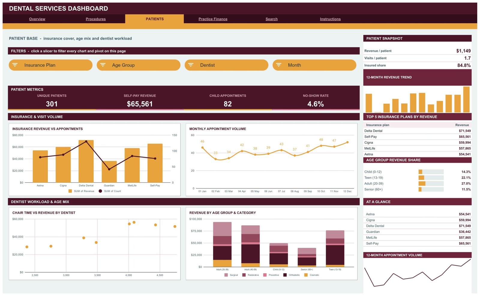
Reports Unique Patients, Self-Pay Revenue, Child Appointments and No-Show Rate, with revenue per patient, visits per patient and insured share in the snapshot. The charts are Insurance Revenue vs Appointments, Monthly Appointment Volume, Chair Time vs Revenue by Dentist and Revenue by Age Group & Category. The Top 5 Insurance Plans by Revenue table ranks Delta Dental, Self-Pay, Cigna, MetLife and Aetna.
Page 4: Practice Finance — collections, lab costs and payment behaviour
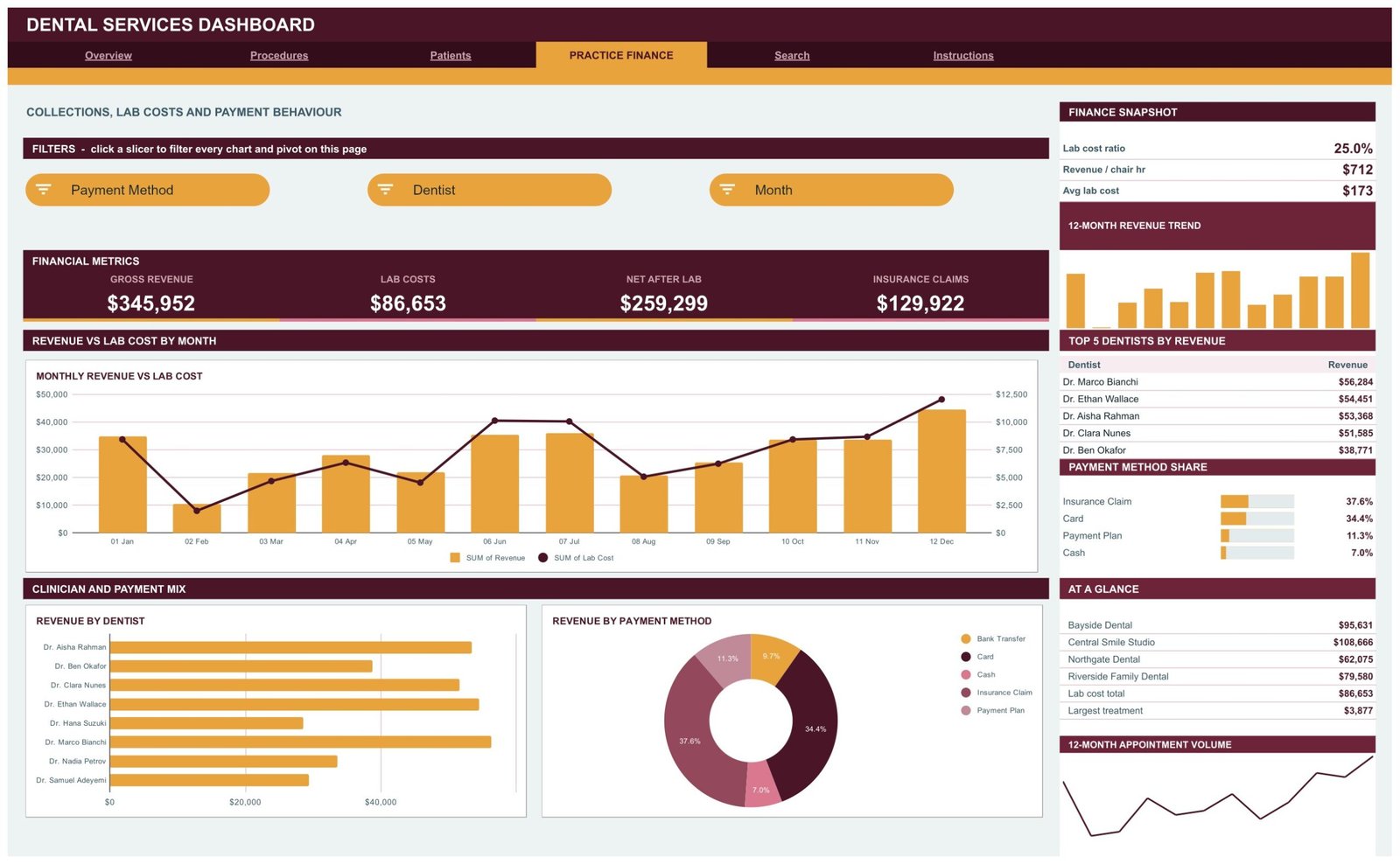
Reports Gross Revenue, Lab Costs, Net After Lab and Insurance Claims, with lab cost ratio, revenue per chair hour and average lab cost in the snapshot. The charts are Monthly Revenue vs Lab Cost, Revenue by Dentist and Revenue by Payment Method. Top 5 Dentists by Revenue and a Payment Method Share panel covering Insurance Claim, Card, Payment Plan and Cash complete the sidebar.
Page 5: Search — appointment lookup
Choose an Appointment ID and the page returns the full record: date, clinic, procedure, category, patient name, insurance plan, revenue, chair time, lab cost, dentist, payment method, status, age group, month and quarter. It is the fastest way to check the row behind an outlier you spotted on a chart.
Page 6: Instructions — the 10-point user guide
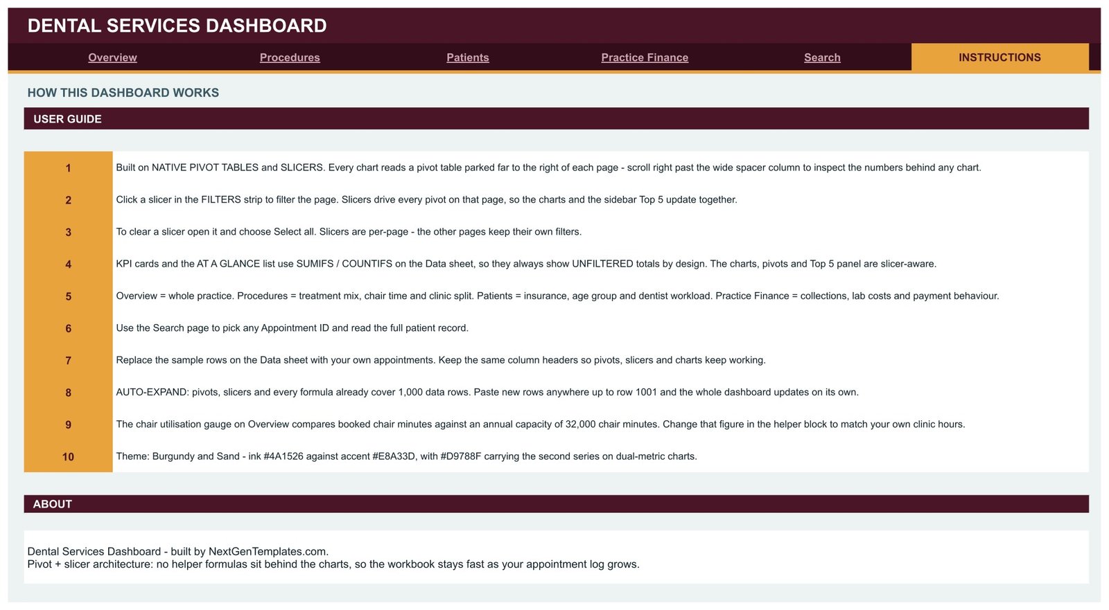
Explains the pivot-and-slicer architecture, why the KPI cards are unfiltered, how to clear a slicer with Select all, the 1,000-row auto-expand, where to change the 32,000-minute chair capacity, and the Burgundy and Sand colour codes for rebranding.
Behind these pages is the Data sheet — one row per appointment, 16 columns, seeded with 500 sample visits across 4 clinics, 8 dentists, 12 procedures, 5 treatment categories, 6 insurance plans and 5 payment methods. Google’s own pivot table documentation covers the mechanics if you want to extend a pivot beyond what ships.
Dental Services Dashboard in Google Sheets vs. Excel Dashboard vs. Paid Dental Practice SaaS — Feature Comparison
| Feature | Dental Services Dashboard in Google Sheets | Microsoft Excel Dashboard | Dentrix Ascend / Curve Dental |
|---|---|---|---|
| Cost | ✅ $9.99 one-time | $14-30 one-time | $300-600 / practice / month |
| Platform | ✅ Browser, no install | Microsoft Excel licence needed | Vendor cloud only |
| Setup time | ✅ Under 10 minutes | Under 10 minutes | Weeks, with vendor onboarding |
| Real-time team collaboration | ✅ Native Google Sheets sharing | Needs OneDrive co-authoring | ✅ Built in |
| Mobile access | ✅ Google Sheets app | Excel mobile, limited slicers | ✅ Vendor app |
| Customisable fields and charts | ✅ Every pivot and chart is editable | ✅ Fully editable | ❌ Fixed vendor reports |
| Share with a link | ✅ One view-only link | File attachment or OneDrive link | Per-seat login required |
| Chair utilisation and lab cost reporting | ✅ Both, out of the box | Depends on the template | ✅ Both, plus clinical modules |
| Year-1 cost at 5 users | ✅ $9.99 total | $14-30 plus Office licences | $3,600-7,200 |
For practices that want revenue, chair-time and lab-cost reporting without a per-practice monthly contract, the Dental Services Dashboard in Google Sheets sits in the sweet spot — it reports on the data your practice-management system already exports, rather than replacing that system.
Who Should Use This Template
Perfect for:
- Practice managers at single-site or 2-6 site dental groups who already export appointment data monthly
- Principal dentists who want chair utilisation, lab cost ratio and revenue per chair hour on one page
- Dental bookkeepers and accountants reporting collections, insurance claim mix and self-pay revenue to owners
- Dental consultants who need a shareable review pack built from a client’s own numbers
Not a fit if:
- You need a patient record system — this is a reporting spreadsheet with no clinical charting, no notes and no images
- You expect live sync with a PMS or EHR — there is no connector, no API and no scheduled refresh; you paste an export
- You need e-claim submission, recall automation or online booking — this template reports on those activities rather than performing them
- You need a formally certified, access-controlled environment for identifiable patient data — a shared spreadsheet is not that, and your practice remains responsible for what it puts on the Data sheet
Real-World Use Cases
Priya manages four dental practices for a regional group. Each month she exports appointments from the group’s practice-management system, pastes them onto the Data sheet, and reads Revenue by Category & Clinic on the Procedures page to see which site is carrying orthodontics and which is leaning on preventive work. She sends one view-only link to the four principals instead of emailing four spreadsheets.
Dr. Wallace owns a two-surgery practice and worries about idle chair time. He watches the chair utilisation gauge on Overview and Monthly Chair Minutes on Procedures. Once he recalibrated the 32,000-minute capacity to his real opening hours, he could tell whether a quiet February was a booking problem or simply a shorter month.
Marcus keeps the books for three independent dentists. He lives on the Practice Finance page. Monthly Revenue vs Lab Cost tells him whether the 25% lab cost ratio is drifting, Revenue by Payment Method shows how much value is parked in insurance claims rather than collected on card, and Top 5 Dentists by Revenue gives each principal their own line in the quarterly review.
Advantages of the Dental Services Dashboard in Google Sheets
- It costs less than one hour of chair time. A $9.99 one-time purchase against $3,600-7,200 for a year of dental analytics SaaS at five users.
- It is quick to trust. Because the charts read pivots and the pivots read one Data sheet, you can scroll right on any page and check the numbers behind any chart yourself.
- It stays fast. There is no farm of helper formulas recalculating behind the visuals, which is what usually makes a spreadsheet dashboard crawl once the log gets long.
- It shares like any other Sheet. View-only links, comments, mobile access and version history come free with Google Sheets — no seats to buy.
- It is fully editable. Change a chart type, add a pivot field, restyle it in your own practice colours; nothing is locked.
Opportunities for Improvement
Being honest about the edges is more useful than pretending there are none. The KPI cards are unfiltered by design, which is right for a stable baseline but does surprise people the first time they click a slicer and watch the big numbers stay put. Slicers are per page, so filtering Overview to one clinic does not filter Procedures — you set each page’s filters separately. There is no live connection to a practice-management system, so the dashboard is only as current as your last paste. And the chair utilisation gauge is meaningless until you replace the default 32,000-minute annual capacity with your own; leaving it at the shipped value will flatter or punish you at random.
Best Practices
- Fix the chair capacity figure before you show the dashboard to anyone — it is the one number that must be yours.
- Keep the 16 column headers exactly as shipped. Renaming a header is the quickest way to break a pivot.
- Paste a full 12 months on the first load so the trend charts and cumulative revenue line have something to say.
- Decide deliberately what goes in the Patient Name column. If a name is not needed for your reporting, a patient reference works just as well and keeps the file duller if it leaks.
- Duplicate the file each month rather than overwriting, so you keep a dated record of what each practice meeting saw.
- Use Select all inside a slicer to clear it, and clear filters before you export a page to PDF.
Explore Relevant Templates
- Dental Clinic Appointment Calendar in Google Sheets — plan the diary this dashboard later reports on.
- Dental Patient Log Data Entry System in Excel — capture visits with a form if you have no PMS export.
- Dental Practice KPI Dashboard in Google Sheets — a month-picker KPI scorecard with traffic lights; a different template from this analytical dashboard.
- Doctor Appointments & Medical History Tracker in Google Sheets — a personal-side companion for patients rather than practices.
- Dental Clinic Management System Web App — if you need data entry, roles and records instead of reporting.
Also available as: Dental Services Dashboard in Excel and Dental Services Dashboard in Power BI.
Related Templates
More related walkthroughs on this blog: Dental Clinic Management System Complete Dental Web App Template, Dental Practice Dashboard in HTML and Dental Practice Dashboard in Google Sheets. Each is a separate template with its own layout and sample data.
If you want to build pivot-driven reports like these yourself, the Excel Pivot Tables & Dashboards course on NextGenTemplates Academy covers the method step by step.
Get the Dental Services Dashboard in Google Sheets
Frequently Asked Questions
What KPIs does the Dental Services Dashboard in Google Sheets track?
The Dental Services Dashboard in Google Sheets reports 16 KPI cards including Total Revenue, Appointments, Unique Patients, Avg Treatment Value, Implant Revenue, Cleanings Booked, Orthodontic Revenue, Total Chair Hours, Self-Pay Revenue, Child Appointments, No-Show Rate, Lab Costs, Net After Lab and Insurance Claims, plus lab cost ratio and revenue per chair hour.
Does it connect to my practice-management software?
No. The Dental Services Dashboard in Google Sheets is a static reporting template with no live connection, connector or API. You export appointments from your existing system and paste them onto the Data sheet, keeping the 16 column headers, and every page updates from that paste.
How long does setup take?
Under 10 minutes. Open the PDF, click the copy link, paste your appointment export over the sample rows, and adjust the slicer lists to your own clinics and dentists. The pivots, slicers and formulas already cover 1,000 data rows, so nothing needs re-ranging.
Is the Dental Services Dashboard in Google Sheets a patient record system?
No. It is a management reporting layer, not clinical software, and it holds no notes, radiographs or treatment plans. The sample data is fictional. Your practice decides what it places on the Data sheet and remains responsible for handling identifiable information appropriately.
How does this compare to Dentrix Ascend or Curve Dental?
Those are full practice-management platforms with booking, charting and claims, priced in the hundreds per month. The Dental Services Dashboard in Google Sheets does none of that — it is a $9.99 one-time reporting layer over data those platforms export, which is why many practices run both side by side.
Can I add my own procedures, clinics and insurance plans?
Yes. The Dental Services Dashboard in Google Sheets ships with 12 procedures, 4 clinics, 8 dentists, 5 categories and 6 insurance plans as samples. Replace them on the Data sheet, refresh the slicers, and every pivot, chart and Top 5 panel picks up your own list.
Do I need add-ons, macros or Apps Script?
No. The Dental Services Dashboard in Google Sheets uses native Google Sheets pivot tables, slicers and SUMIFS/COUNTIFS formulas only. Nothing to install, nothing to authorise, no script permissions to grant.
About the Author
Built by PK — Microsoft Certified Professional with 15+ years of Excel, Google Sheets and Power BI experience. Founder of NextGenTemplates, reaching 300K+ subscribers across YouTube channels. Every template is hand-built and tested before release.
Conclusion
If your practice already exports appointments and you are rebuilding the same charts by hand every month, the Dental Services Dashboard in Google Sheets removes that work: 4 analysis pages, 16 KPI cards, 18 charts and 15 slicers, all reading a single appointment log you paste once. It will not book patients or chart treatment — it tells you what the booking and the charting added up to.
Instant download · One-time payment · No subscription
Last updated: September 2026