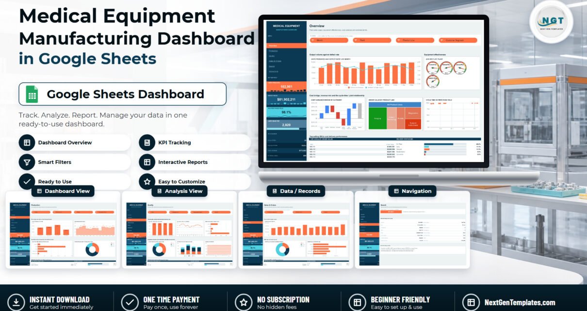

A device plant runs on numbers that live in five different places at once: the line supervisor knows the unit counts, quality owns the reject log, finance owns the cost variance, and the commercial team owns the order book. The Medical Equipment Manufacturing Dashboard in Google Sheets puts all four on one shareable link. It is a six-tab workbook carrying 950 sample manufacturing orders across 21 columns, 18 charts and 15 native slicers, and the sample plant it models produces 102,901 units against $81,902,211 of order value, at 98.1% average first-pass yield with 2,820 rejected units and $772,662 of cost variance.Medical Equipment Manufacturing Dashboard in Google Sheets
Before anything else, the boundary, because this subject deserves plain language: this is a reporting spreadsheet and nothing more. It is static – there is no live connection to an ERP, MES, PLM or machine historian, and nothing syncs. It provides no regulatory compliance capability of any kind: no FDA, ISO 13485, ISO 9001, CE marking, EU MDR, 21 CFR Part 11, validation, traceability, audit-trail, device-history-record or quality-management-system function. A Google Sheet is not a validated QMS and this workbook must never be treated as one. It also does not track device safety, recalls, complaints or adverse events. Regulated records belong in your regulated system; this file is for the Monday morning production meeting.Medical Equipment Manufacturing Dashboard in Google Sheets
Get the Medical Equipment Manufacturing Dashboard in Google Sheets
Key Features of the Medical Equipment Manufacturing Dashboard
- Six linked tabs – Overview, Production, Quality, Sales & Orders, Search and Instructions, navigated from a navy side rail.
- Four persistent KPI cards – Units Produced, Order Value, Avg First-Pass Yield and Units Rejected sit in the rail on every page, each with a sparkline.
- Four at-a-glance stats – Active SKUs (25), Avg cycle time (14.0 h), Cost variance ($772,662) and On-time orders (655).Medical Equipment Manufacturing Dashboard in Google Sheets
- 18 charts across four analysis pages, including four plant OEE gauges, a cost-variance waterfall, an order-value treemap and a cycle-time versus first-pass-yield scatter.
- 15 native slicers – Month, Plant, Product Line, Customer Segment and Regulatory Class, applied per page so each tab holds its own view.Medical Equipment Manufacturing Dashboard in Google Sheets
- Real pivot tables – every chart reads a native pivot starting at column Z rather than a stack of helper formulas.Medical Equipment Manufacturing Dashboard in Google Sheets
- An order lookup page that returns all 16 fields of any single manufacturing order.
- Room to grow – the pivots read A1:U1201, so 1,200 orders fit before you extend anything.Medical Equipment Manufacturing Dashboard in Google Sheets
What This Template Does Not Do
Worth spelling out item by item, because in medical device manufacturing an overstated claim is a real problem rather than a marketing quibble:Medical Equipment Manufacturing Dashboard in Google Sheets
- No compliance function. It does not provide, support or evidence conformity with any standard or regulation, and produces no validated record.
- No live data. You paste an export onto the Data tab. There is no connector, no refresh schedule, no API.
- No safety surveillance. Units Rejected and Defect Rate % are in-process production counts from your own rows. They are not complaint records, recall tracking or adverse-event reporting.Medical Equipment Manufacturing Dashboard in Google Sheets
- The Regulatory Class column is just a label. Class I, II and III are text values you type in yourself, used purely as a slicing dimension so output and rejects can be split by device class. The workbook does not check, verify or maintain a classification.Medical Equipment Manufacturing Dashboard in Google Sheets
Dashboard Pages Explanation
Overview
The plant-wide page. Units Produced and Defect Rate % by Month is a combo chart with output as columns and the defect rate as a line on a secondary axis. Avg OEE % by Plant renders as four gauges – Aurora 85.1, Belmont 78.1, Cascade 89.3 and Danforth 71.6 – so the weakest site is obvious at a glance. Below sit a Cost Variance Bridge by Category waterfall stepping through Direct Labor, Logistics, Machining, Overhead, Quality Testing, Raw Materials and Sterile Packaging to a subtotal, an Order Value by Product Line treemap, and a Cycle Time vs First-Pass Yield scatter. A Top 5 SKUs by Order Value table and a Delivery Status Mix panel close the page. Four slicers – Month, Plant, Product Line, Customer Segment – drive everything on it.
Production
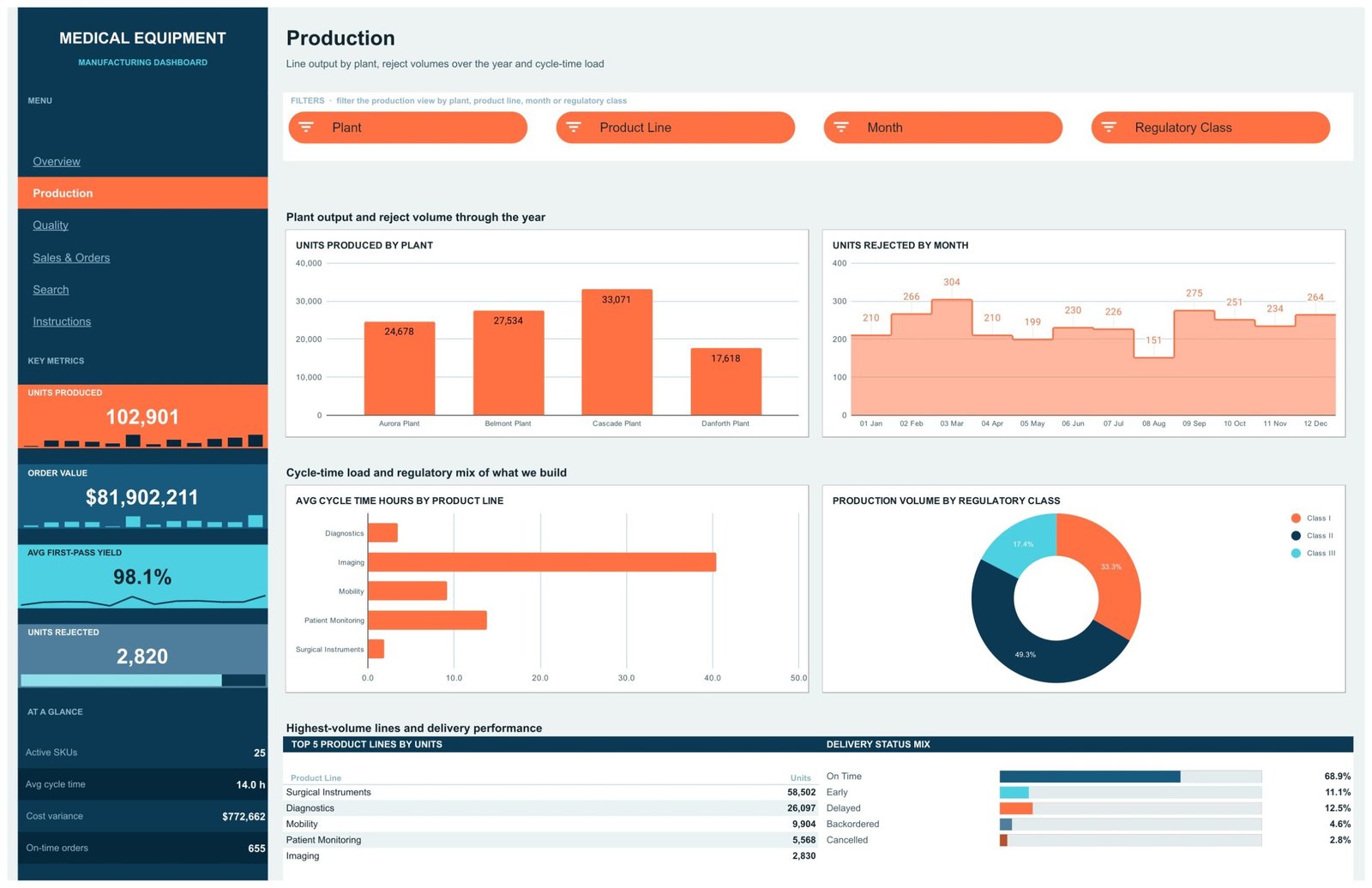
Four charts: Units Produced by Plant (Cascade 33,071, Belmont 27,534, Aurora 24,678, Danforth 17,618), Units Rejected by Month as an area chart with labelled points, Avg Cycle Time Hours by Product Line as a horizontal bar, and Production Volume by Regulatory Class as a donut (Class II 49.3%, Class I 33.3%, Class III 17.4%). A Top 5 Product Lines by Units table sits underneath. Slicers: Plant, Product Line, Month, Regulatory Class.
Quality
The densest page, with six charts. Avg First-Pass Yield % by Plant shows the four sites within a point of each other (98.3, 97.6, 98.5, 97.7). Avg Defect Rate % by Month traces the trend. Units Rejected by Product Line makes the concentration plain – Surgical Instruments dwarf everything else. Reject Share by Regulatory Class, Units Rejected by Plant and Class as a stacked column, and Avg OEE % by Month complete it, with a Top 5 SKUs by Units Rejected table below.
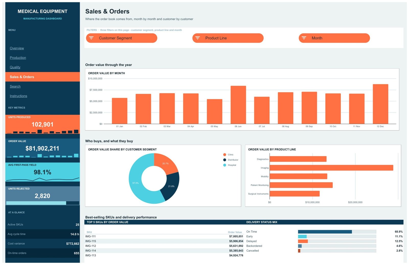
Sales & Orders
The commercial view: Order Value by Month, Order Value Share by Customer Segment (Hospital 57.5%, Distributor 21.8%, Clinic 20.7%) and Order Value by Product Line, where Imaging leads by a wide margin. Three slicers here rather than four.
Search
Type an Order ID such as MO-00001 and the panel returns the full record – Order ID, Date, Product Line, SKU, Plant, Cost Category, Customer Segment, Regulatory Class, Delivery Status, Month, Units Produced, Units Rejected, First Pass Yield %, Cycle Time Hours, OEE % and Order Value. Every field is an INDEX/MATCH against the Data tab wrapped in IFERROR, so an unknown ID reads “Not found” instead of throwing #N/A.
Instructions
A four-step guide covering how to load your own data, how the slicers behave, how the navigation and pivot layout work, and how to recolour the whole thing.
Medical Equipment Manufacturing Dashboard vs. Excel vs. a Paid BI Suite – Feature Comparison
| This template (Google Sheets) | Excel dashboard | Paid BI suite (e.g. Tableau Creator) | |
|---|---|---|---|
| Cost | $9.99 once | $13.99 once + Microsoft 365 | ~$75 per user per month |
| Platform | Any browser | Excel desktop | Desktop app + cloud |
| Setup time | Minutes | Minutes | Days, plus a data source |
| Real-time team collaboration | Yes, native | Limited | Yes |
| Mobile access | Sheets mobile app | Excel mobile | Yes |
| Customizable fields | Yes – edit any of the 21 columns | Yes | Yes, with modelling work |
| Share with a link | Yes | File-based | Licensed viewers |
| Year-1 cost at 5 users | $9.99 | $13.99 + licences | ~$4,500 |
| Live ERP / MES connection | No | No | Yes, with a connector |
| Regulatory / QMS capability | None | None | None – a separate validated system |
An ERP or MES belongs in a different category entirely. If your orders already sit in one, treat this workbook as a reporting layer you paste an export into, not as a substitute.
Who Should Use This Template
Production and operations managers at small-to-mid device manufacturers who want a single shared view of output, yield, cycle time, cost variance and the order book. Plant supervisors comparing sites on OEE. Quality leads who want the reject picture summarised before a review – with the investigation itself recorded elsewhere. Commercial leads splitting order value by customer segment and product line. Consultants and analysts who need something presentable in an afternoon rather than a BI project.
It is the wrong tool for anyone who needs a validated record system, electronic signatures or an audit trail, anyone who needs live machine data or sub-minute refresh, and anyone carrying tens of thousands of orders in a single file.
Real-World Use Cases
Comparing four plants on effectiveness. The OEE gauges put Cascade at 89.3 and Danforth at 71.6 side by side. Cascade is also the highest-volume site at 33,071 units against Danforth’s 17,618, which reframes the question from “who is behind” to “what is different about Danforth’s mix”.
Finding where rejects concentrate. On the Quality tab, Units Rejected by Product Line shows Surgical Instruments far ahead of everything else, and the Top 5 SKUs by Units Rejected panel narrows it to specific part numbers – SRG-145 at 395 rejects, SRG-141 at 376. Slice by Plant and the picture splits again.
Reading the order book by who buys. Hospitals account for 57.5% of order value, distributors 21.8% and clinics 20.7%. Cross-referenced with cycle time – Imaging is both the biggest revenue line and the slowest to build at roughly 40 hours – that becomes a genuine capacity conversation.
Advantages of the Medical Equipment Manufacturing Dashboard
- It uses native Sheets features. Pivot tables and slicers, not fragile formula chains. Google’s own documentation on pivot tables and slicers applies directly, so anyone on the team can extend it.
- One link, no install. No licence, no add-on, no per-seat fee, and it opens on a phone.
- Honest scope. It does one job – summarising a manufacturing order table – and does not pretend to be a quality system.
- Everything follows the slicers. Charts, ranking tables and the Delivery Status Mix panel all respond to the same selection.
- Editable end to end. Colours, product lines, plant names and regulatory class values are all yours to change.
Opportunities for Improvement
Being fair about the limits: the 1,200-row pivot ceiling means a high-volume plant will outgrow it and need the ranges extended by hand. There is no automated refresh – somebody has to paste the export. Pivot tables need a manual refresh after a large paste before the charts catch up. The Search page returns one order at a time rather than a filtered list. And because the workbook is a single file, very large teams editing simultaneously will feel it. None of these are defects; they are the shape of a spreadsheet tool, and worth knowing before you buy.
Best Practices
- Keep all 21 column headers exactly as shipped – the pivots and the Search page both bind to them by name.
- Never leave Order ID blank. It is the key the pivots use to ignore empty rows and the Search page uses to look up a record.
- Paste values, not formatted cells, when importing from an ERP export – it keeps the number formats intact.
- Refresh the pivots after a bulk paste, then spot-check one KPI card against a manual count.
- Share the file view-only with the wider team and keep edit access to whoever owns the data load.
- Keep anything regulated – complaints, CAPAs, device history records – in your validated system, and use this workbook only for the management summary.
Explore Relevant Templates
- Medical Equipment Manufacturing Dashboard in Google Sheets – the template covered in this post.
- Medical Equipment Manufacturing Dashboard in Power BI – same subject, Power BI model.
- Medical Equipment Manufacturing Dashboard in Excel – the offline workbook edition.
- Medical Equipment Manufacturing KPI Dashboard in Excel – a different template: month picker and traffic-light scorecards rather than six analysis pages.
- Heavy Machinery Dashboard in Google Sheets and Chemical Manufacturing Dashboard in Google Sheets – the same six-page build for other plants.
Related Templates
More related walkthroughs on this blog: Medical Equipment Calibration Calendar in Google Sheets, Equipment Maintenance Management System Web App and Chemical Manufacturing Dashboard in Google Sheets. Each is a separate template with its own layout and sample data.
Want to build skills like this step by step? The Excel Pivot Tables & Dashboards course on NextGenTemplates Academy walks you through it with practice files.
Get the Medical Equipment Manufacturing Dashboard in Google Sheets
Frequently Asked Questions
Does this dashboard help with FDA, ISO 13485 or CE marking compliance?
No. It offers no compliance, validation, traceability or audit-trail capability at all, and it must not be used as a regulated record. It is a reporting spreadsheet.
Does it connect to an ERP, MES or machine data?
No. It is static. You paste an export onto the Data tab and the pivots summarise it.
How many manufacturing orders does it hold?
It ships with 950 sample orders and the pivots read A1:U1201, giving room for 1,200 before you extend the ranges yourself.
What are the 21 columns?
Order ID, Date, Product Line, SKU, Plant, Cost Category, Customer Segment, Regulatory Class, Delivery Status, Month, Units Produced, Units Rejected, First Pass Yield %, Cycle Time Hours, OEE %, Defect Rate %, Planned Cost, Actual Cost, Cost Variance, Order Value and a Count helper.Medical Equipment Manufacturing Dashboard in Google Sheets
Do I need Excel or a paid add-on?
No. It runs entirely in Google Sheets in any browser.Medical Equipment Manufacturing Dashboard in Google Sheets
Can I change the plants, product lines and regulatory classes?
Yes – they are ordinary text values on the Data tab. Type your own, refresh the pivots, and the slicers and charts follow.Medical Equipment Manufacturing Dashboard in Google Sheets
Is this the same product as the KPI Dashboard?
No. This is the six-page analytical dashboard. The KPI Dashboard is a separate template built around a month picker and traffic-light scorecards.
About the Author
Built by PK – Microsoft Certified Professional with 15+ years of Excel, Google Sheets, and Power BI experience. Founder of NextGenTemplates, reaching 300K+ subscribers across YouTube channels. Every template is hand-built and tested before release.Medical Equipment Manufacturing Dashboard in Google Sheets
Conclusion
The Medical Equipment Manufacturing Dashboard in Google Sheets turns a flat table of manufacturing orders into six pages a production meeting can actually read – output and defect rate side by side, OEE per plant, where the rejects concentrate, what the cost bridge looks like, and who is buying what. It is deliberately narrow: a static reporting layer with no compliance role and no live connection, priced at $9.99 rather than $75 a seat a month.Medical Equipment Manufacturing Dashboard in Google Sheets
Get the Medical Equipment Manufacturing Dashboard in Google Sheets – $9.99 (regular $16.99), instant download, and the PDF in your download carries the “Make a copy” link.Medical Equipment Manufacturing Dashboard in Google Sheets