Most solar installation companies already know their monthly install count. Far fewer can say, in the same breath, what a watt cost them to put on a roof last month, how long the utility took to grant permission to operate, and whether their first-time inspection pass rate is drifting. The numbers exist — they are just scattered across a CRM, a job board, a permit tracker and somebody’s spreadsheet.Solar Panel Installation KPI Dashboard in Google Sheets
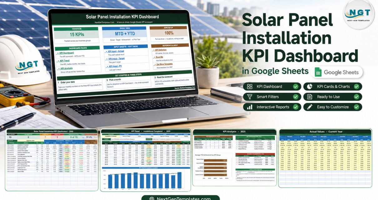
The Solar Panel Installation KPI Dashboard in Google Sheets pulls those fifteen numbers onto one page. It is a formula-driven monthly scorecard: you type actuals, targets and last year’s results on three input sheets, pick a month from a dropdown, and the workbook does the rest — Month-to-Date and Year-to-Date achievement, traffic lights, prior-year comparison, a per-KPI trend page and a group roll-up.
This article walks through what is actually in the build, which KPIs it tracks and why, and where the workbook stops.Solar Panel Installation KPI Dashboard in Google Sheets
Why a Solar Installer Needs a Monthly Scorecard
Solar installation is a business with three clocks running at once. There is the sales clock (how many contracts signed, at what value, for what acquisition cost). There is the delivery clock (permit approval, install, inspection, interconnection). And there is the quality clock (callbacks, warranty claims, safety incidents) that only shows up months later.Solar Panel Installation KPI Dashboard in Google Sheets
Look at any one clock alone and you get a misleading picture. A crew that installs faster by skipping the pre-inspection checklist looks excellent on cycle time and terrible on first-time pass rate six weeks afterwards. A sales team that buys leads harder hits its install count and quietly doubles customer acquisition cost. A monthly scorecard that shows all three at once is what stops those trades happening by accident.Solar Panel Installation KPI Dashboard in Google Sheets
That is the job this workbook does. It is deliberately narrow: fifteen KPIs, one month at a time, one year at a time.
The 15 KPIs in the Solar Panel Installation KPI Dashboard
The KPIs sit in five groups. Each carries a unit, a direction, an owner, a priority and a written formula, all stored on a single master sheet.Solar Panel Installation KPI Dashboard in Google Sheets
Volume & Output (3 KPIs)
- Installations Completed — count of residential and commercial systems energised in the month. Owned by the Operations Manager, flagged Critical.
- Capacity Installed (kW) — the sum of system sizes in kW DC. Install count alone hides the difference between twenty 5 kW roofs and four 25 kW commercial arrays.
- Revenue per Install — total installation revenue divided by systems installed. The Sales Director’s number.
Cost & Efficiency (3 KPIs)
- Cost per Watt Installed — all-in cost divided by system capacity in watts, hardware plus soft costs. Lower is better, and it is the single most quoted efficiency metric in the trade.Solar Panel Installation KPI Dashboard in Google Sheets
- Customer Acquisition Cost — sales and marketing spend divided by new customers won. Lower is better.Solar Panel Installation KPI Dashboard in Google Sheets
- Crew Utilisation — billable install hours as a share of total available crew hours. This is where drive time, rework and weather show up.Solar Panel Installation KPI Dashboard in Google Sheets
Quality & Compliance (4 KPIs)
- First-Time Inspection Pass Rate — installs clearing the AHJ inspection on the first visit. Critical priority, and the cheapest cost saving available to most installers.
- Module Efficiency — rated module output over incident solar energy, averaged across the panels specified on installed systems.
- Warranty Claim Rate — systems raising a warranty or callback claim as a share of systems under warranty. Lower is better.
- Safety Incident Rate (TRIR) — recordable incidents multiplied by 200,000 over total hours worked, the standard OSHA recordable rate calculation, owned by the EHS Officer.
Timeline & Process (3 KPIs)
- Permit Approval Time — average days from permit submission to approval. Largely outside your control, which is exactly why it is worth measuring by jurisdiction.
- PTO / Interconnection Time — average days from finished install to permission to operate. The gap customers complain about most.
- Install Cycle Time — average calendar days from signed contract to finished install.
Customer & Growth (2 KPIs)
- Net Promoter Score — from post-installation surveys.
- Referral Rate — new customers arriving through an existing-customer referral, as a share of all new customers. For a residential installer this is usually the cheapest channel in the mix.
Eight of the fifteen are upper-the-better and seven are lower-the-better. The workbook handles that properly: achievement is Actual over Target for upper-the-better KPIs and Target over Actual for lower-the-better ones, so beating a cost or a cycle-time target scores above 100% rather than below it. It sounds obvious; a surprising number of hand-built scorecards get it backwards and quietly punish their best month.

What Each Page Does
KPI Dashboard
The scorecard. Seven header cards across the top: Total KPIs Tracked, On Target (YTD), At Risk (YTD), Missed (YTD), Improving vs PY (MTD), Avg Achievement (MTD) and Avg Achievement (YTD). Underneath, fifteen rows split into a Month-to-Date block and a Year-to-Date block, each with Actual, Target, Achievement %, Status, Prior Yr and vs PY.
The demo file ships loaded with a 2025 dataset. Selecting September 2025 gives 6 KPIs On Target for the year, 7 At Risk, 2 Missed, 9 of 15 improving against 2024, and average achievement of 97.0% for the month against 98.7% for the year to date. That gap — a weaker month inside a stronger year — is the sort of thing the two-block layout is designed to surface immediately.
The status bands are printed on the page: On Target from 100%, At Risk from 95% to 99%, Missed below 95%. They live in the Status formulas rather than in conditional-formatting rules, so a company that reports on tighter bands can change them in one place.
KPI Trend
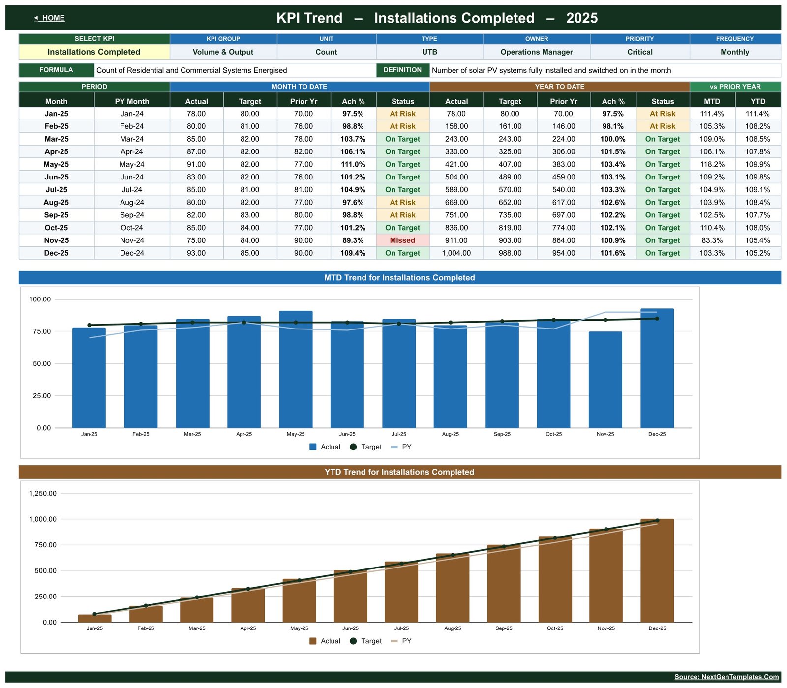
One KPI, twelve months, two charts. Pick a KPI from the dropdown and the page rebuilds: its group, unit, type, owner, priority and frequency in a header strip, its formula and definition spelled out, then a twelve-month table with MTD Actual, Target, Prior Yr, Achievement % and Status, the same set for YTD, and MTD and YTD indices against prior year. The two charts below plot Actual against Target and Prior Year, monthly and cumulative.
This is the page for the argument that starts “was that a bad month or a trend?” On the sample data, Installations Completed runs At Risk in January, February, August and September, Missed once in November, and On Target everywhere else — a KPI that wobbles month to month while finishing the year 5.2% ahead of the prior year.
KPI Analysis
Two questions answered on one page: which group is dragging, and which individual KPIs are at the extremes.
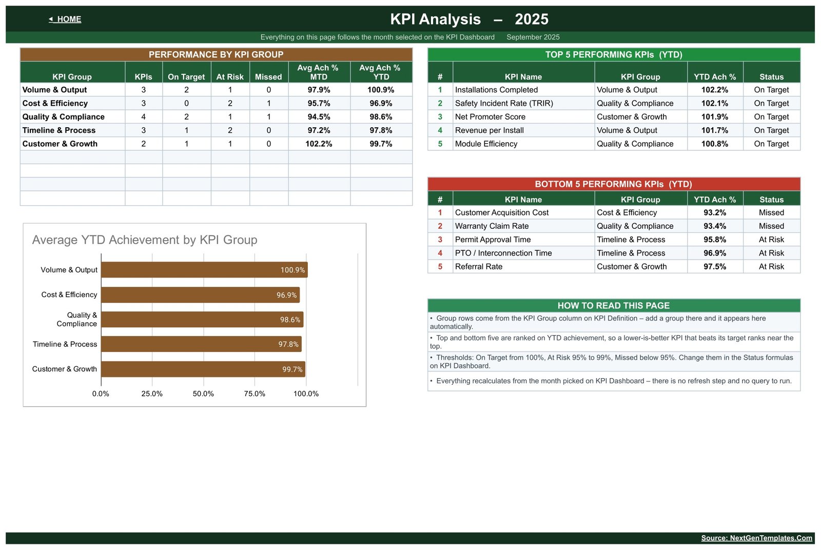
Performance by KPI Group lists the five groups with a count of On Target, At Risk and Missed KPIs and their average MTD and YTD achievement, plotted as a bar chart. Top 5 and Bottom 5 Performing KPIs rank all fifteen on YTD achievement. In the sample, Cost & Efficiency is the weakest group at 96.9% average YTD, with Customer Acquisition Cost bottom of the list at 93.2% and Warranty Claim Rate just above it at 93.4%.
Because the ranking runs on achievement rather than raw value, a lower-is-better KPI that beats its target ranks near the top — Safety Incident Rate sits second in the sample Top 5. The page explains that in its own How to Read This Page block, which is a small thing that saves a lot of confused questions.
The three input sheets
KPI Input – Actual, KPI Input – Target and KPI Input – PY are the only places you type. Each is the same grid: one row per KPI, twelve month-pairs of MTD and YTD columns, yellow cells. Cell E3 on the Actual sheet sets the first month of the reporting year, so a July-to-June fiscal year needs one edit rather than a rebuild.
KPI Definition
The master list, and the reason the workbook is worth customising rather than replacing. Every sheet reads its KPI names, groups, units, types, owners, priorities and frequencies from here. Replace Module Efficiency with Soiling Loss, or add Battery Attach Rate, and the dashboard, trend and analysis pages follow without a single formula edit.
How to Set It Up
- Open the PDF that comes with the download and click Make a copy. The copy lands in your own Google Drive.
- Go to KPI Definition and edit the fifteen rows to match how your business actually reports. Keep the groups if you can — the analysis page rolls up by them.
- Set E3 on KPI Input – Actual to your first reporting month.
- Fill KPI Input – Target first. Targets are easier to agree before you can see the actuals.
- Fill KPI Input – PY with last year’s numbers if you have them. If you do not, leave it blank for the first year and the vs PY columns simply stay empty.
- Enter actuals monthly on KPI Input – Actual, then read the scorecard.
Realistically, the first month takes an afternoon because you are agreeing definitions, not typing numbers. Every month after that is about twenty minutes.
Where the Workbook Stops
Worth being blunt about the limits before anyone buys it:
- It is manual entry. There is no CRM connector, no ERP integration, no inverter or monitoring-portal feed. Somebody types the numbers in.
- The only controls are two dropdowns — a month picker and a KPI picker. There is no slicer panel, no multi-select, no filtering by crew or by branch.
- It holds one reporting year at a time. Copy the file at year end if you want the history.
- The 2025 figures in the demo are sample data, not industry benchmarks. Do not set your targets from them.
- It is a reporting layer, not a compliance system. It does not replace licensed electrical design, AHJ permitting requirements, NEC compliance, utility interconnection procedures or an OSHA 300 log.
If you need crew-level or branch-level slicing, or a live connection to a data source, this is not the right tool and no amount of customising will make it one.
Dashboard or Scorecard? They Are Different Products
NextGenTemplates ships two formats for the same trade and they are easy to confuse. The Solar Panel Installation KPI Scorecard in Google Sheets is the compact one: ten KPIs, a single page, no group roll-up and no separate analysis sheet. The dashboard covered here is the fuller build — fifteen KPIs, five groups, a dedicated trend page and a ranking page.
Pick the scorecard if one printable page for a monthly meeting is all you need. Pick the dashboard if you want to interrogate a single KPI across twelve months and see which group is dragging the year.
Related Templates on the Same Build
The same fifteen-KPI architecture is published for several other trades, which is useful if you run more than one service line:
- Window and Door Installation KPI Dashboard in Google Sheets
- Garage Door Service KPI Dashboard in Google Sheets
- Fencing Contractor KPI Dashboard in Google Sheets
- Insulation Contractor KPI Dashboard in Google Sheets
Get the Template
The workbook is available on NextGenTemplates as an instant download. The file you receive is a PDF carrying a Make a copy link to the live sheet, so the copy is yours and private from the moment you click it.Solar Panel Installation KPI Dashboard in Google Sheets
Solar Panel Installation KPI Dashboard in Google Sheets — view the template
FAQ
Does it need an add-on or Apps Script?
No. Everything is native Google Sheets formulas. Nothing to install, nothing to authorise.Solar Panel Installation KPI Dashboard in Google Sheets
Can I add a sixteenth KPI?
Yes. Add the row on KPI Definition and the other sheets pick it up. Add the matching rows on the three input sheets so the new KPI has numbers to read.Solar Panel Installation KPI Dashboard in Google Sheets
Can my whole team see it?
Yes. Once the copy is in your Drive, normal Google Sheets sharing applies, per person, view or edit.Solar Panel Installation KPI Dashboard in Google Sheets
Will it work in Excel?
You can export the copy to .xlsx, but the build is written and tested for Google Sheets. Excel and Power BI editions of the KPI range are published separately.Solar Panel Installation KPI Dashboard in Google Sheets
What if my fiscal year starts in April?
Change cell E3 on KPI Input – Actual and every month column re-bases across the workbook.
Solar Panel Installation KPI Dashboard in Google Sheets