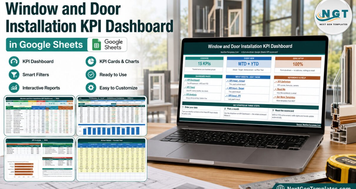
Most window and door installation companies already know which month was busy and which job went wrong twice. What they rarely have is one page that puts quoting, installation delivery, workmanship, customers and job economics side by side for the month and the year so far. The Window and Door Installation KPI Dashboard in Google Sheets does exactly that: fifteen installation KPIs, five groups, a month picker, and red / amber / green status calculated from your own numbers – all in a browser, with no add-on, macro or subscription.Window and Door Installation KPI Dashboard in Google Sheets
This walkthrough covers every page of the workbook, how the scoring actually works, who it suits, and where it deliberately stops.
Get the Window and Door Installation KPI Dashboard in Google Sheets
Key Features of the Window and Door Installation KPI Dashboard in Google Sheets
15 installation KPIs across five management groups
The KPI register is grouped the way an installation business is actually run, not the way a spreadsheet happens to sort:Window and Door Installation KPI Dashboard in Google Sheets
- Sales & Growth (3): Installations Completed, New Quotes Issued, Lead-to-Sale Conversion Rate.
- Operations & Delivery (4): On-Time Installation Rate, Average Installation Lead Time, Jobs Completed per Installer per Day, Installer Utilization Rate.
- Quality & Warranty (3): Right First Time Rate, Callback / Rework Rate, Warranty Claim Rate.
- Customer Experience (2): Customer Satisfaction (CSAT), Net Promoter Score.
- Financial & Cost (3): Average Revenue per Installation, Gross Profit Margin, Material Waste Rate.Window and Door Installation KPI Dashboard in Google Sheets
Direction-aware achievement and traffic lights
Eleven of the fifteen metrics are upper-the-better and four are lower-the-better. Achievement is Actual ÷ Target for UTB metrics and Target ÷ Actual for LTB metrics, so shortening Average Installation Lead Time or cutting Callback / Rework Rate, Warranty Claim Rate or Material Waste Rate scores above 100% instead of below it. That single rule is what most hand-built installation spreadsheets get wrong, and it is why a good month on rework can otherwise read as a failure.Window and Door Installation KPI Dashboard in Google Sheets
Status bands are On Target from 100%, At Risk 95% to 99%, and Missed below 95%. They live in the Status formulas, so a business that runs tighter or looser bands can change them without touching anything else.Window and Door Installation KPI Dashboard in Google Sheets
One month picker, two reporting horizons
Pick a month on the KPI Dashboard sheet and the whole workbook re-bases: the scorecard, the per-KPI trend page and the group analysis page all follow it. Every KPI is shown twice – month to date and year to date – each with Actual, Target, Achievement %, Status, Prior Year and vs PY.
Dashboard Pages Explanation
1. Home
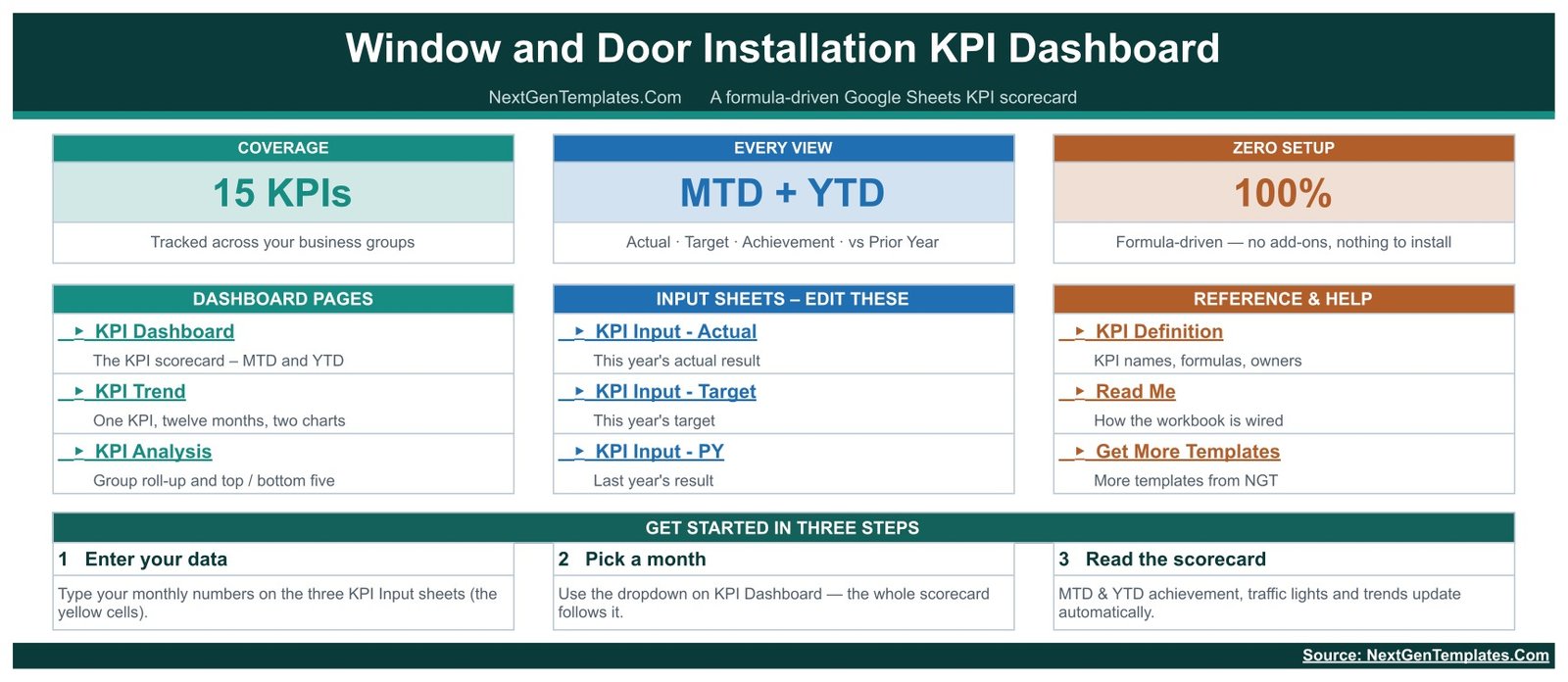
A launch page. Three header cards state the coverage (15 KPIs), the reporting horizons (MTD + YTD) and the setup cost (100% formula-driven, nothing to install). Below them, three link columns point at the dashboard pages, the three input sheets you edit, and the reference pages, followed by a three-step getting-started strip.
2. KPI Dashboard
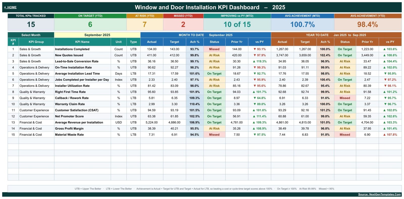
The scorecard itself. Seven header cards summarise the selected month; in the supplied September 2025 sample they read 15 KPIs tracked, 6 On Target, 7 At Risk and 2 Missed on YTD, 10 of 15 improving against prior year, and average achievement of 100.7% MTD and 98.4% YTD. Beneath them sit the fifteen rows, each showing its group, unit, UTB/LTB type, and the full MTD and YTD blocks. A footnote spells out the scoring rule and the thresholds so nobody has to reverse-engineer a formula to trust a colour.Window and Door Installation KPI Dashboard in Google Sheets
Those figures are invented demonstration data. They are not industry benchmarks for the glazing or door trade, and nothing in the workbook claims they are.
3. KPI Trend
One KPI, twelve months. Choose a metric from the dropdown and the page shows its group, unit, type, owner, priority and frequency, the written formula and definition, then a January-to-December table with MTD and YTD Actual, Target, Prior Year, achievement and status, plus the MTD and YTD percentages against prior year. Two column charts sit underneath – an MTD trend and a cumulative YTD trend, both with target and prior-year overlays.Window and Door Installation KPI Dashboard in Google Sheets

4. KPI Analysis
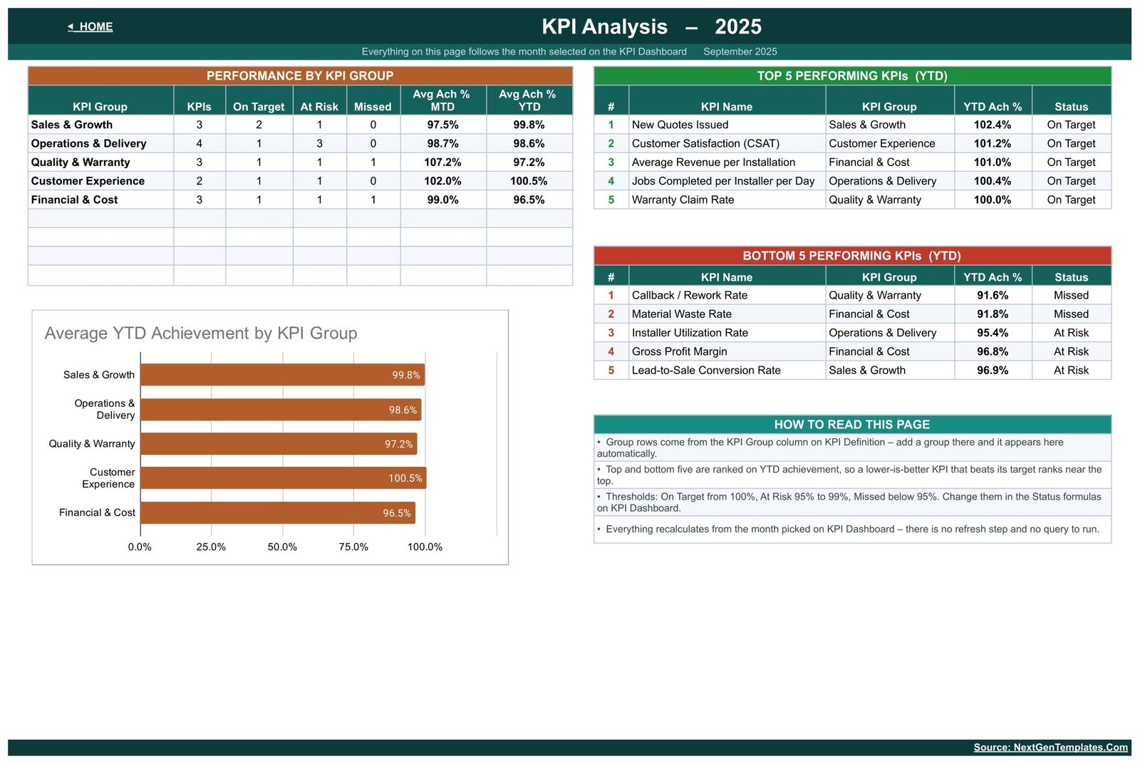
The management view. A Performance by KPI Group table gives each of the five groups its KPI count, its On Target / At Risk / Missed split and its average MTD and YTD achievement, with a bar chart beneath. In the sample year Customer Experience leads on 100.5% YTD and Financial & Cost trails on 96.5%. To the right, a Top 5 and a Bottom 5 table rank every KPI by YTD achievement – and because ranking is done on achievement rather than on raw value, a lower-is-better metric that beats its target ranks near the top, exactly as it should.Window and Door Installation KPI Dashboard in Google Sheets
5. Actual, Target and PY input sheets
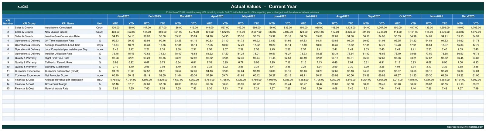
Three sheets – KPI Input – Actual, KPI Input – Target and KPI Input – PY – carry the monthly numbers in yellow cells, with the cumulative YTD column calculated beside each month. These three sheets are the only place you type. Cell E3 on the Actual sheet sets the first month of the reporting year, so a business on an April-to-March year changes one cell rather than rebuilding the workbook.Window and Door Installation KPI Dashboard in Google Sheets
6. KPI Definition
The master list, and the sheet that makes the workbook yours. Each of the fifteen KPIs carries its group, unit, written formula, plain-English definition, UTB/LTB direction, owner, priority and frequency – for example, Right First Time Rate is defined as installs passing final inspection first time divided by total installs, owned by the Quality Lead, Critical priority, monthly. Rename, add or delete a row here and the dashboard, trend, analysis and input sheets follow automatically.

A Read Me page explains how the sheets are wired together, and a Get More Templates page links back to the wider library.
Window and Door Installation KPI Dashboard vs. Excel vs. Paid Installer Software
| Area | This Google Sheets dashboard | An Excel KPI workbook | Paid installer / field service platform |
|---|---|---|---|
| Cost | One-time template price | Template plus Microsoft 365 if needed | Recurring per-user subscription |
| Time to first report | Copy the sheet, type last month’s totals | Download, open, edit | Implementation and data migration |
| Sharing | A Google Sheets link | Best through OneDrive | Seat-based accounts |
| Changing a KPI | Edit one row on KPI Definition | Edit the workbook | Depends on the vendor plan |
| Formula transparency | Every formula visible and editable | Visible and editable | Usually a black box |
| Quoting, surveys, scheduling, invoicing | No | No | Usually yes |
| Where numbers come from | You type monthly totals | You type monthly totals | Captured from live jobs |
KPI Dashboard or KPI Scorecard? The Two Are Different Templates
There are two Google Sheets products for this trade, and they are easy to confuse by name alone. This one – the KPI Dashboard – is the month-picker build: a fifteen-row MTD and YTD grid with traffic lights, a per-KPI Trend page, a group Analysis page and three monthly input sheets. The Window and Door Installation KPI Scorecard in Google Sheets is a different template built around KPI cards and comparison dropdowns rather than this grid.
Pick the dashboard when you want one month’s full scorecard plus twelve-month trends in a table you can read line by line. Pick the scorecard when you want a card wall for a quick monthly stand-up. Buying one does not include the other.
Who Should Use This Template
Window and door installation company owners, installation and operations managers, fitting-team supervisors, sales leads who own the quote pipeline, and the office manager or bookkeeper who already assembles monthly totals. It fits a two-fitter operation as comfortably as a multi-crew glazing and door contractor, because the only thing that scales is how many rows you type.
It is not for anyone who needs the workbook to capture the data. There is no job entry, no survey record, no scheduling and no invoicing – you supply monthly totals and it turns them into a scorecard.
Real-World Use Cases
The monthly review. An owner opens KPI Dashboard, sets the month, and reads the seven header cards before anyone speaks. The conversation starts from what is amber and red rather than from whoever prepared the slides.
Diagnosing a soft sales month. New Quotes Issued against Lead-to-Sale Conversion Rate separates a quoting-volume problem from a closing problem – two very different fixes that a single revenue figure hides.
Deciding whether to add a crew. Installer Utilization Rate and Jobs Completed per Installer per Day read together tell you whether the existing team is genuinely full before a van and a wage are added.
Chasing rework properly. Right First Time Rate, Callback / Rework Rate and Warranty Claim Rate sit in one group, so a fall in first-time completion and the callbacks it causes are visible on the same screen, in the same month.
Protecting margin. Average Revenue per Installation, Gross Profit Margin and Material Waste Rate are reviewed together before a window range is repriced or a supplier is changed.
Advantages
- Fifteen trade-specific KPIs already written, defined and grouped – no blank-page problem.
- Correct lower-is-better scoring on lead time, rework, warranty and waste.
- MTD and YTD in every row, so a bad month inside a good year is obvious.
- Formulas are readable Google Sheets functions; nothing is hidden behind a script.
- Twelve months of sample data so the workbook is legible before you type anything.
- Works on a free Google account, in any browser, with no add-on.
Opportunities for Improvement
- Monthly granularity only – there is no weekly or per-job view.
- Data is typed, not imported; there is no connector to a quoting or accounting system.
- One reporting year at a time, so multi-year comparison means a second copy.
- The KPI Trend page shows one metric at a time by design.
- Sample figures must be replaced before the workbook means anything.
Best Practices
- Fix the definitions first. Agree what counts as a completed installation and what counts as a callback before the first number goes in, and write it on the KPI Definition sheet.
- Set targets for the whole year up front, not month by month – a target edited after the result is not a target.
- Fill KPI Input – PY once from last year’s records so the vs PY column works from month one.
- Check the UTB/LTB flag on every metric you add. It is the one field that silently inverts a result.
- Keep KPI names identical between the definition and input tables so the lookups keep matching.
- Give edit access only to whoever maintains the inputs; share view access with everyone else.
Explore Relevant Templates
- Window and Door Installation KPI Scorecard in Google Sheets – the card-based companion for the same trade, reviewed page by page.
- Glass Installation KPI Scorecard in Google Sheets – the closest neighbouring trade.
- Flooring Installation KPI Dashboard in Google Sheets – the same month-picker build for another fit-out trade.
- Fencing Contractor KPI Dashboard in Google Sheets – the same layout for an outdoor installation contractor.
- Carpentry Workshop KPI Dashboard in Google Sheets – joinery KPIs in the same structure.
- Locksmith Business KPI Dashboard in Google Sheets – the same dashboard for a door-hardware call-out trade.
Curious how dashboards like this are put together? The Excel Pivot Tables & Dashboards course on NextGenTemplates Academy covers the method with practice files.
Get the Window and Door Installation KPI Dashboard in Google Sheets
Frequently Asked Questions
Is this the KPI Dashboard or the KPI Scorecard?
This is the KPI Dashboard: fifteen KPIs, a month picker, an MTD and YTD grid with traffic lights, a per-KPI Trend page, a group Analysis page and three monthly input sheets. The scorecard for the same trade is a separate template built around KPI cards and comparison dropdowns.
Do I need a paid Google Workspace account?
No. A free Google account can copy, edit and share the workbook. It runs in the browser with no add-on, script or macro.
Can I add my own KPIs?
Yes. KPI Definition is the master list. Rename, add or delete rows there and the dashboard, trend, analysis and input sheets follow. Keep the names identical across the definition and input tables.
Are the results in the screenshots industry benchmarks?
No. Twelve months of invented sample data are supplied so the workbook is readable on first open. The September 2025 figures are a demonstration, not a target for your business.
Does it prove FENSA, building-regulation or fire-door compliance?
No. It measures commercial and operational performance only. It holds no certification, notification, survey or warranty records and is not evidence of compliance with any scheme or standard. The Warranty Claim Rate KPI counts claims; it does not administer them.
Will it import job data from my quoting or scheduling software?
No. Monthly values are typed in. There is no API, import or automatic sync – which is also why nothing breaks when a vendor changes their software.
How do I receive the template?
You download a PDF that carries the Google Sheets link. Click it, make your own copy in your Google Drive, and the workbook is yours to edit.
About the Author
Built by PK – Microsoft Certified Professional with 15+ years of Excel, Google Sheets and Power BI experience. Founder of NextGenTemplates, reaching 300K+ subscribers across YouTube channels. Every template is hand-built and tested before release.
Conclusion
Installation businesses rarely fail on one number. They drift – a lead time that stretches a day a month, a callback rate that creeps, a margin that erodes while revenue looks fine. The Window and Door Installation KPI Dashboard in Google Sheets puts all fifteen of those numbers on one page, scores them in the right direction, and shows the month against the year and against last year, so drift is visible while it is still small.
Get the Window and Door Installation KPI Dashboard in Google Sheets and run next month’s review from one page.