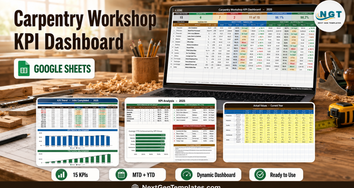
Most carpentry workshops already have the numbers. They are in the job book, the timesheets, the timber invoices and the QC clipboard. What they usually do not have is one page, refreshed the same way every month, that says whether the shop is winning. The Carpentry Workshop KPI Dashboard in Google Sheets is that page: 15 joinery KPIs in 6 groups, each one carrying month-to-date and year-to-date actual, target, achievement percentage, a traffic light, the prior-year figure and a year-on-year arrow. In the sample month shipped with the file – September 2025 – it reads 6 On Target, 7 At Risk, 2 Missed, 11 of 15 improving on last year, and 98.1% average MTD achievement against 98.2% YTD.Carpentry Workshop KPI Dashboard in Google Sheets
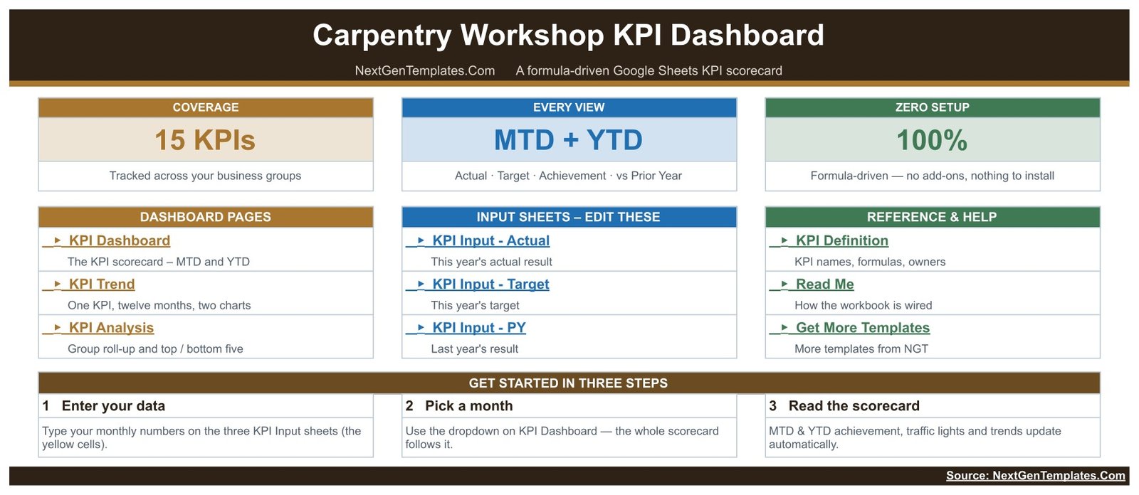
Before anything else, a disambiguation, because three NextGenTemplates families share almost the same name. This article is about the KPI Dashboard – the month-picker scorecard with a KPI Trend page and a KPI Analysis page. It is not one of the analytical Google Sheets dashboards built over a transaction table with slicers and pivots, and it is not the Carpentry Workshop KPI Scorecard in Google Sheets, which is a separate and lighter template. Three different products, sold separately.
Key Features of the Carpentry Workshop KPI Dashboard in Google Sheets
- 15 KPIs in 6 groups. Production has 4, Materials 3, Quality 2, Delivery 2, Commercial 3 and Safety 1.Carpentry Workshop KPI Dashboard in Google Sheets
- A single month dropdown. Cell D6 on the KPI Dashboard sheet lists the twelve months of the reporting year. The scorecard and the KPI Analysis page both follow it, with no refresh step.Carpentry Workshop KPI Dashboard in Google Sheets
- MTD and YTD in the same row. Both halves carry Actual, Target, Ach %, Status, Prior Yr and a vs-PY arrow.
- Direction handled per KPI. 8 KPIs are upper-the-better and 7 are lower-the-better. Achievement is Actual divided by Target for UTB and Target divided by Actual for LTB.
- Editable status bands. On Target from 100%, At Risk 95% to 99%, Missed below 95% – all living in the Status formulas on the KPI Dashboard sheet.
- Seven summary cards. Total KPIs Tracked, On Target (YTD), At Risk (YTD), Missed (YTD), Improving vs PY (MTD), Avg Achievement (MTD), Avg Achievement (YTD).
- Wired for 22 KPIs. Fifteen are filled; seven live empty rows are already formula-connected.Carpentry Workshop KPI Dashboard in Google Sheets
- Worksheet formulas only. No add-on, no Apps Script macro, no query. A free Google account is enough.Carpentry Workshop KPI Dashboard in Google Sheets
Dashboard Pages Explanation
KPI Dashboard – the scorecard
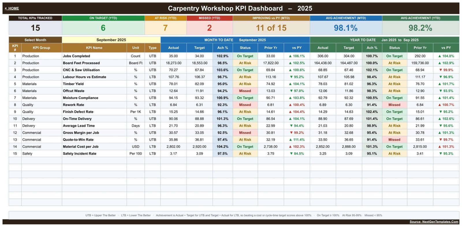
One row per KPI, with the KPI number, group, name, unit and UTB/LTB type on the left, then the Month To Date block, then the Year To Date block. The 15 KPIs as shipped are Jobs Completed (Count), Board Feet Processed (Board Ft), CNC & Saw Utilisation (%), Labour Hours vs Estimate (%), Timber Yield (%), Offcut Waste (%), Moisture Compliance (%), Rework Rate (%), Finish Defect Rate (Per 1K), On-Time Delivery (%), Average Lead Time (Days), Gross Margin per Job (%), Quote-to-Win Rate (%), Material Cost per Job (USD) and Safety Incident Rate (Per 100).Carpentry Workshop KPI Dashboard in Google Sheets
The arrow colouring is worth understanding, because it is what stops a KPI grid from lying to you. The vs-PY arrow points in the raw direction – the actual is above or below last year – while its colour says whether that direction is good for that particular KPI. That is why, in the sample data, Average Lead Time falling from 22.99 days to 21.70 shows a green down-arrow, while Material Cost per Job rising from 2,738 to 2,802 USD shows a red up-arrow. Both moved down and up respectively; only one of them is good news.Carpentry Workshop KPI Dashboard in Google Sheets
KPI Trend – one KPI, twelve months

Choose a KPI in cell B4 and the whole page follows. You get an attribute strip – KPI Group, Unit, Type, Owner, Priority, Frequency – then the formula and a plain-English definition, then a twelve-month table with MTD and YTD actual, target, prior year, achievement and status, plus the vs-prior-year percentages. Underneath sit two charts, named for the KPI you picked: on the sample they read “MTD Trend for Jobs Completed” and “YTD Trend for Jobs Completed”, each plotting actual columns against a target line and a prior-year line.
KPI Analysis – the group roll-up
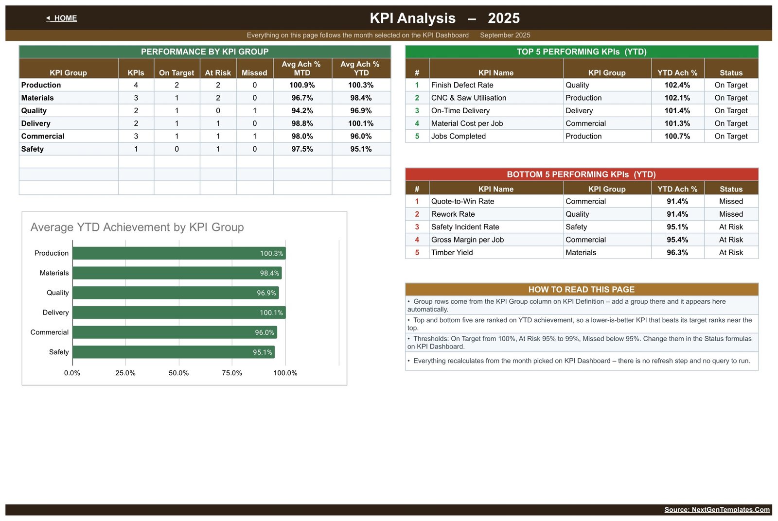
Everything here follows the same month you picked on the scorecard. Performance by KPI Group counts the KPIs, On Target, At Risk and Missed in each group and averages achievement for MTD and YTD; on the September sample that is Production 100.3%, Materials 98.4%, Quality 96.9%, Delivery 100.1%, Commercial 96.0% and Safety 95.1% for the year to date. The Average YTD Achievement by KPI Group chart plots the same figures. Top 5 and Bottom 5 Performing KPIs rank on YTD achievement, so a lower-is-better KPI that beats its target ranks near the top rather than near the bottom – which is exactly what you want and exactly what a naive ranking gets wrong.
The three input sheets and the KPI Definition master
KPI Input – Actual, KPI Input – Target and KPI Input – PY are the only sheets you normally type in. Each is a 15-row by 12-month grid with an MTD and a YTD column for every month, and the editable cells shaded yellow. Cell E3 on KPI Input – Actual is the first month of the reporting year; change it and the target sheet, the prior-year sheet, the month dropdown and every sheet title re-base themselves.
KPI Definition is the master list that drives everything else: number, group, name, unit, formula, definition, UTB/LTB type, owner, priority and frequency. Owners in the shipped file run from Workshop Manager and Production Lead through CNC Supervisor, Estimator, Purchasing Manager, QC Inspector, Site Foreman, Finance Manager and Sales Estimator to Safety Officer. Rename a KPI here and every sheet picks it up; clear the row and the dashboard row goes blank and the cards recount themselves. A Support sheet holds the helper calculations, a Read Me explains the wiring, and a Get More Templates sheet links the rest of the catalogue.
Carpentry KPI Dashboard vs. Excel vs. Paid Job-Management SaaS – Feature Comparison
| This template (Google Sheets) | Excel KPI dashboard | Paid job-management SaaS | |
|---|---|---|---|
| Cost | One-off template price | One-off template price | Recurring per-user subscription |
| Platform | Any browser, free Google account | Desktop Excel licence | Vendor web app |
| Setup time | Minutes – copy the sheet, type your numbers | Minutes – open the workbook | Onboarding, data migration, training |
| Real-time team collaboration | Yes, native multi-user editing | Via OneDrive co-authoring | Yes |
| Mobile access | Google Sheets app | Excel mobile app | Vendor app |
| Customisable KPI list | Yes – edit KPI Definition, up to 22 rows | Yes | Usually fixed to the vendor model |
| Share with a link | Yes | File send or cloud link | Seat invitation |
| Year-1 cost at 5 users | The template price, once | The template price, once | Subscription x 5 seats x 12 months |
| UTB / LTB direction per KPI | Built in, set per KPI | Built in, set per KPI | Varies by vendor |
| Job costing, quoting and invoicing | No – reports KPIs only | No | Yes |
Who Should Use This Template
Bespoke joinery shops, site-carpentry contractors, cabinet makers and shopfitters who already record their monthly numbers somewhere and want a single management page. Production managers who report to an owner or a board every month. Estimators who need to see Labour Hours vs Estimate next to Quote-to-Win Rate. Workshop owners who want the same layout every month so that a change in the numbers actually reads as a change.
It is the wrong tool if you want live job costing, quoting or invoicing, or an automatic feed from a CNC controller or an ERP – this is a monthly reporting layer over figures you enter. It is also not a safety or OSHA recordkeeping system. Safety Incident Rate is one KPI among fifteen, calculated from numbers you type; tracking it here satisfies no statutory logging duty and makes no compliance claim.
Real-World Use Cases
The yield conversation. Timber Yield and Offcut Waste sit two rows apart in the Materials group. When yield drops and waste climbs in the same month, the question is whether the cutting lists changed or the stock did – and the KPI Trend page for either KPI shows twelve months against target and last year, which usually settles it.
The estimate re-base. Labour Hours vs Estimate is lower-the-better; above 100% means jobs are over-running the hours quoted. Read next to Quote-to-Win Rate and Gross Margin per Job, a persistent over-run with a falling win rate points at the estimating model rather than at the bench.
The monthly owner pack. The KPI Analysis page alone – group roll-up, bottom five, top five – is a one-page board update. The detail lives on KPI Trend for whoever wants it.
Advantages of the Carpentry Workshop KPI Dashboard in Google Sheets
- Nothing to install and nothing to refresh. Because it is all worksheet formulas, opening the file is the whole setup, and Google Sheets handles version history and sharing for you – see the Google Sheets function reference if you want to extend the formulas yourself.
- The UTB/LTB rule is applied consistently, so cost, waste, rework and lead-time KPIs are scored honestly rather than being made to look bad by a revenue-shaped formula.
- MTD and YTD sit on the same row, which stops the common failure of judging a shop on one good or bad month.
- Adding a sixteenth KPI is data entry, not formula surgery.
- Owners, priorities and frequencies are recorded per KPI, so the review meeting knows who answers for each number.
Opportunities for Improvement
Honest limits, so nobody is surprised. It reads a month at a time – there is no rolling twelve-month view on the scorecard itself, only on KPI Trend and only one KPI at a time. There is no drill-through to job-level detail, because there is no job-level table in the file. Data entry is manual: the three input sheets expect you to bring the MTD and YTD numbers, which means whatever defines your YTD stays your decision but also stays your job. And the capacity ceiling is 22 KPIs; past that you are editing formula ranges. Finally, the shipped September 2025 figures are invented sample data for demonstration – they are not benchmarks, and you should replace them before showing the file to anyone.
Best Practices
- Set cell E3 on KPI Input – Actual first. Everything else re-bases from it, so doing this after data entry is wasted work.
- Fix the UTB/LTB flag on KPI Definition before you trust a single traffic light. A wrong direction flag turns a good month green when it should be red.
- Agree the status bands once. If your shop treats 98% as acceptable, move the At Risk boundary in the Status formulas and leave it alone thereafter.
- Fill the Prior Year sheet even if it is a rough reconstruction. The vs-PY arrows are the cheapest early-warning signal in the file.
- Keep the KPI count small enough to act on. Fifteen is already a lot for a monthly meeting; the seven spare rows are there for when a KPI earns its place, not to be filled on principle.
Explore Relevant Templates
- Carpentry Workshop KPI Dashboard in Google Sheets – the template this article describes.
- Carpentry Workshop KPI Dashboard in Excel – the same dashboard for Excel.
- Carpentry Workshop KPI Scorecard in Google Sheets and Carpentry Workshop KPI Scorecard in Excel – the separate scorecard family.
- Painting Contractor KPI Dashboard in Google Sheets, Flooring Installation KPI Dashboard in Google Sheets and Roofing Contractor KPI Dashboard in Google Sheets – the same build for neighbouring trades.
Related Templates
More related walkthroughs on this blog: Carpentry Workshop KPI Scorecard in Google Sheets, Welding Shop KPI Dashboard in Google Sheets and HVAC Contractor KPI Dashboard in Google Sheets. Each is a separate template with its own layout and sample data.
Interested in how dashboards like this are planned and built? The Excel Pivot Tables & Dashboards course on NextGenTemplates Academy takes you through it with practice files.
Frequently Asked Questions
How is this different from the Carpentry Workshop KPI Scorecard in Google Sheets?
They are separate templates with separate files. This KPI Dashboard carries 15 KPIs with full MTD and YTD blocks, a month dropdown, a dedicated KPI Trend page and a KPI Analysis page. The KPI Scorecard is a different, lighter layout. Buying one does not include the other.
Do I need an add-on or Apps Script?
No. Every number in the file is a worksheet formula. There is no add-on, no macro and no query to run.
Can I add my own KPIs?
Yes. Fill the next empty row on KPI Definition and type its monthly numbers into the three input sheets. The file is wired for 22 KPIs, so seven rows are free.
How is achievement calculated?
Actual divided by Target for an upper-the-better KPI, and Target divided by Actual for a lower-the-better one. Beating a cost or cycle-time target therefore scores above 100%.
Are the numbers in the screenshots real?
No. The September 2025 figures are invented sample data included to demonstrate the formulas.
Does it handle safety compliance?
No. Safety Incident Rate is one management KPI among fifteen. This is not a safety, OSHA or incident-recordkeeping system and it makes no compliance claim.
What exactly do I download?
A PDF that carries the “Make a copy” link. Click it and Google Sheets creates your own editable copy of the dashboard in your own Drive.
About the Author
Built by PK – Microsoft Certified Professional with 15+ years of Excel, Google Sheets, and Power BI experience. Founder of NextGenTemplates, reaching 300K+ subscribers across YouTube channels. Every template is hand-built and tested before release.
Conclusion
A carpentry workshop does not need more numbers; it needs the same fifteen numbers, every month, scored in the right direction and read the same way. That is what the Carpentry Workshop KPI Dashboard in Google Sheets does – one dropdown, six groups, MTD and YTD side by side, a trend page for the argument and an analysis page for the owner. Open the PDF, click “Make a copy”, set your reporting year and type in one month. You will know by the end of that month whether the fifteen are the right fifteen for your shop, and the seven spare rows are there if they are not.
For walkthroughs and template tutorials, visit youtube.com/@PKAnExcelExpert.