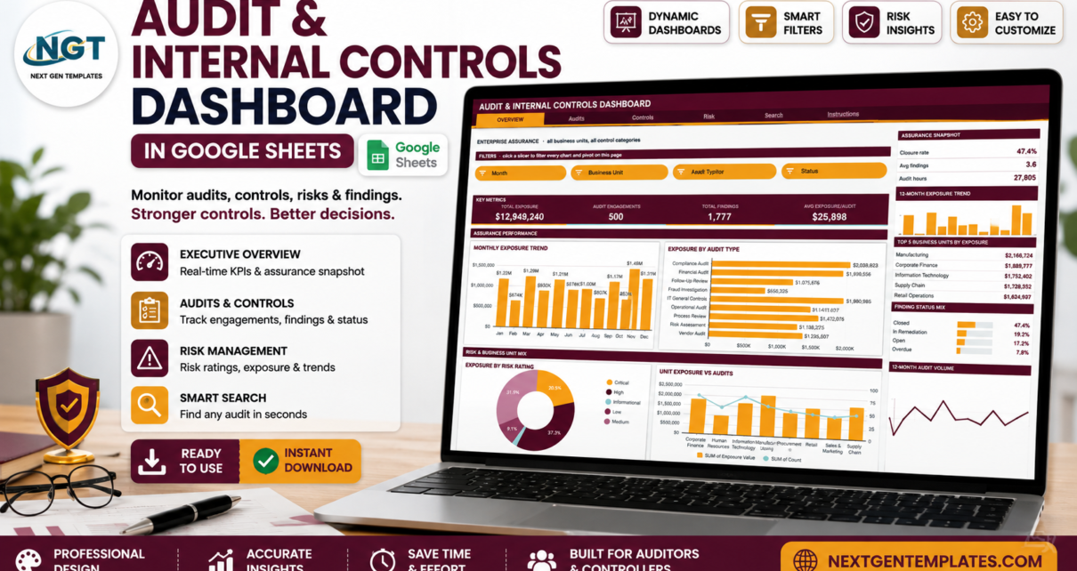
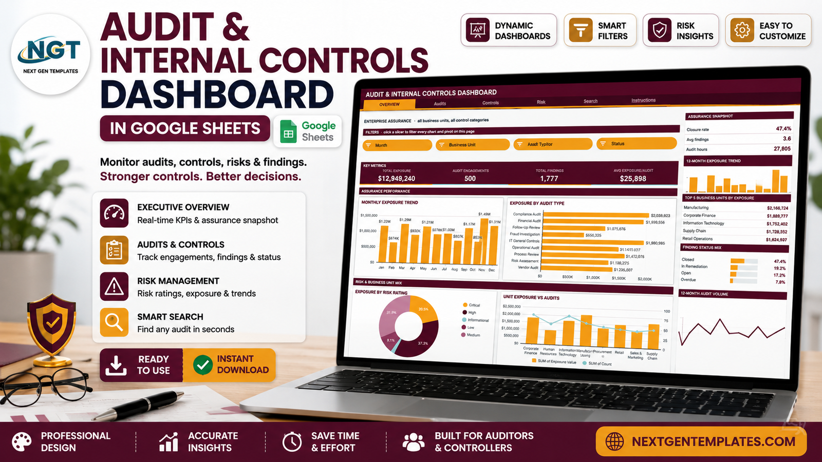
Most internal audit functions do not have a GRC platform. They have a spreadsheet, a shared drive, and someone who rebuilds the same status deck every month. The Audit & Internal Controls Dashboard in Google Sheets is built for exactly that situation: it takes one flat audit log and turns it into six linked pages of reporting. The sample build ships with 500 audit engagements, 1,777 findings, 27,805 recorded audit hours and $12,949,240 of exposure value across 8 business units, 9 audit types, 8 control categories and 10 lead auditors – so everything you see has already been tested at realistic volume.
The architecture matters here. Every chart on this dashboard reads a native Google Sheets pivot table, and every page is filtered by native slicers rather than a wall of nested formulas. That keeps the workbook fast as the log grows, and it means you can scroll right past the spacer column on any page and inspect the exact numbers feeding any visual.
Get the Audit & Internal Controls Dashboard in Google Sheets
One important caveat before we go further. This is a tracking and reporting template. It visualises the audit activity you enter and nothing more. It does not test controls, does not certify or assess compliance with SOX, COSO, ISO 27001, PCI-DSS, GDPR or any other framework, and none of its output is audit, legal or assurance advice. Framework names appear in the dashboard only as labels you attach to your own engagements. Judgement stays with your audit team.
Key Features of the Audit & Internal Controls Dashboard in Google Sheets
- Six pages behind one navigation bar – Overview, Audits, Controls, Risk, Search and Instructions.
- Four slicers on each of the four analysis pages, chosen to match what that page is actually asking.
- 16 KPI cards covering exposure value, engagement counts, findings, audit hours, closure rate and overdue rate.
- 16 charts – column, bar, donut, area, line and dual-axis combo – each fed by its own pivot table.
- A Top 5 ranking panel on every analysis page, plus share-of-total bars and an At a Glance list.
- A single-record lookup page that returns all 16 fields for any Audit ID.
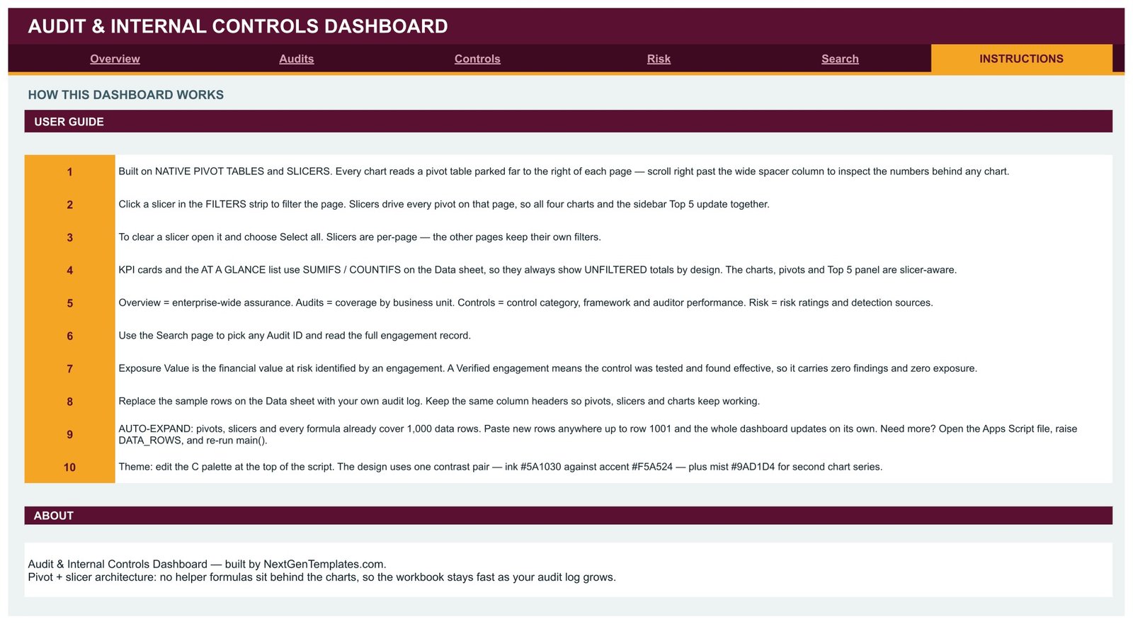
- Room for 1,000 rows out of the box, with a DATA_ROWS constant in the bundled Apps Script if you need more.
- A one-block colour palette at the top of the script – the shipped theme pairs ink #5A1030 with accent #F5A524 and a #9AD1D4 second series.
Dashboard Pages Explanation
Page 1 – Overview: enterprise-wide assurance
The Overview answers the two questions a management meeting always opens with: how much are we carrying, and how much have we closed? Four KPI cards lead – Total Exposure $12,949,240, Audit Engagements 500, Total Findings 1,777 and Avg Exposure/Audit $25,898. Below them, Monthly Exposure Trend plots value by month and Exposure by Audit Type ranks the nine engagement types, with Compliance Audit at $2,038,823 and IT General Controls at $1,980,985 at the top. Lower still, Exposure by Risk Rating shows the split as a donut (High 37.3%, Medium 31.9%, Critical 20.5%) and Unit Exposure vs Audits puts exposure value and engagement count on the same chart so you can see which units are expensive per audit.
The right sidebar is the fast-read column: an Assurance Snapshot (closure rate 47.4%, avg findings 3.6, 27,805 audit hours), a 12-month exposure sparkline, Top 5 Business Units by Exposure led by Manufacturing at $2,166,724, a Finding Status Mix, and an At a Glance list that surfaces 129 overdue findings and 305 process owners.

Page 2 – Audits: coverage by business unit
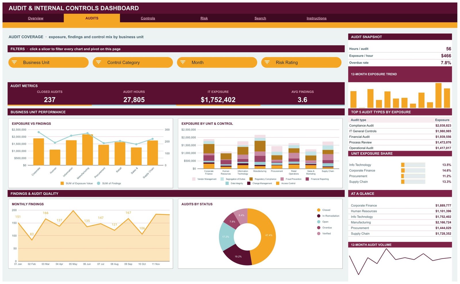
Where did the work actually go? Exposure vs Findings pairs value with finding count for each of the eight business units. Exposure by Unit & Control stacks all eight control categories inside each unit, which is the chart that shows you whether one unit’s exposure is concentrated in a single control area or spread thin. Monthly Findings runs as an area chart, and Audits by Status splits the portfolio into Closed 47.4%, In Remediation 19.2%, Open 17.2%, Verified 8.4% and Overdue 7.8%.
The Audit Snapshot converts effort into rates you can quote: 56 hours per audit, $466 of exposure per hour, a 7.8% overdue rate. Slicers here are Business Unit, Control Category, Month and Risk Rating.
Page 3 – Controls: control category, framework and auditor performance
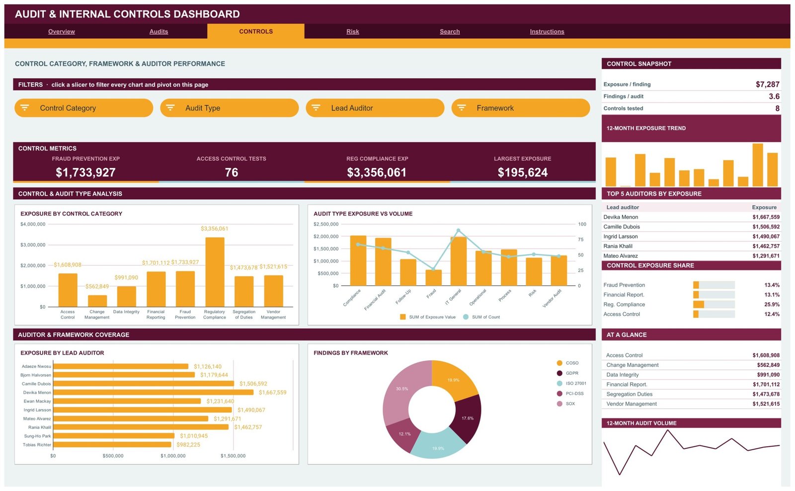
This is the page for the person who owns the control environment. Exposure by Control Category ranks all eight, from Change Management at $562,849 up to Regulatory Compliance at $3,356,061 – a spread wide enough to make the priority obvious. Audit Type Exposure vs Volume shows which engagement types carry the most value per run. Exposure by Lead Auditor lists all ten auditors as horizontal bars, and Findings by Framework splits findings across COSO, GDPR, ISO 27001, PCI-DSS and SOX, with SOX-tagged work accounting for 30.5% of findings in the sample.
The Control Snapshot adds three derived numbers: $7,287 of exposure per finding, 3.6 findings per audit, 8 control categories tested. Slicers are Control Category, Audit Type, Lead Auditor and Framework.
Page 4 – Risk: ratings, frameworks and detection sources
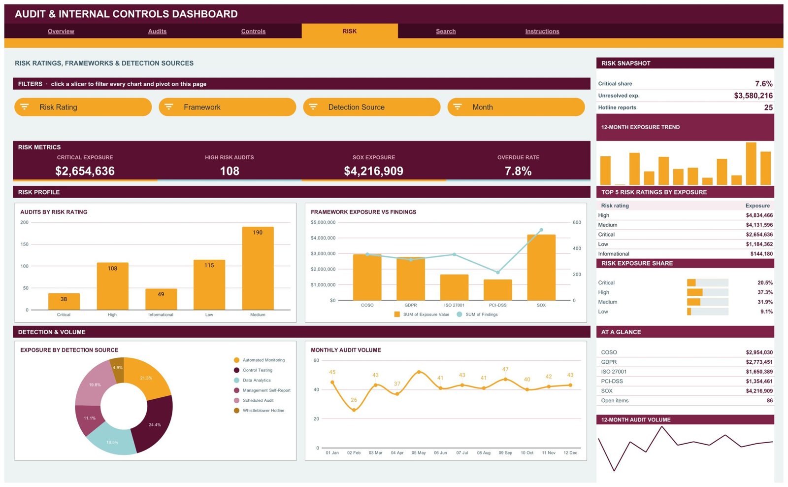
Audits by Risk Rating counts engagements at each level – 38 Critical, 108 High, 190 Medium, 115 Low, 49 Informational. Framework Exposure vs Findings pairs value with volume for each framework label. The most interesting chart on the page is Exposure by Detection Source: it shows how issues actually surface, splitting across Control Testing 24.4%, Automated Monitoring 21.3%, Scheduled Audit 19.8%, Data Analytics 18.5%, Management Self-Report 11.1% and the Whistleblower Hotline 4.9%. If most of your exposure is arriving through self-reports rather than testing, that is a finding in itself. Monthly Audit Volume closes the page with throughput by month.
Page 5 – Search: one engagement at a time
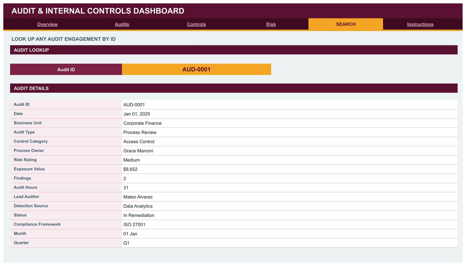
Pick an Audit ID from the dropdown and a detail card fills with all 16 fields for that engagement: date, business unit, audit type, control category, process owner, risk rating, exposure value, findings, audit hours, lead auditor, detection source, status, compliance framework, month and quarter. This is the page you share when somebody asks about one specific finding rather than the portfolio.
Page 6 – Instructions: the built-in user guide
Ten numbered steps explaining the pivot-and-slicer architecture, how to clear a slicer, why the KPI cards stay unfiltered, how to swap in your own log, and how to raise the row limit. It also documents the theme palette, so a colleague can rebrand the workbook without asking you.
Audit Dashboard in Google Sheets vs. Excel vs. Paid GRC Software – Feature Comparison
| This Google Sheets dashboard | Excel audit dashboard | Paid GRC platform | |
|---|---|---|---|
| Cost | $9.99 once | $17.99 once | $150-$400 per user / month |
| Platform | Any browser, Google Drive | Desktop Excel | Vendor cloud |
| Setup time | Under 10 minutes | Under 15 minutes | 4-12 weeks implementation |
| Real-time team collaboration | Yes, native | Only via OneDrive co-authoring | Yes |
| Mobile access | Yes, Sheets app | Limited | Yes |
| Customisable fields | Yes, edit the Data sheet | Yes | Usually vendor-controlled |
| Share with a link | Yes | No, file attachments | Seat-based |
| Year-1 cost at 5 users | $9.99 | $17.99 | $9,000-$24,000 |
| Evidence storage and sign-off workflow | No | No | Yes |
| Framework mapping maintained for you | No – framework is a label you set | No | Yes |
Who Should Use This Template
It fits a small internal audit function that already reports from a spreadsheet and wants the reporting layer done properly. It fits a finance or risk manager who owes a monthly exposure-and-findings view to a management meeting. It fits a consultant who runs control reviews for several clients and wants one shareable copy per client. And it fits a controller at a company with no audit department who runs a handful of reviews a year and simply wants to see where the issues cluster.
It is the wrong tool if you need evidence attachments, approval workflow and electronic sign-off, if you need automated control testing, or if your log runs to tens of thousands of rows. It is also the wrong tool if what you actually want is something that tells you whether you are compliant – no spreadsheet can do that, and this one does not pretend to.
Real-World Use Cases
An internal audit manager at a mid-size manufacturer. Roughly 40 engagements close each quarter across eight plants. Rather than rebuilding a status deck by hand, she pastes the quarter’s log in, filters the Audits page to one plant at a time, and lifts the Exposure vs Findings chart straight into the audit committee pack.
A financial controller at a 60-person software company. No audit department, a handful of self-run control reviews a year. He uses the Controls page to see which of the eight control categories keeps generating findings, and the Risk page’s Detection Source donut to check whether problems are being caught by testing or only surfacing through self-reports after the fact.
A risk consultant with a client portfolio. One copy per client, each shared as a link rather than an emailed attachment. The client’s finance lead can open the Search page and read any engagement record without her exporting anything.
Advantages of the Audit & Internal Controls Dashboard in Google Sheets
- It stays fast. Pivot tables do the aggregation, so there is no cloud of volatile formulas recalculating on every edit.
- It is auditable. Every chart’s source pivot is visible on the same sheet, so anyone can check the number rather than trusting it.
- Sharing is a link. No version-mismatch problems, no attachments circulating by email.
- It works on a phone. The Google Sheets mobile app opens the same workbook, which matters when someone asks a question mid-meeting.
- The fields are yours. Business units, audit types, control categories, frameworks and detection sources are just text in the Data sheet, so they can match whatever taxonomy your function already uses.
- It costs $9.99 once. No seats, no renewal.
Opportunities for Improvement
Two design decisions are worth knowing about up front. First, the KPI cards and the At a Glance lists do not respond to slicers – they use SUMIFS and COUNTIFS against the whole Data sheet. That is deliberate, so the enterprise total stays on screen while the charts show the filtered slice, but it does surprise people the first time. The charts, pivots and Top 5 panels are the slicer-aware parts.
Second, slicers are per-page. Filtering the Overview to one business unit does not filter the Controls page; each page keeps its own selection. Again this is intentional – the pages ask different questions – but it means you set a filter more than once when you are chasing one unit across the whole dashboard.
Beyond that: there is no evidence attachment, no remediation workflow and no automated reminder for overdue findings. The 1,000-row ceiling is generous for most functions but is a real limit, and raising it means editing the Apps Script rather than clicking a setting.
Best Practices
- Keep the shipped column headers. The pivots and slicers are bound to them; add your own columns to the right instead of renaming or reordering.
- Standardise your list values before you paste. “IT” and “Information Technology” become two separate slicer entries. A quick clean-up first saves a confusing chart later.
- Enter exposure value consistently. The dashboard sums whatever you give it, so agree with your team whether the number is gross exposure, residual, or estimated loss – and stick to one.
- Use the Verified status honestly. A Verified engagement in the sample carries zero findings and zero exposure, so misusing it will quietly deflate your totals.
- Take a copy per period. File > Make a copy at quarter end gives you a frozen snapshot to compare against, which is easier than versioning inside one workbook.
- Restrict edit access to the Data sheet and share the dashboard pages as view-only. Google’s own protected sheets and ranges documentation covers how.
Explore Relevant Templates
- Audit & Internal Controls Dashboard in Google Sheets – the template covered in this article.
- Audit & Internal Controls Dashboard in Excel – the same six-page structure for desktop Excel.
- Audit & Internal Controls Dashboard in Power BI – for teams already reporting in Power BI Desktop.
- Sustainability and ESG Dashboard in Google Sheets – the governance-side companion.
- Cybersecurity Dashboard in Google Sheets – pairs with the IT General Controls side of an audit plan.
- Investor Relations Dashboard in Google Sheets – the reporting layer above assurance.
Want to build reporting views like this step by step? The Excel Pivot Tables & Dashboards course on NextGenTemplates Academy covers pivots, slicers and dashboard layout with practice files.
Frequently Asked Questions
Does this dashboard make my organisation SOX or ISO 27001 compliant?
No. It records and charts the audit activity you enter, including whichever framework label you attach to each engagement. It performs no control testing, provides no assurance, and makes no compliance determination. Those remain the responsibility of your audit, risk and legal teams.
Do I need Google Sheets experience?
No. If you can paste rows into a spreadsheet and click a filter button, you can run it. The Instructions page inside the workbook covers the rest in ten short steps.
How many audit records does it hold?
1,000 out of the box. The pivots, slicers and formulas already extend that far, so pasting new rows needs no re-pointing. For more, raise the DATA_ROWS constant in the bundled Apps Script and re-run main().
Why don’t the KPI cards change when I click a slicer?
By design. The KPI cards and At a Glance lists are whole-dataset SUMIFS and COUNTIFS totals, so the enterprise number stays visible while the charts below show the filtered slice.
Can I change the colours?
Yes. The palette is one block at the top of the bundled Apps Script – edit it, re-run, and every page recolours. You can also format cells directly like any other Google Sheet.
Can I add my own fields?
Add extra columns to the right of the existing ones freely. Do not rename or reorder the shipped headers, because the pivots and slicers reference them by position.
Is it a one-time payment?
Yes – one payment, lifetime access to your copy, no subscription and no per-user fee.
About the Author
Built by PK – Microsoft Certified Professional with 15+ years of Excel, Google Sheets, and Power BI experience. Founder of NextGenTemplates, reaching 300K+ subscribers across YouTube channels. Every template is hand-built and tested before release.
Conclusion
An internal audit function does not need a six-figure platform to report well. It needs one clean log and a reporting layer that does not have to be rebuilt every month. The Audit & Internal Controls Dashboard in Google Sheets gives you that layer: six pages, sixteen KPI cards, sixteen pivot-backed charts, slicer filtering on four of them, and a lookup page for the moment somebody asks about one specific engagement. Load your log, click a slicer, and the reporting is done – with the honest reminder that what the dashboard shows is exactly what you entered, and the assurance judgement stays yours.
Get the Audit & Internal Controls Dashboard in Google Sheets – $9.99