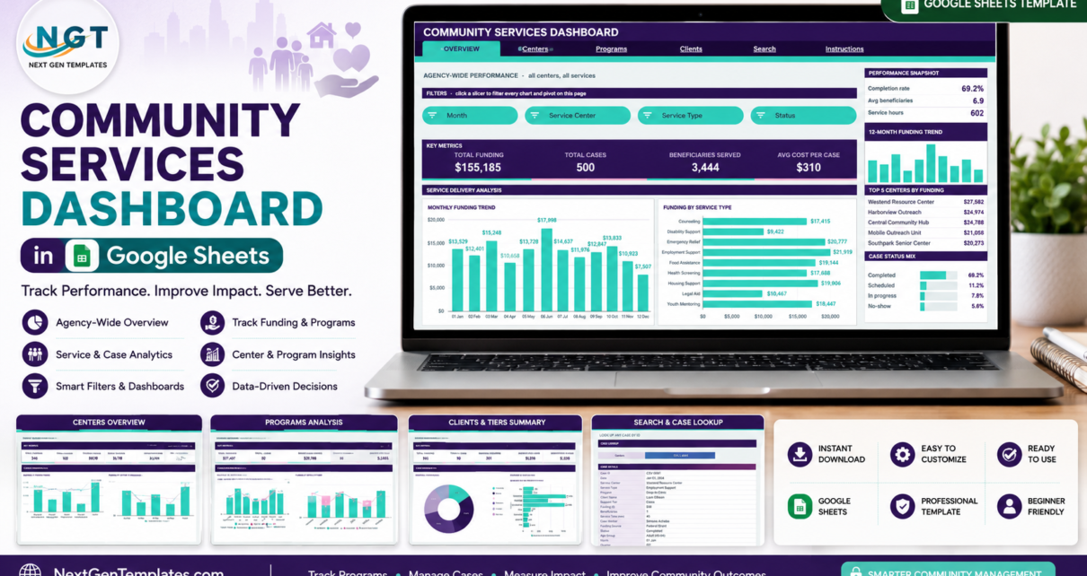
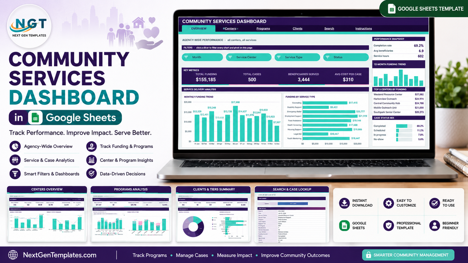
The Community Services Dashboard in Google Sheets tracks 16 KPIs across four interactive report pages, built on 16 native pivot tables, 16 pivot charts and 16 slicers. Its sample case log carries 500 service records worth $155,185 in funding, 3,444 beneficiaries served, 301 unique clients and an average cost of $310 per case, spread across 8 service centres, 8 programs and 9 service types.Community Services Dashboard in Google Sheets
Most community organisations already keep a case log somewhere – a shared sheet, a sign-in book, an export from an intake form. What they usually do not have is a way to turn that log into a funder-ready picture of where the money went, which centres are busiest, and how many people were actually served. That is the gap this dashboard fills, and it does it without a subscription, a per-user seat fee or a multi-week implementation.
Get the Community Services Dashboard in Google Sheets
Key Features of the Community Services Dashboard in Google Sheets
- Four slicer-driven report pages. Overview, Centers, Programs and Clients. Each page carries four slicers, four KPI cards, four charts and a sidebar with a snapshot panel, a Top 5 ranking table, a funding-share bar list and an At a Glance summary.
- Native pivot tables, not helper formulas. Every chart reads a real pivot table parked to the right of its page, past a wide spacer column. Nothing recalculates a hidden formula grid, so the file stays responsive as the case log grows.
- 16 slicers in total. Four per page, and they are page-scoped – filtering the Programs page does not disturb the filters you left on Clients.Community Services Dashboard in Google Sheets
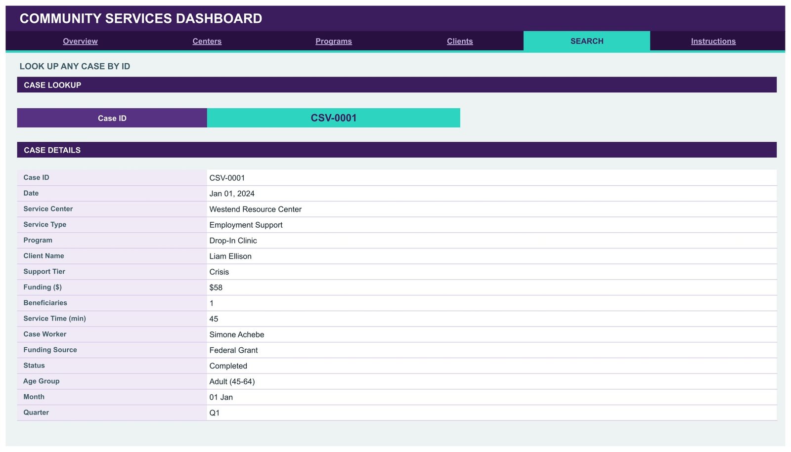
- A dedicated Search tab. Pick any Case ID and read the full 16-field record without scrolling the Data sheet.Community Services Dashboard in Google Sheets
- 1,000-row auto-expand. Pivots, slicers and formulas already cover rows 2 to 1001, so pasted rows are picked up with no range editing.Community Services Dashboard in Google Sheets
- A single palette block. The theme is ink #3B1D5E, accent #2DD4BF and rose #F0A6CA for second chart series. Change those three values in the Apps Script file and the whole dashboard recolours.
One design decision is worth calling out because it surprises people: the KPI cards and the At a Glance lists use SUMIFS and COUNTIFS against the Data sheet, so they deliberately show unfiltered totals. The charts, pivots and Top 5 panels are the slicer-aware parts. That gives you a fixed reference point on every page while you slice around it.
Dashboard Pages Explanation
Overview – Agency-Wide Performance
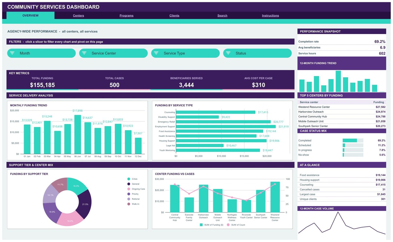
Slicers for Month, Service Center, Service Type and Status sit above four KPI cards: Total Funding $155,185, Total Cases 500, Beneficiaries Served 3,444 and Avg Cost Per Case $310. The charts are Monthly Funding Trend, Funding by Service Type, Funding by Support Tier and Center Funding vs Cases. The right sidebar holds a Performance Snapshot (completion rate 69.2%, average beneficiaries 6.9, service hours 602), a 12-Month Funding Trend, Top 5 Centers by Funding, a Case Status Mix bar list and an At a Glance summary.
Centers – Utilisation by Service Centre
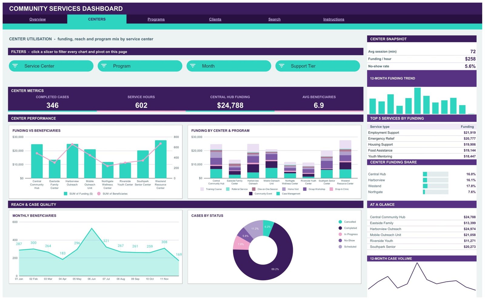
Slicers for Service Center, Program, Month and Support Tier drive Completed Cases 346, Service Hours 602, Central Hub Funding $24,788 and Avg Beneficiaries 6.9. Charts are Funding vs Beneficiaries, Funding by Center and Program, Monthly Beneficiaries and Cases by Status. The sidebar shows a Center Snapshot (average session 72 minutes, funding per hour $258, no-show rate 5.6%), Top 5 Services by Funding and a Center Funding Share list. This is the page that answers “which of our sites is actually delivering reach per dollar”.Community Services Dashboard in Google Sheets
Programs – Program, Service and Case Worker Performance
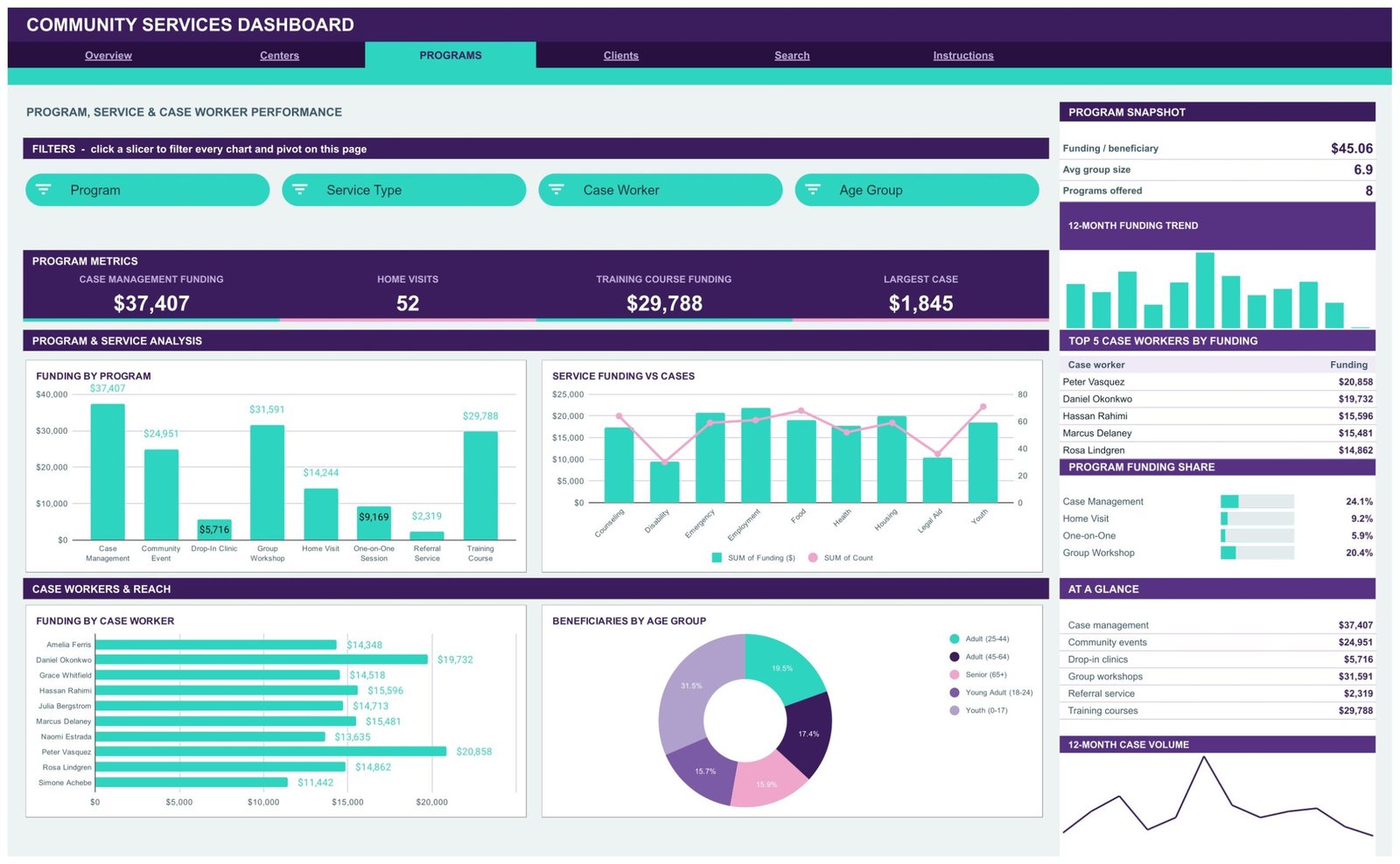
Slicers for Program, Service Type, Case Worker and Age Group sit above Case Management Funding $37,407, Home Visits 52, Training Course Funding $29,788 and Largest Case $1,845. Charts are Funding by Program, Service Funding vs Cases, Funding by Case Worker and Beneficiaries by Age Group. The sidebar adds a Program Snapshot (funding per beneficiary $45.06, average group size 6.9, 8 programs offered), Top 5 Case Workers by Funding and a Program Funding Share list.
Clients – Support Tiers, Age Groups and Funding Sources
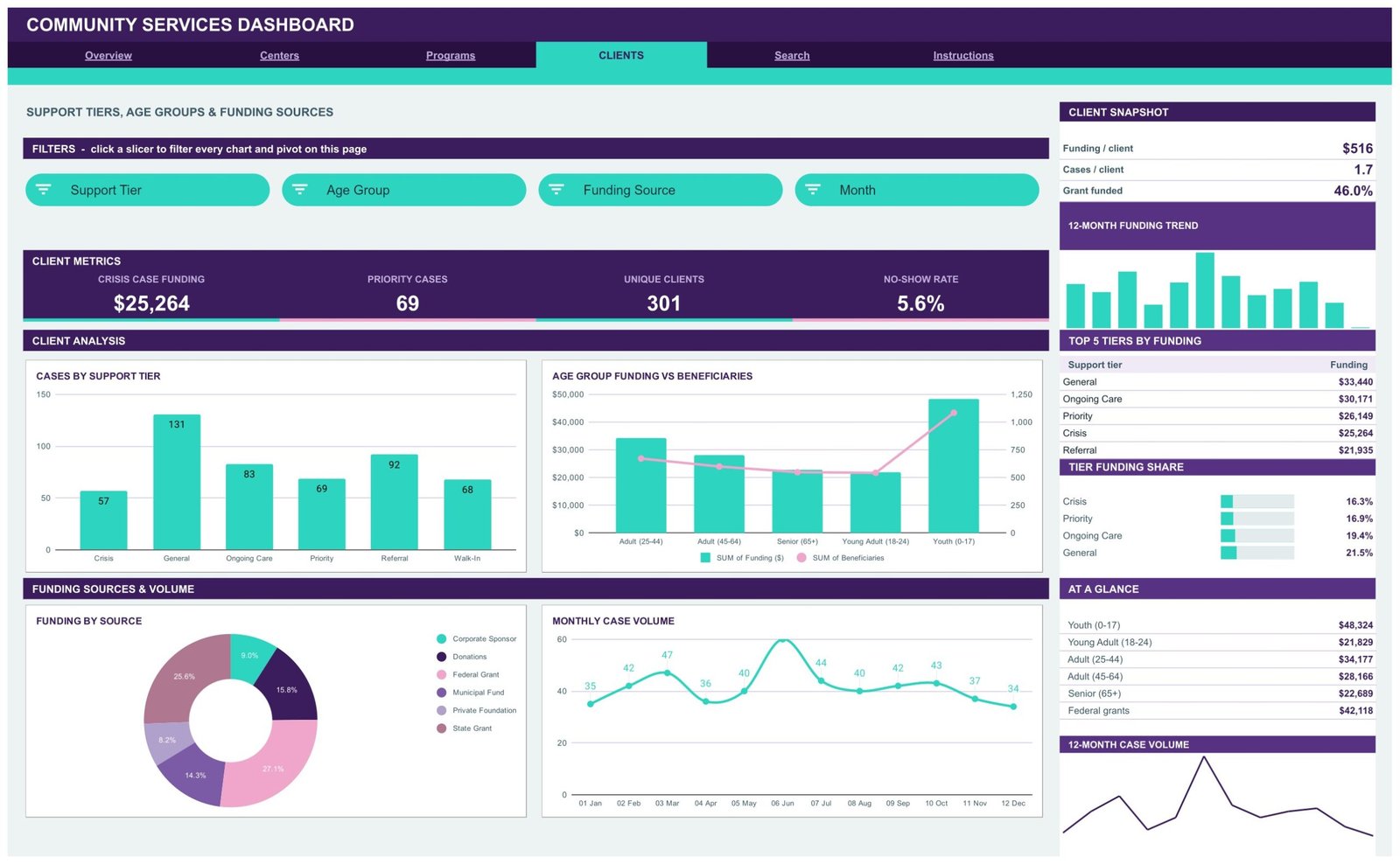
Slicers for Support Tier, Age Group, Funding Source and Month drive Crisis Case Funding $25,264, Priority Cases 69, Unique Clients 301 and No-Show Rate 5.6%. Charts are Cases by Support Tier, Age Group Funding vs Beneficiaries, Funding by Source and Monthly Case Volume. The sidebar carries a Client Snapshot (funding per client $516, cases per client 1.7, grant funded 46.0%), Top 5 Tiers by Funding and a Tier Funding Share list. In the sample data, Federal Grant covers 27.1% of funding and State Grant 25.6%, with Donations, Municipal Fund, Corporate Sponsor and Private Foundation making up the rest.Community Services Dashboard in Google Sheets
Search – Look Up Any Case by ID
Choose a Case ID from the dropdown and the Case Details panel returns the whole record: date, service centre, service type, program, client name, support tier, funding, beneficiaries, service time in minutes, case worker, funding source, status, age group, month and quarter. It is the page you open when a supervisor or a funder asks about one specific case.
Instructions – How the Dashboard Works
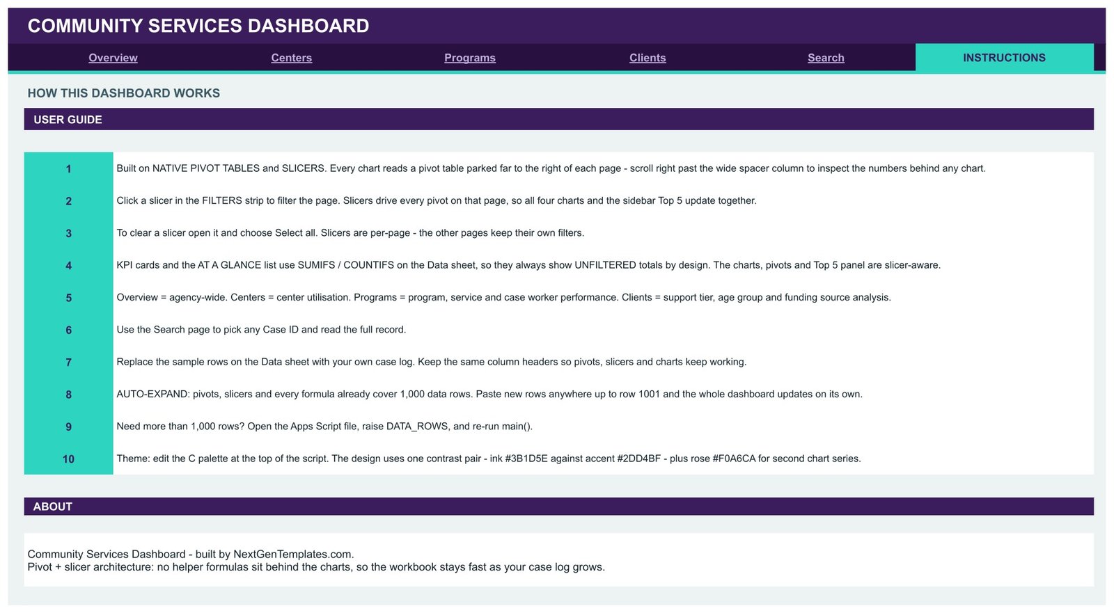
A 10-step user guide covering the pivot and slicer architecture, how to clear a slicer with Select all, why the KPI cards stay unfiltered, how the 1,000-row auto-expand works, and how to raise DATA_ROWS in the Apps Script file if you need more capacity.Community Services Dashboard in Google Sheets
Community Services Dashboard in Google Sheets vs. Microsoft Excel Dashboard vs. Paid Case Management SaaS – Feature Comparison
| Feature | Community Services Dashboard in Google Sheets | Microsoft Excel Dashboard | Bonterra / CaseWorthy / Apricot |
|---|---|---|---|
| Cost | $9.99 one-time | $18-30 one-time | $100-400 per user / month |
| Platform | Any browser, no install | Desktop Excel required | Vendor cloud only |
| Setup time | Under 10 minutes | 15-30 minutes | 4-12 week implementation |
| Real-time team collaboration | Yes, native | Only via OneDrive co-authoring | Yes |
| Mobile access | Google Sheets app | Limited on mobile Excel | Dedicated app |
| Customisable fields and charts | Fully editable | Fully editable | Admin-gated, often paid |
| Share with a link | Yes | File attachment | Named seats only |
| Year-1 cost at 5 users | $9.99 total | $18-30 total | $6,000-24,000 |
| Case-level record lookup | Built-in Search tab | Usually manual filtering | Yes |
For small agencies and nonprofits that want funding, case and beneficiary reporting without a five-figure case management contract, the Community Services Dashboard in Google Sheets sits in the sweet spot.Community Services Dashboard in Google Sheets
Who Should Use This Template
Perfect for:
- Program managers at community centres and nonprofits running roughly 2 to 15 service sitesCommunity Services Dashboard in Google Sheets
- Grant coordinators reporting funding by source, program and quarterCommunity Services Dashboard in Google Sheets
- Outreach and social services teams tracking cases, beneficiaries and no-show rates
- Volunteer-run organisations with no IT budget and no appetite for a SaaS contractCommunity Services Dashboard in Google Sheets
- Local government service teams that need a shareable monthly reporting packCommunity Services Dashboard in Google Sheets
Not a fit if:
- You store protected health information or identifiable client records that need HIPAA-grade, audit-logged storage
- You need intake forms, referral workflow and automated eligibility checks – that is a case management system, not a reporting dashboard
- Your case log runs well past 20,000 rows, where a database-backed tool will serve you better
Real-World Use Cases
Marta coordinates four neighbourhood centres for a city-funded outreach charity. Every month she opens the Centers page, compares Funding vs Beneficiaries across sites, and looks for the centre that is spending the most per person reached. In the sample data that is Northgate Wellness Center, and the fix is usually a schedule change rather than a budget change – two drop-in clinic slots moved to a busier site.
Devon writes quarterly grant reports for a family services nonprofit. The Clients page gives him the funding-source split in a single screenshot: 46% grant funded, with federal and state grants covering just over half of total spend. What used to be an afternoon of rebuilding the same pivot table is now a copy and a paste into the report template.
Priya supervises ten case workers on an employment support program. Before one-to-ones she filters the Programs page by Case Worker and checks Funding by Case Worker alongside the Top 5 panel. The 5.6% no-show rate has become the standing first item on her monthly team agenda.
Advantages of the Community Services Dashboard
The obvious advantage is cost. A dedicated case management platform typically lands between $100 and $400 per user per month, which for a five-person team is $6,000 to $24,000 in year one before implementation. This dashboard is a one-time purchase and there are no seats to buy when a new coordinator joins.
The less obvious advantage is time. Because the charts sit on real pivot tables rather than a formula grid, adding six months of new case rows costs nothing – you paste and the pivots pick the rows up. Teams that currently rebuild a monthly report by hand usually get that afternoon back permanently.
The third is portability. It lives in Google Sheets, so a board member can open it on a phone, a funder can be given view-only access with a link, and nobody has to install anything or be added to a licence.
Opportunities for Improvement
Being straight about the limits: this is a reporting layer, not an intake system. There is no client-facing form, no referral routing and no eligibility logic. If you need those, keep your intake tool and use this to report on its export.
The 1,000-row default will feel tight for a busy multi-site agency. Raising DATA_ROWS in the bundled Apps Script and re-running main() fixes it, but that is a small technical step rather than a setting in the sheet. Similarly, the KPI cards staying unfiltered is deliberate, but it does take a few minutes to get used to when you first start clicking slicers.
Finally, Google Sheets is not the right home for identifiable client health records. Use case IDs and initials rather than full names if your data is sensitive.
Best Practices
- Keep the column headers on the Data sheet exactly as delivered – the pivots, slicers and SUMIFS formulas are all bound to them.
- Standardise your dimension values before you paste. “Food Assistance” and “food assistance” will split into two pivot rows.
- Log funding at case level rather than monthly totals, so cost per case and funding per beneficiary stay meaningful.
- Clear slicers with Select all before you screenshot a page for a funder, or you will publish a filtered number by accident.
- Take a copy at the end of each quarter so you keep a frozen version of what was reported.
- If you are new to the underlying mechanics, Google’s own guides on pivot tables and slicers are worth ten minutes.
Explore Relevant Templates
If your reporting spans the wider social sector, the Social Services Dashboard in Google Sheets works at agency level, and we covered it in detail in our Social Services Dashboard walkthrough. For the income side, the Nonprofit Fundraising Dashboard in Google Sheets handles campaigns, donors and pledges – see the fundraising dashboard post.
Need something lighter? The Social Services KPI Scorecard in Google Sheets fits on one screen, and the Municipal Services KPI Dashboard covers council-side service delivery. Two close siblings of this template are also worth a look: the Religious and Faith-Based Organizations Dashboard in Google Sheets and the Housing and Urban Development Dashboard in Google Sheets.
Also available as: Social Services Dashboard in Power BI for teams already on Microsoft Fabric.
Want to build pivot-table dashboards like this step by step? The Excel Pivot Tables & Dashboards course on NextGenTemplates Academy teaches the same pivot and slicer approach with practice files.
Get the Community Services Dashboard in Google Sheets
Frequently Asked Questions
What KPIs does the Community Services Dashboard in Google Sheets track?
The Community Services Dashboard tracks 16 KPIs across four pages: total funding, total cases, beneficiaries served, average cost per case, completed cases, service hours, central hub funding, average beneficiaries, case management funding, home visits, training course funding, largest case, crisis case funding, priority cases, unique clients and no-show rate.
How long does setup take?
Under 10 minutes. Open the copy link in the PDF, paste your case log onto the Data sheet keeping the delivered headers, and the Community Services Dashboard recalculates every chart, KPI card and Top 5 panel on its own. No formula editing is needed.
How many case records can the dashboard hold?
Pivots, slicers and formulas cover 1,000 data rows out of the box. To go beyond that, open the bundled Apps Script file, raise the DATA_ROWS constant and run main() again to rebuild every range in the Community Services Dashboard.
How does this compare to paid case management software?
Bonterra, CaseWorthy and Apricot typically cost $100-400 per user per month and take weeks to implement. The Community Services Dashboard in Google Sheets is a one-time purchase reporting on the same funding, case and beneficiary metrics, though it reports on your data rather than replacing an intake and workflow system.
Can several people use it at the same time?
Yes. The Community Services Dashboard runs entirely in Google Sheets, so you share it with a link and colleagues view or edit in real time. There are no per-user fees, no seat limits, and nothing to install beyond a browser.Community Services Dashboard in Google Sheets
Can I match it to our brand colours?
Yes. The Community Services Dashboard uses one palette block in its Apps Script file – ink #3B1D5E, accent #2DD4BF and rose #F0A6CA. Edit those three values and every header bar, KPI card and chart series recolours consistently across all six tabs.
Do I need to know Apps Script to use it?
No. The Community Services Dashboard arrives fully built. Apps Script only comes into it if you want more than 1,000 rows or a different colour palette, and both are single-value edits documented on the Instructions tab.Community Services Dashboard in Google Sheets
About the Author
Built by PK – Microsoft Certified Professional with 15+ years of Excel, Google Sheets, and Power BI experience. Founder of NextGenTemplates, reaching 300K+ subscribers across YouTube channels. Every template is hand-built and tested before release.Community Services Dashboard in Google Sheets
Conclusion
If your community organisation already keeps a case log and just needs it to answer questions, the Community Services Dashboard in Google Sheets is a short path from raw rows to a funder-ready report pack. Six tabs, 16 KPIs, 16 pivot charts, 16 slicers and a case lookup, all driven by one Data sheet you control.
Instant download · One-time payment · No subscriptionCommunity Services Dashboard in Google Sheets
Last updated: August 2026Community Services Dashboard in Google Sheets