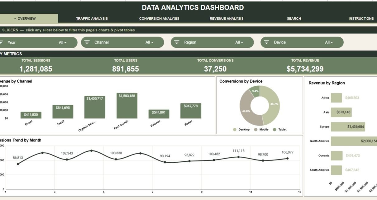
The Data Analytics Dashboard in Google Sheets is a ready-to-use reporting template. It has 6 connected tabs, 4 headline KPI cards, 16 charts, slicer filters, a Record ID Search Sheet and a structured Data Sheet. It tracks sessions, users, conversions, revenue, cost, channel, region, device, campaign, category, month and year in one editable file, for a one-time price.
It is built for marketers, analysts, founders, consultants and operations teams who want fast performance visibility in a familiar spreadsheet, without paying for a recurring reporting tool. Paste your records into the Data Sheet and every KPI card, chart and lookup updates from that one source table.
🎥 Watch the Video Tutorial
Get the Data Analytics Dashboard
Key Features of the Data Analytics Dashboard in Google Sheets
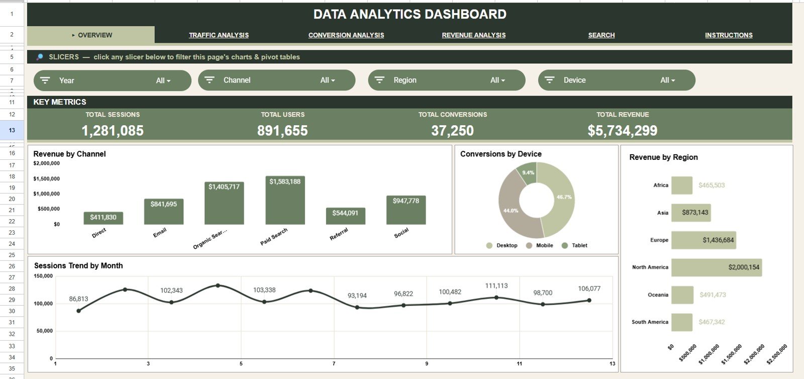
- 4 KPI cards on the Overview page: Total Sessions, Total Users, Total Conversions and Total Revenue.
- 16 dashboard charts across the Overview, Traffic, Conversion and Revenue pages.
- Interactive slicers on every analysis page for Year, Channel, Region, Device, Campaign and Category.
- Record ID lookup that returns the full record without searching the raw data.
- Editable Data Sheet: add your data in the same format and the whole report stays connected.
- Google Sheets collaboration for shared review, comments and access from any browser.
KPIs on the analysis pages
Each analysis page has its own KPI row. The values below come from the sample data, and the formulas reproduce them exactly.
| KPI | What it measures | Formula | Sample value | Better when |
|---|---|---|---|---|
| Total Sessions | All visits in the filtered data | Sum of Sessions | 1,281,085 | Higher |
| Total Users | Audience size | Sum of Users | 891,655 | Higher |
| Total Conversions | Completed goals or orders | Sum of Conversions | 37,250 | Higher |
| Conversion Rate | Share of sessions that convert | Conversions ÷ Sessions | 2.91% | Higher |
| Total Revenue | Income generated | Sum of Revenue | $5,734,299 | Higher |
| Avg Order Value | Revenue per conversion | Revenue ÷ Conversions | $154 | Higher |
| Total Cost | Spend behind the activity | Sum of Cost | $1,301,494 | Lower, for the same revenue |
| Net Profit | Revenue left after cost | Revenue − Cost | $4,432,805 | Higher |
| ROAS | Revenue earned per $1 of cost | Revenue ÷ Cost | 4.41x | Higher |
For example, 37,250 conversions ÷ 1,281,085 sessions = 2.91%, and $5,734,299 revenue ÷ $1,301,494 cost = 4.41x ROAS.
Dashboard Pages Explanation
Overview Page
The Overview page gives the fastest executive snapshot. The four KPI cards (Total Sessions, Total Users, Total Conversions and Total Revenue) show total activity, audience size, conversion volume and commercial impact together. Slicers filter by Year, Channel, Region and Device.
Revenue by Channel compares revenue across Direct, Email, Organic Search, Paid Search, Referral and Social, so you can see which sources bring the strongest return.
Conversions by Device splits conversions between Desktop, Mobile and Tablet and shows whether conversion performance differs by device.
Revenue by Region breaks revenue into Africa, Asia, Europe, North America, Oceania and South America, so high-value regions stand out.
Sessions Trend by Month shows traffic over time and helps you spot growth, seasonality or sudden changes.
Traffic Analysis
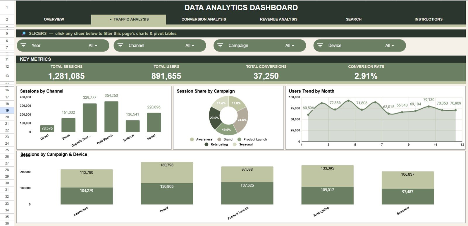
The Traffic Analysis tab focuses on acquisition and audience volume. Its KPI row shows Total Sessions, Total Users, Total Conversions and Conversion Rate, and its slicers filter by Year, Channel, Campaign and Device.
Sessions by Channel compares how many sessions each channel contributes.
Session Share by Campaign shows each campaign’s share of sessions (Awareness, Brand, Product Launch, Retargeting and Seasonal).
Users Trend by Month tracks users over time, which separates real audience growth from short-lived spikes in sessions.
Sessions by Campaign & Device shows whether each campaign performs better on particular devices.
Conversion Analysis
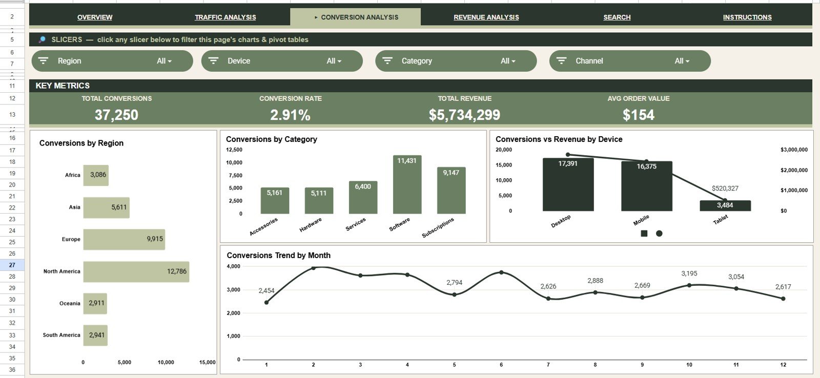
The Conversion Analysis tab moves from traffic volume to outcomes. Its cards show Total Conversions, Conversion Rate, Total Revenue and Avg Order Value, and its slicers filter by Region, Device, Category and Channel.
Conversions by Region shows where visitors are most likely to take action.
Conversions by Category compares Accessories, Hardware, Services, Software and Subscriptions.
Conversions vs Revenue by Device sets conversion volume against revenue, so you can spot a device that converts often but earns less.
Conversions Trend by Month supports campaign reviews and monthly reporting.
Revenue Analysis
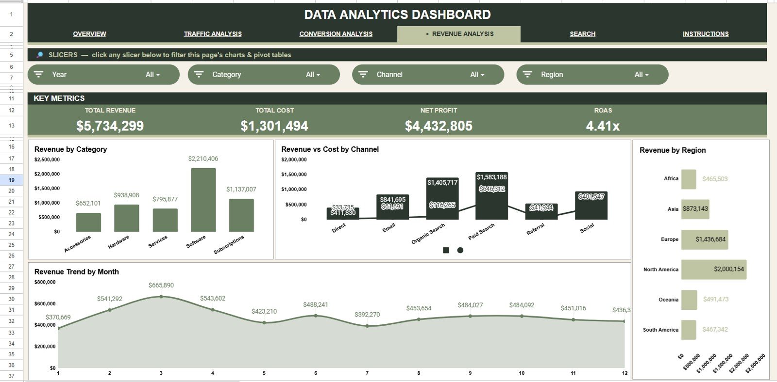
The Revenue Analysis tab covers financial performance and cost. Its cards show Total Revenue, Total Cost, Net Profit and ROAS, and its slicers filter by Year, Category, Channel and Region.
Revenue by Category shows which category contributes most to top-line revenue.
Revenue vs Cost by Channel compares income with spend for each channel and highlights channels where cost is high.
Revenue by Region supports region-level planning and budget allocation.
Revenue Trend by Month tracks growth, seasonality and the financial effect of campaign changes.
Search Sheet
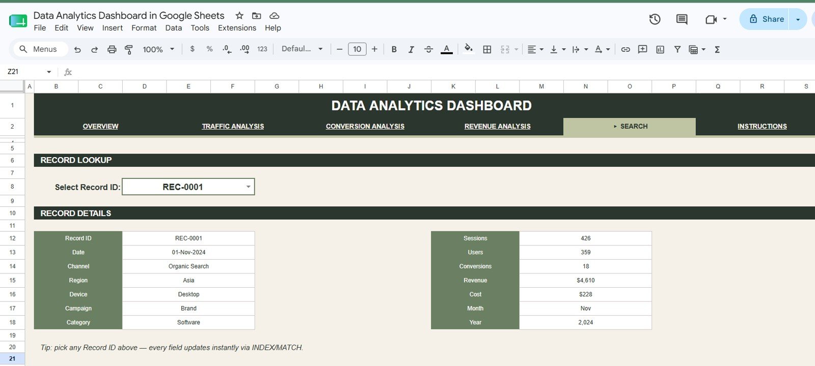
The Search Sheet has a Record ID selector. Pick any Record ID and the detail panel updates instantly (using INDEX/MATCH) to show the Record ID, Date, Channel, Region, Device, Campaign, Category, Sessions, Users, Conversions, Revenue, Cost, Month and Year.
Data Sheet
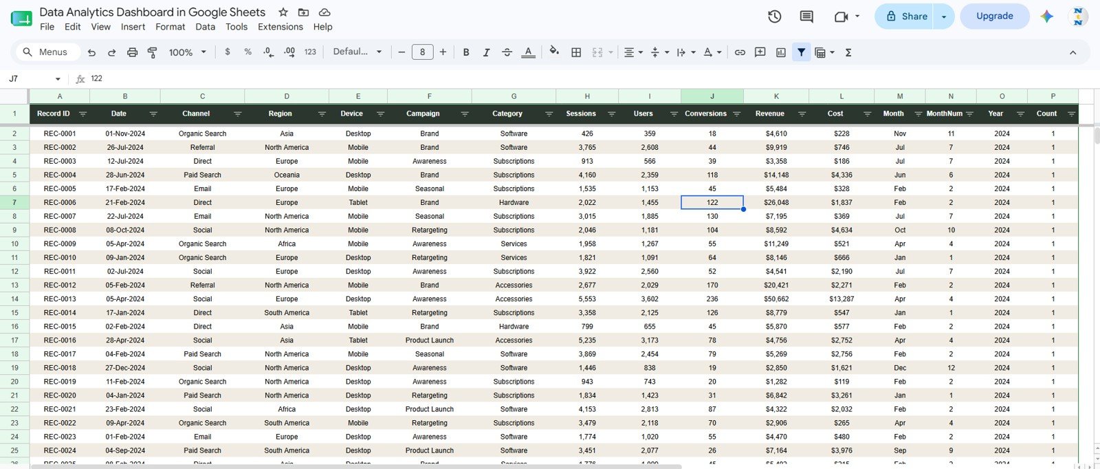
The Data Sheet is where you add or paste your analytics records in the same column format. Keeping that structure lets the KPI cards, slicers, charts and Search Sheet all update from one source table.
Google Sheets Dashboard vs. Excel Dashboard vs. Paid Analytics Tools
| Feature | Google Sheets Dashboard | Microsoft Excel Dashboard | Paid BI / SaaS tool |
|---|---|---|---|
| Cost | One-time purchase | Template cost plus a possible Microsoft 365 licence | Monthly or per-user subscription |
| Platform | Google Sheets in a browser | Excel desktop or web | Vendor cloud platform |
| Setup time | Under 10 minutes | Under 10 minutes | Days or weeks |
| Real-time team collaboration | Built in through Google Drive | Needs OneDrive or SharePoint | Usually included |
| Customizable fields | Fully editable | Fully editable | Often limited by the vendor’s setup |
| Automatic data connectors | No, you paste or enter data | No, unless you build them | Usually included |
| Record lookup | Built-in Search Sheet | Possible with formulas | Depends on plan and setup |
How to Use It With Your Own Data
- Make your own copy of the file in Google Drive.
- Export your records (for example from your analytics or ad platforms) with the same columns as the Data Sheet.
- Paste them into the Data Sheet as values only, keeping the header row unchanged.
- Open the Overview page, check the KPI cards, then use the slicers to filter by year, channel, region or device.
- Use the Traffic, Conversion and Revenue tabs for deeper analysis, and the Search Sheet for questions about a single record.
Who Should Use This Template
This dashboard suits small business owners, marketing teams, analytics consultants, ecommerce operators, campaign managers, founders and reporting teams who already keep data in spreadsheets. It is especially useful when you want a clean dashboard without building charts from scratch every month.
It is not the right fit if you need automatic API ingestion, enterprise access controls, predictive modelling or a central data warehouse. In those cases, use a BI platform and keep this Google Sheets dashboard for lightweight reporting or client handoff.
Real-World Use Cases
A growth marketer uses the Traffic Analysis tab to compare sessions by channel and campaign before moving budget between paid search, email and organic content.
A founder checks conversions by device and revenue by channel each week to decide whether to work on mobile checkout or campaign targeting next.
A freelance analyst sends clients a view-only dashboard link and uses the Search Sheet during review calls to answer questions about individual records.
Advantages of the Data Analytics Dashboard in Google Sheets
The main advantage is speed. Instead of rebuilding a report each month, you paste records into the Data Sheet and the Overview, Traffic, Conversion and Revenue pages are ready to review. Because the file is in Google Sheets, you can share it with a link, work on it together in real time and control permissions through Google Drive.
The second advantage is flexibility. You can add rows, adjust charts, change categories and colours, or extend the data table for your own business model. Google explains the core sharing controls in its official Google Sheets sharing guide.
Opportunities for Improvement
This is a spreadsheet dashboard, not a live data pipeline. For automatic imports you would need Google Apps Script, a connector or a separate ETL process. Very large datasets are better handled in BigQuery, Looker Studio, Power BI or another database-backed reporting stack.
Teams with strict governance or complex attribution logic should treat the template as a reporting layer, not a full analytics platform.
Best Practices
- Keep the Data Sheet headers unchanged so the formulas, slicers and charts keep working.
- Paste values only when you replace the sample data, to avoid formatting problems.
- Start with the Overview page, then use the Traffic, Conversion and Revenue pages to dig deeper.
- Use the Search Sheet in meetings when someone asks about a specific record.
- Give stakeholders view-only access, and edit access only to the people who update the data.
If you want to learn how dashboards like this are built, the Pivot Tables & Dashboards course on NextGenTemplates Academy covers summarising, slicers and charting step by step.
Explore Relevant Templates
These related dashboards on NeoTech Navigators cover marketing and web performance from other angles:
- Data Analytics KPI Dashboard in Google Sheets for target and trend tracking of analytics KPIs.
- Marketing Analytics Dashboard in Google Sheets for campaign-level marketing reporting.
- Website Traffic KPI Dashboard in Google Sheets for traffic-focused KPIs.
- Marketing ROI Dashboard in Google Sheets to compare spend against return.
- Digital Marketing KPI Dashboard in Google Sheets for digital channel KPIs.
Related templates on NextGenTemplates: the Data Analytics Dashboard Report in Excel and the Data Analytics KPI Dashboard in Google Sheets.
Frequently Asked Questions
What does the Data Analytics Dashboard in Google Sheets track?
It tracks sessions, users, conversions, revenue, cost, channel, region, device, campaign, category, month and year across 6 connected tabs.
How many charts are included?
There are 16 charts, four each on the Overview, Traffic Analysis, Conversion Analysis and Revenue Analysis tabs.
How is the conversion rate calculated?
Conversion Rate is total conversions divided by total sessions. In the sample data that is 37,250 ÷ 1,281,085 = 2.91%.
Does it include a Search Sheet?
Yes. The Search Sheet has a Record ID selector that returns the full matching record instantly.
Does it connect to live analytics tools automatically?
No. It is designed for data you enter or paste from exports. You can add an automation workflow separately if you need one.
Do I need a paid Google account?
No. A standard Google account is enough to copy and use the sheet.
About the Author
Built by PK, a Microsoft Certified Professional with 15+ years of experience in Excel, Google Sheets and Power BI. He founded NextGenTemplates and its YouTube channels reach 300K+ subscribers. Every template is built by hand and tested before release.
Wrapping Up
The Data Analytics Dashboard in Google Sheets gives you one clean, editable place to monitor traffic, conversions, revenue, cost, campaigns, regions, devices and categories. With 6 tabs, KPI cards on every analysis page, 16 charts, slicers and a Search Sheet, it is a practical choice for teams that want analytics visibility without another subscription. Copy it, paste in last month’s export, and start with the Overview page.
Get the Data Analytics Dashboard
📅 Last updated: October 2026