The International Development Dashboard in Google Sheets is a ready-to-use reporting template for NGOs, donor-funded programs, public-sector project units, and international development teams. It helps teams track committed funding, funds disbursed, pending funds, beneficiaries, project status, regions, sectors, officers, and progress score in one shared spreadsheet.International Development Dashboard in Google Sheets
According to OECD preliminary 2025 ODA data, official development assistance from DAC members and associates reached USD 174.3 billion in 2025, down 23.1% from 2024. When funding is under pressure, program teams need a simple way to explain where money is committed, where it has actually been disbursed, and which projects are delayed.
Get the International Development Dashboard in Google Sheets
Get the International Development Dashboard in Google Sheets
Key Features of International Development Dashboard in Google Sheets
- Seven worksheet tabs: Overview, Sectors, Funding, Regions, Impact, Search Sheet, and Data Sheet.
- Top KPI cards: Funding Committed, Total Projects, Beneficiaries, Funds Disbursed, Monthly Funding, Active Portfolio, Committed, Disbursed, Pending Funds, Avg Progress, and Delayed.
- Dashboard slicers: Filter quickly by fields such as sector, region, status, priority, funding source, partner type, and officer.
- Funding visibility: Compare committed versus disbursed funding by month, sector, region, funding source, and partner type.
- Impact tracking: Review beneficiaries, average progress, priority-level movement, officer ownership, and delayed work.
- Project ID lookup: Select one Project ID and view the full project record on the Search Sheet.
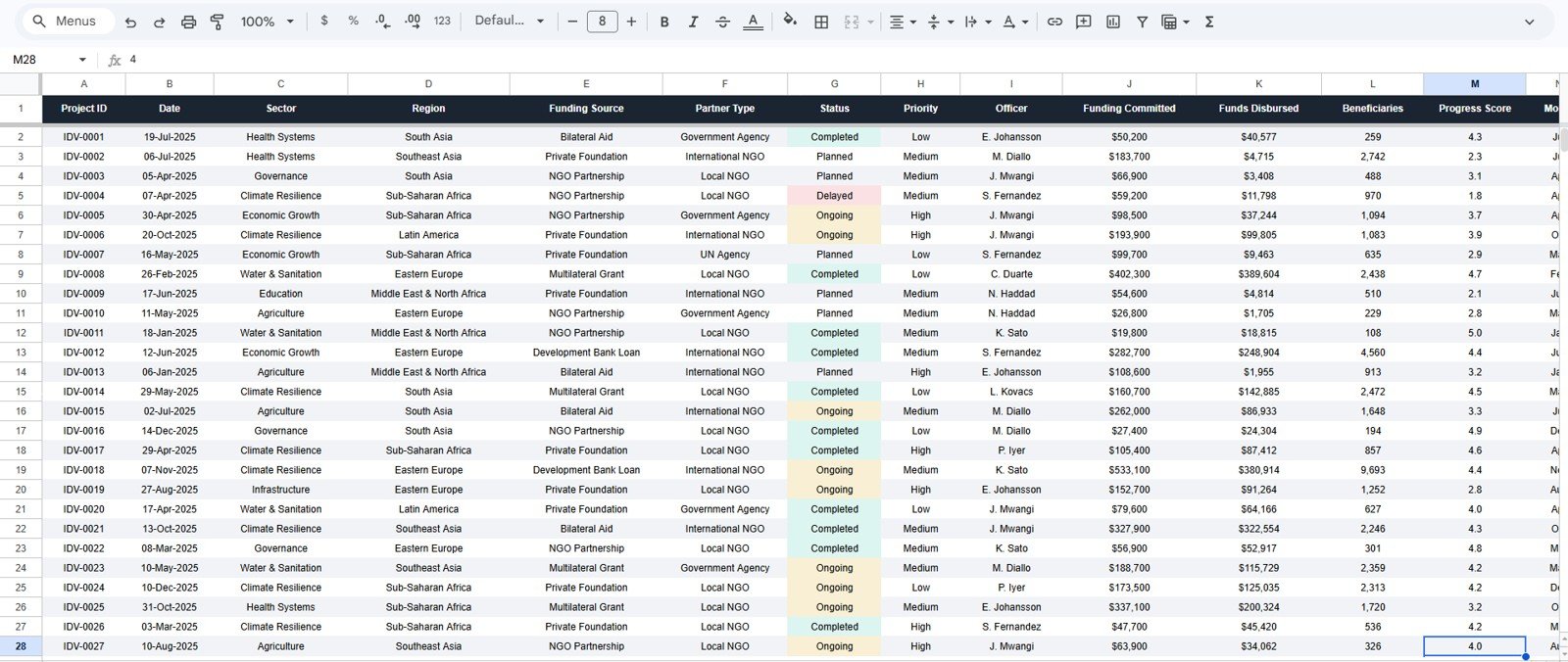
- Editable source table: Replace the sample rows in the Data Sheet while keeping the same column structure.
Dashboard Pages Explanation
1. Overview Page
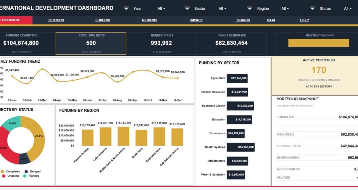
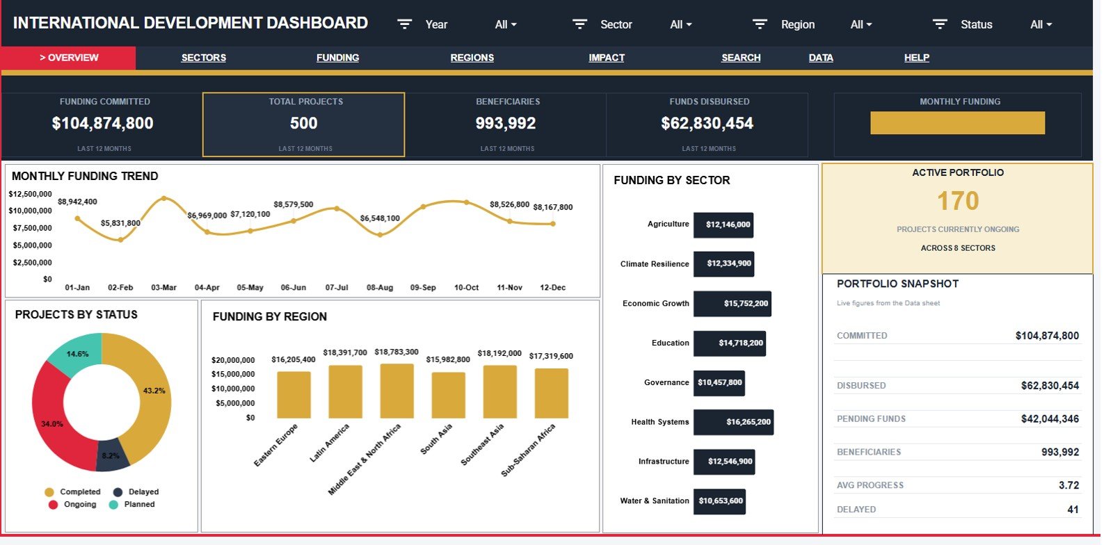
The Overview page is the leadership summary tab. At the top, cards show Funding Committed, Total Projects, Beneficiaries, Funds Disbursed, Monthly Funding, Active Portfolio, Committed, Disbursed, Pending Funds, Avg Progress, and Delayed. This gives a fast read on financial commitment, delivery activity, reach, and project health.
Monthly Funding by Month: This chart shows how committed or recorded funding moves month by month. It helps managers spot funding spikes, slower months, and timing gaps that may affect implementation.
Projects by Status: This chart breaks project records into status groups. It helps teams see how much work is active, completed, delayed, or pending.
Funding by Region: This chart compares funding across regions. It helps identify where resources are concentrated and where allocation may need review.
Funding by Sector: This chart shows how funding is distributed across sectors such as health, education, livelihoods, infrastructure, or other program categories.
Get the International Development Dashboard in Google Sheets
2. Sectors Page
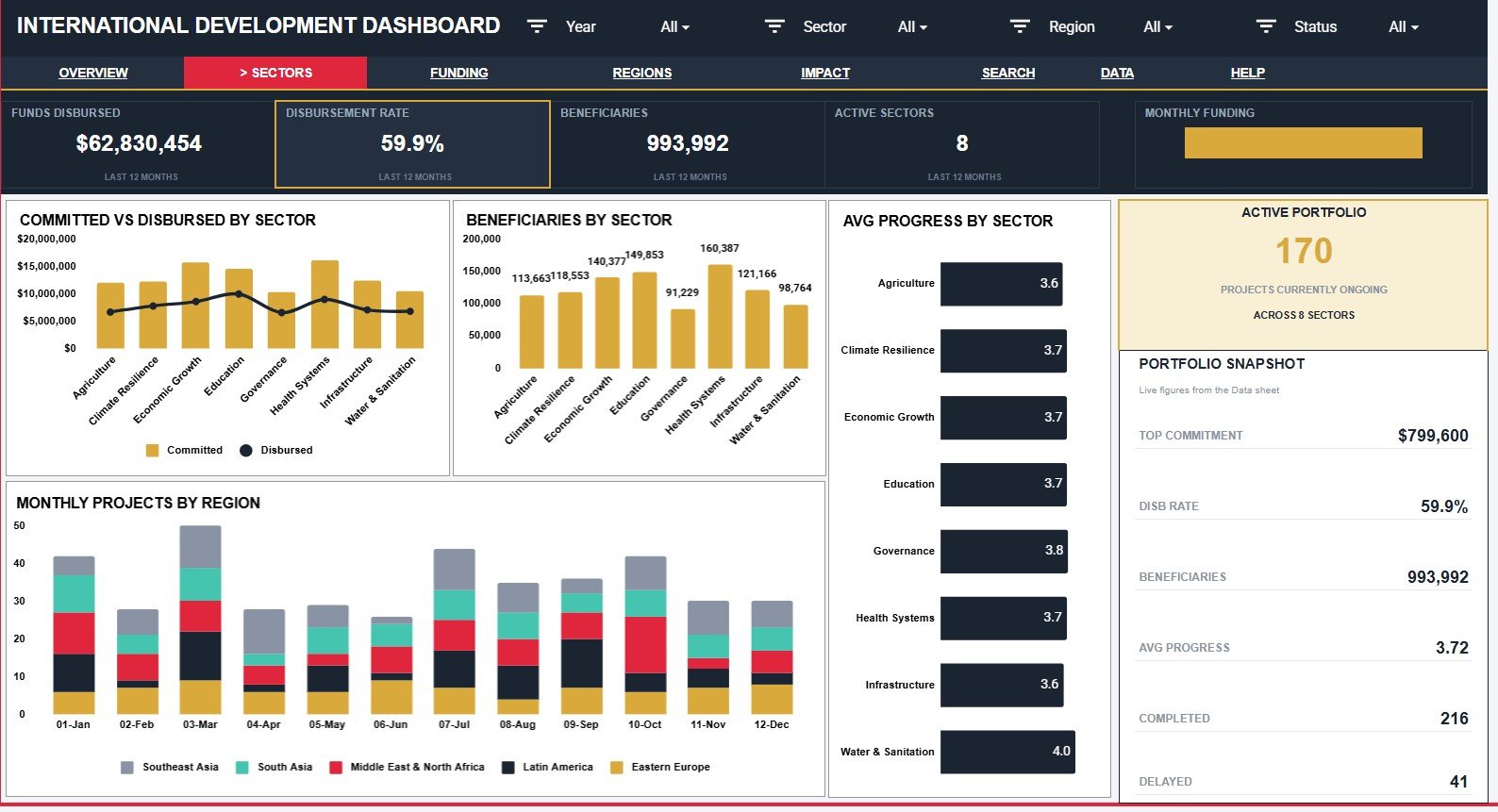
The Sectors page compares funding, beneficiaries, and progress by program area. It is useful when donors, country directors, or program leads need to understand which sectors are receiving resources and which sectors are translating those resources into visible progress.International Development Dashboard in Google Sheets
Committed and Disbursed Funding by Sector: This chart compares promised funding with actual disbursement by sector. It helps explain whether a sector is funded on paper but waiting for release.International Development Dashboard in Google Sheets
Beneficiaries by Sector: This chart shows the reach of each sector. It helps compare financial allocation with the number of people served.International Development Dashboard in Google Sheets
Average Progress by Sector: This chart summarizes delivery progress by sector. It helps identify strong sectors and sectors that may need follow-up.
Monthly Projects by Region: This chart tracks project volume over time by region. It helps reveal regional activity patterns across the reporting period.
3. Funding Page
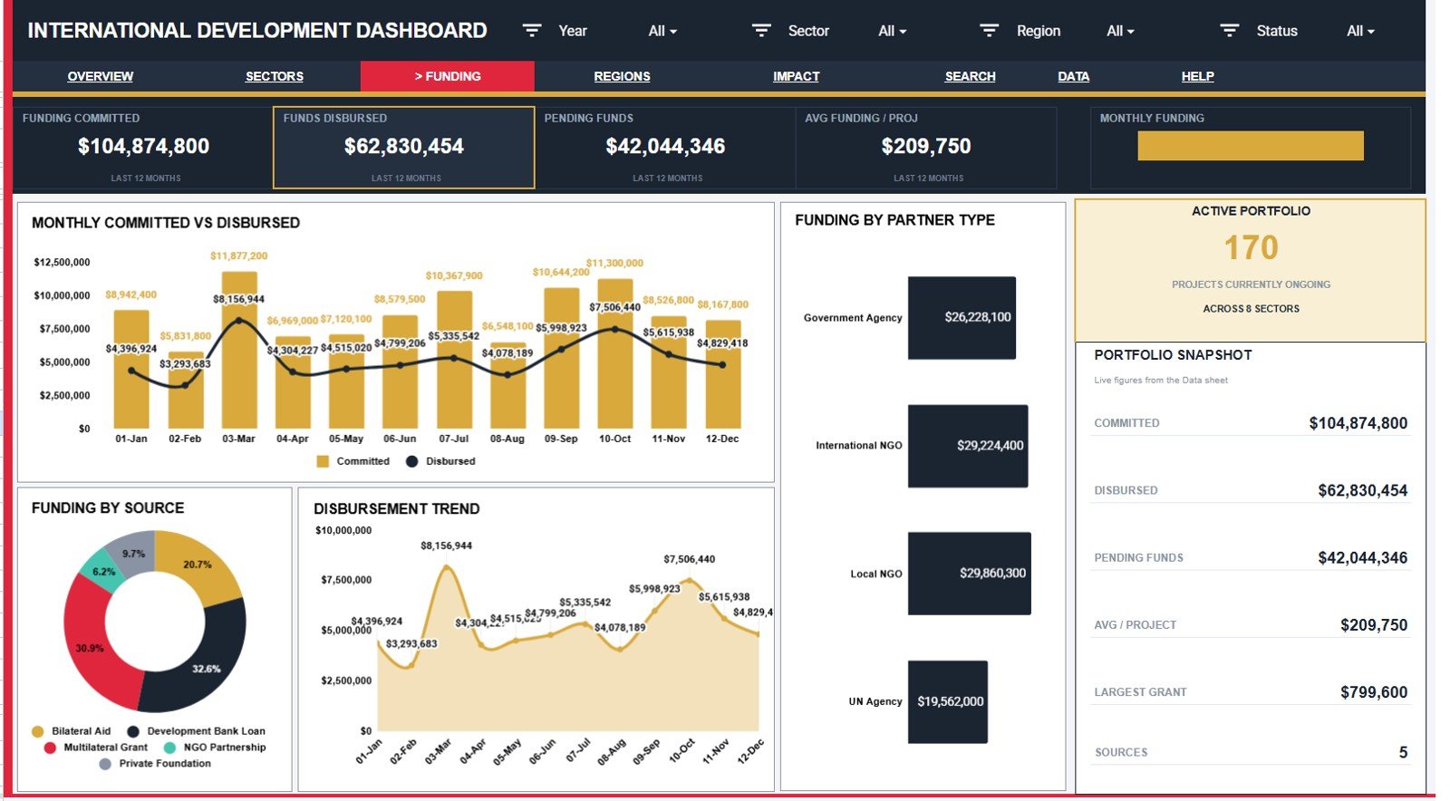
The Funding page is built for donor reporting, finance checks, and grant review meetings. It focuses on where funding comes from, how much has been disbursed, and whether partner type or monthly timing explains funding movement.
Committed and Disbursed Funding by Month: This chart compares money committed against money disbursed over time. It helps identify cash-flow gaps that can delay implementation.
Funding by Source: This chart shows which funding sources contribute the most. It helps managers understand donor concentration and reporting priorities.
Disbursement by Month: This chart shows the pace of released funds. It helps teams confirm whether disbursement is following the expected project timeline.
Funding by Partner Type: This chart groups funding by implementing partner type. It helps compare how money is distributed across NGOs, government partners, agencies, or other delivery channels.
Get the International Development Dashboard in Google Sheets
4. Regions Page
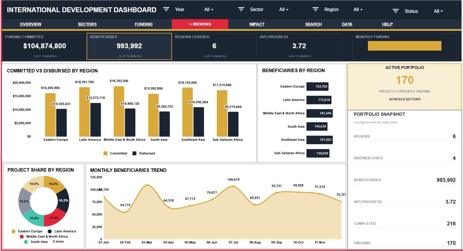
The Regions page helps managers compare project reach and funding by geography. It is useful for country programs, regional portfolios, donor updates, and internal steering meetings.
Committed and Disbursed Funding by Region: This chart shows funding balance by geography. It helps highlight regions where disbursement lags behind commitment.
Beneficiaries by Region: This chart compares reach across regions. It helps show whether funding allocation is translating into beneficiary coverage.
Project Share by Region: This chart shows the proportion of projects in each region. It helps identify where the portfolio is concentrated.
Monthly Beneficiaries by Month: This chart tracks beneficiary reach over time. It helps explain whether program reach is growing, stable, or slowing down.
5. Impact Page
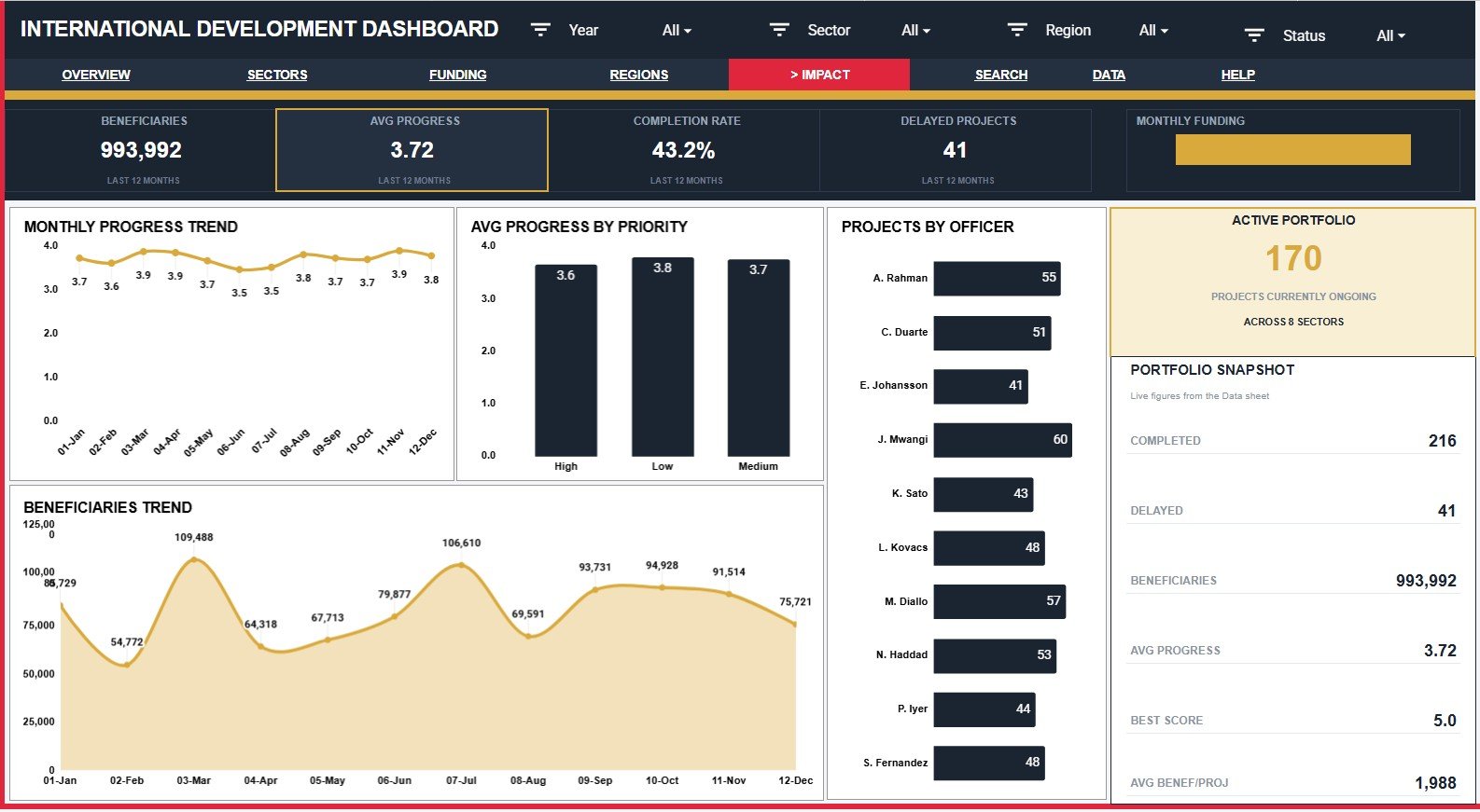
The Impact page focuses on delivery progress, priority, officer ownership, and beneficiary movement. It helps teams move from financial reporting into implementation performance.
Average Progress by Month: This chart shows progress movement over time. It helps leaders see whether the portfolio is advancing or stalling.
Average Progress by Priority: This chart compares progress across priority levels. It helps confirm whether high-priority projects are receiving enough attention.
Projects by Officer: This chart shows project ownership by officer. It helps managers understand workload distribution and accountability.
Beneficiaries by Month: This chart tracks the number of beneficiaries reached each month. It helps connect implementation activity with real-world program reach.
Get the International Development Dashboard in Google Sheets
6. Search Sheet Tab
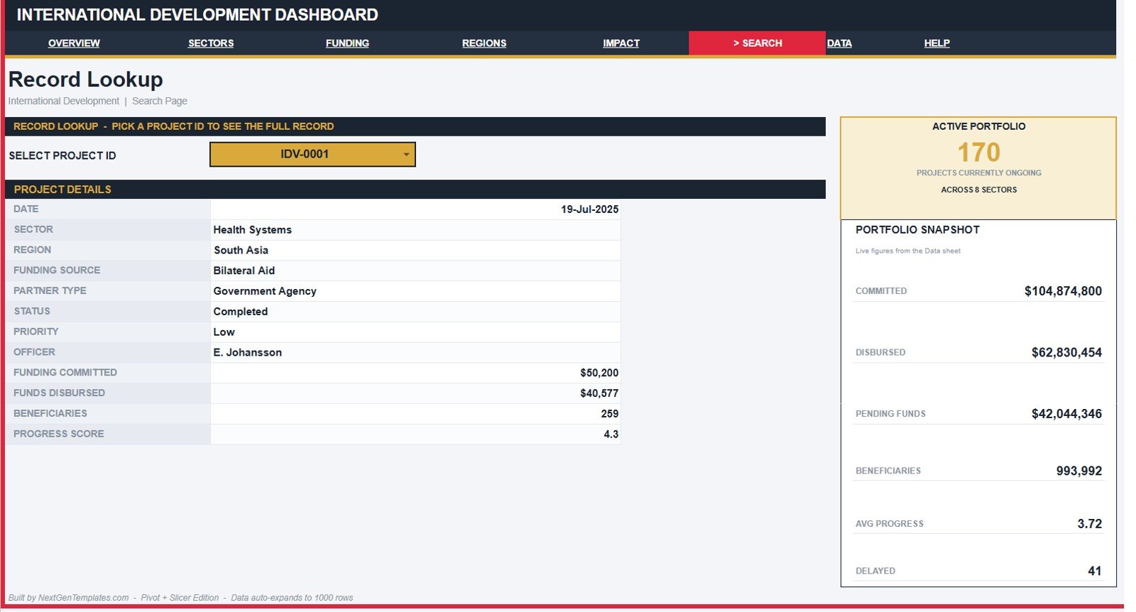
The Search Sheet lets you select a Project ID and view the full project record in one place. It shows date, sector, region, funding source, partner type, status, priority, officer, funding committed, funds disbursed, beneficiaries, and progress score. This is especially helpful when a chart highlights a delayed project and you need the underlying row quickly.
7. Data Sheet Tab
The Data Sheet stores the source records that power the dashboard. Add your own project data in the same format, keep the columns consistent, and the dashboard pages can continue to update from the structured records.
Get the International Development Dashboard in Google Sheets
International Development Dashboard in Google Sheets vs. Microsoft Excel Dashboard vs. Paid M&E SaaS – Feature Comparison
| Feature | This template | Microsoft Excel dashboard | Paid M&E or grant SaaS |
|---|---|---|---|
| Cost | $9.99 one-time sale price | Template cost plus Excel licensing | Usually subscription-based |
| Platform | Google Sheets in Drive | Excel desktop or web | Vendor-hosted application |
| Setup time | Copy the file and replace sample records | Open workbook and customize | Often requires onboarding |
| Real-time team collaboration | Built into Google Sheets sharing | Depends on Microsoft 365 setup | Usually available by paid user role |
| Mobile access | Google Sheets app or browser | Excel mobile app | Usually included |
| Customizable fields | Editable sheet fields and labels | Editable workbook structure | Depends on vendor permissions |
| Share with link | Yes, through Drive permissions | Yes, through OneDrive or SharePoint | Usually invite-based |
| Year-1 cost at 5 users | $9.99 before any Google Workspace cost | Template plus license costs | Can rise quickly with users and modules |
| Project ID lookup | Included Search Sheet | Must be built or customized | Usually included |
Who Should Use This Template
- NGO program managers tracking donor-funded projects.
- Monitoring and evaluation officers preparing monthly or quarterly reviews.
- Grant managers comparing committed and disbursed funding.
- Regional coordinators comparing beneficiary reach and project share.
- Consultants building practical reporting systems for development clients.
It is not a fit for teams that need a full grant management system, field survey collection, biometric beneficiary records, accounting controls, or automated workflow approvals. Use dedicated systems for those needs, and use this dashboard as a reporting layer.
Real-World Use Cases
Amina, M&E manager: prepares monthly donor updates by reviewing the Overview, Funding, and Impact pages before writing the narrative report.
Jonas, regional program lead: filters the Regions page to compare disbursement gaps and beneficiary reach across field offices.
Leah, grant consultant: uses the Search Sheet to answer detailed project questions during client review calls without scrolling through the raw data table.
Advantages of International Development Dashboard in Google Sheets
- It runs in Google Sheets, so teams can use a familiar cloud spreadsheet interface.
- It combines finance, sectors, regions, impact, and project lookup in one file.
- It is easier to customize than many locked dashboard tools.
- It supports team sharing through Google Drive permissions.
- It gives non-technical stakeholders charts and cards instead of raw tables only.
Opportunities for Improvement
The template depends on clean manual or imported source data. It does not automatically connect to accounting systems, grant databases, survey tools, or field-data apps. Teams with advanced needs can use it as a reporting layer after exporting records from their source systems.
For organizations with sensitive beneficiary data, protect access carefully and avoid putting personally identifiable information in shared dashboard files unless your governance process allows it.
Best Practices
- Keep Project ID values unique so the Search Sheet returns the correct record.
- Maintain the Data Sheet column structure when adding new records.
- Use consistent sector, region, status, priority, funding source, and partner type labels.
- Reconcile committed and disbursed funding with finance records before official donor submission.
- Use protected ranges if several users will edit the file.
- Review Google’s official slicer guidance if your team is new to filtering charts and tables in Sheets.
Explore Relevant Templates
- International Development Dashboard in Google Sheets – product page for this template.
- International Development Dashboard in Excel – for Excel-based development reporting.
- International Development Dashboard in Power BI – for BI-style dashboards.
- Nonprofit Organizations Dashboard in Google Sheets – for nonprofit operating metrics.
- Government Administration Dashboard in Google Sheets – for public-sector administration tracking.
If you want to practise turning project data into charts and reports, the Excel Pivot Tables & Dashboards course on NextGenTemplates Academy covers it step by step with practice files.
Get the International Development Dashboard in Google Sheets
Frequently Asked Questions
What does the International Development Dashboard in Google Sheets track?
It tracks project records by date, sector, region, funding source, partner type, status, priority, officer, funding committed, funds disbursed, beneficiaries, and progress score.
Can I use it for donor reporting?
Yes, it can support donor reporting analysis. Always confirm the official donor reporting format before submitting final figures.
Does the dashboard support team collaboration?
Yes. Because it runs in Google Sheets, you can share the copied file with view or edit permissions through Google Drive.
Can I customize sectors and regions?
Yes. You can adjust labels and records to match your program structure, as long as the dashboard formulas and ranges stay aligned.
Does it replace grant management software?
No. It is a reporting dashboard, not a grant approval, accounting, procurement, field-data, or audit workflow system.
What happens if I add more rows to the Data Sheet?
New rows should be added in the same format as the sample records so the charts, cards, slicers, and Search Sheet continue to work correctly.
About the Author
Built by PK – Microsoft Certified Professional with 15+ years of Excel, Google Sheets, and Power BI experience. Founder of NextGenTemplates, reaching 300K+ subscribers across YouTube channels. Every template is hand-built and tested before release.
Conclusion
The International Development Dashboard in Google Sheets gives development teams a practical way to review funding, disbursement, sectors, regions, beneficiaries, progress, delayed projects, and individual project records. It is best for teams that want a clean spreadsheet dashboard before moving to a larger M&E platform.
Get the International Development Dashboard in Google Sheets and start turning project records into a clearer reporting system.