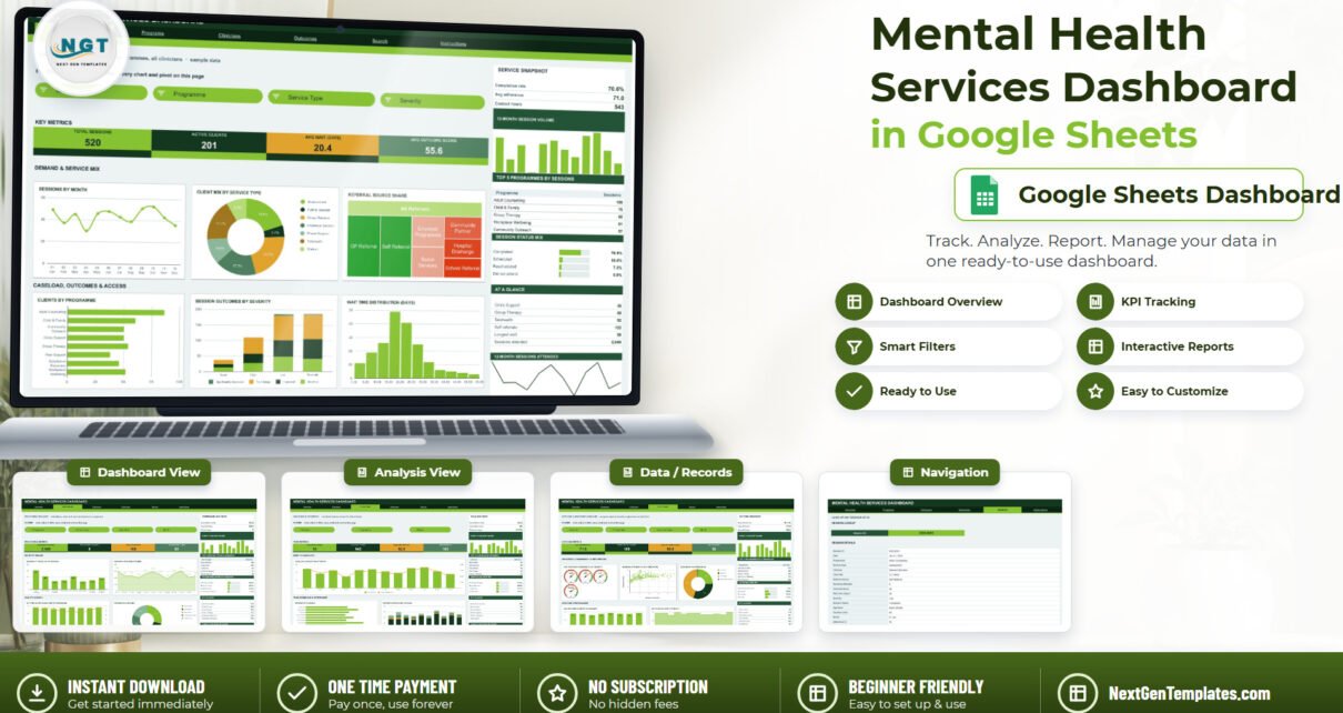
Most community mental health services already own their numbers. The sessions are logged, the referrals are recorded, the did-not-attends are counted – and then, once a quarter, somebody spends an afternoon rebuilding the same pivot tables from scratch to answer the same commissioner questions. The Mental Health Services Dashboard in Google Sheets exists to end that afternoon.Mental Health Services Dashboard in Google Sheets
It is a reporting template: 7 tabs, 16 KPI cards, 18 chart panels and 15 slicers, all built on native Google Sheets pivot tables sitting over a single 20-column session log. It ships with 520 invented sample session rows spanning 8 programmes, 7 service types, 7 referral sources, 5 age bands and 10 clinicians, so every chart is populated the second you open it. Pivots, slicers and formulas already cover 1,000 rows.Mental Health Services Dashboard in Google Sheets
One thing to be clear about before anything else, because it matters more here than on any other template we publish. This is a business reporting tool, not a clinical one. It does not assess, screen, triage, diagnose, score risk or recommend treatment. It is not a crisis or safeguarding system. It contains no clinical guidance. What it does is count sessions, average waiting times, and show you where your caseload and your referrals are actually going.Mental Health Services Dashboard in Google Sheets
Get the Mental Health Services Dashboard in Google Sheets
Key Features of the Mental Health Services Dashboard in Google Sheets
- Four cross-filtered analysis pages – Overview, Programs, Clinicians and Outcomes – each with its own slicer strip.Mental Health Services Dashboard in Google Sheets
- 15 slicers across those pages: Month, Programme, Service Type, Severity, Age Band, Clinician and Outcome Band. Filters are per page, so one page can sit on a single programme while another stays service-wide.Mental Health Services Dashboard in Google Sheets
- 16 KPI cards driven by SUMIFS and COUNTIFS – and deliberately unfiltered, so you always keep a service-wide anchor number while the charts move underneath the slicers.
- 18 chart panels: line, area, donut, treemap, horizontal bar, stacked column, histogram, scatter, a dual-axis combo and a four-gauge adherence panel.
- A sidebar on every analysis page – a three-row snapshot, a 12-month volume column chart, a Top 5 table, a share-of-total bar list, a six-row At A Glance block and a sparkline.
- A Search page that returns a single session’s full 17-field record from one Session ID.
- Native pivot architecture with no helper formulas behind the charts, so the file stays responsive as the log grows.Mental Health Services Dashboard in Google Sheets
- Auto-expansion to 1,000 rows, with a
DATA_ROWSconstant in the bundled Apps Script if you need more.Mental Health Services Dashboard in Google Sheets - One editable palette – forest green #14371F, lime #86C232, amber #E0A32E – set from a single block at the top of the script.
Dashboard Pages Explanation
1. Overview – service-wide activity
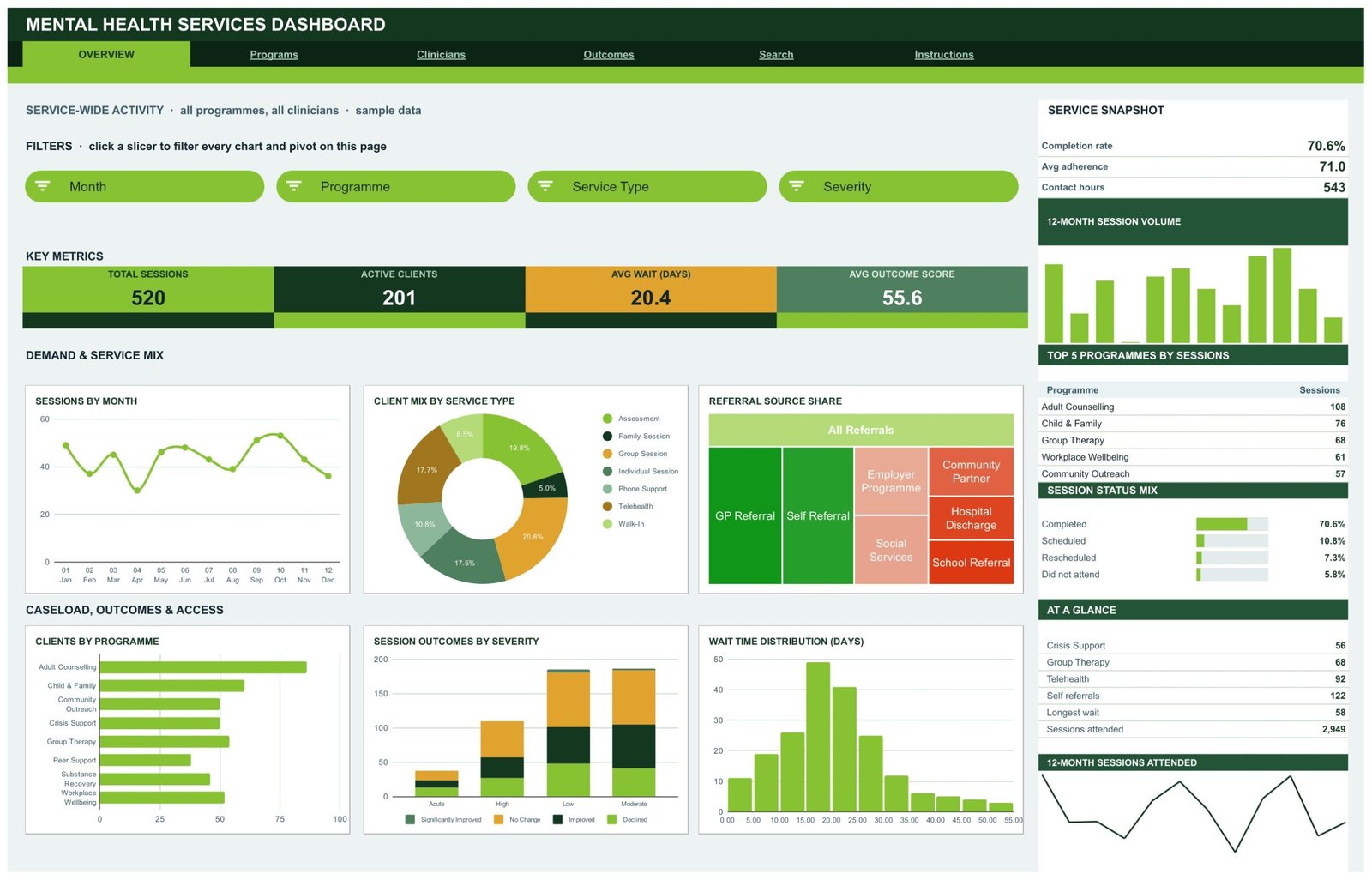
Four KPI cards head the page: Total Sessions 520, Active Clients 201, Avg Wait 20.4 days, Avg Outcome Score 55.6. Below them sit Sessions by Month, Client Mix by Service Type, Referral Source Share as a treemap, Clients by Programme, Session Outcomes by Severity and a Wait Time Distribution histogram. The sidebar carries a completion rate of 70.6%, average adherence of 71.0, 543 contact hours, a Top 5 Programmes table led by Adult Counselling on 108 sessions, and a session status mix showing 5.8% did-not-attend.
2. Programs – programme delivery
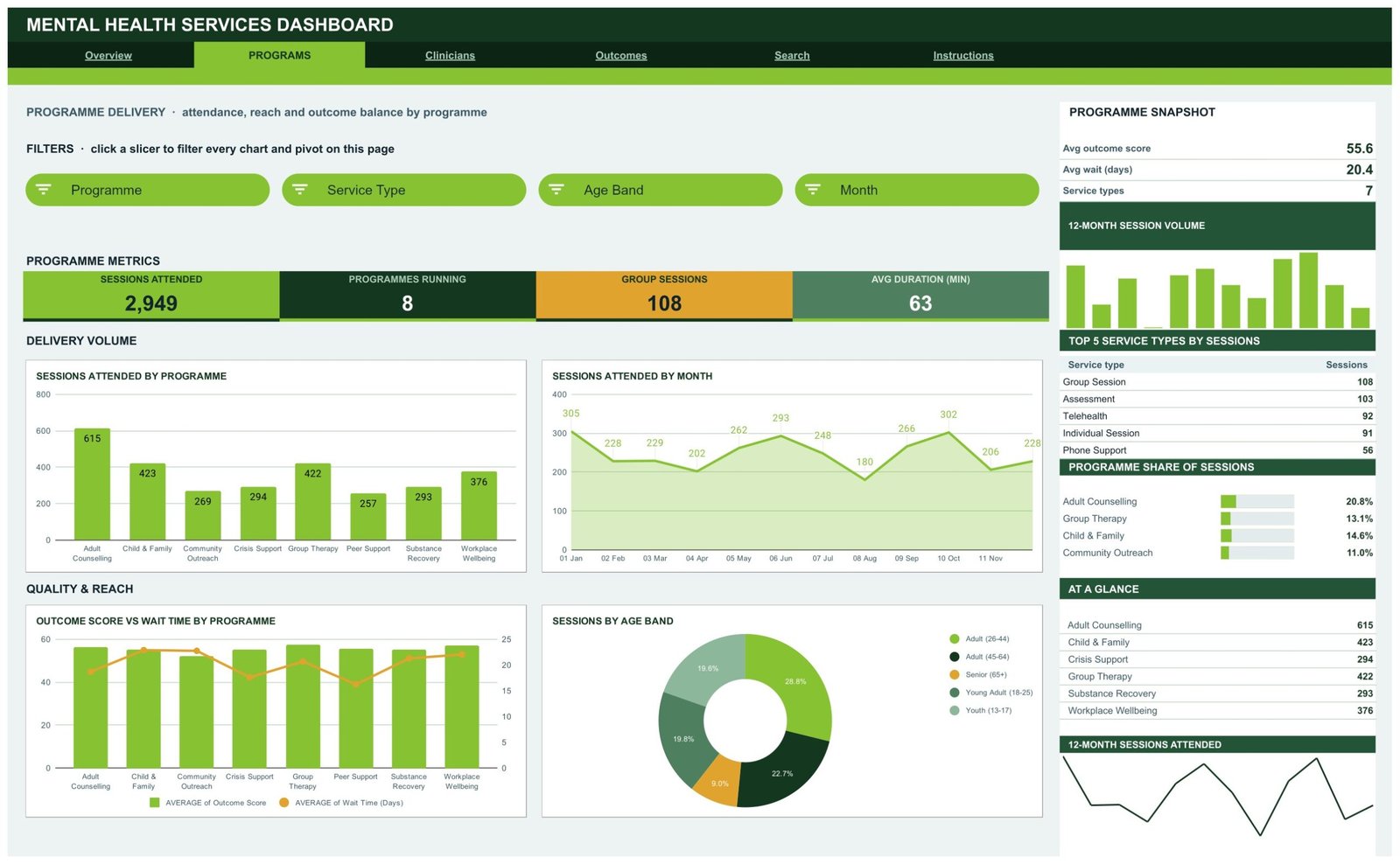
Sessions Attended 2,949, Programmes Running 8, Group Sessions 108, Avg Duration 63 minutes. Then Sessions Attended by Programme (Adult Counselling 615, Child & Family 423, Group Therapy 422, Workplace Wellbeing 376), Sessions Attended by Month as an area chart, an Outcome Score vs Wait Time by Programme combo, and Sessions by Age Band as a donut – 28.8% in the 26-44 band, 19.6% in the 13-17 youth band.
3. Clinicians – caseload and utilisation
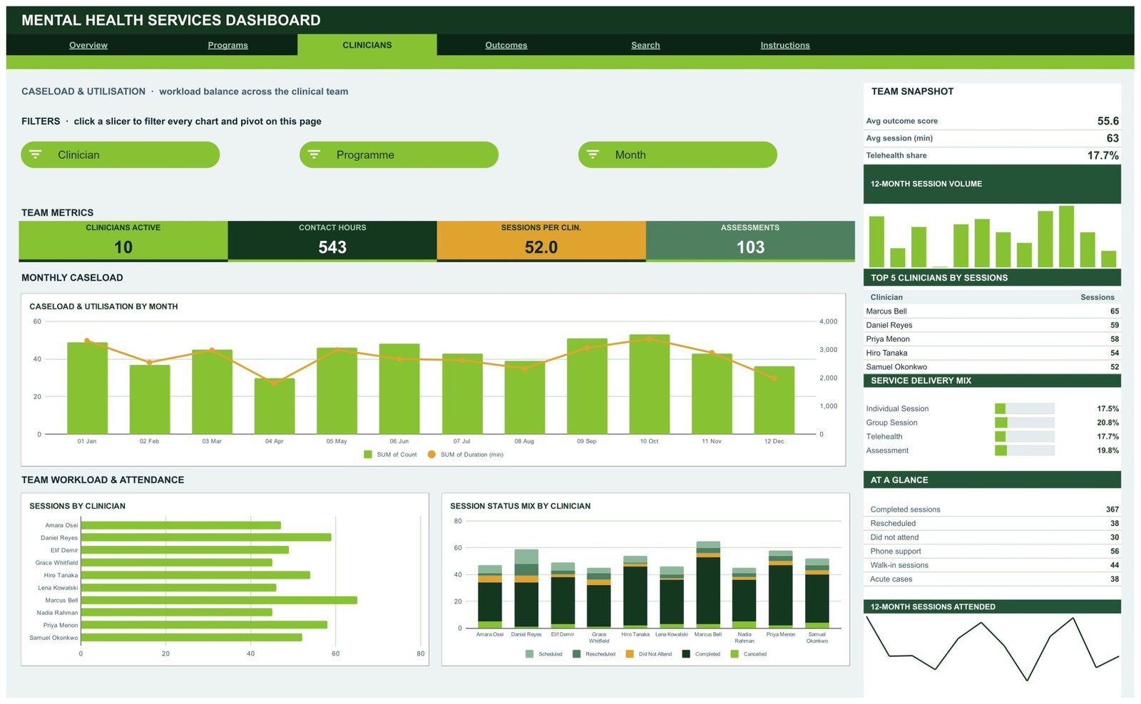
Clinicians Active 10, Contact Hours 543, Sessions per Clinician 52.0, Assessments 103. A dual-axis Caseload & Utilisation by Month chart pairs session count against total duration; a horizontal bar ranks Sessions by Clinician; a stacked column breaks each clinician’s Session Status Mix into scheduled, rescheduled, did-not-attend, completed and cancelled. This is a workload-distribution view of a staff roster – it is not a performance rating, and it should not be read as one.
4. Outcomes – recorded adherence and outcome bands
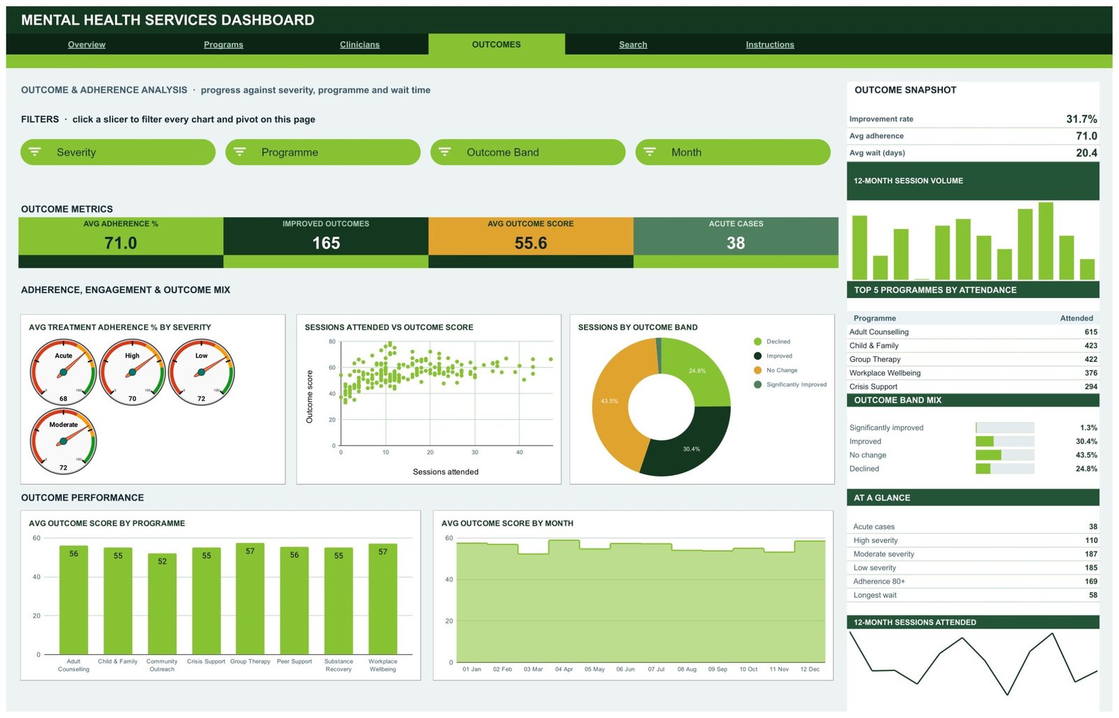
Avg Adherence 71.0, Improved Outcomes 165, Avg Outcome Score 55.6, Acute Cases 38. Four gauges show average adherence by severity band (Acute 68, High 70, Low 72, Moderate 72); a scatter plots Sessions Attended against Outcome Score; a donut splits the Outcome Band mix – 43.5% no change, 30.4% improved, 24.8% declined, 1.3% significantly improved.
Read this page literally. The sheet averages and counts whatever you type into the Outcome Score, Adherence % and Outcome Band columns. It does not calculate, validate or interpret them. It has no view on whether a client is getting better, and it makes no claim about treatment efficacy. If those columns are meaningful in your service, it is because your own recording practice makes them so.
5. Search – single-record lookup
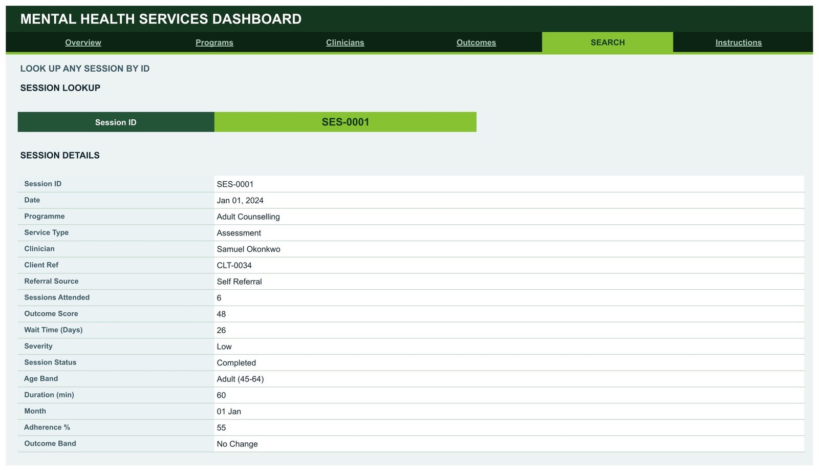
Type a Session ID and the page returns that row’s 17 fields – date, programme, service type, clinician, client reference, referral source, sessions attended, outcome score, wait time, severity, session status, age band, duration, month, adherence and outcome band. Useful when somebody in a meeting queries a single figure.
6. Instructions, and 7. Data
The Instructions tab is an 11-point user guide covering how the slicers drive the pivots, why the KPI cards stay unfiltered, how to swap in your own rows and how to raise the row limit. The Data tab holds the log itself. Its 20 columns are Session ID, Date, Programme, Service Type, Clinician, Client Ref, Referral Source, Sessions Attended, Outcome Score, Wait Time (Days), Severity, Session Status, Age Band, Duration (min), Month, Year, Quarter, Count, Adherence % and Outcome Band.
Worth stating plainly: in the sample data, clients are identified only by a coded reference such as CLT-0034 – 201 unique references across the 520 rows – and by a banded age group. There is no name, contact, address, diagnosis, medication or clinical-notes column anywhere in the template. Clinicians are named, because the Clinicians page reports on a staff roster. If you add identifying columns of your own, that is your decision and your organisation’s governance responsibility. This is an ordinary Google Sheet with no compliance certification attached to it.
Mental Health Services Dashboard in Google Sheets vs. an Excel Dashboard vs. a Paid BI Suite – Feature Comparison
| This template (Google Sheets) | Excel dashboard | Paid BI suite (Power BI Pro / Tableau Creator) | |
|---|---|---|---|
| Cost | $9.99 one time | $24.99 one time | $10-$75 per user per month |
| Platform | Google Sheets, browser only | Desktop Excel | Desktop authoring plus a cloud service |
| Setup time | Copy the sheet, paste your rows – under an hour | Open the workbook, paste your rows | Days: model, publish, license, train |
| Real-time team collaboration | Yes, native co-editing | Limited | Yes |
| Mobile access | Yes, Sheets app | Limited | Yes |
| Customisable fields | Yes – edit columns, re-run the script | Yes | Yes |
| Share with a link | Yes | No | Only to licensed users |
| Year-1 cost at 5 users | $9.99 | $24.99 | $600-$4,500 |
| Live connection to an EHR or booking system | No – you paste or import rows | No | Yes, with connectors and engineering time |
| Row capacity as shipped | 1,000 (raise via the script) | Tens of thousands | Millions |
Note what this table compares. All three columns are reporting tools. This template is not an alternative to an EHR, a practice-management system or a clinical record, and it should never be used in place of one.
Who Should Use This Template
It suits a service manager or operations lead who already keeps a session log in a spreadsheet: community mental health teams, counselling charities, employee-assistance providers, student wellbeing services, and small private practices with a handful of clinicians. The sweet spot is roughly 5 to 30 practitioners and up to a few thousand sessions a year – enough volume that manual pivots hurt, not so much that you need a warehouse.
It is the wrong tool if you need a clinical, triage or safeguarding system, a live feed from your EHR, per-client case notes, or a platform certified under a formal compliance regime. Those are different products, and a spreadsheet is not one of them.
Real-World Use Cases
The quarterly commissioner pack. A counselling charity pastes the quarter’s sessions into the Data tab, filters Overview to the quarter, and lifts the wait-time histogram and session-status mix straight into the report. What used to be an afternoon becomes ten minutes.
Rebalancing a rota. An operations lead opens the Clinicians page before an intake round, sees one counsellor carrying noticeably more sessions than the rest of the team, and redistributes. The page shows workload, nothing else – the judgement stays human.
Making the case for capacity. A university wellbeing coordinator filters Programs by Age Band to show how demand splits between 18-25 and 26-44, then uses Referral Source Share to argue for more self-referral capacity in next year’s budget.
Advantages of the Mental Health Services Dashboard in Google Sheets
- It works the moment you open it. 520 populated rows means you can see every chart behave before you commit your own data.
- Slicers, not formula edits. Filtering is a click. Google’s own documentation covers the mechanics if you want to add more – see Google’s guide to slicers in Sheets.
- It stays fast. Charts read pivot tables directly rather than a stack of helper formulas.
- Unfiltered KPI cards. A small design decision that saves a lot of confusion: your headline totals do not silently change when someone leaves a slicer on.
- Browser only. No installation, no licence, and link-sharing that works for a board member who has never opened Excel.
- Recolourable in one place. House colours are a palette edit, not a chart-by-chart slog.
Opportunities for Improvement
Honest limitations, so nobody is surprised. It ships covering 1,000 rows – beyond that you edit DATA_ROWS in the Apps Script and re-run it, which is a two-minute job but does mean opening the script editor. The sample data covers a single year (2024), so year-on-year comparison needs you to add rows and extend the Month/Year fields. There is no import automation: getting data out of your EHR and into the Data tab is a manual export-and-paste, or a job for someone comfortable with Google Apps Script. And the KPI cards being unfiltered is a deliberate trade-off – it is the right default, but if you want filtered headline numbers you will need to rebuild those cards as pivot outputs.
Best Practices
- Keep the headers exactly as they are. The pivots, slicers and formulas are bound to those 20 column names. Rename one and something quietly stops working.
- Decide your identifier policy before you paste anything. The template gets by on a coded Client Ref. Adding names is possible and sometimes necessary – but make it a deliberate decision with whoever owns data protection in your organisation, not an accident of copy-paste.
- Agree what Outcome Score and Adherence % mean across your team before you rely on them. The sheet will average anything you give it; consistency has to come from you.
- Clear slicers before screenshotting. Open the slicer and choose Select all – a leftover filter is the classic way a board pack ends up wrong.
- Keep a clean copy. Duplicate the sheet before a big data swap so you can roll back.
- Report volumes and access, not conclusions about people. The dashboard is at its best describing demand, waiting and capacity. Leave clinical interpretation to clinicians.
Explore Relevant Templates
- Mental Health Services KPI Dashboard in Google Sheets – the month-picker scorecard sibling, with traffic lights and dedicated trend and analysis pages. A different template, not a duplicate.
- Mental Health Services Dashboard in Power BI – same subject, built for larger volumes.
- Mental Health Services Dashboard in Excel – for teams that live in desktop Excel.
- Rehabilitation Center KPI Dashboard in Google Sheets
- Substance Abuse Center KPI Dashboard in Google Sheets
Related Templates
More related walkthroughs on this blog: Mood Mental Health Tracker in Google Sheets, Healthcare Services Dashboard in Google Sheets Template and Dental Practice Dashboard in HTML. Each is a separate template with its own layout and sample data.
Anyone who wants to build the pivot tables and slicers behind a reporting dashboard like this can follow the Excel Pivot Tables & Dashboards course on NextGenTemplates Academy, which comes with practice files.
Get the Mental Health Services Dashboard in Google Sheets
Frequently Asked Questions
Is the Mental Health Services Dashboard in Google Sheets a clinical tool?
No. It is a service-operations reporting template. It performs no assessment, screening, triage, risk scoring, diagnosis or treatment recommendation, and nothing in it constitutes clinical guidance.
Does it track client wellbeing or symptom severity?
No. Severity, Outcome Score, Adherence % and Outcome Band are columns you fill in from your own records. The dashboard counts and averages them and does nothing else with them.
Does it hold patient names?
Not in the template. Clients appear as a coded Client Ref and a banded age group; there is no name, contact, address, diagnosis or notes column. Clinician names are present because the Clinicians page reports on a staff roster.Mental Health Services Dashboard in Google Sheets
Is it HIPAA or GDPR compliant?
No compliance claim is made. It is an ordinary Google Sheet. Whether your use of it is compliant depends on your Workspace configuration, your data-protection assessments and your own policies.Mental Health Services Dashboard in Google Sheets
Can it connect to my EHR or booking system?
No. It is static – you paste or import rows into the Data tab. There is no live link to any external system.Mental Health Services Dashboard in Google Sheets
How many sessions can it handle?
1,000 rows as shipped. Raise DATA_ROWS in the bundled Apps Script and re-run it to go further.
How is this different from the KPI Dashboard version?
This is the analytical dashboard: four cross-filtered pages of charts plus a record lookup. The KPI Dashboard is a month-picker scorecard with traffic lights. Different templates, different jobs.Mental Health Services Dashboard in Google Sheets
About the Author
Built by PK – Microsoft Certified Professional with 15+ years of Excel, Google Sheets, and Power BI experience. Founder of NextGenTemplates, reaching 300K+ subscribers across YouTube channels. Every template is hand-built and tested before release.Mental Health Services Dashboard in Google Sheets
Conclusion
If your service already logs its sessions and still rebuilds the same pivots every quarter, this template closes that gap for the price of a takeaway. It gives you waiting times, attendance, referral mix, programme reach and caseload balance in four clickable pages, and it is honest about its own edges: static, spreadsheet-scale, uncertified, and firmly on the operations side of the line rather than the clinical one.Mental Health Services Dashboard in Google Sheets
Get the Mental Health Services Dashboard in Google Sheets for $9.99 (regular $16.99) – instant download, one-time payment, no subscription. Your download includes the PDF with the Google Sheets copy link.
For more Google Sheets dashboard walkthroughs, subscribe to NeoTechNavigators on YouTube.