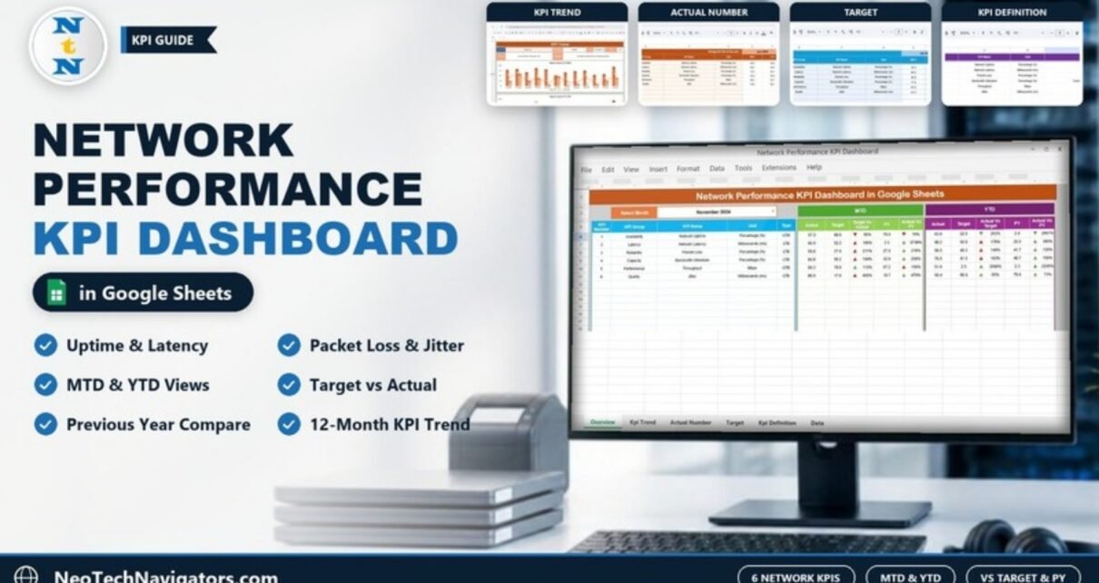
The Network Performance KPI Dashboard in Google Sheets tracks six core network KPIs (uptime, latency, packet loss, bandwidth utilization, throughput and jitter) against target and against last year. Pick a month and the whole dashboard updates with MTD and YTD figures and up/down arrows.
It is built for IT managers, network engineers, NOC leads and managed-service providers who report on network health each month and want one shared Google Sheet instead of screenshots from several monitoring tools. The file has six tabs: Dashboard, KPI Trend, Actual Number, Target, Previous Year Number and KPI Definition.
Below, you will see what each tab does, the exact KPI list with formulas, how the percentages are calculated, and how to load your own monthly numbers.
Get the Network Performance KPI Dashboard
Why Track Network Performance KPIs in One Dashboard?
Monitoring tools are great at real-time alerts but weak at month-end reporting. When a manager asks whether the network got better this quarter, someone has to export uptime from one tool, latency from another and bandwidth from a third, then line them up against targets.
A KPI dashboard turns that into a routine. Each month you record one actual, target and previous-year value per KPI. The sheet then answers three questions at a glance:
- Did we hit target?
- Are we better than last year?
- Is the year-to-date picture improving?
Inside the Network Performance KPI Dashboard in Google Sheets: Sheet by Sheet
1. Dashboard
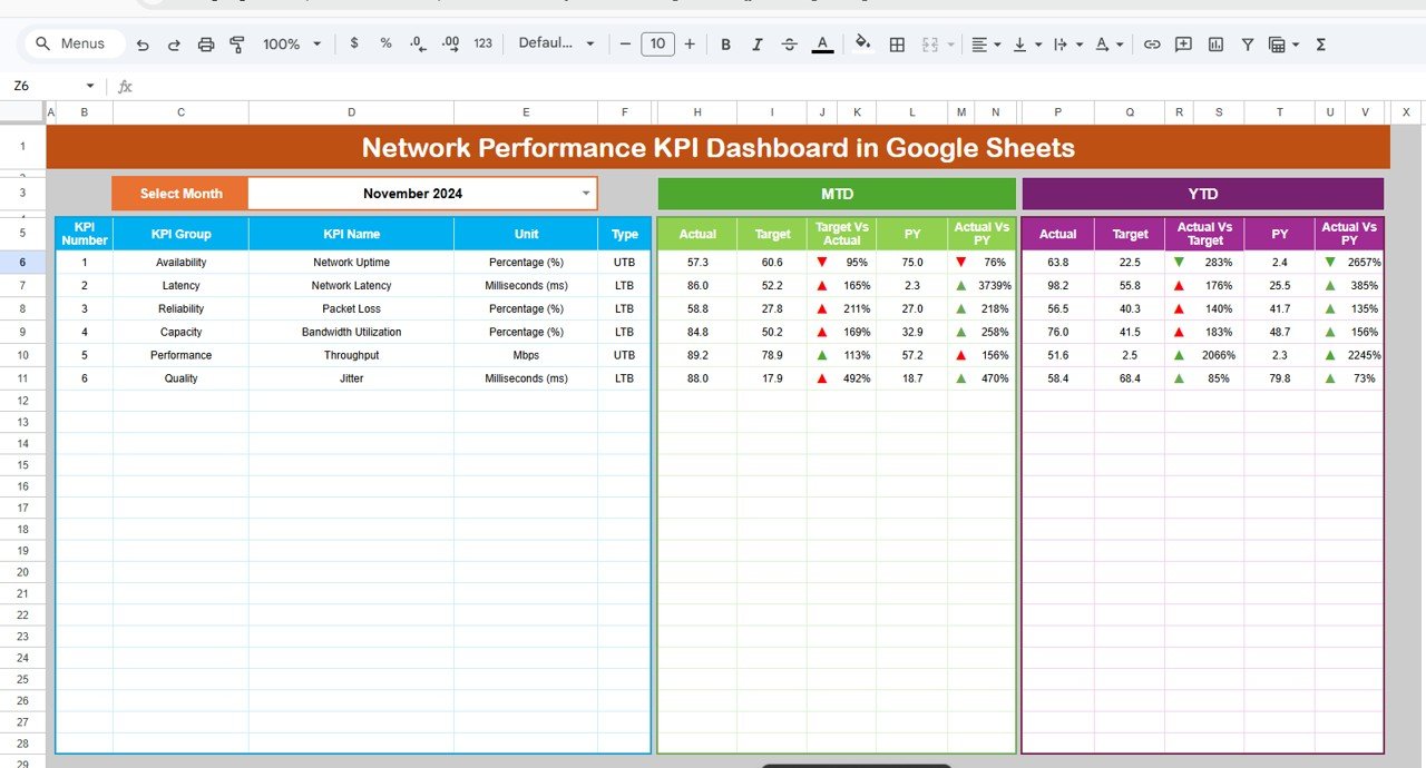
The main tab. Use the Select Month dropdown (November 2024 in the sample) to choose the reporting month. The left block lists each KPI’s KPI Number, KPI Group, KPI Name, Unit and Type (UTB or LTB). The MTD and YTD blocks each show:
- Actual and Target
- the actual-to-target percentage (headed Target Vs Actual in the MTD block and Actual Vs Target in the YTD block)
- PY (previous year)
- Actual Vs PY (%)
Coloured arrows beside each percentage flag whether the result is moving the right way.
2. KPI Trend
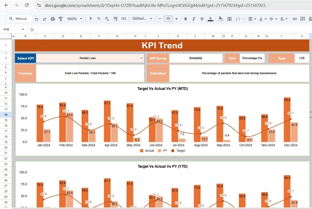
Choose a KPI in the Select KPI dropdown (cell C3). The tab then shows its KPI Group, Unit, Type, Formula and Definition, plus two combo charts:
- Target Vs Actual Vs PY (MTD)
- Target Vs Actual Vs PY (YTD)
Both charts run across all twelve months. In the screenshot, Packet Loss is selected (group Reliability, unit Percentage, type LTB).
3. Actual Number
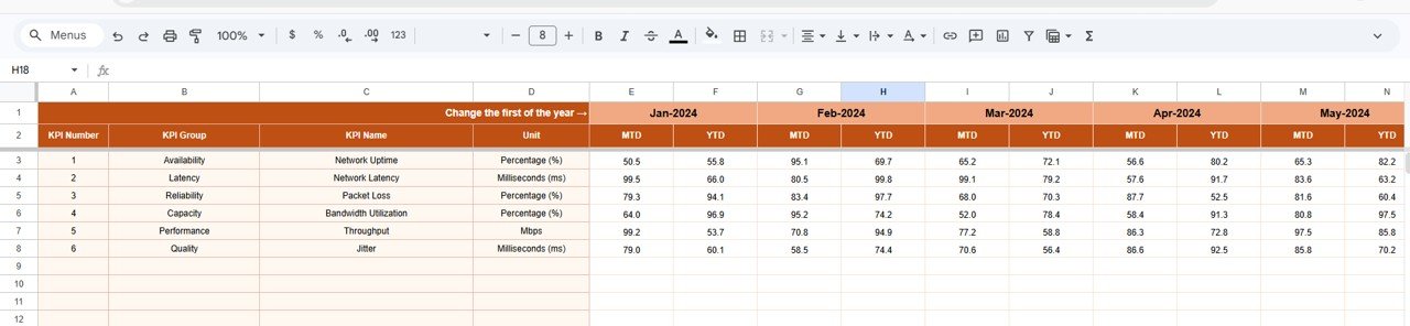
This is where you type the actual results. Each KPI is a row, and each month has an MTD and a YTD column (Jan-2024, Feb-2024 and so on). The cell marked “Change the first of the year →” sets the starting month, and the month headers that follow are based on it, which makes starting a new year simple.
4. Target
Same layout as Actual Number, but for goals. Enter an MTD and a YTD target for each KPI and month.

5. Previous Year Number
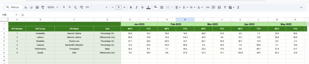
Holds last year’s MTD and YTD values (Jan-2023 onwards in the sample). These feed the PY and Actual Vs PY columns.
6. KPI Definition
The master list: #, KPI Group, KPI Name, Unit, Formula, Definition and Type. The Dashboard and KPI Trend tabs read their labels from here.

The 6 Network KPIs in the Dashboard
These come straight from the template’s KPI Definition sheet. “Better when” follows the template’s UTB/LTB setting.
| KPI | Group | Unit | What it measures | Formula | Better when |
|---|---|---|---|---|---|
| Network Uptime | Availability | Percentage (%) | Share of time the network is operational | Total Uptime / Total Time * 100 | Higher |
| Network Latency | Latency | Milliseconds (ms) | Time for a packet to travel from source to destination | Average Latency | Lower |
| Packet Loss | Reliability | Percentage (%) | Packets lost during transmission | Total Lost Packets / Total Packets * 100 | Lower |
| Bandwidth Utilization | Capacity | Percentage (%) | Bandwidth in use compared with what is available | Current Bandwidth Usage / Total Available Bandwidth * 100 | Lower |
| Throughput | Performance | Mbps | Rate at which data is successfully transmitted | Average Throughput | Higher |
| Jitter | Quality | Milliseconds (ms) | Variation in delay between packets | Average Jitter | Lower |
Note: Bandwidth Utilization is set to LTB in the template. Some teams prefer a target band instead, because very low utilization can mean you are paying for unused capacity. Adjust the Type to match your own policy.
How the Percentages Are Calculated
Both comparison columns are ratios of the actual value:
Target Vs Actual = Actual / Target
Actual Vs PY     = Actual / PY
Here is Network Uptime for November 2024 (MTD) from the sample:
- Actual = 57.3, Target = 60.6, PY = 75.0
- Target Vs Actual = 57.3 ÷ 60.6 = 95%
- Actual Vs PY = 57.3 ÷ 75.0 = 76%
Uptime is Upper the Better, so both figures below 100% get a downward arrow. For an LTB KPI such as Packet Loss, a result above 100% means the KPI is worse than target.
The sample values are illustrative placeholders. Replace them with your real figures before reading anything into them.
How to Use It With Your Own Data
- Open the template in Google Sheets. After purchase, open the file in Google Sheets and work in your own copy saved to your Google Drive.
- Check the KPI list. On KPI Definition, keep the six KPIs or rename them, and confirm each Type (UTB or LTB).
- Set the first month. On Actual Number, update the “Change the first of the year” cell so the month headers match your reporting year.
- Enter targets and last year’s numbers. Fill the Target and Previous Year Number tabs with MTD and YTD values.
- Record actuals monthly. After each month closes, paste the MTD and YTD actuals from your monitoring tool into Actual Number.
- Review. Select the month on the Dashboard, then use KPI Trend to study any KPI with a red arrow.
Real-World Use Cases
- Monthly IT operations review: An IT manager presents uptime, latency and packet loss against SLA targets with one screen instead of several tool exports.
- Managed-service reporting: An MSP keeps one copy per client and shares a view-only link as the monthly service report.
- Capacity planning: A network team watches YTD Bandwidth Utilization and Throughput against last year before approving a circuit upgrade.
Best Practices
- Define the measurement window. Decide whether uptime excludes planned maintenance, and note it in the Definition column.
- Use the same source every month. Switching monitoring tools mid-year breaks comparability with PY.
- Set realistic targets. Base them on your SLA commitments rather than round numbers.
- Look for patterns. Use KPI Trend to tell a single bad month from a steady decline.
- Protect formula areas. Lock the Dashboard and KPI Trend tabs so only the input tabs can be edited.
Limitations: Who Should Not Use It
- It is not a live monitoring tool. It does not poll devices or send alerts, and you enter monthly figures yourself.
- It holds six summary KPIs per month, not per-device or per-site detail.
- Teams that need minute-level data or incident correlation should keep a dedicated NMS and use this sheet only for management reporting.
Related Templates and Guides
For a telecom-focused view, see the Telecom Network KPI Dashboard in Google Sheets. For a broader IT view, there is the IT Infrastructure KPI Dashboard and the IT Operations KPI Dashboard. When outages need deeper analysis, pair this with the Incident Response and Downtime Analysis Dashboard.
Prefer Excel? There is also an Excel version: the Network Performance KPI Dashboard in Excel.
If you want to learn how to build KPI dashboards like this yourself, the Excel Pivot Tables & Dashboards course on NextGenTemplates Academy walks through it step by step.
Frequently Asked Questions
Which KPIs does the Network Performance KPI Dashboard track?
Six: Network Uptime, Network Latency, Packet Loss, Bandwidth Utilization, Throughput and Jitter. Each has a group, unit, formula, definition and UTB/LTB type on the KPI Definition sheet.
Does it pull data from my monitoring tools automatically?
No. You enter or paste monthly MTD and YTD values into the Actual Number tab. Everything else updates automatically once the numbers are in.
What does Target Vs Actual mean on the dashboard?
It is Actual divided by Target. For example, an uptime of 57.3 against a target of 60.6 shows as 95%. Actual Vs PY works the same way against last year’s value.
Can I add more KPIs?
Each tab has empty rows below the six sample KPIs. To try a new KPI, add it to KPI Definition and fill the matching rows in Actual Number, Target and Previous Year Number, then check that it appears on the Dashboard before relying on it.
How do I start a new year?
Change the first-month cell on the Actual Number tab, move this year’s actuals into Previous Year Number, and enter new targets.
Is it suitable for small IT teams?
Yes. It only needs monthly summary numbers, so a single administrator can maintain it in a few minutes a month.
Wrapping Up
The Network Performance KPI Dashboard in Google Sheets gives IT teams a clear monthly scorecard for uptime, latency, packet loss, bandwidth, throughput and jitter, measured against target and last year. Set your KPI definitions and targets once, add actuals each month, and use the trend view to back up your network decisions.
Get the Network Performance KPI Dashboard in Google Sheets
📅 Last updated: October 2026