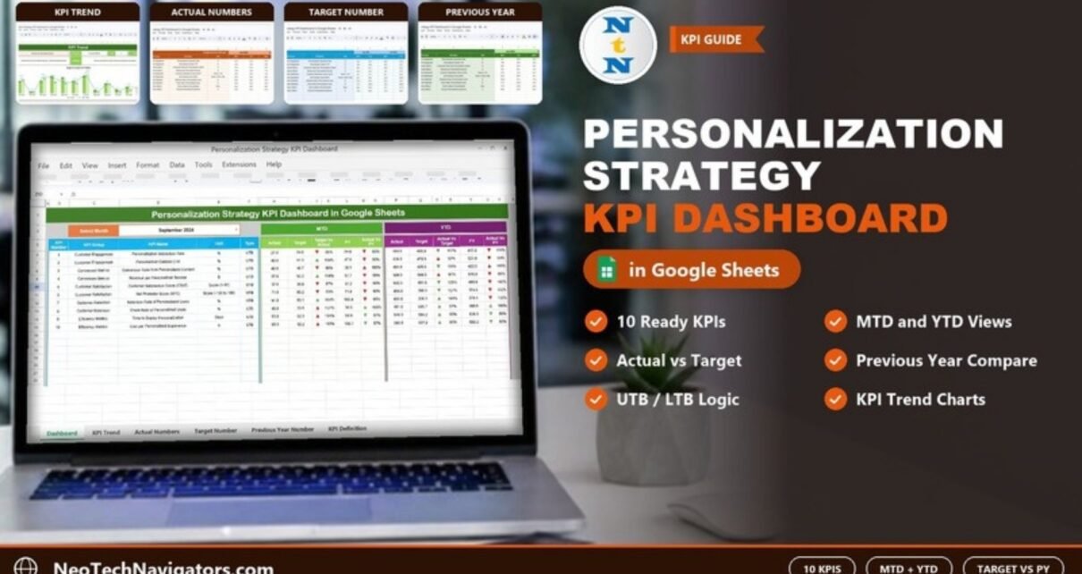
The Personalization Strategy KPI Dashboard in Google Sheets lets marketing and growth teams track whether their personalization work is paying off, month by month and year to date. It compares Actual figures against Target and Previous Year (PY) for ten ready-defined KPIs, from Personalization Interaction Rate and Personalized Content CTR to Churn Rate of Personalized Users and Cost per Personalized Experience.
It is built for personalization managers, CRM and e-commerce marketers, and agencies that report on personalization to clients. The file has six sheets: Dashboard, KPI Trend, Actual Numbers, Target Number, Previous Year Number and KPI Definition. You type in your monthly numbers and the Dashboard and trend charts calculate everything else.
Get the Personalization Strategy KPI Dashboard
What Problem Does This KPI Dashboard Solve?
Personalization touches many metrics at once: engagement, conversion, satisfaction, retention and cost. Teams often report these from different tools in different formats, without a consistent target or a comparison with last year. That makes it hard to say whether personalization is improving results or just adding cost.
This dashboard puts all ten KPIs on one page with the same structure: Actual, Target and PY for the selected month (MTD) and for the year so far (YTD). It also records whether a KPI should go up or down, so a rising churn rate is not mistaken for good news.
The 10 Personalization KPIs in the Template
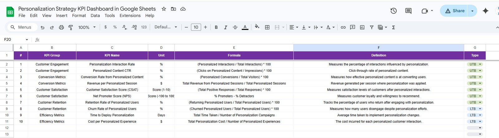
These KPIs, groups, units, formulas and types come straight from the template’s KPI Definition sheet. UTB means “Upper the Better” (higher is better) and LTB means “Lower the Better”.
| KPI | Group | Unit | What it measures | Formula | Better when |
|---|---|---|---|---|---|
| Personalization Interaction Rate | Customer Engagement | % | Share of interactions influenced by personalization | (Personalized Interactions / Total Interactions) × 100 | Higher (UTB) |
| Personalized Content CTR | Customer Engagement | % | Click-through rate of personalized content | (Clicks on Personalized Content / Impressions) × 100 | Higher (UTB) |
| Conversion Rate from Personalized Content | Conversion Metrics | % | How well personalized content converts users | (Personalized Conversions / Total Visitors) × 100 | Higher (UTB) |
| Revenue per Personalized Session | Conversion Metrics | $ | Revenue per session where personalization was applied | Total Revenue from Personalized Sessions / Total Personalized Sessions | Higher (UTB) |
| Customer Satisfaction Score (CSAT) | Customer Satisfaction | Score (1-10) | Satisfaction after personalized interactions | (Total Positive Responses / Total Responses) × 100 | Higher (UTB) |
| Net Promoter Score (NPS) | Customer Satisfaction | Score (-100 to 100) | Loyalty and willingness to recommend | % Promoters − % Detractors | Higher (UTB) |
| Retention Rate of Personalized Users | Customer Retention | % | Users who return after engaging with personalization | (Returning Personalized Users / Total Personalized Users) × 100 | Higher (UTB) |
| Churn Rate of Personalized Users | Customer Retention | % | Users who disengage despite personalization | (Churned Personalized Users / Total Personalized Users) × 100 | Lower (LTB) |
| Time to Deploy Personalization | Efficiency Metrics | Days | Average time to implement personalization changes | Total Time Taken / Number of Personalization Campaigns | Lower (LTB) |
| Cost per Personalized Experience | Efficiency Metrics | $ | Cost of each personalized customer interaction | Total Personalization Cost / Number of Personalized Experiences | Lower (LTB) |
You can rename, replace or add KPIs in the KPI Definition sheet, so the list can match your own personalization programme.
Personalization Strategy KPI Dashboard in Google Sheets: The 6 Worksheets
1. Dashboard
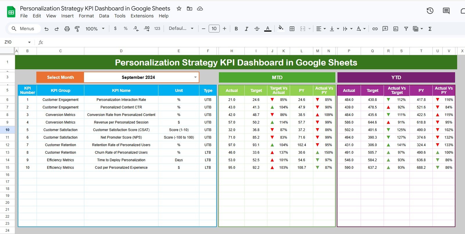
Pick a month from the Select Month drop-down at the top (September 2024 in the sample) and the whole page updates. For each KPI the left block lists KPI Number, KPI Group, KPI Name, Unit and Type. The MTD block shows Actual, Target, Target Vs Actual, PY and Actual Vs PY for that month, and the YTD block shows Actual, Target, Actual Vs Target, PY and Actual Vs PY for the year to date. Up and down arrows from conditional formatting flag each comparison.
Worked Example: Reading the Comparisons
Both comparison columns are simple ratios of the Actual figure:
Target Vs Actual = Actual ÷ Target
Actual Vs PY     = Actual ÷ PY
Using the September 2024 sample values:
- Personalization Interaction Rate (UTB): MTD Actual 21.0 against a Target of 24.6 gives 21.0 ÷ 24.6 = 85%. The KPI is behind target for the month.
- Revenue per Personalized Session (UTB): Actual 57.0 against Target 50.2 gives 114%, ahead of target.
- Churn Rate of Personalized Users (LTB): Actual 46.0 against Target 33.6 gives 137%. Because this KPI is Lower the Better, a figure above 100% is a bad result: churn is higher than planned.
Always read the Type column alongside the percentage. Above 100% is good for UTB KPIs and bad for LTB KPIs.
2. KPI Trend
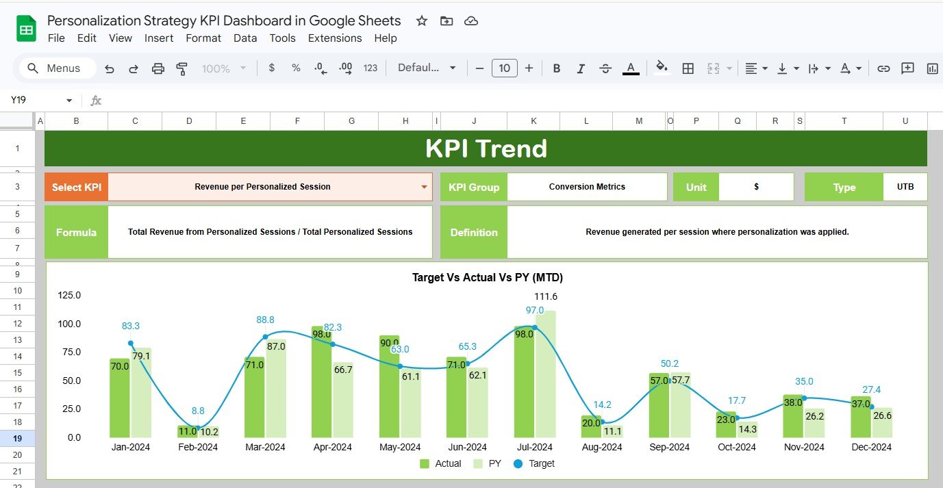
Choose a KPI in the Select KPI drop-down and the sheet shows its KPI Group, Unit, Type, Formula and Definition. Below that, a combined chart titled Target Vs Actual Vs PY (MTD) plots Actual and PY as columns with Target as a line for each month. The KPI Trend sheet also includes a YTD trend chart. In the screenshot, Revenue per Personalized Session is selected (Conversion Metrics, $, UTB).
3. Actual Numbers
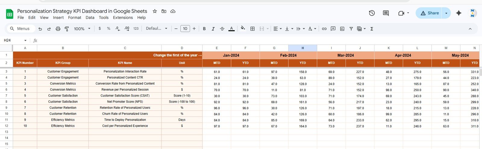
Enter the actual MTD and YTD value for each KPI under each month. The cell labelled Change the first of the year → holds the first month (Jan-2024 in the sample). Change it and the month headers move to match your financial year.
4. Target Number
This sheet has the same layout: one MTD and one YTD target per KPI per month. Setting both lets you plan a seasonal monthly target while still tracking the annual plan.
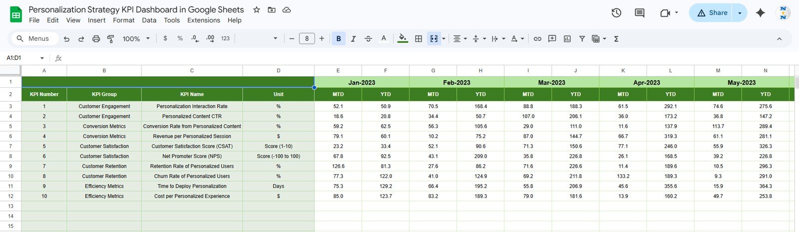
5. Previous Year Number
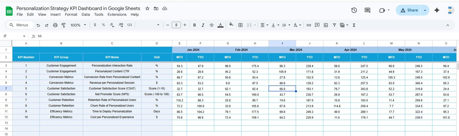
Enter last year’s MTD and YTD values here in the same format (the sample starts at Jan-2023). These feed the PY and Actual Vs PY columns on the Dashboard and the PY series in the trend charts.
6. KPI Definition
This is the setup sheet. Each row holds the KPI Group, KPI Name, Unit, Formula, Definition and Type (UTB or LTB from a drop-down). The Dashboard and KPI Trend sheets read their labels and logic from here.
How to Use It with Your Own Data
- Open the template from the link in your download and choose File → Make a copy to save it to your Google Drive.
- Review the KPI Definition sheet. Keep the ten KPIs or edit the names, units, formulas and UTB/LTB type to match what you measure.
- In Actual Numbers, set the first month of your financial year in the Change the first of the year cell.
- Fill in the Target Number and Previous Year Number sheets for each month, both MTD and YTD.
- Each month, add the new MTD and YTD actuals in Actual Numbers.
- On the Dashboard, pick the month from Select Month and review the MTD and YTD blocks.
- Open KPI Trend for any KPI that is off target and check whether the gap is new or has been building.
If you want to learn how KPI dashboards like this are built, the Pivot Tables & Dashboards course on NextGenTemplates Academy covers the reporting and dashboard skills behind them.
Real-World Use Cases
- E-commerce personalization team: track recommendation engagement, conversion from personalized content and revenue per personalized session each month, and use the YTD block to report progress against the annual plan.
- SaaS growth or CRM team: watch Retention Rate and Churn Rate of Personalized Users side by side to see whether onboarding or in-app personalization is keeping users active.
- Marketing agency: keep a separate copy per client, adjust the KPI Definition sheet for each one, and use the Dashboard as the core of the monthly report.
Template vs Other Ways to Track Personalization KPIs
| Need | Ad-hoc spreadsheet | This Google Sheets template | Marketing platform reports |
|---|---|---|---|
| MTD and YTD in one view | Build yourself | Ready-made | Depends on the tool |
| Target and Previous Year comparison | Manual formulas | Built in | Often limited |
| Higher-is-better vs lower-is-better logic | Manual | UTB / LTB per KPI | Rarely configurable |
| Custom KPI definitions | Yes | Yes (KPI Definition sheet) | Limited to the tool’s metrics |
| Automatic data import | No | No (manual entry) | Yes |
| Cost model | Free | One-time purchase | Usually part of a subscription |
Best Practices
- Agree on the KPI definitions with your team before entering data, so everyone measures CSAT, churn and cost in the same way.
- Set realistic targets from your own history. The Previous Year sheet is a good starting point.
- Enter actuals on the same working day each month so the Dashboard is ready for your monthly review.
- Read the Type column with every percentage, especially for LTB KPIs such as Churn Rate, Time to Deploy Personalization and Cost per Personalized Experience.
- Keep a dated copy at each quarter end (File → Make a copy) so you can look back at how targets changed.
Limitations: Who Should Not Use It
- It does not connect to analytics, CDP or email tools. All numbers are entered by hand, or pasted in from your own exports.
- It reports at monthly KPI level. It does not break results down by segment, channel or experiment.
- It shows performance but does not explain causes. You still need your analytics tools to understand why a KPI moved.
- Teams that need real-time monitoring or automated alerts will need a BI or marketing analytics platform.
Related Templates and Guides
The same dashboard is also available as the Personalization Strategy KPI Dashboard in Excel and the Personalization Strategy KPI Dashboard in Power BI.
For related metrics, see the Customer Engagement KPI Dashboard in Google Sheets, the Customer Retention KPI Dashboard in Google Sheets, the Email Marketing KPI Dashboard in Google Sheets and the NPS Dashboard in Google Sheets.
Frequently Asked Questions
Which KPIs come with the Personalization Strategy KPI Dashboard in Google Sheets?
Ten KPIs are set up: Personalization Interaction Rate, Personalized Content CTR, Conversion Rate from Personalized Content, Revenue per Personalized Session, CSAT, NPS, Retention Rate of Personalized Users, Churn Rate of Personalized Users, Time to Deploy Personalization and Cost per Personalized Experience.
Can I change or add KPIs?
Yes. Edit the KPI Definition sheet to change names, groups, units, formulas, definitions or the UTB/LTB type, and add matching rows to the Actual, Target and Previous Year sheets.
What do UTB and LTB mean?
UTB (Upper the Better) means a higher value is good, as with CTR or retention. LTB (Lower the Better) means a lower value is good, as with churn rate, time to deploy or cost per experience.
How is “Target Vs Actual” calculated?
It is Actual divided by Target. For example, an MTD Actual of 21.0 against a Target of 24.6 shows 85%. Actual Vs PY works the same way using the previous year’s value.
Does it support a financial year that does not start in January?
Yes. Set the first month in the “Change the first of the year” cell on the Actual Numbers sheet and the month headers follow it.
Does the dashboard pull data automatically?
No. You enter or paste monthly values into the Actual, Target and Previous Year sheets. The Dashboard and KPI Trend sheets then calculate everything else.
Wrapping Up
The Personalization Strategy KPI Dashboard in Google Sheets gives you a clear monthly scorecard for personalization: ten defined KPIs, MTD and YTD views, target and prior-year comparisons, and a trend view for any single KPI. Set up your KPI definitions and targets once, add actuals each month, and use the Dashboard as the agenda for your personalization review.
Get the Personalization Strategy KPI Dashboard in Google Sheets
📅 Last updated: October 2026