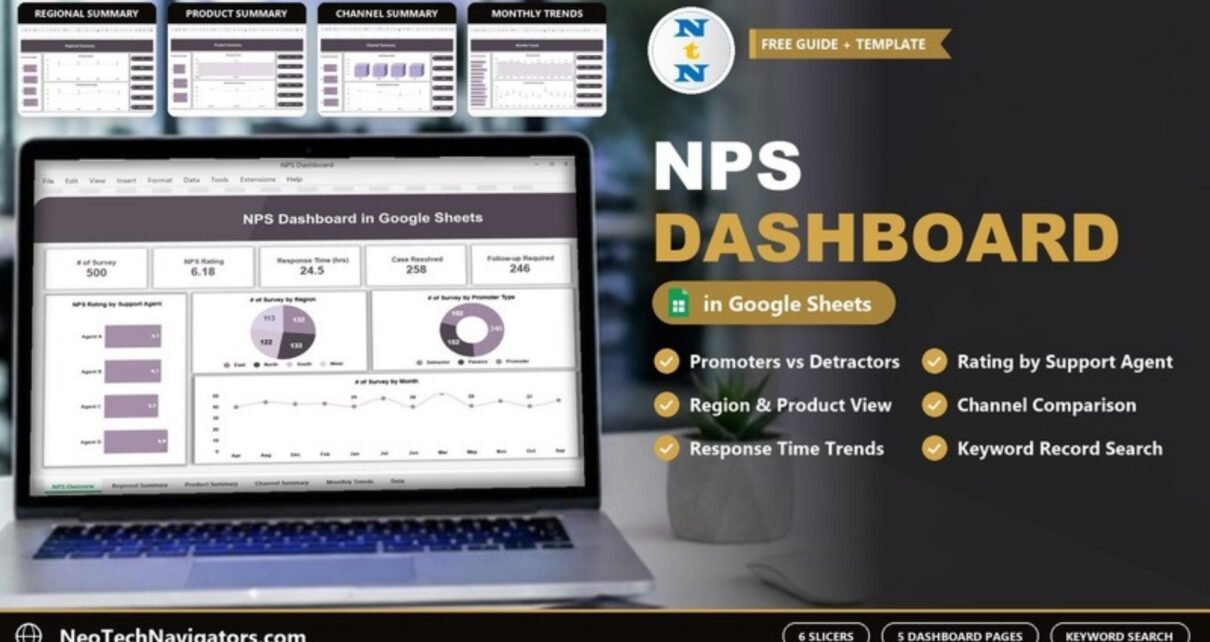
An NPS Dashboard in Google Sheets takes raw Net Promoter Score survey responses and shows what they mean: how many customers are promoters, passives or detractors, how ratings differ by support agent, region, product and channel, how fast the team responds, and how many cases still need a follow-up. This guide walks through a ready-made NPS dashboard page by page, using the sample numbers in the screenshots.
It is written for customer experience teams, support managers, product managers and small businesses that collect NPS or satisfaction surveys and want a clear view without a BI tool. The template has five dashboard pages (NPS Overview, Regional Summary, Product Summary, Channel Summary and Monthly Trends) plus a detailed data and search sheet, and every dashboard page shares six slicers: Year, Month, Region, Product, Channel and Support Agent.
🎥 Watch the Video Tutorial
Get the NPS Dashboard in Google Sheets
A Quick NPS Refresher
Net Promoter Score comes from one question: “How likely are you to recommend us to a friend or colleague?” on a 0–10 scale. Respondents are grouped as:
- Promoters (9–10): loyal and likely to recommend.
- Passives (7–8): satisfied but not enthusiastic.
- Detractors (0–6): unhappy and at risk of leaving or complaining.
The classic NPS is the percentage of promoters minus the percentage of detractors, giving a score from −100 to +100. This dashboard shows both the promoter/passive/detractor split and the average rating (on the 0–10 scale), so it helps to know the difference, as explained below.
Metrics in the NPS Dashboard in Google Sheets
| Metric | What it measures | Sample value | Better when |
|---|---|---|---|
| # of Survey | Survey responses in the current filter | 500 | – |
| NPS Rating | Average 0–10 rating across responses | 6.18 | Higher |
| Response Time (hrs) | Average hours to respond to the customer | 24.5 | Lower |
| Case Resolved | Count of cases marked resolved | 258 | Higher |
| Follow-up Required | Count of cases flagged for follow-up | 246 | Lower |
| Promoter / Passive / Detractor | Survey count by promoter type | 246 / 152 / 102 | More promoters, fewer detractors |
Calculating the classic NPS from the sample
The dashboard’s “NPS Rating” card shows the average rating (6.18). If you also want the classic −100 to +100 score, you can calculate it from the promoter type counts on the Overview page:
NPS = (Promoters − Detractors) / Total surveys × 100
    = (246 − 102) / 500 × 100
    = 28.8
In Google Sheets, if your promoter type labels are in a column named, say, Promoter_Type, the formula is:
=(COUNTIF(Promoter_Type,"Promoter")-COUNTIF(Promoter_Type,"Detractor"))/COUNTA(Promoter_Type)*100Both numbers are useful: the average rating moves smoothly and is good for comparing agents or channels, while the classic NPS is the figure most companies report and benchmark.
Page 1: NPS Overview
The Overview page puts the five KPI cards at the top: # of Survey (500), NPS Rating (6.18), Response Time (hrs) (24.5), Case Resolved (258) and Follow-up Required (246). The six slicers sit in a panel on the right. Four charts follow:
- NPS Rating by Support Agent – Agent A 6.1, Agent B 6.1, Agent C 5.7, Agent D 6.8.
- # of Survey by Region – East, North, South and West, fairly balanced at 113 to 133 surveys each.
- # of Survey by Promoter Type – 246 Promoters, 152 Passives, 102 Detractors.
- # of Survey by Month – roughly 37 to 50 surveys per month across the year.
The first insight jumps out: Agent D’s average rating (6.8) is more than a full point above Agent C (5.7). That is a coaching conversation, and a reason to look at Agent C’s comments in the search sheet.

Page 2: Regional Summary
This page compares the four regions on three measures:
- Response Time (hrs) by Region – East 24.0, North 25.2, South 22.8, West 26.0.
- NPS Rating by Region – East 6.1, North 6.2, South 6.4, West 6.0.
- Case Resolved Count by Region – East 66, North 60, West 61, with South the highest.
The pattern in the sample is a useful one: South has the fastest response time and the best rating, while West has the slowest response and the lowest rating. Faster responses tend to go with happier customers.

Page 3: Product Summary
The Product Summary page asks whether satisfaction depends on what the customer bought:
- Response Time (hrs) by Product – Product A 21.9, Product B 25.8, Product C 25.9.
- NPS Rating by Product – Product A 6.1, Product B 6.3, Product C 6.1.
- Case Resolved Count by Product – Product B has the fewest resolved cases (78).
Interesting detail: Product B has a slower response time and fewer resolved cases, yet the highest rating, so product quality may be offsetting slower support. That is exactly the kind of question to test with the Product slicer and the comments.

Page 4: Channel Summary
Customers reach support through Email, In-App, Phone and SMS. This page compares them:
- Response Time (hrs) by Channel – Email 23.0, In-App 24.6, Phone 24.3, SMS 25.9.
- NPS Rating by Channel – Email 6.2, In-App 6.1, Phone 6.3, SMS 6.2.
- Case Resolved Count by Channel – Phone 53 and SMS 63, with Email the highest.
Phone has the best rating but the fewest resolved cases in the sample, which suggests phone contacts may be more complex. SMS is the slowest channel to respond.

Page 5: Monthly Trends
The last dashboard page tracks the same three measures by month:
- Response Time (hrs) by Month – from 20.8 hours in July to 27.3 hours in November.
- NPS Rating by Month – ranges roughly from 5.7 to about 6.8 through the year.
- Case Resolved Count by Month – peaks at 32 in March.
In the sample, the months on this page are sorted alphabetically (Apr, Aug, Dec, Feb…) rather than in calendar order. When you load your own data, sort the month field in calendar order so the trend reads naturally.

The Detailed Data & Search Sheet
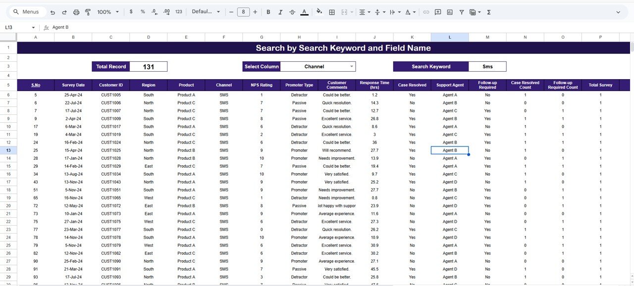
Behind the dashboard is a sheet titled Search by Search Keyword and Field Name. Pick a field in the Select Column dropdown, type a word in Search Keyword, and the sheet lists every matching survey with a Total Record count at the top. In the screenshot, Select Column = Channel and Search Keyword = Sms returns 131 records.
Each record shows these columns: S.No, Survey Date, Customer ID, Region, Product, Channel, NPS Rating, Promoter Type, Customer Comments, Response Time (hrs), Case Resolved, Support Agent, Follow-up Required, Case Resolved Count, Follow-up Required Count and Total Survey. This is where a manager goes after spotting a problem on a chart, for example to search Support Agent = Agent C and read the customer comments behind that agent’s lower rating.
How to Use It With Your Own Survey Data
- Make a copy of the file (File > Make a copy).
- Export your survey responses (from Google Forms, your helpdesk or survey tool) to a sheet.
- Open the template’s data sheet, note its column headers, and arrange your export in the same order. The record layout shown on the search sheet is a good guide: Survey Date, Customer ID, Region, Product, Channel, NPS Rating, Promoter Type, Customer Comments, Response Time (hrs), Case Resolved, Support Agent and Follow-up Required.
- If your export only has the 0–10 score, add the promoter type with a formula such as
=IF(G2>=9,"Promoter",IF(G2>=7,"Passive","Detractor"))(G2 is the NPS Rating cell in the layout above; adjust it to your rating column). - Paste the rows into the data sheet, keeping the header row unchanged.
- Check that # of Survey on the Overview equals your number of responses, then test each slicer.
- Calculate the classic NPS with the formula above if you report it externally.
Real-World Use Cases
- Weekly support review: the support manager filters by Support Agent and compares ratings and response times, then reads detractor comments for the lowest-rated agent.
- Product feedback loop: a product manager uses the Product slicer to see whether a new release changed ratings or the number of follow-ups.
- Channel strategy: a CX lead uses the Channel Summary to decide whether to staff SMS better, since it is the slowest channel to respond.
Best Practices
- Keep the survey question identical every time so ratings stay comparable.
- Close the loop with detractors within a few days. The Follow-up Required card is your to-do list.
- Look at response time and rating together. In the sample, the slowest region also has the lowest rating.
- Do not judge an agent on a handful of surveys. Check the survey count before drawing conclusions.
- Update weekly and reset slicers to “All” before reading headline numbers.
Limitations
The dashboard reports on survey data you paste in; it does not send surveys or collect responses itself, and it does not analyse comment text automatically. The headline “NPS Rating” is an average 0–10 rating rather than the classic −100 to +100 score, so calculate the classic NPS separately if that is what your company reports. Very large survey volumes may feel slow in Google Sheets; at that point the Power BI version is a better fit.
Related Guides and Templates
For a broader satisfaction view, see the Customer Satisfaction Dashboard in Google Sheets and the Customer Feedback Analysis Dashboard in Google Sheets. Support teams may also like the Customer Support Dashboard in Google Sheets and the Call Center KPI Dashboard in Google Sheets, and to log responses before they reach the dashboard there is the Customer Satisfaction Survey Tracker in Google Sheets.
The same dashboard is available as an NPS Dashboard in Excel and an NPS Dashboard in Power BI.
If you want to build survey dashboards like this from scratch, the Pivot Tables & Dashboards course on NextGenTemplates Academy covers summarising responses and building the charts.
Frequently Asked Questions
What does the NPS Dashboard in Google Sheets show?
Survey count, average NPS rating, response time, cases resolved, follow-ups required and the promoter/passive/detractor split, broken down by support agent, region, product, channel and month across five pages, plus a keyword search sheet for individual records.
Is the “NPS Rating” card the same as the Net Promoter Score?
No. The card shows the average 0–10 rating (6.18 in the sample). The classic NPS is % promoters minus % detractors; with 246 promoters and 102 detractors out of 500 it is 28.8.
How do I calculate NPS in Google Sheets?
Use =(COUNTIF(range,"Promoter")-COUNTIF(range,"Detractor"))/COUNTA(range)*100 on your promoter type column, or classify the 0–10 score first with an IF formula.
Can I filter by agent, region or channel?
Yes. Every dashboard page has slicers for Year, Month, Region, Product, Channel and Support Agent, and the search sheet lets you look up records by any column.
Can I connect it to Google Forms?
You can copy or link your Google Forms response sheet into the data sheet, as long as the columns match the template’s layout. The dashboard does not create the form for you.
What is a good NPS?
Any score above zero means more promoters than detractors. Benchmarks vary widely by industry, so the most useful comparison is your own trend over time.
Wrapping Up
An NPS Dashboard in Google Sheets turns a pile of survey responses into a clear story: who your promoters and detractors are, which agents, regions, products and channels drive the score, and how response time affects it. Load your latest survey export, check the Overview, and spend your next team meeting on the detractor comments rather than on building the report.
Get the NPS Dashboard in Google Sheets
📅 Last updated: October 2026