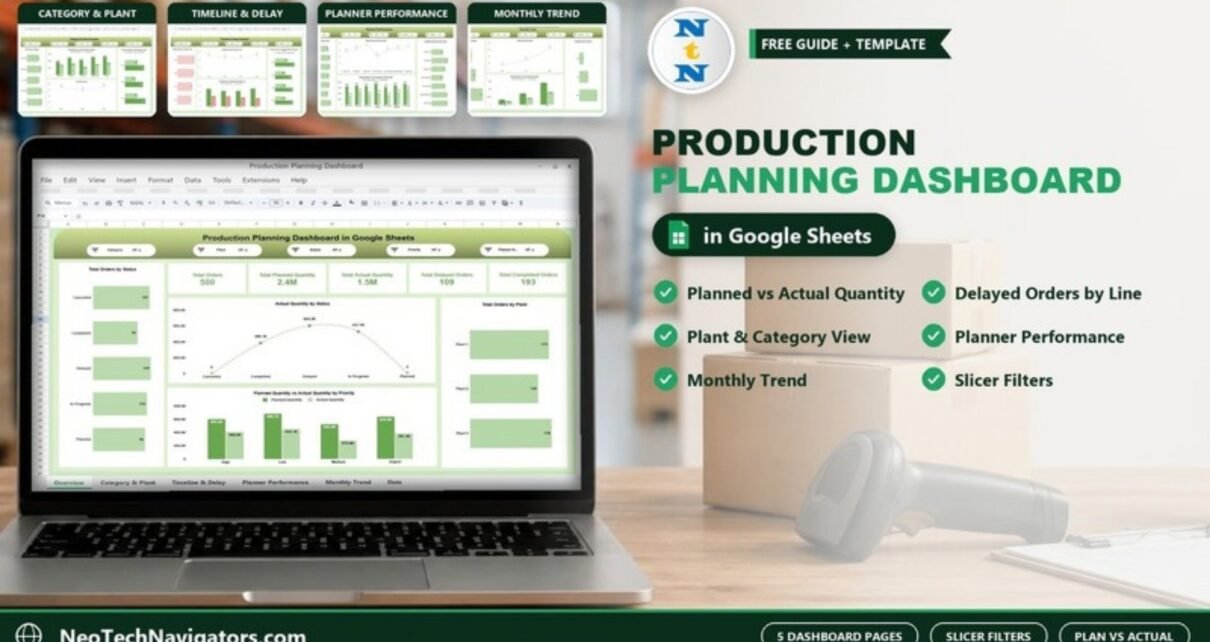
A Production Planning Dashboard in Google Sheets gives a production manager one screen that answers the daily questions: how many orders are open, how much was planned versus actually produced, where orders are getting delayed, and which plant, production line or planner needs attention. This guide walks through the ready-made dashboard page by page, using the sample data shown in the screenshots.
It is written for production planners, plant managers, operations heads and small manufacturers who already keep order data in a spreadsheet and want a visual layer on top of it without paying for a BI tool. The template has five dashboard pages (Overview, Category & Plant Analysis, Timeline & Delay Analysis, Planner Performance and Monthly Trend) plus a data sheet, and each page has a slicer bar for quick filtering.
🎥 Watch the Video Tutorial
Get the Production Planning Dashboard
What Problem Does a Production Planning Dashboard in Google Sheets Solve?
Most production teams track work orders in a long sheet: order ID, category, plant, line, planner, priority, status, planned quantity and actual quantity. The data is there, but nobody can see the pattern. Is Plant 2 behind? Are urgent orders actually getting priority? Which planner is carrying the most delayed orders?
The dashboard turns that order list into summary cards and charts that update when you change a filter. Instead of building pivot tables every Monday, you open the file, pick a plant or a priority from the slicer, and read the answer.
- See the gap between planned quantity and actual quantity at every level: priority, category, plant, line, planner and month.
- Spot where delayed orders pile up before they turn into missed deliveries.
- Compare planner workload and output fairly, using the same data for everyone.
- Share one live file with the team instead of emailing versions around.
The Slicers at the Top of Each Page
Each dashboard page has its own row of five slicers at the top. Across the pages they cover these fields:
| Slicer | Values in the sample data |
|---|---|
| Category | Automotive, Electronics, Furniture, Pharmaceuticals, Textiles |
| Plant | Plant 1, Plant 2, Plant 3 |
| Status | Planned, In Progress, Completed, Delayed, Cancelled |
| Priority | High, Medium, Low, Urgent |
| Planner Name | Seven planners (Allison Cline, Brian Melton, Gregory Gray, Leslie Christensen, Lorraine Bridges, Michelle Maldonado, Thomas Pugh) |
Four pages use exactly this set. On the Planner Performance page, the slicer bar shows Category, Plant, Status and two Planner Name slicers instead of a Priority slicer. Production lines (Line A to Line D) and months are used as chart dimensions rather than slicers.
Page 1: Overview
The Overview page is the one you will open most often. Five KPI cards run across the top. In the sample data they read:
- Total Orders: 500
- Total Planned Quantity: 2.4M
- Total Actual Quantity: 1.5M
- Total Delayed Orders: 109
- Total Completed Orders: 193
Below the cards are four charts:
- Total Orders by Status – Cancelled 107, Completed 84, Delayed 109, In Progress 102, Planned 98.
- Actual Quantity by Status – a line chart showing where the produced quantity sits (for example 604.3K on Delayed orders and 527.9K on In Progress).
- Planned Quantity vs Actual Quantity by Priority – clustered columns for High, Low, Medium and Urgent.
- Total Orders by Plant – Plant 1 has 173 orders, Plant 2 has 149 and Plant 3 has 178.
The quick read from the sample: actual output is roughly 1.5M against 2.4M planned, so about 63% of planned quantity has been produced, and delayed orders (109) outnumber any other single status.

Page 2: Category & Plant Analysis
This page answers “which product families and which plants are falling behind plan?” It has four charts:
- Total Orders by Category – Automotive 88, Electronics 104, Furniture 89, Pharmaceuticals 108, Textiles 111.
- Planned Quantity vs Actual Quantity by Category – for example Textiles at 549.6K planned against 350.0K actual, and Furniture at 448.3K planned against 235.6K actual.
- Total Order by Plant – a line chart of the 173 / 149 / 178 split.
- Planned Quantity vs Actual Quantity by Plant – Plant 1 810.2K vs 539.3K, Plant 2 762.6K vs 448.5K, Plant 3 867.1K vs 529.5K.
Furniture has the weakest planned-to-actual ratio in the sample (about 53%), which is exactly the kind of signal this page is built to surface.

Page 3: Timeline & Delay Analysis
Delays are where cost and customer complaints come from, so this page breaks them down by production line:
- Delayed Orders by Production Line – Line A 30, Line B 29, Line C 26, Line D 24.
- Completed order by Production Line – Line A 51, Line B 45, Line C 45, Line D 52.
- Completed order vs Delayed by Production Line – the two series side by side.
- Planned Quantity vs Actual Quantity by Production Line – for example Line A 661.1K planned vs 437.1K actual.
In the sample, Line A has the most delayed orders (30) while Line D has the most completed (52), so Line A is the first place to look. Filtering by Priority = Urgent on this page is a good way to check whether urgent work is the part getting delayed.

Page 4: Planner Performance
This page puts the seven planners side by side:
- Total Orders by Planner Name – from 62 (Michelle Maldonado) to 81 (Thomas Pugh).
- Delayed Orders by Planner Name – a line chart; Leslie Christensen has the fewest delays at 11.
- Completed Orders by Planner Name – Brian Melton leads with 32.
- Planned Quantity vs Actual Quantity by Planner Name – for example Thomas Pugh at 376.1K planned vs 287.5K actual.
Use it to balance workload, not to rank people on a single number. A planner with more delays may also be handling the hardest categories, so check with the Category slicer before drawing conclusions.

Page 5: Monthly Trend
The last page shows how the numbers move over time. The sample covers April, May and June:
- Total Orders by Month – Apr 68, May 287, Jun 145.
- Delayed Orders by Month – Apr 14, May 65, Jun 30.
- Completed Orders by Month – Apr 27, May 111, Jun 55.
- Planned Quantity vs Actual Quantity by Month – May has the largest gap, 1.4M planned against 825.8K actual.
One detail to know: in the sample the month axis on these charts is sorted alphabetically (Apr, Jun, May). When you load your own data, check the sort order of the month field so the trend reads left to right in calendar order.

Useful Ratios You Can Read From the Dashboard
The template shows counts and quantities. If you want a few ratios for a weekly review, you can calculate them from the numbers on screen (or add them to a helper cell). These are not built-in cards, just simple arithmetic on the values the dashboard already shows:
| Ratio | How to calculate | Sample result | Better when |
|---|---|---|---|
| Plan attainment | Total Actual Quantity ÷ Total Planned Quantity | 1.5M ÷ 2.4M ≈ 63% | Higher |
| Delayed share of orders | Total Delayed Orders ÷ Total Orders | 109 ÷ 500 ≈ 22% | Lower |
| Line delay share | Delayed orders on a line ÷ (Completed + Delayed on that line) | Line A: 30 ÷ 81 ≈ 37% | Lower |
| Plant attainment | Actual ÷ Planned for one plant | Plant 1: 539.3K ÷ 810.2K ≈ 67% | Higher |
If you add a helper cell for plan attainment, a simple formula such as this works once you point it at your total cells:
=IFERROR(Actual_Total / Planned_Total, 0)How to Use It With Your Own Data
- Make your own copy of the file in Google Drive (File > Make a copy) so you are not editing the master.
- Open the data sheet and look at the column headers. Keep the headers exactly as they are; the charts and slicers read from them.
- Delete the sample rows and paste your production orders in the same column order: one row per order.
- Use the same spelling for repeat values (status, priority, plant, line, planner). “In Progress” and “In progress” will show up as two separate bars.
- Go back to the Overview page and check that the Total Orders card matches the number of rows you pasted.
- Try each slicer once to confirm the charts respond, then share the file with your team (Share button, top right) with view or edit access as needed.
Real-World Use Cases
- Daily production meeting: a plant manager filters by Plant = Plant 2 and Status = Delayed, then walks the team through the Timeline & Delay page line by line.
- Monthly planning review: an operations head uses the Monthly Trend page to show leadership that May volume was roughly four times April’s and delays rose with it, supporting a request for extra shift capacity.
- Workload balancing: a planning lead checks the Planner Performance page before assigning new orders, giving more work to planners with lower order counts and fewer delays.
Best Practices
- Update daily, not weekly. A delay you see on day one is easier to recover than one you discover at month-end.
- Use a fixed list for status and priority. Add data validation dropdowns (Data > Data validation) to those columns.
- Always reset slicers to “All” before reading the headline cards, so you are not quoting a filtered number by mistake.
- Protect the dashboard tabs (Data > Protect sheets and ranges) so only the data sheet is editable.
- Review the delay page every week and write down the root cause for each delayed urgent order.
Who Should Not Use This Template
Be realistic about what a spreadsheet dashboard does. It is a reporting layer, not a scheduling engine. It will not sequence jobs, calculate machine capacity, run MRP or create a Gantt schedule. If you need finite capacity scheduling or live machine data, you need an MES or ERP module. Very large datasets (tens of thousands of rows updated many times a day) will also feel slow in Google Sheets; at that point the Power BI version is the better fit.
Related Guides and Templates
If you want a broader factory view, see the Manufacturing Dashboard in Google Sheets. To capture shift output before it reaches the dashboard, the Daily Production Output Tracker in Google Sheets is a good companion. Teams that outsource production can compare with the Contract Manufacturing Dashboard in Google Sheets, and for target-based tracking there is the Manufacturing KPI Dashboard in Google Sheets.
Prefer another tool? The same topic is available as a Production Planning Dashboard in Excel and a Production Planning Dashboard in Power BI.
If you want to build dashboards like this yourself, the Pivot Tables & Dashboards course on NextGenTemplates Academy covers summarising data and laying out charts step by step.
Frequently Asked Questions
What does a Production Planning Dashboard in Google Sheets track?
This one tracks total orders, planned quantity, actual quantity, delayed orders and completed orders, broken down by status, priority, category, plant, production line, planner and month across five dashboard pages.
Can I filter the dashboard by plant or planner?
Yes. The pages have slicers for Category, Plant, Status, Priority and Planner Name (the Planner Performance page has no Priority slicer). Changing a slicer updates the cards and charts on that page.
Do I need to write formulas to use it?
No. You paste your order data into the data sheet using the same column headers, and the dashboard pages update. Formulas are only needed if you want to add your own extra ratios.
Can several people use the dashboard at the same time?
Yes. Because it is a Google Sheets file, you can share it with your team and everyone sees the same updated numbers. Give edit access only to the people who maintain the data.
Is it suitable for a small manufacturer?
Yes. It works well for small and mid-sized plants that already track orders in a spreadsheet. Very high-volume operations with live machine data will be better served by an MES or a Power BI model.
Can I add more plants, lines or planners?
Yes. Add rows with the new names in the data sheet and they appear in the charts and slicer lists. Check that chart ranges cover the new rows after a large paste.
Wrapping Up
A Production Planning Dashboard in Google Sheets will not plan your production for you, but it makes the plan-versus-actual picture impossible to ignore. With five pages covering the overview, categories and plants, line-level delays, planner workload and monthly trend, a production team can find the problem area in a few clicks and spend the meeting fixing it instead of building reports. Start by loading one month of your own orders and checking the delay page.
Get the Production Planning Dashboard in Google Sheets
📅 Last updated: October 2026