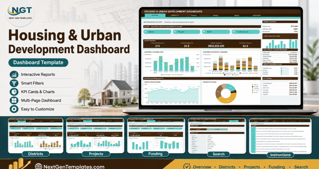
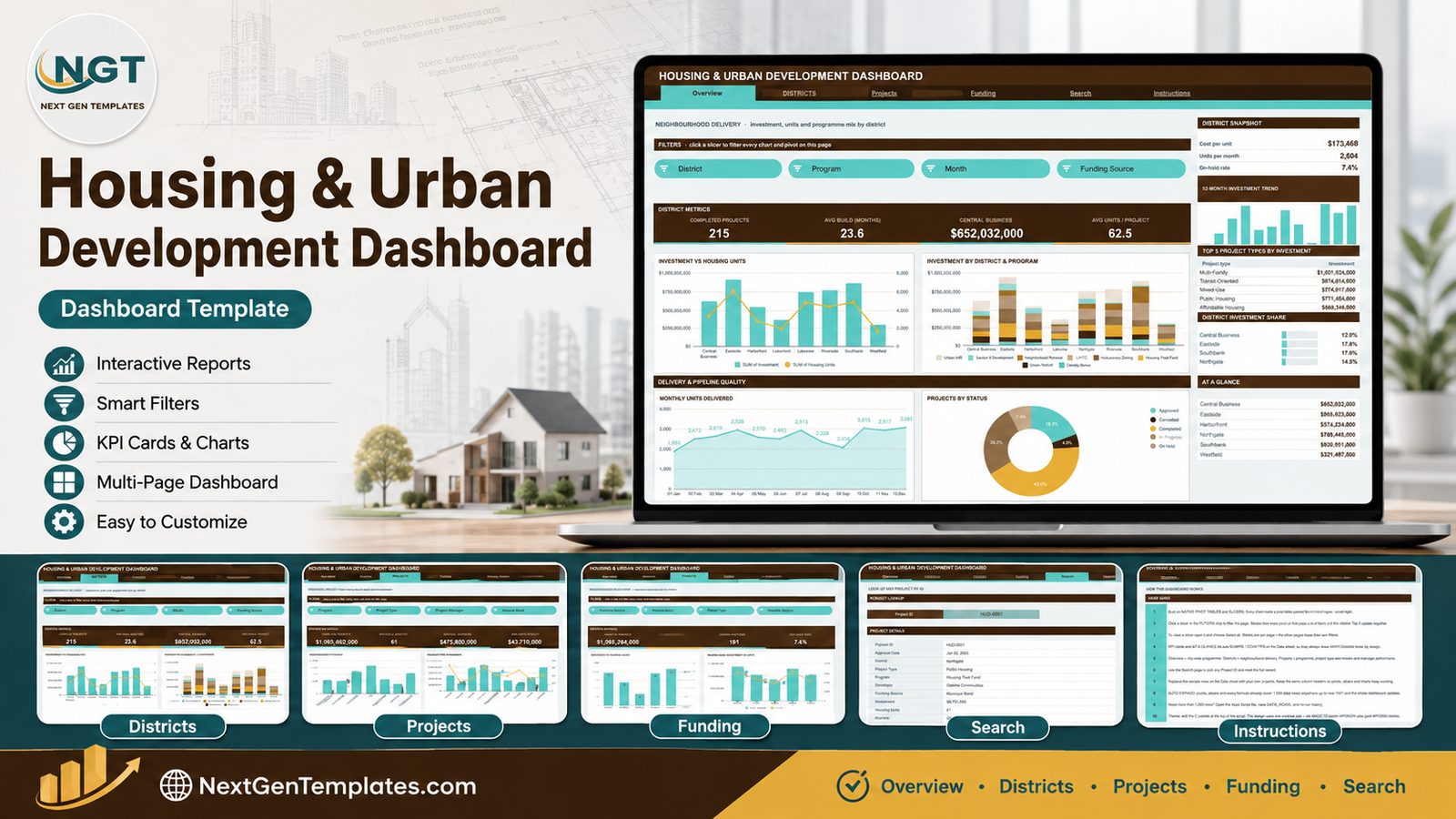
The Housing & Urban Development Dashboard in Google Sheets puts 16 KPI cards, 16 slicer-driven charts and a record-level project lookup across 6 linked tabs. The sample programme that ships with it covers 500 projects, $5,419,472,000 of investment and 31,242 housing units at an average cost of $173,468 per unit, spread over 8 districts, 9 project types, 8 housing programs and 6 funding sources.
Housing teams rarely lack data. They lack one place where district delivery, programme spend, funding mix and affordability band can be read together, in a file everyone on the committee can open. Most offices end up with a project register in one spreadsheet, a funding tracker in another, and a slide deck rebuilt by hand every quarter. This Google Sheets housing dashboard collapses all of that into a single shared link that refreshes the moment the register changes.
Get the Housing & Urban Development Dashboard in Google Sheets
Key Features of the Housing & Urban Development Dashboard
- Native pivot tables behind every chart. Each chart reads a pivot table parked to the right of its page, past a wide spacer column. There is no SUMPRODUCT chain to slow the file down, and you can scroll right to inspect the exact numbers behind any visual.
- Sixteen native slicers, four per analysis page. Overview filters on Month, District, Project Type and Status. Districts filters on District, Program, Month and Funding Source. Projects filters on Program, Project Type, Project Manager and Income Band. Funding filters on Funding Source, Income Band, Permit Type and Month.
- KPI cards that stay programme-wide on purpose. The four cards and the At a Glance list on each page use SUMIFS and COUNTIFS against the Data sheet, so they always report the full picture while the charts and Top 5 panels follow your slicers.
- A 1,000-row register out of the box. Pivots, slicers and formulas already span row 1001, so you can paste your own projects with no range edits at all.
- A dedicated Search tab that returns all 16 stored fields for a single Project ID.
- One-block theming. The dashboard is generated by an Apps Script whose colour palette lives in a single block at the top of the file.
If you have used slicers in Google Sheets before, the interaction will feel familiar; if you have not, the Instructions tab walks through it in ten short steps.
Dashboard Pages Explanation
Page 1: Overview – City-Wide Housing Programme
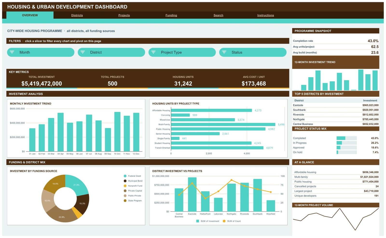
The programme-level summary. KPI cards report Total Investment ($5,419,472,000), Total Projects (500), Housing Units (31,242) and Avg Cost / Unit ($173,468). The four charts are Monthly Investment Trend, Housing Units by Project Type, Investment by Funding Source and District Investment vs Projects. The right rail holds a Programme Snapshot (43.0% completion rate, 62.5 average units per project, 23.6 month average build), a 12-Month Investment Trend sparkline, Top 5 Districts by Investment led by Eastside at $965,023,000, a Project Status Mix bar set and an At a Glance list that surfaces 24 cancelled projects and 191 unique developers.
Page 2: Districts – Neighbourhood Delivery
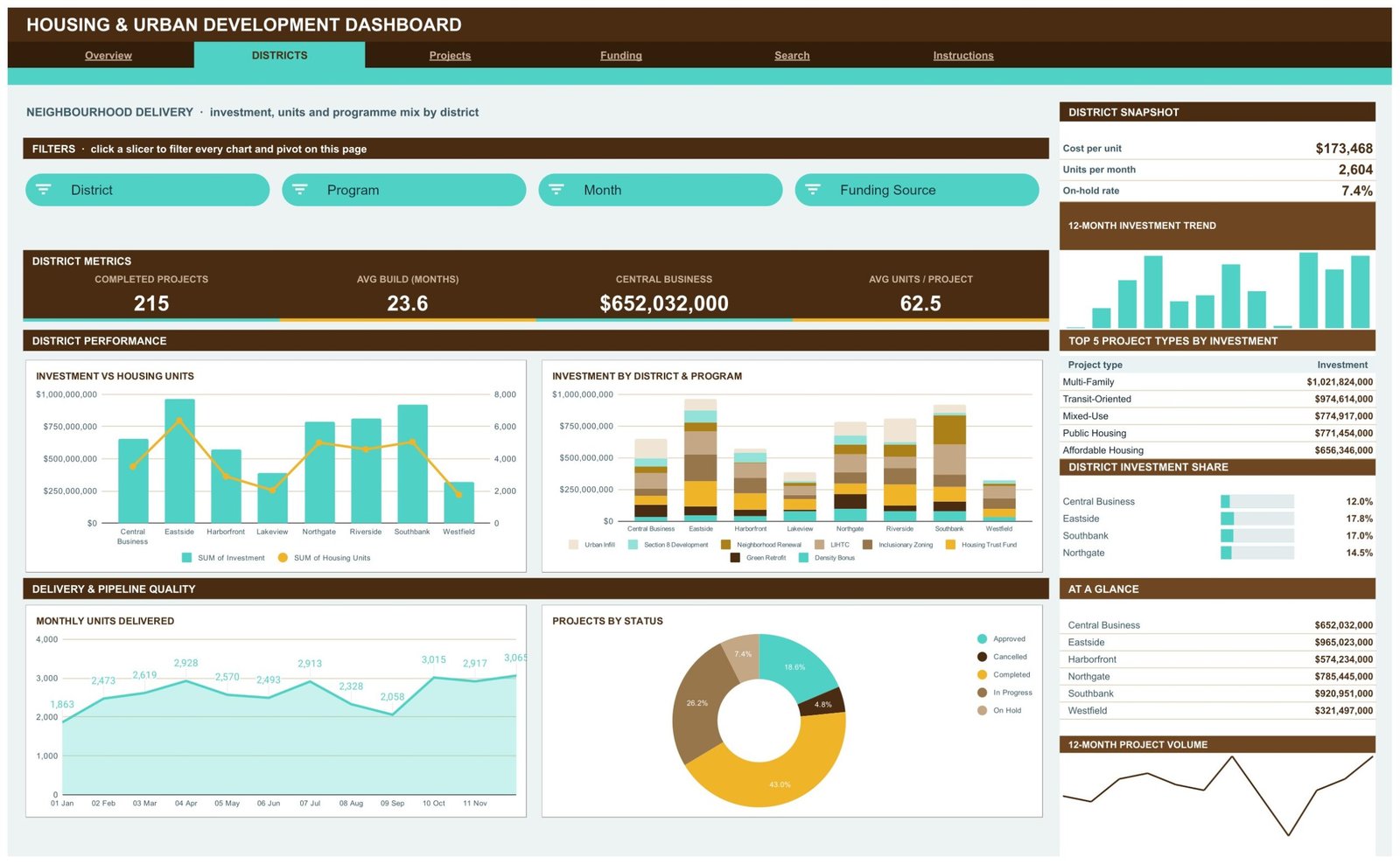
Where the money actually landed. KPI cards show Completed Projects (215), Avg Build in Months (23.6), Central Business investment ($652,032,000) and Avg Units per Project (62.5). Charts are Investment vs Housing Units, Investment by District & Program, Monthly Units Delivered and Projects by Status. The rail carries a District Snapshot with cost per unit and a 7.4% on-hold rate, Top 5 Project Types by Investment with Multi-Family at $1,021,824,000, and a District Investment Share bar set where Eastside takes 17.8% and Southbank 17.0%.
Page 3: Projects – Programme, Project Type and Manager Performance
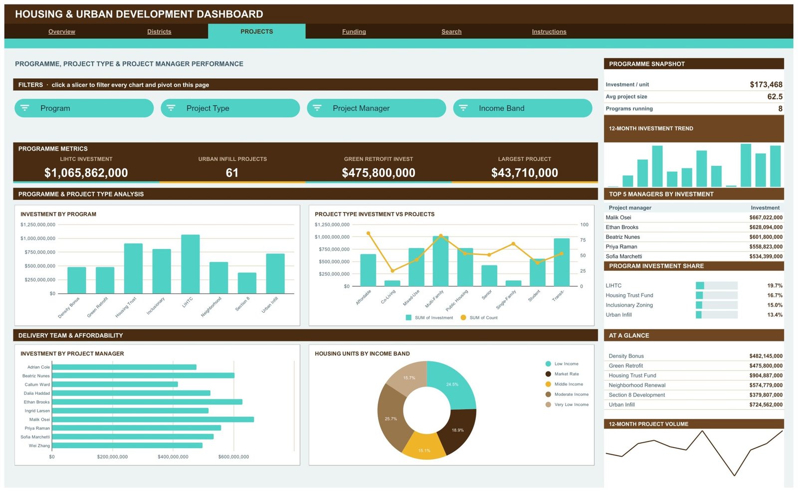
Delivery accountability. KPI cards show LIHTC Investment ($1,065,862,000), Urban Infill Projects (61), Green Retrofit Investment ($475,800,000) and Largest Project ($43,710,000). Charts are Investment by Program, Project Type Investment vs Projects, Investment by Project Manager across ten named managers, and Housing Units by Income Band. The rail ranks the Top 5 Managers by Investment, with Malik Osei at $667,022,000, and shows a Program Investment Share where LIHTC holds 19.7% and the Housing Trust Fund 16.7%.
Page 4: Funding – Sources, Affordability Bands and Permit Mix
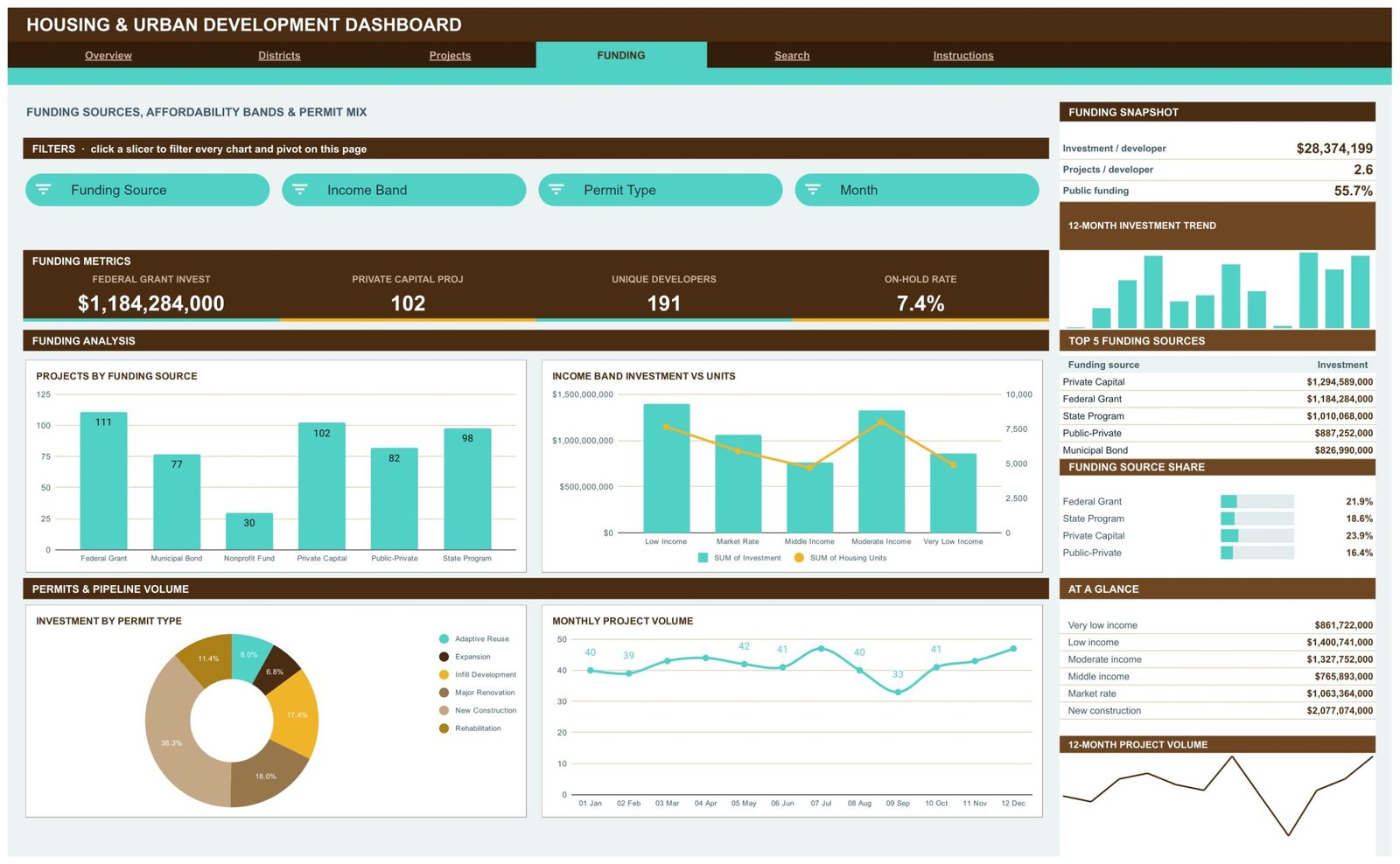
The capital stack. KPI cards show Federal Grant Investment ($1,184,284,000), Private Capital Projects (102), Unique Developers (191) and On-Hold Rate (7.4%). Charts are Projects by Funding Source, Income Band Investment vs Units, Investment by Permit Type and Monthly Project Volume. The rail reports $28,374,199 of investment per developer, 2.6 projects per developer, and a 55.7% public funding share, alongside Top 5 Funding Sources led by Private Capital at $1,294,589,000.
Page 5: Search – Look Up Any Project by ID
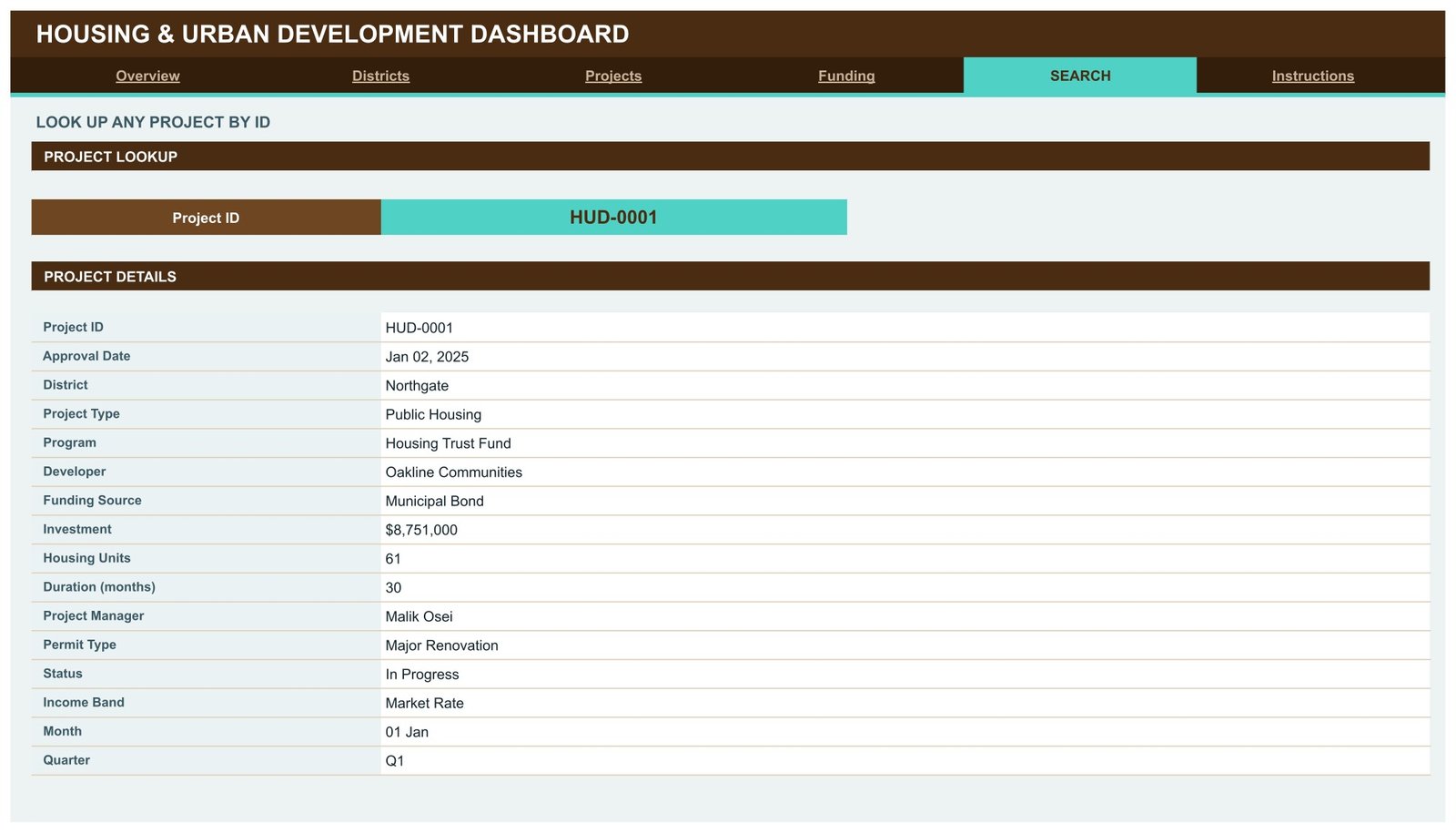
Enter a Project ID such as HUD-0001 and the Project Details panel returns the full record: Approval Date, District, Project Type, Program, Developer, Funding Source, Investment, Housing Units, Duration in months, Project Manager, Permit Type, Status, Income Band, Month and Quarter. It answers the single most common question in a housing review meeting without anyone scrolling the raw register.
Page 6: Instructions – How This Dashboard Works
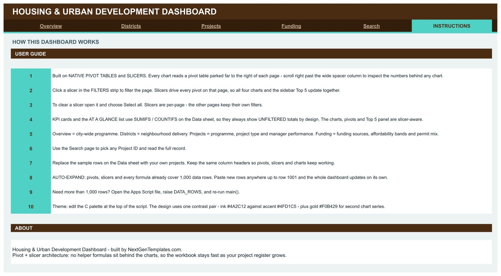
A ten-point user guide covering the pivot-and-slicer architecture, clearing a slicer with Select all, why the KPI cards stay unfiltered, replacing the sample rows, the 1,000-row auto-expand limit and how to raise it, and how to recolour the whole workbook from the palette block in the script.
Data sheet
A single flat register of 500 sample projects with 16 columns: Project ID, Approval Date, District, Project Type, Program, Developer, Funding Source, Investment, Housing Units, Duration, Project Manager, Permit Type, Status, Income Band, Month and Quarter. Keep the headers exactly as they are and every pivot table on every page keeps working.
Housing & Urban Development Dashboard vs. an Excel Build vs. Procore / Yardi Voyager – Feature Comparison
| Feature | Housing & Urban Development Dashboard (Google Sheets) | Microsoft Excel dashboard build | Procore / Yardi Voyager |
|---|---|---|---|
| Cost | $9.99 one-time ✔ | $60-200 for a comparable template, or days of build time | $375-1,200 / month, quoted per portfolio |
| Platform | Browser, any OS, no install ✔ | Desktop Excel or a Microsoft 365 licence | Vendor cloud with an onboarding project |
| Setup time | Under 10 minutes ✔ | 30-60 minutes to relink pivots and charts | 4-12 weeks of implementation |
| Real-time team collaboration | Native, unlimited editors ✔ | Co-authoring only on OneDrive / SharePoint | Yes, priced per named seat |
| Mobile access | Google Sheets app ✔ | Excel mobile, slicers are awkward | Dedicated app ✔ |
| Customisable fields | Edit any column and re-run the script ✔ | Editable, but pivots must be rebuilt | Configurable by an admin or the vendor |
| Share with a link | One Drive link, view or edit ✔ | Send a file or a OneDrive link | Guest seats usually billed |
| Project-level record lookup | Built-in Search tab, 16 fields ✔ | Needs an XLOOKUP block you write yourself | Yes ✔ |
| Year-1 cost at 5 users | $9.99 ✔ | $60-200 plus Microsoft 365 seats | $4,500-14,400 |
For housing teams that want district, programme and funding visibility without an enterprise implementation, the Housing & Urban Development Dashboard sits in the sweet spot.
Who Should Use This Template
Perfect for:
- Municipal housing and community development offices running 50 to 1,000 projects a year
- Affordable housing developers and CDCs tracking LIHTC, Housing Trust Fund and Section 8 pipelines side by side
- Urban planning consultants who present district-level delivery to a council or board each quarter
- Housing nonprofits and grant managers who need the funding-source and income-band split without buying a platform
- Programme managers already working in Google Workspace who want one shared link instead of emailed files
Not a fit if:
- You need construction scheduling, RFIs, submittals or daily site logs – that is a construction platform’s job
- You must file to a regulator from the system of record, with an audit trail and role-based permissions
- Your portfolio runs past roughly 10,000 project rows, where a warehouse and Power BI will serve you better
- You need tenant-level rent rolls, lease accounting or property management ledgers
Real-World Use Cases
Maria runs a city housing office covering eight districts. Each month she opens the Districts page, filters to one neighbourhood, and screenshots Investment vs Housing Units and Monthly Units Delivered into her council pack. Because the dashboard is a shared link rather than a file she emails, the committee argues about the same numbers she is looking at.
Devon leads a 40-project affordable housing nonprofit. He uses the Projects page to compare LIHTC spend against Housing Trust Fund and Inclusionary Zoning, and the Housing Units by Income Band ring to show his board that low and very-low income units are holding their share as the pipeline grows. His funder report now takes an afternoon instead of a week.
Priya consults for three municipalities. She keeps one copy per client, uses the Funding page to show each of them their public-versus-private split and on-hold rate, and charges for the analysis rather than the spreadsheet plumbing. Recolouring the palette per client takes about a minute.
Advantages of the Housing & Urban Development Dashboard
The pivot-first architecture is the practical win. Formula-driven dashboards get slower with every row; a pivot recalculates once and feeds its chart, so a register that grows from 200 to 900 projects does not turn into a spinning cursor. Splitting the KPI cards away from the slicers is the second win – reviewers can see the programme total and the filtered slice in the same glance, which is exactly the comparison most housing meetings are trying to make.
On cost, a one-time $9.99 against $375 a month for a housing or construction platform is not a close call for a team that only needs the reporting layer. And because everything is standard Google Sheets, there is no add-on to get approved by IT and nothing to install.
Opportunities for Improvement
Being honest about the limits: the 1,000-row ceiling is generous for a municipal programme but tight for a state-level portfolio, and raising it means editing the Apps Script rather than dragging a range. There is no geographic map view, so district comparison is by bar chart rather than by choropleth. Google Sheets slicers do not support multi-select across pages, so each tab keeps its own filter state – useful once you know it, surprising the first time. And there is no built-in change log; if you need to know who edited a project row, you are relying on Sheets version history.
Best Practices
- Standardise your district, project type, program and status values before pasting. Pivots treat “In Progress” and “in progress” as two categories.
- Keep Approval Date as a real date so the Month and Quarter columns stay sortable.
- Duplicate the file per reporting cycle if you want a frozen snapshot for the board pack.
- Share with Viewer access for stakeholders and Editor only for the one or two people who maintain the register.
- Set the theme once, at the start, from the palette block – it is faster than restyling charts individually later.
Explore Relevant Templates
If you work the developer side of the same pipeline, read our write-up of the Real Estate Development Dashboard in Google Sheets. Teams reporting climate and social outcomes alongside housing usually pair this with the Sustainability and ESG Dashboard in Google Sheets. For a look at how the same pivot-and-slicer pattern is applied to other sectors, see the Hospitality & Resorts Dashboard and the Sports and Recreation Dashboard in Google Sheets.
Also available as: Housing & Urban Development Dashboard in Excel and Housing & Urban Development Dashboard in Power BI, plus the lighter Urban Development KPI Dashboard in Google Sheets.
To learn the pivot-and-slicer approach behind dashboards like this, the Excel Pivot Tables & Dashboards course on NextGenTemplates Academy covers it step by step with practice files.
Get the Housing & Urban Development Dashboard in Google Sheets
Frequently Asked Questions
What KPIs does the Housing & Urban Development Dashboard track?
The Housing & Urban Development Dashboard tracks 16 KPI cards across four analysis pages: total investment, total projects, housing units, cost per unit, completed projects, average build months, LIHTC and Green Retrofit investment, urban infill projects, largest project, federal grant investment, private capital projects, unique developers and on-hold rate.
How long does setup take?
Under 10 minutes. Click the Make a copy link in the PDF that comes with your download, open the Data sheet, and paste your project register beneath the existing headers. The Housing & Urban Development Dashboard uses pivot tables rather than fixed ranges, so no chart needs relinking.
How many projects can the dashboard handle?
Pivots, slicers and formulas already cover 1,000 data rows, so you can paste up to row 1001 with no edits. To go further, open the bundled Apps Script file, raise the DATA_ROWS constant and re-run main(). Past roughly 10,000 rows a database-backed tool is the better answer.
How does this compare to Procore or Yardi Voyager?
Those platforms handle construction execution and property accounting and start around $375 per month. The Housing & Urban Development Dashboard is a $9.99 one-time reporting layer for programme, district and funding analysis. Many teams run both and use the dashboard purely for board-level reporting.
Why do the KPI cards ignore my slicer selections?
By design. The KPI cards and At a Glance list use SUMIFS and COUNTIFS against the Data sheet, so they always show programme-wide totals, while the charts, pivots and Top 5 panels respond to slicers. That lets you read the whole and the filtered slice at the same time.
Can I change the colours to match our branding?
Yes. The Housing & Urban Development Dashboard is generated by an Apps Script whose palette sits in one block at the top of the file. Edit the ink, accent and secondary values, re-run main(), and every header, KPI card and chart series repaints across all six tabs.
Do I need add-ons, macros or a paid Google plan?
No. The dashboard runs on standard Google Sheets features – native pivot tables, native slicers, built-in charts and SUMIFS. A free Google account is enough; there is no add-on to install and no marketplace approval to request.
About the Author
Built by PK – Microsoft Certified Professional with 15+ years of Excel, Google Sheets, and Power BI experience. Founder of NextGenTemplates, reaching 300K+ subscribers across YouTube channels. Every template is hand-built and tested before release.
Conclusion
If your housing programme reporting currently lives in three spreadsheets and a slide deck, this template replaces all four with one shared link that updates itself. Sixteen KPI cards, sixteen charts, a project lookup and a 1,000-row register, for the price of a lunch.
Instant download · One-time payment · No subscription
Last updated: August 2026