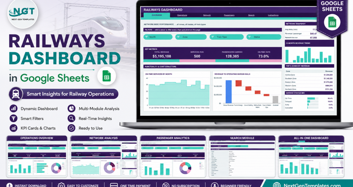
The Railways Dashboard in Google Sheets is a six-tab reporting template that turns a flat service log into a filterable operations pack: 16 KPI cards, 19 charts and gauges, 15 native slicers and a Trip ID lookup page. Every chart reads a real pivot table rather than a helper formula, and the pivots, slicers and formulas already stretch to row 1001, so a new file is working within about ten minutes.
Most rail reporting still happens in a spreadsheet that gets rebuilt by hand every month – one person copying pivots, another re-pointing chart ranges, and a slide deck that is stale the day after it ships. This template fixes the rebuild problem rather than the analysis problem: you keep your own definitions and your own data, and the layout stops moving.
Get the Railways Dashboard in Google Sheets
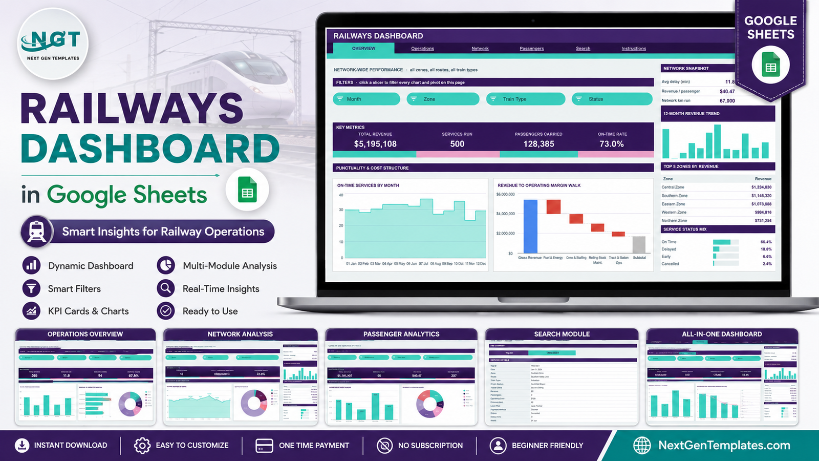
Important: this is a reporting layer over data you supply. The figures in every screenshot below are generated demo rows included to show the layout working – they are not real network statistics and should not be read as benchmarks. The template makes no assessment of rail safety, signalling, engineering fitness or regulatory compliance.
Key Features of the Railways Dashboard in Google Sheets
- Six tabs – Overview, Operations, Network, Passengers, Search and Instructions, all fed by one Data sheet.
- 16 KPI cards across four analysis pages, four to a page.
- 19 charts and gauges, including a waterfall margin walk, a route treemap, two donuts, a scatter, two combo charts and three performance gauges.
- 15 native slicers covering Month, Zone, Route, Train Type, Status, Ticket Class, Payment Method and Loco Pilot.
- Native pivot tables behind every visual – they sit to the right of each page past a wide spacer column, so you can scroll across and audit any number on screen.
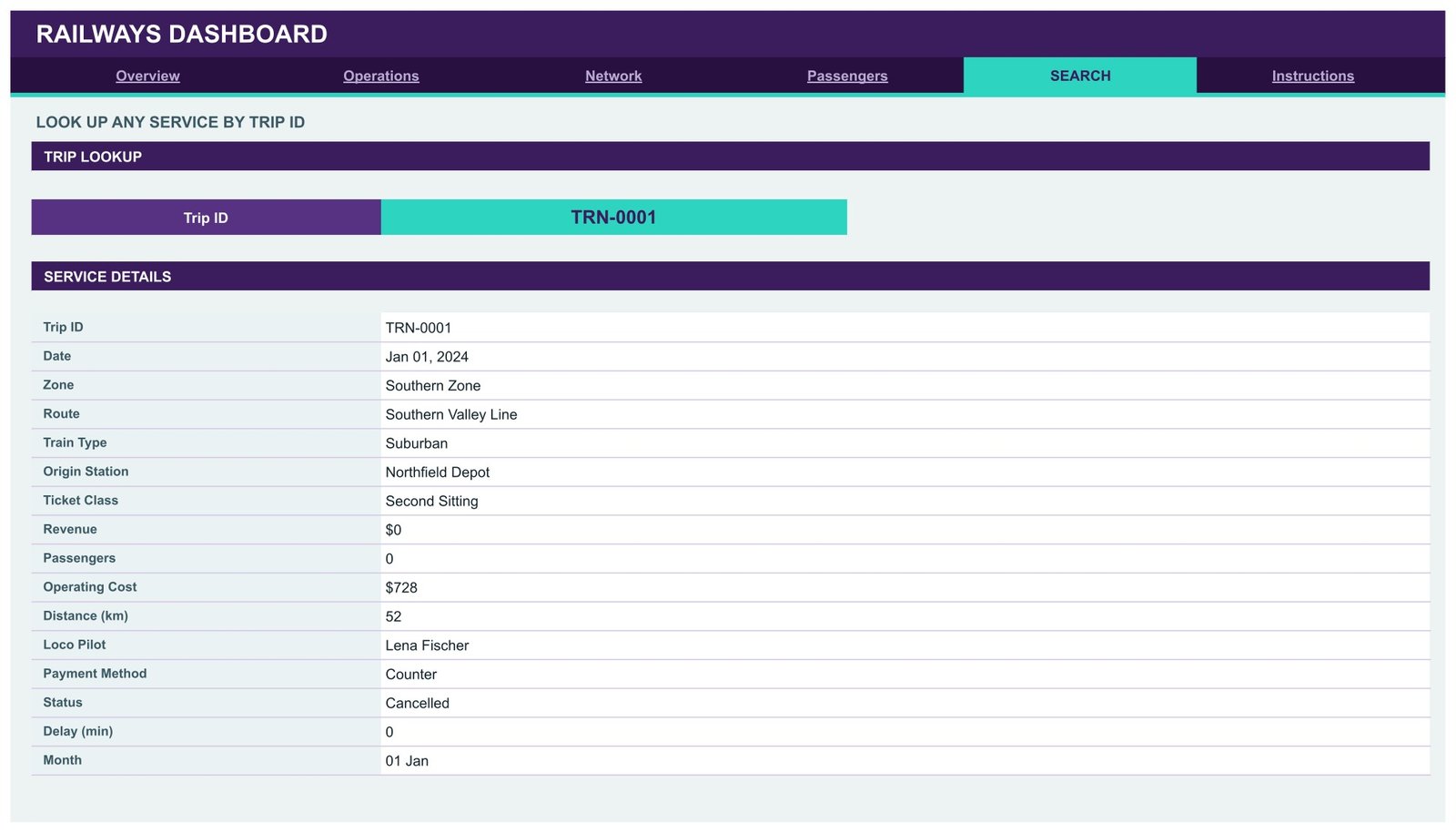
- A Trip ID search page that returns all 16 fields of a single service record.
- Auto-expansion to 1,000 rows with no rebuild; raising the limit is a one-line change in the attached Apps Script file.
- 500 demo service rows, clearly labelled as sample data, so the dashboard is populated the moment you open it.
Two design decisions are worth calling out because they change how you read the pages. First, the KPI cards, the At A Glance list, the treemap and the performance gauges use SUMIFS and COUNTIFS against the Data sheet, so they deliberately show unfiltered totals – they are your constant reference point. The charts, the pivots, the margin walk and the Top 5 panels are slicer-aware and move with your filters. Second, because the visuals sit on native Google Sheets pivot tables and slicers, the file stays responsive as the log grows instead of dragging a wall of array formulas behind it.
Dashboard Pages Explanation
Overview – Network-Wide Performance
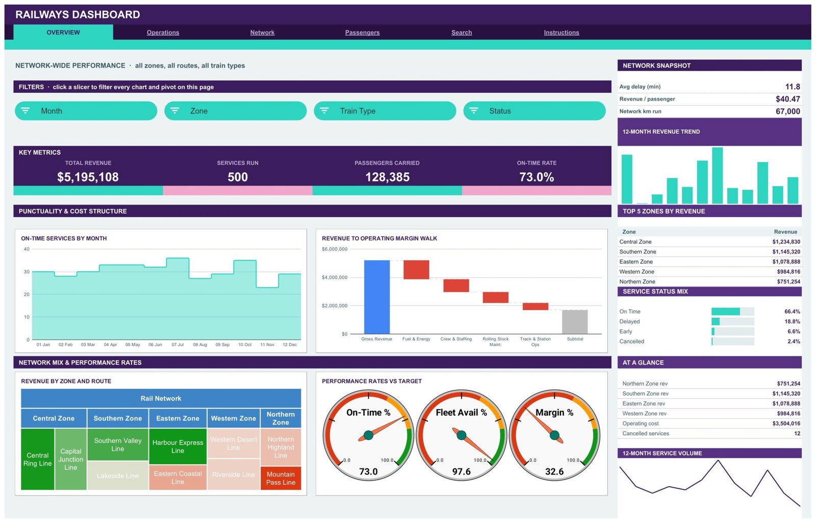
The landing page opens with four KPI cards – Total Revenue, Services Run, Passengers Carried and On-Time Rate – then splits into a punctuality and cost band. On-Time Services by Month is an area chart; Revenue to Operating Margin Walk is a waterfall that steps gross revenue down through Fuel & Energy, Crew & Staffing, Rolling Stock Maintenance and Track & Station Ops to a subtotal. Below that, a Revenue by Zone and Route treemap nests each line inside its zone, and three gauges read On-Time %, Fleet Availability % and Margin % against target. The right sidebar carries a network snapshot, a 12-month revenue trend, Top 5 Zones by Revenue, a Service Status Mix panel and a service-volume sparkline.
Operations – Punctuality, Delays and Reliability by Train Type
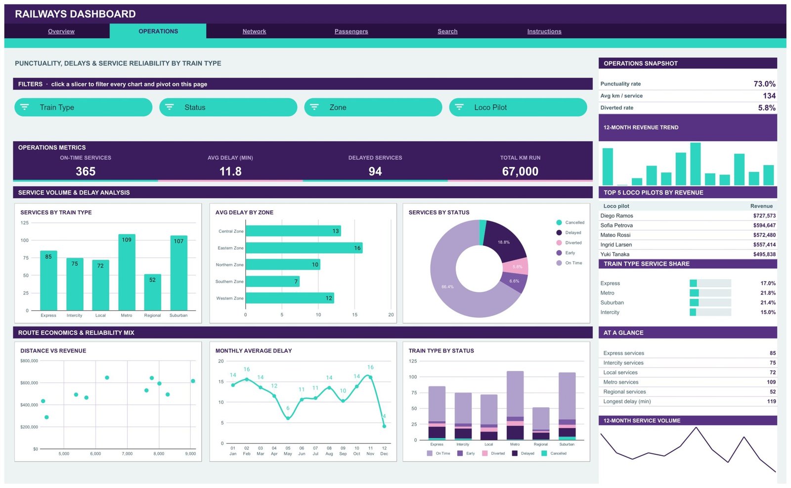
This is the page a depot or control team lives on. KPI cards report On-Time Services, Avg Delay (min), Delayed Services and Total km Run, filtered by Train Type, Status, Zone and Loco Pilot. Charts cover Services by Train Type, Avg Delay by Zone, Services by Status, Distance vs Revenue, Monthly Average Delay and Train Type by Status – the last one stacking on-time, early, diverted, delayed and cancelled workings so the reliability mix per train type is visible in one glance. The sidebar adds punctuality rate, average km per service, diverted rate, Top 5 Loco Pilots by Revenue and a Train Type Service Share panel.
Network – Zone and Route Performance
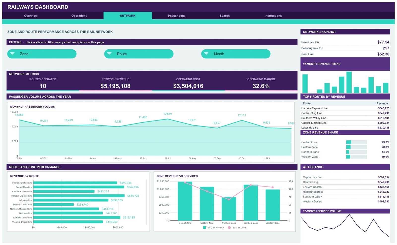
Network is the commercial view. Routes Operated, Network Revenue, Operating Cost and Operating Margin head the page, and the analysis runs through Monthly Passenger Volume, Revenue by Route and a Zone Revenue vs Services combo chart that puts revenue columns and service counts on twin axes – the quickest way to spot a zone earning well on few services, or the reverse. The sidebar reports revenue per km, passengers per trip and cost per km alongside Top 5 Routes by Revenue and a Zone Revenue Share panel. Slicers here are Zone, Route and Month.
Passengers – Ticket Class, Payment and Station Demand
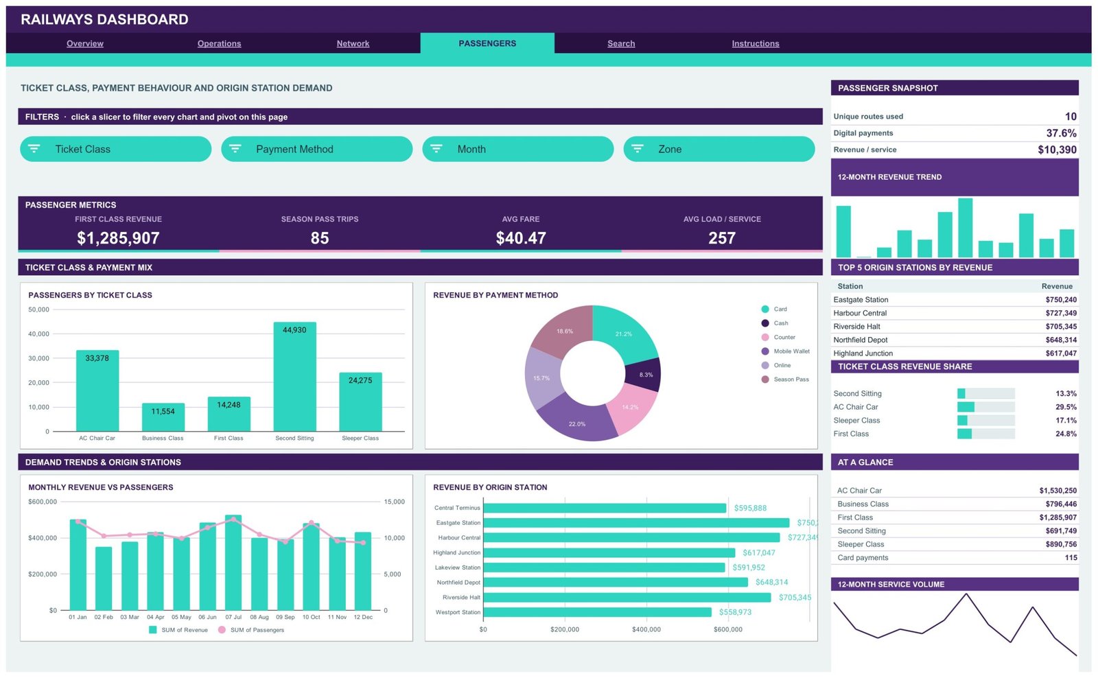
The Passengers page answers who is travelling, how they pay and where they board. KPI cards show First Class Revenue, Season Pass Trips, Avg Fare and Avg Load per Service. Passengers by Ticket Class and Revenue by Payment Method give the mix, Monthly Revenue vs Passengers shows whether fare income is tracking volume, and Revenue by Origin Station ranks boarding points. The sidebar reports unique routes used, digital payment share and revenue per service, plus Top 5 Origin Stations by Revenue and a Ticket Class Revenue Share panel. Slicers: Ticket Class, Payment Method, Month and Zone.
Search – Look Up Any Service by Trip ID
Pick a Trip ID and the Service Details panel returns the complete record: date, zone, route, train type, origin station, ticket class, revenue, passengers, operating cost, distance, loco pilot, payment method, status, delay and month. Worth knowing when you read the screenshot below – the demo record shown is a Cancelled service, which is why its revenue and passenger count are zero while the operating cost is not. That is correct behaviour, not a broken formula.
Instructions – How This Dashboard Works
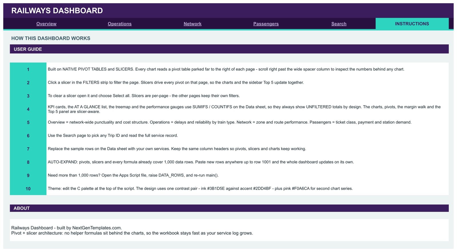
A numbered 10-step guide covers the pivot-and-slicer architecture, how to clear a slicer with Select all, which cards are slicer-aware and which are unfiltered by design, how to replace the sample rows without breaking the pivots, how to raise the row limit, and how to recolour the whole file from one palette at the top of the Apps Script.
Data sheet
One flat table, 16 columns: Trip ID, Date, Zone, Route, Train Type, Origin Station, Ticket Class, Revenue, Passengers, Operating Cost, Distance (km), Loco Pilot, Payment Method, Status, Delay (min) and Month. Keep the headers exactly as they are and everything downstream keeps working.
Railways Dashboard in Google Sheets vs. a Microsoft Excel Dashboard vs. Paid BI Software – Feature Comparison
| Feature | Railways Dashboard in Google Sheets | Microsoft Excel Dashboard | Zoho Analytics / Tableau |
|---|---|---|---|
| Cost | $9.99 one-time | $13.99-$19.99 one-time | $25-$150 / user / month |
| Platform | Any browser, no install | Excel desktop licence | Cloud BI platform |
| Setup time | Under 10 minutes | Under 15 minutes | Days of modelling |
| Real-time team collaboration | Built in via Google Drive | Needs OneDrive co-authoring | Yes, per seat |
| Mobile access | Google Sheets app | Excel mobile app | Vendor app |
| Customisable fields | Edit any column or pivot | Yes | Admin-controlled |
| Share with a link | Yes, free viewers | File sharing | Paid seat per viewer |
| Year-1 cost at 5 users | $9.99 total | $13.99-$19.99 plus licences | $1,500-$9,000 |
| Trip-level record lookup | Built-in Search page | Depends on build | Requires a report |
For teams that want route, punctuality and revenue reporting without paying per-seat BI fees, the Railways Dashboard in Google Sheets sits in the sweet spot.
Who Should Use This Template
Perfect for:
- Operations and planning analysts at regional rail, metro or suburban operators reporting from spreadsheets today
- Commercial teams tracking fare income by ticket class, payment method and origin station
- Depot and route managers who need a repeatable monthly pack instead of a hand-rebuilt deck
- Transport consultancies, tender teams and university projects that need a working rail model quickly
Not a fit if:
- You need a safety, signalling, incident-investigation or regulatory-compliance system – this template is not one and makes no such assessment
- You need live train running, timetabling or dispatch, which require a real-time operational system
- Your service history runs to millions of rows, where a spreadsheet is the wrong store
- You were hoping the sample figures could stand in as industry benchmarks – they cannot; they are generated demo data
Real-World Use Cases
Priya, commercial analyst at a five-zone regional operator. Each month she exports the service log, pastes it over the Data sheet, and works the Network page: revenue per km and operating margin by route, then the Top 5 Routes by Revenue panel lifted straight into the board pack. The pivot rebuild that used to eat two afternoons no longer exists.
Marco, suburban depot manager. He filters Operations by Train Type and Zone to see where average delay concentrates, then shows his team Train Type by Status so the on-time, early, diverted, delayed and cancelled split is a picture rather than a number in an email.
Aisha, transport analytics lecturer. She shares the copy link with a cohort, has them load a public timetable and ticketing extract, and sets an assignment comparing fare income across ticket classes and payment methods on the Passengers page – a complete reporting model without a single BI licence.
Advantages of the Railways Dashboard in Google Sheets
The cost case is straightforward: a one-time $9.99 purchase against $25-$150 per user per month for a cloud BI seat, and unlimited free viewers through Google Drive rather than a licence per person who wants to look at a chart. Over a year with five people reading the pack, that is roughly $10 against $1,500 or more.
The time case matters more day to day. Because the pivots and slicers already cover 1,000 rows, the monthly cycle is paste-and-read rather than rebuild-and-check. Because the visuals sit on native pivots that you can scroll to and inspect, any figure on screen is traceable back to the numbers behind it – which is what makes the pack defensible when somebody queries a route’s margin in a meeting.
And because it is Google Sheets, there is nothing to install, nothing to enable, and no macro warning. Comments, version history and link sharing all come free with the platform.
Opportunities for Improvement
Being honest about the edges is more useful than a feature list. The 1,000-row ceiling is generous for a year of a mid-sized operation but not for a large network’s full history; raising it means editing DATA_ROWS in the Apps Script and re-running, which is a small technical step some buyers will want help with. The gauges and the At A Glance panel are intentionally unfiltered, and anyone who misses that note on the Instructions tab may briefly think a slicer is broken. There is no built-in period-over-period comparison – month-on-month change is read from the trend charts rather than presented as a delta card. Finally, the template has no notion of timetable adherence beyond the delay minutes you supply; if your definition of punctuality is more nuanced, that logic belongs in your source data before it reaches the Data sheet.
Best Practices
- Freeze your column definitions before the first import. Changing what “Delay (min)” means halfway through a year makes the trend charts meaningless.
- Import once a month on a fixed date so the 12-month panels stay comparable.
- Keep the demo rows in a copy of the file until your own import is verified – they are a useful reference for the expected format.
- Use one slicer at a time when you are investigating; stacked filters on four dimensions can leave a chart with two data points and no obvious reason why.
- Share with view access by default and edit access only to the person who runs the import.
- Recolour once, at the palette level in the Apps Script, rather than restyling charts by hand.
Explore Relevant Templates
If you run more than trains, the Transportation Services Dashboard in Google Sheets covers multi-mode trip and fleet reporting, and we walked through it in detail in the Transportation Services Dashboard post. Freight-side teams should look at the Shipping Dashboard in Google Sheets for consignment and carrier performance, and the Marine & Ports Dashboard in Google Sheets where the network meets the quayside. For distribution KPIs there is the Distribution KPI Scorecard in Google Sheets.
Also available as: the same subject ships as the Railways Dashboard in Excel for desktop teams, and rail freight has its own Railway Cargo Dashboard in Power BI. The whole catalogue lives under Google Sheets Dashboard Templates.
Want to build skills like this step by step? The Excel Pivot Tables & Dashboards course on NextGenTemplates Academy walks you through pivots and dashboard layouts with practice files.
Get the Railways Dashboard in Google Sheets
Frequently Asked Questions
What does the Railways Dashboard in Google Sheets track?
The Railways Dashboard in Google Sheets tracks revenue, services run, passengers carried, on-time rate, average delay, delayed services, kilometres run, routes operated, operating cost, operating margin, average fare and average load per service across 16 KPI cards on four analysis pages.
Is the sample data in the screenshots real railway data?
No. The Railways Dashboard in Google Sheets ships with 500 generated demo service rows so the layout is populated on first open. They are not real network statistics, must not be quoted as benchmarks, and should be replaced with your own records before you report anything.
Does the template cover rail safety or regulatory compliance?
No. The Railways Dashboard in Google Sheets is a reporting layer over data you supply. It makes no assessment of safety, signalling, engineering fitness or regulatory compliance, and it should not be used as evidence for any of those purposes.
How long does setup take?
Under 10 minutes. Open the PDF in your download, click the copy link to create your own file in Google Drive, then paste your service records over the demo rows keeping the 16 headers unchanged. Pivots, slicers and charts already reach row 1001.
How does this compare to a paid BI tool like Tableau or Zoho Analytics?
Paid BI platforms charge $25-$150 per user per month and expect a modelling project first. The Railways Dashboard in Google Sheets is a single $9.99 purchase, opens in any browser, and can be shared with unlimited free viewers, which suits teams reporting rather than building a data warehouse.
Can I add more than 1,000 service rows?
Yes. The Railways Dashboard in Google Sheets covers 1,000 rows out of the box. For more, open the attached Apps Script file, raise the DATA_ROWS value and re-run main(), as described on the Instructions tab.
Why do some cards not change when I click a slicer?
By design. In the Railways Dashboard in Google Sheets the KPI cards, At A Glance list, treemap and gauges use SUMIFS and COUNTIFS against the Data sheet and always show unfiltered totals. The charts, pivots, margin walk and Top 5 panels are the slicer-aware elements.
About the Author
Built by PK – Microsoft Certified Professional with 15+ years of Excel, Google Sheets, and Power BI experience. Founder of NextGenTemplates, reaching 300K+ subscribers across YouTube channels. Every template is hand-built and tested before release.
Conclusion
If your rail reporting is currently a spreadsheet somebody rebuilds every month, the Railways Dashboard in Google Sheets replaces the rebuild with a paste. Six tabs, 16 KPI cards, 19 charts and gauges, 15 slicers and a Trip ID lookup – all reading native pivots you can audit, all sharable from Drive with as many colleagues as you like.
Instant download · One-time payment · No subscription
Last updated: August 2026