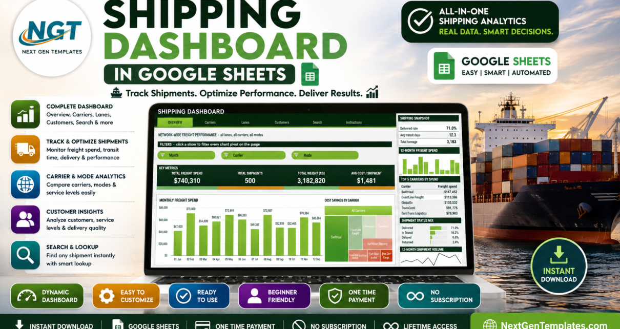
Most shipping data starts life as an export: a few hundred rows of shipment IDs, carriers, lanes, weights and freight costs that nobody has time to pivot. The Shipping Dashboard in Google Sheets is the layer that sits on top of that export. Paste the rows in and you get five linked pages, 16 KPI cards and 17 charts covering $740,310 of freight spend across 500 shipments, 8 carriers, 8 trade lanes, 8 hubs and 12 customers – a 71.0% delivered rate, 12.3 average transit days and 3,182,820 kg moved, all visible before you change a single setting.Shipping Dashboard in Google Sheets
Get the Shipping Dashboard in Google Sheets
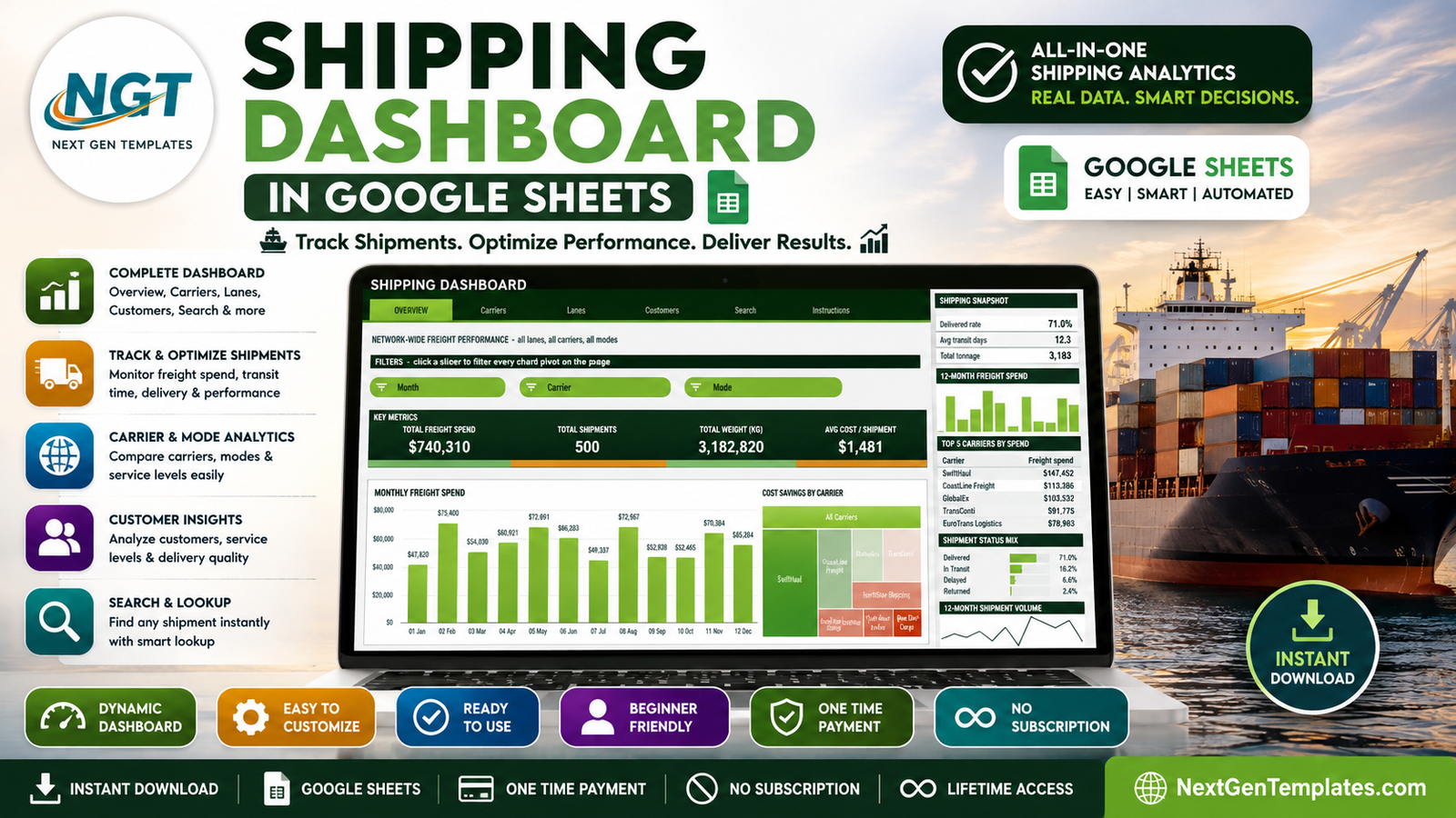
What makes this build different from most spreadsheet dashboards is the architecture. Every chart reads a real Google Sheets pivot table, parked to the right of each page behind a wide spacer column, and every page carries its own slicers. There is no wall of helper formulas behind the visuals, so the file stays quick as the shipment log grows.
Key Features of the Shipping Dashboard in Google Sheets
- Five linked pages plus instructions – Overview, Carriers, Lanes, Customers, Search and a ten-step user guide, all reachable from a tab strip repeated at the top of every sheet.
- 16 KPI cards – total freight spend, shipments, tonnage, cost per shipment, air and ocean spend, express shipments, cost per kg, lanes served, average and longest transit days, delayed shipments, active customers, spend per customer, delivered shipments and return rate.
- 17 pivot-driven charts – column, bar, donut, treemap, histogram, stepped area, stacked column, combo and scatter.
- Page-level slicers – up to four per page, filtering every chart, pivot and Top 5 table on that page at once.
- A consistent right-hand sidebar – snapshot block, 12-month freight spend mini chart, Top 5 table, share bar list, At a Glance panel and a 12-month shipment volume sparkline.
- Shipment-level lookup – choose an ID and read all 16 stored fields for that consignment.
- 1,000-row auto-expand – pivots, slicers and formulas already cover rows 2 to 1001.
- One-block theme – a forest ink and lime accent pair plus an amber for second series, all editable in a single palette block.
Dashboard Pages Explanation
Overview – network-wide freight performance
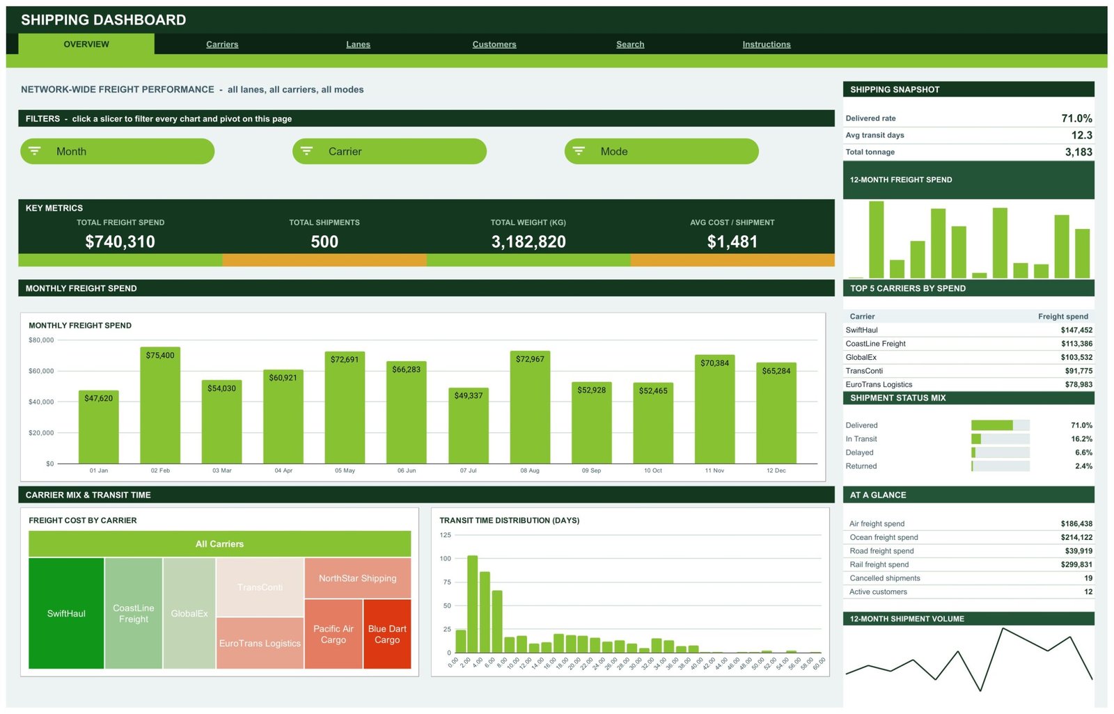
The landing page answers the question a finance director asks first: what did shipping cost, and did it arrive? Four KPI cards carry Total Freight Spend ($740,310), Total Shipments (500), Total Weight (3,182,820 kg) and Average Cost per Shipment ($1,481). Month, Carrier and Mode slicers sit above them.
Below, a Monthly Freight Spend column chart runs January to December with labelled values from a $47,620 low to a $75,400 peak. A Freight Cost by Carrier treemap sizes all eight providers against each other, and a Transit Time Distribution histogram spreads shipments across 0 to 60 days, showing the bulk clustered under eight days with a long tail beyond thirty.
The sidebar carries a Shipping Snapshot, a Top 5 Carriers by Spend table led by SwiftHaul at $147,452, a Shipment Status Mix bar list (Delivered 71.0%, In Transit 16.2%, Delayed 6.6%, Returned 2.4%) and an At a Glance panel splitting spend by mode – rail $299,831, ocean $214,122, air $186,438 and road $39,919.
Carriers – carrier, mode and service level performance
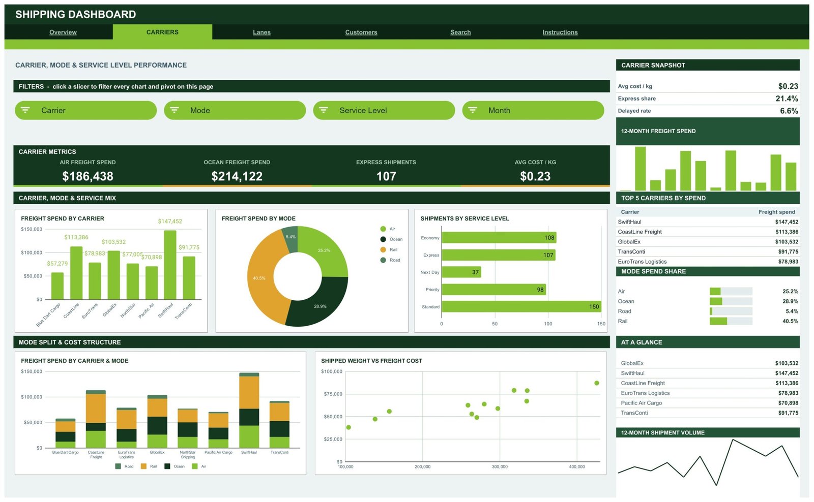
This page separates who carried the freight from how it moved. KPI cards show Air Freight Spend ($186,438), Ocean Freight Spend ($214,122), Express Shipments (107) and Average Cost per KG ($0.23). Four slicers – Carrier, Mode, Service Level and Month – drive everything below.
Freight Spend by Carrier ranks all eight providers from Blue Dart Cargo at $57,279 up to SwiftHaul at $147,452. A Freight Spend by Mode donut splits rail 40.5%, ocean 28.9%, air 25.2% and road 5.4%. Shipments by Service Level counts standard 150, economy 108, express 107, priority 98 and next day 37. Underneath, a stacked Freight Spend by Carrier and Mode chart shows each provider’s modal blend, and a Shipped Weight vs Freight Cost scatter tests whether the rate card actually scales with tonnage.
Lanes – lane, hub and destination analysis
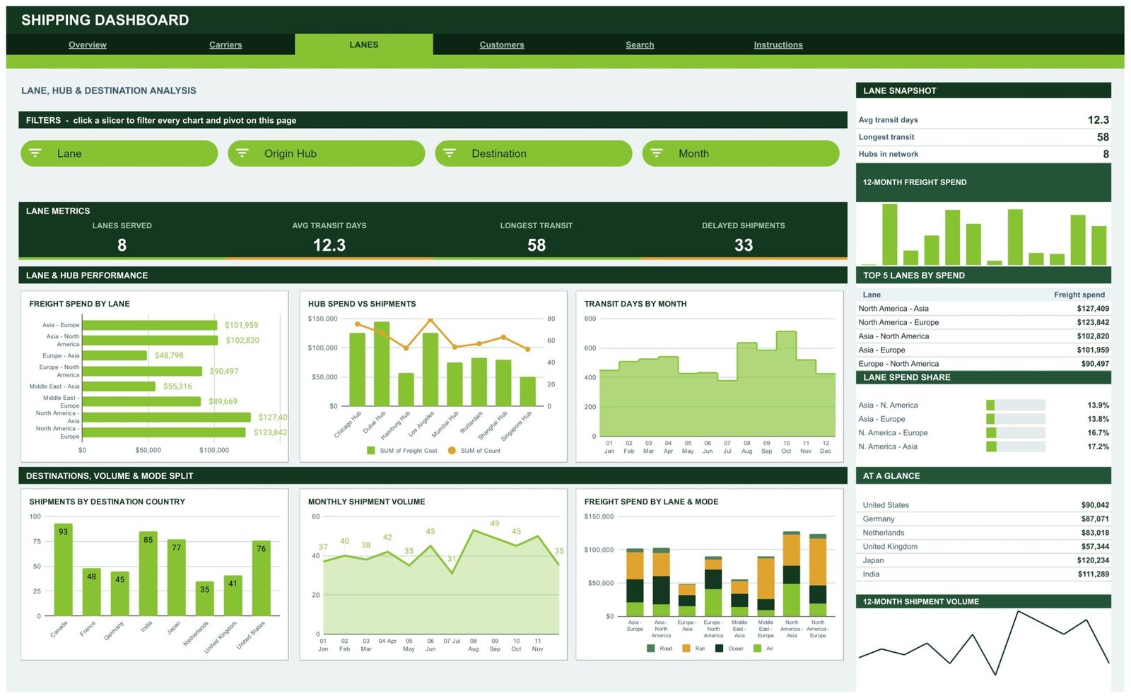
The geography view. Lanes Served (8), Average Transit Days (12.3), Longest Transit (58) and Delayed Shipments (33) head the page, with Lane, Origin Hub, Destination and Month slicers above.
Freight Spend by Lane ranks the eight corridors, North America to Asia leading at $127,409 ahead of North America to Europe at $123,842. Hub Spend vs Shipments overlays a shipment-count line on spend columns for Chicago, Dubai, Hamburg, Los Angeles, Mumbai, Rotterdam, Shanghai and Singapore, which is where an over-served hub becomes obvious. Transit Days by Month draws the seasonal shape as a stepped area. Beneath, Shipments by Destination Country covers Canada 93, India 85, Japan 77, United States 76, France 48, Germany 45, United Kingdom 41 and Netherlands 35, alongside a Monthly Shipment Volume area chart and a stacked Freight Spend by Lane and Mode chart.
Customers – customer, service level and delivery quality
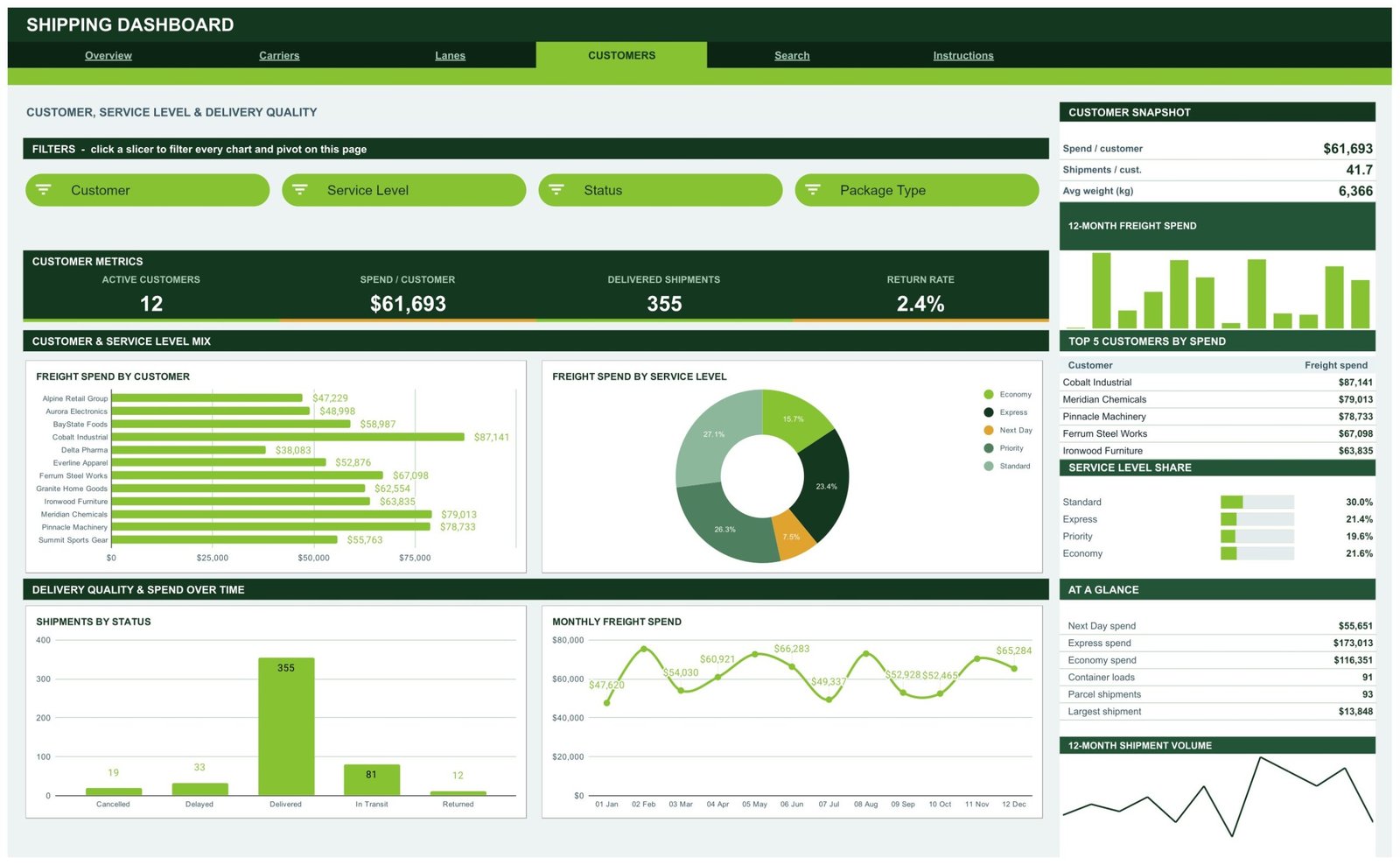
Active Customers (12), Spend per Customer ($61,693), Delivered Shipments (355) and Return Rate (2.4%) open the page, filtered by Customer, Service Level, Status and Package Type slicers.
Freight Spend by Customer ranks all twelve accounts from Delta Pharma at $38,083 to Cobalt Industrial at $87,141. A Freight Spend by Service Level donut shows where the money concentrates, and Shipments by Status counts delivered 355, in transit 81, delayed 33, cancelled 19 and returned 12 – the delivery-quality picture in one column chart. A Monthly Freight Spend line tracks the same twelve months as a trend rather than bars. The sidebar adds Top 5 Customers by Spend, a Service Level Share list (standard 30.0%, express 21.4%, economy 21.6%, priority 19.6%) and an At a Glance panel with container loads, parcel shipments and the largest single shipment at $13,848.
Search – look up any shipment by ID
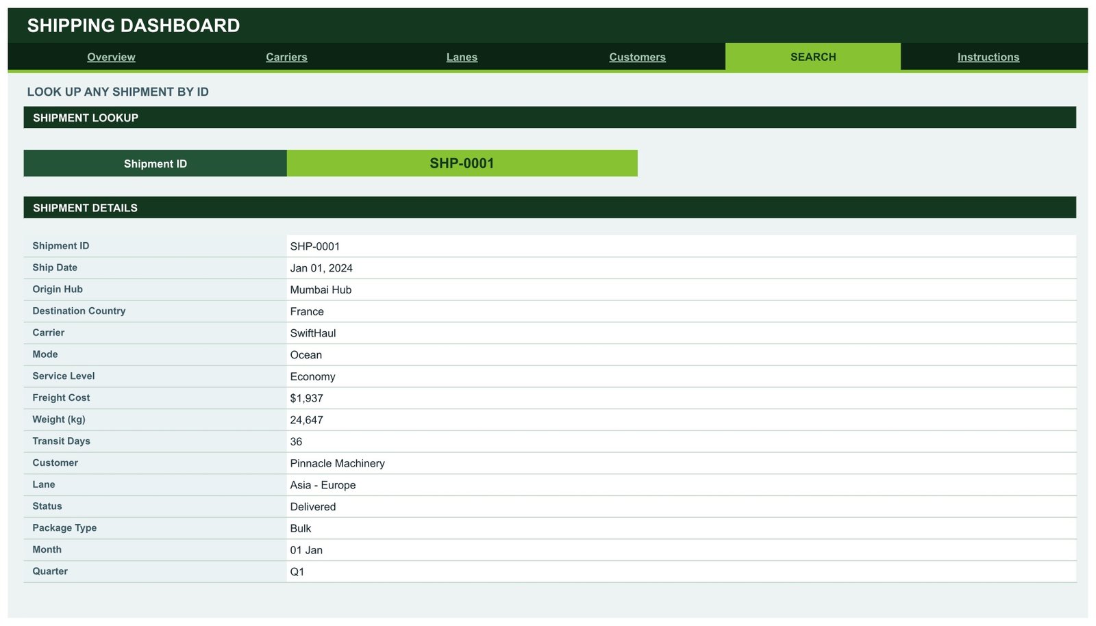
Pick a Shipment ID from the dropdown and the page returns the whole record: ship date, origin hub, destination country, carrier, mode, service level, freight cost, weight in kg, transit days, customer, lane, status, package type, month and quarter. It is the page you open when a customer calls about one consignment and you do not want to filter the Data sheet by hand.
Instructions – how the dashboard works
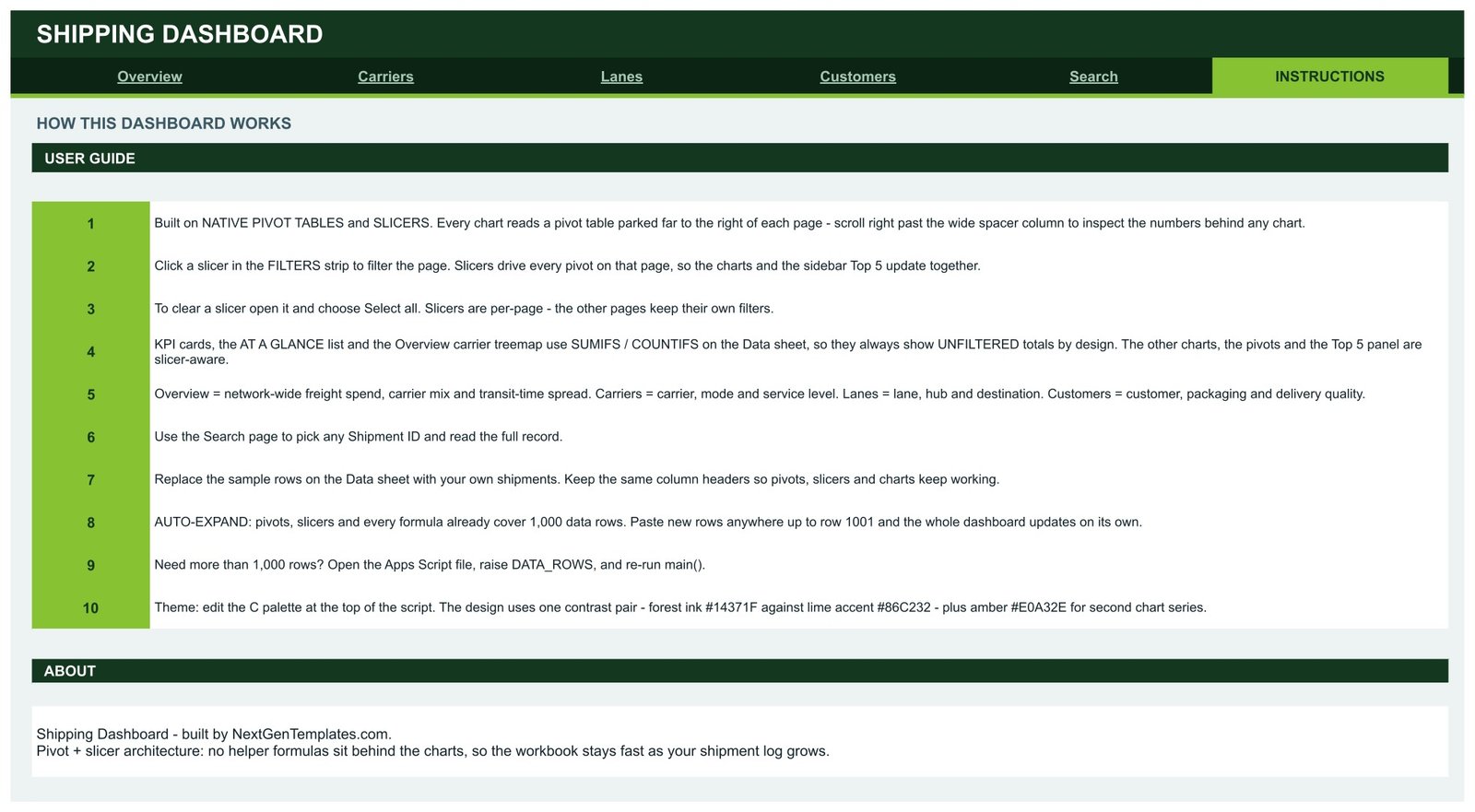
A ten-point guide covering where the pivots are parked, how slicers behave per page, which figures are deliberately unfiltered, how to swap in your own shipments, the 1,000-row auto-expand, how to go beyond it, and where the colour palette lives.
Shipping Dashboard in Google Sheets vs. an Excel Shipping Dashboard vs. Paid TMS Software – Feature Comparison
| What matters | This Google Sheets template | Excel shipping dashboard | Paid TMS / freight-analytics platform |
|---|---|---|---|
| Cost | One payment, currently $9.99 | Typically $18-$30 one payment | Usually $250-$1,200 per month |
| Platform | Google Sheets in any browser | Microsoft Excel desktop | Vendor web app |
| Setup time | About 2 minutes – Make a copy, paste data | 10-20 minutes – download, enable, relink | Weeks – carrier onboarding and EDI mapping |
| Real-time team collaboration | Yes, native multi-user editing | Only via OneDrive co-authoring | Yes |
| Mobile access | Yes, Google Sheets mobile app | Limited | Yes |
| Customisable fields and charts | Fully – nothing is locked | Fully | Restricted to vendor options |
| Share with a link | Yes | No, the file has to be sent | Yes, per seat |
| Year-1 cost at 5 users | $9.99 total | $18-$30 total | $3,000-$15,000+ |
| Carrier, lane and customer analysis | Three dedicated pages | Depends on the template | Included |
| Live carrier tracking feeds | No – you paste your own log | No | Yes |
Who Should Use This Template
Logistics and supply-chain managers who review freight spend monthly and want the carrier, lane and customer cuts on separate pages instead of one crowded sheet. Third-party logistics providers and freight forwarders who report carrier and lane performance to clients and need something presentable without buying a seat per account. Ecommerce operations leads watching shipping cost per order and return rate. Finance analysts reconciling carrier invoices against shipped tonnage. Consultants running network reviews who want one file they can copy per engagement.
It is not the right tool if you need live carrier API tracking, EDI 214 status feeds, rate shopping and booking, or customs documentation. This is a reporting layer over data you already export – it does not move freight or talk to carriers.
Real-World Use Cases
Monthly carrier rate review. A freight forwarding operations manager exports the month’s shipments, pastes them into the Data sheet and opens the Carriers page. Seeing rail carry 40.5% of spend while air carries 25.2% on a fraction of the tonnage is the argument for shifting two lanes to intermodal.
Ecommerce fulfilment review. An operations lead watches average cost per shipment and return rate week to week. When the Customers page shows the return rate drifting above 2.4% for one account, the Search page identifies the package type behind it and the carton spec changes.
Network and hub study. A supply-chain consultant copies the file per client, drops in twelve months of history and presents the Lanes page – hub spend against shipment count on one chart – as the centrepiece of a network review.
Advantages of the Shipping Dashboard in Google Sheets
- Pivot-native architecture. Charts read pivot tables, not chains of SUMPRODUCT formulas, so the file does not slow down as rows accumulate.
- Honest slicer behaviour, documented. The KPI cards, At a Glance lists and the Overview treemap use SUMIFS and COUNTIFS against the Data sheet and stay unfiltered as a reference point; the charts, pivots and Top 5 panels are slicer-aware. The Instructions page says so explicitly rather than leaving you to work it out.
- Nothing is locked. Every sheet, pivot and chart is editable. Add a column, add a pivot, change a chart type.
- Browser-based and shareable. Send a link instead of a file, and let three people look at the same freight review at once.
- No add-ons or macros. Nothing to authorise, nothing to install, nothing an IT policy will block.
- A drill-down that most dashboards skip. The Search page turns aggregate reporting into a shipment-level answer.
Opportunities for Improvement
Two limits are worth stating plainly. First, the 1,000-row ceiling is a default, not a hard cap – but going past it means opening the bundled Apps Script file, raising the DATA_ROWS constant and re-running it, which is a step some buyers will not want to take. Second, the KPI cards being deliberately unfiltered surprises people who expect every number on a page to respond to a slicer. It is documented on the Instructions page, and it is the correct design for a reference total, but it is worth reading before you file a bug against your own copy.
Beyond that: there is no carrier integration, no on-time-in-full calculation against a promised date (the file carries transit days and status, not a delivery SLA field), and currency is single, so a multi-currency freight book needs a conversion column added before import.
Best Practices
- Keep the 16 column headers exactly as shipped. Pivots, slicers and charts all key off them.
- Standardise carrier, mode, service level, status and package type values on the list sheet before importing, so eight carriers do not become fourteen spellings.
- Import a full twelve months the first time. The monthly charts and the 12-month sidebar visuals only tell a story with a complete cycle.
- Clear a slicer with Select all before moving to another page – slicers are per page, and a forgotten filter is the most common cause of a number that looks wrong.
- Take a copy of the file each quarter before you overwrite the data, so you keep a comparable snapshot.
- Recolour once, in the palette block, rather than restyling charts individually.
Explore Relevant Templates
- Logistics Dashboard in Google Sheets – the wider operations view alongside freight.
- Transportation Services Dashboard in Google Sheets – fleet, route and driver performance, the natural companion to this shipping view.
- Drop Shipping Dashboard in Google Sheets – supplier and order economics for ecommerce sellers.
- Fleet Fuel and Mileage Tracker in Google Sheets – the vehicle-level cost log behind a road freight review.
- Supply Chain End-to-End Bundle – ten supply-chain templates in Excel and Google Sheets.
Curious how freight dashboards like this are put together? The Excel Pivot Tables & Dashboards course on NextGenTemplates Academy teaches the pivot and slicer techniques with practice files.
Frequently Asked Questions
Do I need add-ons, scripts or macros?
No. The dashboard is plain Google Sheets – pivot tables, slicers, charts and formulas. There is nothing to authorise and nothing to install unless you choose to raise the row limit.
How many shipments will it hold?
Every pivot, slicer and formula covers 1,000 data rows out of the box, so you can paste up to row 1001 and the whole file updates itself. Larger logs need the DATA_ROWS setting raised in the Apps Script file, as described on the Instructions page.
Why do the KPI cards not respond to my slicer?
By design. The KPI cards, the At a Glance lists and the Overview carrier treemap read the Data sheet directly with SUMIFS and COUNTIFS so they always show network totals. Everything else on the page – charts, pivots, Top 5 tables – follows the slicer.
Can I change the colours?
Yes. The design uses one contrast pair, a forest ink against a lime accent, plus an amber for second chart series. Edit the palette block described on the Instructions page and the whole file recolours.
Will it open in Microsoft Excel?
Not cleanly. It uses Google Sheets native slicers, which Excel does not import. For Excel or Power BI, look at the Excel and Power BI freight dashboards in the NextGenTemplates catalogue instead.
What do I actually download?
A PDF containing the Make a copy link for the Google Sheet plus a short setup note. Click the link and the dashboard copies into your own Google Drive, yours to edit and keep.
About the Author
Built by PK – Microsoft Certified Professional with 15+ years of Excel, Google Sheets, and Power BI experience. Founder of NextGenTemplates, reaching 300K+ subscribers across YouTube channels. Every template is hand-built and tested before release.
Conclusion
Freight data is rarely the problem; the missing piece is usually a place to look at it. The Shipping Dashboard in Google Sheets gives that place five ways at once – network spend on Overview, provider economics on Carriers, geography on Lanes, delivery quality on Customers, and a single consignment on Search – built on pivot tables and slicers so it holds up as the log grows. Copy it, paste in a year of shipments, and you have a freight review that takes minutes rather than an afternoon of manual pivoting.