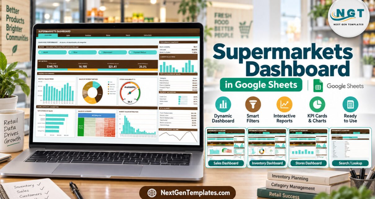
The Supermarkets Dashboard in Google Sheets turns a store sales log into a six-page chain report: 500 sample records, 4 headline KPI cards per page, 18 charts and 15 slicers, all driven by native Google Sheets pivot tables. The sample data covers 8 fictional stores in 3 regions, 8 departments, 16 categories, 10 suppliers and 6 payment methods across the twelve months of 2025, and the pivots already read 1,000 data rows.
Get the Supermarkets Dashboard in Google Sheets
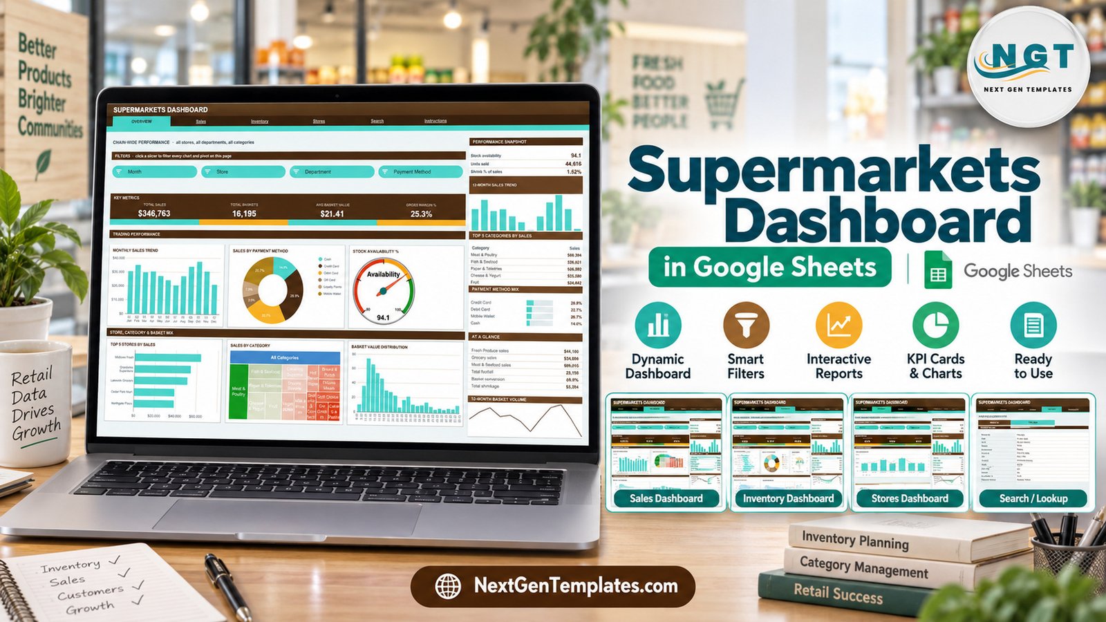
Most supermarkets already have the raw material for a good monthly review: an export from the till or back-office system with one row per transaction batch, showing the store, the department, the supplier, the sales value, the baskets and the margin. What is usually missing is the step from that export to a view a store manager or buyer can read in five minutes. This template is that step. You paste the rows in, and four analysis pages rebuild themselves around sales, departments, stock availability, shrinkage and store footfall.
Below you will find what the file contains page by page, what it deliberately does not do, how it compares with an Excel dashboard and a paid BI suite, and a few habits that keep the numbers trustworthy.
Key Features of the Supermarkets Dashboard in Google Sheets
- Four analysis pages. Overview for chain-wide trading, Sales for departments, suppliers and margin, Inventory for availability and shrinkage, and Stores for footfall, conversion and basket value.
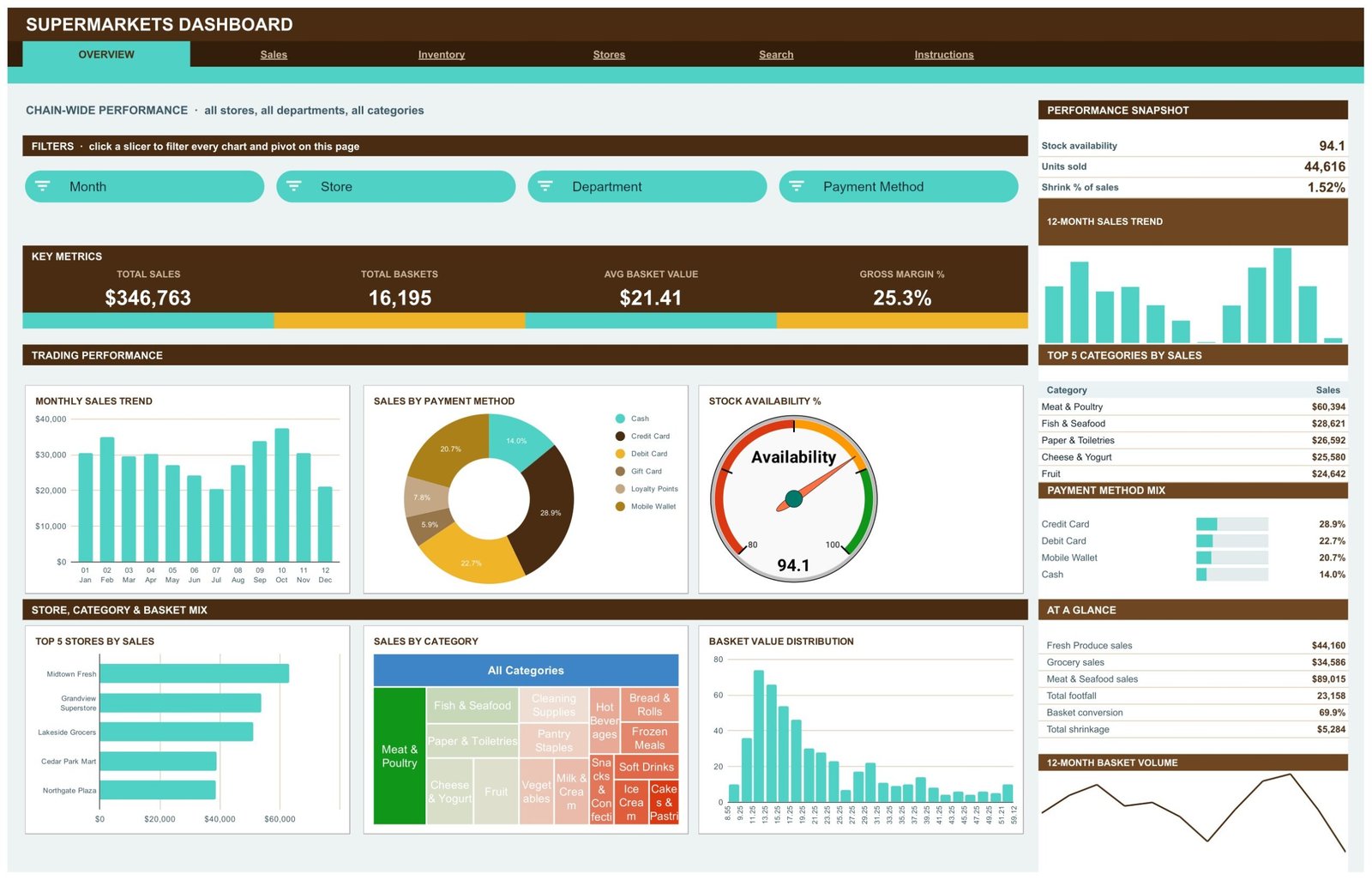
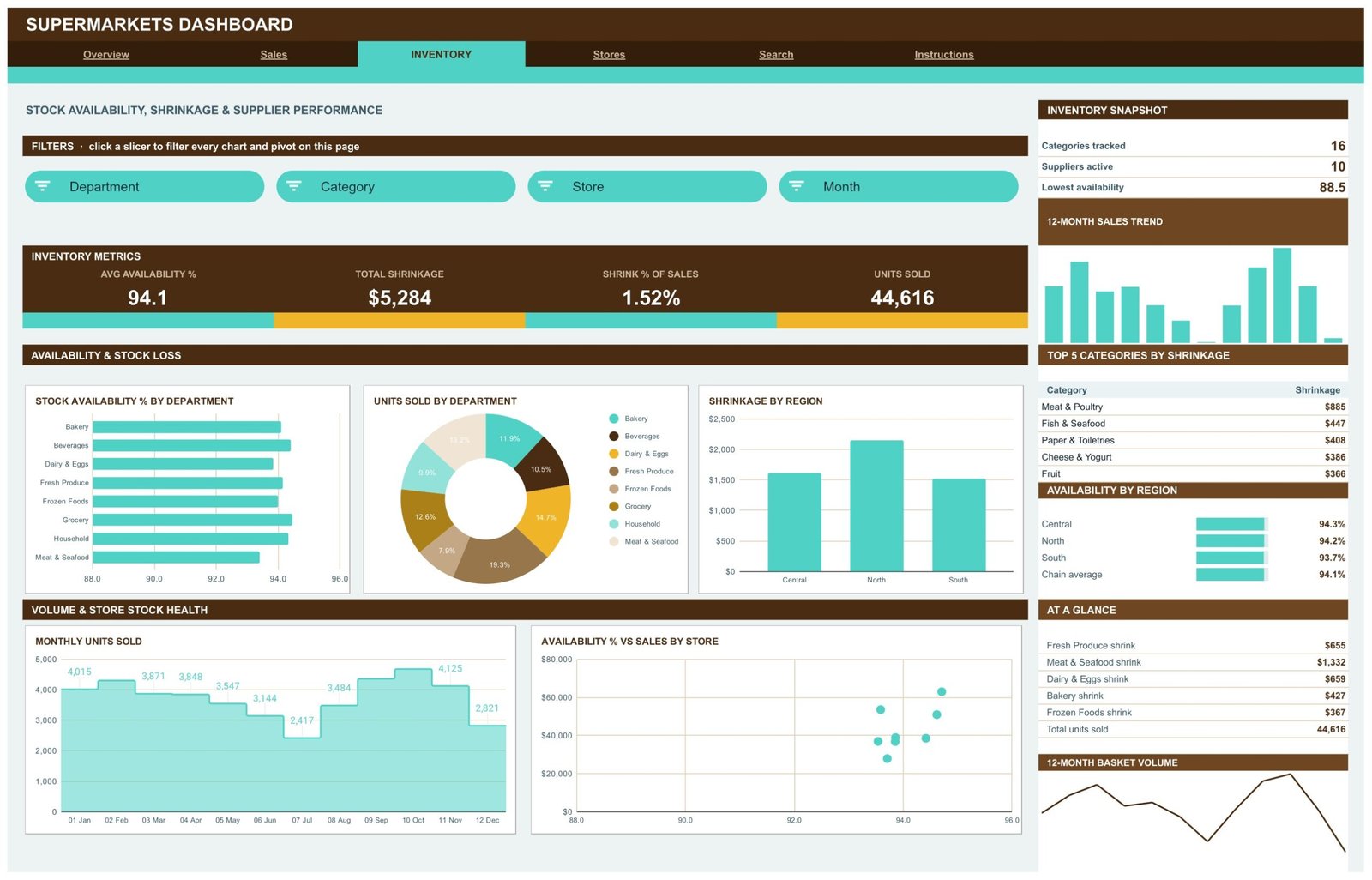
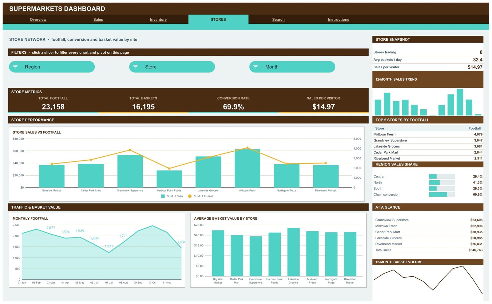
- Four KPI cards on every page. The sample chain reads Total Sales $346,763, Total Baskets 16,195, Avg Basket Value $21.41 and Gross Margin 25.3% on Overview; Inventory adds Total Shrinkage $5,284 and Shrink % of Sales 1.52%; Stores adds Total Footfall 23,158 and Conversion Rate 69.9%.
- Fifteen slicers. Four each on Overview, Sales and Inventory and three on Stores, covering Month, Store, Region, Department, Category and Payment Method.
- Eighteen charts in six styles. Bars, lines, donuts and areas, plus a stock availability gauge, a sales-by-category treemap, a basket value histogram, a stepped monthly units chart, an availability-versus-sales scatter and a sales-and-footfall combo chart.
- A sidebar on each analysis page with a snapshot block, a 12-month sales trend, a Top 5 table, a share panel, an AT A GLANCE list and a 12-month basket volume line.
- A Search page that returns the full 16-field record for any Record ID.
- Built for growth. Pivots, slicers and formulas already cover 1,000 data rows.
What This Template Is, and What It Is Not
It is a reporting template for supermarket sales records you already hold. It is not a point-of-sale system, it does not track stock on hand or raise purchase orders, and it has no live data connection to a till, ERP or loyalty platform. Numbers change when you paste new rows into the Data tab. Every store, supplier and SKU in the sample (Midtown Fresh, Grandview Superstore, Harvest Valley, GoldGrain Bakery and so on) is fictional.
What the data model actually contains
The Data tab holds one row per record with 20 columns: Record ID, Date, Store, Region, Department, Category, SKU, Supplier, Sales, Units Sold, Baskets, Basket Value, Gross Margin, Footfall, Availability %, Shrinkage, Payment Method, Month, Quarter and a Count helper. Availability % is a figure you enter for each record; the workbook does not measure shelf gaps itself.
Two behaviours to know before you filter
First, the built-in Instructions page states that the KPI cards and the AT A GLANCE list use SUMIFS / COUNTIFS on the Data sheet and always show unfiltered totals by design. The charts, pivots and Top 5 panels are the parts that follow the slicers. If you filter the Stores page to one region, read the charts for that region, not the KPI row.
Second, the share panels in the sidebar list only their top rows. Department Sales Share on the Sales page shows 4 of the 8 departments and Payment Method Mix on Overview shows 4 of the 6 payment methods, so those bars do not add up to 100%. The full split is in the Sales by Payment Method donut and the Sales by Month and Department chart.
Dashboard Pages Explanation
Page 1: Overview, chain-wide trading
Overview answers “how is the chain doing” in one screen. Monthly Sales Trend shows the year month by month, with October the strongest month in the sample. Sales by Payment Method splits takings across Cash, Credit Card, Debit Card, Gift Card, Loyalty Points and Mobile Wallet (Credit Card leads at 28.9%). The Stock Availability % gauge reads 94.1. Top 5 Stores by Sales puts Midtown Fresh first, Sales by Category shows all 16 categories as a treemap, and Basket Value Distribution shows how most baskets cluster at the lower end. The sidebar ranks the Top 5 Categories by Sales, led by Meat & Poultry at $60,394.
Page 2: Sales, departments, suppliers and margin
Sales is the buyer’s page. Sales by Month and Department stacks all 8 departments, Monthly Gross Margin tracks margin dollars through the year, Sales by Supplier compares the 10 suppliers and Average Basket Value by Month shows basket size holding close to $20-23. Meat & Seafood is the top department at $89,015, and the snapshot reads 2.75 units per basket and $14.97 sales per visitor.

Page 3: Inventory, availability and shrinkage
Inventory puts stock health next to sales. Stock Availability % by Department compares all 8 departments, Units Sold by Department shows the volume mix, Shrinkage by Region shows North with the largest loss in the sample, Monthly Units Sold runs as a stepped area chart and Availability % vs Sales by Store plots each store as a point. The sidebar ranks the Top 5 Categories by Shrinkage and lists availability for Central (94.3%), North (94.2%) and South (93.7%).
Page 4: Stores, footfall, conversion and basket value
Stores compares the 8 sample stores. Store Sales vs Footfall puts sales bars and a footfall line on one combo chart, Monthly Footfall shows visitor numbers through the year and Average Basket Value by Store shows which sites sell bigger baskets. The KPI row reads Total Footfall 23,158, Total Baskets 16,195, Conversion Rate 69.9% and Sales per Visitor $14.97, and the sidebar ranks the Top 5 Stores by Footfall (Midtown Fresh, 4,079) and Region Sales Share (North 41.3%).
Page 5: Search, look up any sales record by ID
Search pulls one record from the Data tab. Type a Record ID such as TXN-0001 and read the date, store, region, department, category, SKU, supplier, sales, units, baskets, basket value, gross margin, footfall, availability and payment method.

Page 6: Instructions, the user guide inside the file
Ten numbered notes cover the pivot-and-slicer build, clearing slicers, which figures stay unfiltered, what each page is for, replacing the sample rows, the 1,000-row range and changing the colour palette.

Google Sheets Dashboard vs. an Excel Dashboard vs. a Paid BI Suite: Feature Comparison
| Feature | This Google Sheets dashboard | Microsoft Excel dashboard | Power BI Pro / Tableau Creator |
|---|---|---|---|
| Cost | $9.99 one-time ✅ | One-time template + Microsoft 365 | $14-75 / user / month |
| Platform | Google Sheets, browser only ✅ | Desktop Excel | Desktop authoring + service |
| Setup time | Under 10 minutes ✅ | Under 15 minutes | Days: model, publish, licence |
| Real-time team collaboration | Built in ✅ | Only via OneDrive co-authoring | Yes, per seat |
| Share with store managers | Any Google account ✅ | File send or OneDrive link | Viewers need a licence |
| Sales record lookup | Search page, no add-ons ✅ | Needs a lookup sheet | Drillthrough page |
| Live POS connection | No, paste rows | No, paste or refresh | Yes, with a gateway ✅ |
| Row capacity out of the box | 1,000 records | Excel row limit | Millions ✅ |
Who Should Use This Template
- Owners and area managers of small supermarket or grocery chains who export sales to a spreadsheet and want a monthly pack.
- Category and buying teams comparing department, category and supplier performance.
- Retail lecturers and trainers who need realistic, clearly fictional supermarket data.
It is not the right tool if you need a till, a stock-control system or live data from a POS; for billing and stock at the counter, a dedicated app such as the General Store POS Web App fits better.
Real-World Use Cases
Aisha runs four neighbourhood supermarkets. She pastes the month’s sales export in, filters the Stores page by region and brings Store Sales vs Footfall to her managers’ meeting instead of building pivots by hand.
Tom is a category buyer for a regional grocer. He uses the Sales page to compare suppliers within each department and checks the Inventory page for categories where shrinkage is climbing.
Lena teaches retail management. The fictional stores and suppliers let her students practise reading basket value, conversion and availability without touching a real retailer’s figures.
Advantages of the Supermarkets Dashboard in Google Sheets
- Nothing to install. It runs in a browser on any Google account, and store managers can open a shared copy on a phone with the Google Sheets app.
- Native pivots and slicers. No helper formulas sit behind the charts, so the file stays quick as the log grows. Google’s guides to pivot tables and slicers explain the building blocks.
- Sales and stock on the same screen. Availability and shrinkage sit next to sales, so a strong month with rising shrink is visible straight away.
- One-time price. No per-seat licence to share it across stores.
Opportunities for Improvement
- The KPI cards and AT A GLANCE list do not follow the slicers; read the charts when a filter is on.
- The sidebar share panels show only top rows, so they are not a full split.
- There is no target or budget column; a month-picker scorecard such as the Grocery Store KPI Dashboard in Google Sheets is the better fit for target tracking.
- Past 1,000 records you need to raise the range in the Apps Script and re-run it.
Best Practices
- Paste one consistent export each month and keep the column headers unchanged.
- Give every row a unique Record ID so Search finds it.
- Keep Month labels in the 03 Mar format so monthly charts stay in order.
- Clear slicers with Select all before sharing a copy, so the next reader starts from the whole chain.
- Record availability and shrinkage the same way at every store, or the regional comparison means little.
Explore Relevant Templates
- Supermarkets Dashboard in Excel and Supermarkets Dashboard in Power BI: separate builds with their own pages and sample data, not ports of this file.
- Grocery Store KPI Dashboard in Google Sheets: a target-based scorecard for grocery KPIs.
- Bakery Business Dashboard in Google Sheets: a food retail dashboard for bakeries.
- Product Expiration Date Calendar in Google Sheets: keep dated stock visible.
- All Google Sheets dashboards on NextGenTemplates.
Want to build dashboards like this step by step? The Excel Pivot Tables & Dashboards course on NextGenTemplates Academy covers the pivot and chart skills behind it, with practice files.
Get the Supermarkets Dashboard in Google Sheets
Frequently Asked Questions
What does the Supermarkets Dashboard in Google Sheets track?
Sales, units, baskets, basket value, gross margin, footfall, stock availability and shrinkage, cut by store, region, department, category, supplier, payment method and month across 18 charts on four analysis pages.
Is it a POS or inventory management system?
No. It is a reporting template. It does not ring up sales, track stock on hand or raise purchase orders, and it has no live connection to a till.
Do the KPI cards follow the slicers?
No. The KPI cards and AT A GLANCE list always show unfiltered totals by design. The charts, pivots and Top 5 panels follow each page’s slicers.
How long does setup take?
Most users are running in under 10 minutes: make a copy from the PDF link, paste rows into the Data tab and the pages refresh.
How many records can it hold?
1,000 data rows out of the box. The Instructions page explains how to raise the range in the Apps Script for more.
About the Author
Built by PK, a Microsoft Certified Professional with 15+ years of Excel, Google Sheets and Power BI experience and the founder of NextGenTemplates, reaching 300K+ subscribers across the @PKAnExcelExpert, @NextGenTemplates and @NeoTechNavigators YouTube channels.
Conclusion
If your stores already export sales to a spreadsheet, this dashboard turns that export into a readable monthly review of trading, departments, suppliers, stock availability, shrinkage and footfall, without a BI licence. Just remember it reports on the rows you give it; it does not run your tills or your stock.