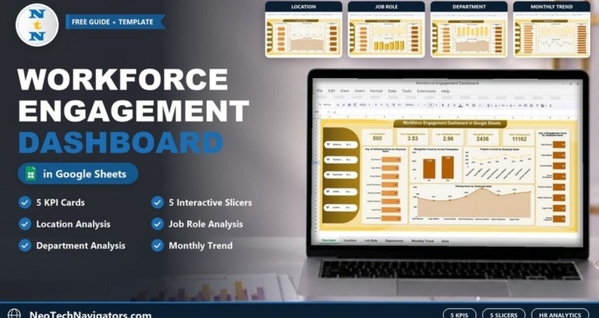
Engagement surveys, recognition programmes and training records often live in separate files, so HR teams struggle to see whether people are engaged, where satisfaction is slipping and who is getting enough development. The Workforce Engagement Dashboard in Google Sheets brings those numbers onto one interactive dashboard and four analysis pages, all fed by a single data sheet.
It is designed for HR managers, HR analysts, people-operations teams and department heads who want a clear engagement report without an expensive HR analytics platform. You get a main dashboard with five KPI cards, five slicers (Month, Employee, Department, Job Role and Location), Location, Job Role, Department and Monthly Trend analysis pages, and a Data sheet where you maintain the records.
Get the Workforce Engagement Dashboard
What Problem Does a Workforce Engagement Dashboard Solve?
Engagement problems rarely show up in one place. A team can have high engagement scores but low satisfaction, or a location can receive far fewer training hours than the rest. When these figures sit in different spreadsheets, nobody notices until attrition rises. This dashboard lets you compare engagement, satisfaction, recognition, projects and training side by side and slice them by employee, department, role, location and month.
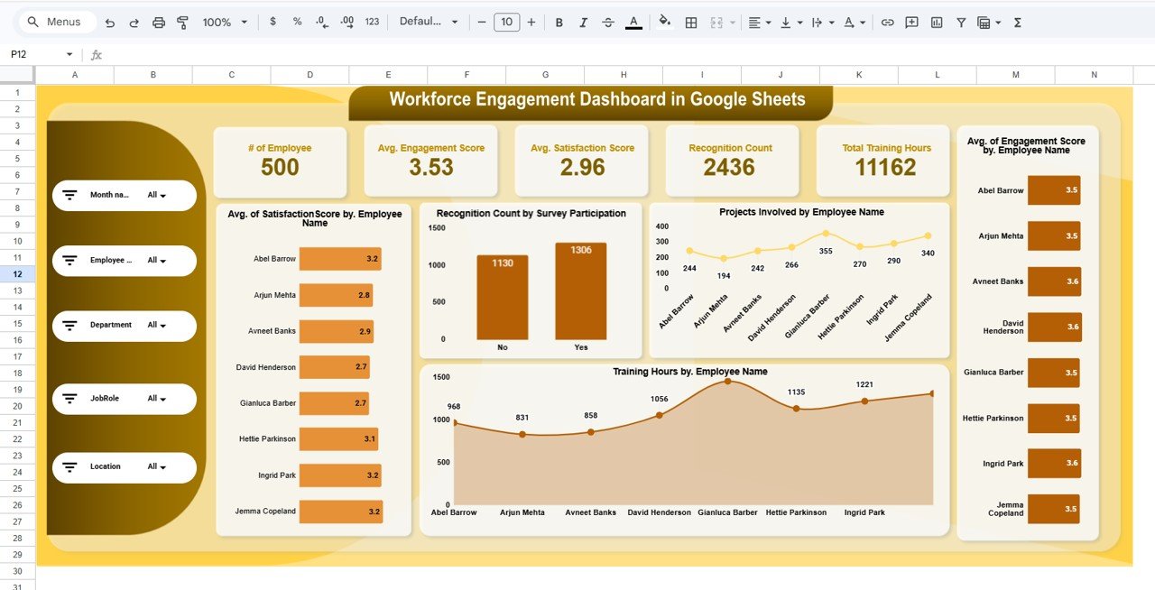
KPI Cards on the Main Dashboard
The sample file contains 500 employee records. Here is what each card shows:
| KPI card | What it measures | How it is calculated | Sample value | Better when |
|---|---|---|---|---|
| # of Employee | Number of employee records in the current filter | Count of rows in the Data sheet | 500 | Context only |
| Avg. Engagement Score | Average engagement level | Average of the Engagement Score column | 3.53 | Higher |
| Avg. Satisfaction Score | Average job satisfaction | Average of the Satisfaction Score column | 2.96 | Higher |
| Recognition Count | Total recognitions received | Sum of the Recognition Count column | 2,436 | Higher |
| Total Training Hours | Development time invested | Sum of the Training Hours column | 11,162 | Higher, within budget |
In the sample, the average engagement score (3.53) is noticeably higher than the average satisfaction score (2.96). That gap is exactly the kind of signal this dashboard is built to surface: people may be committed to their work while being unhappy with conditions such as workload, pay or management.
Inside the Dashboard: Page by Page
1. Main Dashboard
The left panel holds the five slicers. Next to the KPI cards, five charts break the data down by person and participation:
- Avg. of Satisfaction Score by Employee Name – for example Abel Barrow 3.2 and Arjun Mehta 2.8.
- Recognition Count by Survey Participation – 1,306 recognitions for employees who took part in the survey (Yes) and 1,130 for those who did not (No).
- Projects Involved by Employee Name – a line chart from 194 to 355 projects in the sample.
- Training Hours by Employee Name – an area chart of training hours per employee.
- Avg. of Engagement Score by Employee Name – values between 3.5 and 3.6 in the sample.
2. Location Analysis
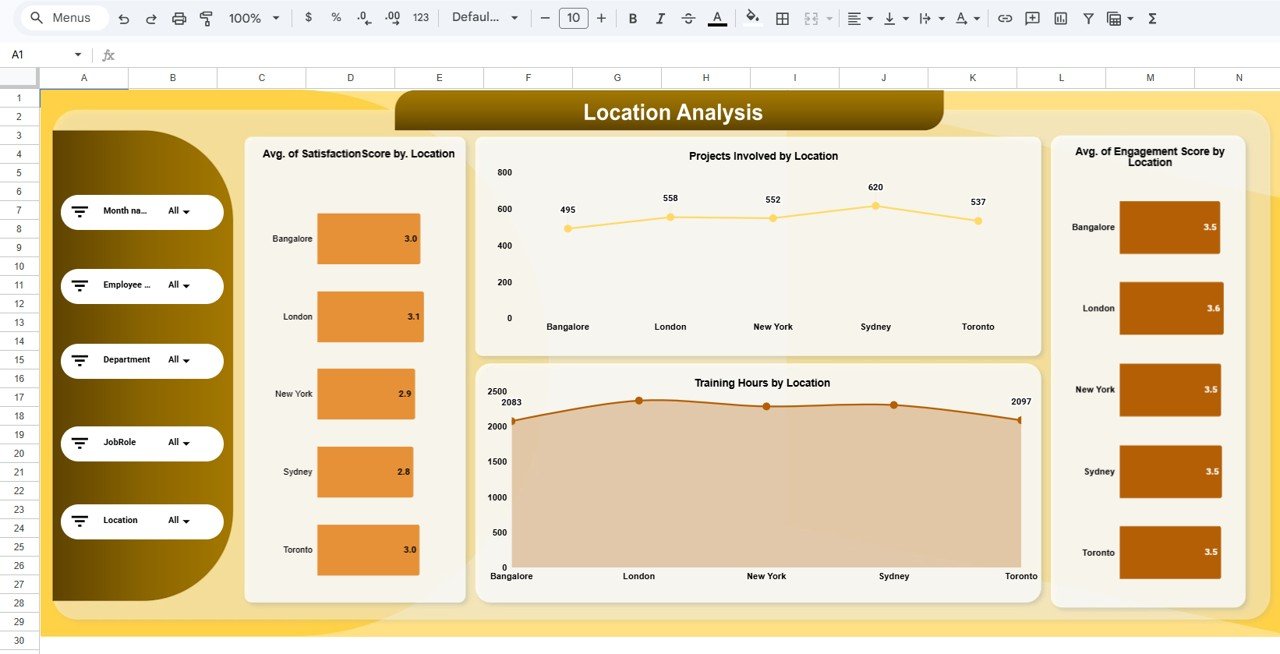
This page compares five locations: Bangalore, London, New York, Sydney and Toronto. It shows Avg. Satisfaction Score by Location (London is highest at 3.1, Sydney lowest at 2.8), Projects Involved by Location (Sydney leads with 620), Training Hours by Location and Avg. Engagement Score by Location (London 3.6, the others 3.5).
3. Job Role Analysis
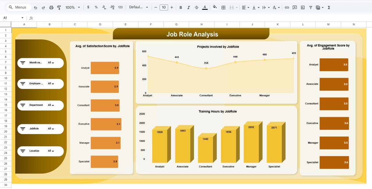
Six roles are compared: Analyst, Associate, Consultant, Executive, Manager and Specialist. In the sample, Executives and Managers have the highest satisfaction (3.1), Managers receive the most training hours (2,092) and Consultants the fewest (1,442), and Consultants are also involved in the fewest projects (358).
4. Department Analysis
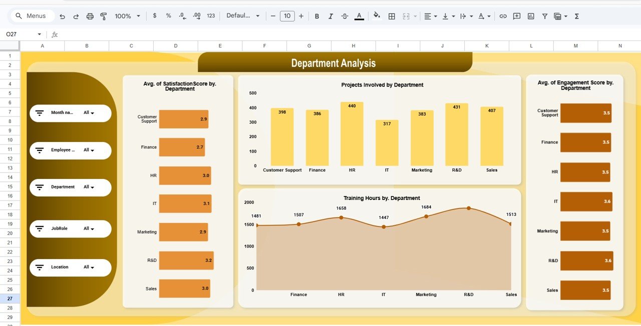
Seven departments are covered: Customer Support, Finance, HR, IT, Marketing, R&D and Sales. R&D has the highest satisfaction in the sample (3.2) and Finance the lowest (2.7). HR is involved in the most projects (440) and IT the fewest (317). Training hours by department and average engagement by department complete the page.
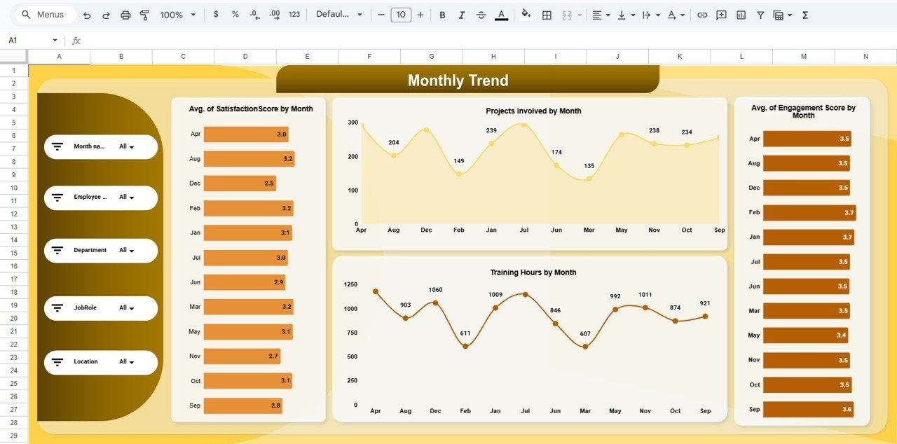
5. Monthly Trend
The Monthly Trend page shows the same four measures by month: Avg. Satisfaction Score by Month, Projects Involved by Month, Training Hours by Month and Avg. Engagement Score by Month. In the sample, December has the lowest satisfaction (2.5) while February and January show the highest engagement (3.7). Note that the months on this page are listed in alphabetical order (Apr, Aug, Dec …) rather than calendar order, so read the labels carefully when spotting trends.
6. Data Sheet
All pages read from the Data sheet, where each row is one employee record. Judging by the slicers and charts, it holds employee name, department, job role, location and month, together with the engagement score, satisfaction score, recognition count, projects involved, training hours and survey participation for each record.
How to Use It With Your Own Data
- Make a copy of the file in your Google Drive.
- Export your survey results and HR records (employee, department, role, location, month).
- Match your columns to the existing Data sheet headers and keep the same order.
- Use one consistent scoring scale for Engagement Score and Satisfaction Score so the averages are comparable.
- Clear the sample rows and paste your records.
- Open the main dashboard and use the slicers, for example Department = Finance, to drill in.
- Add new survey rounds and training data each month so the Monthly Trend page stays current.
Real-World Use Cases
- Quarterly engagement review: HR compares satisfaction across the seven departments and picks the lowest two for focus groups.
- Training budget allocation: L&D sees that one role or location receives far fewer training hours and rebalances the next quarter’s plan.
- Recognition programme check: leaders compare recognition counts between survey participants and non-participants to see whether recognition goes to people who speak up.
Best Practices
- Look at engagement and satisfaction together. A gap between the two is often more useful than either number alone.
- Keep names consistent. “R&D” and “R and D” will be treated as different departments.
- Protect personal data. Share a view-only copy, and consider removing names before sharing beyond HR.
- Act on what you see. Pair the dashboard with a simple action log so each low score leads to a follow-up.
- Update on a fixed cycle. Monthly or after each pulse survey works well.
Limitations: Who Should Not Use It
- It analyses the data you provide; it does not run surveys or collect responses.
- Employee-name charts become crowded with large headcounts, so use the Employee slicer or rely on the department, role and location pages.
- Months appear alphabetically on the Monthly Trend page, which is less convenient for reading seasonal patterns.
- It does not predict attrition or calculate eNPS. Teams that need those measures should add them separately.
Other Engagement Metrics Worth Tracking
These are not part of this template, but many HR teams track them alongside it: employee Net Promoter Score (eNPS), voluntary turnover rate, absenteeism rate and internal promotion rate. Keep them in a separate sheet if you need them.
Related Guides and Templates
For a broader HR view, see the HR KPI Dashboard in Google Sheets and the Employee Productivity Dashboard in Google Sheets. If training hours are your focus, the Training and Development Dashboard in Google Sheets goes deeper. To collect the inputs, try the Employee Feedback Tracker and the Employee Recognition Nomination Tracker.
A related template is the Employee Engagement Dashboard in Google Sheets. To learn how dashboards like this are designed, the pivot tables and dashboards course on NextGenTemplates Academy covers the method step by step.
Frequently Asked Questions
What does the Workforce Engagement Dashboard track?
Five KPI cards: # of Employee, Avg. Engagement Score, Avg. Satisfaction Score, Recognition Count and Total Training Hours, plus projects involved, broken down by employee, location, job role, department and month.
Which filters are available?
Month, Employee, Department, Job Role and Location slicers appear on every page.
Can I use my own survey scale?
Yes, as long as you use the same scale for every record. The dashboard averages whatever scores you enter.
How many employees can it handle?
The sample has 500 records. Google Sheets handles a few thousand rows comfortably; very large datasets will slow it down.
Is employee data safe in Google Sheets?
Access depends on your sharing settings. Keep the master file restricted to HR and share view-only copies with leaders.
Do I need formula knowledge?
No. You only update the Data sheet; the cards and charts recalculate automatically.
Wrapping Up
Engagement improves when you can see it clearly and act early. The Workforce Engagement Dashboard in Google Sheets puts engagement, satisfaction, recognition, projects and training on one screen and lets you slice them by employee, department, role, location and month. Load your latest survey data, find the biggest gap, and make it the focus of your next HR review.
Get the Workforce Engagement Dashboard for Google Sheets
📅 Last updated: October 2026