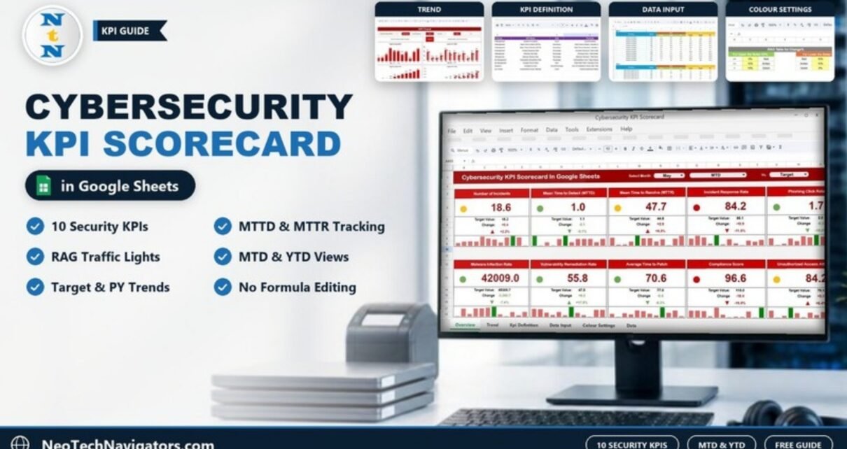
The Cybersecurity KPI Scorecard in Google Sheets shows ten security metrics on one screen, from Number of Incidents and Mean Time to Detect (MTTD) to Compliance Score and Unauthorized Access Attempts. Each one gets a green, amber or red light against its target or last year. Pick a month, switch between MTD and YTD, and the whole page updates.
It is designed for IT security leads, SOC managers, CISOs at smaller companies and IT managers who have to report security posture to management every month. The file contains five sheets: Scorecard, Trend, KPI Definition, Data Input and Colour Settings. The calculations, arrows and colours are already built in, so you only enter monthly numbers.
Below you will find each sheet explained, the ten KPIs with the formulas used in the template, a worked example from the sample data, and an honest note on what a spreadsheet scorecard cannot replace.
🎥 Watch the Video Tutorial
Get the Cybersecurity KPI Scorecard
Why Security Teams Need a Scorecard
Security tools produce a lot of data: SIEM alerts, ticket queues, vulnerability scan results, phishing simulation reports. What management usually wants is much simpler. Are we getting better or worse, and where should we spend effort next month?
A scorecard answers that by reducing each area to one number per month, comparing it with a target and with the previous year, and colouring the result. It does not replace your security tools. It is the summary page you take into a monthly risk or IT steering meeting.
The 10 KPIs in the Cybersecurity KPI Scorecard in Google Sheets
These are the KPIs exactly as defined on the template’s KPI Definition sheet. The Type column decides how colours are applied: UTB means Upper the Better, LTB means Lower the Better.
| KPI | KPI Group | Unit | Formula (from the template) | Better when |
|---|---|---|---|---|
| Number of Incidents | Incident Management | Count | Count(Incidents) | Lower (LTB) |
| Mean Time to Detect (MTTD) | Incident Management | Hours/Days | (Total Time to Detect) / (Number of Incidents) | Lower (LTB) |
| Mean Time to Resolve (MTTR) | Incident Management | Hours/Days | (Total Time to Resolve) / (Number of Incidents) | Lower (LTB) |
| Incident Response Rate | Incident Management | Percentage | (Incidents Resolved / Total Incidents) * 100 | Higher (UTB) |
| Phishing Click Rate | Threat Management | Percentage | (Phishing Clicks / Total Emails) * 100 | Lower (LTB) |
| Malware Infection Rate | Threat Management | Percentage | (Malware Infections / Total Devices) * 100 | Lower (LTB) |
| Vulnerability Remediation Rate | Vulnerability Management | Percentage | (Vulnerabilities Fixed / Total Vulnerabilities) * 100 | Higher (UTB) |
| Average Time to Patch | Vulnerability Management | Days | (Total Patch Time) / (Number of Vulnerabilities) | Lower (LTB) |
| Compliance Score | Compliance | Score/Percentage | Sum of Compliance Checks Met / Total Checks * 100 | Higher (UTB) |
| Unauthorized Access Attempts | Access Control | Count | Count(Unauthorized Attempts) | Lower (LTB) |
Note that seven of the ten KPIs are Lower the Better. That is normal for security, where fewer incidents, faster detection and shorter patch times are the goal.
Sheet-by-Sheet Walkthrough
1. Scorecard Sheet
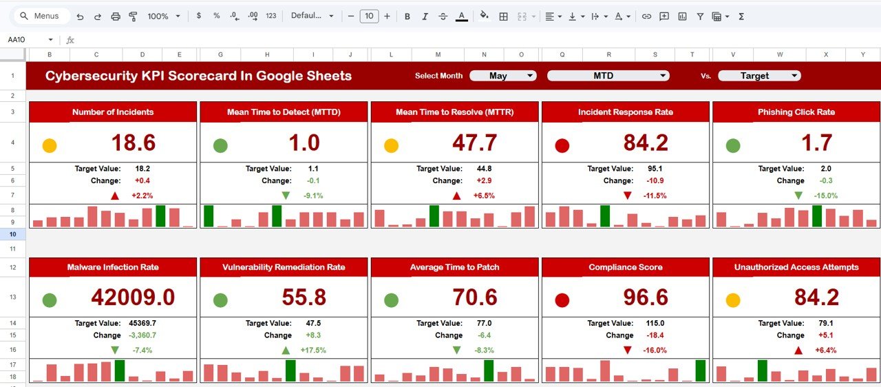
The header has three dropdowns: Select Month, a period selector for MTD or YTD, and Vs., set to Target in the sample. Ten KPI cards sit below in two rows. Each card shows:
- The actual value with a coloured status dot
- The Target Value for the selected period
- The Change as a number and as a percentage, with an arrow
- A 12-month mini bar chart that shows how the KPI moved across the year
2. Trend Sheet
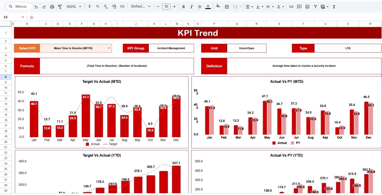
Select a KPI from the Select KPI dropdown in cell C3. The sheet fills in the KPI Group, Unit, Type, Formula and Definition, and shows four charts: Target Vs Actual (MTD), Actual Vs PY (MTD), Target Vs Actual (YTD) and Actual Vs PY (YTD). The sample shows Mean Time to Resolve (MTTR): Incident Management group, Hours/Days, LTB.
3. KPI Definition Sheet
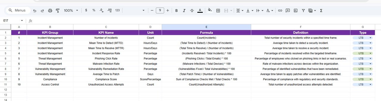
Each KPI has one row: number, KPI Group, KPI Name, Unit, Formula, Definition and Type (UTB or LTB from a dropdown). This is the reference everyone should agree on before data entry starts, because “incident” and “resolved” mean different things in different teams.
4. Data Input Sheet
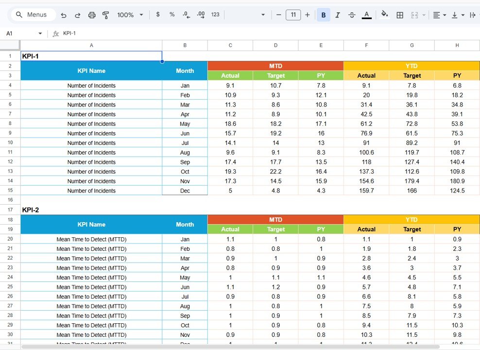
Data is entered in blocks, one per KPI (KPI-1, KPI-2 and so on). Each block has a row for every month from Jan to Dec, with six value columns: MTD Actual, MTD Target, MTD PY and YTD Actual, YTD Target, YTD PY. The scorecard and trend charts read directly from these blocks.
5. Colour Settings Sheet
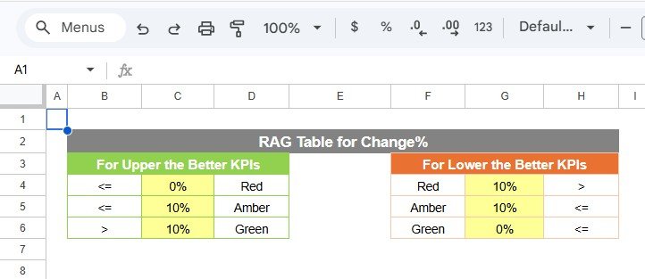
The RAG Table for Change% sets the thresholds:
- Upper the Better: 0% or less is Red, up to 10% is Amber, above 10% is Green.
- Lower the Better: above 10% is Red, up to 10% is Amber, 0% or less is Green.
Worked Example: Reading the May Scorecard
In the sample, May MTD for Number of Incidents has an actual of 18.6 and a target of 18.2.
Change    = 18.6 - 18.2           = +0.4
Change %  = (18.6 - 18.2) / 18.2  = +2.2%
Number of Incidents is Lower the Better, so any increase is unwelcome, but +2.2% is inside the 10% amber band. The card shows amber.
Three more cards from the same month show how the rules play out:
- Incident Response Rate (UTB): 84.2 against 95.1 is −10.9, or −11.5%. A fall on an Upper the Better KPI is red.
- Phishing Click Rate (LTB): 1.7 against 2.0 is −15.0%. A fall on a Lower the Better KPI is green.
- Vulnerability Remediation Rate (UTB): 55.8 against 47.5 is +17.5%, above the 10% line, so green.
Reading the May page, the story is clear: phishing awareness and remediation are working, but fewer incidents are being resolved on time. That is where the next month’s attention goes.
How to Use It With Your Own Data
- Agree definitions on the KPI Definition sheet first: what counts as an incident, when detection time starts, what “resolved” means.
- Check each KPI’s Type. If you replace a KPI, make sure UTB or LTB is set correctly, or the colours will be reversed.
- Adjust the thresholds on Colour Settings if 10% is too wide for metrics such as Compliance Score.
- Clear the sample values in Data Input and enter your monthly MTD Actual, Target and PY figures for each KPI.
- Fill the YTD columns the same way every month. In the sample file, YTD values are running totals of the monthly figures; if you prefer running averages for times and percentages, adjust the targets to match and stay consistent.
- Open the Scorecard, select the month and MTD or YTD, then use the Trend sheet to investigate any red card.
Three Real-World Use Cases
Monthly IT risk committee
The IT security lead presents the scorecard in YTD view against Target, then opens the Actual Vs PY charts on the Trend sheet to show whether MTTD and MTTR have improved since last year.
A managed security service provider reporting to a client
One copy of the scorecard per client gives a consistent monthly report: incidents, response rate, patching and compliance, all on one page.
Security awareness programme review
HR and IT look at Phishing Click Rate and Malware Infection Rate together after each training round, using the trend charts to see whether the effect lasts.
Best Practices
- Take numbers from the system of record (SIEM, ticketing, vulnerability scanner), not from memory or estimates.
- Keep the definition of an incident stable for the whole year, or the trend charts lose meaning.
- Do not set a zero target for counts like Unauthorized Access Attempts. Some background noise is normal; set a realistic ceiling.
- Review MTTR and Incident Response Rate together. One can improve at the expense of the other.
- Restrict edit access to the Data Input sheet to the people who own the numbers.
Other KPIs Worth Tracking
The template ships with the ten KPIs above. Depending on your environment, you might replace one or two with measures such as mean time to contain, percentage of endpoints with up-to-date antivirus, multi-factor authentication coverage, or backup restore test success rate. These are not part of the template; you would add them yourself through the KPI Definition and Data Input sheets.
Limitations and Who Should Not Use It
This is a monthly reporting tool, not a monitoring tool. It will not raise alerts, ingest logs or show anything in real time. Large security operations centres with automated pipelines will already have dashboards in their SIEM and may only find this useful as a management summary. And because figures are typed in, the scorecard is only as reliable as the process behind it.
Related Templates and Guides
If you prefer charts to KPI cards, see the Cybersecurity KPI Dashboard in Google Sheets. For incident-focused reporting, compare the Cyber Incident Response KPI Dashboard and the Cybersecurity Incident KPI Dashboard. Broader IT teams may want the IT KPI Scorecard in Google Sheets, and the Cybersecurity Checklist in Google Sheets helps with the controls behind the numbers.
Related template: there is also a Cybersecurity KPI Scorecard in Excel for teams that work offline.
If you want to learn how to build scorecards and dashboards like this, the Excel Pivot Tables & Dashboards course on NextGenTemplates Academy covers the techniques in structured lessons.
Frequently Asked Questions
Which KPIs are included in the Cybersecurity KPI Scorecard?
Number of Incidents, Mean Time to Detect (MTTD), Mean Time to Resolve (MTTR), Incident Response Rate, Phishing Click Rate, Malware Infection Rate, Vulnerability Remediation Rate, Average Time to Patch, Compliance Score and Unauthorized Access Attempts.
How are the traffic-light colours decided?
The scorecard calculates the percentage change between actual and the comparison value, then applies the RAG table on the Colour Settings sheet. The direction depends on whether the KPI is Upper the Better or Lower the Better.
Can I compare with last year instead of target?
Yes. The Data Input sheet stores PY values for every month, the Trend sheet has Actual Vs PY charts for both MTD and YTD, and the scorecard header has a Vs. selector next to the MTD/YTD dropdown (set to Target in the sample).
Can I replace the KPIs with my own?
Yes. Edit the KPI Definition sheet and enter matching data in the Data Input blocks. Set the Type correctly so the colours make sense.
Does the scorecard connect to my SIEM or ticketing tool?
No. You enter or paste monthly figures. If you want automation, you could export monthly totals from your tools and paste them into the Data Input sheet.
Is my security data safe in Google Sheets?
The file stays in your own Google account. Share it only with people who need it, and enter aggregated monthly figures rather than sensitive incident details.
Get the Cybersecurity KPI Scorecard in Google Sheets
Wrapping Up
The Cybersecurity KPI Scorecard in Google Sheets turns ten core security measures into a one-page monthly report that managers can read in a minute. Agree your definitions first, load last year’s figures so the PY comparisons work, and bring the scorecard to your next security review.
📅 Last updated: October 2026