Logistics Dashboard in Google Sheets is a 7-tab reporting template for shipment volume, freight cost, carrier performance, delivery status, transit days, regional trends, and Shipment ID lookup. It includes 4 KPI cards, 12 chart views, slicers, a Search Sheet, and a structured Data Sheet, giving logistics teams a practical way to review freight performance without building a dashboard from zero.
Many logistics teams still review shipments in exported files, carrier portals, emails, and separate spreadsheets. That makes it harder to answer simple questions: how many shipments moved this month, which carrier handled the most weight, which region is expensive, and whether on-time delivery is improving. This Google Sheets dashboard puts those answers in one editable workbook.
Click here to get the Logistics Dashboard in Google Sheets from NextGenTemplates.
Key Features of Logistics Dashboard in Google Sheets
- 7 connected sheet tabs: Overview, Shipment Analysis, Freight Cost Analysis, Carrier Performance, Delivery Performance, Search Sheet, and Data Sheet.
- 4 headline KPI cards: Total Shipments, Total Freight Cost, On-Time Delivery, and Avg Transit Days.
- 12 chart views: Analyze shipment volume, transport mode, freight cost, carrier workload, delivery status, and regional transit days.
- Interactive slicers: Filter dashboard views quickly by available fields. Google also documents slicers in Google Sheets for users who want to understand how dashboard filtering works.
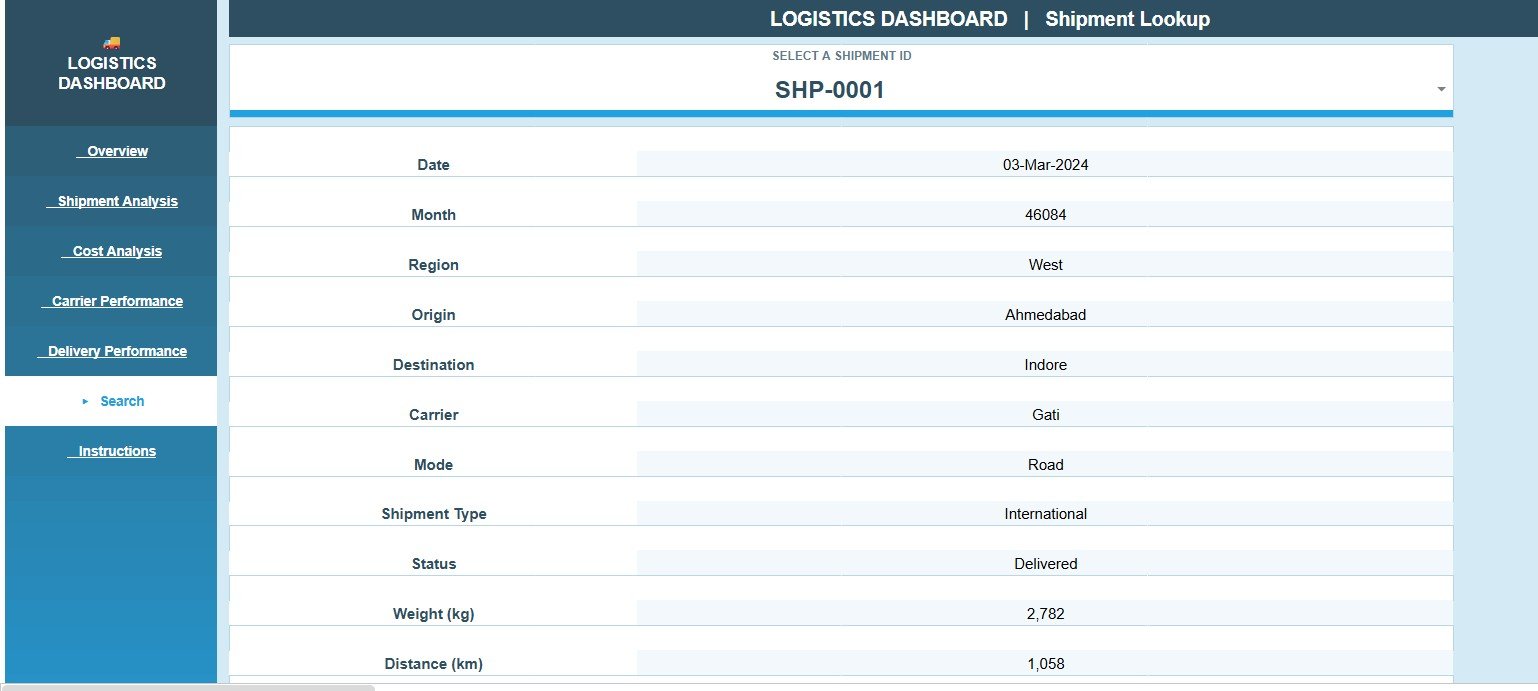
- Shipment Lookup: Select a Shipment ID and instantly view the matching shipment record.
- Editable Data Sheet: Replace the sample rows with your own logistics data while keeping the same structure.
- Team-friendly format: Share the Google Sheets file with view or edit permissions through Google Drive.
Dashboard Pages Explanation
1. Overview Page
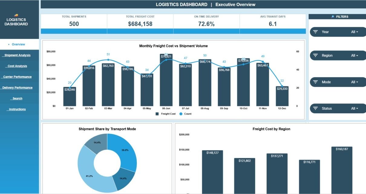
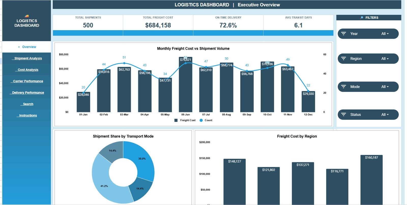
The Overview Page is the management summary tab. At the top, it shows Total Shipments, Total Freight Cost, On-Time Delivery, and Avg Transit Days, so a manager can quickly understand volume, spend, service quality, and delivery speed.
Freight Cost and Shipment Volume by Month: This chart compares monthly freight cost with monthly shipment count.
It helps you see whether cost movement is driven by more shipments, higher freight rates, mode mix, or operating pressure.
Shipment Share by Transport Mode: This chart shows how shipments are distributed by mode, such as road, air, rail, sea, or other options.
It helps teams understand dependency on each transport mode and review whether mode mix matches cost and service goals.
Freight Cost by Region: This chart compares freight cost across regions.
It helps identify high-cost regions that may need route review, carrier negotiation, or process improvement.
2. Shipment Analysis
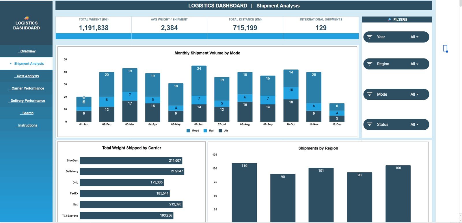
The Shipment Analysis tab focuses on movement, volume, carrier load, shipped weight, and region contribution. It is useful for operations reviews and monthly logistics reporting.
Shipment Volume by Month and Mode: This chart shows shipment count by month and transport mode.
It helps teams identify seasonal volume changes, mode shifts, and capacity pressure before it becomes a service issue.
Total Weight Shipped by Carrier: This chart compares total shipped weight by carrier.
It helps you see which partners are carrying heavier freight and whether carrier workload is balanced.
Shipments by Region: This chart shows shipment count by region.
It helps managers understand where logistics activity is concentrated and which regions drive the most operational volume.
3. Freight Cost Analysis
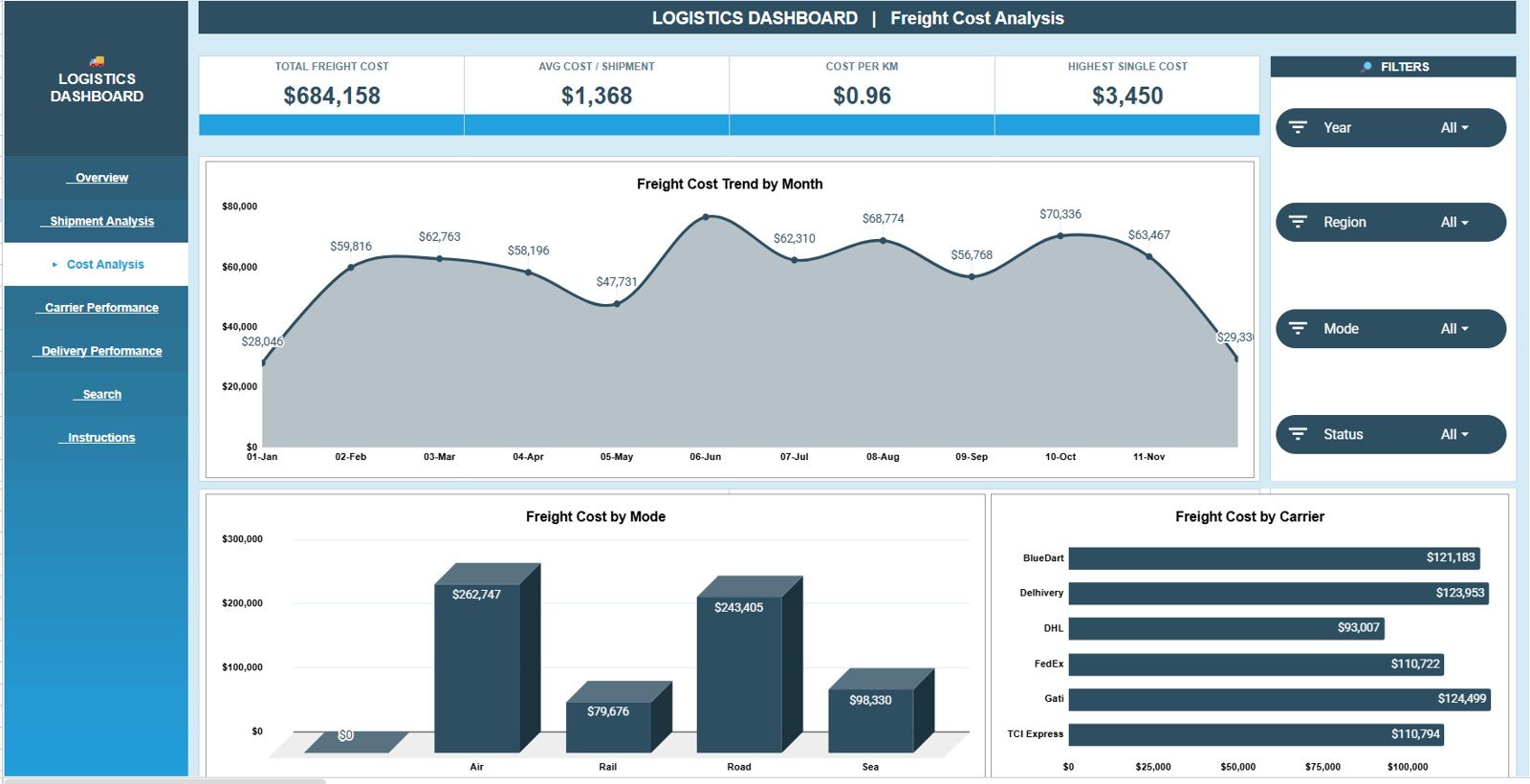
The Freight Cost Analysis tab is designed for cost review. It separates freight spending by month, mode, and carrier so finance and operations teams can discuss cost drivers with the same view.
Freight Cost by Month: This chart tracks freight spend over time.
It helps identify months where shipping cost increased and supports budget review or root-cause analysis.
Freight Cost by Mode: This chart compares cost across transport modes.
It helps reveal whether a mode such as air, road, rail, or sea is responsible for most logistics spend.
Freight Cost by Carrier: This chart ranks carriers by freight cost.
It helps teams prepare for carrier review meetings and compare cost concentration across partners.
4. Carrier Performance
The Carrier Performance tab helps compare carriers on workload, status mix, and average transit days. This makes it easier to review speed, reliability, and dependency by carrier.
Shipment Status Mix by Carrier: This chart breaks shipment statuses by carrier.
It helps identify carriers with more delayed, pending, or exception records compared with others.
Shipments Handled by Carrier: This chart compares shipment count by carrier.
It helps reveal whether one carrier is carrying most of the workload or whether shipment volume is spread across partners.
Average Transit Days by Carrier: This chart compares average transit time by carrier.
It helps teams evaluate carrier speed alongside cost, instead of selecting partners from price alone.

5. Delivery Performance
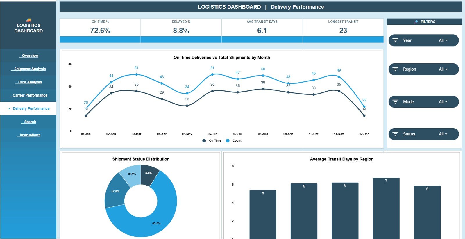
The Delivery Performance tab focuses on on-time delivery, shipment status, and region-level transit days. It is useful for service-level review and delivery improvement discussions.
On-Time Deliveries and Total Shipments by Month: This chart compares total shipments with on-time deliveries by month.
It helps check whether service quality is keeping up as shipment volume changes.
Shipments by Status: This chart shows the distribution of shipments by status.
It helps managers quickly see how much work is completed, delayed, pending, or in progress.
Average Transit Days by Region: This chart compares average transit days across regions.
It helps identify regional lanes or zones where delivery times are longer than expected.
6. Search Sheet Tab
The Search Sheet tab is the Shipment Lookup sheet. Select a Shipment ID and the dashboard returns the matching shipment details, including date, region, origin, destination, carrier, mode, shipment type, status, weight, and distance.
This is helpful when a manager, customer, or operations user asks about one shipment and you do not want to scroll through the full Data Sheet.
7. Data Sheet Tab
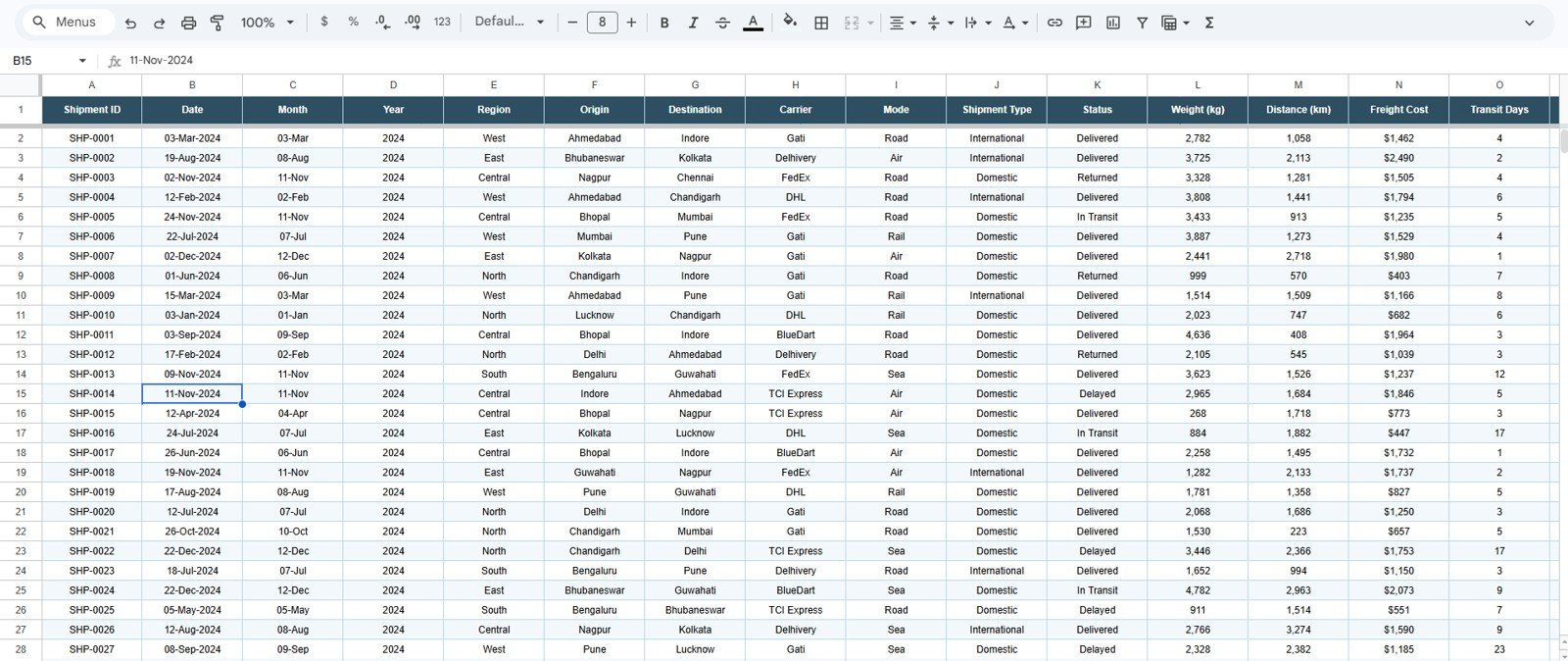
The Data Sheet tab is where users add or paste logistics records in the same format as the sample data. Keeping the same columns allows the KPI cards, charts, slicers, and Shipment Lookup tab to keep working correctly.
Logistics Dashboard in Google Sheets vs. Microsoft Excel Dashboard vs. Paid TMS SaaS – Feature Comparison
| Feature | Logistics Dashboard in Google Sheets | Microsoft Excel dashboard | Paid TMS SaaS |
|---|---|---|---|
| Cost | $9.99 one-time template purchase | Template cost plus possible Microsoft 365 license | Monthly or annual subscription |
| Platform | Google Sheets in browser | Excel desktop or web | Vendor-hosted logistics software |
| Setup time | Copy sheet, replace data, review dashboard | Open workbook, update data, refresh formulas | Implementation and onboarding |
| Real-time team collaboration | Native Google Drive sharing | Best with OneDrive or SharePoint | Usually included by plan |
| Mobile access | Google Sheets app or browser | Excel app or browser | Vendor app or browser |
| Customizable fields | Edit sheet fields, charts, formulas, and slicers | Edit workbook structure | Often limited by admin permissions |
| Share with link | Yes, based on Google permissions | Yes, with Microsoft cloud storage | Often requires user accounts or paid seats |
| Year-1 cost at 5 users | $9.99 plus any Google Workspace costs | Template plus licensing if needed | Often hundreds or thousands per year |
| Shipment lookup | Built-in Shipment ID Search Sheet | Possible with formulas | Usually included in shipment records |
| Carrier performance reporting | Status mix, shipment count, freight cost, and transit days | Depends on workbook setup | Plan and implementation dependent |
Who Should Use This Template
- Logistics managers tracking shipment volume, delivery status, and freight cost.
- Supply chain analysts preparing recurring monthly logistics reports.
- Warehouse or dispatch teams that need a shared shipment reporting workbook.
- Small 3PL, courier, and distribution teams that are not ready for a paid TMS subscription.
- Finance teams reviewing freight cost by month, carrier, region, and mode.
Real-World Use Cases
Meera runs logistics for a regional distributor. She checks the Overview page every Monday to compare total shipments, freight cost, on-time delivery, and average transit days before the operations meeting.
Daniel is a supply chain analyst. He uses Freight Cost Analysis to explain why costs rose in a specific month, then checks transport mode and carrier views to separate volume growth from rate pressure.
Sana manages warehouse dispatch. When a customer asks about one shipment, she uses the Search Sheet tab to look up the Shipment ID and confirm origin, destination, carrier, mode, status, weight, and distance.
Advantages of Logistics Dashboard in Google Sheets
Click here to get the Logistics Dashboard in Google Sheets.
- Fast setup: Copy the Google Sheet, add your shipment data, and start reviewing dashboards.
- Low one-time cost: Useful for teams that need reporting without a recurring software bill.
- Clear page structure: Separate tabs for overview, shipment, cost, carrier, delivery, lookup, and data entry.
- Collaboration: Google Drive sharing makes it easier for operations, finance, and management to review the same file.
- Editable source: You can adjust fields, labels, formulas, and charts after purchase.
Opportunities for Improvement
This dashboard is a reporting template, not a live logistics platform. It does not include automatic carrier API connections, live GPS tracking, driver mobile apps, route optimization, EDI, warehouse scanning, or automated proof-of-delivery capture. Larger logistics operations may still need a dedicated TMS, especially if dispatch and customer notifications must run in real time.
The template also depends on clean data entry. If carrier names, regions, shipment statuses, or modes are inconsistent in the Data Sheet, charts may split categories. A simple data-entry standard will keep the dashboard much cleaner.
Best Practices
- Keep one row per shipment in the Data Sheet.
- Use consistent names for carriers, regions, modes, shipment types, and statuses.
- Do not change column headers unless you also update the related formulas and charts.
- Review Freight Cost by Month before budget meetings.
- Use Carrier Performance monthly to compare status mix, shipment volume, and transit speed.
- Share view-only access with stakeholders who only need to review the dashboard.
Explore Relevant Templates
- EV Fleet Dashboard in Google Sheets
- Inventory Management Dashboard in Google Sheets
- Logistics Management System Web App
- Transportation and Logistics Dashboard in HTML
- Browse Google Sheets dashboard templates
Frequently Asked Questions
Click here to get the Logistics Dashboard in Google Sheets.
Is the Logistics Dashboard built in Google Sheets?
Yes. It is a Google Sheets dashboard template that you copy into your own Google Drive and update with your shipment records.
What KPI cards are included?
The Overview page includes Total Shipments, Total Freight Cost, On-Time Delivery, and Avg Transit Days.
How many tabs are included?
The template includes 7 tabs: Overview, Shipment Analysis, Freight Cost Analysis, Carrier Performance, Delivery Performance, Search Sheet, and Data Sheet.
Can I search for one shipment?
Yes. The Search Sheet tab lets you select a Shipment ID and view matching shipment details such as date, region, origin, destination, carrier, mode, type, status, weight, and distance.
Can I customize the dashboard?
Yes. You can edit sheet names, formulas, fields, colors, charts, slicers, and labels in Google Sheets.
Does this replace a TMS?
No. It is a reporting dashboard. It does not replace live dispatch, GPS tracking, carrier API booking, EDI, route optimization, or proof-of-delivery workflows.
About the Author
Built by PK – Microsoft Certified Professional with 15+ years of Excel, Google Sheets, and Power BI experience. Founder of NextGenTemplates, reaching 300K+ subscribers across YouTube channels. Every template is hand-built and tested before release.
Conclusion
The Logistics Dashboard in Google Sheets gives logistics and supply chain teams a simple way to review shipment volume, freight cost, transport mode share, carrier workload, on-time delivery, average transit days, regions, and Shipment ID lookup from one editable workbook.
Click here to get the Logistics Dashboard in Google Sheets.
For step-by-step spreadsheet, dashboard, and automation tutorials, visit YouTube.com/@NeoTechNavigators.
Last updated: July 11, 2026.