Most risk teams do not have a measurement problem. They have a reporting problem. The register is somewhere – a GRC tool, a shared workbook, a consultant’s model – and every month somebody rebuilds the same board slide by hand, then argues about whether 84% is good.Risk Mitigation KPI Dashboard in Google Sheets
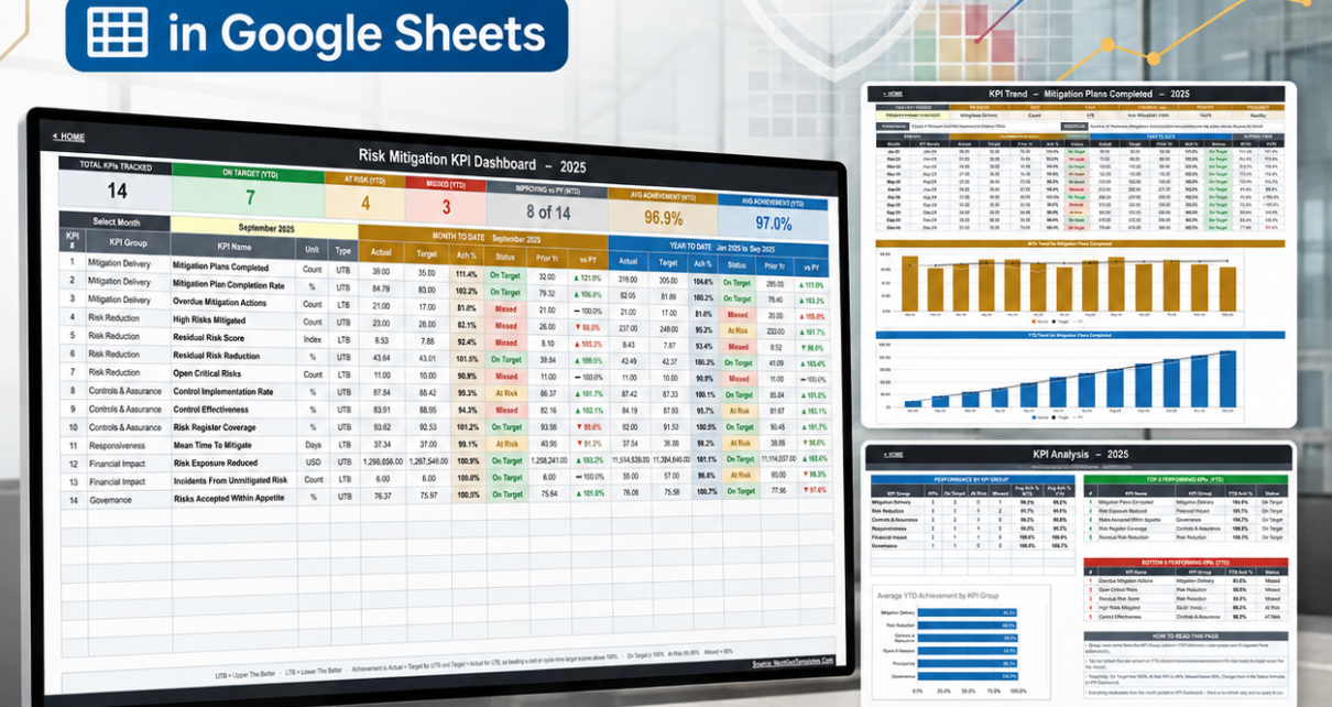
The Risk Mitigation KPI Dashboard in Google Sheets is built for exactly that last mile. It tracks 14 risk mitigation KPIs across 6 groups, gives every one of them a month-to-date and year-to-date achievement figure against target and prior year, colours it green, amber or red, and re-bases the whole sheet from a single month dropdown. It ships with a complete 2025 sample year, opens on September 2025, and runs on nothing but spreadsheet formulas – no add-on, no Apps Script, no refresh step, no paid Google account.
Get the Risk Mitigation KPI Dashboard in Google Sheets
Risk Mitigation KPI Dashboard in Google Sheets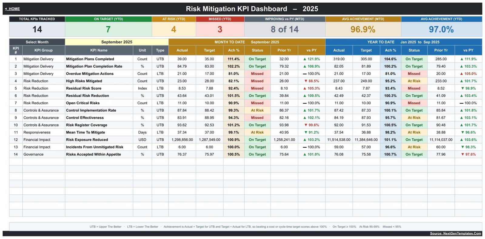
One thing to settle before anything else, because risk is a topic where vague claims do real damage. This is a reporting sheet. It is not a risk management system of record. It performs no risk scoring and implements no assessment methodology. It is not aligned to or certified against ISO 31000, COSO, NIST or SOC 2. It keeps no audit trail. It satisfies no regulatory or insurance requirement. Every number in it is typed in by you, and on its own it evidences nothing. What it does is make the numbers you already own legible in one page.Risk Mitigation KPI Dashboard in Google Sheets
Key Features of the Risk Mitigation KPI Dashboard in Google Sheets
- 14 KPIs in six groups. Mitigation Delivery (Mitigation Plans Completed, Mitigation Plan Completion Rate, Overdue Mitigation Actions), Risk Reduction (High Risks Mitigated, Residual Risk Score, Residual Risk Reduction, Open Critical Risks), Controls & Assurance (Control Implementation Rate, Control Effectiveness, Risk Register Coverage), Responsiveness (Mean Time To Mitigate), Financial Impact (Risk Exposure Reduced, Incidents From Unmitigated Risk) and Governance (Risks Accepted Within Appetite).
- Direction-aware achievement. Each KPI is tagged UTB (upper the better) or LTB (lower the better). Achievement is Actual ÷ Target for UTB and Target ÷ Actual for LTB – so cutting Mean Time To Mitigate below target scores above 100%, which is the behaviour most hand-built scorecards get wrong.Risk Mitigation KPI Dashboard in Google Sheets
- Editable traffic lights. On Target from 100%, At Risk 95% to 99%, Missed below 95%. The thresholds sit in the Status formulas, not in a locked script.
- Seven header cards – total KPIs tracked, On Target / At Risk / Missed counts for YTD, how many KPIs improved on prior year, and average achievement for MTD and YTD.
- Mixed units, one scorecard. Count, %, Index, Days and USD KPIs all coexist without breaking the achievement maths.Risk Mitigation KPI Dashboard in Google Sheets
- The KPI list is data. Add, rename or delete a KPI on one sheet and the dashboard, trend page and analysis page follow automatically.Risk Mitigation KPI Dashboard in Google Sheets
Dashboard Pages Explanation
Ten tabs, in three functional blocks, with a Home sheet acting as the switchboard.Risk Mitigation KPI Dashboard in Google Sheets
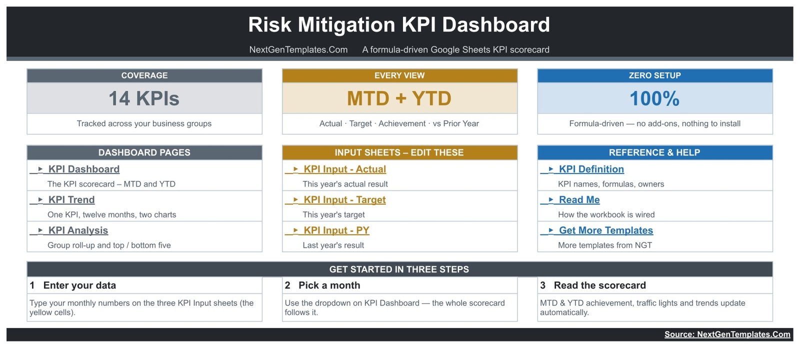
KPI Dashboard – the scorecard
Fourteen rows, one per KPI, each carrying group, name, unit and type, then two mirrored blocks: Month to Date (actual, target, achievement %, status, prior-year, vs PY) and Year to Date (the same six columns, cumulative from January). In the shipped sample, September 2025 shows 7 KPIs On Target for the year, 4 At Risk and 3 Missed, with average achievement of 96.9% MTD and 97.0% YTD – a deliberately imperfect month, so you can see every colour in use.Risk Mitigation KPI Dashboard in Google Sheets
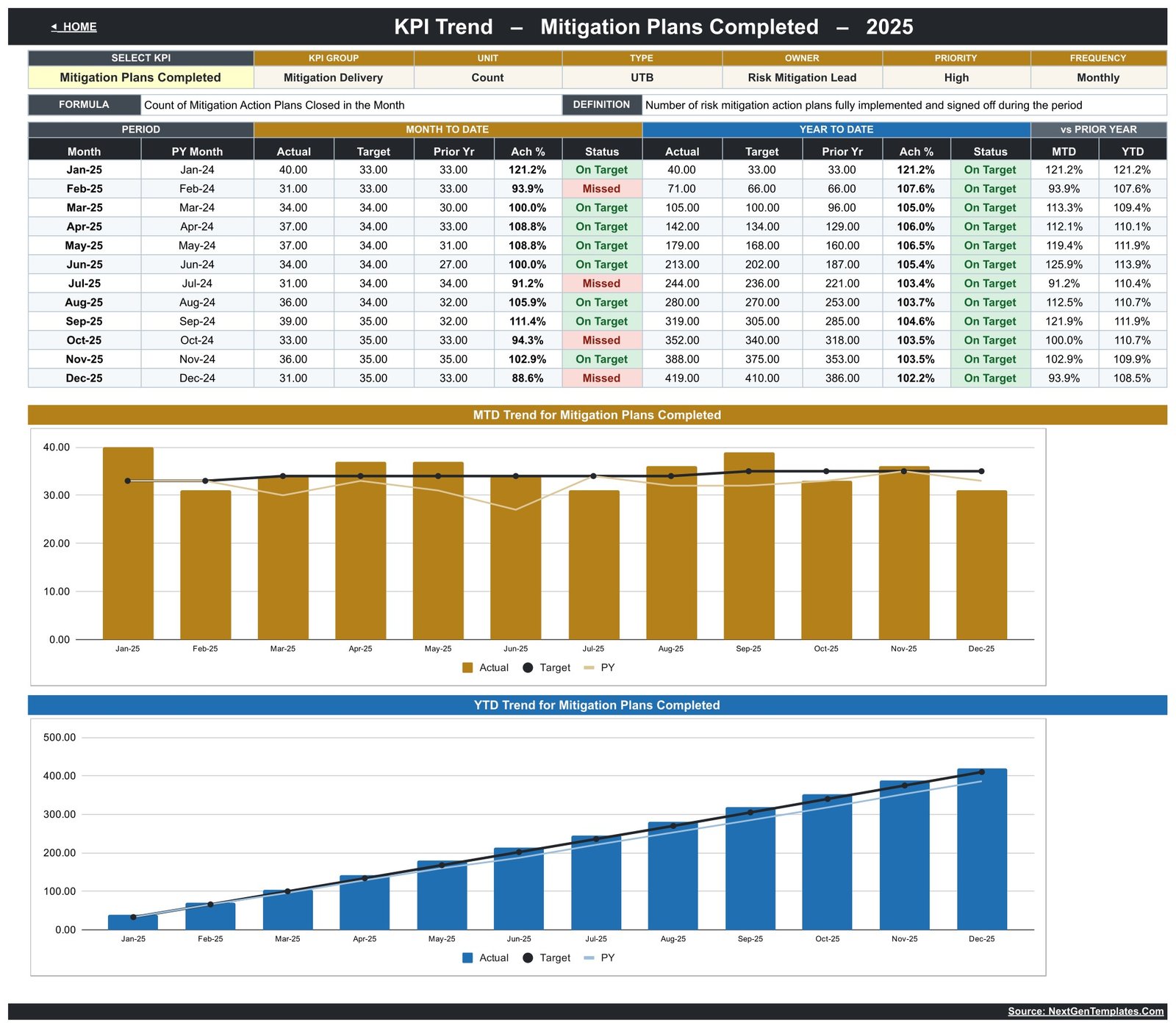
KPI Trend – one KPI, twelve months
Pick a KPI from the dropdown and the page loads its full identity card – group, unit, type, owner, priority, frequency, calculation formula and plain-English definition – then twelve months of MTD and YTD figures with status on each row. Below the table sit two charts: Actual vs Target vs Prior Year by month, and the cumulative YTD build. This is the page that answers “is this getting better or worse”, which is usually the only question a risk committee really asks.Risk Mitigation KPI Dashboard in Google Sheets
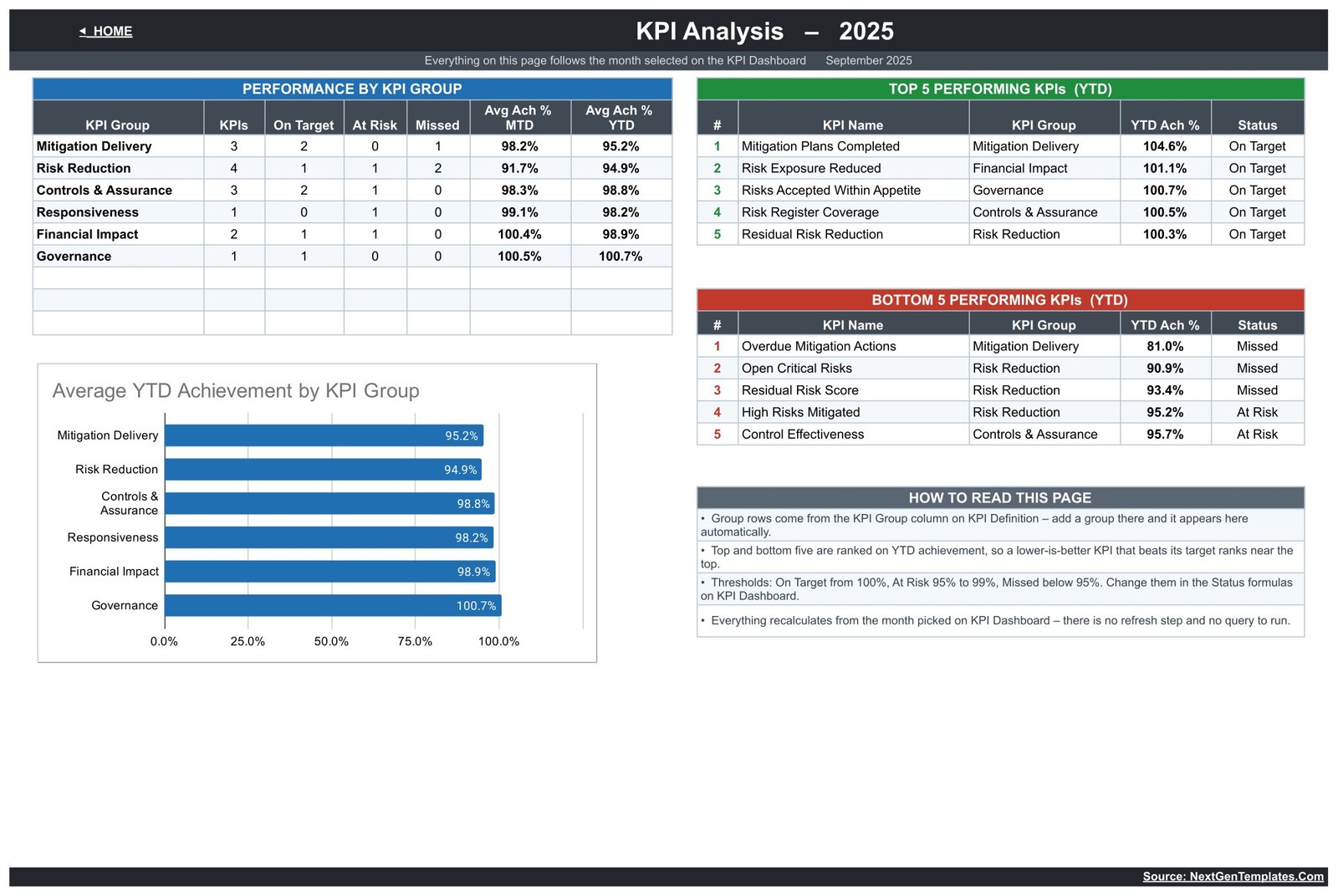
KPI Analysis – the roll-up
Performance by KPI group (count of KPIs, On Target / At Risk / Missed, average MTD and YTD achievement), Top 5 and Bottom 5 Performing KPIs ranked on YTD achievement, a bar chart of average YTD achievement by group, and a short “How to read this page” panel that explains the ranking and threshold logic in the sheet itself. In the sample, Controls & Assurance leads at 98.8% while Risk Reduction trails at 94.9% – a group-level story you would otherwise have to assemble by eye.Risk Mitigation KPI Dashboard in Google Sheets
Input sheets and reference sheets
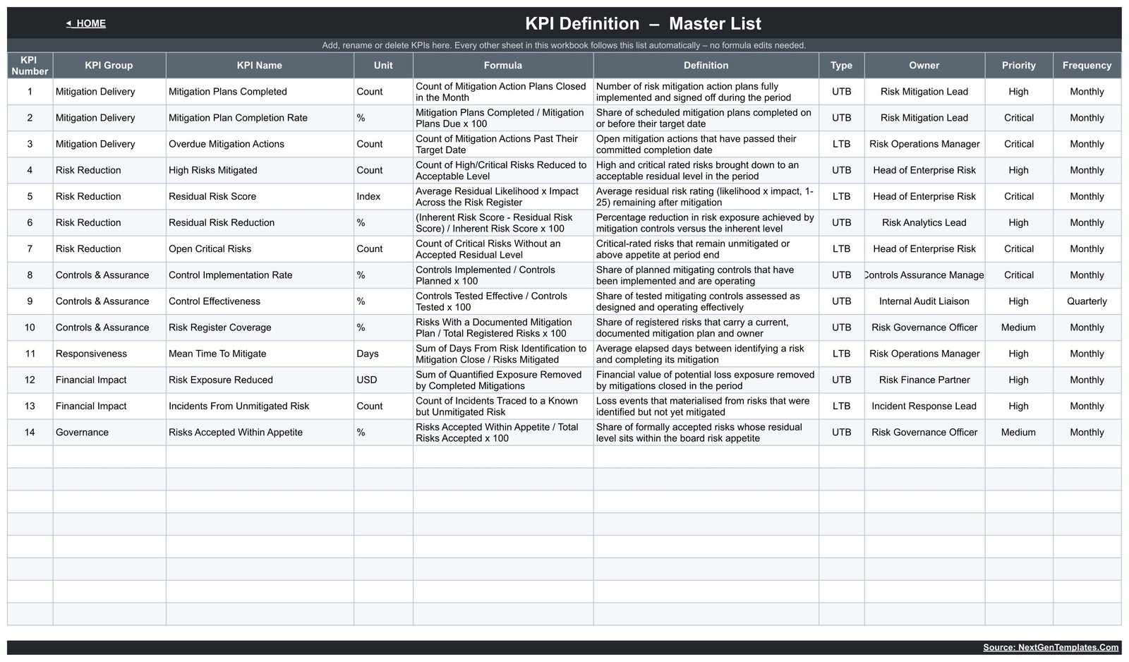
Three input sheets – KPI Input – Actual, KPI Input – Target and KPI Input – PY – share one grid: 14 KPI rows by twelve months, MTD and YTD columns per month, all in yellow entry cells. Cell E3 on the Actual sheet defines the first month of the reporting year; change it and every month label re-bases. KPI Definition is the master list carrying number, group, name, unit, formula, definition, type, owner, priority and frequency for all fourteen – the sample assigns owners such as Risk Mitigation Lead, Risk Operations Manager, Head of Enterprise Risk, Internal Audit Liaison and Risk Governance Officer, with Critical, High or Medium priority and a Monthly cadence for thirteen of the fourteen. A Read Me sheet and a Get More Templates sheet round it out.
Google Sheets vs. Excel vs. Paid GRC Software – Feature Comparison
| This template (Google Sheets) | Excel KPI dashboard | Paid GRC / risk platform | |
|---|---|---|---|
| Cost | One-off, under $15 | One-off, similar | $5,000-$50,000+ per year |
| Platform | Browser, any OS | Desktop Excel | Vendor-hosted SaaS |
| Setup time | Minutes | Minutes | Weeks of implementation |
| Real-time collaboration | Yes, native | Via OneDrive only | Yes |
| Mobile access | Sheets app | Excel app | Vendor app |
| Customisable KPI list | Yes – edit one sheet | Yes | Usually vendor-configured |
| Share with a link | Yes | No | Seat-based |
| Year-1 cost at 5 users | Under $15 total | Under $20 total | Often five figures |
| Risk register, workflow, approvals | No | No | Yes |
| Audit trail and evidence store | No | No | Yes |
Who Should Use This Template
Risk and assurance leads who need a monthly one-pager for a risk committee. Operations managers who want to know whether mitigation actions are actually closing. Small and mid-size organisations with no GRC budget. Consultants who need a reusable client reporting format. Anyone whose current process is a manual slide rebuilt from scratch every month.
It is the wrong tool if you need the register itself – risk descriptions, likelihood and impact scoring, treatment workflow, approvals, evidence attachments – or if you need a system that calculates risk rather than displaying figures you supply, or if you must demonstrate control operation to an auditor or an insurer. Those are software problems, not spreadsheet problems.
Real-World Use Cases
Monthly risk committee pack. Type the month’s actuals, pick the month, print the KPI Dashboard sheet. Overdue Mitigation Actions and Open Critical Risks sitting red does more for the conversation than twenty slides.
Mitigation programme tracking. Mitigation Plan Completion Rate against target, month by month on the trend page, shows whether a remediation push is holding or fading after quarter-end.
Consulting deliverable. Copy the sheet per client, swap the KPI Definition list for their metrics, hand over a scorecard in their language. Setup is an afternoon.
Quantifying the risk function. Risk Exposure Reduced puts a currency figure next to the mitigation work, which is usually the argument that wins the next year’s headcount.
Advantages of the Risk Mitigation KPI Dashboard
It is transparent – every calculation is a visible formula you can click into, not a black box. It is extensible without editing formulas, because the KPI list drives every other sheet. It handles lower-is-better metrics correctly, which matters enormously in risk, where most of the good news is a number going down. It costs a fraction of a percent of a GRC licence. And it needs no installation, no add-on and no permissions review, which for many teams is the difference between using it next Monday and using it next quarter.
Opportunities for Improvement
Being straight about the rough edges: two columns ship slightly too narrow. On KPI Definition, the Owner cell for KPI 8 shows “Controls Assurance Manager” clipped at both ends. On KPI Input – Actual, the eight-digit YTD figures on the Risk Exposure Reduced row lose their final character from August onward. Both are display-only – the stored values are intact and every calculation downstream is correct – and both disappear the moment you widen the column.
Beyond that, the honest limitations are structural rather than defects: there is no register, no workflow, no approval, no evidence store, no per-user permission inside the file, and no automatic data feed. Anyone with edit access can change any input cell, so treat the file the way you would treat any shared spreadsheet holding sensitive figures.
Best Practices
- Fix the KPI list before you type a single number. Editing KPI Definition after you have loaded three input sheets means re-checking every row.Risk Mitigation KPI Dashboard in Google Sheets
- Set your thresholds deliberately. 100 / 95 / 95 is a starting point, not a standard. If your organisation calls 98% acceptable, change the Status formulas and say so in the Read Me sheet.Risk Mitigation KPI Dashboard in Google Sheets
- Keep the prior-year sheet honest. The vs PY column is only as useful as the numbers behind it – if last year’s figures were measured differently, note it rather than letting the arrow imply a trend.Risk Mitigation KPI Dashboard in Google Sheets
- Lock the calculated sheets and share view-only to everyone but the person who owns the inputs. Google’s protected ranges documentation covers how.
- Never present it as assurance. Put a line on the printed page saying the figures are management-reported and unaudited. It costs nothing and it prevents the one misunderstanding that actually matters.Risk Mitigation KPI Dashboard in Google Sheets
Explore Relevant Templates
Working in Excel instead? The same scorecard exists as the Risk Mitigation KPI Dashboard in Excel. For a broader view of risk in Google Sheets there is the Risk Management KPI Dashboard in Google Sheets and the analytics-style Risk Management Dashboard in Google Sheets – separate templates with their own metric lists, not versions of this one.
Adjacent scorecards built on the same engine: Compliance Audit KPI Dashboard, Workplace Safety KPI Dashboard and Operational Efficiency KPI Dashboard. For control-level detail see the Audit & Internal Controls Dashboard, and for the recovery side of risk, Business Continuity Dashboard in Google Sheets.
Prefer to learn the reporting techniques behind a scorecard like this? The Excel Pivot Tables & Dashboards course in NextGenTemplates Academy covers them with downloadable practice files.
Get the Risk Mitigation KPI Dashboard in Google Sheets
Frequently Asked Questions
Does this make my organisation compliant with anything?Risk Mitigation KPI Dashboard in Google Sheets
No. It is a reporting spreadsheet. It is not aligned to or certified against ISO 31000, COSO, NIST or SOC 2, it satisfies no regulatory or insurance requirement, and it is not evidence of compliance with any standard.Risk Mitigation KPI Dashboard in Google Sheets
Does it score or assess risks?
No. There is no scoring model and no assessment methodology in the file. Residual Risk Score is a number you type in; the sheet only compares it to a target you also type in.Risk Mitigation KPI Dashboard in Google Sheets
Is there an audit trail?
Not in the template. Google Sheets keeps its own version history, but the sheet records no approvals, sign-offs or evidence links.Risk Mitigation KPI Dashboard in Google Sheets
Can I change the KPIs?
Yes – it is designed for that. Edit the KPI Definition sheet and every other page follows automatically, with no formula changes.Risk Mitigation KPI Dashboard in Google Sheets
Does it need an add-on or a paid Google account?
No. Pure formulas and native charts, on a free account.Risk Mitigation KPI Dashboard in Google Sheets
Are the numbers in the screenshots real?
No. Every figure is invented sample data for 2025 so the sheet demonstrates itself. Delete it and enter your own.Risk Mitigation KPI Dashboard in Google Sheets
About the Author
Built by PK – Microsoft Certified Professional with 15+ years of Excel, Google Sheets, and Power BI experience. Founder of NextGenTemplates, reaching 300K+ subscribers across YouTube channels. Every template is hand-built and tested before release.Risk Mitigation KPI Dashboard in Google Sheets
Conclusion
The Risk Mitigation KPI Dashboard in Google Sheets does one job properly: it turns a month of risk-function figures into a fourteen-line scorecard with targets, prior-year comparison and traffic lights, backed by a trend page and a group roll-up. It will not hold your register, score your risks, chase an action owner or make anybody compliant with anything – and it does not pretend to. What it will do is turn the monthly risk review into a fifteen-minute conversation about direction instead of an afternoon of spreadsheet archaeology.Risk Mitigation KPI Dashboard in Google Sheets
Get the Risk Mitigation KPI Dashboard in Google Sheets and make your own copy today. For more Google Sheets walkthroughs, subscribe at youtube.com/@NeoTechNavigators.