Most research agencies already have the data. What they do not have is a place where revenue, methodology mix, response rates and fieldwork cost sit on the same screen. The Market Research Dashboard in Google Sheets is that place: six tabs, 4 KPI tiles that repeat on every report page, 17 charts, 3 gauge dials and 15 native slicers, all reading from one Data sheet pre-wired for 1,000 rows. The demo book ships with 12 months of fieldwork across 500 studies, 12 clients, 8 methodologies, 6 industry sectors, 6 target audiences and 8 lead researchers, totalling $18,842,766 in research revenue, 279 studies completed, 297,767 interviews completed and a 42.0% average response rate.
Key Features of the Market Research Dashboard in Google Sheets
- Six tabs – Overview, Methodology, Clients and Fieldwork are full report pages; Search is a study lookup; Instructions is a built-in guide.
- Four KPI tiles that travel with you – Total Research Revenue, Studies Completed, Interviews Completed and Avg Response Rate sit across the top of every report page, each with an inline sparkline.
- An At a Glance rail – Avg project value $37,686, Avg sample size 596, Avg cost/complete $162, Active clients 12 and Studies in field 77, above a 12-month revenue sparkline.
- 15 native slicers – Month, Methodology, Industry Sector, Project Status, Target Audience, Client and Lead Researcher, each scoped to its own page.
- 17 charts and 3 gauges – stacked columns, donuts, bars, lines, a stepped area, a scatter and a cost-vs-days combo.
- Four Top 5 panels – clients, methodologies and researchers ranked by revenue, each paired with a Project Status Mix bar panel.
- A Search page – type a Study ID such as MR-0001 and 17 fields fill in through INDEX/MATCH wrapped in IFERROR.
- 1,000 rows pre-wired – the pivots read A1:Q1001, so nothing needs extending until you pass a thousand studies.
Dashboard Pages Explanation
Overview – the executive view
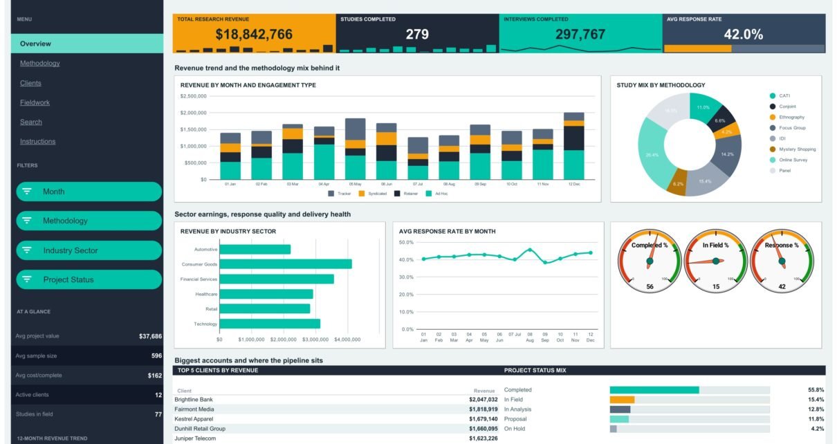
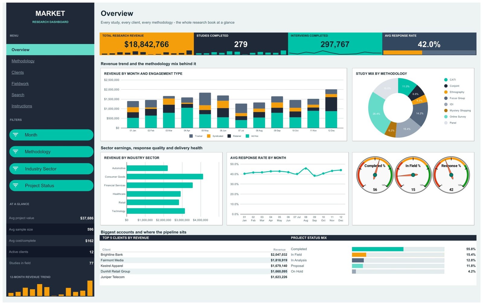
The Overview opens with the four KPI tiles, then splits into two bands. The first band pairs Revenue by Month and Engagement Type – a stacked column that separates Tracker, Syndicated, Retainer and Ad Hoc work over 12 months – with Study Mix by Methodology, a donut that reports Online Survey 26.4%, Panel 16.0%, IDI 15.4%, Focus Group 14.2%, CATI 11.0%, Conjoint 6.6%, Mystery Shopping 6.2% and Ethnography 4.2%.
The second band is the health check: Revenue by Industry Sector ranks Consumer Goods, Financial Services, Technology, Healthcare, Retail and Automotive; Avg Response Rate by Month tracks answer quality across the year; and three gauge dials read Completed % 56, In Field % 15 and Response % 42. The page closes with Top 5 Clients by Revenue – Brightline Bank $2,047,032, Fairmont Media $1,818,919, Kestrel Apparel $1,679,140, Dunhill Retail Group $1,660,095 and Juniper Telecom $1,623,226 – beside a Project Status Mix showing Completed 55.8%, In Field 15.4%, In Analysis 12.8%, Proposal 11.8% and On Hold 4.2%.
Methodology – what each technique earns
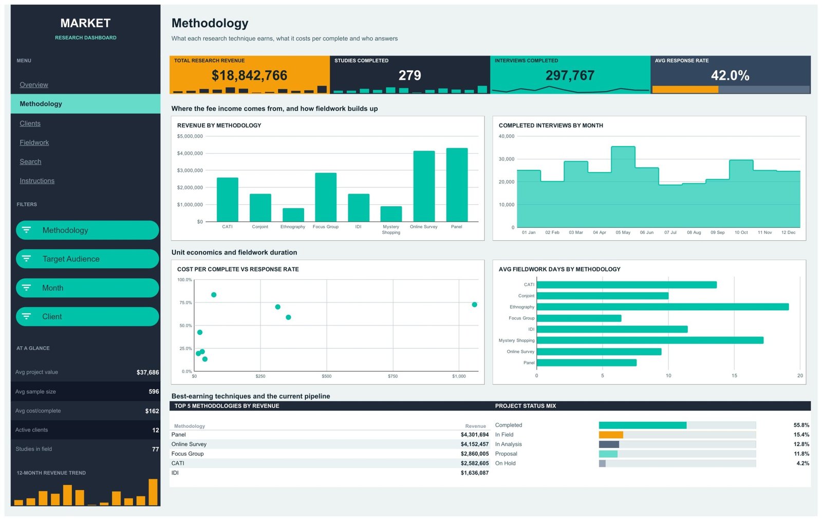
Revenue by Methodology and Completed Interviews by Month sit at the top; underneath, Cost per Complete vs Response Rate is a scatter that makes an uncomfortable point plainly – the most expensive technique on the book, at roughly $1,000 per complete, does not buy the highest response rate. Avg Fieldwork Days by Methodology completes the picture: Ethnography runs past 19 days and Mystery Shopping past 17, while Focus Groups close in under 7. The Top 5 panel reports Panel $4,301,694, Online Survey $4,152,457, Focus Group $2,860,005, CATI $2,582,605 and IDI $1,636,087.
Clients – the account book
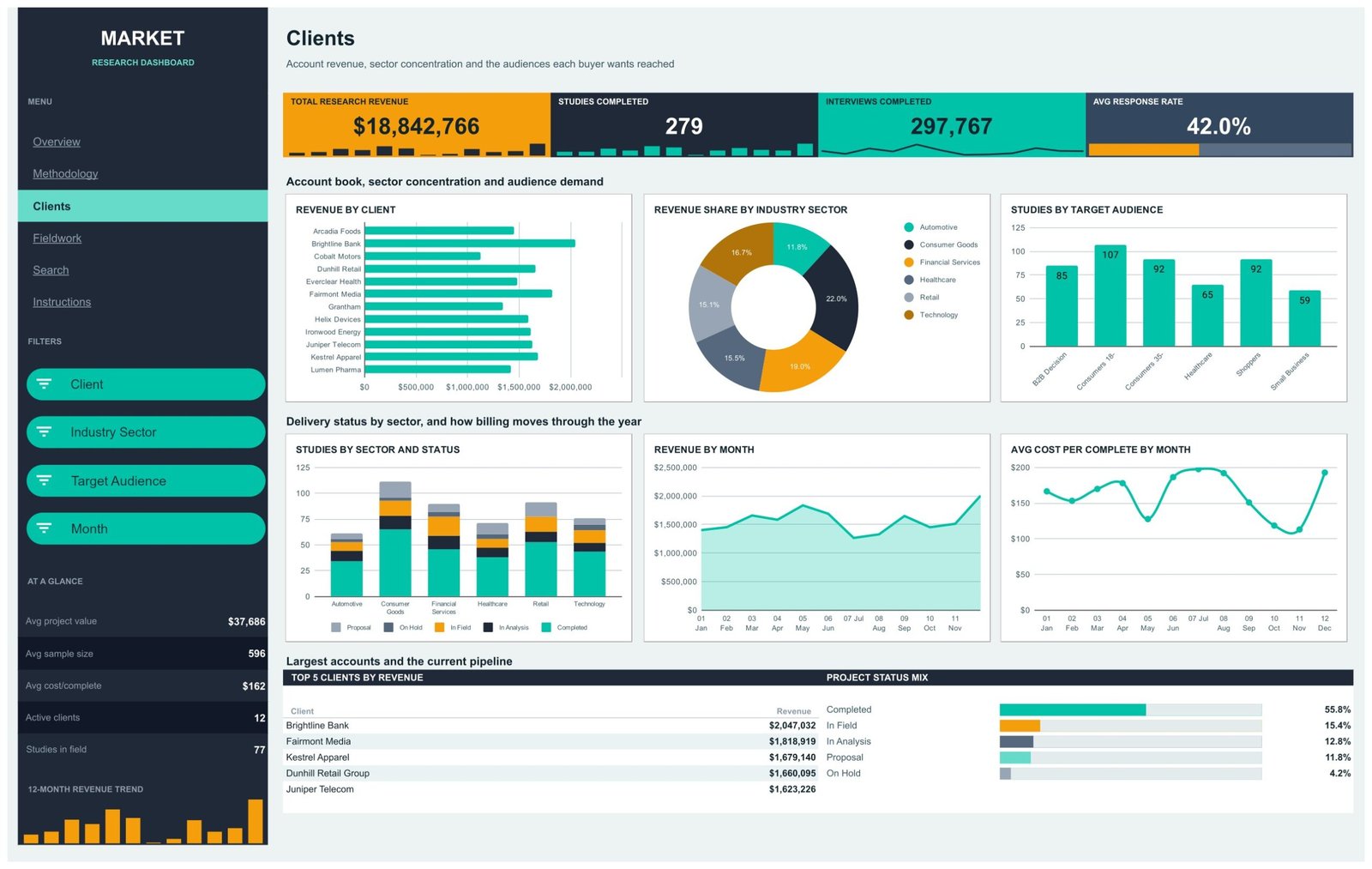
Revenue by Client ranks all 12 accounts from Arcadia Foods to Lumen Pharma. Revenue Share by Industry Sector splits the year into Consumer Goods 22.0%, Financial Services 19.0%, Technology 16.7%, Healthcare 15.5%, Retail 15.1% and Automotive 11.8% – a concentration chart that answers the awkward question of what happens if the largest sector pauses spending. Studies by Target Audience counts Consumers 18-34 at 107, Consumers 35+ at 92, Shoppers at 92, B2B Decision Makers at 85, Healthcare at 65 and Small Business at 59. Below, Studies by Sector and Status, Revenue by Month and Avg Cost per Complete by Month show how delivery and billing move through the year.
Fieldwork – workload and delivery cost
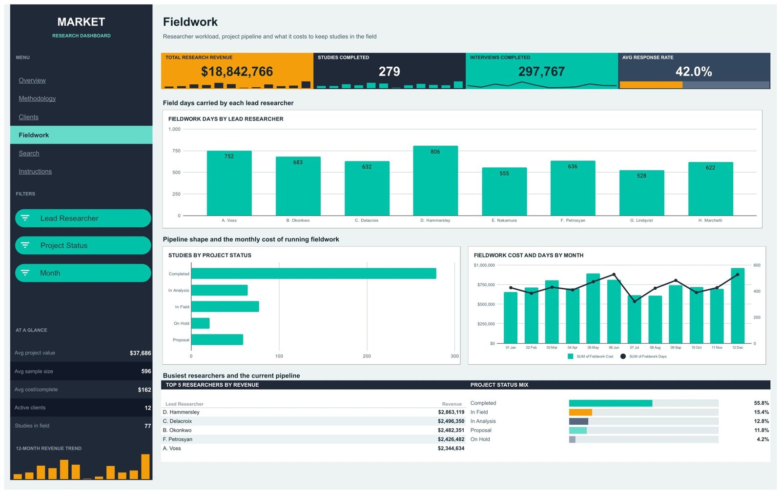
Fieldwork Days by Lead Researcher labels every bar, so the load imbalance is a number rather than an impression: D. Hammersley carries 806 days, A. Voss 752, B. Okonkwo 683 and G. Lindqvist 528. Studies by Project Status shows the pipeline shape, and Fieldwork Cost and Days by Month puts spend as columns against days as a line – when the columns climb and the line does not, you are paying more for the same amount of field time. The Top 5 panel ranks researchers by revenue, led by D. Hammersley at $2,863,119.
Search – one study, 17 fields
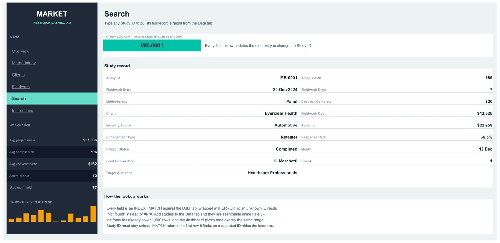
Type a Study ID into the green cell and the record fills in: client, industry sector, methodology, engagement type, project status, lead researcher, target audience, sample size, fieldwork start and days, cost per complete, fieldwork cost, revenue, response rate and month. MR-0001, for example, is a Panel study for Everclear Health – 689 completes at $20 each, $13,628 of fieldwork cost against $22,959 of revenue and a 36.5% response rate. Every field is an INDEX/MATCH against the Data tab wrapped in IFERROR, so an unknown ID reads “Not found” instead of #N/A.
Instructions – the built-in guide
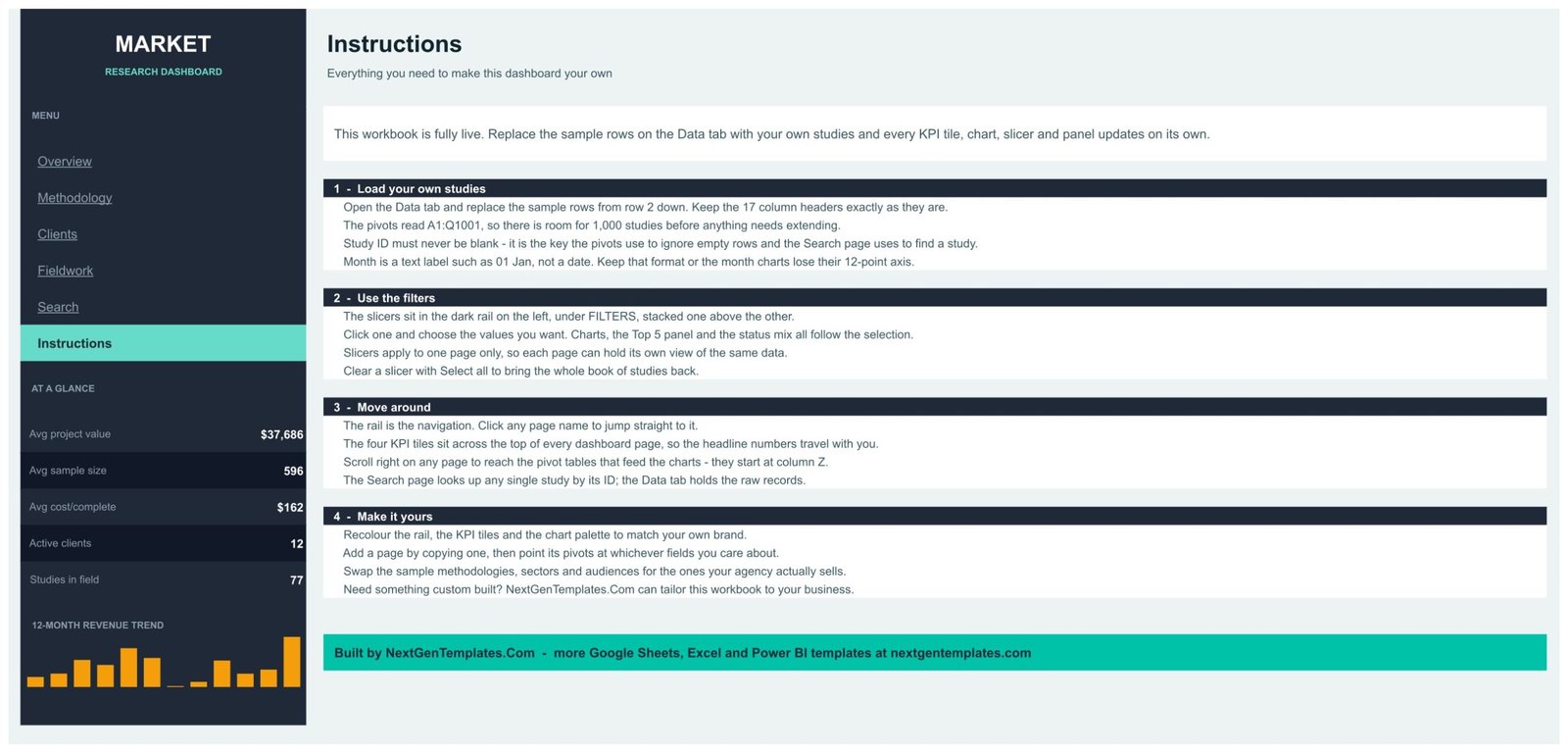
Four numbered sections cover loading your own studies, using the filters, moving around the book and making it yours. The rules that actually matter are here: keep the 17 column headers exactly as they are, never leave Study ID blank, and keep Month as a text label such as 01 Jan rather than a date, or the month charts lose their 12-point axis.
Market Research Dashboard vs. Excel vs. Paid Research Analytics SaaS – Feature Comparison
| This template (Google Sheets) | Excel dashboard | Paid research platform | |
|---|---|---|---|
| Cost | One-time $9.99 | One-time, plus an Office licence | $1,200-$5,000+ per year |
| Platform | Any browser, any OS | Windows or Mac desktop | Vendor web app |
| Setup time | Under 10 minutes | 15-30 minutes | Days, often with onboarding |
| Real-time team collaboration | Yes, native | Only via OneDrive co-authoring | Yes, per seat |
| Mobile access | Sheets app, free | Excel mobile, limited | Vendor app |
| Customizable fields | All 17 columns, freely | All columns, freely | Only what the vendor exposes |
| Share with a client by link | Yes, view-only in one click | Send a file, or a OneDrive link | Extra viewer seats |
| Year-1 cost at 5 users | $9.99 | $9.99 plus licences | $3,000+ |
| Study-level lookup | Built in on the Search page | Needs a formula you write | Yes |
| Cost per complete and response-rate tracking | Charted on two pages | Build it yourself | Yes |
Who Should Use This Template
Boutique and mid-size research agencies running 50-500 studies a year get the most out of it, because that is the range where a spreadsheet log stops being readable and a research platform is still hard to justify. Insight teams inside brands who commission fieldwork rather than field it themselves use the Clients and Methodology pages to see where the budget actually went. Freelance quant and qual researchers use the Search page and the cost-per-complete charts to price the next wave properly.
It is not a survey collection tool, and it is not a respondent database – it reports at study level and holds no personally identifiable data. If your book runs to several thousand studies a year, the same structure in Power BI will serve you better.
Real-World Use Cases
Quarterly client review. Filter the Clients page to a single account and the last three months, export to PDF, and the review deck writes itself – revenue, studies by status, target audiences reached and cost per complete, all on one page.
Repricing a methodology. The Cost per Complete vs Response Rate scatter and Avg Fieldwork Days by Methodology together tell you which techniques are quietly eating margin. An agency that spots a 19-day Ethnography average can decide whether the premium is being charged for.
Balancing researcher load. Fieldwork Days by Lead Researcher makes a 278-day gap between the busiest and least busy researcher visible before it becomes an attrition problem.
Advantages of the Market Research Dashboard in Google Sheets
- Nothing to install. Native Google Sheets pivot tables and slicers do all the work, so there is no add-on to license and no script to schedule.
- Client-safe sharing. A view-only link lets a client click the slicers and read every page without touching your Data tab.
- Page-scoped slicers. Each report page holds its own view of the same data, so two people can look at different cuts of the book without fighting over one filter.
- Honest unit economics. Cost per complete, fieldwork cost and response rate are charted rather than buried in a column.
- One-time cost. No seat licence and no renewal, and the file lives in your own Google Drive.
Opportunities for Improvement
Two things are worth knowing before you buy. First, the four KPI tiles report the whole book by design – they do not respond to slicers, which keeps the headline numbers comparable but occasionally surprises a first-time user. Second, the pivots are wired to 1,000 rows; past that you need to widen the ranges yourself, which takes a minute but is a manual step. A third, smaller point: the sample data is invented, so treat every figure in the demo book as a shape to replace, not a benchmark.
Best Practices
- Keep Study ID unique. MATCH returns the first row it finds, so a repeated ID hides the later study on the Search page.
- Keep Month as a text label – 01 Jan, 02 Feb – so the month charts keep their 12-point axis in the right order.
- Paste values, not formatted cells, when you import from a project system. Formatting pasted over the sample rows can break the number formats the KPI tiles rely on.
- Recolour the rail, tiles and chart palette once, at the start, so every export you send a client is branded.
- Duplicate a report page rather than rebuilding one when you want a new cut – the pivots come with it and only need repointing.
Explore Relevant Templates
- Research Institutions Dashboard in Google Sheets – grants, projects and publications for academic research groups.
- Product Feedback and NPS Dashboard in Google Sheets – the voice-of-customer side of the same question.
- Advertising Dashboard in Google Sheets – campaign spend and performance.
- Public Relations (PR) Dashboard in Google Sheets – coverage, reach and share of voice.
- Market Research Dashboard in Excel – for teams who work offline.
Frequently Asked Questions
Do I need Excel, Power BI or an add-on?
No. It is a Google Sheets file built on native pivot tables and slicers. Nothing is installed and nothing runs on a schedule.
How many studies does it handle?
The pivots and the Search formulas read A1:Q1001, so 1,000 studies fit with no changes.
Why don’t the KPI tiles change when I click a slicer?
They report the whole book on purpose, so the headline numbers stay comparable while you filter. The charts, Top 5 panels and status mix all follow your selection.
Is the sample data real?
No. The 500 studies, 12 clients and 8 lead researchers are invented sample records that exist so every chart is populated when you open the file.
Can I add my own methodologies, sectors and audiences?
Yes. Type them into the Data tab and the pivots and slicers pick them up. Nothing is hard-coded to the eight sample methodologies.
Can clients view it without editing it?
Yes. Share your copy view-only. Clients can use the slicers and read every page, and they cannot change the Data tab.
Does the file hold respondent data?
No. It reports at study level – sample size, response rate, cost and revenue – and contains no personal or respondent-level records.
About the Author
Built by PK – Microsoft Certified Professional with 15+ years of Excel, Google Sheets, and Power BI experience. Founder of NextGenTemplates, reaching 300K+ subscribers across YouTube channels. Every template is hand-built and tested before release.
Conclusion
A research book is easy to keep and hard to read. This dashboard makes it readable: four headline numbers that follow you between pages, seventeen charts that answer the questions an agency actually gets asked, and a study lookup for the moment somebody says “what did we charge for that one”. Paste your studies over the sample rows and the whole book redraws itself.
Get the Market Research Dashboard in Google Sheets on NextGenTemplates, and subscribe to NeoTechNavigators on YouTube for Google Sheets walkthroughs.