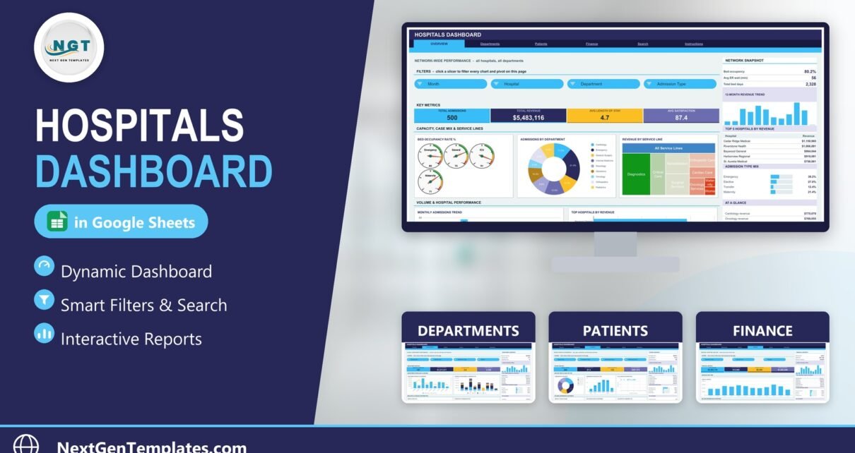
The Hospitals Dashboard in Google Sheets reports on an admissions log across six linked tabs, with 16 KPI cards, 18 charts and 15 slicers driven entirely by native Google Sheets pivot tables. The sample file carries 500 admissions spanning 6 hospitals, 9 departments, 9 service lines and 10 attending doctors, and every pivot, slicer and formula already reaches row 1,001 — so pasting in your own export is the whole setup.
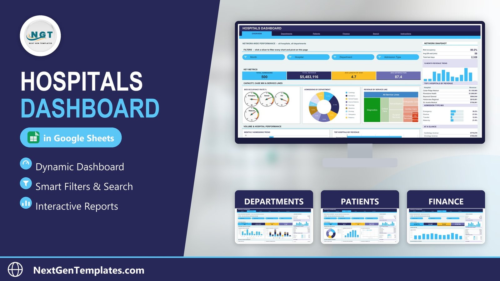
Most hospital reporting fails in the same place: the numbers exist, but they live in a billing export nobody can read. Somebody rebuilds the same pivot every month, the bed-day figure disagrees with finance’s, and the board pack arrives a week late. This template fixes the presentation problem, not the plumbing one — and it is worth being precise about that difference before you read any further.
What the Hospitals Dashboard in Google Sheets Actually Is
It is a static reporting template. You copy the Google Sheets file into your own Drive and paste an admissions extract onto its Data sheet. It does not connect to an EHR, HIS, PAS or billing system. Nothing syncs on a schedule. There is no API integration, and it is not a medical record.
The Data sheet holds 22 columns describing an admission: hospital, department, service line, insurance type, revenue, length of stay, procedures, attending doctor, admission type, discharge status, age group, month, quarter, satisfaction score, ER wait, ward and bed occupancy percentage. There are no diagnosis or procedure codes, no clinical notes, no medication lists, no dates of birth, no addresses and no contact details. Age arrives pre-banded — Child (0-12) through Senior (65+) — never as a birth date.
One column is person-level: a display Patient Name, used solely to compute the distinct “unique patients” count. Swap it for a coded reference and that count keeps working exactly as before. Because this is an ordinary Google Sheets document, it inherits whatever sharing and retention controls your own Google Workspace applies. We make no HIPAA, GDPR or accreditation claim on its behalf — if you plan to load real data, run it past your privacy lead the way you would any other spreadsheet. Google’s own Workspace sharing controls documentation is the right starting point for that review.
Key Features of the Hospitals Dashboard in Google Sheets
- Six tabs, one data source. Overview, Departments, Patients, Finance, Search and Instructions all read the same Data sheet.
- Native pivot architecture. Every chart reads a pivot table parked to the right of its page — scroll past the spacer column and you can inspect the exact numbers behind any visual. No helper formulas hide behind the charts, so the file stays fast as the log grows.
- 15 slicers. Four on Overview, four on Departments, four on Patients, three on Finance. Slicers are per-page, so filtering one view never disturbs another.
- 16 KPI cards — four on each analysis page — plus a sidebar on each carrying a three-metric snapshot, a 12-month revenue trend, a Top 5 ranking, a percentage-share bar list and a six-row At a Glance panel.
- Auto-expansion to 1,000 rows out of the box, with a DATA_ROWS constant in the Apps Script file for anything larger.
Dashboard Pages Explanation
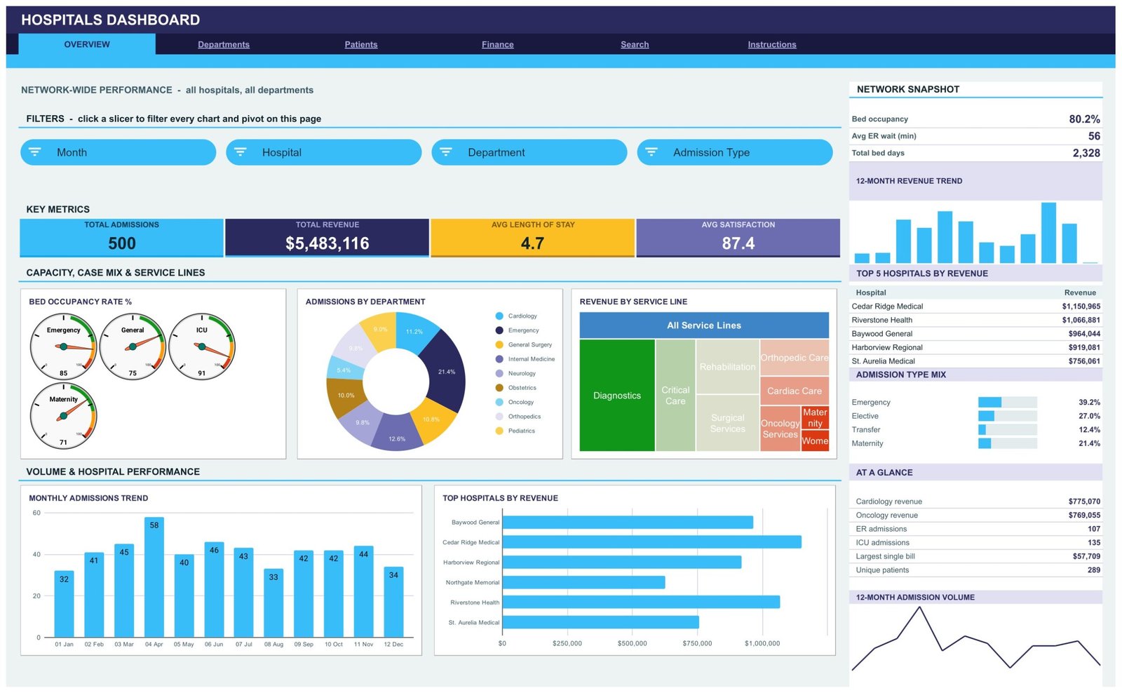
Page 1: Overview — network-wide performance
The snapshot leads with bed occupancy, average ER wait and total bed days. Below it sit four KPI cards — Total Admissions, Total Revenue, Avg Length of Stay, Avg Satisfaction — and five charts: Bed Occupancy Rate % as gauges for Emergency, General, ICU and Maternity; Admissions by Department; Revenue by Service Line as a treemap; Monthly Admissions Trend; and Top Hospitals by Revenue. The sidebar ranks the top five hospitals and breaks out the admission-type mix.
Page 2: Departments — clinical workload and case mix
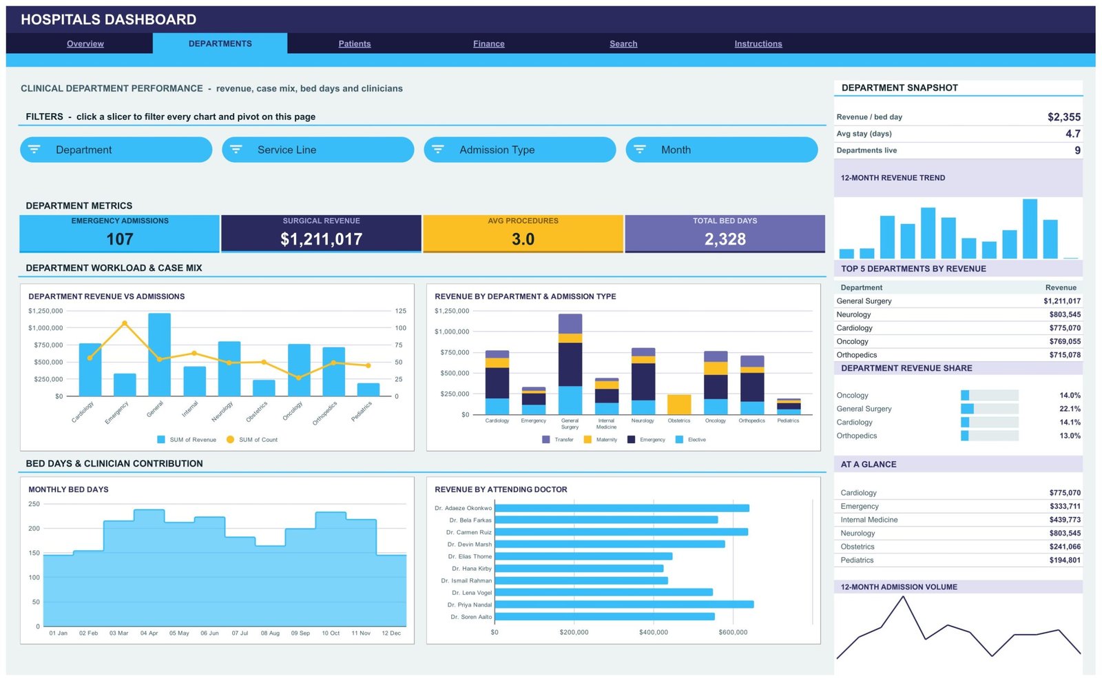
Revenue per bed day, average stay and the number of live departments head this page. The charts are Department Revenue vs Admissions (a combo of revenue bars against an admissions line), Revenue by Department and Admission Type, Monthly Bed Days, and Revenue by Attending Doctor. The sidebar ranks the top five departments by revenue and shows each one’s share of the total.
Page 3: Patients — profile, payer and experience
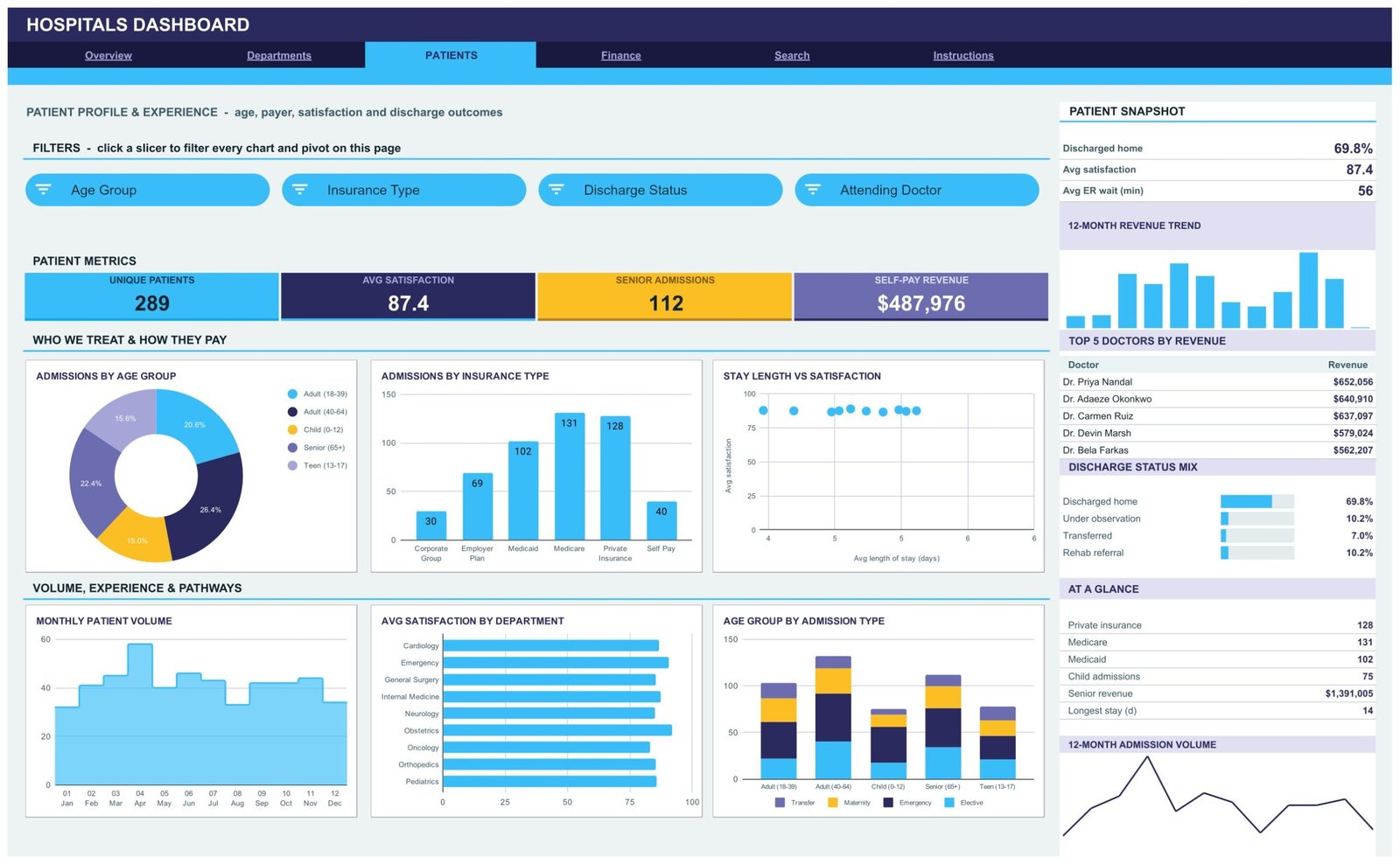
Six charts: Admissions by Age Group, Admissions by Insurance Type, Stay Length vs Satisfaction, Monthly Patient Volume, Avg Satisfaction by Department and Age Group by Admission Type. The KPI row covers Unique Patients, Avg Satisfaction, Senior Admissions and Self-Pay Revenue. The sidebar ranks the top five doctors by revenue and splits discharge status across its five outcomes.
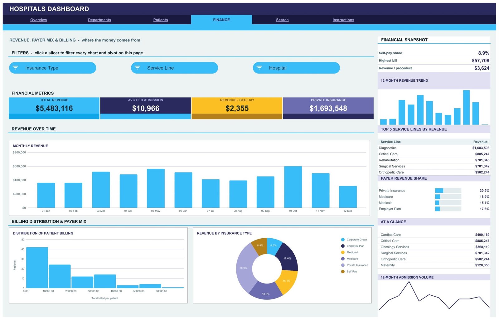
Page 4: Finance — revenue, payer mix and billing
Self-pay share, highest single bill and revenue per procedure sit above Monthly Revenue, Distribution of Patient Billing (a histogram of total billed per patient) and Revenue by Insurance Type. The sidebar ranks the top five service lines and shows payer revenue share across Private Insurance, Medicare, Medicaid and Employer Plan.
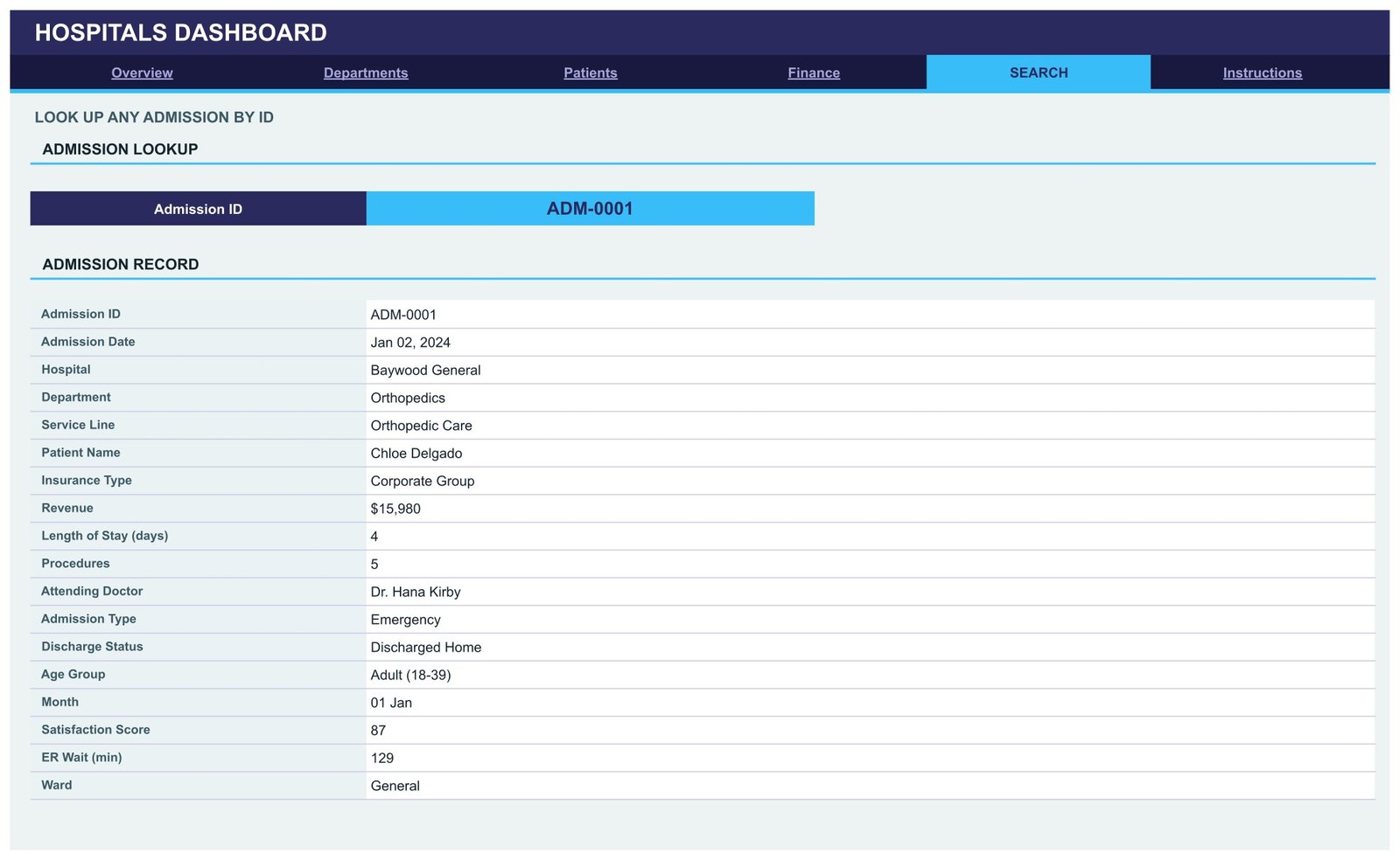
Page 5: Search — look up any admission by ID
Choose an Admission ID and the record card fills in all 18 reported fields for that admission. This is the page that settles arguments: when a department head disputes a bed-day figure, you pull the underlying records without leaving the dashboard.
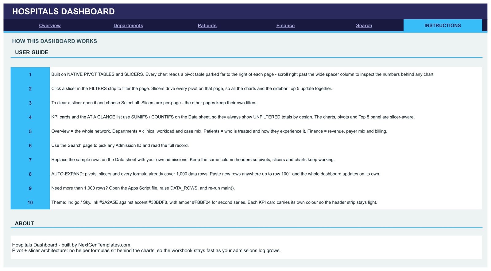
Page 6: Instructions — the ten-point user guide
A numbered guide covering the pivot-and-slicer architecture, clearing a slicer, which figures are slicer-aware and which are deliberately unfiltered, swapping in your own data, raising the row limit, and the Indigo / Sky colour theme so you can rebrand the file.
Hospitals Dashboard in Google Sheets vs. an Excel Build vs. a Hospital BI Suite — Feature Comparison
| Feature | Hospitals Dashboard in Google Sheets | Excel hospital dashboard | Hospital BI suite (Tableau / Qlik) |
|---|---|---|---|
| Cost | $9.99 one-time | $25-60 one-time, plus Office | $70-100 / user / month |
| Platform | Browser, any OS | Desktop Excel | Desktop + server or cloud tenant |
| Setup time | Under 10 minutes ✅ | 15-30 minutes | Days to weeks with IT |
| Real-time team collaboration | Native, multi-editor ✅ | Only via OneDrive co-authoring | Yes, licensed per viewer |
| Mobile access | Google Sheets app ✅ | Limited | Vendor app |
| Customisable fields | Edit any column or pivot ✅ | Yes | Governed by a data model owner |
| Share with a link | Yes, view or edit ✅ | File attachment | Licensed seat required |
| Year-1 cost at 5 users | $9.99 total ✅ | ~$50 + licences | $4,200-6,000 |
| Live EHR / HIS connection | No — paste an extract | No — paste an extract | Yes, via connectors |
For a hospital group that wants departmental, payer and bed-day reporting from an export it already runs — without a BI licence per viewer — the Hospitals Dashboard in Google Sheets sits in the sweet spot. None of these three columns is a clinical records system.
Who Should Use This Template
Perfect for:
- Hospital operations and performance managers producing a monthly pack across 2-10 sites
- Finance teams tracking revenue, payer mix and revenue per bed day in one view
- Department heads presenting case mix, bed days and clinician contribution
- Small private hospitals and nursing homes with a spreadsheet export and no BI licence
Not a fit if:
- You need a live feed from an EHR, HIS or PAS — this reads a pasted extract
- You need clinical record keeping, coding, or a formal compliance audit trail
- Your dataset runs to tens of thousands of admissions, where a warehouse is the right answer
- You need row-level access control — Google Sheets shares the whole file or nothing
Real-World Use Cases
Priya manages performance for a three-site private hospital group. Each month she exports admissions from the billing system, pastes roughly 700 rows into the Data sheet and reads the Overview page: bed occupancy by ward, admissions by department, and which site is pulling the most revenue. A board pack that used to take two days now takes an afternoon.
Daniel runs finance at a 120-bed hospital. He lives on the Finance page — payer revenue share, revenue per bed day, and the billing histogram showing how many admissions land under $10,000. When the CFO asks why self-pay sits near 9% of revenue, the slicers answer it live.
Dr. Anand chairs the clinical governance meeting. He opens the Patients page, filters to Senior (65+), and puts Avg Satisfaction by Department and Stay Length vs Satisfaction on screen. It is an operations view built from data the hospital already reports, with no patient chart involved.
Advantages of the Hospitals Dashboard in Google Sheets
The cost case is blunt: $9.99 once against $4,200-6,000 for a year of five BI seats. But the practical advantage is the pivot architecture. Because every chart reads a visible pivot table rather than a chain of hidden helper formulas, anyone on the team can audit a number in ten seconds — scroll right, read the pivot, done. That is the difference between a dashboard people trust and one they quietly re-check in their own spreadsheet.
The per-page slicer design also matters more than it sounds. Finance can filter to Medicare on their page while operations filters to the ICU on theirs, in the same file, at the same time, without either seeing the other’s view shift.
Opportunities for Improvement
Three honest limitations. First, the KPI cards and the At a Glance lists use SUMIFS and COUNTIFS against the whole Data sheet, so they deliberately show unfiltered totals — the charts, pivots and Top 5 panels are the slicer-aware parts. That is a design decision, and the Instructions tab says so, but it surprises people on day one.
Second, the row ceiling is 1,000 without editing the Apps Script. Third, there is no period-over-period comparison built in — no “this month vs last month” delta on the KPI cards. If variance analysis against targets is what you need, a KPI scorecard is the better shape of product.
Best Practices
- Replace the Patient Name column with a coded reference before loading real data — the unique-patient count still works.
- Keep the 22 column headers exactly as shipped; the pivots, slicers and charts resolve by header name.
- Take a dated copy of the file each month so you have a reporting history rather than one rolling sheet.
- Share view-only by default and reserve edit access for whoever owns the data refresh.
- Recolour the header strip and KPI cards to your own brand — it is plain cell fill, not an image.
Explore Relevant Templates
- Hospital Patient Flow Dashboard in Google Sheets — same architecture, aimed at admission-to-discharge flow rather than network revenue.
- Hospital Operations KPI Scorecard in Google Sheets — a month-picker scorecard with traffic lights and targets. A scorecard, not an analytical dashboard: different product, similar name.
- HealthTech Dashboard in Google Sheets — for digital-health and telehealth businesses rather than inpatient sites.
- Blood Bank Management System Tracker in Google Sheets — a companion tracker for stock and donor records.
- Hospital Management System Web App — if you need data entry and role-based logins rather than reporting on an export.
More in the Google Sheets Dashboards catalogue.
Related Templates
More related walkthroughs on this blog: Dental Practice Dashboard in HTML, Veterinary Clinic Dashboard in HTML and Hospital Patient Flow Dashboard in HTML. Each is a separate template with its own layout and sample data.
Frequently Asked Questions
Does the Hospitals Dashboard in Google Sheets connect to my EHR or billing system?
No. The Hospitals Dashboard in Google Sheets is a static reporting template. You paste or import an admissions extract onto its Data sheet and the pivots recalculate. There is no live connector, no scheduled sync and no API integration of any kind.
Does it store patient medical records?
No. The Data sheet holds admission-level operational and revenue fields only — no diagnoses, no procedure codes, no clinical notes, no medications and no dates of birth. The single person-level column is a display name you can replace with a coded reference without breaking any calculation.
Is the Hospitals Dashboard in Google Sheets HIPAA compliant?
We make no compliance claim. It is a spreadsheet that inherits whatever controls your own Google Workspace applies. If you intend to load real data, have your privacy or compliance lead review it first, exactly as you would any other spreadsheet holding operational data.
How many admissions can it handle?
Every pivot, slicer and formula in the Hospitals Dashboard in Google Sheets already covers 1,000 rows, and it ships with 500 sample admissions. Beyond 1,000, open the Apps Script file, raise the DATA_ROWS constant and re-run main().
Why don’t the KPI cards change when I click a slicer?
By design. The KPI cards and At a Glance lists use SUMIFS and COUNTIFS across the whole Data sheet, giving a stable unfiltered reference. The charts, pivots and Top 5 sidebar panels are slicer-aware and update together when you filter.
How long does setup take?
Under ten minutes. Copy the sheet from the link in the PDF, paste your admissions export over the sample rows keeping the same 22 headers, and every chart, pivot and slicer across the four analysis pages updates on its own.
How does this compare to a hospital BI suite?
A BI suite connects live to source systems and costs $70-100 per user per month. The Hospitals Dashboard in Google Sheets is a $9.99 one-time file reporting on an export you already produce. It is the right tool when the reporting matters more than the pipeline.
About the Author
Built by PK — Microsoft Certified Professional with 15+ years of Excel, Google Sheets and Power BI experience. Founder of NextGenTemplates, reaching 300K+ subscribers across YouTube channels. Every template is hand-built and tested before release.
Conclusion
The Hospitals Dashboard in Google Sheets does one job well: it turns an admissions export into six readable, filterable pages that a management meeting can actually use. It is not an EHR, it does not connect to one, and it holds no clinical data — which is precisely why it drops into an existing reporting routine without a procurement cycle.
👉 Click here to Purchase the Hospitals Dashboard in Google Sheets
Instant download · One-time payment · No subscription
🎥 For step-by-step walkthroughs, visit YouTube.com/@NeoTechNavigators
Last updated: September 2026