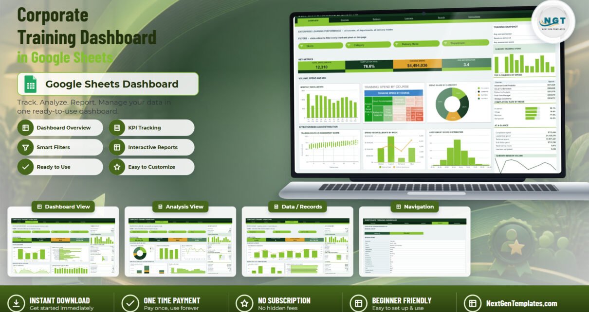
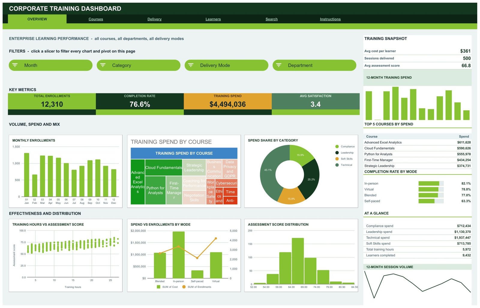
The Corporate Training Dashboard in Google Sheets turns a flat training log into a six-tab reporting file: 16 KPI cards, 18 charts and 15 slicers, all reading native pivot tables. The sample data covers 500 training sessions, 14 courses across 4 categories, 4 delivery modes, 8 departments and 10 trainers, returning 12,310 enrollments, a 76.6% completion rate and $4,494,036 of training spend. Every formula, pivot and slicer already covers 1,000 rows, so pasting your own log takes minutes rather than an afternoon.
Most L&D teams already have the data. It sits in a session log — one row per class, with a date, a course, a trainer, a headcount and a cost. What they do not have is a way to answer “where did the training budget go, and did it work?” without rebuilding pivot tables every quarter. That is exactly the gap this Google Sheets training dashboard fills.

Key Features of the Corporate Training Dashboard in Google Sheets
- Six tabs, one source of truth. Overview, Courses, Delivery, Learners, Search and Instructions all read the same Data sheet, so one paste updates the entire file.
- 16 KPI cards across four analysis pages. Total Enrollments, Completion Rate, Training Spend, Avg Satisfaction, Courses Delivered, Total Training Hours, Avg Assessment Score, Compliance Spend, Virtual Spend, In-person Sessions, Avg Cost per Learner, Self-paced Completions, Total Completions, Departments Covered, Avg Hours per Session and Leadership Spend.
- 15 slicers. Month, Category, Delivery Mode, Department, Course, Trainer and Seniority — each one filters every chart and pivot on its page at once.
- Native pivot tables, no helper columns. Every chart reads a pivot parked to the right of its page, which is why the file stays responsive as the log grows.
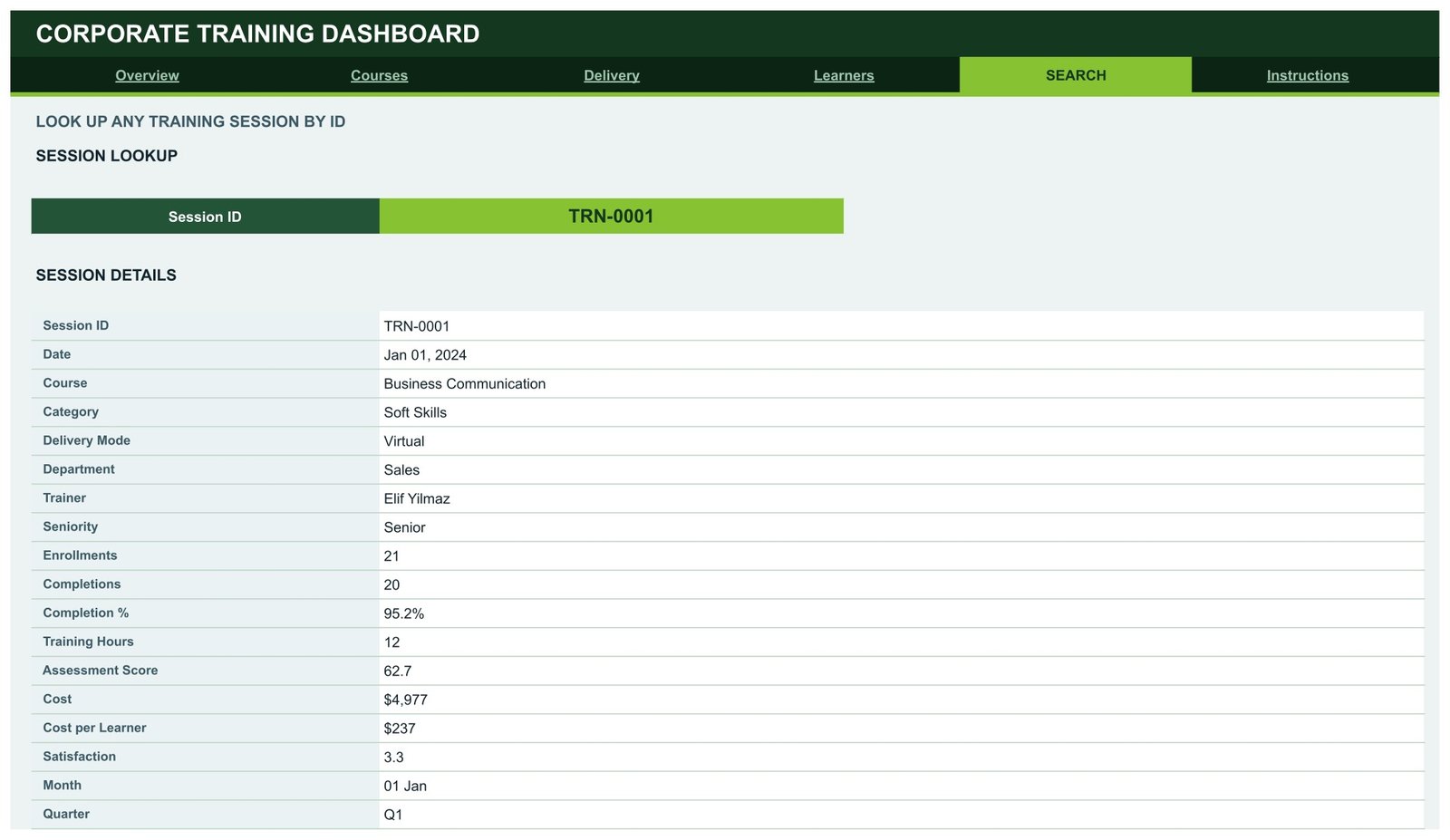
- A session lookup page. Type a Session ID such as TRN-0001 and the Search tab returns 17 fields for that one record.
- 1,000-row capacity out of the box, extendable by raising a single DATA_ROWS constant in the Apps Script file.
- A Forest and Lime theme you can change in one edit, because the palette constants sit at the top of the script.
Three statements worth quoting: the dashboard reports 16 KPIs on a 500-row sample log; it ships 15 slicers wired to native pivot tables rather than helper formulas; and it costs a single one-time payment instead of a per-user monthly LMS fee.
Dashboard Pages Explanation
Page 1: Overview — Enterprise Learning Performance
The Overview tab reports all courses, all departments and all delivery modes together. Its KPI strip shows Total Enrollments, Completion Rate, Training Spend and Avg Satisfaction, and the charts are Monthly Enrollments, Training Spend by Course, Spend Share by Category, Training Hours vs Assessment Score, Spend vs Enrollments by Mode, and Assessment Score Distribution. The right-hand rail carries a Training Snapshot with average cost per learner, sessions delivered and average assessment score, plus 12-Month Training Spend, Top 5 Courses by Spend, Completion Rate by Mode and a 12-Month Session Volume line.
Page 2: Courses — Curriculum Performance
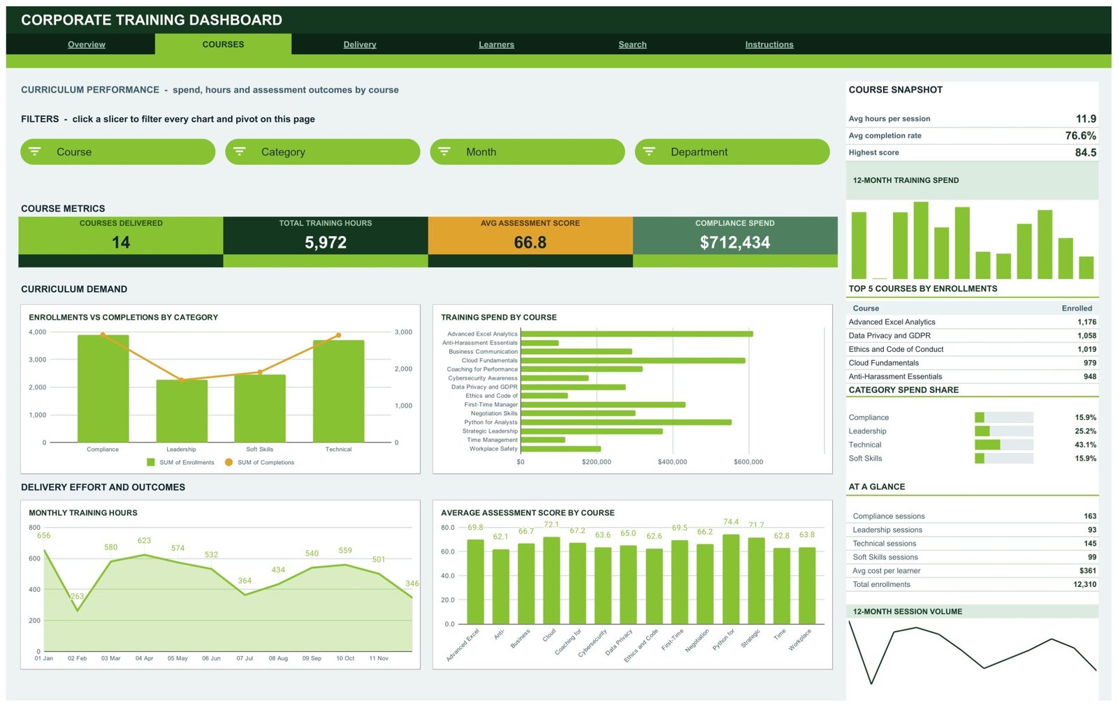
The Courses tab reports spend, hours and assessment outcomes course by course. KPI cards show Courses Delivered, Total Training Hours, Avg Assessment Score and Compliance Spend, and the charts are Enrollments vs Completions by Category, Training Spend by Course, Monthly Training Hours, and Average Assessment Score by Course. The sidebar adds a Course Snapshot, Top 5 Courses by Enrollments and Category Spend Share across Compliance, Leadership, Technical and Soft Skills.
Page 3: Delivery — Delivery Channel Analysis
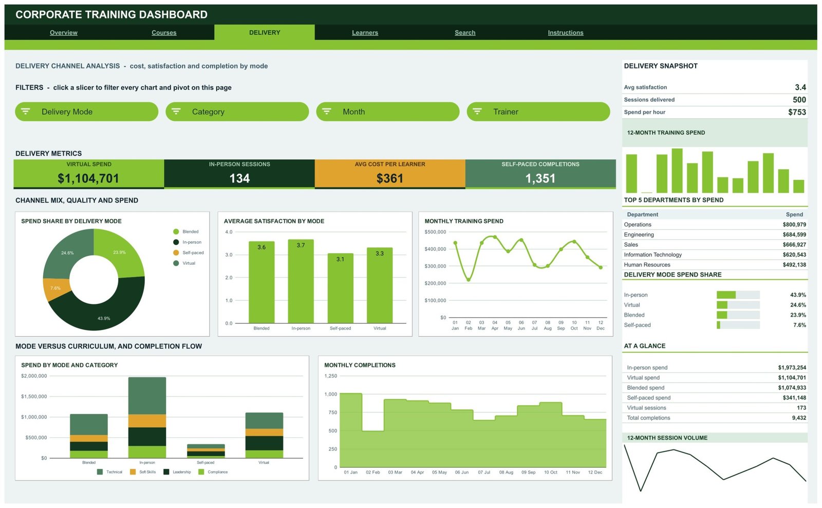
The Delivery tab compares Blended, In-person, Self-paced and Virtual delivery on cost, satisfaction and completion. KPI cards show Virtual Spend, In-person Sessions, Avg Cost per Learner and Self-paced Completions, and the charts are Spend Share by Delivery Mode, Average Satisfaction by Mode, Monthly Training Spend, Spend by Mode and Category, and Monthly Completions. The sidebar lists Top 5 Departments by Spend and Delivery Mode Spend Share, which is where a “why is self-paced so cheap and so incomplete?” conversation usually starts.
Page 4: Learners — Workforce Reach
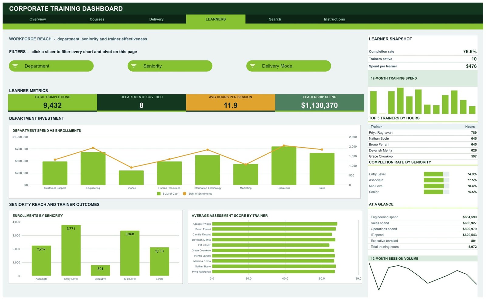
The Learners tab answers who is actually being trained. KPI cards show Total Completions, Departments Covered, Avg Hours per Session and Leadership Spend, and the charts are Department Spend vs Enrollments, Enrollments by Seniority, and Average Assessment Score by Trainer. The sidebar carries a Learner Snapshot, Top 5 Trainers by Hours and Completion Rate by Seniority across Entry Level, Associate, Mid-Level and Senior.
Page 5: Search — Session Lookup
The Search tab is a single-record view. Choose a Session ID and it prints the date, course, category, delivery mode, department, trainer, seniority, enrollments, completions, completion percentage, training hours, assessment score, cost, cost per learner, satisfaction, month and quarter for that session. It is the tab to open when a manager asks about one specific class rather than a trend.
Page 6: Instructions — User Guide
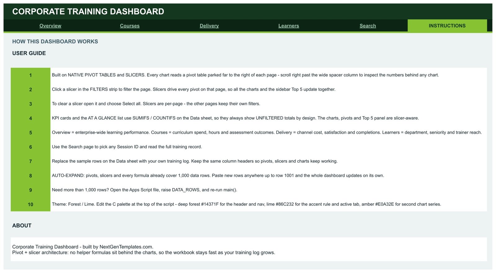
A 10-point guide explaining the pivot-and-slicer architecture, how to clear a slicer, why the KPI cards intentionally stay unfiltered, how to swap in your own rows, how the 1,000-row auto-expand works, and where the colour palette lives.
The Data Sheet
Behind the six visible tabs sits a Data sheet holding 500 sample training sessions with the exact column headers the pivots depend on. Replace the rows, keep the headers, and the dashboard rebuilds itself. If you are new to how the underlying machinery works, Google’s own guides to pivot tables and slicers are the best 10-minute primer.
Corporate Training Dashboard in Google Sheets vs. Microsoft Excel Dashboard vs. Paid LMS Analytics — Feature Comparison
| Feature | Corporate Training Dashboard in Google Sheets | Microsoft Excel Dashboard | Docebo / Cornerstone / TalentLMS |
|---|---|---|---|
| Cost | $9.99 one-time | $14-30 one-time + an Excel licence | $3-15 per user per month, annual contract |
| Platform | Google Sheets, any browser | Desktop Excel | Vendor cloud platform |
| Setup time | Under 10 minutes | 15-30 minutes | Weeks — implementation and data migration |
| Real-time team collaboration | ✅ Built in via Google Drive sharing | Only through OneDrive co-authoring | ✅ Yes |
| Mobile access | ✅ Google Sheets app | Limited on mobile Excel | ✅ Yes |
| Customisable fields and charts | ✅ Every pivot, chart and colour is editable | ✅ Editable | ❌ Vendor-defined reports only |
| Share with a link | ✅ One Drive share link | File must be sent or synced | ✅ Yes, inside the platform |
| Year-1 cost at 5 users | $9.99 total | $14-30 plus licences | $180-900 |
| Owns your training data | ✅ Your Drive, your file | ✅ Your file | ❌ Export required to leave |
For L&D teams that want spend, completion and trainer reporting without signing an annual LMS contract, the Corporate Training Dashboard in Google Sheets sits in the sweet spot.
Who Should Use This Template
Perfect for:
- L&D and HR managers at 50-2,000 person companies who report training spend and completion upward
- Training coordinators already keeping a session log in a spreadsheet
- Corporate training providers presenting course, trainer and delivery-mode performance to clients
- Compliance and safety teams tracking mandatory course completion by department and seniority
- Operations leads deciding between in-person, virtual, blended and self-paced delivery
Not a fit if:
- You need a full LMS — this reports on training, it does not host courses or issue certificates
- You need automatic sync from Workday, SuccessFactors or an LMS API; the log is pasted or imported by you
- Your organisation requires SOC 2, SSO or row-level permissions inside the reporting tool itself
- You are an individual learner; this is built around a company-wide session log
Real-World Use Cases
Meera runs L&D for a 600-person software company. Every quarter she has to explain where the training budget went. She opens the Delivery tab, filters to the quarter, and shows leadership that in-person delivery carries the largest share of spend while self-paced has the lowest completion rate. That single screen is the argument for shifting next year’s budget — and it took a slicer click, not a week of pivot-building.
Daniel is a corporate training provider with eight client accounts. He keeps one copy of the dashboard per client. When a client asks which of their departments actually turned up, he opens the Learners tab, shows department spend against enrollments alongside completion rate by seniority, and exports the page as a PDF for the account review.
Priya coordinates compliance training at a manufacturing group. She filters the Courses tab to the Compliance category and reads completion rate and assessment score course by course. The two courses lagging behind get a follow-up session booked before the audit rather than after it.
Advantages of the Corporate Training Dashboard in Google Sheets
The obvious advantage is cost: a one-time $9.99 sale price against $180-900 a year for five LMS analytics seats. But the practical advantages matter more day to day.
It removes the quarterly rebuild. Because the charts read pivot tables rather than a hand-built formula block, adding three months of sessions does not mean re-pointing anything. Paste and refresh.
It is shareable without a licence conversation. A Google Drive share link puts the dashboard in front of a department head who does not have Excel, does not have an LMS seat, and would not have opened either.
It keeps unfiltered totals visible. The KPI cards and the AT A GLANCE list deliberately use SUMIFS and COUNTIFS on the Data sheet, so they always show enterprise totals even while the charts are filtered to one department. That combination — filtered detail against a constant baseline — is what stops a slicer-heavy dashboard from misleading its reader.
It is honest about delivery mode. Comparing spend share, satisfaction and completion rate side by side on the Delivery tab is the single most useful view for anyone deciding where next year’s training hours should go.
Opportunities for Improvement
A few limitations are worth stating plainly. The dashboard is a reporting layer, not a learning platform: it will not enrol anyone, serve content or issue a certificate. It has no live connection to an HRIS or LMS, so refreshing it means pasting or importing an updated log rather than clicking a sync button.
The 1,000-row default suits a mid-sized annual training programme comfortably, but a large enterprise running tens of thousands of sessions a year will need to raise DATA_ROWS and accept slower recalculation — at that scale a database-backed BI tool is the better answer, and the Corporate Training Dashboard in Power BI exists for exactly that case.
Finally, satisfaction is captured on a simple numeric scale rather than a full survey instrument. If your organisation runs detailed post-course evaluations, treat the satisfaction figure here as a headline and keep the survey tool for the detail.
Best Practices
- Freeze your column headers. The pivots key off them; rename one and the chart above it goes blank.
- Log every session, including cancelled ones, with zero enrollments rather than deleting the row — the monthly trend stays honest that way.
- Clear slicers before you screenshot. Open the slicer and choose Select all; slicers are per-page, so check each tab you plan to share.
- Keep one copy per audience. A client copy and an internal copy avoids someone seeing a filter you did not intend.
- Re-theme once, at the start. Change the palette constants at the top of the Apps Script file and re-run the script before you distribute it.
- Review the Delivery tab quarterly, not annually — mode-level cost and completion move faster than most training teams expect.
Explore Relevant Templates
The same topic is already available on two other platforms: the Corporate Training Dashboard in Excel for desktop Excel teams, and the Corporate Training Dashboard in Power BI for teams publishing to a Power BI workspace. If you would rather have a month-picker scorecard than analysis pages, look at the Corporate Training KPI Dashboard in Excel or the Corporate Training Providers KPI Dashboard in Power BI.
Across the wider learning function, the Professional Training and Coaching Dashboard in Google Sheets covers a coaching practice, the Education Services Dashboard in Google Sheets and the EdTech Dashboard in Google Sheets handle the provider side, and the Tutoring Business Dashboard in Google Sheets suits a smaller teaching operation. Newer education-sector releases include the Test Preparation Centers Dashboard in Google Sheets, the Coaching and Tutoring Dashboard in Google Sheets and the Language Schools Dashboard in Google Sheets.
On this blog, our walkthroughs of the Professional Training and Coaching Dashboard, the Coach Performance and Revenue Dashboard, the E-learning Course Calendar, the Corporate Governance KPI Dashboard and the Community Services Dashboard cover neighbouring builds in the same Google Sheets style.
Frequently Asked Questions
What KPIs does the Corporate Training Dashboard in Google Sheets track?
The Corporate Training Dashboard in Google Sheets tracks 16 KPIs across four pages, including total enrollments, completion rate, training spend, average satisfaction, courses delivered, total training hours, average assessment score, average cost per learner, total completions and leadership spend. All of them recalculate when you replace the sample data.
How long does setup take?
Under 10 minutes. Open the PDF in your download, click the copy link to put the Corporate Training Dashboard in Google Sheets in your own Drive, then paste your training log over the Data sheet keeping the same column headers. Every pivot table, chart and slicer updates automatically; no script editing is needed.
How does this compare to a paid LMS like Docebo or TalentLMS?
A learning management system hosts and delivers courses and charges $3-15 per user per month. The Corporate Training Dashboard in Google Sheets is the reporting layer instead — a one-time purchase that turns your session log into spend, completion, satisfaction and trainer analytics that you own outright.
How many training sessions can it handle?
The file ships with 500 sample sessions and every pivot, slicer and formula already covers 1,000 rows. Paste rows anywhere up to row 1001 and the dashboard updates on its own. For a larger log, raise the DATA_ROWS constant at the top of the Apps Script file and re-run main().
Why do the KPI cards not change when I click a slicer?
That is by design. In the Corporate Training Dashboard in Google Sheets the KPI cards and the AT A GLANCE list use SUMIFS and COUNTIFS on the Data sheet so they always show unfiltered totals as a reference point, while the charts, pivot tables and Top 5 panel are slicer-aware.
Can I re-brand the colours?
Yes. The Corporate Training Dashboard in Google Sheets ships in a Forest and Lime palette and the colour constants sit at the top of the Apps Script file. Change the header, accent and secondary-series values, re-run the script, and the whole workbook takes your brand colours.
Do I need Excel or any add-on?
No. The Corporate Training Dashboard in Google Sheets runs entirely in Google Sheets in any browser using native pivot tables, native slicers and built-in charts. There is no add-on, no subscription and no per-user fee, and it works in the Google Sheets mobile app.
About the Author
Built by PK — Microsoft Certified Professional with 15+ years of Excel, Google Sheets and Power BI experience. Founder of NextGenTemplates, reaching 300K+ subscribers across YouTube channels. Every template is hand-built and tested before release.
Conclusion
If your training data already exists as a session log, the Corporate Training Dashboard in Google Sheets is the shortest path from that log to a report your leadership team will actually read: six tabs, 16 KPIs, 18 charts, 15 slicers, and a Data sheet you overwrite in one paste.
👉 Click here to Purchase the Corporate Training Dashboard in Google Sheets
Instant download · One-time payment · No subscription
🎥 For step-by-step video walkthroughs of our Google Sheets builds, visit Youtube.com/@NeoTechNavigators.
Last updated: September 2026