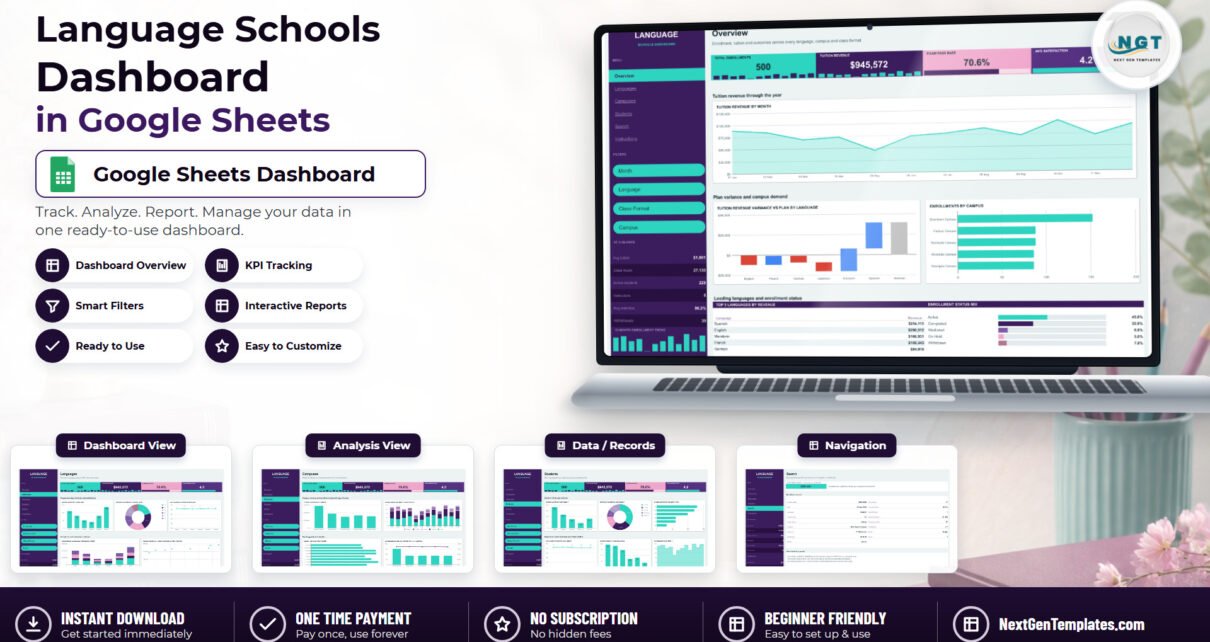
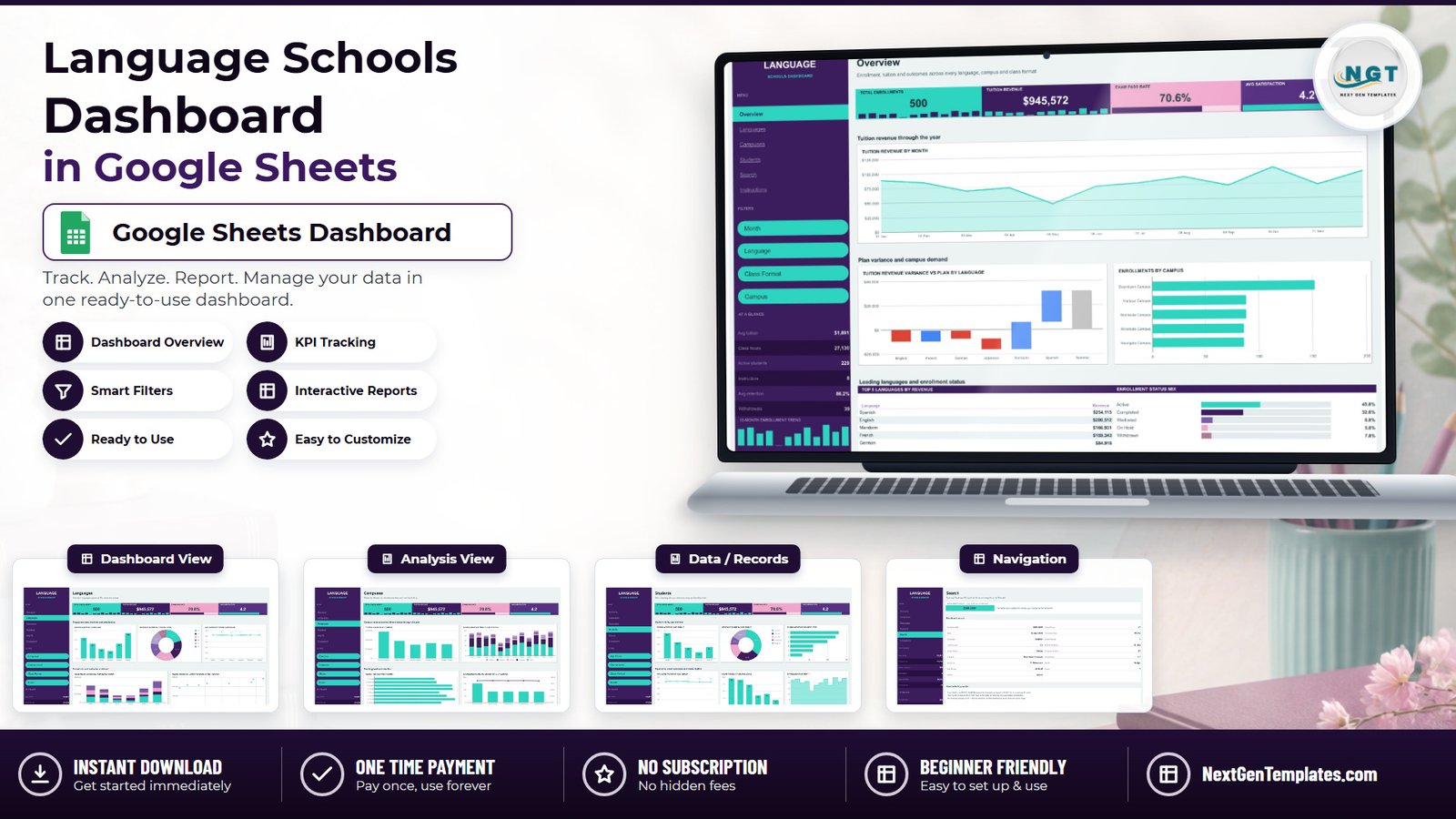
Most language schools know two numbers cold: how many students walked in this month, and whether the bank balance went up. Almost nobody can answer the third question quickly — which language, at which campus, taught in which format, is actually paying for itself? That is the question the Language Schools Dashboard in Google Sheets was built to answer, and it answers it from a single flat register of enrollments.
The build ships with 500 sample enrollments spread over 6 languages, 5 campuses, 8 instructors, 6 CEFR levels (A1 to C2) and 4 class formats. Those rows roll up to $945,572 in tuition revenue, 27,130 class hours, a 70.6% exam pass rate and a 4.2 average satisfaction score — every one of which recalculates the moment you paste your own data over the samples. This walkthrough goes page by page through what is actually on screen, what each chart is measuring, where the template is genuinely strong, and — just as usefully — where it stops.
Get the Language Schools Dashboard in Google Sheets
Key Features of the Language Schools Dashboard in Google Sheets
- Six tabs plus a Data tab. Overview, Languages, Campuses, Students, Search and Instructions sit on top of one 17-column register.
- Four KPI tiles pinned to every dashboard page. Total Enrollments, Tuition Revenue, Exam Pass Rate and Avg Satisfaction, each with a sparkline strip underneath, so the headline numbers follow you between pages.
- Sixteen charts, all fed by native Google Sheets pivot tables. Nothing is a static picture and nothing is an Apps Script macro — the pivots sit from column Z rightwards on each page and refresh with the data.
- Four slicers per page, scoped to that page only. The Overview filters Month, Language, Class Format and Campus; Languages swaps in Course Level; Campuses swaps in Instructor and Status; Students swaps in Age Group.
- A dedicated Search page. Type an Enrollment ID such as ENR-0001 and all 17 fields for that record appear instantly, via INDEX/MATCH wrapped in IFERROR.
- A persistent left navigation rail carrying an At a Glance panel — avg tuition $1,891, class hours 27,130, active students 229, instructors 8, avg retention 86.2%, withdrawals 39 — plus a 12-month enrollment sparkline.
- Capacity for 1,000 enrollments without touching a formula. The pivots read A1:Q1001.
- No macros, no add-ons, no Apps Script. Formulas, pivot tables, slicers and charts only, which is why it opens the same way on a phone as on a laptop.
Dashboard Pages Explanation
1. Overview — the headline page
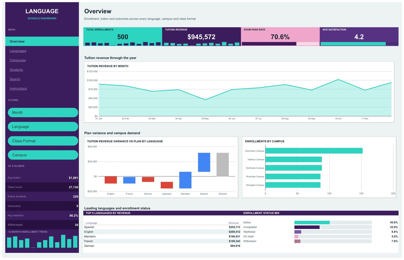
The first thing you see is the four KPI tiles, then Tuition Revenue by Month as an area chart across the full year. In the sample data it peaks in October at $102,414 and collapses in May to $45,558 — the summer trough almost every school recognises, made visible in one glance.
Underneath sit the two panels that earn the page. Tuition Revenue Variance vs Plan by Language is a waterfall, and it is the most useful chart in the file: English is $9,419 behind plan, German $6,452 behind and Japanese $8,832 behind, while French runs $8,655 ahead, Mandarin $22,105 ahead and Spanish $25,520 ahead, closing on a $31,577 subtotal. Beside it, Enrollments by Campus makes Downtown’s 152 enrollments against roughly 86 to 88 at each of the other four sites impossible to argue with.
The page closes on a Top 5 Languages by Revenue table (Spanish $254,113, English $200,512, Mandarin $166,931, French $159,343, German $84,916) and an Enrollment Status Mix bar strip — Active 45.8%, Completed 32.6%, Waitlisted 8.8%, Withdrawn 7.8%, On Hold 5.0%.
2. Languages — programme economics
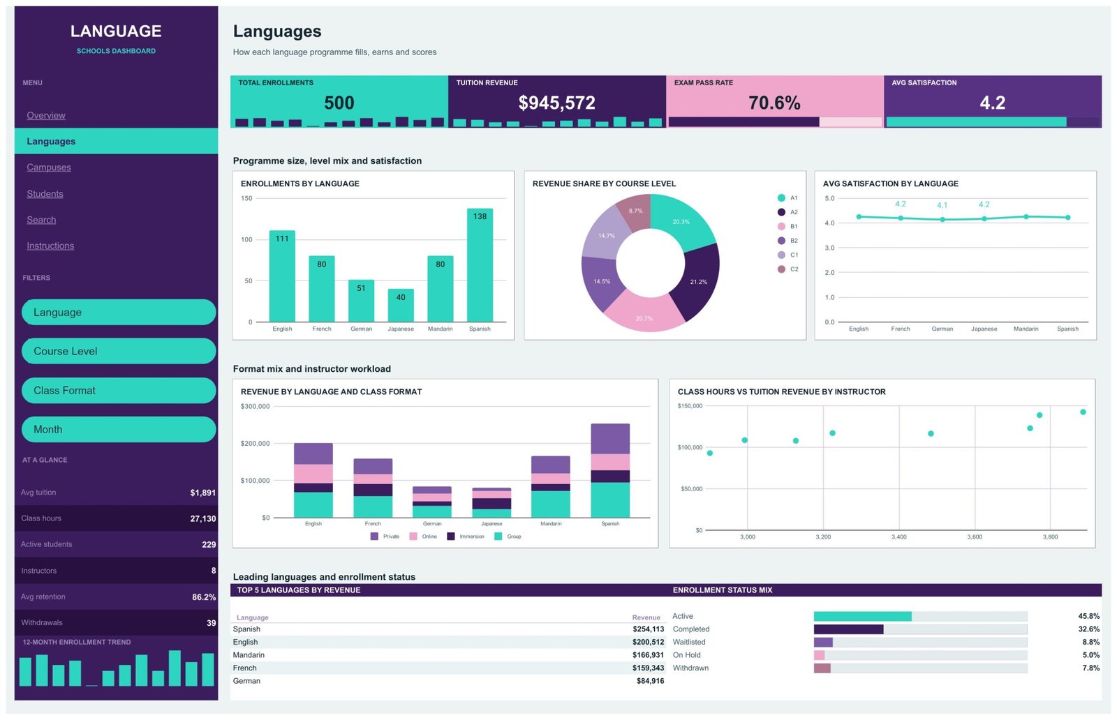
Five charts on how each programme fills, earns and scores. Enrollments by Language is a labelled column chart — Spanish 138, English 111, French 80, Mandarin 80, German 51, Japanese 40. Revenue Share by Course Level is a donut across A1 to C2, and it is the answer to “are we a beginners’ school or an advanced one?” Avg Satisfaction by Language runs flat around 4.1 to 4.3, which is itself a finding: satisfaction is not the differentiator here, revenue is.
Below, Revenue by Language and Class Format stacks Group, Online, Private and Immersion inside each language column, and Class Hours vs Tuition Revenue by Instructor is a scatter plotting all eight instructors, so an instructor teaching many hours for little revenue shows up as an outlier rather than a hunch.
3. Campuses — where the classes run
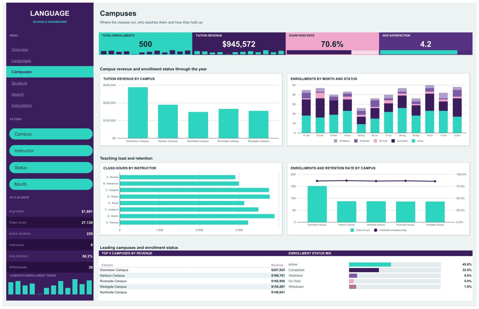
Tuition Revenue by Campus ranks Downtown $287,925, Harbour $188,781, Riverside $165,958, Westgate $154,267 and Northside $148,641. Enrollments by Month and Status is a stacked column that shows the withdrawal and waitlist tail inside each month rather than as a separate report. Class Hours by Instructor is a horizontal bar — G. Okafor leads on 3,886 hours, A. Moreau sits at 2,900 — and the final panel is a combo chart pairing enrollment counts with average retention rate per campus, which is where an under-performing site actually reveals itself: the retention line barely moves (85.5% to 86.9%) while the bars vary by a factor of nearly two.
4. Students — who is learning
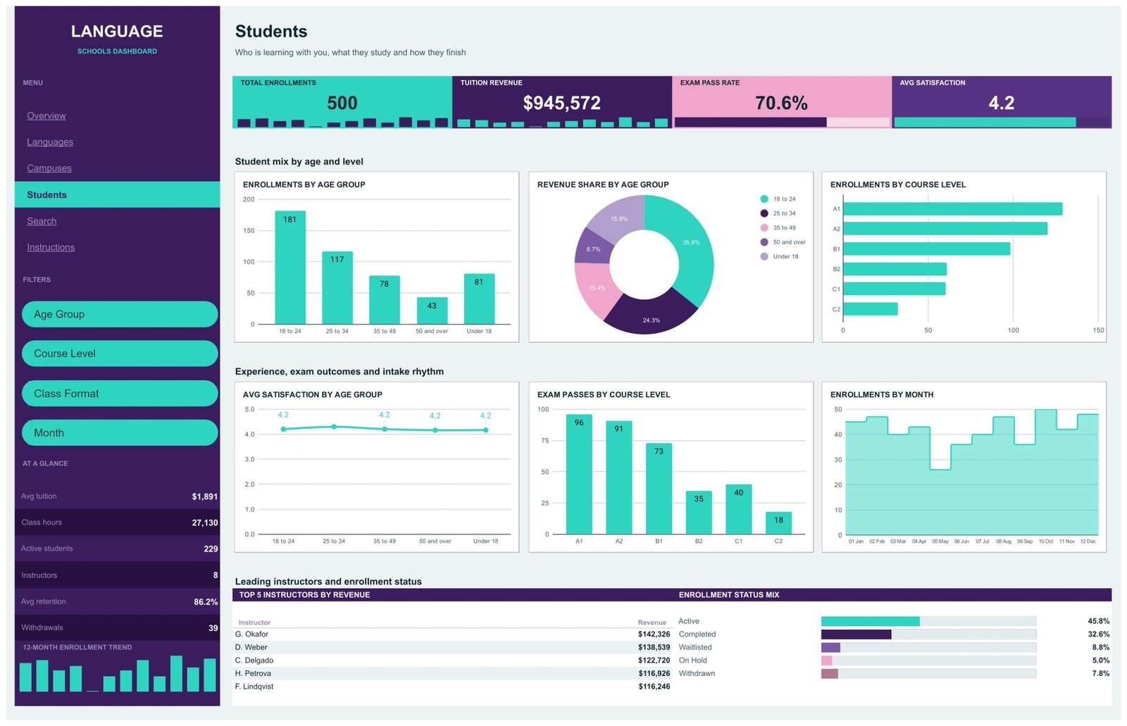
Six charts on the student body. Enrollments by Age Group puts 18-24 at 181 of 500, with 25-34 at 117, Under 18 at 81, 35-49 at 78 and 50-and-over at 43. Enrollments by Course Level tapers cleanly from A1 (129) to C2 (32), and Exam Passes by Course Level — A1 96, A2 91, B1 73, C1 40, B2 35, C2 18, for 353 passes — is the chart to bring to a curriculum meeting, because the pass count falling faster than the enrollment count at B2 is a teaching signal, not an admissions one. A Top 5 Instructors by Revenue table closes the page, ranking G. Okafor at $142,326 down to F. Lindqvist at $116,246.
5. Search — one record, seventeen fields
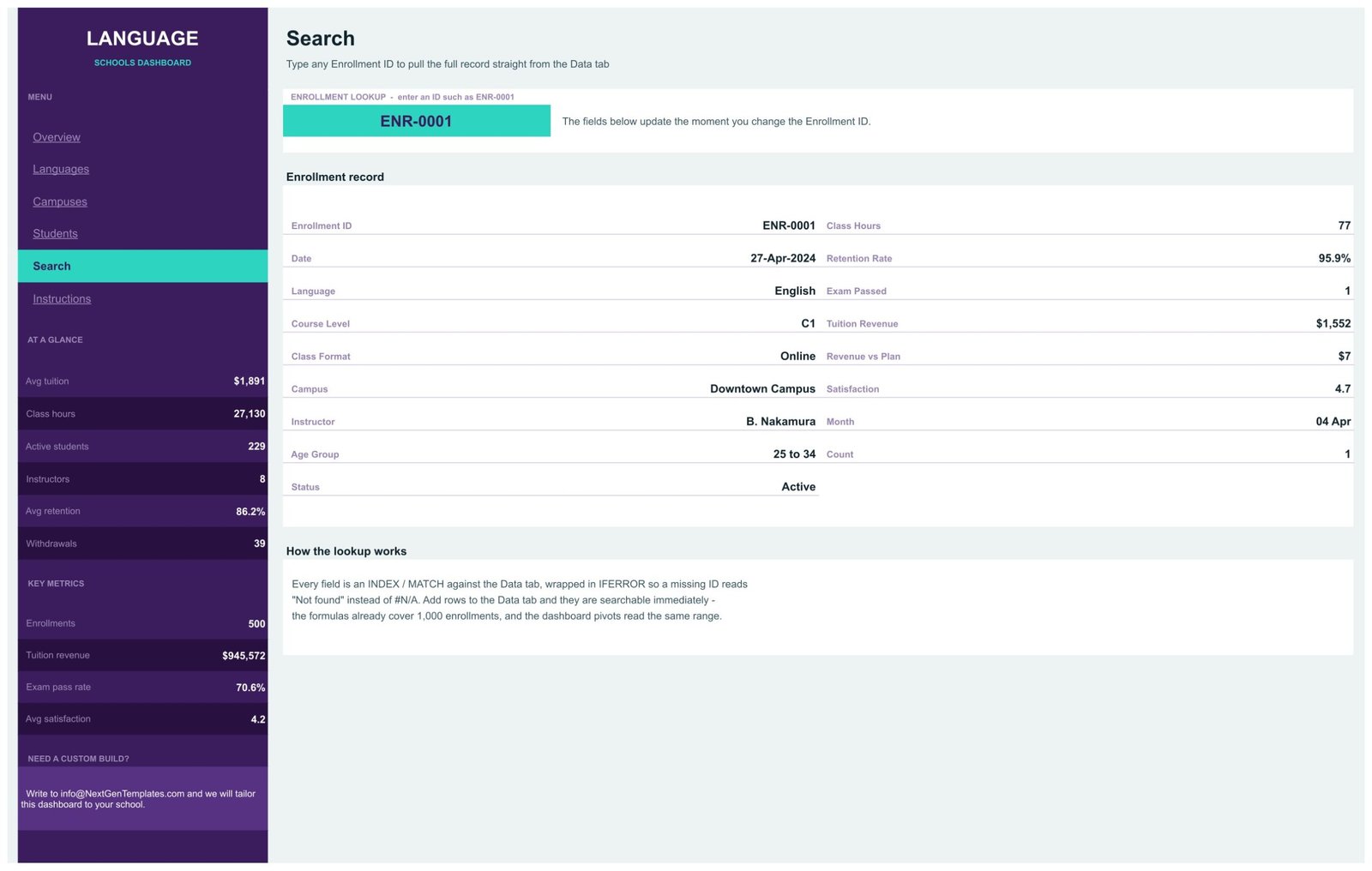
Type an Enrollment ID into one green cell and the full record renders as a card: language, course level, class format, campus, instructor, age group, status, class hours, retention rate, exam passed, tuition revenue, revenue vs plan, satisfaction, month and count. The page documents its own construction — every field is an INDEX/MATCH against the Data tab wrapped in IFERROR, so an unrecognised ID reads “Not found” rather than throwing #N/A across the card. Add rows to the Data tab and they are searchable immediately.
6. Instructions — the handover page
Four numbered blocks: load your own data, use the filters, move around, and make it yours. It tells you the pivots read A1:Q1001, that Enrollment ID must never be blank, that the slicers are page-scoped, and where to look for the pivot tables. It is short, which is the right length for a page most buyers read once.
Language Schools Dashboard in Google Sheets vs. Excel vs. Paid School Software — Feature Comparison
| This template (Google Sheets) | Excel dashboard edition | Paid SIS / course management SaaS | |
|---|---|---|---|
| Cost | $9.99 one time | $13.99-$17.99 one time | $50-$300+ per month |
| Platform | Any browser, free Google account | Microsoft Excel or Microsoft 365 | Vendor cloud |
| Setup time | Under 5 minutes | Under 10 minutes | 2-8 weeks with onboarding |
| Real-time collaboration | Native and simultaneous | OneDrive co-authoring only | Yes, priced per seat |
| Mobile access | Google Sheets app, read and edit | Excel mobile app | Vendor app |
| Customizable fields | Yes — it is your spreadsheet | Yes | Limited to configured fields |
| Share with a link | Yes, view-only or editable | File send or OneDrive link | Seat invitation only |
| Year-1 cost at 5 users | $9.99 | $13.99-$17.99 | $3,000-$18,000 |
| CEFR level reporting | Built in, A1-C2, four charts | Built in | Usually a custom field |
| Revenue vs plan variance | Waterfall by language | Yes | Finance module, often extra |
| Enrolment portal, invoicing, timetabling | No | No | Yes |
The comparison is not really cost against cost. A student information system runs admissions, billing and timetabling; this template runs the reporting layer over data you already keep. Schools that buy the SaaS usually still export to a spreadsheet to answer the board’s questions — this is that spreadsheet, already built.
Who Should Use This Template
It fits an independent language school with 2 to 8 campuses; an owner-operator who already keeps enrollments in a spreadsheet and wants a board-ready view without hiring anyone; an academic director comparing programme profitability across languages and CEFR levels; a centre manager who needs per-campus retention and instructor workload side by side; and a franchise operator who reports a fixed set of numbers upwards every month.
It does not fit a school that needs to transact — take applications, issue invoices, collect payment, build a timetable. It also does not fit a register running to tens of thousands of rows, where a proper database beats pivot tables, and it is not the right place for detailed personal data: use enrollment IDs and keep names out of the sheet.
Real-World Use Cases
The Monday campus review. Set the Month slicer on the Campuses page to last month and read Tuition Revenue by Campus next to the retention combo chart. A site whose enrollment count held but whose retention line dropped is a staffing conversation you can have before the term-end withdrawal window, not after it.
The programme cut. The Overview waterfall is the cleanest case for closing or expanding a language. In the sample data, Japanese is $8,832 behind plan on 40 enrollments while Mandarin is $22,105 ahead on 80 — one screenshot, one decision.
The head-office report. Filter the Students page by Age Group, export Exam Passes by Course Level, copy the Top 5 Instructors by Revenue table. What used to be a pivot rebuild becomes a filter and a paste.
Advantages of the Language Schools Dashboard in Google Sheets
- It is genuinely live. Every KPI recomputes from the register — the four headline figures reconcile exactly against the 500 sample rows, which is not something every dashboard template can claim.
- Page-scoped slicers. Because each page holds its own filter state, two people can look at two different questions in the same file at the same time.
- Sensible dimensional coverage. Language, campus, instructor, CEFR level, class format, age group, status and month all get their own view — which is unusually broad for a single-file template.
- Nothing to install or authorise. No macros, no Apps Script, no add-on permissions dialog, and it works on the Google Sheets mobile app.
- Real headroom. 1,000 rows out of the box against 500 shipped, so a mid-sized school gets a full year before touching a range.
Opportunities for Improvement
Three honest observations from working through the file, none of them blocking:
1. The age-group chart sorts alphabetically, not by age. On the Students page, Enrollments by Age Group runs 18-24, 25-34, 35-49, 50-and-over, Under 18 — so the youngest band sits at the far right rather than at the left. It reads fine once you know, and it is a one-minute fix: rename the band to “00 Under 18” in the Data tab, or reorder the pivot’s row group manually.
2. The Overview month axis clips its last label. The Tuition Revenue by Month chart plots all twelve months, but the axis labels stop at “11 Nov” — December’s $93,843 point is drawn, just not labelled. Widening the chart or reducing the label font restores it. The same chart on the Campuses and Students pages shows all twelve labels.
3. There is no student-level identity, by design. The register is one row per enrollment, keyed by Enrollment ID — there is no student ID, so “how many students enrolled twice” is not a question this file answers. If you need it, add a Student ID column at column R and build a COUNTIF beside it; the existing pivots read A:Q and will ignore the addition.
Best Practices
- Never blank the Enrollment ID. It is the key the pivots use to ignore empty rows and the Search page uses to look a record up. A blank ID silently drops the row from every chart.
- Keep the 17 headers exactly as shipped. Rename a header and both the pivots and the Search page lose their reference. Add new columns at R and beyond instead.
- Load a full twelve months before you judge a language. The May trough and the October peak in the sample data are seasonal, and a quarter of data will mislead you.
- Fill the Month column consistently in the shipped “01 Jan” through “12 Dec” form — the numeric prefix is what keeps the month charts in calendar order rather than alphabetical.
- Agree who drives a shared page. Slicers are page-scoped, not per-user: two people filtering the Campuses page at once will overwrite each other. Duplicate the page if two managers need standing views.
- Use enrollment IDs, not names. A shared spreadsheet is the wrong place for student personal data. Keep identifiers in whatever system already holds them.
If you are new to slicers and pivot tables in Sheets, Google’s own documentation on filtering with slicers is a short and accurate read.
Explore Relevant Templates
If you liked this one, these neighbours cover the rest of the education sector: Education Services Dashboard in Google Sheets, EdTech Dashboard in Google Sheets, Research Institutions Dashboard in Google Sheets, Music School Dashboard in Google Sheets and the E-learning Course Calendar in Google Sheets.
The same product exists on two other platforms: the Language Schools Dashboard in Excel and the Language Schools Dashboard in Power BI. Two more education dashboards are being prepared for release alongside this one — the Coaching & Tutoring Dashboard in Google Sheets and the Test Preparation Centers Dashboard in Google Sheets.
Curious how dashboards like this come together? The Excel Pivot Tables & Dashboards course on NextGenTemplates Academy covers the method, with practice files to follow along.
Frequently Asked Questions
Do I need to know formulas to use this dashboard?
No. Paste your enrollments over the sample rows on the Data tab and every page updates. The formulas, pivot tables, slicers and charts are already built and wired.
How many enrollments will it hold?
The pivots read A1:Q1001, so 1,000 rows before anything needs extending — double the 500 sample rows shipped. Extending the ranges is a straightforward edit if you outgrow it.
Can my campus managers and I use it at the same time?
Yes, that is the point of building it in Google Sheets. One caveat worth knowing: slicers are page-scoped, not per-user, so two people filtering the same page will see each other’s selections. Different pages are fine.
Does it work in Microsoft Excel?
Not this build. It uses native Google Sheets pivot tables, slicers and charts. If Excel is your working environment, the Language Schools Dashboard in Excel is built natively for it.
Can I add a seventh language or a sixth campus?
Yes. The charts read pivot tables over the Data tab, so a new value in Language, Campus, Course Level or Class Format appears in the charts and slicers on the next refresh. Nothing is hard-coded to the six languages shipped.
What currency is it in, and can I change it?
The sample data is formatted in US dollars. Change the cell format on the Tuition Revenue and Revenue vs Plan columns and the whole dashboard follows — there are no currency symbols baked into formulas.
Are the campus and instructor names real?
No. Downtown, Harbour, Northside, Riverside and Westgate Campus, and the eight instructor names, are illustrative sample data so the dashboard has something to render before you load your own. Replace them all.
About the Author
Built by PK — Microsoft Certified Professional with 15+ years of Excel, Google Sheets and Power BI experience, and founder of NextGenTemplates, reaching 300K+ subscribers across YouTube channels. Every template is hand-built and tested before release.
Conclusion
If you run a language school and your monthly review still means rebuilding the same three pivot tables, the Language Schools Dashboard in Google Sheets replaces that with one file, six pages and four slicers per page. It will not take an application or issue an invoice — but it will tell you, every month, which language is ahead of plan, which campus is holding its students, which instructor is carrying the timetable, and which CEFR level is quietly failing its exams.
Get the Language Schools Dashboard in Google Sheets
Instant download · One-time payment · No subscription
Last updated: September 2026