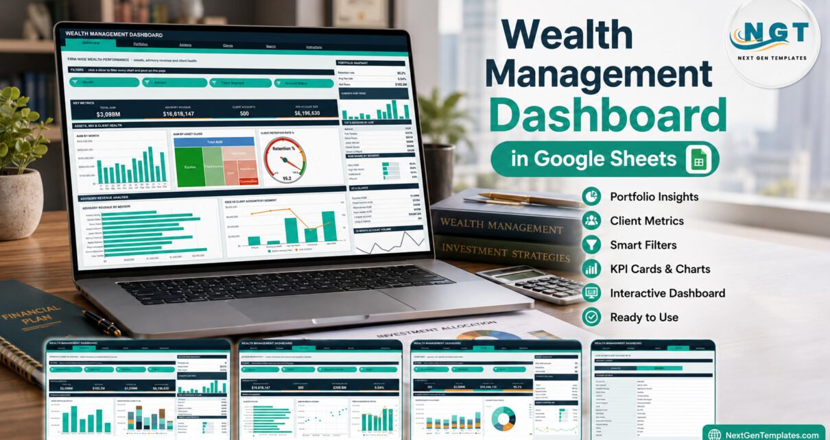
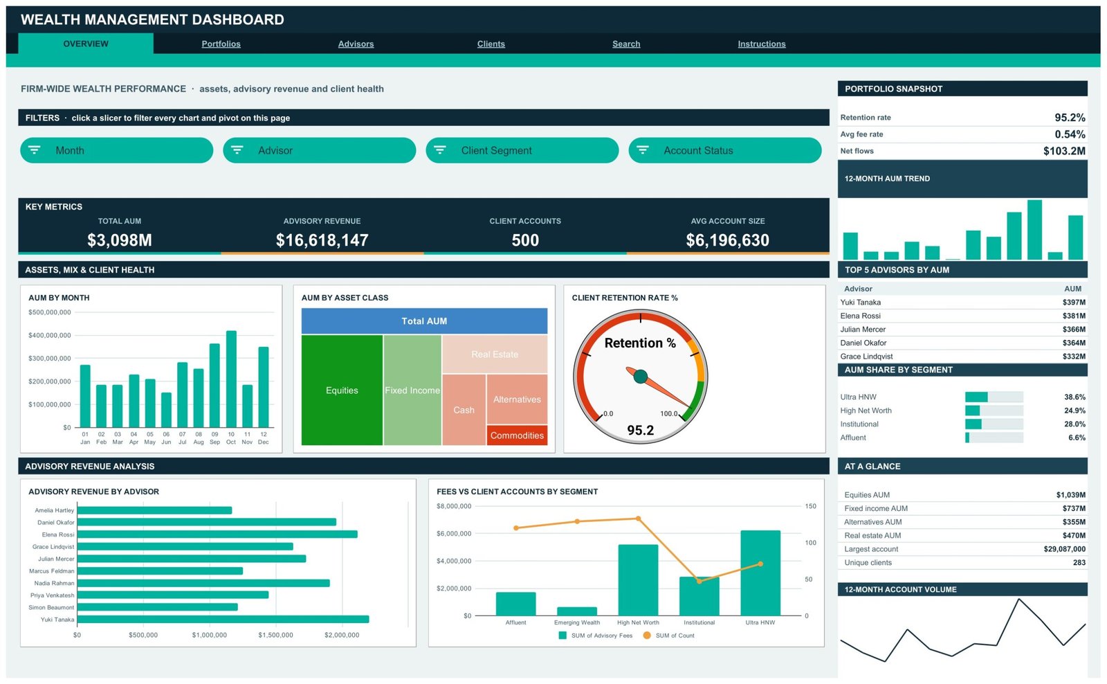
The Wealth Management Dashboard in Google Sheets is a six-page reporting workbook built on native pivot tables and slicers. Its fictional sample firm holds 500 client accounts for 283 unique clients, managed by 10 advisors across 6 offices, and the dashboard reports $3,098M in assets under management, $16,618,147 in advisory fees, $103.2M in net flows and a 95.2% client retention rate. Four analysis pages carry 16 KPI cards, 18 chart panels and 15 slicers, and every pivot already reaches 1,000 data rows.
Most small advisory firms keep their client register in a spreadsheet and rebuild the same summary every month: AUM by advisor, fees by office, which segments are growing and how many accounts are onboarding or closing. This template does that summary once, in Google Sheets, so the register itself becomes the report. It is a reporting layer, not advisory software, and this guide is clear about both sides of that line.
Get the Wealth Management Dashboard in Google Sheets
Key Features of the Wealth Management Dashboard in Google Sheets
- Sixteen KPI cards on four pages. Overview shows Total AUM, Advisory Revenue, Client Accounts and Avg Account Size. Portfolios shows Net Flows and Equities AUM. Advisors shows Avg Book per Advisor and Avg Fee Rate. Clients shows Unique Clients, Avg AUM per Client and Retention Rate.
- Pivot tables and slicers, not helper formulas. Each chart reads a pivot table parked to the right of its page. Nine slicer fields appear across the pages: Month, Advisor, Client Segment, Account Status, Portfolio Strategy, Asset Class, Risk Profile, Office and Acquisition Channel.
- A gauge and a treemap on the Overview. The Client Retention Rate % gauge reads 95.2 in the sample and AUM by Asset Class sizes Equities, Fixed Income, Real Estate, Cash, Alternatives and Commodities by assets. Both react to the slicers above them.
- Sidebar panels on every analysis page. A snapshot block, a 12-Month AUM Trend, a Top 5 table, a percentage mix list, an At a Glance list and a 12-Month Account Volume line sit beside the charts.
- An account Search page. Type an Account ID such as WM-0001 and read all 16 fields of that record.
- 1,000-row capacity. Paste accounts up to row 1001 and the pivots, slicers and formulas pick them up.
What This Template Is, and What It Is Not
It summarises a client account register: assets, fees, net flows, client segments, advisor books and account status. It is not portfolio-management, custody, trading, financial-planning or advisory-compliance software. It holds no market prices, calculates no investment returns or performance and connects to no custodian, broker or CRM.
It gives no investment, financial or tax advice and promises no returns. Strategy names such as Aggressive Growth or Capital Preservation, and risk profiles such as Conservative or Aggressive, are sample labels for grouping records, not recommendations. The template makes no SEC, FINRA, FCA or SEBI claim and is not a books-and-records system. All sample names and figures are fictional.
The Data sheet holds client names and the Search page prints a named record, so use internal client codes if identity is confidential. A Google Sheet is only as private as its sharing settings; Google’s guide to sharing files from Google Drive covers the options.
Dashboard Pages Explanation
Page 1: Overview
The Overview answers “how is the firm doing”. KPI cards read Total AUM $3,098M, Advisory Revenue $16,618,147, Client Accounts 500 and Avg Account Size $6,196,630. Slicers filter by Month, Advisor, Client Segment and Account Status. Charts are AUM by Month, AUM by Asset Class, Client Retention Rate %, Advisory Revenue by Advisor, and Fees vs Client Accounts by Segment, which pairs fee columns with an account-count line. The sidebar shows the Portfolio Snapshot (0.54% average fee rate, $103.2M net flows), Top 5 Advisors by AUM led by $397M, AUM Share by Segment and an At a Glance list with the largest account at $29,087,000.
Page 2: Portfolios
Portfolios covers strategy and asset allocation. Cards read Total AUM, Net Flows $103.2M, Equities AUM $1,039M and Avg Account Size. Slicers are Portfolio Strategy, Asset Class, Risk Profile and Month. Charts are AUM by Portfolio Strategy across six strategies, AUM by Strategy & Asset Class as stacked columns, Monthly Net Flows and AUM by Risk Profile. The sidebar reports 6 strategies live, a 33.5% equity weight and 11.7% cash weight, with Balanced the largest strategy at $752M.

Page 3: Advisors
Advisors covers books of business. Cards read Advisory Revenue, Client Accounts, Avg Book per Advisor $309.8M and Avg Fee Rate 0.54%. Slicers are Advisor, Office, Acquisition Channel and Month. Charts are AUM by Advisor, AUM vs Fees by Advisor as a scatter, Fees vs Accounts by Office across Boston, Chicago, Dallas, Miami, New York and San Francisco, Monthly Advisory Fees, Accounts by Acquisition Channel and Accounts by Risk Profile. The Advisor Snapshot shows 50 accounts and $33,236 in fees per account on average.

Page 4: Clients
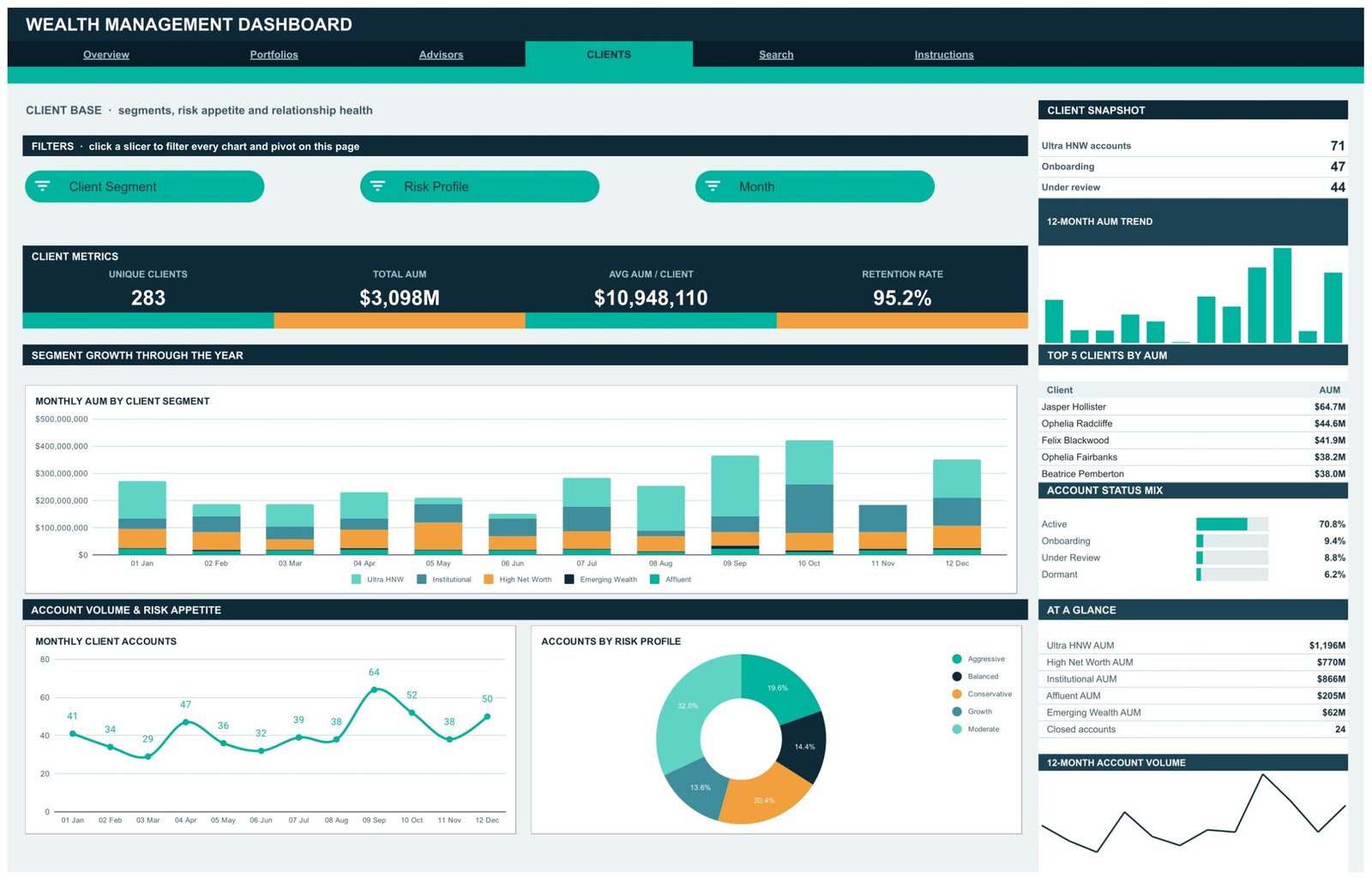
Clients covers segments and relationship health. Cards read Unique Clients 283, Total AUM, Avg AUM per Client $10,948,110 and Retention Rate 95.2%. Slicers are Client Segment, Risk Profile and Month. Charts are Monthly AUM by Client Segment across Ultra HNW, Institutional, High Net Worth, Emerging Wealth and Affluent, Monthly Client Accounts and Accounts by Risk Profile. The sidebar lists 71 Ultra HNW accounts, 47 onboarding and 44 under review, the Top 5 Clients by AUM, an Account Status Mix with Active at 70.8%, and 24 closed accounts.
Page 5: Search
Enter an Account ID and the Account Details table returns the record: Date Opened, Portfolio Strategy, Asset Class, Advisor, Client Name, Client Segment, AUM, Advisory Fees, Net Flows, Risk Profile, Acquisition Channel, Account Status, Office, Month and Quarter.
Page 6: Instructions
Ten notes explain the pivot-and-slicer build, how to clear a slicer, why KPI cards stay unfiltered, the 1,000-row auto-expand and the colour theme. Google documents the underlying features in its help pages on pivot tables and slicers.
Google Sheets Dashboard vs. an Excel Dashboard vs. a Paid Wealth Reporting Platform: Feature Comparison
| Feature | This Google Sheets dashboard | Microsoft Excel dashboard | Paid wealth reporting platform |
|---|---|---|---|
| Cost | $9.99 one-time ✅ | $17.99 one-time + Microsoft 365 | Quote-based, per seat or per AUM |
| Platform | Browser, Google account ✅ | Desktop Excel | Vendor web app |
| Setup time | Under 10 minutes ✅ | Under 15 minutes | Weeks: feeds and onboarding |
| Real-time collaboration | Built in ✅ | OneDrive co-authoring | Per seat |
| Mobile access | Google Sheets app ✅ | Excel mobile, limited slicers | Vendor app |
| AUM, fee and retention views | Ready-made ✅ | Ready-made in the Excel edition | Configured per firm |
| Share with a link | Any Google account ✅ | File or OneDrive link | Named users |
| Year-1 cost at 5 users | $9.99 ✅ | $17.99 + 5 Microsoft 365 seats | Thousands per year |
| Custodian feeds, performance, returns | Not included | Not included | Included ✅ |
For a small advisory team that wants its account register summarised without a platform contract, this Google Sheets dashboard sits in the sweet spot.
Who Should Use This Template
Perfect for:
- Operations managers at small wealth and advisory firms with a client register in a spreadsheet
- Principals reviewing AUM, fees and retention by advisor, office and segment each month
- Team leads comparing advisor books and acquisition channels
- Analysts and trainers learning pivot tables and slicers on a realistic finance layout
Not a fit if:
- You need portfolio management, custody, trading or financial planning
- You need performance, returns, benchmarks or market prices
- You need regulatory books and records, audit trails or SSO
- You hold well over 1,000 account records a period or want a live custodian or CRM feed
Real-World Use Cases
Maya runs operations at a six-advisor independent firm. Before the monthly meeting she filters the Advisors page by Office and brings AUM vs Fees by Advisor plus the Top 5 Advisors by Fees, instead of rebuilding a summary by hand.
Daniel is a principal at a family-office style practice. On the Clients page he filters Client Segment to Ultra HNW and reads how many accounts are onboarding or under review, and how segment AUM moved month by month.
Priya leads business development for a regional advisory team. Accounts by Acquisition Channel shows whether bank referrals, seminars or centres of influence bring in accounts, and the Office slicer shows where.
Advantages of the Wealth Management Dashboard in Google Sheets
- One-time $9.99. No platform contract, per-seat licence or per-AUM fee.
- Fast to adopt. Replace the sample rows, keep the headers, and all four analysis pages update.
- Shareable. Partners and team leads open it in a browser with a Google account.
- Transparent. Every chart’s numbers sit in a visible pivot table on the same page.
- Clear roles for each page. Firm, strategy, advisor and client questions each have their own page and slicers.
Opportunities for Improvement
- KPI cards do not follow slicers. They show firm totals by design, so a filtered chart and its card can differ.
- Sidebar mix lists show the main items. AUM Share by Segment lists four of five segments, Account Status Mix lists four statuses without Closed, and Acquisition Channel Mix lists four of six channels, so the shown percentages do not add to 100%.
- AUM is a sum of account records. It is not a month-end valuation, and there is no pricing, performance or return calculation.
- Axis label. The Monthly Net Flows axis labels stop at 11 Nov while the line runs to the last month.
- Capacity. 1,000 rows out of the box; larger books need the ranges extended.
Best Practices
- Replace client names with internal codes before sharing the file outside the firm.
- Keep one row per account record and keep the Data sheet headers unchanged.
- Use consistent labels for advisors, offices, strategies and segments so slicers group cleanly.
- Clear slicers with Select all before reading firm totals on a chart.
- Save a dated copy at each month end if you want a history.
Explore Relevant Templates
If your firm also reports on investor communications, the Investor Relations Dashboard in Google Sheets guide covers a similar pivot build. For a scorecard view, read the Wealth Management KPI Dashboard in Google Sheets walkthrough, a month-picker template with targets and traffic lights. Personal-finance readers may prefer the Net Worth Tracker in Google Sheets or the Stock Portfolio Tracker in Google Sheets, and financial-services teams can compare the Banking Dashboard in Google Sheets.
On NextGenTemplates, the Wealth Management Dashboard in Excel and Wealth Management Dashboard in Power BI are built separately for those platforms, and the Wealth Management KPI Dashboard in Google Sheets is the scorecard edition.
To get comfortable with the pivot tables and charts behind a report like this, the Excel Pivot Tables & Dashboards course in NextGenTemplates Academy takes you through them step by step.
Get the Wealth Management Dashboard in Google Sheets
Frequently Asked Questions
What does the Wealth Management Dashboard in Google Sheets track?
It tracks assets under management, advisory fees, net flows, fee rate, client accounts, unique clients, advisor books and client retention, broken down by advisor, office, strategy, asset class, risk profile, acquisition channel and client segment, across 16 KPI cards and 18 chart panels.
Does it give investment advice or calculate returns?
No. It summarises the records you paste in and holds no market prices, so it calculates no performance or returns. Strategy and risk-profile labels are sample categories, not recommendations, and nothing in the template is investment, financial or tax advice.
Is it portfolio-management or compliance software?
No. It is not portfolio-management, custody, trading or advisory-compliance software, it keeps no regulatory books and records, and it makes no SEC, FINRA, FCA or SEBI claim.
How does it compare with a paid wealth reporting platform?
Paid platforms connect to custodians and report performance, usually on a quote-based contract. This template costs $9.99 once and summarises a spreadsheet register. Choose it when a clear AUM, fee and client summary is enough.
How long does setup take?
Under 10 minutes. Make your copy from the PDF link, paste your accounts over the sample rows with the headers unchanged, and every pivot, chart and slicer updates.
Why don’t the KPI cards change when I use a slicer?
The cards and At a Glance lists use SUMIFS and COUNTIFS on the Data sheet, so they always show firm totals. Charts, pivots and Top 5 panels follow the slicers.
About the Author
Built by PK, Microsoft Certified Professional with 15+ years of Excel, Google Sheets and Power BI experience. Founder of NextGenTemplates, reaching 300K+ subscribers across YouTube channels. Every template is hand-built and tested before release.
Conclusion
The Wealth Management Dashboard in Google Sheets turns a client account register into four focused reporting pages, a Search page and a built-in guide, at a one-time price. It reports assets, fees, flows and client health clearly, and it stays honest about what it does not do: no advice, no returns, no custody or compliance function.
✅ Instant download · One-time payment · No subscription
Last updated: September 2026