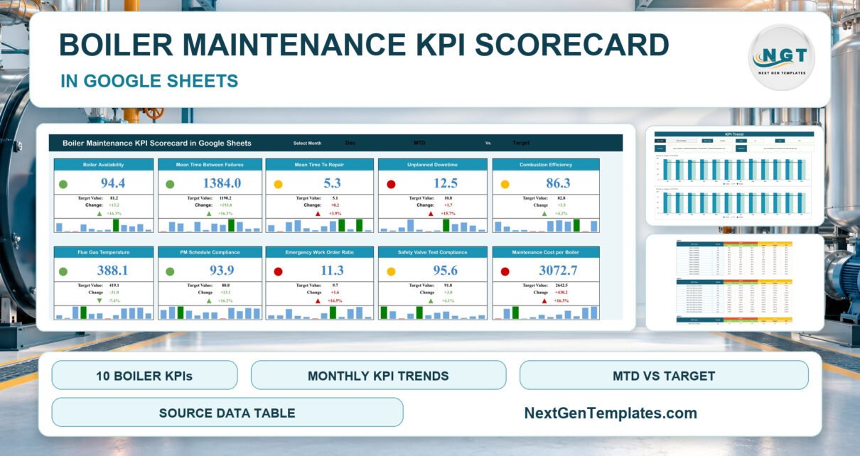
The Boiler Maintenance KPI Scorecard in Google Sheets puts 10 boiler maintenance KPIs on a single page of traffic-light cards, split across five groups: Reliability, Efficiency, Maintenance Execution, Safety & Compliance and Cost. Every card carries a 12-month mini chart, a KPI Trend page charts any KPI against Target and prior year (PY), and the sample file ships with 120 monthly records (10 KPIs x 12 months).
Most boiler houses already collect the raw numbers: run hours from the controls, breakdown times from the work-order system, combustion readings from the analyser and spend from the purchase ledger. The trouble is that they live in four places, so the monthly maintenance review turns into a hunt for figures. This Google Sheets KPI scorecard gives you one place to type the month’s totals and see at a glance which measures beat target, which slipped, and how each one moved over the year.
Key Features of the Boiler Maintenance KPI Scorecard in Google Sheets
- Three selectors on one page. Choose the month (Jan to Dec), MTD or YTD, and Target or PY. All ten cards recalculate from the Input Data tab using ordinary sheet formulas, with no Apps Script, add-ons or macros.
- Direction-aware traffic lights. Five KPIs are upper-the-better (UTB) and five are lower-the-better (LTB). A UTB KPI turns green only when it beats its comparison by more than 10%, amber from 0% to 10% above, and red at or below it. An LTB KPI such as Mean Time To Repair is green at or below its comparison, amber up to 10% above and red beyond that.
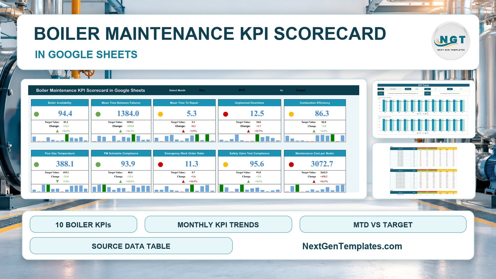
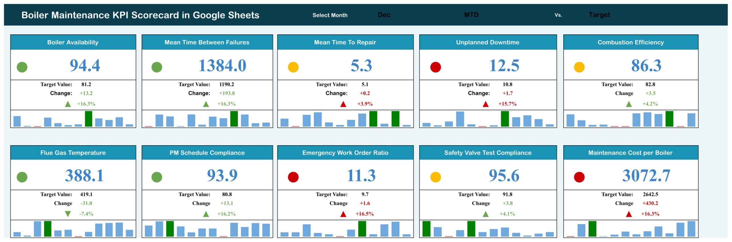
- Full detail on every card. Actual value, Target or PY value, change, change %, a coloured arrow and a 12-month mini column chart.
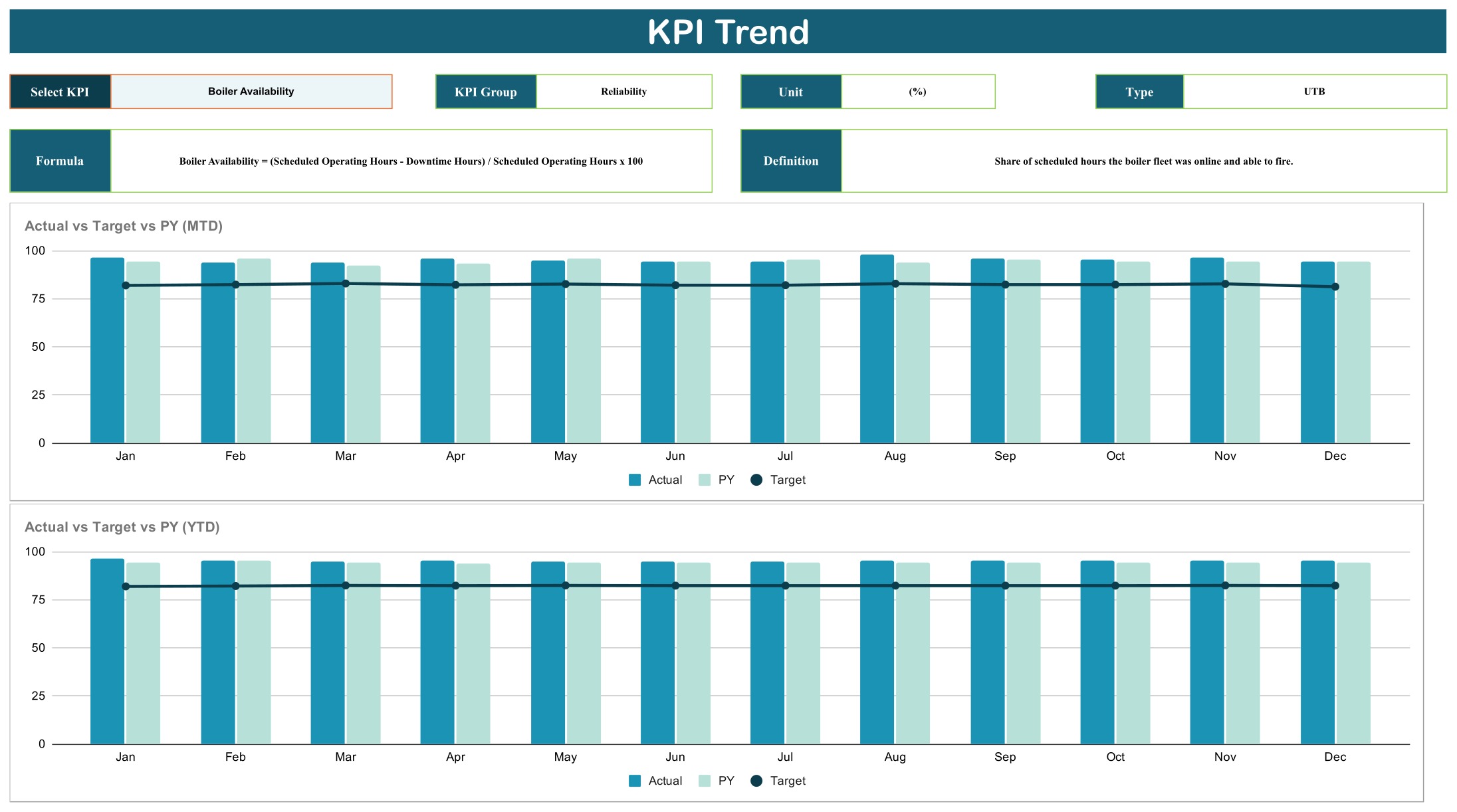
- KPI Trend page. Pick a KPI to see its group, unit, type, formula and definition above two charts: Actual vs Target vs PY (MTD) by Month and Actual vs Target vs PY (YTD) by Month.
- Editable KPI definitions. Names, units, formulas, definitions and the UTB/LTB type all live on one sheet, so you can adapt the scorecard to how your site measures its boilers.
- Built-in Read Me. A short in-file guide covers the sheets, the setup steps and how the lights work.
Dashboard Pages Explanation
The scorecard has four working pages plus Read Me, Color Settings, Support and Trend_Support tabs.
Page 1: Scorecard
Ten cards in two rows of five. With December, MTD and Target selected, the sample data shows 4 green, 3 amber and 3 red lights. Boiler Availability reads 94.4% against an 81.2 target (green, up 16.3%); Mean Time Between Failures reads 1384.0 hours against 1190.2 (green); Flue Gas Temperature reads 388.1°F against 419.1 (green, because a cooler stack is better); while Unplanned Downtime (12.5 hours against 10.8), Emergency Work Order Ratio (11.3% against 9.7) and Maintenance Cost per Boiler (3072.7 against 2642.5) all show red. Mean Time To Repair, Combustion Efficiency and Safety Valve Test Compliance sit in amber.
Page 2: KPI Trend
Select KPI, KPI Group, Unit, Type, Formula and Definition boxes sit above two charts: Actual vs Target vs PY (MTD) by Month and Actual vs Target vs PY (YTD) by Month. The sample shows Boiler Availability, a UTB percentage KPI in the Reliability group, with its formula: (Scheduled Operating Hours – Downtime Hours) / Scheduled Operating Hours x 100.
Page 3: KPI Definition
All 10 KPIs with group, unit, formula, definition and type:
- Reliability: Boiler Availability (%), Mean Time Between Failures (hours), Mean Time To Repair (hours, LTB), Unplanned Downtime (hours, LTB)
- Efficiency: Combustion Efficiency (%), Flue Gas Temperature (°F, LTB)
- Maintenance Execution: PM Schedule Compliance (%), Emergency Work Order Ratio (%, LTB)
- Safety & Compliance: Safety Valve Test Compliance (%)
- Cost: Maintenance Cost per Boiler ($, LTB)
For example, Combustion Efficiency = (Fuel Energy Input – Stack Losses) / Fuel Energy Input x 100, and Emergency WO Ratio = Emergency Work Orders / Total Work Orders x 100.

Page 4: Input Data
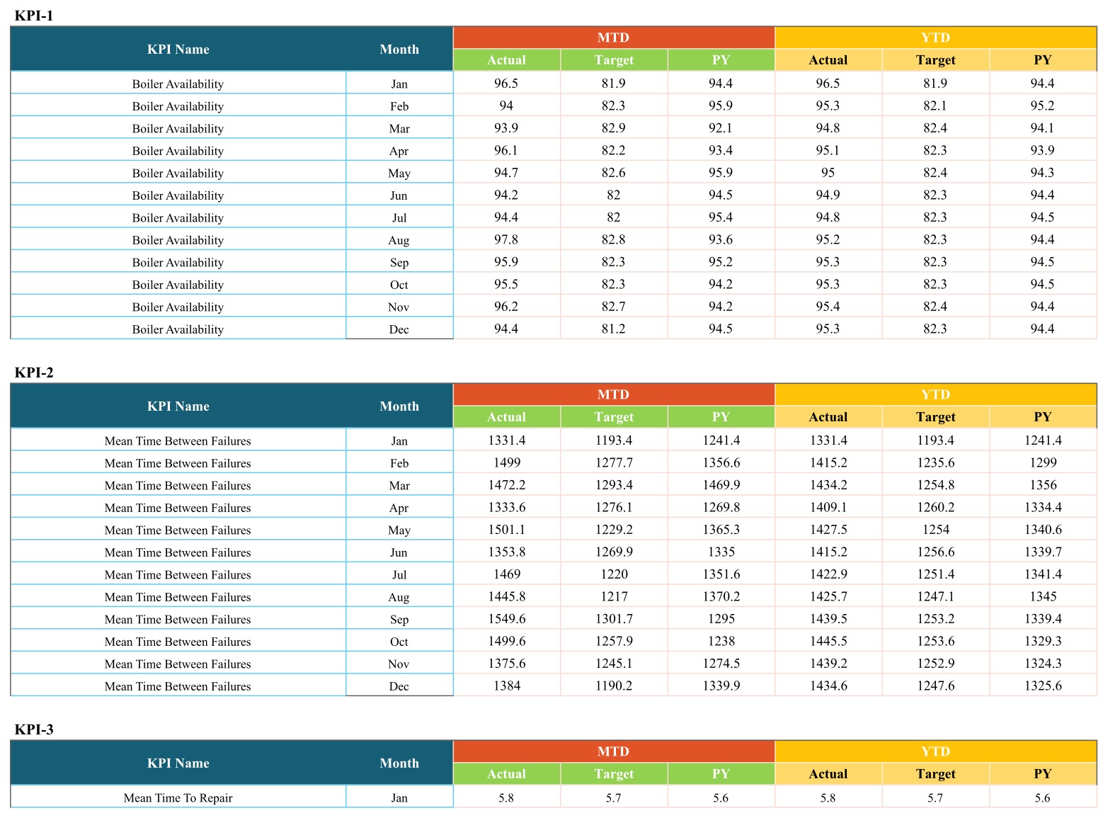
Ten blocks, KPI-1 to KPI-10, each with 12 monthly rows of MTD and YTD Actual, Target and PY. This is the only sheet you type into. YTD values are entered rather than calculated, so you decide whether a YTD figure is a sum (downtime hours, cost) or an average (availability, efficiency).
Boiler Scorecard vs. Excel vs. CMMS Software: Feature Comparison
| Feature | This scorecard (Google Sheets) | Boiler Maintenance KPI Scorecard in Excel | CMMS / maintenance software |
|---|---|---|---|
| Cost | ✅ One-time payment | One-time, plus an Excel licence | Recurring subscription |
| Platform | ✅ Browser, any OS | Desktop Excel 2016 or later | Vendor web and mobile apps |
| Setup time | ✅ Minutes | Minutes | Days to weeks |
| KPIs | 10 reliability, efficiency and cost KPIs | Up to 20, with a different service-call KPI set | Vendor-defined reports |
| Real-time team collaboration | ✅ Native Google sharing | File attachments or OneDrive | Per-user seats |
| Mobile access | ✅ Google Sheets app | Limited | ✅ Yes |
| Customisable KPIs | ✅ Names, units, formulas, UTB/LTB | ✅ Yes | Within vendor limits |
| Work orders, asset register, PM scheduling | No, monthly totals only | No | ✅ Yes |
For maintenance teams that want a monthly boiler performance scorecard without another seat-based platform, this Google Sheets file sits in the sweet spot. It complements a CMMS rather than replacing it.
Who Should Use This Template
Perfect for:
- Plant and utilities engineers who run steam or hot-water boilers and hold a monthly maintenance review
- Facilities managers for hospitals, schools, hotels and campuses who want availability, downtime and cost per boiler on one page
- Boiler service contractors who report reliability and PM compliance back to clients
- Multi-site owners who want one identical scorecard per boiler house
Not a fit if:
- You need work orders, an asset register, PM scheduling, spare-parts stock or daily readings
- You are looking for a maintenance log or record-keeping system; the scorecard only reports the monthly figures you type in
Real-World Use Cases
Rahul runs utilities at a food plant with four steam boilers. At month end he enters totals from the plant controls and the work-order system, then switches between Target and PY to check Unplanned Downtime and Emergency Work Order Ratio. He shares a view-only link with the production manager so both teams see the same numbers.
Claire manages a boiler service contract for a hospital estate. When Maintenance Cost per Boiler turns red she opens the KPI Trend page, sees which months pushed spend up, and brings the chart to the quarterly client review.
Tom looks after heating plant for a school group. He watches Combustion Efficiency and Flue Gas Temperature side by side, because a rising stack temperature is often the first hint that tubes need cleaning.
Advantages of the Boiler Maintenance KPI Scorecard
- One page, one meeting. Ten KPIs with lights and 12-month history fit on a single screen, which keeps a monthly review short.
- No recurring cost. It is a one-time purchase that runs on a free Google account.
- Honest direction handling. Repair time, downtime, stack temperature, emergency work and cost turn red when they rise, not when they fall.
- Easy to adapt. Change KPI names, units and formulas on one sheet without touching the card formulas, so it doubles as a general boiler KPI template.
Opportunities for Improvement
We would rather you know these before you buy:
- June and July drop-down mismatch. The Month drop-down lists “June” and “July” while Input Data uses “Jun” and “Jul”, so those two months do not display their data. Fix it once: on the Scorecard tab select cell N1, open Data > Data validation and change the two entries. Google’s help page explains how to edit a drop-down list.
- Color Settings is not linked. The Read Me says the thresholds live on the Color Settings tab, but the RAG bands that drive the lights are in the Support tab (Z4:AE6). Edit them there.
- Asymmetric bands. A higher-is-better KPI needs to beat its comparison by more than 10% to show green, while a lower-is-better KPI is green as soon as it is at or below target. Adjust the Support table if you want a different rule.
- Typed YTD values. YTD figures are entered by hand, which is flexible but means you must keep them consistent.
Best Practices
- Apply the June/July fix before entering any data.
- Set targets for all 12 months at the start of the year, and enter actuals within a few days of month end.
- Keep KPI names on the KPI Definition sheet identical to those in the Input Data blocks.
- Pull each KPI from the same source every month (controls, work-order system, analyser reports, purchase ledger) so the trend lines compare like with like.
- Share the file with view-only access in Google Sheets for managers, and edit access only for whoever enters the data.
If you look after other building services, our HVAC Service Dashboard in Google Sheets covers heating and cooling service analytics. The same scorecard layout also powers the Water Treatment Services KPI Scorecard in Google Sheets, the Appliance Repair Business KPI Scorecard in Google Sheets and the Home Inspection Services KPI Scorecard in Google Sheets.
Explore Relevant Templates
- Boiler Maintenance KPI Scorecard in Excel: the Excel edition, with up to 20 KPIs and a different service-call KPI set.
- Boiler Maintenance KPI Dashboard in Excel: a dashboard-style layout for the same trade.
- HVAC Service Dashboard in Google Sheets: service analytics for heating and cooling work.
- Water Treatment Services KPI Scorecard in Google Sheets: the same scorecard layout for water treatment.
Frequently Asked Questions
What KPIs does the Boiler Maintenance KPI Scorecard in Google Sheets track?
It tracks ten boiler maintenance KPIs: Boiler Availability, Mean Time Between Failures, Mean Time To Repair, Unplanned Downtime, Combustion Efficiency, Flue Gas Temperature, PM Schedule Compliance, Emergency Work Order Ratio, Safety Valve Test Compliance and Maintenance Cost per Boiler. All of them can be renamed on the KPI Definition sheet.
How long does setup take?
Copying the file takes a minute and the June/July drop-down fix takes another. After that, setup is simply entering 12 months of Actual, Target and PY figures for your 10 KPIs on the Input Data sheet.
How does it compare to CMMS software?
A CMMS raises work orders, schedules preventive maintenance and stores asset history on a subscription. This scorecard is a one-time-purchase reporting layer for monthly totals; many teams use it alongside their CMMS for the management review.
Is it the same as the Excel scorecard?
No. The Excel edition holds up to 20 KPIs with a different set of boiler-service measures, adds a KPI Analysis page and keeps its bands on Color Settings. This Google Sheets version tracks 10 reliability, efficiency and cost KPIs and runs in a browser.
Do I need Apps Script or add-ons?
No. Every card, light and chart is driven by standard Google Sheets formulas and drop-down lists, so nothing asks for script permissions.
Is the data in the template real?
No. The supplied figures are fictional sample data for demonstration. Replace them with your own monthly totals.
About the Author
Built by PK, Microsoft Certified Professional with 15+ years of Excel, Google Sheets and Power BI experience. Founder of NextGenTemplates, reaching 300K+ subscribers across YouTube channels. Every template is hand-built and tested before release.
Conclusion
The Boiler Maintenance KPI Scorecard in Google Sheets turns ten monthly boiler figures into one page of traffic lights and trend charts that engineers and managers can read in a minute. Apply the one-minute June/July fix, enter your numbers, and your monthly maintenance review has a single source of truth.
👉 Click here to Purchase the Boiler Maintenance KPI Scorecard in Google Sheets
✅ Instant download · One-time payment · No subscription
🎥 More tutorials: Youtube.com/@NeoTechNavigators
Last updated: September 2026