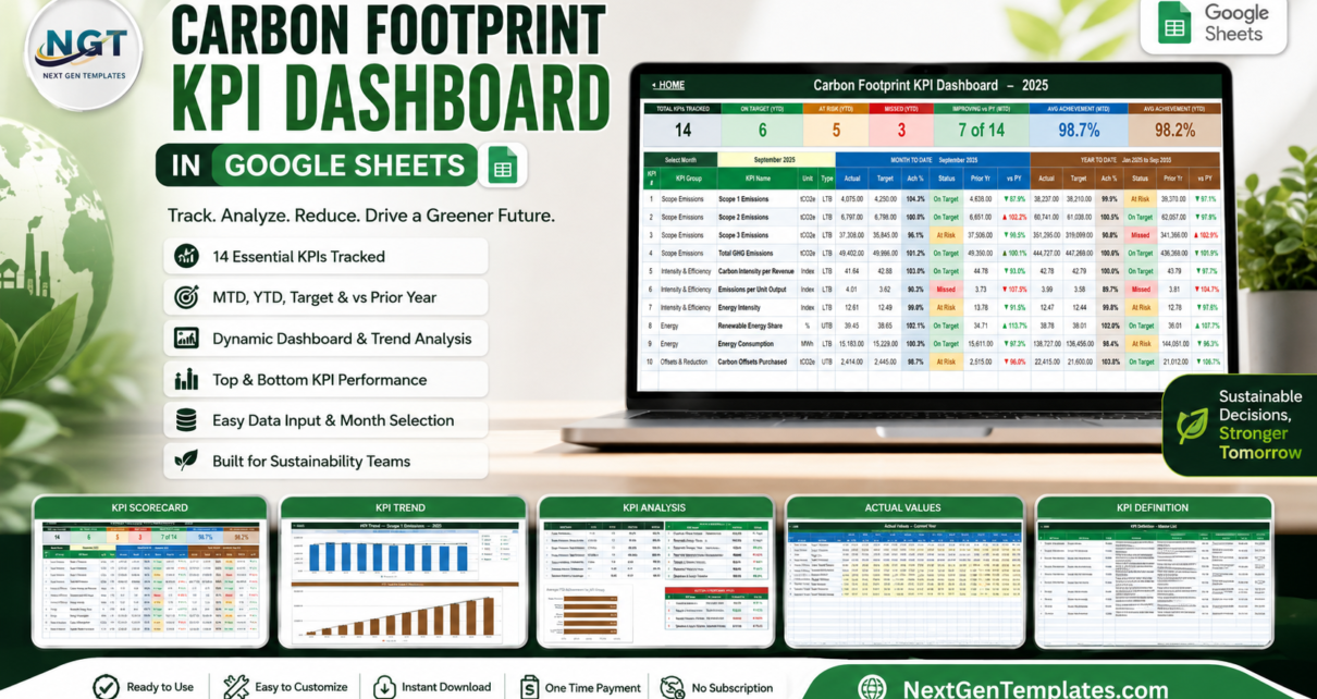
Most carbon reporting dies in the gap between the calculation and the conversation. The emissions get worked out once a quarter in a spreadsheet somebody built in 2019, and by the time anyone sees a number it is too old to act on. A carbon footprint KPI dashboard in Google Sheets closes that gap: 14 KPIs, 12 months, 6 pages, and a single month dropdown that re-reads the whole workbook. This is the month-picker scorecard build – Actual, Target, Achievement %, Status and prior-year comparison on every row, for month-to-date and year-to-date at the same time.
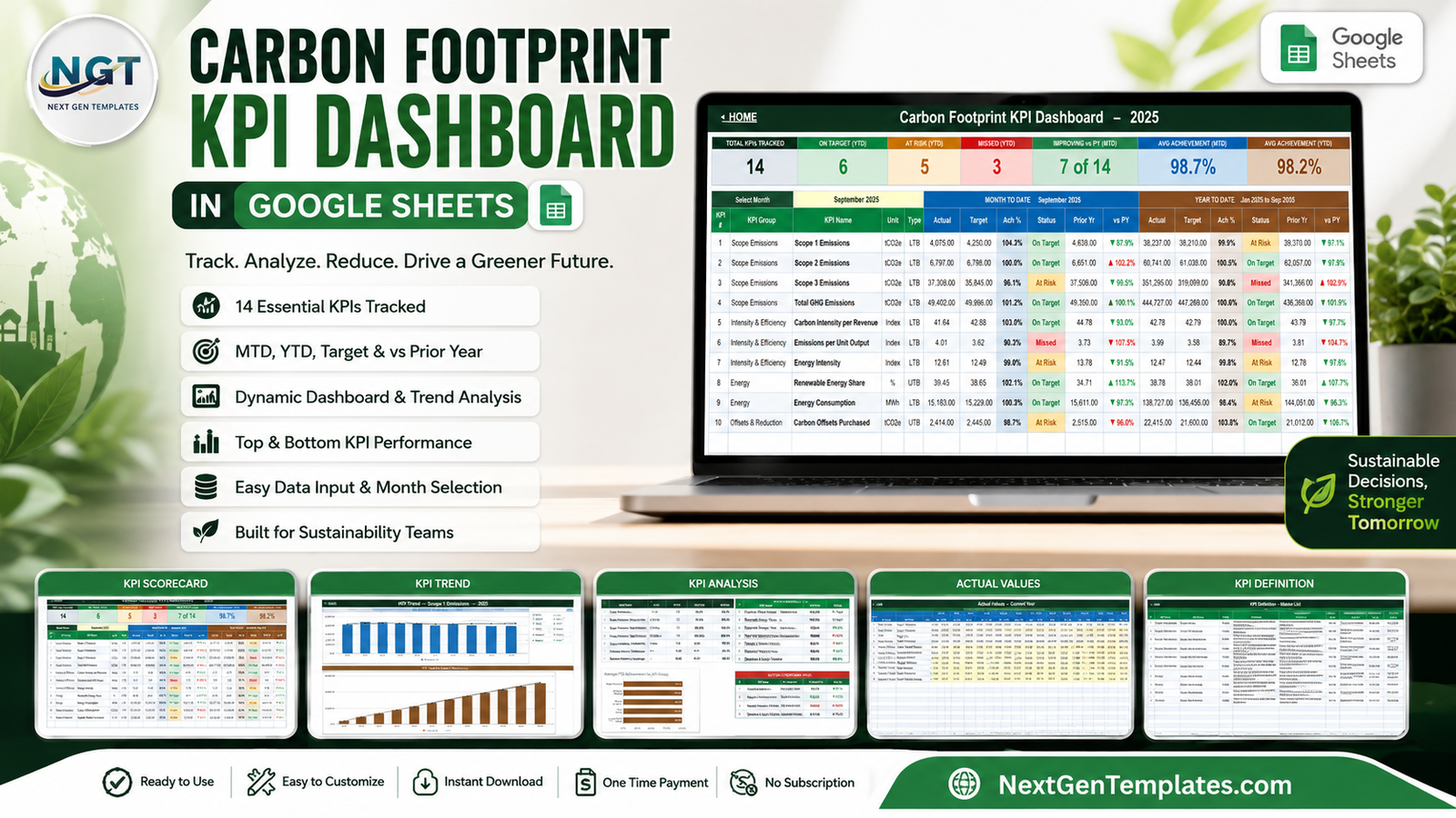
One thing to be clear about before anything else: this template does not calculate your emissions. It carries no emission factors and converts nothing. You bring tCO2e, MWh and percentages you already trust, and the workbook turns them into a monthly management view. It makes no claim of alignment with the GHG Protocol, ISO 14064, CSRD or SECR, and it is not assurance evidence.
Get the Carbon Footprint KPI Dashboard in Google Sheets
Key Features of the Carbon Footprint KPI Dashboard in Google Sheets
- 14 KPIs across five groups – Scope Emissions (Scope 1, Scope 2, Scope 3, Total GHG), Intensity & Efficiency (Carbon Intensity per Revenue, Emissions per Unit Output, Energy Intensity), Energy (Renewable Energy Share, Energy Consumption), Offsets & Reduction (Carbon Offsets Purchased, Emission Reduction vs Baseline) and Operations & Supply Chain (Fleet Emissions, Waste Diversion Rate, Supplier Emissions Coverage).
- Seven header tiles – Total KPIs Tracked, On Target (YTD), At Risk (YTD), Missed (YTD), Improving vs PY (MTD), Avg Achievement (MTD), Avg Achievement (YTD).
- MTD and YTD in the same row – six columns each: Actual, Target, Ach %, Status, Prior Yr, vs PY.
- LTB and UTB logic – lower-the-better KPIs score Target / Actual, so beating an emissions target reads above 100% instead of looking like a failure.
- Thresholds you own – On Target from 100%, At Risk 95-99%, Missed under 95%, all editable in the Status formulas.
- Owner, Priority and Frequency per KPI – Scope 3 belongs to the Supply Chain Director, Renewable Energy Share to the Energy Manager, Waste Diversion to the Facilities Lead.
- Plain formulas only – no add-ons, no Apps Script, no macros, nothing to authorise.
Dashboard Pages Explanation
Home
A navigation page. Three tiles state the coverage (14 KPIs, MTD + YTD, 100% formula-driven), three link blocks jump to the dashboard pages, the input sheets and the reference sheets, and a three-step strip explains the whole workflow: enter your data, pick a month, read the scorecard.
KPI Dashboard
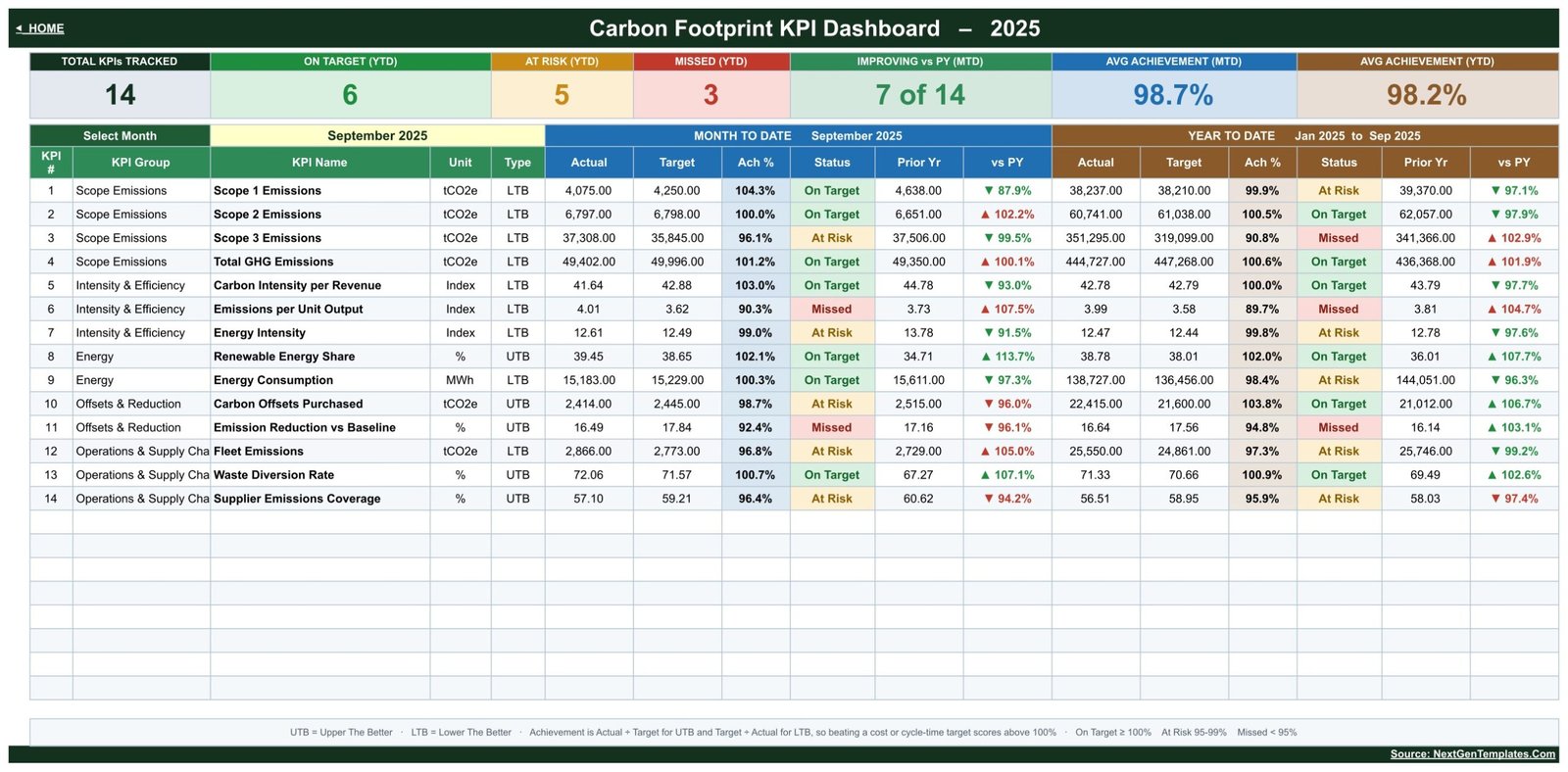
The scorecard. The Select Month dropdown sits at the top left of the table and everything above and below it follows. In the shipped sample, September 2025 returns 6 On Target, 5 At Risk and 3 Missed on a YTD basis, average MTD achievement 98.7% and average YTD achievement 98.2%, with 7 of 14 KPIs improving against prior year. Each row carries the KPI number, group, name, unit and type, then the eleven result columns. Colour is doing real work here – green On Target, amber At Risk, red Missed, with green and red arrows on the vs PY percentages.
KPI Trend
One KPI at a time, twelve months deep. A header strip repeats the KPI’s group, unit, type, owner, priority and frequency alongside its formula and definition – for Scope 1 Emissions that is “Sum of Direct Emissions from Owned Sources (tCO2e)” and “Direct greenhouse gas emissions from company-owned combustion, process and fugitive sources”. Below it, a twelve-row table pairs each month with its prior-year month, then two charts: MTD Trend for Scope 1 Emissions (bars for Actual, a line for Target, a line for Prior Year) and YTD Trend for Scope 1 Emissions in the same three series. Reading the sample, Scope 1 sits At Risk from February through September and only crosses into On Target in the last quarter.
KPI Analysis
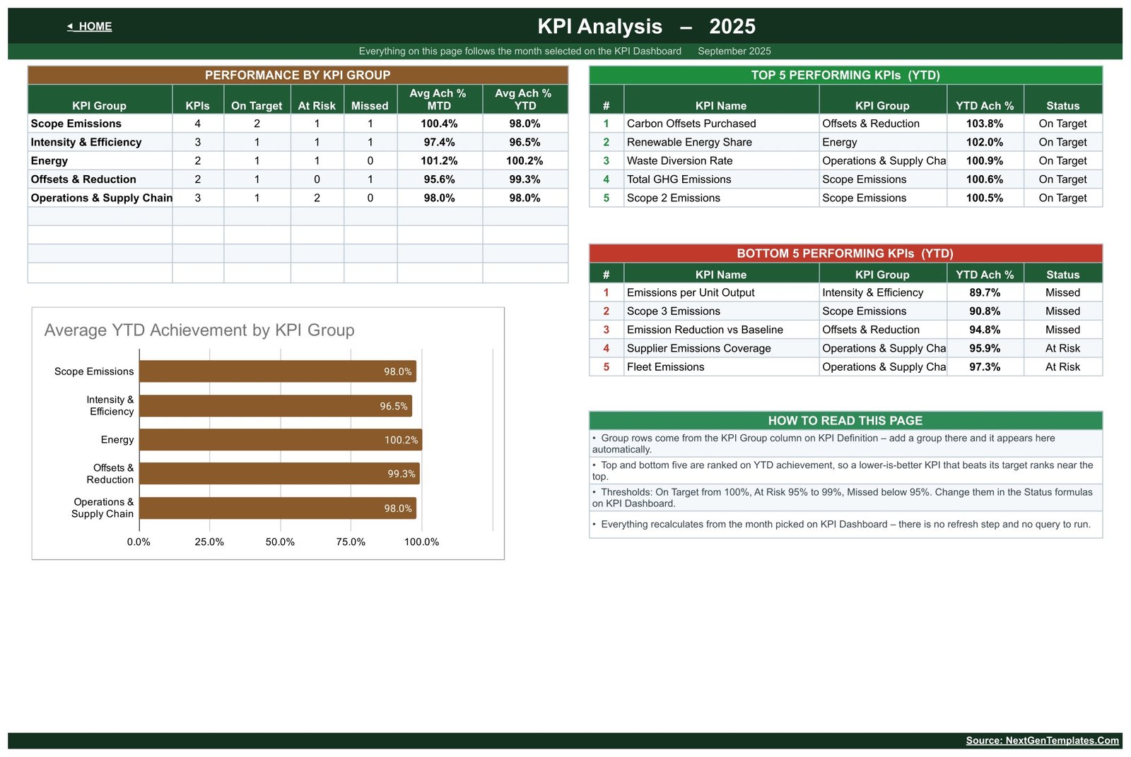
The roll-up. Performance by KPI Group counts KPIs, On Target, At Risk and Missed per group and averages MTD and YTD achievement – Energy leads at 100.2% YTD, Intensity & Efficiency trails at 96.5%. An Average YTD Achievement by KPI Group bar chart makes the spread obvious, and ranked Top 5 and Bottom 5 tables name the KPIs to celebrate and the ones to fix. In the sample the bottom three are Emissions per Unit Output (89.7%), Scope 3 Emissions (90.8%) and Emission Reduction vs Baseline (94.8%).
KPI Input – Actual, Target and PY
Three identical sheets, one for this year’s actuals, one for targets, one for last year. Twelve month blocks run across the page, each with an MTD and a YTD column, and the yellow cells are the only ones you type in. Cell E3 on the Actual sheet sets the first month of the reporting year; change it and everything re-bases.
KPI Definition
The master list, and the reason the workbook is easy to adapt. Each row holds the KPI number, group, name, unit, formula, definition, type, owner, priority and frequency. Add a row here and the KPI appears on the dashboard, the trend picker, the analysis roll-up and all three input sheets – no formula edits anywhere.
Carbon Footprint KPI Dashboard vs. Excel vs. Paid Carbon Accounting SaaS – Feature Comparison
| This template (Google Sheets) | Excel KPI scorecard | Paid carbon accounting SaaS | |
|---|---|---|---|
| Cost | One payment of $8.99 | One payment, similar | Typically $200+ per month |
| Platform | Any browser | Desktop Excel | Vendor web app |
| Setup time | Minutes | Minutes | Weeks of onboarding |
| Real-time collaboration | Yes, native | Via OneDrive only | Yes |
| Mobile access | Yes | Limited | Yes |
| Customisable KPI list | Yes – one sheet drives it | Yes | Usually vendor-fixed |
| Share with a link | Yes | File send | Seat-based |
| Year-1 cost at 5 users | $8.99 once | One licence | $2,400+ |
| Emission factor library | No | No | Yes |
| Third-party assurance | No | No | Sometimes offered |
Who Should Use This Template
Sustainability and EHS leads who already produce emissions figures and need a monthly view their executives will actually read. Finance business partners who report carbon intensity per revenue next to the revenue itself. Facilities and operations managers who own energy, fleet and waste lines. Procurement teams tracking supplier emissions coverage. And independent consultants who want one file to copy per client rather than seats in a platform.
It is the wrong tool if you need the emissions computed, audited or filed for you, or if you want an analytical dashboard that slices a transaction table by site and month – that is a different style of build entirely.
Real-World Use Cases
Monthly sustainability review
The Head of Sustainability picks last month on the dropdown, screenshots the scorecard, and walks the meeting straight to the three red rows instead of narrating fourteen.
Scope 3 escalation
Scope 3 is the largest number and the worst performer in the sample, at 90.8% YTD. Because the KPI carries an owner, the conversation has a name attached to it before the meeting starts.
Consultant client pack
A consultant copies the file per client, rewrites the KPI Definition list to match that client’s material topics, and issues a monthly scorecard in the same format every time.
Site-level energy accountability
The Facilities Lead opens Energy Consumption on the KPI Trend page and can tell a genuine drift from a single cold month before defending it upward.
Advantages of the Carbon Footprint KPI Dashboard in Google Sheets
- Nothing to install. Open the link, make a copy, start typing. There is no add-on to approve and no script permission dialog.
- The month picker replaces the rebuild. No refresh step, no query to run, no pivot to update.
- Honest scoring for reduction targets. LTB handling means a team that cuts emissions is not punished by a naive Actual / Target ratio.
- Prior year is always on screen. Every KPI shows vs PY for both MTD and YTD, so improvement is visible without a second report.
- One list controls the whole file. Adding a fifteenth KPI is a row on KPI Definition, not a formula project.
- Genuine collaboration. Sheets sharing means the Energy Manager and the Supply Chain Director can update their own lines in the same file.
Opportunities for Improvement
Being straight about the edges: there is no emission factor library, so the conversion from litres, kWh or spend into tCO2e happens outside this file. There is no site or business-unit breakdown – the model is one organisation, fourteen KPIs, twelve months; multiple sites means multiple copies or a consolidation step upstream. History is a single reporting year plus prior year, not a rolling multi-year baseline, although the KPI Input – PY sheet gives you the comparison that matters most. And the KPI Trend page shows one KPI at a time by design, so cross-KPI correlation is a manual read across pages.
Best Practices
- Set the year first. Change E3 on KPI Input – Actual before you type anything else.
- Fix the KPI list before you fill the data. Editing KPI Definition later is safe, but it is less work to settle the list up front.
- Set targets that mean something. The traffic lights are only useful if the Target column reflects a real reduction plan rather than last year’s number.
- Name a single owner per KPI. The Owner column is where accountability lives; leaving it generic wastes the best feature on the page.
- Agree the thresholds once. If 95% is too generous for a critical KPI, change it in the Status formulas and tell everyone rather than arguing about colours each month.
- Protect the input sheets. Use Google Sheets’ built-in protected ranges so only the owners edit their own numbers.
- Keep the calculation trail elsewhere. Store the workings that produce each tCO2e figure in your carbon accounting process; this file is the reporting layer.
Explore Relevant Templates
- Carbon Footprint KPI Dashboard in Google Sheets – the template described in this post.
- Carbon Footprint KPI Dashboard in Excel – the same scorecard as an Excel workbook.
- Green Building KPI Dashboard in Google Sheets
- Sustainable Tourism KPI Dashboard in Google Sheets
- Water Usage Efficiency KPI Dashboard in Excel
- Corporate Governance KPI Dashboard in Google Sheets
- ESG Environmental Dashboard in Power BI – the analytical, chart-led alternative.
If you want to build reporting views like this yourself, the Excel Pivot Tables & Dashboards course on NextGenTemplates Academy teaches the method with practice files.
Get the Carbon Footprint KPI Dashboard in Google Sheets
Frequently Asked Questions
Does the template calculate emissions from fuel or electricity use?
No. There are no emission factors and no conversions inside it. You enter figures you have already calculated.Carbon Footprint KPI Dashboard in Google Sheets
How is this different from an analytical carbon dashboard?
This is the KPI scorecard line: a month dropdown, an Actual / Target / Achievement / Status table, a per-KPI trend page and a group roll-up. Analytical dashboards are chart-led and slice a transaction table. They answer different questions and plenty of teams use both.Carbon Footprint KPI Dashboard in Google Sheets
Can I change the 14 KPIs?
Yes. KPI Definition is the master list and every other sheet follows it, so adding, renaming or removing a KPI needs no formula edits.
Why do some KPIs score above 100% when the number went down?
Those are LTB – lower-the-better – KPIs, scored as Target / Actual. Emitting less than target is a win and the achievement percentage reflects that.Carbon Footprint KPI Dashboard in Google Sheets
Do I need Google Workspace, or will a free account do?
A free Google account is enough. The file uses ordinary spreadsheet formulas.
Can several people update it at once?
Yes, it is a normal Google Sheet. Share the link and set edit rights per person, and consider protected ranges so each owner edits only their rows.Carbon Footprint KPI Dashboard in Google Sheets
Does using this template make our reporting compliant?
No. It is a management reporting layout with no certification, no assurance and no claim of conformity with any emissions reporting standard.Carbon Footprint KPI Dashboard in Google Sheets
About the Author
Built by PK – Microsoft Certified Professional with 15+ years of Excel, Google Sheets, and Power BI experience. Founder of NextGenTemplates, reaching 300K+ subscribers across YouTube channels. Every template is hand-built and tested before release.
Conclusion
Carbon numbers only change behaviour when somebody sees them monthly, with a target beside them and a name attached. That is all this file does, and it does it without a platform, a login or an onboarding call: fourteen KPIs, one dropdown, MTD and YTD, prior year always in view. Bring the figures you already trust, spend ten minutes typing them in, and you have a scorecard your leadership team can read in one screen.Carbon Footprint KPI Dashboard in Google Sheets
Get the Carbon Footprint KPI Dashboard in Google Sheets – instant download, a Make a Copy link inside the PDF, and unlimited re-downloads.Carbon Footprint KPI Dashboard in Google Sheets


