The Cement and Steel Dashboard in Google Sheets gives production, dispatch, sales, and quality teams a ready reporting system with 7 sheet tabs, 4 KPI cards, 20 chart views, slicers, a Batch ID search sheet, and a structured data sheet. Instead of building a cement and steel tracking dashboard from scratch, teams can replace the sample records, keep the same row format, and review production, revenue, dispatch rate, product mix, plant performance, and quality score in a familiar spreadsheet environment.
Cement and steel operations move through many checkpoints: production batches, plant capacity, region demand, dispatch quantity, sales channel, quality score, supervisor activity, and revenue. A spreadsheet can become messy fast when each team tracks a different version. This Google Sheets dashboard keeps the reporting layer centralized so managers can review the same numbers during daily production meetings, sales reviews, and quality checks. For team collaboration guidance, Google also explains how to share and collaborate in Google Sheets.
Get the Cement and Steel Dashboard Template
Key Features of Cement and Steel Dashboard in Google Sheets
- Seven sheet tabs: Overview, Plant Performance, Product Mix, Sales and Dispatch, Quality Control, Search Sheet, and Data Sheet.
- Four top KPI cards: Total Production, Total Revenue, Dispatch Rate, and Avg Quality Score.
- Twenty chart views: Production, dispatch, revenue, quality, batch status, plant, region, product, sales channel, shift, and supervisor analysis.
- Slicers for quick filtering: Filter dashboard views without rebuilding charts or editing formulas.
- Batch ID lookup: Select one Batch ID and view the complete record details in the Search Sheet tab.
- Editable data structure: Add new records in the Data Sheet tab using the same format.
- Google Sheets format: Useful for browser-based access and team sharing inside Google Drive.
Dashboard Pages Explanation
Overview Page
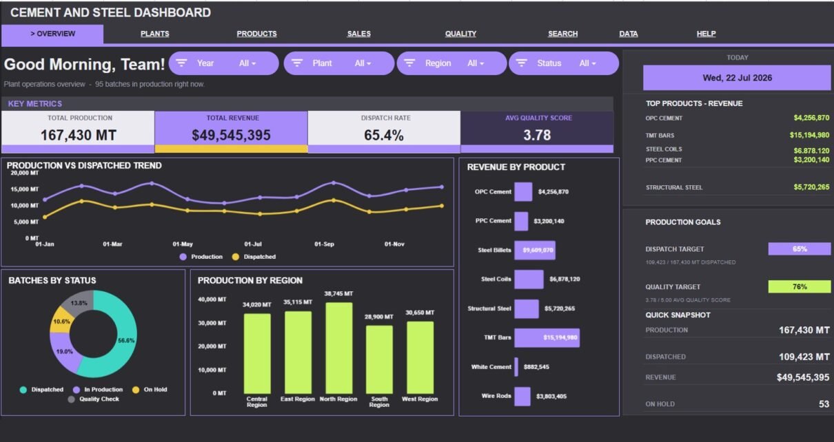
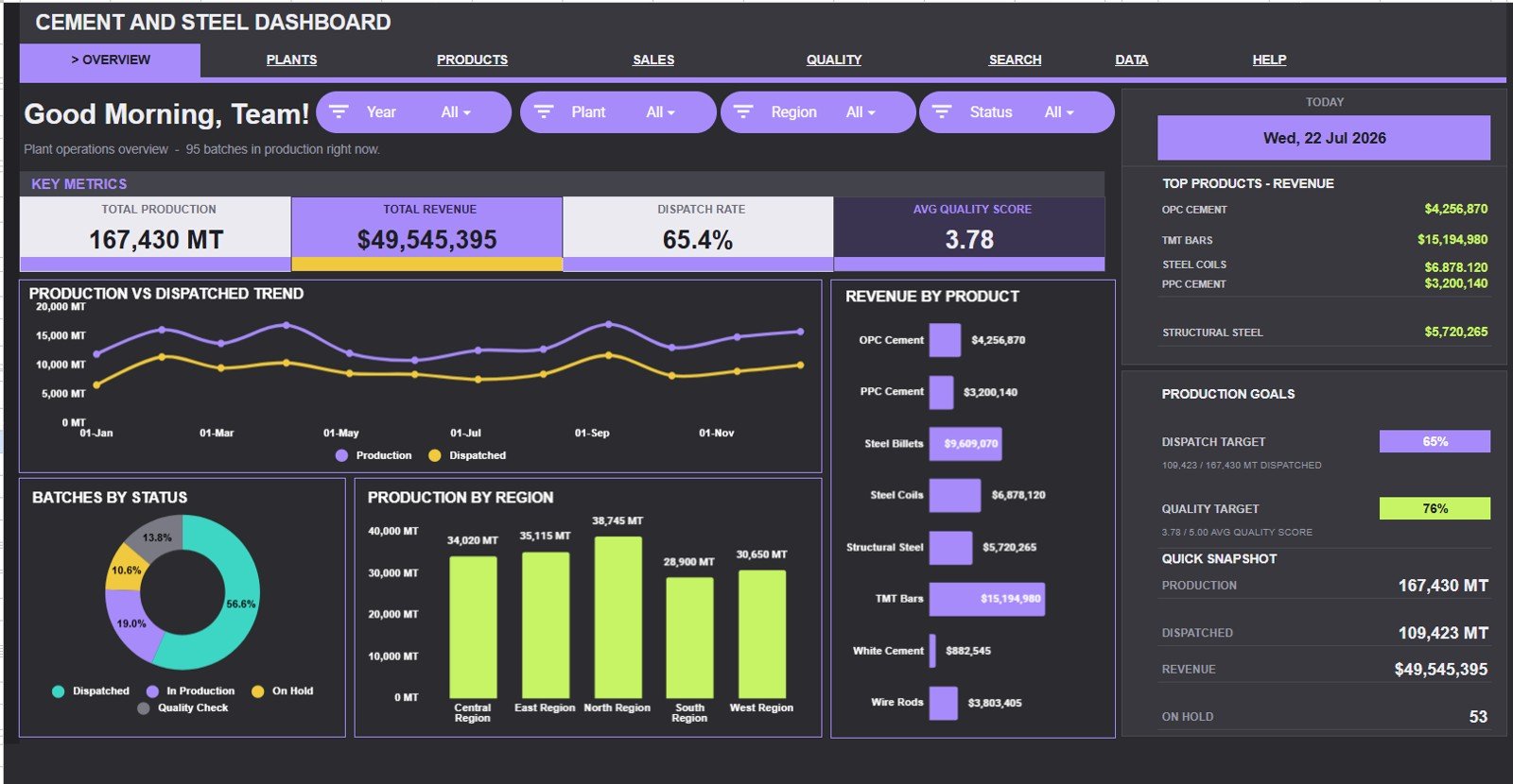
The Overview Page gives the high-level view of the cement and steel operation. At the top, the dashboard shows Total Production, Total Revenue, Dispatch Rate, and Avg Quality Score so leadership can review output, sales value, movement efficiency, and quality in one glance.
Production and Dispatched by Month: This chart compares production quantity with dispatched quantity month by month. It helps managers see whether finished material is moving out at the same pace as production or creating dispatch backlog.
Revenue by Product: This chart shows which cement and steel product categories generate the highest revenue. It helps sales and production teams decide where demand is strongest and where product focus may need adjustment.
Batches by Status: This chart separates batches by status so users can quickly see completed, pending, in-progress, or delayed work. It is useful for daily production meetings because status mix often reveals operational bottlenecks.
Production by Region: This chart compares production volume across regions. It helps leadership understand which regions are driving demand and where production planning may need more attention.
Plant Performance
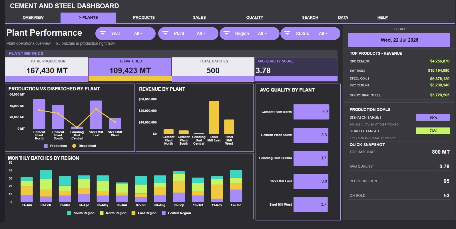
The Plant Performance tab focuses on location-level output, dispatch, revenue, quality, and regional batch movement. It is helpful when plant heads or operations directors need to compare performance between facilities.
Production and Dispatched by Plant: This chart compares how much each plant produced against how much it dispatched. It highlights plants where output is strong but dispatch movement may be slower than expected.
Revenue by Plant: This chart ranks plants by revenue contribution. It helps finance and operations teams see which facilities are generating the highest commercial value.
Avg Quality by Plant: This chart compares average quality scores across plants. It helps quality teams identify facilities that may need process review, training, or tighter quality checks.
Monthly Batches by Region: This chart tracks batch volume across regions by month. It helps users see whether regional workload is stable, seasonal, or shifting over time.
Product Mix
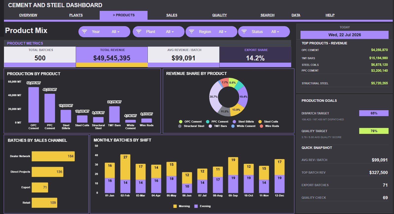
The Product Mix tab helps users understand which products, channels, and shifts drive cement and steel activity. This page is useful for production planning, sales reviews, and portfolio-level discussions.
Production by Product: This chart compares total production by product category. It helps teams see which cement or steel products account for the largest production share.
Revenue Share by Product: This chart shows how revenue is distributed across products. It helps users compare production volume with sales value so they can spot high-value products.
Batches by Sales Channel: This chart breaks down batch count by sales channel. It helps sales operations teams understand whether dealer, distributor, direct, project, or other channels are driving more transactions.
Monthly Batches by Shift: This chart tracks how batch activity varies by shift across months. It helps supervisors review workload balance and identify shifts with rising pressure or lower throughput.
Sales and Dispatch
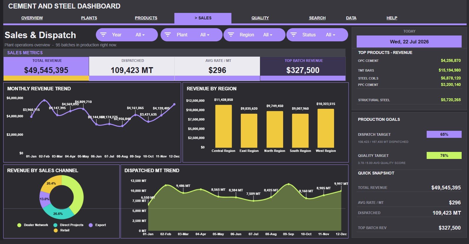
The Sales and Dispatch tab connects revenue analysis with actual dispatched quantity. It helps managers review whether sales growth is supported by movement of physical material.
Monthly Revenue by Month: This chart shows how revenue changes across months. It helps sales managers identify stronger and weaker months and compare performance with production activity.
Revenue by Region: This chart compares revenue contribution by region. It helps teams find high-value territories and regions that may require extra sales or dispatch support.
Revenue by Sales Channel: This chart shows which channels generate the most revenue. It is useful for channel strategy because the highest batch count channel may not always produce the highest revenue.
Dispatched MT by Month: This chart tracks dispatched metric tons by month. It helps dispatch teams see movement trends and identify months where shipment volume lags behind production.
Quality Control
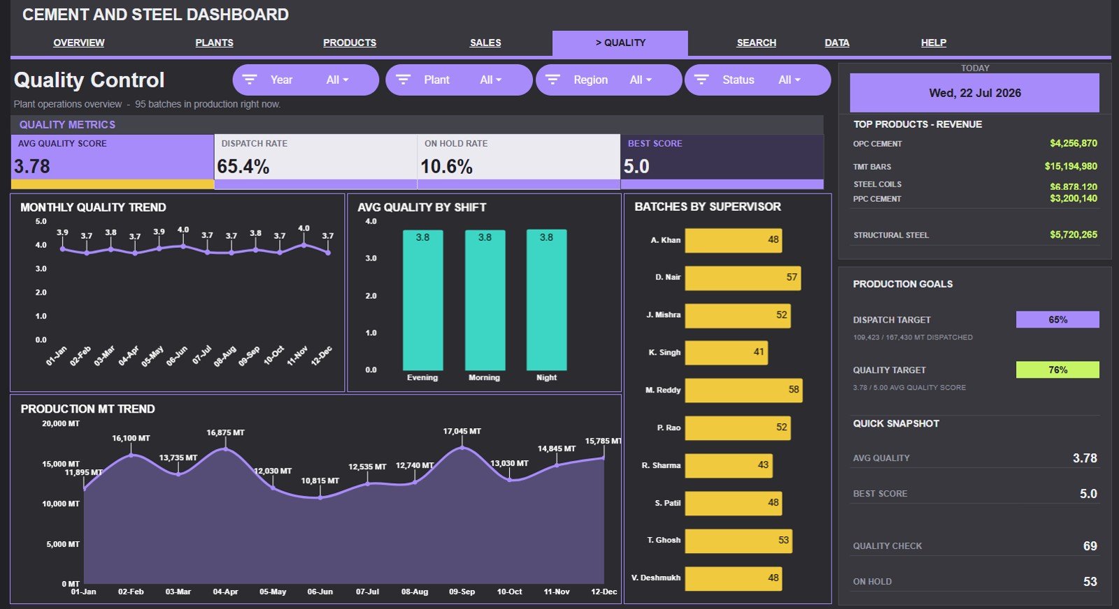
The Quality Control tab is built for monitoring score trends, shift performance, supervisor activity, and production movement. It gives quality teams a focused view before plant reviews.
Monthly Quality Score by Month: This chart shows the quality score trend over time. It helps teams see whether process quality is improving, declining, or staying stable.
Avg Quality by Shift: This chart compares average quality scores across shifts. It helps supervisors identify whether quality differences are linked to timing, staffing, or operating conditions.
Batches by Supervisor: This chart shows batch count by supervisor. It helps managers review workload distribution and connect quality discussions with responsible supervision groups.
Production MT by Month: This chart tracks production metric tons across months. It gives quality teams context because higher production months may also create more pressure on inspection and control processes.
Search Sheet Tab
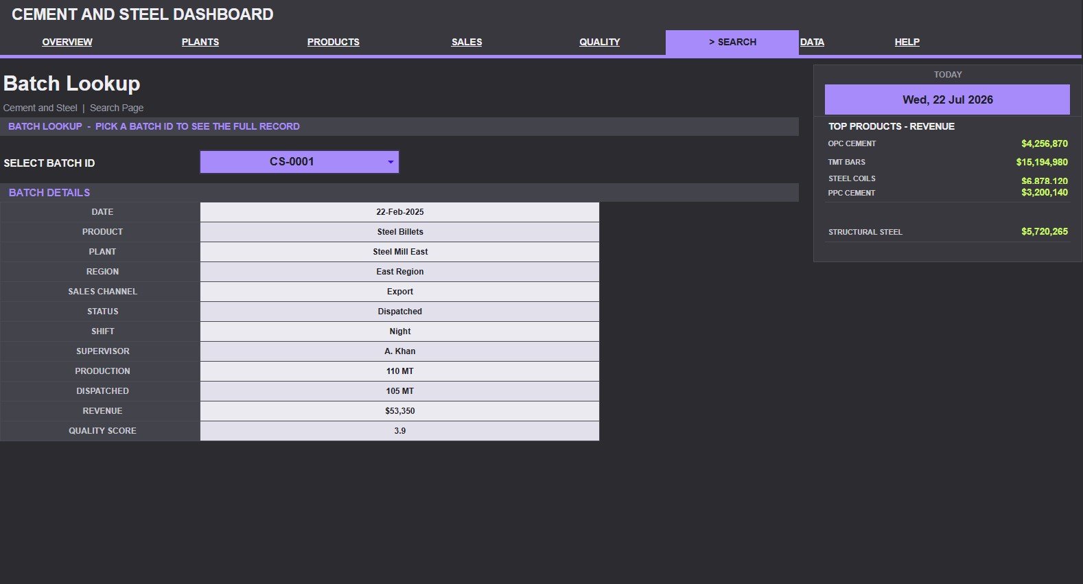
The Search Sheet tab is designed for quick record lookup. Users can select a Batch ID and see the full record details in one place, including date, product, plant, region, sales channel, status, shift, supervisor, production, dispatched quantity, revenue, and quality score.
This is useful during review meetings because users do not need to scroll through the raw data sheet to answer a batch-level question. It turns the dashboard into a practical reference tool for operations, dispatch, sales, and quality teams.
Data Sheet Tab
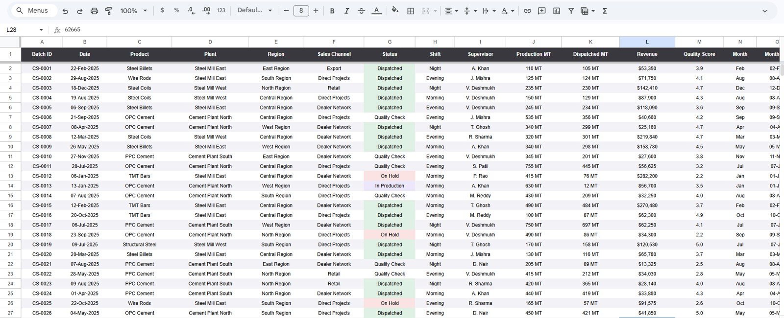
The Data Sheet tab is the foundation of the dashboard. Users add cement and steel records in the same format so the dashboard pages, KPI cards, slicers, charts, and search sheet continue to work correctly.
For best results, keep the columns consistent and use standard names for product, plant, region, sales channel, status, shift, and supervisor. Clean input data makes the dashboard easier to trust.
Cement and Steel Dashboard in Google Sheets vs. Microsoft Excel Dashboard vs. Paid ERP/SaaS – Feature Comparison
| Feature | Cement and Steel Dashboard in Google Sheets | Microsoft Excel dashboard | Paid ERP or manufacturing SaaS |
|---|---|---|---|
| Cost | One-time template purchase | Template cost plus Excel access if needed | Usually subscription or implementation cost |
| Platform | Google Sheets in browser | Excel desktop or Microsoft 365 | Vendor cloud or enterprise system |
| Setup time | Copy the file and replace sample data | Open workbook and replace sample data | May require onboarding and configuration |
| Real-time collaboration | Strong with Google Drive sharing | Depends on OneDrive or SharePoint setup | Usually available by plan |
| Mobile access | Available through browser or Sheets app | Available but may be less dashboard-friendly | Usually available |
| Custom fields | Editable after copying the file | Editable workbook structure | Controlled by vendor configuration |
| Share with link | Yes, through Google Drive permissions | Yes, with Microsoft 365 setup | Usually account-based access |
| Batch ID search | Included Search Sheet | Possible with formulas | Usually record-level views |
| Year-1 cost at 5 users | One template purchase | Template plus license needs | Often much higher due to subscription fees |
Who Should Use This Template
- Cement manufacturing plants tracking production, dispatch, revenue, and quality.
- Steel distributors and steel product teams reviewing product mix and regional demand.
- Construction-material suppliers that manage batch-level records in spreadsheets.
- Plant managers who need a quick production and dispatch review tool.
- Sales operations teams comparing revenue by region, channel, and product.
- Quality supervisors monitoring quality score trends by plant, shift, supervisor, and month.
Real-World Use Cases
Daily production review: A plant manager opens the Overview Page to compare Total Production, Dispatch Rate, and Batches by Status before the morning meeting.
Regional sales review: A sales head uses Revenue by Region and Revenue by Sales Channel to see where demand is strongest and where dispatch follow-up is needed.
Plant benchmarking: An operations director compares Production and Dispatched by Plant with Avg Quality by Plant to identify high-performing and underperforming locations.
Quality investigation: A quality supervisor filters the Quality Control page by shift or supervisor to investigate changes in Avg Quality Score.
Batch follow-up: A dispatch coordinator uses the Search Sheet tab to pull the full details of one Batch ID during a customer or internal follow-up call.
Advantages of Cement and Steel Dashboard in Google Sheets
- Fast setup: Users can start by copying the Google Sheet and replacing sample rows.
- Clear page structure: Separate tabs keep overview, plant, product, sales, dispatch, quality, lookup, and raw data work organized.
- Practical slicers: Slicers make filtered dashboard views easier during meetings.
- Record-level search: The Search Sheet reduces the time spent scrolling through raw data.
- Low ongoing cost: The template avoids subscription fees when spreadsheet reporting is enough.
- Editable design: Users can adjust fields, formulas, labels, and chart layouts after making their own copy.
Opportunities for Improvement
This dashboard is a reporting template, not a full ERP, MES, inventory, accounting, or plant automation system. Teams that need live production equipment feeds, weighbridge integrations, automated invoice posting, purchase workflows, or advanced permissions may need a dedicated system or a custom app alongside it.
The dashboard also depends on consistent data entry. If product names, plant names, region names, status values, shifts, and supervisor names are entered inconsistently, the charts will be harder to interpret. A simple naming standard can prevent most reporting issues.
Best Practices
- Keep the Data Sheet column order unchanged unless you also update formulas and charts.
- Use standard names for products, plants, regions, channels, status values, shifts, and supervisors.
- Update records on a fixed schedule, such as daily or weekly.
- Use slicers during meetings instead of making multiple copies of the file.
- Review Dispatch Rate together with Total Production so backlog does not stay hidden.
- Compare Avg Quality Score with Production MT to avoid judging quality without production context.
- Create a backup copy before major customization.
Explore Relevant Templates
- Cement and Steel Dashboard in Google Sheets
- Cement Products Dashboard in Power BI
- Steel and Metals Dashboard in Power BI
- Cement Industry KPI Dashboard in Excel
- Contract Manufacturing Dashboard in Google Sheets
- Manufacturing Excellence Bundle
You can also browse more Google Sheets dashboard templates and manufacturing templates.
If you want to get better at turning raw batch records into dashboards like this, the Excel Pivot Tables & Dashboards course on NextGenTemplates Academy covers the reporting side with practice files.
Get the Cement and Steel Dashboard in Google Sheets
Frequently Asked Questions
What is the Cement and Steel Dashboard in Google Sheets?
It is a Google Sheets dashboard template for tracking cement and steel production, revenue, dispatch rate, plant performance, product mix, sales channels, quality scores, supervisors, shifts, and batch details.
What KPI cards are shown on the Overview Page?
The Overview Page includes Total Production, Total Revenue, Dispatch Rate, and Avg Quality Score.
How many dashboard pages are included?
The template includes seven tabs: Overview, Plant Performance, Product Mix, Sales and Dispatch, Quality Control, Search Sheet, and Data Sheet.
Can I filter the dashboard?
Yes. The dashboard includes slicers so users can quickly filter the reporting views based on the available fields in the file.
Does the Search Sheet show one batch record?
Yes. Users can select a Batch ID and view the matching record details, including date, product, plant, region, sales channel, status, shift, supervisor, production, dispatched quantity, revenue, and quality score.
Is this a full ERP system?
No. This is a Google Sheets reporting dashboard. It does not replace ERP, MES, accounting, inventory control, or production automation software.
Can I customize the template?
Yes. Because it is built in Google Sheets, users can edit formulas, charts, labels, and layout after making their own copy. Make a backup before major changes.
About the Author
Built by PK – Microsoft Certified Professional with 15+ years of Excel, Google Sheets, and Power BI experience. Founder of NextGenTemplates, reaching 300K+ subscribers across YouTube channels. Every template is hand-built and tested before release.
Conclusion
The Cement and Steel Dashboard in Google Sheets is a practical reporting template for teams that need clearer production, dispatch, revenue, plant, product, and quality visibility without moving into a full paid ERP platform. With seven tabs, four KPI cards, twenty chart views, slicers, a Search Sheet, and a structured Data Sheet, it gives cement and steel teams a cleaner way to turn batch records into meeting-ready insights.
Last updated: July 22, 2026.