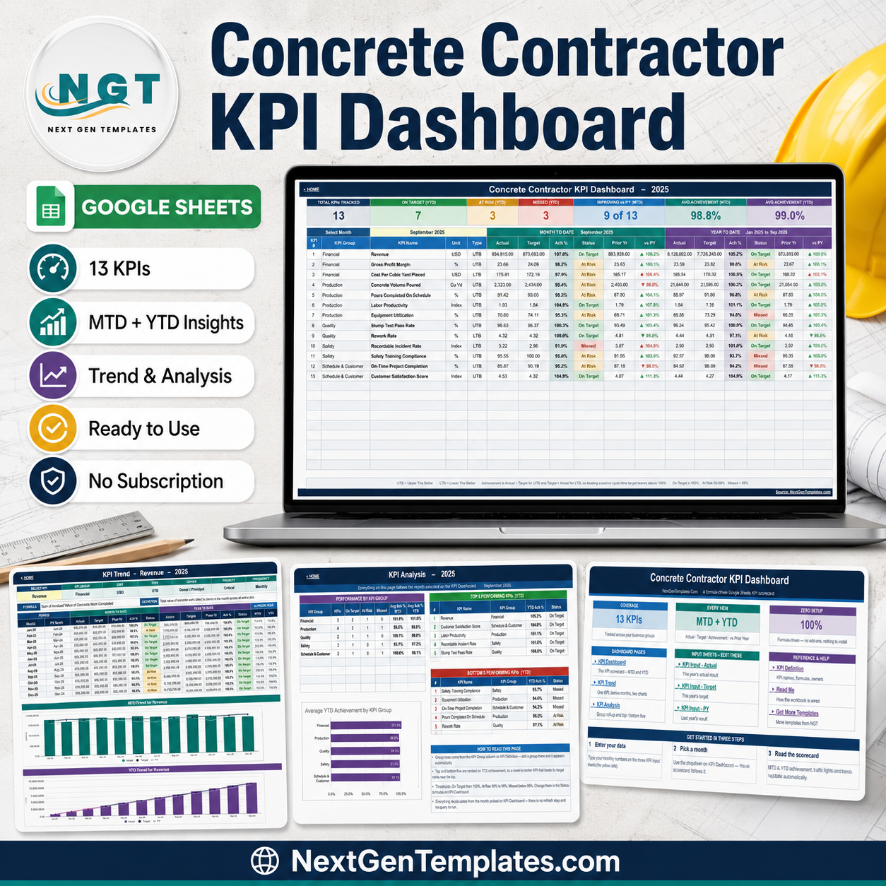
Most concrete contractors already have their numbers. Revenue is in the accounting package, cubic yards are on the batch tickets, crew hours are on the timesheets, slump results are in the QC folder and incidents are in the OSHA log. What is usually missing is the single monthly page that puts all of them beside a target and says, plainly, which ones are on track. The Concrete Contractor KPI Dashboard in Google Sheets is that page: 13 KPIs across five groups, each reported month-to-date and year-to-date in the same row, with a traffic light, a prior-year comparison and a twelve-month trend behind it. It is formula-driven, needs no add-ons or scripts, and costs 8.99 once instead of a monthly seat.
One detail matters more than it sounds: three of the 13 KPIs are Lower-The-Better — Cost Per Cubic Yard Placed, Rework Rate and Recordable Incident Rate. The workbook types them correctly, so beating a cost target or driving an injury rate down scores above 100% and shows green. Get that direction flag wrong and a falling injury rate renders as a failing KPI, which is exactly the sort of quiet error that makes a safety review useless.
Key Features of the Concrete Contractor KPI Dashboard in Google Sheets
- 13 KPIs across five groups. Financial (3), Production (4), Quality (2), Safety (2) and Schedule & Customer (2).
- One month dropdown. Pick a month on the KPI Dashboard sheet and the scorecard, the header cards and the KPI Analysis roll-up all re-base to it. No refresh, no query.
- MTD and YTD in the same row. Actual, Target, Ach %, Status, Prior Yr and vs PY, twice per KPI.
- Direction-aware achievement. Actual ÷ Target for Upper-The-Better KPIs, Target ÷ Actual for Lower-The-Better ones.
- Stated traffic-light bands. On Target at 100% and above, At Risk from 95% to 99%, Missed below 95% — editable in the Status formulas.
- Seven header cards. Total KPIs Tracked, On Target (YTD), At Risk (YTD), Missed (YTD), Improving vs PY (MTD), Avg Achievement (MTD), Avg Achievement (YTD).
- A per-KPI trend page with twelve months of history and two charts.
- Group scoring and rankings on a dedicated analysis page.
- An editable KPI master list that every other sheet follows automatically.
Dashboard Pages Explanation
The workbook is nine tabs: three you read, three you type into, three for reference.
Home
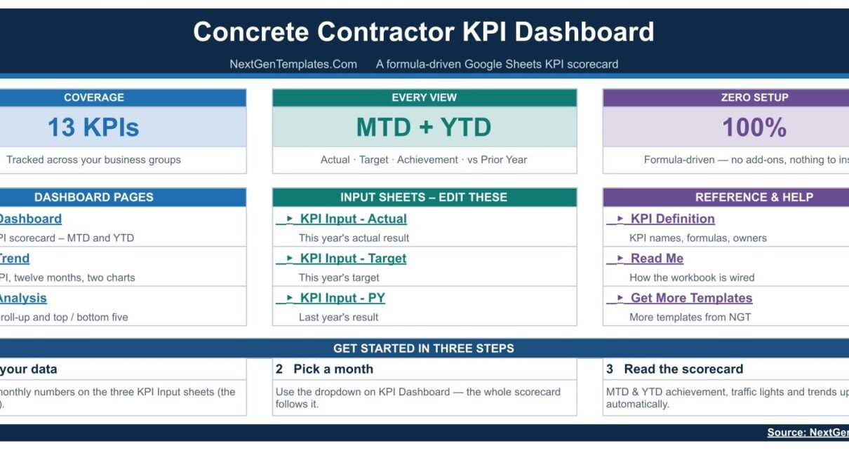
A navigation cover carrying three summary cards — Coverage: 13 KPIs, Every View: MTD + YTD, Zero Setup: 100% — then hyperlinked lists of the Dashboard Pages, the Input Sheets and the Reference & Help sheets, and a “Get Started In Three Steps” strip at the foot: enter your data, pick a month, read the scorecard.
KPI Dashboard
The scorecard itself, and the page you will actually print. Thirteen numbered rows: Revenue, Gross Profit Margin, Cost Per Cubic Yard Placed, Concrete Volume Poured, Pours Completed On Schedule, Labor Productivity, Equipment Utilization, Slump Test Pass Rate, Rework Rate, Recordable Incident Rate, Safety Training Compliance, On-Time Project Completion and Customer Satisfaction Score. Each carries its KPI Group, Unit and Type, then a Month To Date block and a Year To Date block, each with Actual, Target, Ach %, Status, Prior Yr and vs PY.
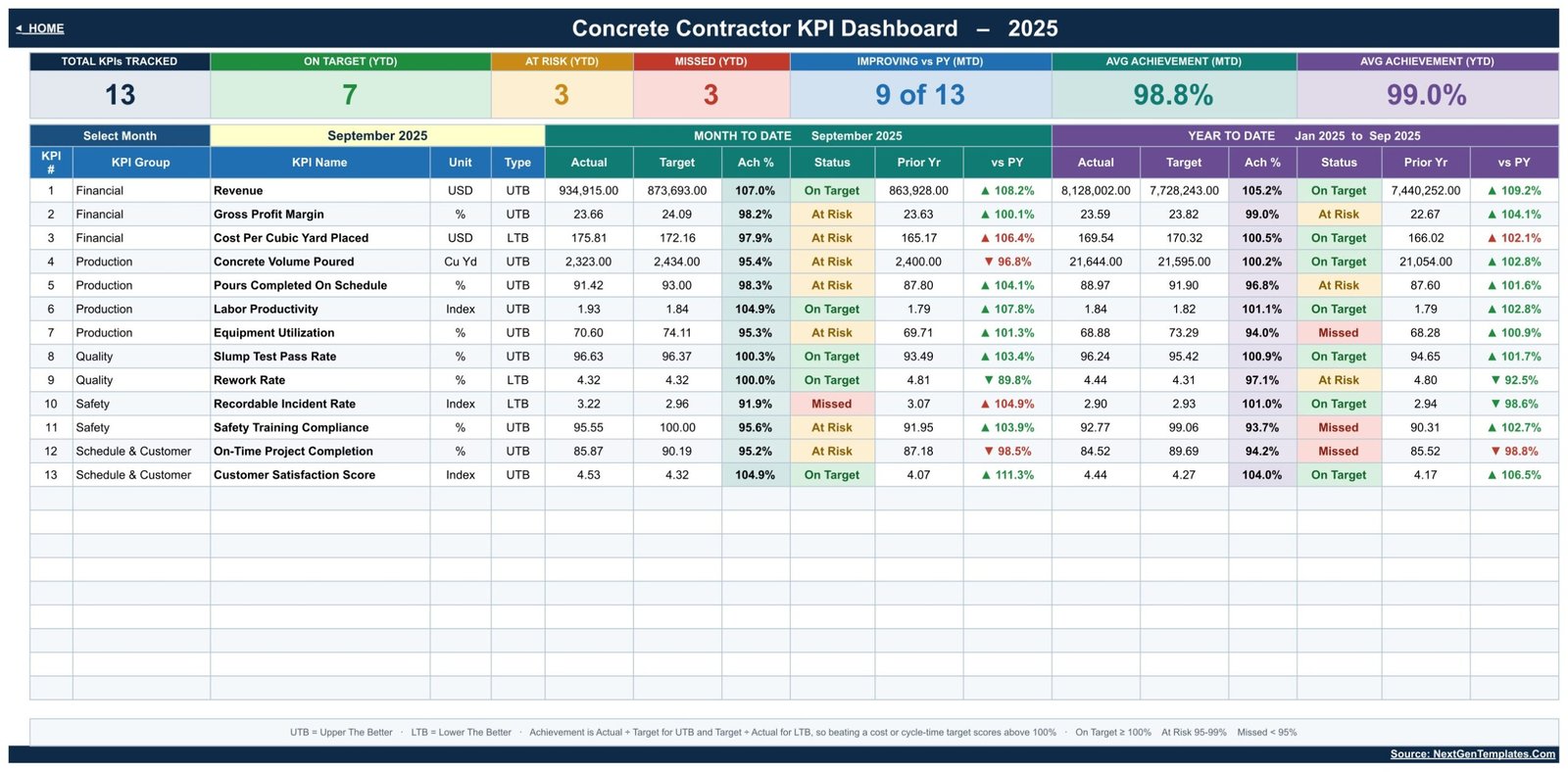
In the sample data, September shows Revenue on target at 107.0% MTD, Cost Per Cubic Yard Placed at 97.9% and At Risk, Recordable Incident Rate Missed at 91.9%, and Customer Satisfaction Score On Target at 104.9%. Seven KPIs are On Target for the year, three At Risk and three Missed — the sort of split that gives a monthly meeting an agenda rather than a mood.
KPI Trend
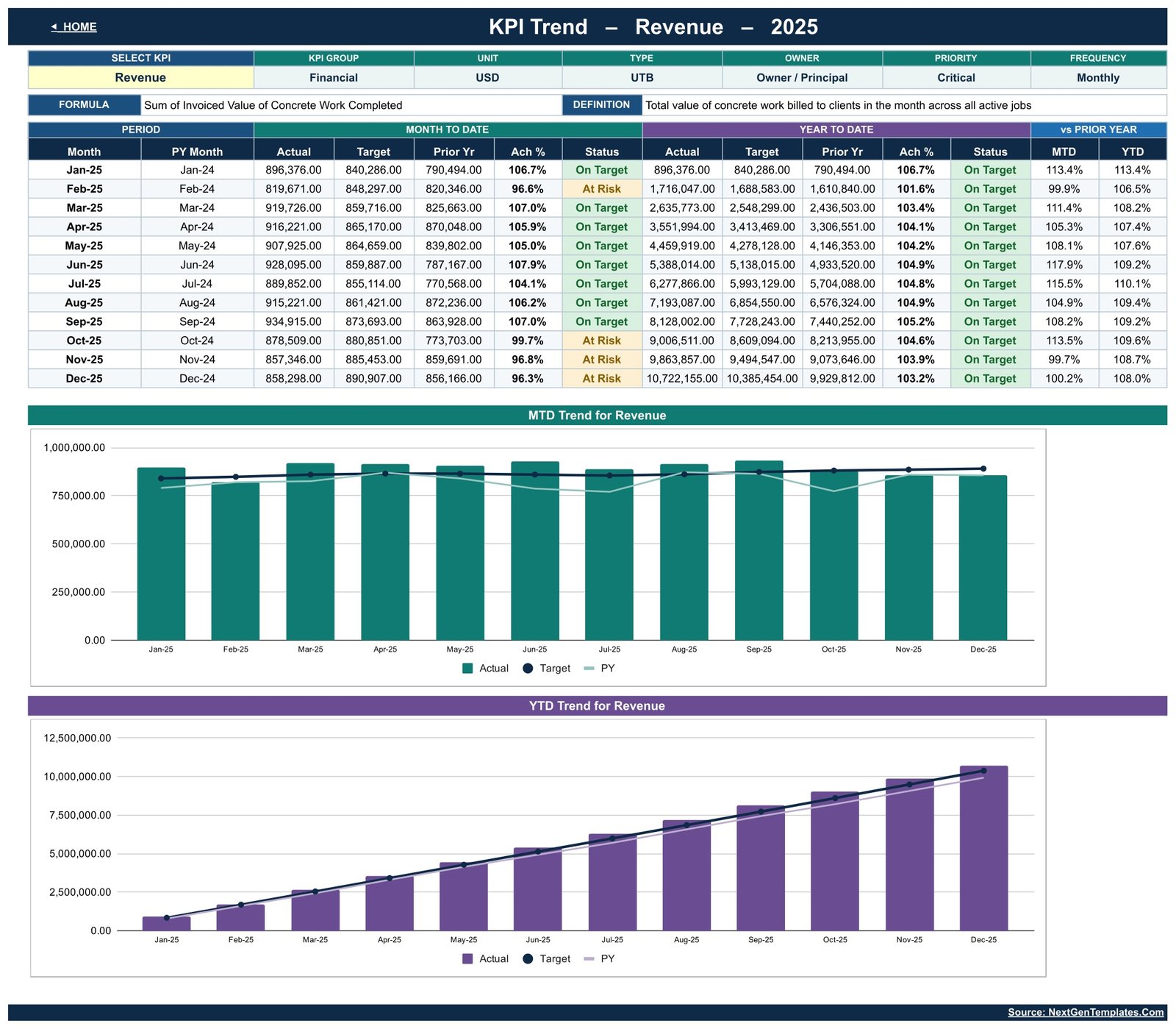
One KPI at a time, twelve months deep. A Select KPI dropdown pulls through that KPI’s group, unit, type, owner, priority, frequency, formula and definition, then lists January to December with MTD and YTD Actual, Target, Prior Yr, Ach % and Status, plus vs Prior Year for both bases. Underneath sit two charts, MTD Trend for Revenue and YTD Trend for Revenue, each plotting Actual as columns against Target and prior-year lines.
KPI Analysis
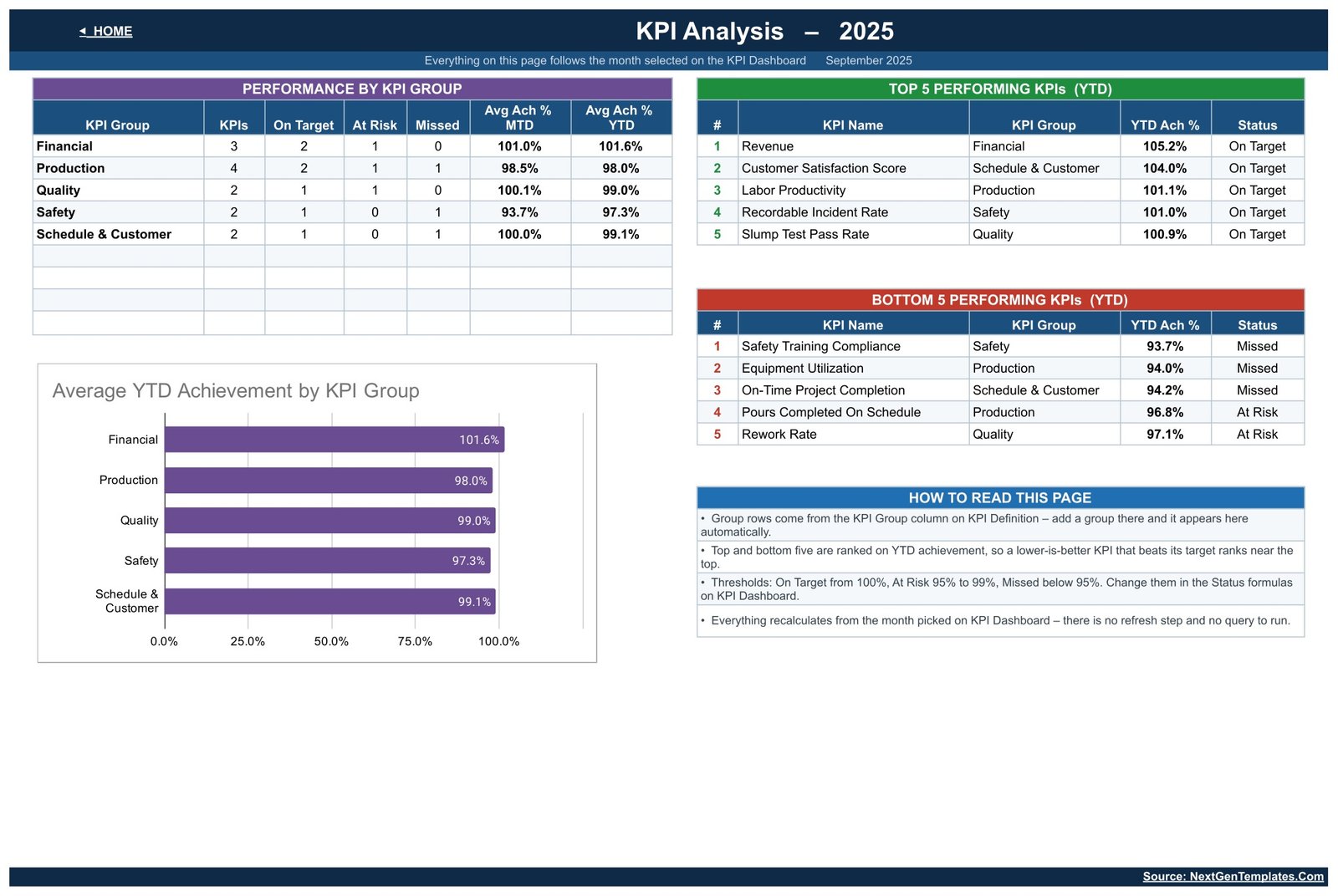
The exception page. Performance By KPI Group counts KPIs, On Target, At Risk and Missed for each of the five groups with Avg Ach % MTD and YTD beside them. Top 5 Performing KPIs (YTD) and Bottom 5 Performing KPIs (YTD) rank everything by year-to-date achievement, and an Average YTD Achievement by KPI Group bar chart puts the five groups side by side. A “How To Read This Page” panel explains, usefully, that a Lower-The-Better KPI beating its target will rank near the top — which is correct, and worth saying out loud before someone assumes it is a bug.
KPI Input – Actual, Target and PY
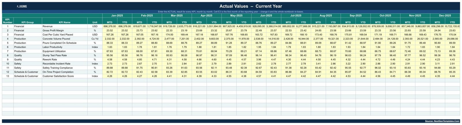
Three identical grids, one row per KPI, twelve month-columns each holding an MTD cell and a YTD cell. You type only the yellow MTD cells. Sum-type KPIs such as Revenue and Concrete Volume Poured accumulate down the YTD column; rate and index KPIs average instead. Cell E3 on the Actual sheet sets the first month of the reporting year, so a contractor on a June-to-May year changes one cell rather than rebuilding anything.
KPI Definition and Read Me
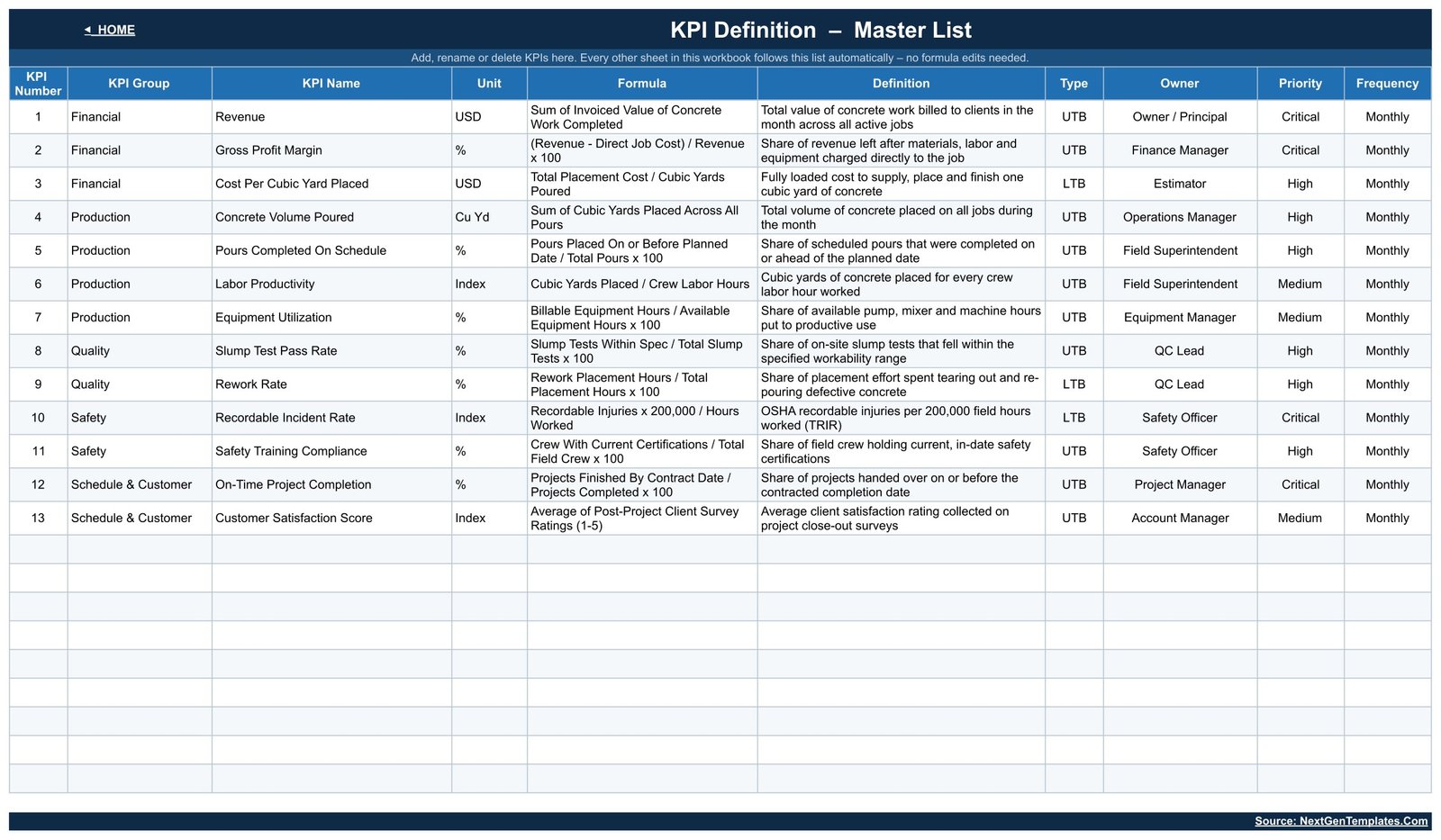
The KPI Definition master list is where the workbook is actually configured. Every KPI has a Group, Name, Unit, Formula, Definition, Type, Owner, Priority and Frequency — Cost Per Cubic Yard Placed is “Total Placement Cost / Cubic Yards Poured”, owned by the Estimator at High priority; Recordable Incident Rate is “Recordable Injuries x 200,000 / Hours Worked”, owned by the Safety Officer at Critical. Add, rename or delete a row and the Dashboard, Trend and Analysis pages follow it without a single formula edit.
Concrete Contractor KPI Dashboard in Google Sheets vs. Excel vs. Paid Construction SaaS — Feature Comparison
| This template (Google Sheets) | Excel KPI dashboard | Procore / Buildertrend | |
|---|---|---|---|
| Cost | 8.99 one time | 12.99 one time | Several hundred dollars a month, quoted per volume |
| Platform | Google Sheets, any browser | Microsoft Excel desktop | Cloud SaaS plus field apps |
| Setup time | Under an hour | Similar, plus an Excel licence | Weeks of implementation and training |
| Real-time collaboration | Yes, native | Only via OneDrive co-authoring | Yes |
| Mobile access | Google Sheets app | Excel mobile, limited | Full field apps |
| Customisable KPIs | Edit one master list | Yes, with formula edits | Vendor report catalogue plus paid custom work |
| Share with a link | Yes | No | Seat required per viewer |
| Reads batching plant or weighbridge data | No — you type monthly figures | No | Yes, via integrations |
| Pour scheduling and daily field logs | No | No | Yes |
| Year-1 cost at 5 users | 8.99 total | 12.99 total | Thousands |
Vendor pricing is indicative and changes; get a current quote before comparing. If you want a monthly KPI review your superintendent and your owner can both open, without wiring anything to a batch plant, this template sits in the gap between a blank spreadsheet and a construction ERP.
Who Should Use This Template
A good fit for:
- Owners and operations managers of small to mid-size concrete, flatwork and structural concrete contractors who report monthly rather than by the pour
- Field superintendents and estimators who already have cubic yards, crew hours and placement costs and want them scored against target
- QC leads and safety officers who need slump pass rate, rework rate, TRIR and training compliance read against a target instead of sitting in separate folders
- Anyone preparing a monthly pack for an owner, a board or a bonding agent
Not a fit if you need: live job costing, pour scheduling, daily field logs, batch-ticket capture, crew time clocks, or a per-project breakdown. This reports one company-level number per KPI per month, and it connects to nothing.
A plain word about the Quality and Safety KPIs. Slump Test Pass Rate, Rework Rate, Recordable Incident Rate and Safety Training Compliance are figures you type in. This workbook is not a testing laboratory and is not a compliance or certification tool. It does not perform, witness or validate any test; it carries no certification against IS 456, ASTM C39, EN 206, BS 8500 or any other standard; it does not validate a mix design; and it does not read a batching plant, a weighbridge or a lab system. A green light here evidences nothing about the concrete that was placed — it reflects only what was entered. Your cylinder break reports, mix designs and injury records remain the record of truth, and your OSHA recordkeeping obligations are unaffected by anything in this sheet.
Real-World Use Cases
Daniel, owner of a 22-crew flatwork contractor. His monthly numbers meeting used to be a slideshow assembled by hand. Now it is one printed page. In the sample month, Revenue is On Target at 107.0% MTD while Recordable Incident Rate is Missed and Safety Training Compliance is At Risk, so the meeting is about expiring certifications rather than about sales — which is the meeting he actually needed to have.
Priya, operations manager at a structural concrete subcontractor. She reads Cost Per Cubic Yard Placed and Labor Productivity together. Because the cost KPI is typed Lower-The-Better, a month under target scores above 100% and reads green; when it does not, she opens KPI Trend for that KPI and sees at once whether it is one expensive pour or a drift that started in the spring.
Marcus, a field superintendent reporting into a general contractor. He needs Pours Completed On Schedule and On-Time Project Completion in front of him monthly with last year beside them. He shares the sheet read-only with the GC’s PM, and keeps edit rights on the input sheets to himself.
Advantages of the Concrete Contractor KPI Dashboard in Google Sheets
- The direction flags are right. Cost, rework and injury-rate KPIs are Lower-The-Better, so a good month reads as a good month. This is the single most common defect in trade KPI templates and it is handled here.
- MTD and YTD together. A bad month inside a good year, or a good month inside a bad year, is visible without switching views.
- Prior-year comparison as standard. Every KPI has a vs PY column on both bases, so growth is measured rather than felt.
- Configuration in one place. The KPI Definition sheet drives the rest of the workbook, so re-scoping the dashboard is a data edit, not a rebuild.
- No infrastructure. Browser-based, link-shared, mobile-readable, no add-ons and no subscription.
- Honest about its limits. Formulas and thresholds are visible and editable, not hidden behind a vendor’s metric library.
Opportunities for Improvement
No template is the right shape for everyone, and it is worth being straight about where this one stops.
- Manual entry. Thirteen KPIs times three input sheets is a monthly data-entry job. There is no import and no integration.
- Company level only. There is no per-project or per-crew dimension. If you need to compare two jobs, you need a second copy or a different tool.
- Monthly granularity. Weekly or per-pour reporting is out of scope.
- One year at a time. Multi-year history means keeping prior copies or extending the input sheets yourself.
- Charts on the Trend page follow the selected KPI only — there is no single chart comparing all 13 at once beyond the group bar chart on KPI Analysis.
Best Practices
- Fix the KPI list before you enter a year of data. Edit KPI Definition first; renaming a KPI later is fine, but re-scoping mid-year makes the YTD columns hard to read.
- Guard the Type column. Any cost, defect, delay or injury measure must be LTB. If you add a KPI of your own, set this deliberately.
- Enter prior-year figures. The vs PY column is half the value of the dashboard and it is empty until you fill KPI Input – PY.
- Set targets that mean something. A target copied from last year’s actual makes every traffic light green and the dashboard useless.
- Assign the owners for real. The Owner column on KPI Definition should name a person who will be asked about that KPI in the monthly meeting.
- Share read-only by default. Give edit access only to whoever enters the numbers — Google’s own sharing controls handle this cleanly.
- Work the bottom five, not the top five. The Bottom 5 Performing KPIs list is the agenda.
Explore Relevant Templates
- Concrete Contractor KPI Dashboard in Power BI — the same 13-KPI dashboard for Power BI Desktop. An Excel edition of this dashboard is also on the way.
- Concrete Contractor KPI Scorecard in Google Sheets — a different template family for the same trade. The names are close, so see the FAQ below, and our full walkthrough of the Concrete Contractor KPI Scorecard if you want to compare them side by side.
- Masonry Contractor KPI Dashboard in Google Sheets and Drywall Contractor KPI Dashboard in Google Sheets — sibling trades on the same layout. We have written both up here too: the Masonry Contractor KPI Dashboard guide and the Drywall Contractor KPI Dashboard guide.
- Roofing Contractor KPI Dashboard in Google Sheets and Painting Contractor KPI Dashboard in Google Sheets — useful if you run more than one trade under one roof.
If you want to learn how dashboards like this are built, the Excel Pivot Tables & Dashboards course on NextGenTemplates Academy walks through the process with practice files.
Frequently Asked Questions
Is this the KPI Dashboard or the KPI Scorecard? The names look almost identical.
Both exist for concrete contractors and they are genuinely different products. This is the KPI Dashboard: a month-picker scorecard with MTD and YTD in the same row, a per-KPI Trend page and a KPI Analysis roll-up. The Concrete Contractor KPI Scorecard in Google Sheets comes from a separate production line with its own layout and its own KPI set. If you want the month dropdown, the twelve-month trend page and the group analysis, this is the one.
What do I actually download?
A PDF. It carries the “Make a copy” link that creates your own editable Google Sheets copy in your Drive. There is no .xlsx and no .zip.
Does it connect to my batching plant, weighbridge or accounting system?
No. Every figure is typed in on the three input sheets. There is no integration, no import and no API.
Can I add, remove or rename KPIs?
Yes, on the KPI Definition sheet. Every other page follows that list automatically, with no formula edits.
Why does a KPI score above 100% when its number went down?
Because it is Lower-The-Better. Cost Per Cubic Yard Placed, Rework Rate and Recordable Incident Rate use Target ÷ Actual, so beating the target scores above 100%. The other ten KPIs use Actual ÷ Target.
Can I change the traffic-light thresholds?
Yes. On Target at 100% and above, At Risk 95% to 99% and Missed below 95% are the defaults, set in the Status formulas on the KPI Dashboard sheet.
Does this help with concrete testing or code compliance?
No. It records numbers you supply. It does not test, witness or certify anything, and it makes no claim against IS 456, ASTM C39, EN 206, BS 8500 or any other standard.
About the Author
Built by PK – Microsoft Certified Professional with 15+ years of Excel, Google Sheets, and Power BI experience. Founder of NextGenTemplates, reaching 300K+ subscribers across YouTube channels. Every template is hand-built and tested before release.
Conclusion
The value of the Concrete Contractor KPI Dashboard in Google Sheets is not that it collects anything — it does not, and it says so. It is that it takes 13 numbers you already have and makes them comparable: against a target, against last year, month by month and year to date, with the cost and safety KPIs pointing the right way round. That is the difference between a folder of figures and a monthly review that produces decisions. Thirteen KPIs, nine tabs, one dropdown, 8.99 once, and nothing to install.
Get the Concrete Contractor KPI Dashboard in Google Sheets on NextGenTemplates — regular 13.99, on offer at 8.99, one payment and no subscription.
For walkthroughs and template tutorials, visit youtube.com/@PKAnExcelExpert.